new posts in all blogs
Viewing: Blog Posts Tagged with: Features, Most Recent at Top [Help]
Results 1 - 25 of 241
How to use this Page
You are viewing the most recent posts tagged with the words: Features in the JacketFlap blog reader. What is a tag? Think of a tag as a keyword or category label. Tags can both help you find posts on JacketFlap.com as well as provide an easy way for you to "remember" and classify posts for later recall. Try adding a tag yourself by clicking "Add a tag" below a post's header. Scroll down through the list of Recent Posts in the left column and click on a post title that sounds interesting. You can view all posts from a specific blog by clicking the Blog name in the right column, or you can click a 'More Posts from this Blog' link in any individual post.
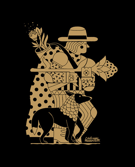
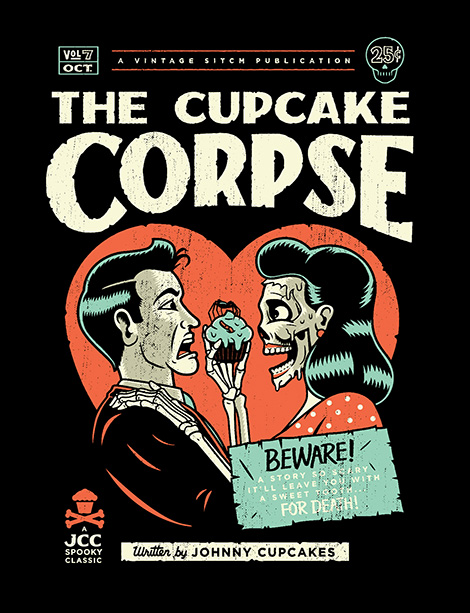
I’ve been following the work of Christopher DeLorenzo for sometime now and i’ve always been impressed with his ability to skillfully navigate between illustration, type and design with the slightest of ease. Building on simple forms, he crafts character-driven work that is equally informed by his love for film and passion for literature. A native of Massachusetts, Chris briefly ventured into NY for a stint at Saatchi & Saatchi X. He has since returned, to take on the lead design / art director role at the clothing brand Johnny Cupcakes. We’ve featured Chris’s work on the site in the past, but in today’s interview he grants us a closer look into his work and process.
When and how did you become interested in illustration and design?
I guess the seed was planted when I was really young. As a kid, art and craft were always around me. My grandfather was a carpenter and constant painter and creative person and my grandmother was basically the town artist. They helped light the spark and eventually fueled as I got older. In college I found out about graphic design, but I felt too limited so I took all of the illustration and printmaking classes I could. During an art history class I first saw Milton Glaser and Seymour Chwast and it was love at first sight and my mind was blown. Basically I’ve been striving to model my career after them ever since.
As a designer, what types of projects are you most passionate about? what attracts you to that type of work?
There are a lot of working designers that like to think of themselves as artists as well and I am definitely in the class. We can all design a logo or lay something out with a bit of personal distance if we have to, but our favorite projects are the ones where the client just wants us to give it our voice, our hand and our personality. When I get an email from a new client who wants me for my art and design thinking and voice rather than my title as “graphic designer” I get very excited and it’s always one more coin in the jar labeled “I think I can do this for a living”. I really like open ended briefs, something where I get one of two words and an emotion to work off of. I love editorial illustrations but sometimes the topics don’t really lend themselves to my drawing style and I sometimes feel they are forced. But nothing beats seeing your work on the printed page. I will never grow tired of that. I hope it never grows tired of me.
Could you walk us through one of your projects? Please include the tools you worked with to achieve the final look.
Last year, Johnny Cupcakes, the company I design for, released a Halloween collection of t-shirts called “Midnight Delights” The idea was a spoof on vintage pulp horror novellas. Three t-shirts packaged in a book-like box. There’s such a rich history with that genre that we really wanted to capture it as best we could. I hand drew all the covers first, sketches and pencil work, then I used my wacom tablet to recreate everything digitally and do the type. Of course, they were looking too flat on the screen so I had to add some texture to them, you’ll see different stippling and line strokes on them that I used with Retro Supply brushes. And then to top it all off I added some distressed textures to give it that worn old book feel. Since our printers screen print everything it’s really nice to have the Retro Supply textures in vector that way I can keep it all in one place and not have to move art into a different application and separate the colors.
In what ways did the initial concepts differ from the finished product?
Not a whole lot changed actually. I just came up with a lot of different titles for the books first and since we had three shirts it made it a lot easier to pick three good ones and not have to dwindle them down to one, that way we got to capture a whole range of stories – some romantic, some summer camp swamp monsters, and the disgruntled undead. Since the client was ourselves it was really just about making us laugh and creating a fun and uniquely Johnny Cupcakes experience for the customer.
How has your work evolved over the years?
Well if you take a look at my tumblr site and start from the beginning you definitely see a certain stylistic change. I think that’s the one thing that some people might be thrown off with, because my execution might differ from the last image but my thinking and personality has always come through no matter what. I have a design brain with an illustration hand so I’m always trying to tackle a problem with the best visual way. Again, trying to be my own one man PushPin studios.
More recently my work has been very illustration heavy as I’ve grown up a little bit I’ve become more confident in how I see the world and not how others make me see. This has resulted in more simple line drawings using a lot of patterns and geometry. I’m more inspired these days in seeing the poetry in objects and things and the idea that everything can be a portal into something else.
In addition to your work for Johnny Cupcakes, you also you produce the Be Brave Podcast which features candid interviews with young creative people. What led you to launch the show and in what ways have side projects contributed to your own growth and development as an artist?
Although Johnny Cupcakes has a huge presence and influence, I have barely gotten any work based on my position and portfolio with them. The work I get these days is all based on the side projects and personal work I’ve made. The Be Brave Podcast started out as a way for my friend David Tanklefsky and I to practice our craft, it was a way to have a client and a problem without having an actual client. David writes and interviews and I create portraits based on people and their stories. We realized we know a lot of cool people who we want to expose to the world and dig deeper into their creative drive and method.
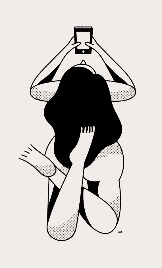
Another project that has been getting lots of attention and work for me are my ‘Nudes with Phones’ series. Those started as just a fun little experiment and quickly evolved. Each drawing I put online is like a fishing lure, some of them bite and some just keep swimming by, that’s why you have to keep making, and if they aren’t biting…go to a different pond.
It sounds like side projects continue to be a strong and effective tool tool for personal growth, developing a new client base and gaining insight into your audience. Do you have any recommendations for designers that feel stuck in the corporate grind and are looking to develop passion projects outside of their day job?
Just do it. Every designer at a corporate jobs probably thinks of at least one or two side projects a day that they don’t know could be side projects yet. They probably grab a beer with their friends and they all say “we should totally do….” or “Wouldn’t it be cool if….” or “I really wish someone would…”. Next time you find yourself daydreaming about a project or saying those words, stop and write them down and start making it happen. Making things is the easiest thing in the world, it’s the abstract stuff we get caught up in. I don’t care that you’re tired when you get home from your job, nobody cares and they are tired of your unhappiness so you should probably do that thing you’ve been talking about. I fall into the same trap all the time, sometimes you gotta pull the plug on that netflix subscription and start it back up after you’re done with your project.
——
We would like to thank Chris for taking time to share with us. You can see more of his work here. Posters, prints and goodies are available from his online shop.
——

This interview is brought to you by RetroSupply Co. the #1 online marketplace for retro inspired effects for Photoshop and Illustrator. Including fonts, Photoshop brushes, Photoshop actions, Illustrator brushes and much more.
Save 50%
For a limited time use the code GRAINEDIT50 and save 50% off all purchases. Offer expires December 31st, 2015.
——
Also worth viewing…
Josh Brill Interview
Brad Woodard Interview
Ty Wilkins Interview
Follow us on RSS, Instagram, Pinterest, Wanelo
 Share on Facebook
Thanks to this week's
Sponsor // I am the Frankenstein Monster! by Ralph Cosentino

Cardcaptor Sakura is hardly an unknown series, yet despite being currently licensed in the US (both in anime and manga form) it seems to fade into the background when people talk about magical girl shows or when newcomers talk about discovering shows for the first time. It’s old enough to have influenced many stories after ... Read more
By:
Liz Carmichael,
on 12/15/2014
Blog:
Liz Carmichael's Portal
(
Login to Add to MyJacketFlap)
JacketFlap tags:
posts,
update,
Features,
Jetpack,
Dashboard,
New Features,
Pages,
WordPress.com,
WordPress dashboard,
Add a tag
Last week, we announced a few updates to the WordPress.com interface, including faster stats and enhanced site management on both desktop and mobile devices.
Our push to make all WordPress.com sites faster and easier to access and manage continues. This week, we’re thrilled to unveil a few brand-new features that allow bloggers, publishers, and business owners to run their sites and manage their content from one central hub, no matter what device they’re using.
From new blog post and page management tools to Jetpack site integrations, we hope you enjoy the latest additions as much as we do!
Centralized post management
You can now access all your posts from one convenient location, whether you write one personal blog or publish on multiple sites. Quickly sort through published, scheduled, drafted, or even trashed posts for one or all of your sites at once!

A visual preview of each blog post lets you scan your content to edit, view, publish, or trash from a single list. Another new functionality we’re excited to introduce today: while “Blog Posts” is selected, you can hop to another blog’s post list using the site selector in the sidebar.
Easy access to pages
For many site administrators, managing pages is just as — if not more — important than post management, so we’ve extended to pages the same functionality that lets you review all your posts from one place.
You can look up any of your pages, and then publish, un-publish, or trash them, all directly from your WordPress.com dashboard. Editing pages is also just one click away, regardless of the number of sites you run.
One WordPress dashboard for all your sites
We also have great news for those of you who have both self-hosted WordPress sites and WordPress.com sites. The new WordPress dashboard gives you access to all your Jetpack-connected sites as well as to sites hosted here on WordPress.com, and allows you to manage your posts, pages, and plugins from the same central hub.
Tell us what you think!
For some, individual-site management in the classic WP Admin dashboard will continue to be the go-to. That said, today’s updates include some entirely new features that are only accessible in the new dashboard. To tap into multi-site posts and pages lists and manage all your WordPress sites under one hood, we encourage you to try out the new interface.
We want to thank all of you who’ve shared constructive feedback with us — it helps us immensely in our effort to make the experience even smoother. Whichever dashboard you fancy, we hope you’ll take the updates for a spin and continue to share your thoughts with us!
Filed under:
Dashboard,
Features,
Jetpack,
New Features,
WordPress.com 


By: Andy Peatling,
on 12/15/2014
Blog:
Sylvan Dell Publishing's Blog
(
Login to Add to MyJacketFlap)
JacketFlap tags:
posts,
update,
Features,
Jetpack,
Dashboard,
New Features,
Pages,
WordPress.com,
WordPress dashboard,
Add a tag
Last week, we announced a few updates to the WordPress.com interface, including faster stats and enhanced site management on both desktop and mobile devices.
Our push to make all WordPress.com sites faster and easier to access and manage continues. This week, we’re thrilled to unveil a few brand-new features that allow bloggers, publishers, and business owners to run their sites and manage their content from one central hub, no matter what device they’re using.
From new blog post and page management tools to Jetpack site integrations, we hope you enjoy the latest additions as much as we do!
Centralized post management
You can now access all your posts from one convenient location, whether you write one personal blog or publish on multiple sites. Quickly sort through published, scheduled, drafted, or even trashed posts for one or all of your sites at once!

A visual preview of each blog post lets you scan your content to edit, view, publish, or trash from a single list. Another new functionality we’re excited to introduce today: while “Blog Posts” is selected, you can hop to another blog’s post list using the site selector in the sidebar.
Easy access to pages
For many site administrators, managing pages is just as — if not more — important than post management, so we’ve extended to pages the same functionality that lets you review all your posts from one place.
You can look up any of your pages, and then publish, un-publish, or trash them, all directly from your WordPress.com dashboard. Editing pages is also just one click away, regardless of the number of sites you run.
One WordPress dashboard for all your sites
We also have great news for those of you who have both self-hosted WordPress sites and WordPress.com sites. The new WordPress dashboard gives you access to all your Jetpack-connected sites as well as to sites hosted here on WordPress.com, and allows you to manage your posts, pages, and plugins from the same central hub.
Tell us what you think!
For some, individual-site management in the classic WP Admin dashboard will continue to be the go-to. That said, today’s updates include some entirely new features that are only accessible in the new dashboard. To tap into multi-site posts and pages lists and manage all your WordPress sites under one hood, we encourage you to try out the new interface.
We want to thank all of you who’ve shared constructive feedback with us — it helps us immensely in our effort to make the experience even smoother. Whichever dashboard you fancy, we hope you’ll take the updates for a spin and continue to share your thoughts with us!
Filed under:
Dashboard,
Features,
Jetpack,
New Features,
WordPress.com 
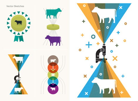
Continuing our series of process related interviews, we chat with illustrator and designer Justin Pervorse. A Bay Area transplant via Atlanta, Justin has been relentlessly perfecting his craft over the last decade.
I first caught wind of Justin’s talents during his tenure at Mailchimp, where he injected his infectious personality into a series of slick illustrations and campaigns for the email giant. He has since moved on to Dropbox’s internal design department, a position that has allowed him to further expand his creative capabilities. Through the support of his peers, Justin and his team have created a series of self-initiated projects that explore and uplift the spirit of the brand. In today’s interview we highlight one of these projects, delve into his workflow and discuss his earliest days as a designer.
Lets start off with a little bit about your background. Where are you from originally?
I was born in the wonderful northern beauty of Michigan and after a short stint in South Carolina my family moved to the suburbs of Georgia where I grew up. The majority of my childhood was spent playing outdoors and building things with whatever random junk I could find. I always had a wild imagination that consistently led to me doing crazy things — usually playing with fire or trying to blow something up but getting into trouble was a regular occurrence for me as I was always very adventurous.
I loved to draw growing up but I never really thought about it as a future career. My parents were both creative in some sense but neither had any major background in general art. My mother did have a short artistic exploration in college so as a kid I was amazed with the few drawings she had kept from that point in her life. My old man had a very unique job in building ropes courses and climbing towers. It was definitely a bragging point to tell all my friends that my Dad built zip lines for a living and even better that I got my occasional share of zippy adventures. Though I didn’t understand it yet my parents were always very good to encourage me about my creativity and wild ideas.
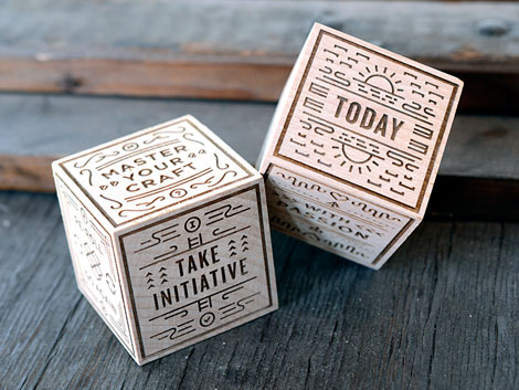
Dice created for an internal office team at Dropbox
Moving into my awkward years of high school I started to take more interest in art and took as many drawing, painting, photography and computer classes as I could. I yet again found myself indulging in mischief in a printshop class where I learned boatloads about offset, letter press printing, finishing and a lot of other production techniques. I liked to make fake business cards, stupid bumper stickers to put on friends cars and the occasional weirdo mini zine to share with friends. Between print shop and photography I really started to find more interest in design but it was still a while before I found my calling as a designer.
When and how did you become interested in illustration and design?
After high school I considered college but instead explored a stint of playing music and delivering pizzas, which for the record is still my all time favorite job. I love being a designer but some of the weirdest things would happen to me on deliveries.
Playing music resulted in a lot of design work for my own bands and friends bands. I was primarily started off designing shirts, posters and album artwork which over time lead to a bigger breadth in projects. I’d pretty much take any work I was offered back then, even if it wasn’t something I was interested in or familiar with specifically because I wanted to try new things to learn through those projects. I still don’t regret taking the route of being self taught as it gave me a lot of options to explore different things, which over time led me to realize how much I loved to illustrate and thus my career path began.
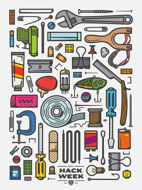
Poster created for 2014 Dropbox Hack Week
What design project are you most proud of? and why?
This is a hard question for me to answer because I look back on most projects and I’m proud of them all on some level, even some of the terrible ones that I will probably never speak of. I like to think that I learn something new on every project and I feel proud that I get to design fun stuff for a living in the first place.
A project that I am very proud of recently though was one I worked on at Dropbox for our annual Hack Week along with fellow designer Drew Roper. I’ll begin this by saying how lucky I am to work somewhere that I can take some level of my crazy childhood ideas and turn them into actual work. I dreamed up the idea to create a shop within the Dropbox office that would serve up made to order t-shirts for all the employees and attendees of Hack Week. It originally started around the concept of one of those bodega or mega mall kiosks with the tacky palm tree logo that sells cheap sunglasses and quickly evolved into a fully branded, built out deli that I named “Scooters Sandwich Shop”. We pushed on every detail with things like custom screen printed sandwich wrap paper used to roll shirts once they were finished, custom scratch pads for taking orders, developing an ordering system and even made a daily secret password system that would land you a secret shirt. We would broadcast our deli hours every day via email and would serenade a sea of people with a curated metal playlist as they all lined up and waited for their shirts. The whole project was crazy and sometimes stressful but its by far one of my favorite things I’ve ever worked on. In the end I am not only proud that I got to make that crazy idea happen but that it created an experience that brought joy to so many people.
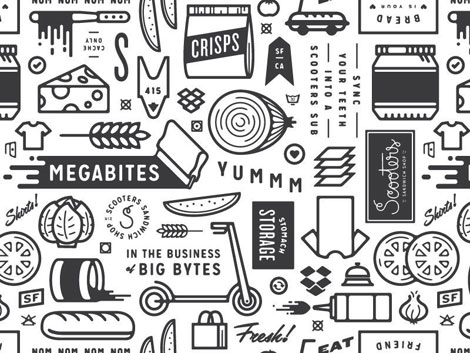
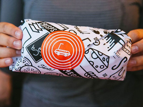
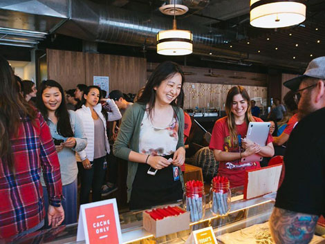
Scooters Sandwich shop project
We would love to highlight one of your projects. Could you walk us through Treasure Island 2090 Gift Shop Print? Please include the tools you worked with to achieve the final look.
I really enjoy designing just for fun sometimes and it usually results in trying something new. I thought it would be fun to think of a futuristic treasure island that is more of a tourist attraction and illustrated a commemorative print that would be picked up in the gift shop. I mean, why not?
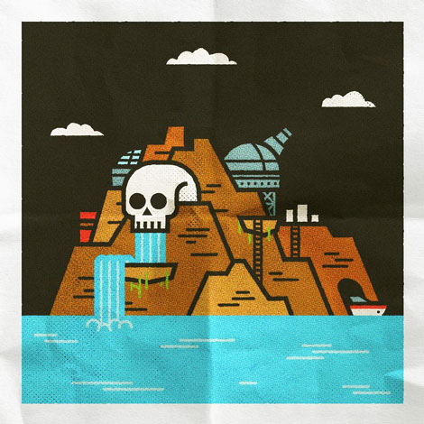
I started with vector forms in illustrator and then worked in photoshop to get the textures and final color tones adjusted to make it visually look more like a folded up poster. I wanted to experiment with some vector textures so I used the Standard Issue Vector Textures to add some subtle halftones and some Vector Supply Sponge Brushes to add some subtle texture to the edges of the artwork. I finished it up in photoshop with some of my own paper and grain textures.
What were some of the thoughts that fueled the direction of the design?
I wanted to to stick to with basic shapes and some subtle line details so I could allow for the textures to bring more character and detail to the illustration.
In what ways did the initial concepts differ from the finished?
I actually just dove straight into this one. Normally I don’t do a ton of sketching unless I’m really unclear of where to start and even then its sometimes just a bunch of chicken scratch in my sketchbook or on post-it notes. I’d say it landed pretty close to what I had envisioned in my head.
SF Dribbble meetup illustration
How has your work evolved over the years?
I actually took a long look back at some of my old work recently. Some as far back as 10 years ago and I had a pretty good laugh. I’d say my work has come a long way over the years but I think the biggest evolvement my own personality into my work. I try and add some bit of weird or funny to everything I create. I think putting your personality into your work is important and makes your work more unique. It took me awhile to realize that as a designer but once I did I feel more attached to what I am working on.
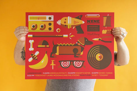
NXNE poster
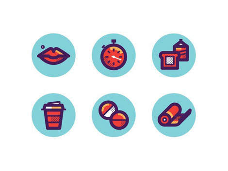
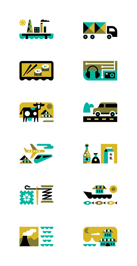
Icons created for Men’s Health magazine
What are your passions outside of design?
I have a lot of passions outside of design but a lot of them still relate back to design in a way. I really love to cook which is truly just a different form of design and its art that you can eat. I can make some mean pasta and know my way around a grill pretty well. I’m also really into riding motorcycles and working on them. I personally own two and plan to own many more in the future. Riding, coupled with traveling and camping is a really nice way for me to relax and clear my mind. Some of my best ideas have come to me while riding or being out in the wilderness cut off from everything else.
Most importantly though is spending time with my wife and son. They mean the world to me and drive me to continue doing what I do every day.
Mailchimp Freddie toy
——
We would like to thank Justin for taking time to share with us. You can see more of his work here.
——
This interview is brought to you by RetroSupply Co. Working with authentic materials (including real paint, ink, paper and screen textures from screen printing shops) they have crafted a vast library of vintage inspired design resources for Photoshop and Illustrator.
Get 9 Best-Selling Design Goods Free
Sign-up for updates about new products from RetroSupply and get instant access to 9 best-selling goods.
Save 20%
RetroSupply Co. is graciously offering grain edit readers a discount on all products for a limited time. Type in GRAINEDIT20 at checkout to save 20% off all purchases.
——
Also worth viewing…
Josh Brill Interview
Brad Woodard Interview
Ty Wilkins Interview
Follow us on RSS, Instagram, Pinterest, Wanelo,
Share on Facebook
Thanks to this week's
Sponsor // RetroSupply Co.: A library of vintage inspired design resources for Photoshop and Illustrator.

It’s rare that I come across a designer whose work has as much personality and charm as Ty Wilkins. Hailing from Austin, Ty’s portfolio is filled with character-driven projects that showcase his mastery of color, texture and repetition.
Prior to launching his own studio, Ty worked for Gardner Design, where he developed branding, packaging, signage and redesigned LogoLounge. He also traveled extensively, which had a profound impact on his aesthetic sensibilities. Currently, Ty can be found developing advertising campaigns, editorial illustrations and identity work for a wide range of clients including Target, Monocle and Wired UK. In addition, he serves as a typography instructor at the Academy of Art University. In today’s interview, Ty graciously shares his beginnings as a designer and grants us a glimpse into his creative process.
Lets start off with a little bit about your background. Where are you from originally?
I was born in Texas and grew-up mostly in Texas and Oklahoma. I graduated from high school in Buenos Aires, Argentina and attended college at Auburn University. I now live in Austin, Texas.
When and how did you become interested in illustration and design?
I love to draw. Growing up, I thought this meant that I would become an animator. As I started researching colleges during my last two years of high school, I realized that animation wasn’t offered as a major at any of the schools I was considering. Instead I discovered “computer art” and “graphic design” in the college course catalogs. I thought that one of these majors might be my way to sneak into the animation industry. I enrolled at Auburn University and after a brief stint as an international business major, switched to graphic design. While taking a Corporate Identity class I discovered a passion for symbols and logo design. The process of distilling complex information into a succinct, unique and memorable icon remains endlessly fascinating.
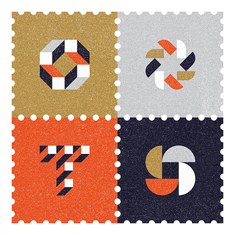
We would love to highlight one of your projects. Could you walk us through the creation of your recent stamp project?
The tools that I used for this project include pencil, paper, Illustrator & Photoshop. I combined several methods to create texture. I visited my local public library and made photocopies of white sheets of paper until black specs started to appear in the copies. I inverted the color, boosted the contrast and repeated the process until I had photocopies full of random flecks. I scanned this texture and combined this with noise I generated in Photoshop and a texture from RetroSupply. These techniques help create the illusion that that the artwork was printed on paper.
What were some of the thoughts that fueled the direction of the design?
My work spans both branding and illustration. Minimal iconic gestalt-like geometric shapes and limited color palettes are common threads among all my work. So when creating this piece for my studio I sought to capture these aspects of my work. I am fascinated by the way two dimensional shapes can suggest three dimensional forms. Three of the symbols are composed to form an interior negative space (a diamond, star and square). The dimensional T is the new symbol for my studio.
In what ways did the initial concepts differ from the finished work?
My initial concepts were more illustrative and detailed. I explored creating a line of environmentally themed stamps with more elaborate scenes of trees, fish and environments. After a few rounds I decided to create something that worked equally well for the branding side of the studio.
What are your passions outside of design?
I love getting outside and being active. I enjoy hiking and biking during most months and when it gets hot outside I like to go paddle boarding and swimming. Austin has several great swimming spots. Two of my favorites are Barton Springs and Hamilton Pool.
——
We would like to thank Ty for taking time to share with us. You can see more of his work at tywilkins.com. Prints are available in his Society6 shop.
——
This interview is brought to you by RetroSupply Co. Working with authentic materials (including real paint, ink, paper and screen textures from screen printing shops) they have crafted a vast library of vintage inspired design resources for Photoshop and Illustrator.
Free Brushes + Textures!
If you sign up for the RetroSupply newsletter you will receive an amazing collection of brushes, textures and templates.
Sign up here to receive all the goodies.
Save 20%
RetroSupply Co. is graciously offering grain edit readers a discount on all products for a limited time. Type in GRAINEDIT20 at checkout to save 20% off all purchases.
——
Also worth viewing…
Josh Brill Interview
Brad Woodard Interview
Ty Mattson Interview
Follow us on RSS, Instagram, Pinterest, Wanelo, Luvocracy
Share on Facebook
Thanks to this week's
Sponsor // RetroSupply Co.: A library of vintage inspired design resources for Photoshop and Illustrator.

I was first introduced to Josh Brill and his work though through his Flora Fauna collection. With nature serving both as a catalyst and a muse, the ongoing series explores and catalogs the identities of plants and animals from around the world. To illustrate these explorations Josh chose to eschew conventional realism in favor of a style that echoes cubist techniques. The end result is vibrant, bold and visually intoxicating.
In addition to sharing the same passion for illustration and design, I was excited to discover that Josh and I shared a similar upbringing. We unknowingly haunted the same swimming holes and drank from the same slush puppy wells while growing up. This served as fodder to fuel our friendship and with this in mind, i’m delighted to present today’s interview with him.
Lets start off with a little bit about your background. Where are you from originally?
I was born in Norway, Maine and raised in the Lake Region area nearby.
When and how did you become interested in illustration and design?
When I was a kid, I became interested in art through pop culture including animation, comic books, skateboard graphics and video games. Though I did not know it as a profession, just for what it was, something fun to me. It wasn’t until high school that I learned that people do this for a living. A friend gave me some comic books to read and I loved the artwork. As I learned more about the artists behind these books I grew excited. It was hard to believe that people could make a living from drawing fun pictures. I told my mom I wanted to be a comic book artist and she was generally supportive. I think she was just happy to see I had a possible career direction. From here I took the closest course in desktop publishing and to be honest, I did not enjoy it. It was the early 90′s and they were still teaching the old paste up methods and the design examples were formulaic at best. This led me to take classes at the Kubert school for cartooning and animation before enrolling in Maine college of Art. It was here that I gained a renewed appreciation for the art.
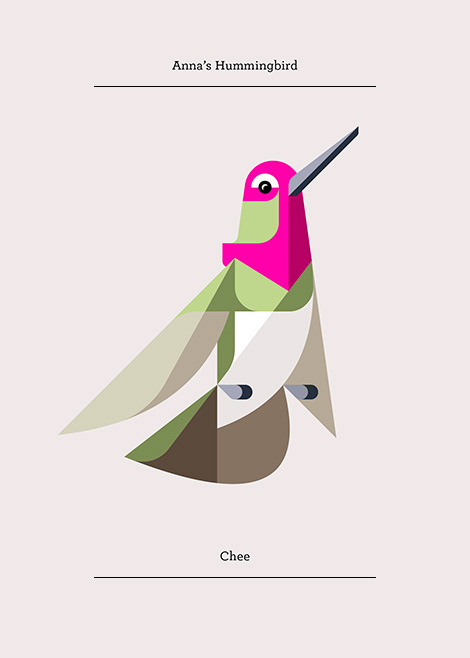
When did “Lumadessa” come into being and what is the story behind the name?
“Lumadessa” took shape in the summer of 2003. At the time, I was still new to field and I didn’t have much client work to show. I was making short experimental interactive narrative art pieces in Flash, and I needed a portfolio site to showcase my skills. After completing the website I decided I wanted to create an identity that would compliment my work but also allow me to grow with it. I liked the word luminosity, because it worked for the literal side of art and the interpretation of light for creativity. The word “odyssey” struck a chord for me as well, as it implies the journey that art takes you on. From there, I combined the two words to form Lumadessa.
We would love to highlight one of your projects. Could you walk us through the Nature Explorer poster? Please include the tools you used to create this project.
I used Flash and Illustrator to create the vector art, then brought it into Photoshop and used RetroSupply Co.’s Blacksmith filter actions and brushes to create a subtle press printing with an ink bleed effect. Next, I added some light textures using a Wacom tablet.
What were some of the thoughts that fueled the direction of the design?
I have been working on animal art for seven years and while i’ve enjoyed making the work, it’s a challenge to stay focused on one thing. Overtime, it’s caused creative fatigue and for this poster I wanted to head in a different direction. I wanted to logically bridge my existing animal work with my new found love of travel posters. I am planning to create a complete series of posters, but for this initial attempt I chose to create something that encourages others to embrace and explore nature.
In what ways did the initial concepts differ from the finished work?
When I started the project, my intentions were to create a Maine travel poster. Unfortunately, I became busy with other projects and reached a creative stopping point. When I came back to the poster, I toyed with other locations, like Patagonia and Acadia that might work better for such an iconic theme as nature, but each time my explorations felt visually forced. I then realized that this project was more about nature as a visual symbol, rather then a place.
What are your passions outside of design?
Wait a minute, there is a life outside of design? When did this happen? (laughter) All kidding aside, my job takes up much of my time. When possible, I love to travel. The next trip i’m planning is to Acadia National Park in Maine to do some hiking and exploring. In addition, I’ll be taking reference photos for a travel poster based on the park.
——
We would like to thank Josh Brill for taking time to share with us. You can see more of his work at Lumadessa.com. For a limited time Josh is offering $10 off his Nature Explorer poster. Please use the coupon code “GrainEdit1012″ at checkout. The offer is good till 10/12/14 at midnight.
——
This interview is brought to you by RetroSupply Co. Working with authentic materials (including real paint, ink, paper and screen textures from screen printing shops) they have crafted a vast library of vintage inspired design resources for Photoshop and Illustrator.
Free Brushes + Textures!
If you sign up for the RetroSupply newsletter you will receive an amazing collection of brushes, textures and templates.
Sign up here to receive all the goodies.
Save 20%
RetroSupply Co. is graciously offering grain edit readers a discount on all products for a limited time. Type in GRAINEDIT20 at checkout to save 20% off all purchases.
——
Also worth viewing…
Brad Woodard Interview
Brent Couchman/ Moniker SF Interview
Ty Mattson Interview
Share on Facebook
Thanks to this week's
Sponsor // EasyBanners: your number one source for all your large print advertising.

I first discovered Ed Nacional at the end of 2009 as he was completing his studies at Parsons. He had recently taken on a design internship for the New York Times and was beginning to explore his capabilities as an illustrator. I was instantly attracted to his his bold no-nonsense use of type and stylish yet minimal use of color. Since then, I have enjoyed watching Ed grow as a designer and seeing the projects that have resulted from his efforts. Others have taken notice as well, as popular brands and platforms like Skillshare and Wanelo have sought Ed’s expertise and artistic sensibilities in developing their identities. In today’s installment of the Design in Process series we chat with Ed about his workflow, his passions outside of the office and more!
Lets start off with a little bit about your background. Where are you from originally? When and how did you become interested in design?
I was born and raised in Calgary, Alberta, Canada. The city is nestled between the rocky mountains and the prairies. I had a fairly standard suburban childhood and lived in Calgary till I was 23 and moved to New York City.
Growing up I always loved to draw and make things. Most of my time was spent doodling and playing with lego. My Dad has always been a tech junkie, we grew up with a Comodore 64 and we had a computer in our house before any of my friends did. So all through my childhood and high school I was interested in art, drawing, craft and computers. Once I found out that Graphic Design was a real job, I knew it was a good fit for me based on the interests I had. I jumped right into learning graphic design after high school and 14 years later I am still doing it and loving it.
Could you walk us through one of your projects? Please describe your workflow, including the tools, from pen and paper to software and devices.
I find my time is almost evenly split between working on designing brand identities and illustrating for editorials and advertising. I will try to talk broadly about my process for both design and illustration.
Whether I am working in design or illustration the project starts the same. I begin with getting as much information I can from the client and really trying to get a sense of the subject, environment, users/customers/viewers. I do a lot of research into the subject matter. This research is fun because I get to learn something new but more importantly it’s an integral part of the project as I get better perspective and view on the subject. I am full prepared by the time my pencil hits paper or my hand moves a cursor. Once I have the information and research complete, I jump into sketches. I draw rough ideas and often write lists and notes to help brainstorm ideas.
I personally dont have the most refined sketches and my sketchbook pages aren’t works of art like some other designers and illustrators I know. My sketches are often simply to remember ideas and to explore high level concepts. I am usually embarrassed to show people my sketches.
You can see in these two examples just how rough my sketching is and how far it comes when completed.
Although I always like to sketch it doesn’t always happen solely on paper. Sometimes I draw on the ipad, or directly in Adobe illustrator where I create rough layouts.
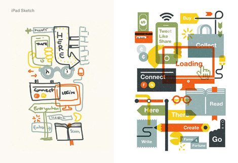
Often times my rough sketches end up very close to the final product, other times it happens all organically while pushing shapes around in illustrator by refining and iterating. Since a lot of my work is complex layouts with many pieces, a lot of my process is re-arranging shapes till the energy and balance feels right.
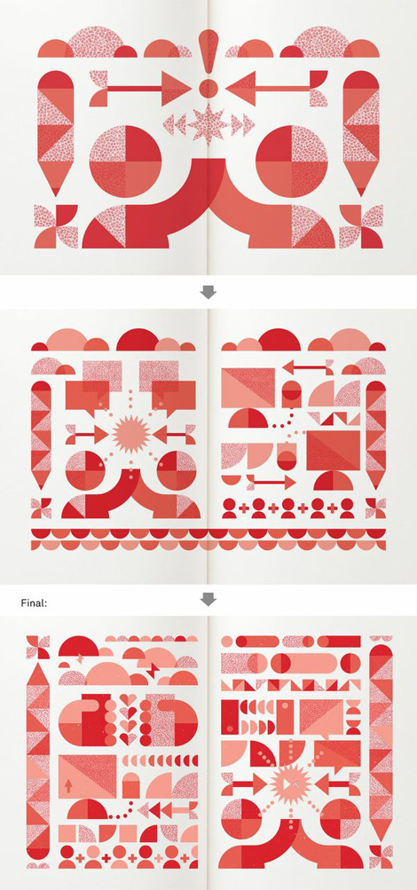
In this illustration for the Kern and Burn book I started with a simple and layout made up of only a few shapes. The theme of the illustration was “Make Work with Friends” so I wanted to push the feel of collaborative energy of working with friends so I kept pushing and adding more. By the end the layout was much more dense and complex. You can see the progression.
For this illustration for Uppercase’s Work Life 3 Book I drew a large number of objects and graphics and then spent a lot of time arranging and re-arranging them until it had the feel I was looking for. This process is very iterative and takes quite a while to get where I feel its balanced and had a good flow.
Here is an very compressed and edited example of a first round of identity directions followed by the final outcome.
You can see here my illustrator art boards are filled with iterations. I choose the best of the best and present a couple to the client.
How has your process evolved since you first started designing?
Back when I first started designing I didn’t do a lot of research, sketching or any of the important conceptual thinking. I was all style and no substance. Over the years I have been learning and exploring that balance of concept and style. Each project and situation is completely different, sometimes I am creating something that concept is most important and style should not interfere or overshadow. Other times I am creating something that is more complementary to a story or brand and the piece is allowed to be more style based and ornamental. The more work I do the better I get at understanding this, when I first started I didn’t have a clue.
Another large difference in my work that has changed is that up until recently I considered myself only a designer. It was a couple of years back while working as an assistant art director at the New York Times and commissioning illustration and working with illustrators daily was when I decided to explore illustration. Illustrating complex editorial articles really pushed my thinking in new ways. I have carried over what I have learnt in illustration to my design work and vice versa. This was a huge help and turning point in understanding that same balance I just talked about with concept and style.
Are you a creature of habit or do you like to try new technologies, applications, and features?
As you have seen in my process examples I am constantly trying new ways to work and I am never afraid to test out other methods to figure out what works best. I feel I am learning more and more with each project I do so often I will use a new project to learn a new subject and sometimes even a new technology. I am some what of an early adopter and love trying out the new physical gadgets as well as applications that relate to my design and illustration work. I’m always looking to streamline my workflow so I often research and keep up to date with technology. Although I love chasing new products and applications I also have a large collection of vintage design books and surround myself with furniture and art from the past. I feel there is definitely a way to keep up to date with what’s happening but also embrace the past and process of the designers of past eras. I feel this balance is important in my work and my life.
What are your passions and interests outside of design and why?
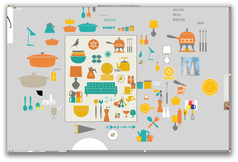
I have many passions that still closely relate to different aspects of design. My wife and I share a strong passion for vintage housewares and furniture. We are always collecting and hunting for new items at flea markets, garage sales, estate sales and thrift stores. I also enjoy taking a break from the computer and work with different printmaking techniques like screen printing and letterpress. I have also recently started to learn more about woodworking and furniture design. These passions are still directly related to the work I do and are still strongly connected to my love of design.
More outside of the world of design, I enjoy exploring cities on foot. New York City is always changing and there is so much to see and experience while walking through different neighborhoods. There are so many great small shops to visit and amazing restaurants to try. In my free time you can find my wife and I walking around our city or taking trips to explore other cities. We love this urban exploration but at the same time we also love the outdoors and nature. We have just purchased a 1847 farmhouse in the Catskills (Upstate New York) and are excited to explore rural life by furnishing and renovating our home as well as tending to our land. This is a new chapter in our lives and we are going to be able to dive in deeper into some of our other passions and interests that revolve around living in the country. We are hoping to have the best of both worlds and indulge in our interests both in city life and the great outdoors.
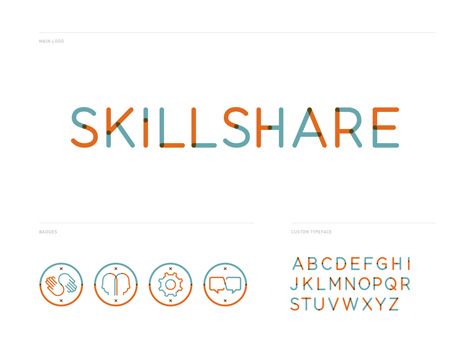
Identity work for Skillshare
——
We would like to thank Ed Nacional for taking time to share with us. You can see more of his work at Ednacional.com. Catch him on Twitter and Pinterest as well.
This interview is part of the #designinprocess series brought to you by Adobe. Read all of the interviews here and follow along on Twitter and Pinterest at #designinprocess and #newcreatives.
——
Also worth viewing…
Mike Cina Interview
Brent Couchman/ Moniker SF Interview
Ty Mattson Interview
Not signed up for the Grain Edit RSS Feed yet? Give it a try. Its free and yummy.
Share on Facebook
Sponsor // Webydo: The leading online design studio that enables designers to create, manage and publish their client’s websites completely code-free.

Nearly 150 of the themes available to WordPress.com users support post formats, which means that these themes offer a variety of post types (standard, image, gallery, video, audio, quote, and more) that display your content differently based on the format. If your theme supports post formats, you’ll see a Format module as you’re …
Born and bred in the Lone-Star state, Brent Couchman is a designer and illustrator that now calls San Francisco his home. Noted for his generous use of color, he employs vibrant yet sophisticated palettes that elevate and accentuate the playfulness and meticulous nature of his work. He has received awards and accolades from distinguished publications including Graphis and Print and has established himself as an accomplished designer with a distinct visual voice. After stints at Fossil and Hatch Design he recently decided to venture out on his own with the launching of Moniker – a design and branding studio focused on timeless work and strong client relationships. In our latest addition to the Design in Process series we chat with Brent on his creative process and the challenges of managing a studio.
Lets start off with a little bit about your background. What was your first design gig?
My first official design job was in high school at a local print shop. I was hired to help the owner, who handled all of the design and production work that came in. I got the hang of things pretty quickly and worked on my own designing a lot of business cards, brochures, ads, etc. It was a great introduction to design because I was exposed to the production side of things and had projects with clients and timelines. They also let me wear flip-flops to work.
What challenges have you faced managing your own studio?
It took me about six months to get comfortable with the ebb and flow of new work. I was afraid that at some point new projects wouldn’t come in and I’d have to get a job at Kinkos. After a while, I got used to the inevitable downtime and have since learned to take that time to relax, work on personal projects or develop the business.
Another challenge was leaving the studio environment, where you collaborate with talented people and see the work they’re creating. You miss a lot of the interaction and even inspiration that happens from walking around and seeing.
What do you enjoy about being on your own, as opposed to the design firm environment?
There’s a feeling of freedom that comes from running my own business, and that shows itself in several ways. I can choose what projects to take on or go after specific work that I’m interested in. Even if I need to take on a project for financial reasons, the decision is still mine, and it directly benefits me.
Time is another way I feel that freedom. Whether it’s the day to day schedule of how long to work, or the amount of time I take off for vacation. It’s great to have the freedom to choose how I spend my time.
Could you walk us through one of your projects? Please describe your workflow, including your tools, from pen and paper to software and devices
Up Global is a Seattle-based company offering resources and support for entrepreneurs of all levels. I was hired to develop a visual identity system for the company, who had recently gone through a merger. After a few days of discussing goals, audience breakdowns, competitive landscape, and other key information, I went back and hit the sketchbook.

One of my favorite ideas was a very literal interpretation of the name, combining an arrow and a globe to make an abstract human form.

After sketching, I took the best ideas and moved to the computer to work out rough comps. I use Adobe Illustrator pretty exclusively, even for most of my presentation mockups. Because I was working directly with the creative director, I showed a larger number of concepts in a rougher state than I would on a normal project.

One of the goals was to create a symbol that was truly international and could identify the company easily without the type. The simple arrow/globe emerged as the favorite, but we moved forward with a few other concepts as well to see how we could expand in each direction.


In the end, the arrow/globe/human icon won. We developed a system through which each future regional chapter could pick their own color and customize the logo with their location.


With so many regional chapters, one of the other major considerations was building a visual language anyone could use. Rather than creating a complex system of guidelines, we opted to keep things simple by keeping the focus on the logo, and breaking it apart to build the visual assets used across the brand.

How has your process evolved since you first started designing? Are you a creature of habit or do you like to try new technologies, applications, and features?
When I first started designing, I did a lot of work to generate ideas. I’d sit down and write word associations, lists, and spend hours sketching, trying to perfect each line and form of a logo or illustration. Then I’d take those to the computer and see what worked. Now, the process is more dictated by the project constraints and time line. I’ll still sketch, but it’s more like jotting down a few words or scribbles to remember an idea later. Through the years I’ve gotten a better feel for what works, so I don’t have to rely on such a rigorous process to generate good ideas.As for new technologies, the two services I’ve used since starting out on my own are Dropbox and Adobe Creative Cloud. Dropbox is great because I can access files from anywhere, which really helps when working from the road. Creative Cloud is great because you can get the software updates as they come out rather than using one version of the software for several years, which I used to do.

Analytical tools are now ubiquitous, and because of this designers are often asked to back up their work with data and research. With this in mind, how much of your work is based on intuition — and what role should intuition play in design today?
I think intuition and research and data go hand in hand. The best work comes from being completely immersed in as much information as possible about the goals, challenges, audience, etc., and then finding a solution based on that information. Without that aspect, there’s no way to communicate effectively, so I definitely think both are integral to good design.
What are your passions and interests outside of design and why?
I collect rare design books and ephemera, which all started when a coworker at my first job let me borrow his copy of Paul Rand’s Design Form and Chaos. I had not heard of Paul Rand at the time, so I was blown away. After that I worked in-house at Fossil and was exposed to more mid-century designers and started collecting old Graphis annuals, which led to more and more rare design books. Now I have a network of dealers in the States and Europe who help me get my fix. My wife isn’t a huge fan, especially since we live in a tiny San Francisco apartment, but that hasn’t stopped me so far.
Another thing I’ve really come to love is exploring the Bay Area and California in general. My wife and I will find new restaurants or shops and take time during the week for day trips in and around the Bay Area. It’s nice to get a break between projects and refresh from time to time.
——
We would like to thank Brent Couchman for taking time to share with us. You can see more of his work at MonikerSF.com. Catch him on Twitter and Instagram as well.
This interview is part of the #designinprocess series brought to you by Adobe. Read all of the interviews here and follow along on Twitter and Pinterest at #designinprocess and #newcreatives.
——
Also worth viewing…
Mike Cina Interview
Katie Kirk Illustration
Ty Mattson Interview
Not signed up for the Grain Edit RSS Feed yet? Give it a try. Its free and yummy.
Share on Facebook
Sponsor // Bootstrap 3.0 Responsive Templates

By: Ben Huberman,
on 3/18/2014
Blog:
Fire It Up!
(
Login to Add to MyJacketFlap)
JacketFlap tags:
comments,
Tags,
Features,
drafts,
Widgets,
Sidebar,
Customization,
Better Blogging,
Sharing Buttons,
Add a tag
From your sidebar to your comments section, these tips will help you clean up your blog in just a few minutes.
I was first introduced to Javier Garcia through his intoxicating blog, No Barcode, where he posts his latest vintage finds. It was here that I discovered that he is an accomplished illustrator and designer in addition to having an amazing collection of design related ephemera. A resident of the Bay Area via Mexico he is developed an audience for his highly expressive and colorful illustrations. In today’s interview, the 4th part of our ongoing design in process series, Javier speaks on his passions outside of design, his workflow and more. Enjoy!
Lets start off with a little bit about your background. Where are you from originally? When and how did you become interested in design?
I was born and raised in México. I grew up drawing since I can remember so my three options when I was going to college were architecture, industrial design or graphic design. I was a bit indecisive and went for a combined industrial and graphic design major back in México. That made me realize that what I wanted to do was more graphic and so I came to the US to go to school.
Could you walk us through one of your projects? Please describe your workflow, including the tools, from pen and paper to software and devices.
I’m going to walk you through my Hail to the King illustration. First I think about what I want to say with the piece even if it’s subjective. In this case, the princes represents power which is something that both evil and good wants. I started by drawing small sketches of the general idea. Since it was a collage of illustrations, I rearranged them multiple times in sketch form until I found the right placement for them. I proceeded to drawing each character multiple times until I got the desired look keeping in mind it’s placement. Then I scan those drawings and trace them in Illustrator. In this phase I play with the scale of the characters and just moving things around. Once I got this down I proceeded to play with a bit of texture which I have created my own photoshop brushes from actual hand inked textures that I drew and scanned myself. For this piece since there wasn’t much texture I converted that to vectors but I usually work with a lot of bitmaps. I used illustrator, photoshop and a wacom tablet to do this. And that’s it!
Early sketches for Hail to the King!
Hail to the King Poster
How has your process evolved since you first started designing?
As far as designing logos, packaging and print it’s been about the same. The drawing tablet replaced my mouse at some point but it’s all been the same process which starts on sketch form in the initial stage and then it’s all computer work from there. But as far as illustration, I have been going a bit backwards. My work is turning more into the hand drawn/inked direction. I use a lot more india ink and brushes now.
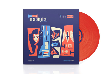
Album cover for Mr. Ho’s Orchestrotica’s
Are you a creature of habit or do you like to try new technologies, applications, and features?
I’m not that much of a techie, I mostly use illustrator and photoshop to edit everything I do. Even when working with hand inked drawings I take it into photoshop and clean up/edit my files quite a bit. I try to mimmic old design and illustration techniques like inking by hand and creating textures by hand as close as possible. I feel that modern technology is not the same when it comes to translating that into the screen. I work in digital mediums but at least there’s a hand done quality to it. I can usually tell when someone used the computer to brush something. Some people are very good at it but I really enjoy the hand done process. So I think technology really speeds up my process but I don’t like to skip that human aspect phase of design.
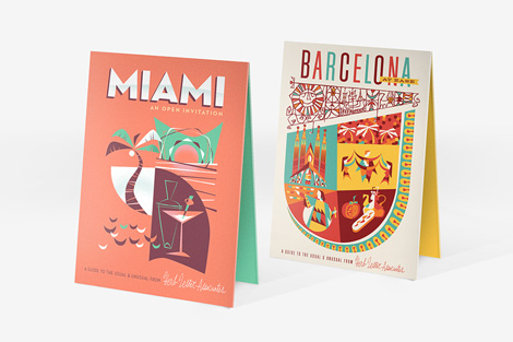
Herb Lester Maps
What are your passions and interests outside of design and why?
This is very tough as I spend most of my time looking at design in one form or another. Architecture, pottery, furniture, interior design, and things of that sort are always on my mind. But outside design I really enjoy listening to music, surfing and being with my little boy and wife.
——
We would like to thank Javier for taking time to share with us. You can see more of his work at javiergd.com and his etsy shop.
This interview is part of the #designinprocess series brought to you by Adobe. Read all of the interviews here and follow along on Twitter and Pinterest at #designinprocess and #newcreatives.
——
Also worth viewing…
Mike Cina Interview
Katie Kirk Illustration
Ty Mattson Interview
Not signed up for the Grain Edit RSS Feed yet? Give it a try. Its free and yummy.
Share on Facebook
Thanks to Signazon for being this week's sponsor.

Browsing through the portfolio of Mattson Creative, an award-winning design studio based in Southern California, can prove to be a daunting task. It’s easy to be overwhelmed by the quantity and consistent quality of work. I’ve long admired their expressive illustrative style and am especially smitten with their self-initiated projects for popular TV shows including Dexter, Lost and more recently Breaking Bad. We’ve profiled the studio in the past, but in today’s interview we talk with Ty Mattson, the studio’s founder and creative director.
Tell us a little bit about your background. Where are you from originally?
Originally I’m from your neck of the woods. I was born in Walnut Creek and lived in the Bay Area until I was about 12, then I moved to Southern California.
I was interested in design before I knew what “design” was. I remember getting a birthday invitation in pre-school that was a rebus – a mix of icons and letters to create a message – and I thought it was amazing. I carried it with me in my pocket for weeks. I’ve made art for as long as I can remember – crayons, magic markers, pencils. Lots of Superman. I still have drawings of every character from Star Wars that I made when I was a kid.

Ty Mattson’s studio
What was your first design gig?
My first design gig…well there were little things like programs for High School plays an things…or employee t-shirts at Disneyland…when I was in college at the University of Michigan I illustrated covers for the Ann Arbor Observer and I designed the logo for the University Arboretum. These projects started out as school assignments, then they became real projects. After school I came back to California and started working for a design firm.
Could you walk us through one of your projects? Please describe your workflow, including the tools, from pen and paper to software and devices.
So we do a wide range of things at Mattson, and each type of project requires somewhat of a unique approach. We do a lot of entertainment branding and consumer product packaging, so we create a lot of style guides and branded programs for Nickelodeon, Dreamworks, Discovery Channel and others…so those projects usually have very specific goals and requirements where our creativity is very focused and specific because typically the core brand visual language already exists – so our job is extend it or expand it to various applications like packaging or products, etc. We also do a lot of corporate branding where we are creating and establishing a visual language from scratch. We may come up with a name…create mood boards…then develop logo concepts, followed by whatever else the client needs – stationery, business cards, websites, trade show or environmental expressions. Then we also do illustration – where we might create a book or a series of posters. I have had a lot of fun with these types of projects over the last few years particularly when I get to reinterpret a brand that is part of popular culture. I’ve designed poster series that have been inspired by “Lost”, “Dexter” and “Breaking Bad” that have been embraced by the fans of those particular programs.
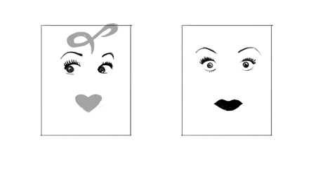
CBS called and asked me to do a series of prints inspired by their classic shows. They were looking to decorate their new office with some unique pieces of custom art. I was incredibly excited to collaborate with them on this project…especially given the cultural significance of some of the television shows that they had selected. I was actually a little intimidated by some of them…I mean the idea of creating a print that represents “I Love Lucy”…is a tricky proposition.
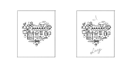
Early sketches for the I love Lucy Poster
That was really the most challenging thing about this project – trying to figure out the the heart of these classic shows – getting down to the DNA and figuring out what it was that was special, unique or iconic. It’s actually the same thing we do on any branding project – discovering what it is that makes a client distinct. You have to do that first, then you can translate it into a unique visual language.
My process on the CBS prints was first to figure out what made the shows iconic. So I watched episodes and intros on YouTube and did research about each show. Most of them I was very familiar with already so I had a strong understanding of the visuals that were associated with these brands.
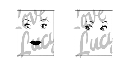
Early sketches for the I love Lucy Poster
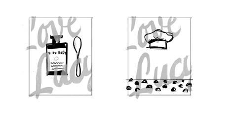
From there I would create quick thumbnail sketches in Adobe Photoshop using a Wacom Cintiq. This allows me to work very quickly at the conceptual level. I did a few ideas for each show and would share these with the client. Working with CBS was fantastic. We worked quickly and they had great notes on everything. I think they selected the strongest concepts as well.
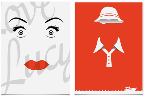
Finished art work for CBS
Once the client selected the concepts they wanted to move forward with, I used Adobe Illustrator to take each concept to the final, finished art.
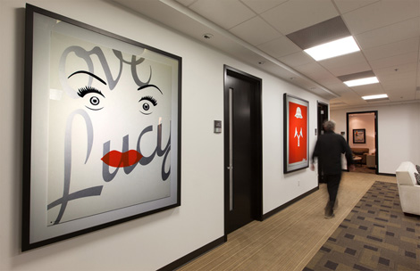
The posters were silk screened on paper. Some of them we did really big and it proved very difficult to find a silkscreen printer who could print bigger than 24×36. That was the biggest challenge of the project overall. But once we got the finished prints up on the walls in the CBS, they really looked incredible.
How has your process evolved since you first started designing? Are you a creature of habit or do you like to try new technologies, applications, and features?
It’s hard to say how my process has evolved, other than I do feel like I’ve become more considerably faster and I am more comfortable in it. In terms of execution…I am probably more of a creature of habit…when I don’t have to think about the technology, that’s when I appreciate it the most.

How do you like to share your work with the creative community? Is the feedback you get valuable and does it influence your work going forward?
I typically can’t share work in progress with the larger creative community until it’s complete…but once we do finalize work, we’ll typically share via the site, newsletter and social media.
Analytical tools are now ubiquitous, and because of this designers are often asked to back up their work with data and research. With this in mind, how much of your work is based on intuition — and what role should intuition play in design today?
Well, I think all of my work is a reflection of my intuition in some way. Every project is the culmination of hundreds and thousands of decisions. This typeface or that typeface…this color or that color…this much space…or that much space…etc etc. And most of those decisions are intuitive… The truth is, our deliverables are subjective. No two design firms are going to create the same logo for the same client, so a designer’s intuitive sensibility is always one of the reasons that we’re hired in the first place. I think research and data are very important at the beginning of a project. Good work is smart work, not just beautiful work. Smart work requires “research” to a certain degree. The more information and data you have about a brand or the audience, I think that is a good thing. I think that knowledge can give a designer more opportunities to pursue at the beginning of a project. But I don’t think research and data have any place at the end of the creative process to “qualify” or “validate” creative. I love Steve Job’s quote about this, ”It’s really hard to design products by focus groups. A lot of times, people don’t know what they want until you show it to them.”
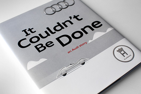
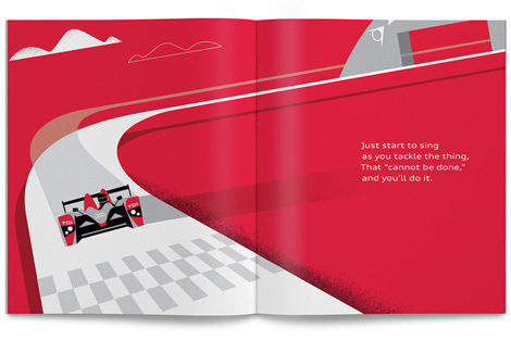
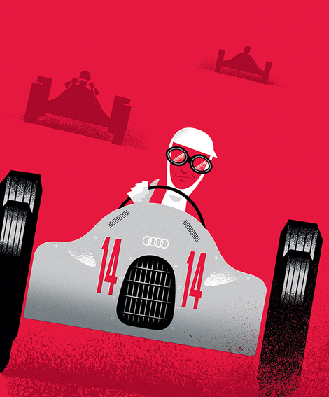
Recent work for Audi celebrating the legendary carmaker’s rich history of innovation.
What are your passions and interests outside of design and why?
Well I’m a dad. I have a 3 year old and a 1 year old…so I’m passionate about my kids and my family which take up most of my time outside of work. I try to get a trail run in once a week. And I’m attempting to learn how to play electric guitar.
——
We would like to thank Ty for taking time to share with us. You can see more of his work at mattsoncreative.com.
This interview is part of the #designinprocess series brought to you by Adobe. Read all of the interviews here and follow along on Twitter and Pinterest at #designinprocess and #newcreatives.
——
Also worth viewing…
Mike Cina Interview
Eight Hour Day Interview
Eli No!
Not signed up for the Grain Edit RSS Feed yet? Give it a try. Its free and yummy.
Share on Facebook
Thanks to Mister Retro: Machine Wash Deluxe for being this week's sponsor.

Back in September we announced some cool new ways to connect your WordPress.com site to your Google+ account. One major improvement was the ability to bring your WordPress.com and Google+ profiles closer together by sharing your content via Publicize.
Make your content visible on your Google+ Page
Today we’re happy to announce yet another way to integrate the two platforms. You can now use Publicize to share your WordPress.com content on your Google+ Page too!
While Google+ Profiles are used by individuals, Google+ Pages function as a space for organizations, companies, public figures, and other branded entities (for example: your blog!). You’d use your Google+ Profile to interact with friends and personal acquaintances; your Google+ Page would serve your public persona as a professional, business owner, artist, or blogger.
To get started, head over to your dashboard, then go to Settings → Sharing. When you’ve reached the Publicize screen, click the “Connect” button next to the Google+ logo. Once you’ve authenticated your account over at Google+, you’re set!

Choose between your Profile, your Pages, or both
It’s important to note that when you connect to Google+ and select an account authorized to manage Pages, you’ll have the option to select whether your content will be shared on your Google+ Profile or Page(s). You can connect multiple times to select both.

WordPress.org users: you can enjoy this feature, too! We have just released Jetpack 2.7, which also includes a Google+ Publicize option. You can visit the Jetpack announcement for more details.
Filed under:
Features,
Social,
WordPress.com 

Eight Hour day is the online home and moniker of Katie Kirk and Nathan Strandberg, a husband and wife design duo based out of Minneapolis. Their client list includes The New York Times, Chronicle Books, Williams Sonoma, Random House, among others. Driven by their belief that process and collaboration should be as exciting and fun as the end result, they create work that is honest, smart and succinct. In today’s interview, the 2nd part of our ongoing design in process series, Katie shares some of the challenges of working with a significant other, her workflow for a recent project and much more.
Let’s start off with a little bit about your background. Where are you from? When and how did you become interested in design?
(Katie) I originally hail from the great state of Wisconsin — the land of cheese, beer and the Packers. I have always loved art, so when it came time for school I wanted to pursue an art career. My (we’ll call him “practical”) father talked me into trying graphic design instead. I attended the University of Minnesota in Minneapolis for Design Communications, and from the very first class I fell in love. I really enjoyed the challenge of working within the parameters that are often part of the equation with design. It was a good fit.
What was your first design gig?
(Katie)My first gig was for a small design shop in Minneapolis called rED Design. Sadly, they were affected by the dot-bomb of the early 2000s and ended up shutting their doors. Shortly after that I started at another Minneapolis studio, Design Guys. I really consider that to be my first real job. I learned a ton about design, process and business there — it also introduced me to some of my best friends to this day.
What are some of the challenges you face as a couple working together? Do you tend to work independently, or do you have a strong collaborative focus?
I think our biggest challenge in working together is always trying to keep our business life balanced with our personal life. We absolutely love what we do, but it’s still a job. We try to set hard boundaries around the beginning and end of the workday, so it’s not a constant in our life.
Although Nate and I focus on our own specialties at times, our process is very collaborative. We are always checking in and talking back and forth. Our branding projects are particularly collaborative.
Do you maintain side projects or do you always work as a team?
We often have our own little side projects, whether it’s Nate working on some lettering or me working on an art print. But even then, we check in with each other all the time, to get opinions and feedback and conversation.
Could you walk us through one of your projects? Please describe your workflow, including your tools, from pen and paper to software and devices.
Yep. Let’s look at the branding and stationery system we created for Linda Engler’s Minneapolis interior design studio.
At the start of our branding projects, we often ask our clients to answer some business-related questions and to send us examples of work they’ve seen and liked. This helps us get inside their heads, and we feel it’s important to start this visual dialogue early. The inspiration pieces Linda sent us involved a lot of patterns and colors, a mixture of classic and modern styling. You can also see that she was speaking to us in her language — interior design.
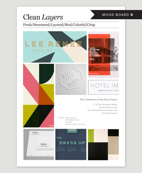
Using that information, we moved on to mood boards. We typically do three boards that span a range of styles, each with their own distinct identity. We’ll spend a couple of days researching and scanning our favorite inspiration sites, going over our personal inspiration folders, and you know, digging through the rest of the Internet. It’s as fun as it is exhausting—I often have crazy dreams those nights because of it. We then go through the inspiration that caught our attention, discuss, add, eliminate and ultimately sort it into our three proposed directions. We create the mood boards using Adobe InDesign and send PDFs to the client. I think a good mood board is as much about each individual image as it is the whole overall look.
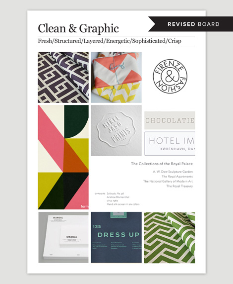
The mood-board portion of the process can be a bit abstract at times. I often feel like the more creative and visual the client is, the more they “get it.” But with all our clients and projects, the mood boards are an important phase. It’s where we listen and see and hear what they’re responding to — and sometimes even more importantly, what they hate. After the first round, we’ll revise the chosen board and move on to start the concepts. You can see that we revised the Engler Studio board to bring the bolder patterns together with the larger areas of color. It also pulls in more white space and modern typography.

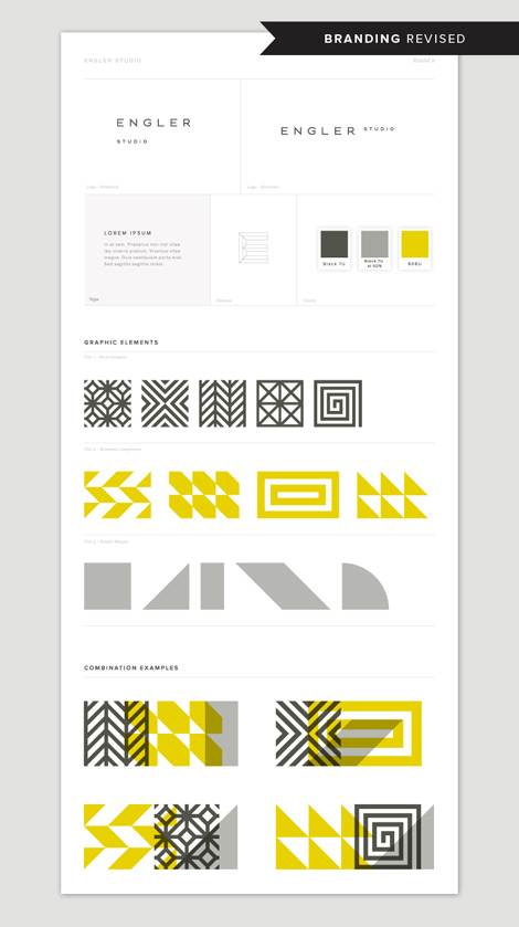
During the concept round, we start playing with typography, patterns and logo design. Most of the time, we use Adobe Illustrator or Photoshop for concepts. Early on, we create a first-round brand board to share with the client. As you can see, our first round wasn’t quite there yet—it lacked some of the depth and dimension that was incorporated in the final work. The revised board is brighter and bolder, with a more constant equation. The client loved it.
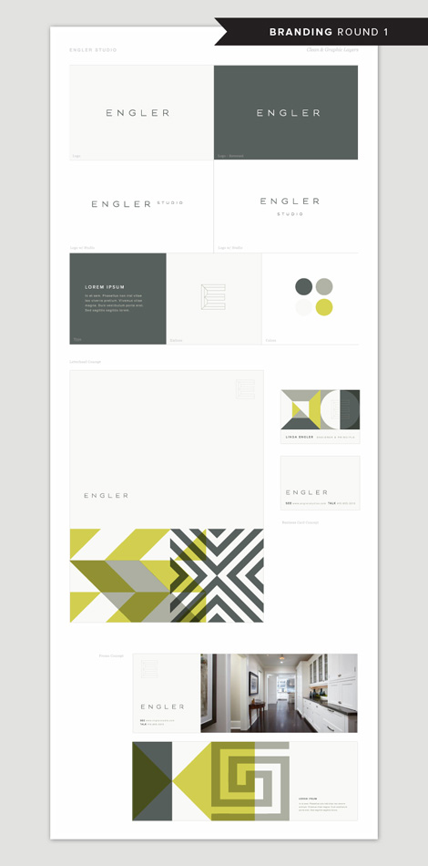
All along, we knew that we wanted to create a brand for Engler Studio that highlighted and celebrated its interior design skills, as well as its individual design personality. The main element of the brand is a graphic combination of patterns that overlap each other; they represent the images and colors you might find on an interior designer’s inspiration board, and also nod to the play of patterns, colors, light and shadows in a beautifully designed room. The patterns can be assembled in various combinations, depending on mood, usage, and need.


From there, we moved onto the stationery system. During that executional part of the process, we’ll often sketch layout ideas in our sketchbooks.
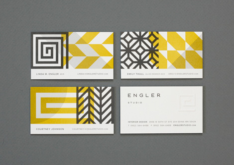
And finally, the finished identity. We often create final files for the printer using Adobe Photoshop, Illustrator or InDesign. This was a two-color job that included an embossed detail and duplexed business cards. As you can see, the “E” detail in the logomark was changed to a simpler, more representational “E,” like a Greek key, which ultimately holds up better against the bold patterns.
How has your process evolved since you first started designing?
I think it’s always evolving, with every project. Sometimes it depends on the client; what works for some doesn’t work for others. Sometimes you figure out a better approach as you go. We almost always learn something new along the way.
Are you a creature of habit or do you like to try new technologies, applications, and features?
Hmmm … that’s a good question. I feel like, sadly, with each year I’m more of a creature of habit — but I mostly blame that on just not having the time to dig in and learn new things. That said, we try to keep up with changing treands and stay abreast of what’s happening in the worlds of design and technology.
Analytical tools are now ubiquitous, and because of this designers are often asked to back up their work with data and research. With this in mind, how much of your work is based on intuition — and what role should intuition play in design today?
Super interesting question. Honestly, I think intuition has a lot to do with our work, but where do you draw the line? As designers, we’re constantly looking, searching and evaluating the world around us: what’s working, what isn’t, how things could be better. During our initial mood-board and concept phases, these are the questions we always ask ourselves, directly or indirectly. Asking the right questions isn’t the same as relying on hard numbers, but I don’t feel like they are any less important. Plus, I feel if hard numbers, data spreadsheets and focus groups ran the world of design, I think it would be a pretty sad and boring place.
What are your passions and interests outside of design and why?
Let’s see… I love movies and their ability to transport, connect and alter you emotionally. I love baking too. It feels creative in a different way than I’m used to — plus it has a delicious outcome. I think if I hadn’t gone into design I probably would have been a baker.
——
We would like to thank Nate and Katie for taking time to share with us. You can see more of their work at eighthourday.com.
This interview is part of the #designinprocess series brought to you by Adobe. Read all of the interviews here and follow along on Twitter and Pinterest at #designinprocess and #newcreatives.
——
Also worth viewing…
Mike Cina Interview
Katie Kirk Illustration
Eli No!
Not signed up for the Grain Edit RSS Feed yet? Give it a try. Its free and yummy.
Share on Facebook
Thanks to The Art of Getting Started for being this week's sponsor.

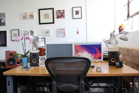
Today we’re excited to announce a new series of process related interviews with our favorite artists and designers. In the first installment we head to to Minneapolis, MN, the home of Michael Cina who is an award-winning creative director and skilled artist. Bridging the gap between music, photography, art and design, he creates work that is innovative and often unconventional in its approach. Here Mike discusses the role of intuition in design, his workflow for a recent Ghostly International project, his passions outside of the studio and much more. Enjoy!
You run a small studio. What do you enjoy about being on your own, as opposed to the design firm environment?
When I started to look for jobs after college, I was curious what it was like working for a firm. I interviewed almost every agency in the Minneapolis area and made up my mind that I would eventually do my own thing. Early on, I recognized that my interests and ideas were different from the norm. I enjoy a wide variety of work, especially drawing logos, making typefaces, fine art and projects that require a different approach.
To make that happen, I had to have the ability to choose what I wanted to work on and who I wanted to work with. Being able to work on many different types of projects stretches my thoughts and abilities. I am very thankful to work with the people and clients that I have. Most people want to put you in a box, so when you don’t fit that mold, they don’t know how to use you.
One of the other things that I enjoy most is having an open schedule. I can manage and work on projects around as I see fit. Somedays I focus on one project for most of the day and make some great progress. Normally I juggle and work on 5 or 6 projects a day.
How important is technology to your creative process? Are there particular tools that play a significant role in helping you bring your ideas to reality?
The internet has defined my career. I was able to cut my teeth making design for the web early in 1996. It afforded me the freedom to have clients from all over the world. I also started a “remote” design studio in the early 2000’s with someone from another part of the United States.
When I went to college, my professors taught us how to create design without using a computer. During college I bought my own computer and taught myself how to use these applications/tools. It fit like a glove for me and I knew this was what I was supposed to do, even though my college professors told me that I was not well-suited for design.
Adobe Illustrator is my favorite application hands down. I start almost every design I do in there, from websites, to books, to typefaces… I use it every day. It is more of a ‘blank canvas’ for how I work and what I work on. Simple things like Dropbox have made my life so much easier. I work from two locations so it is infinitely easier to do that now.
Identity work for TypeCon: Portl&
How has your process evolved since you first started designing?
My process changes depending on what kind of jobs I am working on. I am constantly looking at how I work and how I can improve my workflow. When I was younger, I used to have a formulaic process where I would put all my projects through that structure. Now I have many ways in which I work and approach a problem. I use my past experience and gut to tell me how to approach a situation. Each project requires a different solution, so why should I apply one approach to them all?
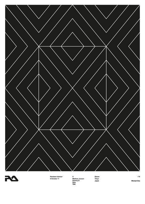
Resident Advisor ten year tour poster
Could you walk us through a project? I would love to see how you approached your recent work for Ghostly International’s SMM Compilation.
The SMM series is a music compilation that is curated by Ghostly’s studio manager, Jeff Owens. He is normally the mediator between myself and the bands, so it is a funny twist that he is the client. As he was working on picking the tracks, he would send me songs and ideas for the album title. We had a lot of emails and conversations about topics such as over consumption, politics, food, and alternate ways of living. The name of the LP fit the tone of the tone of the music but also the concept perfectly.
I did many partial days of researching consumption and opium. As I searched, I kept finding more information. I was struck most from the photos of people who were starving to death while smoking opium. After looking at all the images and putting the puzzle pieces together, I felt that there were some great connections to be made. It felt like I had to create a narrative to tell this story, one image couldn’t pull the weight.
The composition for the cover was stuck in my head for months. I knew I wanted to combine 3 or so images on the cover and obscure them to some degree so you had to look deeper. The first image I started with was the paper. I artificially aged an old piece of paper, printed it out, did the lettering over it and burned it some. The black represented heroin tar. From there I searched for some old pictures of opium addicts. I collected a folder full of them and picked the ones that I felt best fit. Then I wanted a picture that represented death and life. This was the hardest to think of and it stumped me for days. I remembered a photo I took a long time ago from a statue when I was visiting Notre Dame. It struck me because it was a person holding up and caring for someone that is dying or dead. Life in the face of death if you will. The painting in the background is one of my paintings. I had done some paintings specifically for the background of this cover, but this one just fit perfect.
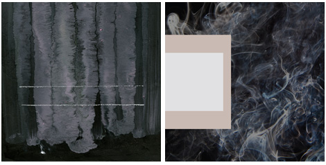
Early Concepts for the front cover
The rest of the package I had no idea what I was going to do though. I was stumped on this also for a while. I had a long time to think about it, too much time actually. When I get stumped, I just start making work. So I got a lot of paper and started weathering it with random techniques and started assembling a stack of images that I felt was applicable to the narrative. One day I was inspired and started making all of these collage pieces. The black board on the back of the cover is from a presentation I did in 1994!
Early concepts for the back cover
To create this cover I used Illustrator to sketch some initial ideas for the cover, draw some type, and then to layout the final package. Most of the package was done with collage, then scanned in and color corrected with Photoshop. I had to add and edit some text in Photoshop for some last minute changes. Now that is fun!
Final front cover
Final Back Cover
Inside Panel A
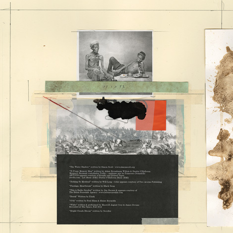
Inside Panel B
I appreciate your ability to work in a broad range of styles and mediums. I often find that you push the limits of what design can be. Are there any materials or techniques you’d like to explore further?
I am a huge fan of all things design. When I look at my work in the context of design history, I feel like I don’t fit in the mold. I don’t have a specific style or niche and I use anything to communicate. Learning new ways to think and work expands my visual vocabulary, so I can say something in a unique way for a project. I want to go a lot further with new ideas and mediums.
I have wanted to experiment with 3D printing since I first heard of it. I had some ideas at one time but forgot them all. Maybe I will do something next year with this. Over the last two weeks I have been messing with filming an idea for a video. I would like to do some larger paintings and do an installation.
There is one project that I have been working on for six months with a friend and it is a new “look” that I have not shown anyone yet and I have not seen work like this ever, so I am keeping it close to my chest. I want to unveil it in either a gallery, a fashion magazine or a big client commission. The project has visual ties to the fashion and art world. It is very exciting to me. We have one gallery already interested but I want to think very big with this idea.
I have been fortunate enough to work with some clients that are open to letting me “take risks” with their brand. So many people want what they have seen before, it’s comfortable. Why I love design so much is that I have the opportunity to push myself in these different directions to see what happens. I would like to continue to work with larger budgets/projects with companies that want to say and do something unique.
Ramsey font
How much of your work is based in observation vs fantasy? Does “chance” play a role?
Observation is very important to me. I don’t see myself having much to do with fantasy, but I do have a fascination for the unseen. When I see something that interests me, I try to understand why I like that particular thing. Is it the color, form, shape, composition, texture, etc? Design uses different languages to speak (semiotics is one of them), so it is essential to me that I understand how to say things visually. A lot of my process is figuring out how to speak visually through a solution.
Chance also plays a big role in my work. I have always learned best through “accidents.” Early in my career, I noticed that “mistakes” (early in the creative process) can be a huge asset. So I have tried to incorporate making mistakes into how I work. Eventually, you learn how to make calculated errors. After the initial creative process there is less room for making these kind of mistakes.
Early development on Matterhorn typeface
Matterhorn typeface
Analytical tools are now ubiquitous and because of this designers are often asked to back up their work with data and research. With this in mind, how much of your work is based on intuition and what role should intuition play in design today?
Facts and details are crucial to any project. I try and find out as much as I can about a project and I often will write up an overview of the essential ‘themes.’ From there it is all intuition. After all of these years designing, you develop what I refer to as your gut (intuition). Western cultures, as a whole, are extremely analytical and Eastern cultures value intuition. I feel that there is a middle ground where if you understand something well enough, you can then use your informed intuition to help guide the process and be open to change. I change things up all the time.
I am interested in critical thinking and economics. I am reading a couple of books right now on these subjects so I can understand these topics more. One of the books states that intuition is is a form of your subconscious processing information. I see design a lot like being a jazz musician. You have to learn about the basic fundamentals, notes, chords, technique, memorization, etc. Once you learn all of these things you don’t have to process that information anymore, it is natural to you. Then you can begin to do things like improvise and make quick decisions based on what you are hearing your other bandmates playing. I think it creates more room for emotion to enter the process. I approach art and design in a similar way. Especially art.
What are your passions and interests outside of design and why?
I have a lot of passions and interests and I love to learn about new things.
Records. I am a music addict and I collect vinyl. It has turned into a bad habit that I am trying to regulate.
Design books. I have been collecting them since the early 90’s.
Family. I have been blessed with two children and an amazing wife.
Non Fiction. I love audiobooks. I can listen to them anywhere and sometimes when I am working on mindless things.
Education. I am passionate about helping others through mentorships and sharing my experience and knowledge. I have been considering teaching lately.
Faith. I try to become closer to God and positive to the world around me.
Cooking and Food. I have always loved cooking. One of my dreams is to open a restaurant but I know the reality is different than the dream. I don’t eat processed food anymore so I have to cook almost every meal I eat. It is a lot of work!
Art. Art has always played a role in my life in one way or another. I have been messing around with no direction lately. Next month, I will be showing three new works on metal in a small group show.
——
We would like to thank Mike for taking time to share with us. You can see more of his work at michaelcinaassociates.com.
This interview is part of the #designinprocess series brought to you by Adobe. Read all of the interviews here and follow along on Twitter and Pinterest at #designinprocess and #newcreatives.
——
Also worth viewing…
Mike Cina Mix
Type Picks
Old & New
Not signed up for the Grain Edit RSS Feed yet? Give it a try. Its free and yummy.
Share on Facebook
Thanks to SHOWN'D for being this week's sponsor.

Today, we’re excited to introduce a new way for people to engage with your WordPress.com blogs: an embeddable version of the Follow Button that you’ve seen in your toolbar for some time now. Like similar buttons you’ve seen for other social networks, this Follow Button can be added anywhere on …
By:
Liz Carmichael,
on 9/27/2013
Blog:
Liz Carmichael's Portal
(
Login to Add to MyJacketFlap)
JacketFlap tags:
Writing,
excerpts,
Features,
HowTo,
Posting,
pagination,
WordPress.com,
page jumps,
splitting content,
the more tag,
Add a tag
As we discussed in the first installment of Digging in the Dashboard, WordPress.com has so many great features that it’s tough to be familiar with them all. I’m still discovering new ones myself! Let’s keep the discovery going with three more features that might be new to you. This time, …
A simple way to add visual variety to your site’s front page is to publish your content using Post Formats. Over 50 of our themes support Post Formats, which means they can display various types of content — including images, videos, quotes, links, audio, and short snippets called “asides” — with different formatting, adding subtle but nice touches to your site.
The types of Post Formats you can choose from depends on your theme. To see what Post Formats your current theme supports, go to Posts » Add New in the dashboard and look for a Format module on the right, with various options like the one below:

Using Post Formats is optional — if your theme supports them, you don’t have to use them, since the default (standard) format works well with any content you publish. Using Post Formats is also free: you don’t need to purchase the custom CSS upgrade to enable different Post Formats.
Our Top Themes Now Support Post Formats
Recently, we made our top 25 themes — from popular free themes like Pilcrow, Manifest, and Bueno to premium themes such as Elemin — look even better with Post Formats. Here’s a sampling of how Post Formats look different, using the Elemin theme as an example:
Image Format:

Video Format:

Quote Format:

Link Format:

Audio Format:

Aside Format:

Graphic icons spice up this particular theme, while other themes have different design or textual elements appropriate for their layouts. Browse the themes that support Post Formats in our Theme Showcase.
Start Posting Now
You can publish instantly using popular Post Formats right in your dashboard. Just click on “New Post” on the top right, then select one of these popular formats to publish instantly to one of your sites:

Alternatively, you can go to Posts » Add New in your dashboard to create a new post. Just select the appropriate Post Format in the Format module, and you can use the “Preview” button to view the post before publishing it.


For us, WordPress.com is our labor of love — we’re continually releasing new themes, upgrades, and features to help you create the best website and/or blog you can. In addition to great tools, we publish articles, prompts, and writing and photo challenges to inspire you to start posting and keep posting. While we’re never, ever done making WordPress.com better, we wanted to look back at some of the goodies we brought you in 2012.
We’ve got the look: 65+ new themes in 2012
We released themes at a rate of more than one a week in 2012. These beautiful themes look great no matter which device your visitors use to see your content. What’s more, if you’re a musician, restaurateur, bride-or-groom-to-be, or a civil servant looking for a simple way to share information with your audience, we’ve got you covered.

Tae Phoenix is a Seattle-based singer-songwriter who recently released her first album, Rise. Her site takes full advantage of everything WordPress.com and the Soundcheck theme have to offer, with embedded audio and video, a tour calendar, her Twitter feed, links to her new album, and press mentions.
Custom Design puts you in charge
Have design chops or an eye for contrast, color, and composition? With the Custom Design upgrade, you can tinker with your site’s CSS, compose a unique color palette for your site, and choose from among some awesome Typekit fonts to create the specific look you desire for your online home on the web.
New and improved for 2012
No matter whether you’re just starting to blog or are a seasoned web designer, here’s a sampling of how we made WordPress.com better for you in 2012:
We made a lot of progress in 2012 and we’re already working on bringing you more awesome in 2013. Happy New Year from WordPress.com!


If you had any doubt that WordPress.com makes a great online home for your band, the range of artists who are now using it to promote their work and grow their fan base should put that to rest. New musicians are signing on every day, making WordPress.com the go-to for artists who want sleek, functional, engaging sites without investing a ton of money or time.
Here are just a few of the acts who are taking advantage of features like the gig calendar and embedded tracks from SoundCloud and Bandcamp. They’re all using the Soundcheck theme, developed specifically for musicians, but they’ve used custom touches to build sites with unique looks and personality.
Tae Phoenix is a Seattle-based singer-songwriter who recently released her first album, Rise. Her site takes full advantage of everything WordPress.com and the Soundcheck theme have to offer, with embedded audio and video, a tour calendar, her Twitter feed, links to her new album, and press mentions. She’s lightened up the basic Soundcheck color scheme with a bold header image that echoes her album cover, and her first single is front and center on the home page, ready to be heard. Her site is polished, professional, and ready for the big time — just like her.

Finnish DJ Radical Effect is a 180 from our Seattle singer-songwriter, and it shows. He uses his WordPress.com site to support the October release of his debut single and his quest to “conquer the Finnish nightlife.” A rotating selection of header images gives the site its industrial feel, while a more washed-out palette creates a chill, laid-back vibe. In addition to the music-specific features, Radical Effect also houses a blog on the site, to post news and give fans insight into his creative process.

Canadian pop-punk outfit Letterbomb proves that you’ve never too young to rock — already performing together for three years, they range in age from 14 to 18. They’ve given their site a youthful edge with a moody color scheme, the repeated use of their bulls-eye logo, and plenty of photos. Their newest track is embedded on every page, begging to be heard, and plenty of links let fans buy music and merch. And as they grow, their WordPress.com site can grow with them, giving them more space for music and video and helping them keep track of tour dates.

Fifteen-year-old twins and Oklahoma natives Grace and Sophia chose WordPress.com to build the site that supports their growing careers as folk singer-songwriters. A colorful yet muted palette, capped off with custom header images and a craft-inspired background, give the site its personality. They’ve added social media sharing buttons to the main navigation bar, encouraging their fans to connect with them across a variety of platforms.
These four artists have opted for the new premium Soundcheck theme, but there are 200+ themes available on WordPress.com, many of which — like Oxygen (a freebie!), Shelf, and Debut — were either designed for or lend themselves well to music sites. With affordable upgrades like custom design, your band’s own URL, and plenty of storage space for your music and videos (coupled with WordPress.com standards, like rock-solid security, unlimited bandwith, and the world’s best Support team), making WordPress.com your band’s online home is a no-brainer.
Is there an act you love on WordPress.com? Share a link in the comments!


By:
Liz Carmichael,
on 12/17/2012
Blog:
Liz Carmichael's Portal
(
Login to Add to MyJacketFlap)
JacketFlap tags:
media manager,
tiled gallery,
Uploads,
uploading,
Photos,
Gallery,
media,
Features,
HowTo,
slideshow,
New Features,
Add a tag
We’re excited to announce more updates to the Media Manager, which makes it even easier to upload and manage media on your site.
Insert a Slideshow in the Media Manager
You can now enable a slideshow in the Media Manager. In Edit Gallery mode, you’ll see a list of options on the right under “Gallery Settings.” Click on the dropdown menu next to “Type” to see a new list of gallery types, including a Slideshow option at the bottom:

Similar to the gallery feature, the slideshow option allows you to include specific images. You can reorder the images by dragging and dropping thumbnails, randomize the order by checkmarking the box next to “Random Order,” and reverse the order of images by clicking the “Reverse Order” button at the top. You can also insert multiple slideshows into a post or page, just as you’re able to do with galleries.
Note that the “Link To” and “Columns” options do not apply to slideshows.
The old [slideshow] shortcode will continue to work, but to access all these new features — such as ordering, excluding certain images, etc. — you would need to update your shortcode to use the new [gallery type="slideshow"] format.
Select Gallery Layouts Easily
You’ll also notice you can now set the type of gallery in the Media Manager, in the same dropdown menu mentioned above. In addition to Slideshow, you’ll see a list of gallery layout options: Default, Tiles, Square Tiles, and Circles. Note that Tiles is the option for the rectangular layout, and Square Tiles is the option for the square layout. (As mentioned in our recent galleries post, the thumbnail grid layout is the default option for all sites.)
Using the various gallery shortcodes to display your galleries still works as well.
These latest updates make it even easier for you to manage your media — all in one place! For further information, please visit our slideshow and gallery support pages.


Today’s Grain Edit interview is brought to you by guest contributor Deva Mirel, and features the words and works of illustrator/fine artist Gary Taxali. We catch up with Gary after he returned in early May from his first solo show abroad at The Outsiders in London. Gary lives and works in Toronto but is originally from India. Here he discusses his most recent show, locating the desi in his work, why kids love him, and some straightforward tips on being in the business of making art.
First off, thanks so much for taking time for this interview. I know it’s been an extremely busy few weeks for you. Your work was shown in California in the show “New Blood,” curated by Morgan Spurlock. The aim of that show was to highlight the game changers of the art world with an eye on the future. Every big name artist brought on board a protégé’ to exhibit alongside them. At the same time, you had your first UK solo show–”My Feelings Like You”–at The Outsiders in London. What challenges did you face having 2 shows opening at once?
The only challenge was that the openings were so close in date so it was impossible for me to attend both. Naturally I picked my solo show. I loved Morgan’s concept for the show and it was really great that Thinkspace Gallery got behind it.
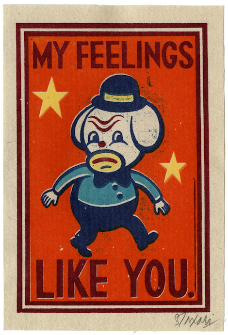
How has your work evolved from your last major solo show–”Hindi Love Song”–in New York?
I don’t know if it’s evolved in a tangible way but perhaps what’s more concise is the messaging in my latest show. That is, I think there are themes I explored that are more cohesive from piece to piece. For example, In “My Feelings Like You”, I really wanted to show more narrative pieces. In a recent interview I did for Lust and Found, I wrote:
“The themes explored are just as much about introspection as well as searching. There are a lot of assertions in the works I make about states of being and status of place. Yet there are also inquisitive, questioning and curious follies regarding various emotions and relationship dynamics. These are realized through my constant exploration of angst, happiness and catharsis that I hope is evident in the characters I draw and paint. A common character I am known for, The Toy Monkey, makes a few appearances in these new works. He’s a guide, if you will. Many people may surmise that he’s taking the viewer to a past time, in particular the 1920s or 1930s, but I’d like think that the place is just a byproduct and the real journey is in conveying the emotions through narratives.”
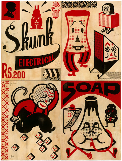
Skunk Electrical Soap
Practically everything I’ve read about your show at The Outsiders notes the debut of your largest work to date. Skunk Electrical Soap measures in at 152 X 203 cm. When I googled the conversion to inches (60″ x 80&Prim
Back in 2010 we introduced the exciting new ability to Like the individual posts you’ve read all around WordPress.com. It’s been one of our most popular features since then, as evidenced by the chart below that goes up-and-to-the-right as an indication of great success and achievement.

Likes per week since the beginning
Today I’m happy to announce a few enhancements to the way Likes work that we think you’ll really like. 
Show Likes on Pages
In the past, we’ve always restricted Likes to individual blog posts. Given the success of Likes, we want to make it as easy as possible for everyone to Like what they are reading, wherever they are reading it. Likes now share the same display settings as your sharing buttons (which you can change from Settings -> Sharing in your dashboard). In addition to showing Likes on single posts, you can now show Likes on all of your site’s content:

Here’s an example of Likes displayed on a blog’s front page:

Do you like naps and puppies? I think I do!
Show Likes on Gallery Images
In addition to making Liking posts easier, we wanted everyone to be able to Like all of the things you publish on your blog, including media. So, we’ve also added the ability to Like photos directly from inside image galleries, like this:

Who can resist liking Paul the Puppy?
What You’ve Liked
Now that it’s super easy to Like everything you see, you need a place to see what you’ve Liked. To make this as convenient as possible, we’ve added a link in the Reader that lists all of the posts you’ve liked across all of WordPress.com. You also have instant access to your favorite posts through the official mobile WordPress apps for all your favorite mobile gadgets.

We think these tweaks really improve the Liking experience, and we hope that you enjoy them!
Did you think I was going to say “like” again? :)
 13 Comments on More Likes in More Places, last added: 4/26/2012


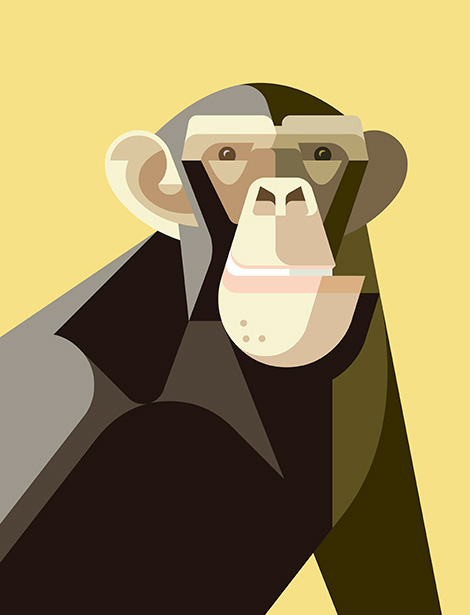


[…] (The Fandom Post) Connie on vol. 28 of Blade of the Immortal (Slightly Biased Manga) Helen on Cardcaptor Sakura (Organization Anti-Social Geniuses) Connie on vol. 1 of Citrus (Slightly Biased Manga) TSOTE on […]