new posts in all blogs
Viewing Blog: Drawing a Fine Line, Most Recent at Top
Results 26 - 50 of 783

Statistics for Drawing a Fine Line
Number of Readers that added this blog to their MyJacketFlap: 11
I'm playing catch-up with my arCATecture kitty drawings. Still trying to finish up the first Up & Downstairs Tabbies series, which I had meant to be done with over a month ago. Oh well. Real life and other work has a way of changing the best laid plans, doesn't it?
The two who are on the board at the moment are the Catley Twins - Edmund and Edwina.
They're both kind of brats. Both decided to stick their tongues out and cross or roll their eyes just as the picture was taken. Their parents (Lord and Lady Catley) were not amused.
Here is Edmund, about half rendered with colored pencils. He is in a traditional Edwardian juvenile sailor get-up. He will get more colored pencil and fur, then I'll do a little Photoshop magic to make some whiskers and put in the banner with his name underneath, like all the other kitties have.
Here's what he looked like on tracing paper. Scary! I had the eyes looking straight out, then over-drew them crossed, and also changed the tongue - all on the same drawing. He looks like Dracula or something (OK, just decided I need to do a Dracula kitty - note to self.) I also flopped him going the other way, so the two will be facing each other in the final art.
And here's his sister Edwina. Same thing with the eyes. I decided to make them rolling up. She has one of those ridiculous over-sized hair bows that all the girls wore back then.
So that's what happening here - cats on the board, and everywhere else.
In other news, my Berry Tart drawing has been accepted into the California State Fair's Fine Art Exhibit. So that's fun! The last time I entered this was in high school, and didn't get in (which I was so steamed about after I saw what
did get in that I wrote a nasty letter to the judge - heh).
So I will have two pieces of art in shows this summer (the Fried Egg piece will be in Atlanta for CPSA). Feeling a little puffed up about that, I must admit. Have some ideas for new food pieces - but first I have to finish the kitties! Its soooo easy to get behind with these things, isn't it? Maybe I should do a post about DISCIPLINE . . .
I feel like doing pen and ink again. I've been doing colored pencils for everything for so long now, its almost like I have to give myself permission to do something else. I drew this little piece while sitting on the porch with the kitties, just hanging out. It was fun. And I didn't think about it very much.
I had some printer paper and a cheap ball point pen, and had intended to make serious lists of things I need to do/draw/figure out, etc., but instead I started drawing this couch.
I added the granny square afghan, then the pillows, then the upholstery.
Next came the lamp. I had no idea where I was going with this. I drew it hanging over the couch, then decided it needed one going the other way. Next was the table, and the stuff on it.
Then the kid,
who needed something to look at, so next came the cat.
I did the chair first, and then added the cat.
Nothing profound. Just fun.
I haven't entered very many juried art shows. I was thrilled to get my Twix Mini piece into the
CPSA International Exhibition 5 years ago, then didn't enter anything again until the
UArt Show here last year. Not sure why exactly, just not motivated I guess, or unwilling to get on that merry-go-round, for whatever reasons.
OK, wait, maybe I do know. Its expensive.
I know its gauche to talk about money. But if you're trying to make a living as an artist, and you want to do the 'show circuit', you need to know what you're getting into.
First, there's the entry fee. That's typically $20-$35 per piece, with sometimes a discount if you enter more than one piece.
Then you have to get the piece framed (not everything needs to be framed, but I'm talking about drawings, which definitely do).
Then you have to ship the art to wherever the show is (if you get in), and arrange to have it shipped back.
That all adds up!
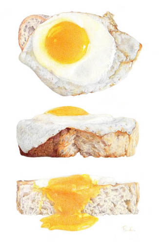
I was excited to have my Fried Egg on Sourdough Toast piece accepted into this year's
CPSA International Exhibition. Its the only piece I entered, and the entry fee was $25. I took the art in to be framed the other day, and that will cost roughly $250 (simple but elegant natural wood frame with plexiglass, for an 11" x 17" drawing). Next I will have to ship it, and have no idea what that will cost. I will do FedEx, and will have to arrange for the return shipping as well. $100 maybe? (That might be a little high, or not. I can't remember what it cost last time.) Then there's the shipping box itself. I have a special
Airfloat Systems box that I'm hoping I can use again, if its the right size. I think the one I have cost $45 or so - its probably more $ now. And in addition to all of that, there's a $40 cartage fee required for the show. So lets' add that all up, shall we?
Entry fee: $25
Framing: $250
Box: $45
Shipping: $100 (estimated guess)
Cartage: $40
-----------------------
Total: $460 (or so)
Lets' just say $450 to make it easier. That's not cheap, is it?
And if you enter more than one show a year, with different pieces of art, that can really add up fast.
On a whim, and at the 11th hour of the entry deadline day, I decided to enter my Berry Tart piece in the
CA State Fair this year. I have no expectations whatsoever of getting in, since this is a state-wide show, with so many different kinds of art being entered, but I decided to go for it.
Notice the Sale/Price Value I put on the art: $2,000.
This piece is already framed, since I had it in the
UArt show last year. The entry fee for the State Fair is only $20. And if it gets in, I can just hand deliver it because I live right here, a few miles away. So that will cost me way less than the CPSA show.
Also, I'm thinking 'gallery', someday, maybe. You have to consider the gallery fees (usually 50%), so a $2,000 piece will automatically only net $1,000. Subtract the framing, and that leaves $750. Not bad, but not $2,000. So even though $2,000 might seem high, it really isn't.
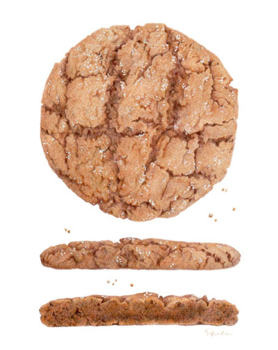
Ideally, we'd all win the big $$ awards in these shows, and that would offset the costs of entering!! Last year I did win a nice little sum in the
UArt show with my Molasses Cookie drawing, and that definitely paid for the costs associated with entering. But you can't count on winning. You have to just enter, and hope for the best.
Its serious business being a fine artist and going this route. Its easy to get discouraged if you don't get accepted, let alone win anything. But I'm giving it a bit of a go, and we'll see what happens!
F I N A L L Y.
The new paulapertile.com is live!
It needs 'more' (mostly, art samples), and a couple of fiddly tweaks, but over all I'm pretty happy with it. I used the
godaddy website builder, mostly because I have my domain name registered there already, and also had a credit. So it made sense. I wanted something simple, and I like the scroll-down design rather than fancier bells and whistles. I went with the business site option, which lets you have a lot of pages. They have several templates you can choose from, and I chose the "Freelance Portfolio" one - and then completely changed it (of course). Its all 'drag-and-drop' and really easy to use. They give you a lot of options for little design-y things (I got so excited over the 'make rounded corners' thingy!), most of which I didn't even use. So I would recommend this. (*godaddy is not paying me to say any of this, by the way)
Besides the business option, they have a simple and inexpensive 5 page option, and also upgrades for SEO optimizing, as well as a store-builder. It can add up, but they have sales often so I plan to wait for one of those before I sign up for anything else.
There are so many options for website building software these days.
Squarespace,
Weebly,
Wix, come to mind. They're all beautiful and modern and fancy and hip. I kind of like the idea of not being so trendy though, and sticking with something a little more classic. It fits my style.
Another really good thing with this is that its mobile-friendly! (All those other options I listed are too, I'm sure.) I looked at my old site on my phone and it was microscopic. The godaddy website builder lets you preview how your site will look on a desktop and a phone as you go along, so you know exactly what you're doing. On a phone, it arranges all the images in a single file 'up and down' scrolling thing, which are sometimes a little out of sync with how they're arranged on the page, but its still 100% better than what I had before, so I'm fine with it.
Full disclosure: there
are a couple of things I'm not 100% thrilled with, and wish I could change.
1) You're allowed 2 drop-down pages for each main page. Which is great. But. Normally, if you hover over a page title that has drop-down choices, you just pick one of those and go to that page. With this design, the main title page is also 'clickable', and is still a stand alone page by itself. So you need to have stuff on there as well as the drop down pages, which feels a little redundant, and I'm not sure how to get around that. (Like, if you hover over "Children's Books", "Color" and "Black & White" pages come up as the drop down options. I think most people would just click on one of those, and not the actual main page - does that make sense?).
2) Another thing is, the way I designed my pages, every element - image, or type - is independent, and can be dragged around to go anywhere on the page. Which I love! But, when I decide to update the site with new work, which will go on the top of the page, I'll have to rearrange the whole rest of the page downward,
one piece at a time, rather than selecting the whole lot and dragging it as one thing. Pretty sure anyway. There might be some way to do it easier that I haven't figured out yet, so don't quote me on this.
Still, I'm super happy to have this done, and it will be fun to update things and fiddle around with it as I go. I know several people who are re-doing their websites right now. It must be "website re-design season"! Its soooooooooooooooooooo much easier now than it used to be - remember using (or trying to use) Dreamweaver or . . . what was the other one? Go Live, that was it. Blimey! I never did figure those out.
Please let me know if you find any links that don't work, or if anything feels clunky or 'off' or weird.
Happy Website Building!
I'm happy. Just found out my "Fried Egg on Sourdough Toast" drawing has been accepted into the Colored Pencil Society of America's 23rd International Exhibition!
Here's a list of everyone who got in. I am in some esteemed company, for sure.
I also just signed up (like, minutes ago) for some new website builder thingy, so my old sad site will be down for a while until I get this one up and running. Wish me luck. I actually don't have all the art I want to use ready to go - I thought that signing up would just let me sit here until I was ready, but nooooo, (has to do with switching hosting plans and technical stuff). So I have my week cut out for me. Thankfully my email will still work though, so that's good. Also, the thing I signed up for has the new 'mobile - friendly' stuff included, so I should be all set. It will be nice to be a little more up to date with things!
Oh, and I guess I have to go get this piece framed now! Details, details . . .
Sphinx Moth
colored pencils on paper
© Paula Pertile
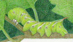
Wow, this was really different subject matter for me! I was inspired to do this illustration by an
amazing creature who's been visiting my jasmine plant by the front porch for several evenings. At first I thought it was some kind of hummingbird. It looks like one. It hovers like one. But . . . something was wrong, and I couldn't put my finger on it. So I googled. And sure enough, there is an actual "Hummingbird Moth"! But mine is actually the very similar "Sphinx Moth".
Both moths come from those awful, scary, creepy but also cool, green horned caterpillars. If you've ever grown tomatoes, you've probably seen them. One variety is in fact a tomato worm, and the other is a tobacco worm. Again, very similar, but with some fiddly differences.
For a moth, this is HUGE. I mean, if I thought it was a hummingbird, you can imagine. I've never seen one before, so I'm not sure why it showed up here all of a sudden. Of course I took science in school, and learned all about caterpillars, and cocoons, and butterflies and all that - but something about this one, and the transformation from that particularly frightening horned worm into such a spectacular flying thing has given me a newfound respect and feel of awe and wonder about Nature, and all the wonderfully amazing things that go on out there in the yard when we're not looking. I will be looking at it all with a slightly different eye now, I think.
I did this with 99.9% Prismacolors and one black Polychromo (mostly because I was running low on Black Prismacolors), on the new Strathmore colored pencil paper. I really like this new paper a lot to draw on. The texture is nice and even, and it has a crisp feel to it. Its better than regular bristol, where the texture (depending on what brand and grade you get) can sometimes be uneven. The only slightly negative thing about it is how thin it is. This wasn't a problem for me with this piece, but I also didn't do any heavy burnishing, or use solvents, or any other 'special effects'. I don't normally do any of that anyway (except for a little burnishing here and there), so I don't anticipate this ever being an issue for me.
But when I stood the piece up periodically to step back and have a look (just propped up against a lamp or something), the paper really sagged. Usually, a piece of bristol, or Stonehenge or anything else will be able to stand up straight. So, this is pretty wimpy. Again, it doesn't bother me, but I'm just sharing, in case anyone is curious. This paper is relatively inexpensive, so that may be why.
I bought mine here at Dick Blick. No one else seems to carry it yet, for some reason.
So that's about it for me, here, for now. I think the snow has finally melted just about everywhere, and everyone is having Spring now, finally. We here in drought-stricken California are already worrying about crispy lawns and thirsty trees and critters. I find myself thinking about all the birdies and crawling things, wondering how they get along when no one is watering as much. The snails all come out and frolic when I do turn on the hose or lawn sprinklers, and the birds are happy too. (Geez, I've turned a new weird corner if I'm worried about worms and bugs and stuff!) Like homeless kitties aren't enough.
To think I've probably unknowingly crushed some of these in the past makes me sad. Be careful where you step out there!
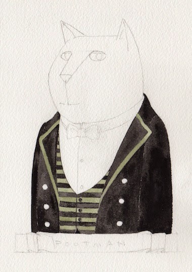
Two new Upstairs Tabbies this week!
Sir Archibald Catley, and Reginald Sweet.

Sir Archibald Catley
"Archie" is the younger brother of Sir Cedric Catley, Earl of Mewton. He loves cricket, but mostly because of the sweaters. He has one for every day of the week. He also loves butterflies, and anchovy pudding.
Reginald Sweet
"Reg" is the brother of Lady Clara Catley (the former Miss Clara Sweet and wife of Sir Cedric Catley). He served in The Great War, and came home with a nasty scar for a souvenir. He did some paw-to-paw combat with a Russian Blue, which resulted in a bad scratch that never healed quite right. He's a little self conscious about it, and doesn't like to sit for pictures. He's not all seriousness though - he enjoys a lively game of cards with his mates, and loves to chase grouse and peafowl on the grounds of his sister's estate, where he lives.
I'm also playing with some new shapes for the Downstairs Tabbies, which, when I get the kinks worked out, I'll do for the Upstairs bunch too. I think some little cards would be fun with this round format, and some other things.
I'm having a lot of fun creating these characters, and learning their stories. I'm also having fun doing the colored pencil + photoshop colored pencil brush technique (I do the first part of the drawing with colored pencils, then scan, and finish it up with photoshop, darkening or doing whatever was too hard or labor intensive to do with the actual pencils). I like that it this let's me keep the 'hand drawn' look and feel, but with a little help where needed.
I'll be doing the Catley children next I think. :~)
I used all Prismacolor colored pencils for this, on Fabriano Artistico paper. Its 11" x 17".
This was a fun one! When the idea came to me, I googled 'fried egg' images to make sure no one else had done a piece like this. Lots of fried egg drawings, but nothing even close to this set up, so I figured I was good to go.
Most images were of an egg on a regular shaped piece of toast, like from a normal loaf. But I liked the idea of doing some really crusty sourdough, so went shopping and found the perfect loaf of French Sourdough. I fried a couple of eggs in butter so they'd have a bit of brown around the edges, and toasted up a couple of thick slices of the bread. One of the egg yolks broke in the pan, so there was only one 'good one' left. I plopped it on a piece of toast and dashed it to the studio to take some pics. I held my breath a bit on the 'section view' one, because once I cut that piece in half I had only a few seconds to shoot a pic before it all ran down all over the place. (I actually took the egg off the bread first, cut the bread in half, nicely, then put the egg back on top and cut it, so I didn't have a complete sloppy mess.)
You will probably be shocked to learn that I took a grand total of I think 6 pictures all together, and 3 of them were good enough to work from. I know some people take lots and lots of pictures, but I get impatient and just want to start working, so as soon as I have something that's good enough, I'm done. In my defense I will say that I'm not trying to do any fancy lighting or anything particularly sophisticated with these food pieces, so I can usually get adequate photos pretty easily.
Of course I had a whole dozen eggs in the frig, and was prepared to have to start over and fry up more in case something went wrong. But I got lucky. The practical side of me also likes that this made a really nice lunch, and that I have eggs and sourdough for the week!
That sounded kind of deep. I guess it is true though, that everything in life is a work in progress, most of the time. Things are always changing and being created anew. That's an especially appropriate thought right now, as Spring officially starts tomorrow. We've unofficially been having it here for weeks now though, with the jasmine in bloom, as well as roses, azaleas, and some other green things. The cats are out sunning themselves all day long in the balmy weather, and I'm even sleeping with the window open.
And I've been sketching a lot. New things for new projects. Lots of children's book art, mostly, but also some kitties, and some new food.
So there's a lot of new work starting to 'bud', if you will, on my drawing table. Some still feels like its in 'winter mode', gathering itself up under the surface, ready to poke up and see the light. Other things are already sprouting.
I also rearranged my studio a little bit, and it has a better 'feng shui' thing going on I think. All I really did was shift my drawing table 90 degrees, but it really changed the energy in the room, and I love it. (I know I'm sounding very 'woo woo' today, but hey, whatever works, right?)
So here's to Spring! And Spring cleaning, and new growth of all kinds!
Please allow me to present Sir Cedric Catley, the Earl of Mewton and his lovely wife, Lady Clara Catley.
Sir Cedric is married to the former Miss Clara Sweet, a licorice fortune heiress. He married her for her money, after his family found themselves in reduced circumstances, thanks to his father investing in a rather unsound financial scheme involving pigeons. He is quite the bug enthusiast, and has an impressive collection. He can often be found in his "bug room", pinning specimens while listening to Chopin and sipping chicken broth tea.
Lady Clara is married to Sir Cedric Catley, the Earl of Mewton. She is the heiress to a great licorice fortune, and he married her for her money. Her parents disapproved, so of course that made her keen on the idea, and also, she wanted to be a "Lady". She enjoys giving lavish dinners, and is especially fond of showing off her Cook's skills with stuffed fowl dishes. Her husband's bug collection is a course of embarrassment, but she allows it because he doesn't interfere with her catnip parties.
*****
These two are the first in the Upstairs Tabbies series. I had fun with her hat! There will be children next, I think, and an odd relative or two.
I'm sad that Downton Abbey is over until next January. And that will be the last season, I've heard. What will we do? There will be some serious withdrawal going on. Although I also heard that Julian Fellowes is planning a new series - The Gilded Age - about Victorians, so maybe we'll have another good period drama to dig into when DA is over. Let's hope!
I'm in a real 'bread and cheese' mood lately. To draw, and to eat. Not sure why, but I'm enjoying doing both.
I just broke off a bit of this wedge and had it with some kalamata olive ciabatta bread for an afternoon snack. So good! My fridge has a handful of other little wedges of interesting cheeses that I hope to manage to get drawn before they get eaten. We'll see.
This was done with all Prismacolor colored pencils on 8" x 10" (20.32 x 25.4 cm) Strathmore bristol.
I actually used a "Bronze" colored pencil on this. I don't know if I've ever used it before! Somewhere along the way I decided the Gold, Silver and Bronze colored pencils were for amateurs. REAL colored pencil artists make their own gold, silver or bronze colors from other color combinations. Which is true, actually.
But this bronze is a really good color, and not even metallic looking. It gave the cheese just a little yellow/gold oomph it needed.
(these are not my images - they're pulled off the web - no © infringement intended)
A good example of what I'm talking about with the metallic colors is my 3 Musketeers Mini drawing. Its Silver, right? But of course I never touched the actual "Silver" pencil. I used a lot of greys, and blues and reds to pick up the reflections in the wrapper.
Same thing here with the Twix Mini. Its all yellows and goldy-browns and whatever else was needed to render the shiny gold foil - without using the "Gold" pencil ever.
Part of the fun of doing shiny things is analyzing what the colors actually are made of (at least I think so). Well, that's true for things that aren't shiny as well. But shiny stuff is a little harder maybe.
This Witor's Noir chocolate was shiny, but a little less so than the Twix, and with a lot of brown. Again, no "Gold", but a lot of other colors.
Well, you get the idea. Its like in illustration class when they told you to never use the "Flesh" color paint! And remember the 'flesh' colored crayon?
Wow, I really wandered off the mark here. I just wanted to share my cheese drawing.
I will clean up the background, and put prints in
the shop. I think a little grouping of bread and cheese prints would look nice on a kitchen wall. Hmmm, I'll have to work on that . . .
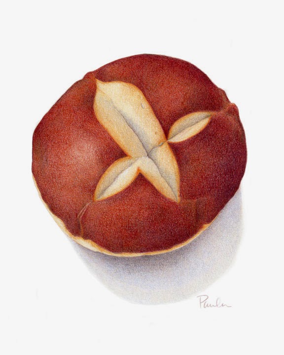
Soft Pretzel Roll 8" x 10" colored pencils on Strathmore bristol
Not a lot of art to talk about this week. I was drawn (pun intended) to this soft pretzel roll in the store for some reason. I like the pattern of the 'cuts' on top, and the rich color of the crust. I'd never eaten one of these before, or even seen them I don't think. Its nice and bready and pretzely, and I liked it.
There's something so comforting about nice bread, especially at this time of year. Although here in California we're having Spring already, with sun and lawns being mowed and yard chores in full swing. Everywhere else people are snowed in, its crazy.
One other thing I'll mention with this piece is that I've gone back to Strathmore bristol, just because I have a lot of it, in pads, laying around. One day I thought "why did I stop using this?" and so did a piece on it and was happy with the result. I don't know. Somewhere along the line, when I decided to get 'serious' about my colored pencil work, I started exploring other papers, thinking the key to doing a good piece lay in the paper choice. I'm glad I discovered Stonehenge and Fabriano Artistico, and will still use them when there's something particular I want to do that requires one of their special characteristics. But for now, I'm perfectly happy with this Strathmore bristol - 300 Series.
I put
prints of this in the shop, in different sizes.
I'm also working on more cat drawings. { meow }
This was a little experiment with first an idea, then the technique. I wanted to do some Colonial cat portraits, based on actual paintings done back in the day. I did some research, and settled on a painting of Lemuel Cox by John Singleton Copley to be my inspiration.
"Lemewl Cox Cat"
At first I was going to be more 'illustrative', then I ended up pretty much copying the painting, substituting a cat for Lemuel Cox, and making adjustments to the coat (neck, mostly) to fit the cat proportions.
I started out with Prismacolors on Strathmore Bristol.
I developed the drawing, and went darker and darker with background.
I just kept going, with different colors + black, then came in with Black and Caput Mortuum Polychromos. Finally, I scanned it and had a go at it with my digital colored pencil brush and Photoshop, just to get the whole thing dark enough. I also did the whiskers digitally (much easier than doing them 'by hand' with colored pencils!)
I've made
prints available in the shop.
Not sure what's going to be next!

By:
Paula Pertile,
on 2/3/2015
Blog:
Drawing a Fine Line
(
Login to Add to MyJacketFlap)
JacketFlap tags:
zazzle,
etsy,
colored pencil,
butler,
cook,
digital colored pencil,
Downstairs Tabbies,
housekeeper,
kitchen maid,
lady's maid,
Add a tag
I have more of the below stairs cat servants to share with you. Some have debuted (wow, that spelling looks wrong - "deybyood" is what I mean, in case it is) already on the arCATecture
Facebook page, and all of them are already for sale as prints on
etsy.
I'm still fiddling with some of the descriptions for them in different places, and so they're just slightly all out of sink with themselves, if that makes any sense.
I've also opened a shop on
Zazzle, and the same is true there. It will take me a good while to get it all stocked up. I'm making each product one.at.a.time, since I have to place the art on each phone case, pillow, mug, tile, shirt, etc. etc. individually, to insure the best size and correct placement. So its my life's work now, basically.
In the last post I said I was determined to figure out how to do these all digitally. Well. I tried. I really did. But what I finally figured out is my 'ideal formula' for these kitties, as well as my other work, is to do 90-99 percent of it with colored pencils, then come in, if necessary, with some digital 'polish' to enhance areas that may not be quite strong enough with pencil alone.
I just can't get the same look of 'real' colored pencil by doing it all digital. The 'polishing' I do though is with a special colored pencil texture brush I made for myself, so it still looks like pencil. The combination works for me, and I'm thrilled to finally have this figured out.
I may take all these over to their own blog, and eventually their own website. (Even though I'm still lagging waaaaaay behind on the re-do of my own main website! which is half done, but not published, and yes, I was one of those kids who didn't finish one thing before starting the next, which drove my parents nuts. Some people never change.)
I think this may be all of the below stairs staff - at least for now. I supposed I could do an under butler, more footmen, housemaids, kitchen maids, scullery maids, hall boy, nanny or nurse (although she would technically be kind of in-between up and downstairs), groundskeepers, and a few other assorted folks. For now though, I need to get these ones all caught up with themselves in all the shops, then I'll move on to something else. I have lots of ideas for other characters, too!
By:
Paula Pertile,
on 1/22/2015
Blog:
Drawing a Fine Line
(
Login to Add to MyJacketFlap)
JacketFlap tags:
Downton Abbey,
drawings of cats,
Paula Pertile Art,
servant cats,
Upstairs Downstairs,
cat illustrations,
digital colored pencil,
cats in costumes,
cat drawings,
cat illustrator,
Add a tag
This is a new 'thing' I'm working on. Its been on a back burner for too long, and one of my resolutions for the new year was to move it to the front, and turn up the heat a bit.
These first few samples were done with traditional colored pencils, then some 'digital colored pencil' to enhance them. I'm going to see if I can do the rest in the series all digitally. I really want to be able to go all digital for some stuff, and am determined to figure this out, once and for all.
These may remind you of some popular TV characters, or not. I'm not trying to copy specific people, but there may be a strong nod to someone we recognize here and there.
Its fun to adapt human 'costumes' to cat proportions. Sometimes. I'm trying not to do 'people bodies with cat heads', although that would make things a lot easier.
The ladies are next!
By:
Paula Pertile,
on 1/14/2015
Blog:
Drawing a Fine Line
(
Login to Add to MyJacketFlap)
JacketFlap tags:
Prismacolor pencils,
food drawing,
food illustration,
colored pencil drawing,
Polychromo pencils,
Coloursoft colored pencils,
chocolate drawing,
food illustrator,
salted caramel brownie,
Add a tag
Finished!
This has to be one of the most decadent things I've ever eaten (or drawn).
I used mostly Prismacolors, then a little Polychromo Caput Mortuum Violet (my favorite color!), and a Coloursoft Brown Earth. Its about 8" x 8" on 10" square-ish paper.
Not much else to say. I'll clean up the background and do prints.
Now its back to kitty drawings . . .
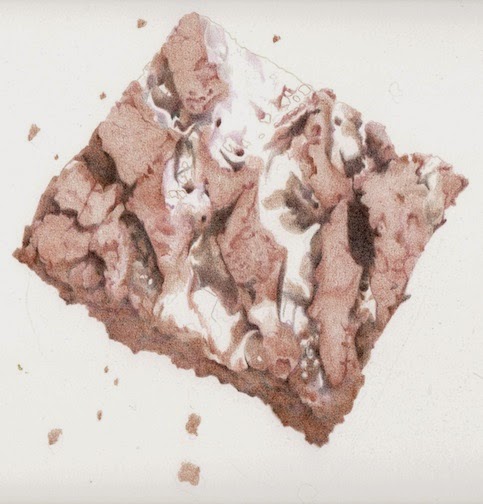
Last week I had to get my car worked on (new brakes!), so I put together a little tin of treats to give the guys (I know, I'm so nice). My motivation wasn't all selfless though. I kept back one of these luscious brownies for myself, to draw.
This isn't any ordinary brownie. Its a super decadent salted caramel brownie. (I overheard one of the car shop guys say he could feel his arteries clogging after he ate one.) They're big, and luscious, and heavy. And irresistible to someone who likes to draw food!
This is how I start. Actually, this is several 'steps' into the process. I just didn't feel like getting up to scan it, but decided I'd better before I got much farther into it. I start by mapping out the nooks and crannies, then start filling in the shadows first, then the more chocolatey parts. I'm simultaneously working out the color (hue), as well as the values (light and dark). One pass of color might focus more on the value, and the next layer might just fill in some flat color.
The parts that are still white are where the caramel is. Its a completely different color, so I'm getting as much of the chocolate established as I can first, then I'll do the caramel.
I can't wait to eat this thing. The smell is driving me crazy! (in a good way)
It has quite a ways to go, but I'll get there.
Oh, its about 8" x 8", so far all Prismacolors, on Fabriano Artistico paper.
By:
Paula Pertile,
on 1/6/2015
Blog:
Drawing a Fine Line
(
Login to Add to MyJacketFlap)
JacketFlap tags:
new year,
cats,
Christmas,
childrens book illustration,
Upstairs Downstairs,
cat illustration,
Downton Abbey,
Strathmore 500 illustration board,
Arches watercolor paper,
paintings of servants,
Add a tag
Happy New Year!
I'm starting it off by painting a lot of dark little paintings. You may be able to tell what I'm up to here, but I won't spill all the beans yet, and instead will talk about how I'm painting them, and how they're kind of giving me fits.
My plan was to do these with watercolors on illustration board.
So I went into my supply closet, where I knew I had a whole box of boards (Strathmore 500 Series). But when I opened the box, . . . it was empty! Somewhere along the line I'd pulled out the last board; but because the box is a sturdy, very boxy box, I didn't even notice there was nothing left in it except for some liner boards (and whatever they built the box with to make it sturdy enough to ship fancy illustration board across the country without it getting damaged).
And so onto Plan B. I wanted to get these started, and didn't want to wait for new board to arrive, so I dug out some Arches watercolor paper. Which is really beautiful paper. But its very bumpy. And kind of rough. And I'm trying to get used to painting on it.
The piece above has several layers of different blacks, but still isn't quite what I wanted the finished 'look' to be.
With this next one, I did a bit less, and somewhere along the way figured out I will still need to add some colored pencil to get the final look I want.
So then I started doing just a base layer of color, without worrying so much about modeling the form or any details, which let me relax a little and enjoy just putting some paint down. The 'splotchy' look is driving me crazy though. I wet an area, then apply the paint (see, I do know how to do this properly), but am still getting uneven-ness. It wouldn't kill me to use a larger brush, which would probably fix the problem. But like I said, I now know I'm going to go over it with pencil, so that will even it all out.
I can see I need to fix the buttons on this one, because they're not lined up right. (How did that happen?)
The paper warps, which drives me insane. I am too lazy to stretch it, and don't want to tape it down either (these are really small little pieces.) I learned all that stuff in art school, and remember running whole sheets of paper under the tap in the bathtub, then taping them down to a board to dry overnight. !!!!! I just don't have the patience for that anymore (but do have the patience to fiddle endlessly with a 00 brush or needle sharp pencil point - so go figure).
Anyways, that's what I'm up to. And I'm not complaining, really! I'm just sharing. I'm actually having fun, and am looking forward to getting these finished.
I hope the new year is starting off well for you. So far so good here. I confess I was happy to get back in the swing of things after the holidays. Its all fun, and emotionally uplifting, but also exhausting. There comes a point when you just can't eat one more cookie or fat-laden thing, and anything red and green and sparkly makes you twitch, and you know you're done. Amirite?
I did have one bit of drama for Christmas, involving a kitty. I'll copy it here as I recounted in on Facebook, if you're interested (and haven't already read it). It has a happy ending, and won't even make you cry or anything, so its an easy read. And with that I'll say good night, and go back to my little black paintings. Good night!
~ ~ ~ ~ ~ ~
* * Christmas Miracle * *
On Christmas EveEve, Tracy kitty got himself stuck in a Barnes & Noble plastic bag, with the handle around his body. He freaked out because he couldn't get away from the crackling bag noise, and although hysterically funny to watch at first (just because it was only a stupid plastic bag), it quickly turned serious as he dashed madly around the house, knocking stuff over, then out the cat door. I heard him and the crackling bag whoosh past the front window and off down the street, poor thing, madly trying to run away from the bag.
So I put on shoes, got the flashlight, and even though I was trying to hurry, felt like the slowest moving beast on the planet - he was long gone, down the street who knows how far and to who knows where? I went to the end of the block, but how did I know which way he turned? He could be blocks away already. I trudged home, simultaneously thinking "Oh, he'll be alright", and "I'll never see that cat again".
A long evening, then sleepless night passed, with me imagining every awful thing that could happen to a cat with a plastic bag attached to himself, and listening for any sound of him coming in the cat door, and getting up more than once to check to see if he'd snuck in. All his beds were empty, and in the morning there was still dry food in the bowl, (its usually totally empty), so I knew he hadn't been back and gone out again.
A long Christmas Eve day of Christmas prep and worrying - no Tracy. Then out to dinner, trying to keep a brave face and smile, and be entertaining to my Mom who was spending the night, doing Christmassy things and just saying "Oh, he's outside somewhere" when she asked about him.
Did I mention I was praying to everyone and anything who might be able to help? Jesus, guardian angels, cats on the Other Side . . . .
Mom turned on "Its a Wonderful Life", and I sat in the kitchen, listening to George and Mary and Mr. Potter in the other room, feeling completely miserable.
And then. Twenty four hours after this story began, in the shadows near the cat door, the next room over, I see a little body. At first I thought it was one of my other cats, but then realized they were all accounted for somewhere else in the house. "Tracy?" . . . He'd popped back outside . . . "TRACY?!" again, and he popped back in, and ran right to the 'treat station' (here, next to the computer) and was perfectly fine! Not a scratch on him! Hungry, but not starving, just his regular self, pretty much. Joy! Relief! There was lots of thanking god, jesus, all the others who'd helped bring him back! In the living room, George Bailey was just starting his journey with Clarence, and so I watched and appreciated George's joy at getting his life back, and it really felt like Christmas.
Tracy slept tucked in next to me, right by the pillow, all night, which he's never done before. Santa brought him a new cat nip cigar, and he's been enjoying that and some Christmas sun all morning.
It does feel like a wonderful life today. And I will never let the cats play with plastic bags again. Especially ones from B&N.
Merry Christmas everyone!!

Its still 10 days away, but the next week will go by in a whoosh! of activities, so I thought I'd post now and have that one small thing crossed off my 'to do' list. (That didn't sound very festive, did it?)
Oh, I'll get festive. Sometimes it takes me a while. Its like before you've had coffee in the morning, and are not at all awake, then all of sudden you come to life and can function. That's how I am with Christmas. I kind of start the season all draggy, then at some point it kicks in and I'm good.
I finished my Christmas art! This is "Kitty's Christmas Tree". Its my first foray back into watercolors after a pretty long hiatus, and I had a blast. Of course I had to add some colored pencil to it too, for detailing. I could have done more, but decided to leave well enough alone.
And no, I did not count how many pine needles there are. If you are some sort of savant (like Rainman) you may do it for me if you like.
In addition to all the usual busy Christmas things to do, I'm getting a new fence put up in the back yard. They were supposed to start it today, but it was raining too much. (Wait, did I just say "raining TOO MUCH"?) Yeah. Drought for how many years, and now we've had storm after storm. Crazy. So hopefully tomorrow it won't be too bad and they can get going on it.
Tonight I'm putting up the tree, and am anxious to see how my newest kitty, Tracy, will behave with it. He's so young, and a real climber - I have a feeling it won't last long in the vertical position! Fingers crossed.
I hope all of you have a peaceful, healthy, joyous, warm, cozy, happy, (what have I forgotten?) Christmas or Winter Solstice or whatever else you may celebrate!
Its been a while since I've done any real painting with watercolors. I've been busy being a colored pencil artist for a while now, with some detours into digital, but have been wanting to go back to watercolors, so here I am.
This piece is my Christmas card, a little behind schedule, but on its way now. I'm working on illustration board (Strathmore 500 series) which is my all time favorite surface to work on. I get cranky with watercolor paper because I can't stand when it warps when wet (even if its stretched and taped down), and illustration board doesn't do that. The only drawback is that you can't transfer art onto it with a light box (its too thick to be 'see-through'), so its back to old-school transferring methods - tracing the drawing down over a graphite transfer sheet.
Here is my glamorous set-up. That's a fancy ceramic yogurt cup for the paint water, held steady by a roll of packing tape. Hey, it works. My drawing table is at a slant, so I have to keep stuff from rolling down. The parallel ruler on the bottom keeps most things from rolling off altogether.
I use a combination of Winsor Newton, Holbein, Daniel Smith, and Turner watercolors. I'm not really a purist - whichever brand has the color I need is what I use. I tend to stay away from the really grainy ones if I can help it, unless I'm doing something with special effects. I like a more even kind of pigment. Sometimes I use gouache (opaque watercolor) too if I need to. Here I've squeezed out some Winsor Newton Hooker's Green, Permanent Sap Green, and Green Gold. So far all I've use on this piece is the Permanent Sap, in various strengths.
And here we have some Christmas tree needles. There will be a lot more of them by the time I'm finished. A LOT.
We're due for an apocalyptic storm tomorrow and the next day. 60-70 mph wind gusts, and 3-4" of rain. This, after years of drought. I think last December it rained one day for about 10 minutes, and the rest of the time we had sun sun sun. The year before, too. Now, we're getting the opposite, and its too much! They're warning the power will go out, trees will fall over and all sorts of awful things will happen, so I thought I'd better blog something in case I'm offline for a while. Let's hope its not as bad as they say!
By:
Paula Pertile,
on 11/19/2014
Blog:
Drawing a Fine Line
(
Login to Add to MyJacketFlap)
JacketFlap tags:
Christmas cards,
Katherine Tyrrell,
house portrait,
Polychromo pencils,
cat nip treats,
Cretacolor Soho Urban Artist pencils,
Drawing 365,
Sketching 365,
SKOR bar,
Add a tag
I've been kinda busy I guess, finishing up some projects and trying not to panic about the holidays. Let's get started with the 'catch up', shall we?
The finished SKOR bar. This is with its new owner and is being framed as we speak. (And I'm so glad I bought a few extra of these for reference, which are still in the cupboard, because I just read an article about how there's a chocolate shortage looming on the horizon - !!!!)
I did this with . . . trying to remember . . . Prismacolors and Polychromos I think, on Stonehenge paper. I know that sounds bad that I can't remember, but when you have as many brands of pencils as I do, and they get cleaned up and put away after each project, its easy to forget.) This is 5" x 10".
~ ~ ~ ~ ~
Then I did this house and people portrait for a nice family who wanted to remember their vacation together in France. This one required some photoshopping to get the people from different photos all looking out the correct windows in this photo before I could start the drawing.
On this one I used Prismacolors and Cretacolor Soho Urban Artist pencils. The Sohos are pretty hard, and had the exact right shade of blue grey I needed for those shutters. I also used a lot of their Lamp Black for shadows, which is really a grey. I don't always mix brands of pencils, but do when I need a certain color, or need something soft or harder to do a specific task.
The original of this was 11" x 15". And it was going to Buffalo, NY, which had 5' of snow today!!! I feel like I should have wrapped it in a blanket or something.
~ ~ ~ ~ ~
I'm really honored to be included in Katherine Tyrrell's new book,
Sketching 365 (or if you're in the US, its called
Drawing 365). She has a
Facebook page dedicated to it.
I can't remember now which pieces of mine she asked for, and I don't have a copy yet to check. But I'm in there, somewhere, along with a whole bunch of other super talented drawers. Thanks Katherine!!
~ ~ ~ ~ ~
And then . . . dun, dun, DUNNNNNN . . .
CHRISTMAS
(insert those Psycho screeching violin noises here)
Every year I say "I'm not making cards! I hate making cards! I'm not making them!" and then I do.
Some of these are newish, some are oldies but goodies, image-wise. I found these fun blank cards with ornamental embossed edges, which I thought were perfect for festive cards. They all have fancy deckle edged envelopes. And they're all in
the shop.
I have a couple other pieces I want to make into cards, but we'll see. One is square, so I ordered square envelopes, and when they arrived yesterday I realized I ordered the wrong size! (note to self: never order stuff before the coffee has fully kicked in) I should probably just work on my new card for this year, and some other projects that are pending.
Its raining here, which is great for our drought. But of course the kitties are all out of whack because they can't go outside as much (translation: they're all climbing the walls in here). They have catnip and snacks and 500 places to perch and sleep, so they're OK. Which reminds me - I need to order their new catnip cigars for Christmas (shhh, don't tell them). Seriously, if you want a really amazing cat nip toy, go here and get these -
Hot Cat Treats.
Stay warm!!
So, this is some of what I've been up to.
This drawing was a commissioned piece for a realtor. The house is stunning (inside, too). And will you just look at all those bricks. When I started this I didn't know I was going to be so fiddly with them, and do them individually like this. Usually I develop a kind of shorthand to indicate bricks or whatever, but once I started, I knew I had to draw them all to do it justice. (Yes, I'm a little nuts.) So, long (long long long) story short, I glued myself to the drawing table and drew them all, and this is how it turned out.
This is 9" x 12", Polychromo and Prismacolor colored pencils on Strathmore bristol.
And now I'm doing more chocolate. Another commission piece. This is how they begin. I like to 'map it all out', then go back and do the detailing.
That's it for now. No time to chit chat. Back to the drawing board!
University Art, who sponsored the UArt Open 2014, sent me an email with the list of winners. I think they'll be putting these up on the website at some point, but for now, this is all we have to look at. The images are small, which is what they sent, so this is the best I can do, sorry. The show is up at their Redwood City store now through November 8th if you'd like to see these in person. I've put links to some websites, for the people I could find easily online.
BEST OF SHOW
1st Place: Vincent Lu, "Kung Pao Chicken" oil
2nd Place:
Lynette Cook, "Connecting the Dots in My Life" acrylic
3rd Place : !!! ME ME ME ME !!! "Molasses Cookie" colored pencil
CATEGORIES
OIL & ACRYLIC
2nd Place:
Laura Snable, "Dirty Dog Blues" oil & oil pastels
3rd Place: Andrew Morrison, "Timeless Tenderloin" acrylic
WATERCOLOR
1st Place:
Nancy Near, "James M: Soul Man" watercolor
DRAWING / PASTEL
1st Place:
Arena Shaun, "Elegance-Life Drawing of Annie" charcoal
2nd Place: Samantha Holland, "Pele" drawing
3rd Place: Craig Sanborn, "Layers and Segments" graphite
MIXED MEDIA
2nd Place: Davida Feder, "Woman Behind" mixed media
3rd Place: Noreen Rubay, "Trust" mixed media
EMERGING ARTIST
1st Place: Elaine Lu, "The E-generation" oil
2nd Place: Annie Zhang, "Keturah" acrylic
3rd Place: Katrina Hernes, "Paint Chip Portrait" mixed media
This is one little humble pimento olive - the kind you put in your cocktails. I haven't eaten many of these, not being much of a martini drinker, and was surprised to find I actually like them!
But that's not the whole story here. Look closely at the bottom edge of this drawing. See all those little red marks? They're BLOOD. I had a small cut on my hand that I didn't even know about, and accidentally rubbed the edge of the drawing. Eww. And then, hours later, I did it again, with a different scrape on the other hand. I know! I couldn't believe it either.
Luckily, they were all along the bottom edge, so I was able to just trim them off. People on Facebook seemed to think it added value to the art, but I'm not so sure. I think its just icky.
So here's how it looks all cleaned up (blood, and also the background) for prints.
I can't seem to look at any food now without seeing it in this 'top, side, and section view' way. I find myself analyzing things in the grocery store for their drawing potential, trying to visualize them cut open, and lined up like this. I've bought a few things that didn't turn out to be very good subjects, but luckily since its all food it just gets worked into dinner or a snack.
Oh, this was done with Prismacolors on Bristol, and is 4" x 9".
This is Seth. He is a cycling enthusiast. He especially loves taking long rides in the Fall, when the air is crisp, and he can wear his tweed trousers and favorite sweater. After a good ride he always stops in the pub for a pint of milk and a good chat with his mates.
View Next 25 Posts