 Ain’t he just the sweetest thing? Author/illustrator Aaron Zenz recently wrote just the loveliest ode to his four top favorite children’s literary blogs, and then went and created original art for each. In my case he created this little Fuse guy (or possibly Fuse gal) based on the bright yellow Fuse you see at the beginnings of each of my posts (I put it there in lieu of my face because I can only look at myself so often before going stark raving mad). This, I should point out, is not the first time a little Fuse person has been created for this blog. Katherine Tillotson, an artist of outstanding ability (I’m biased but it also happens to be true) created not one but TWO little Fusemen in the past, both for separate birthdays.


I’m a fan. So thank you Aaron and, once again, thank you Katherine. Fusemen of the world unite!
- *sniff sniff* Smell that? That’s the distinctive odor of a brouhaha brewing. Sort of a combination of burnt hair, dead goldfish and patchouli. And you wonder why I don’t cover YA books. Sheesh! One word: drama. Seems that a YA blog called Story Siren plagiarized the work of others for her own blog posts. Folks noticed and suddenly the internet was was heaping helpful of flames, burns, accusations, and other forms of tomfoolery. For a sane and rational recap we turn to our own Liz Burns who gives us the run down in Today’s Blog Blow Up. Ugly stuff.
- And while we’re on the subject of YA (which I just said I don’t cover, and yet here we are), I thought we were done with whitewashing, folks. So what’s up with this? Harlequin Teen, you got some explaining to do.
- In other news, book banning: It’s what’s for dinner. Take a trip with me to The Annville-Cleona School District where a picture book fondly nicknamed by some as Where’s the Penis? is getting some heat. If you’ve ever seen The Dirty Cowboy by Amy Timberlake, illustrated by Adam Rex, then you know that calling it “pornographic” works only if you are unaware of what the word “pornography” actually means. I would like to offer a shout-out to librarian Anita Mentzer who has handled the whole situation with class and dignity. You, madam, are the kind of children’s librarian others should aspire to be. Well done. And thanks to Erica Sevetson for the link.
- We may not yet have an ALA accredited poetry award for a work of children’s literature but that doesn’t mean we can’t have a Poet Laureate or two instead. Rich Michelson, gallery owner and
 What Animals Really Like
By Fiona Robinson
Abrams Books for Young Readers
$15.95
ISBN: 978-0-8109-8976-4
Ages 4-8
On shelves now.
I’m sitting in a room with other children’s librarians. Together, we are attempting to determine what the best children’s books of a given year are. It’s late in the publishing season and we haven’t a lot of time left when one of us walks in with Fiona Robinson’s What Animals Really Like. None of us are familiar with Ms. Robinson’s work (though we’ve heard nice things about The 3-2-3 Detective Agency) so our expectations are pretty low. The librarian who has the book, though, informs us in no uncertain terms that this is one of the best of the year. She then proceeds to read it aloud. Ladies and gentlemen, there are few finer pleasures that being read a picture book that works. I don’t care if you’re 5 or 55 or 555. Everyone likes storytime and many people like learning about great new picture books through readalouds. By the time the librarian was done it was unanimous. We were in love with What Animals Really Like and ready to join Fiona Robinson’s fan club, should someone ever feel the urge to start one. And trust me, after this book gains a bit of a following, folks are going to be lining up around the block to start organizations in honor of its author/illustrator. You want a surefire storytime gem? Baby, I got your back.
Maestro Herbert Timberteeth has written a brand new song going by the name of “What Animals Really Like”. For this one time performance he has assembled a chorus of some twelve different groups of animals. At the start, all goes according to plan. The lions reluctantly sing, “We are lions, and we like to prowl.” Next a tepid, “We are wolves, and we like to howl.” “We are pigeons, and we like to coo.” Finally, “We are cows, and we like to . . . dig.” There stand the cows holding various digging accoutrements and looking very pleased. Herbert, suffice to say, is not amused. He’s even less amused when the warthogs suddenly declare mid-song that they like to blow enormous bubbles. As the book continues, more and more animals start to sing what they really like to do, rather than what society expects them to. And though it causes him some serious stress, Herbert eventually lets everyone sing what it is that they really like, even though it doesn’t rhyme or, sometimes, make a lot of sense.
I’m a sucker for any book that upsets expectations. Kids are so used to picture books that allow them to guess the rhyme that when they encounter a book that turns that idea on its head they’re initially flummoxed, and then soon delighted. Not many picture books have the guts to do this. The best known, to my mind, is Mac Barnett’s Guess Again!, which takes the idea to its logical extreme. What’s nice about Robinson’s book is that while it’s not as downright goofy as Barnett’s, the upset expectations serve the story. In a way, all readers are automatically placed in the shoes of Herbert Timberteeth. We may not iden


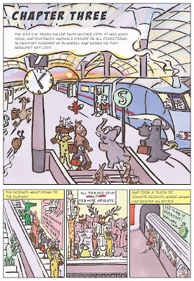
in The Disappearance of Dave WarthogBy Fiona RobinsonOne of my favorite books on the Fall 2009 Amulet list is 3-2-3. I have talked about evolution
Michael Buckley's NERDS in dept and will soon be posting about
Lauren Myracles Luv Ya Bunches but right now its time to take a look at the evolution of the 3-2-3 cover design.
First a little bit about the book
Fast-paced, full-color, and divided into short, easy-to-read chapters, this is a wonderful graphic novel for younger readers, offering a seamless transition between picture books and novels.
On the 3:23 Express to Whiska City, five unlikely friends meet and decide to form a detective agency. There is Jenny the wise donkey, Roger the gourmet dung beetle, Priscilla the theatrical penguin, Slingshot the hyperactive sloth, and Bluebell, the shy but brave rat. With little training but a lot of pluck, they set up shop in Whiska City and soon tackle their first mystery: a rash of disappearances linked to a pink poodle’s beauty salon.A funny, clever detective story for young graphic novel fans!. 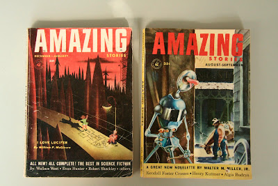
On one of Fiona's many enjoyable visits to our offices she dropped off these 2 pulp comics, AMAZING STORIES. Which I took some direct and indirect influence from. The trick was to introduce the characters in a pulp comic setting while remaining true to the Fiona's voice.
Here are three of our first attempts.


We all loved the humor an wit of Fiona's characters along the spine but how to make the type work was still and issue.

In all three of the above the title type was a problem. No matter what we tried the design forced us to put the copy in a box which just didn't seem to work. Also, it became repetitive to show all five characters along the spine and in the main image. There were to many parts, to many things going on. Below is an attempt at simplifying the above ideas.

This direction seem to click at the time. We liked it enough to present it and the other ideas at our weekly cover meeting for discussion. The conversation in the meeting turned to a confusion over why the monkey was hypnotized and whether this was the image that was best for the book. We also talked about what was more important, introducing the characters or telling the audience that this is a pulp mystery graphic novel. At the moment we were displaying all these ideas yet nothing was working 100%. So we were sent back to the drawing board.
Almost a month went by before I was able to take another go at rethinking the design Luckily we were ahead on this book so I had time to waste. But more importantly time to step back and take another look from a far.
Knowing what we needed to be on the cover helped going forward.
1. Introduce the characters
2. Pulp comic design influence
3. Simple design/Iconic Image
4. Communicating that the book is a mystery.
5. Setting up a design for a possible series if needed.
On a rainy Thursday afternoon Fiona and I sat down in my dark office and I sketched this up while listening to Fiona's ideas.
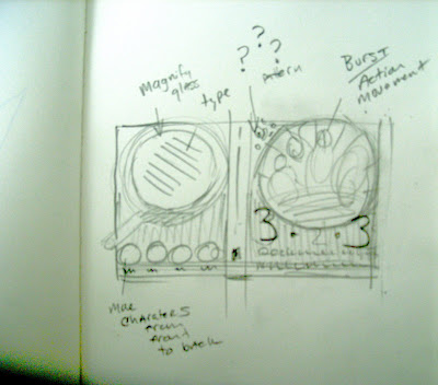
We wanted to somehow keep the circle character drawings from the first cover comps. Can any one say BACK COVER?!

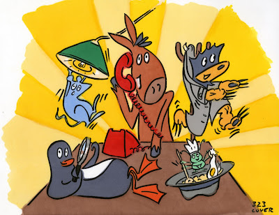
Fiona's Final cover art
Back cover hand drawn text
Paperback text
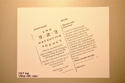
Back cover hand drawn text
Hardcover text

Back cover text plus illustration
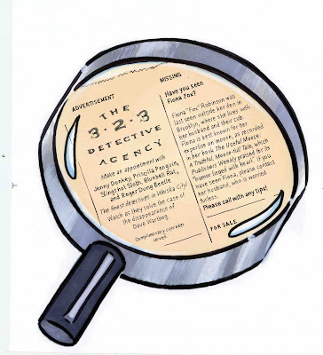
A needed graphic element hinting at a mystery and an important plot point.

Final cover design.

Final Paperback design

Final Hardcover with Flaps design

FIONA ROBINSON
About the author
Fiona Robinson is the author-illustrator of The Useful Moose: A Truthful, Moose-full Tale. Publishers Weekly praised her “flair for humor tinged with heart.” Her work has been honored by the Royal Academy of Arts and been featured in many gallery shows. She lives with her family in Brooklyn, New York.Available in two editions:
Paperback, and hardcover with jacket
SPECIFICATIONS FOR BOTH BOOKS:
80 pages, full color, 6 3⁄4 x 9 3⁄8"
PAPERBACK ISBN: 978-0-8109-7094-6
HARDCOVER ISBN: 978-0-8109-8489-9
US $9.95 CAN $12.95 PB
US $17.95 CAN $23.50 HC
 Ain’t he just the sweetest thing? Author/illustrator Aaron Zenz recently wrote just the loveliest ode to his four top favorite children’s literary blogs, and then went and created original art for each. In my case he created this little Fuse guy (or possibly Fuse gal) based on the bright yellow Fuse you see at the beginnings of each of my posts (I put it there in lieu of my face because I can only look at myself so often before going stark raving mad). This, I should point out, is not the first time a little Fuse person has been created for this blog. Katherine Tillotson, an artist of outstanding ability (I’m biased but it also happens to be true) created not one but TWO little Fusemen in the past, both for separate birthdays.


hey, I Just found your blog through a post on Victoria Jamieson's blog. Really enjoyed reading about the process of this cover and your bulletin board feature. Great blog! I'll have to keep checking back.