Viewing: Blog Posts Tagged with: Who put the B in the Ballyhoo?, Most Recent at Top [Help]
Results 1 - 2 of 2
How to use this Page
You are viewing the most recent posts tagged with the words: Who put the B in the Ballyhoo? in the JacketFlap blog reader. What is a tag? Think of a tag as a keyword or category label. Tags can both help you find posts on JacketFlap.com as well as provide an easy way for you to "remember" and classify posts for later recall. Try adding a tag yourself by clicking "Add a tag" below a post's header. Scroll down through the list of Recent Posts in the left column and click on a post title that sounds interesting. You can view all posts from a specific blog by clicking the Blog name in the right column, or you can click a 'More Posts from this Blog' link in any individual post.
Last weekend was the New Atlantic Independent Booksellers Association’s annual conference, so Vinnie and I spent the weekend (our 12th wedding anniversary!) in Baltimore.
As with any independent bookseller meeting, the morale boost is the best part of it all for me. I leave there with lots of hope and great ideas of how to improve my store, and I just hope now I’ll be able to find the time to implement them all. As always, please feel free to pass on your suggestions of things you would like to see here at WORD.
It was our first visit to Baltimore and even though we didn’t have time to see much of the city, we had a delicious dinner at a tapas restaurant called Pazo and really enjoyed visiting some local bookstores. One store that made us green with envy was Atomic Books, be sure to check it out if you get to Baltimore one day. They specialize in graphic books and comics, but have a great selection of lit mags and toys and just expanded to a second store around the corner called Atomic Pop. They are way cool and so is their website, and we hope one day we will be able to sell our stock online as they do. So much time, so little to do….
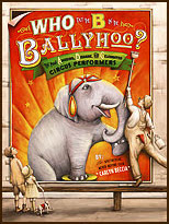 5 book signings, 3 library visits and 8 school visits….in 3 weeks! I have not even had a chance to announce the release of my first book, Who put the B in the Ballyhoo? It’s been said that your first book is like a having a baby, so as a proud parent I couldn’t resist taking a much needed breath to talk about the aspects of the book that I am most proud of.
People have asked me many times how I researched the book. The short answer is that I poured over hundreds of circus posters, placards and broadsides to match the language and style of vintage circus posters. Then, I dug deeper to uncover the history behind these unbelievably talented circus stars. For those that love circus lore you will be familiar with many of the phrases in the book such as “Starling and Stupendous”, “Combined Shows” “New acts that Amaze and Delight” and my personal favorite, “Important Engagement” (It sounds deliciously Victorian!)
But after reading the book to over a 1000 kids this month, I am also proud of the sidebars that give a glimpse of circus life without giving so much detail that the reader’s attention span is lost. Each sidebar has about 3- 4 lines of fascinating factoids about some of the circus’s most celebrated stars. When I first took on this book, I was not convinced it was necessary. I thought kids couldn’t possible care about how much weight Louis Cyr could lift. Luckily, my always wise editor convinced me that it would add another layer to the book. I now find kids are actually far more interested in these factoids than even the art.
But sometimes the things that we are most proud of are not the ones that your critics and readers embrace. They are the private passions that only the artist or author could possibly care about. For me, that passion is the typography and design elements that give each page its own character. I have been a designer for over 10 year now and typography is in my blood. My grandfather set the type for his hardware store. I still have his Speedball books that show the careful way that he traced every letterform and still smell of his favorite tobacco. I know kids, adults and certainly book critics could care less whether I used a decorative art nouveau font or the bolder, 19th century slab type that reflected a nation facing industrialization and the rise of the emerging advertising genre. (yawn) And no, I never point out to kids how some pages have type with bracketed serifs that later evolved to letterforms of contrasting weight popular at the turn of the 20th century. I can just picture their eyes glazing over. People whom have seen the book always comment on how different each page looks.
I never met my grandfather, but I know he would have been proud.


.jpg?picon=679)


How very cool.
I've ordered a copy for myself but I know I'll be fighting over it with my kids.
=o)
Roz
I totally read you on the type!! I am a designer too (not that I need to be, to be a type geek, but) you're speaking my language!!I can't wait to see your fabulous book. Could not find in bookstore - asked them to order it...but if you have some at NESCBWI NH Conference I would love to buy one there from you - a signed copy!! :) :)
Kathy
Congrats on your first book. Can't wait to pick up your book and go back to the circus.