I picked up a copy of Fritz Leiber's Conjure Wife on Amazon. Yes, I went for the dead tree edition for six bucks rather than a $7.69 e-copy. I'm still that guy. If the price was $3.99 or less on Kindle, maybe... but that's beside the point.
I'm a good twenty pages in, and it's a fine book, but the cover troubles me:
This woman is
not Tansy. Not in my imagination. Not from a book published in 1943, no matter how dark the fantasy. The hair, her dress, the gothed-out eyes... Not to mention the words at the bottom of the cover: "The Classic of Urban Fantasy". What?
Urban Fantasy wasn't even a phrase one used in 1943. Was it?
This is
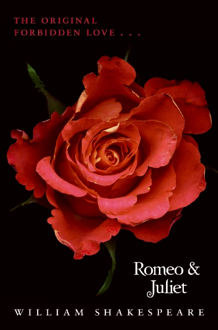
marketing, sure, disguising a classic horror novel in trappings of the now to sucker new readers. Not unlike slapping a
Twilighty cover on
Romeo and Juliet,
Wuthering Heights, and
Pride and Prejudice:
Oh yes they did.
Does the cover effect my reading of the book? The jury is still out, but if I'm thinking about the cover instead of the content, I'd have to say all signs are pointing to YES. What about you?
Fred, the envelope please...
Mary Rajotte is the winner of my 50/50 split of In the Memory House profits for November, thus continuing a fine tradition of Canadians winning my contests. Congrats, Mary. I'll be in touch to share the bounty.
Which might (or might not, who knows?) have been a bigger bounty had I started with this:
Instead of In the Memory House. Sometimes I need a little more market research. I tend to be too much of a gut guy. You see,
In the Memory House is also the title of Howard Mansfield's book of essays about New England culture and history.
Yeah. Not my book at all. Mine features a living house which tries to make friends by killing people. Think of it as a house with Asperger's on steroids.
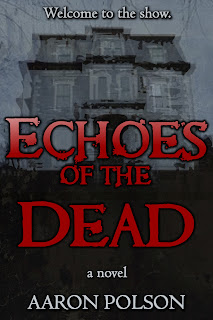
So maybe
Echoes of the Dead has a little more zip. The word "Dead" lands hard, at least. It does deliver the message directly, and I've found that is a key piece of marketing any book. And yes, the paperback is still coming.
And then I've nixed
Smoke and replaced it with
Vengeful Spirits. Again, I think the new title lands harder and sends a little more of a direct message about the book's content. I've also tweaked the cover with new font and image:
This poor puppy has been through a number of changes, originally starting as
Borrowed Saints. Like I said, I'm a gut guy. My heart and mind need to arm wrestle before the next book skitters into the wild.
Congrats again, Mary. And good luck, my dear books. I will try to do you better in the future.


.jpeg?picon=3626)


See, if you'd got the ebook you wouldn't have been thinking about the cover...
(although I still sometimes buy paper books too like you)
For me the cover of a book plays an important factor - it's like setting the overall tone of the reading to come; then I go to the title.
I've seen many a great image ruined by shite fonts, and vice versa. Get the combination right and the thing just comes to life.
Don't worry, Aaron. I'm still "that guy" too. I always will be.
About the cover, yeah, it'd bug me. But that's because I'm overtly sensitiveness to marketing, consumerism, and conformity of all types.
I guess we should just be thankful they didn't put her in a mid-riff and slap a small-of-the-back tribal tattoo on her.
A quick google image search indicates that none of the various covers this book has had over the years have been particularly kind to Tansy.
I'll always prefer the movie poster:
http://ironbombs.files.wordpress.com/2011/10/1962_burn_witch_burn_poster_01.jpg?w=604