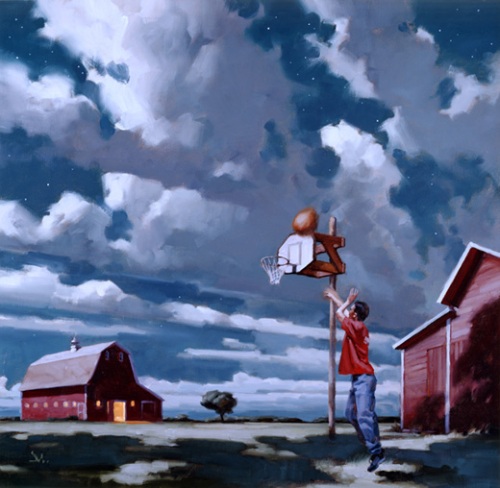
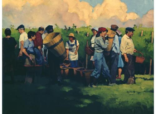
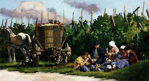
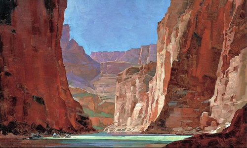
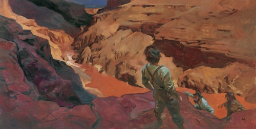
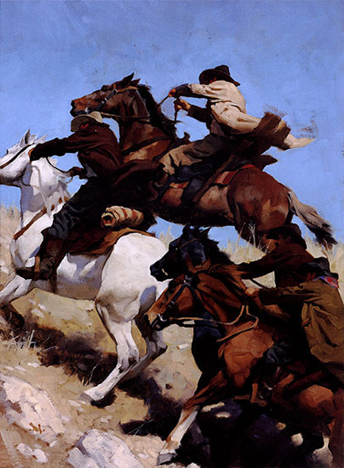
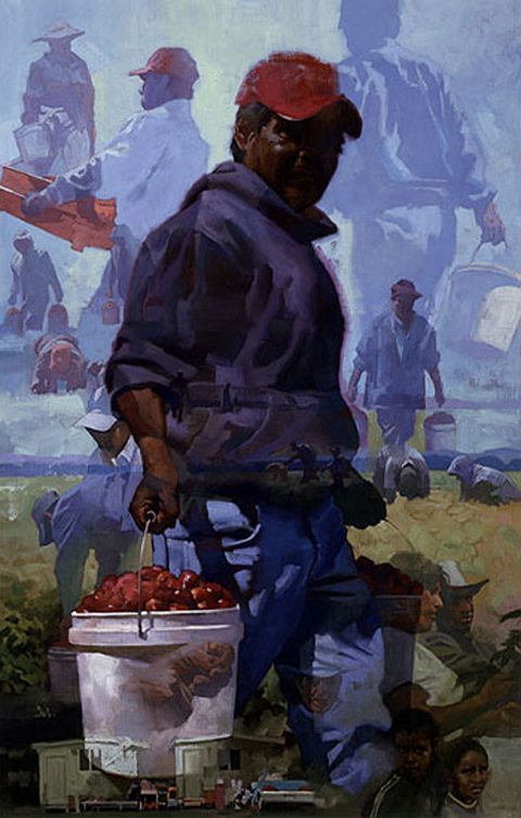
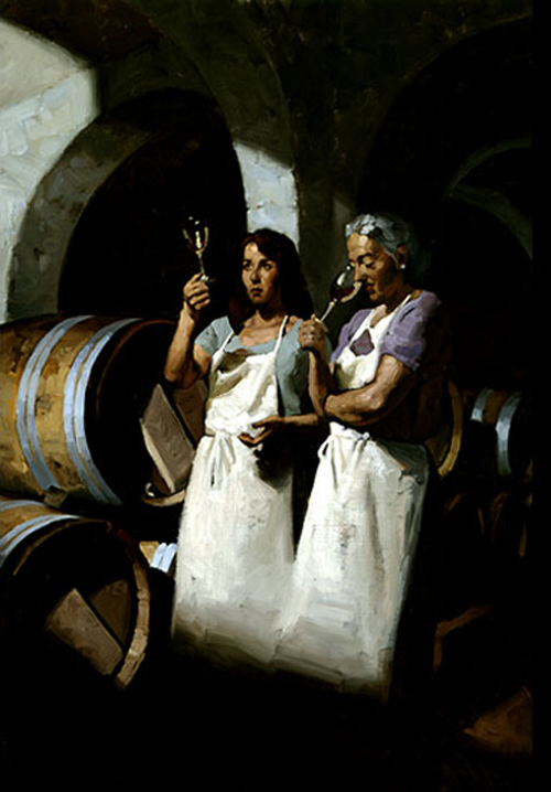
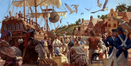
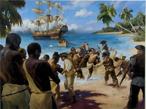
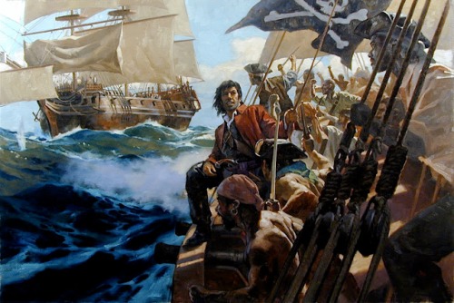
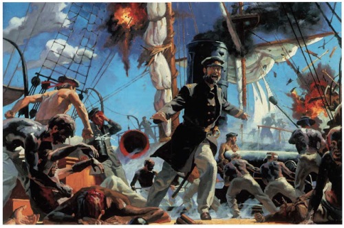
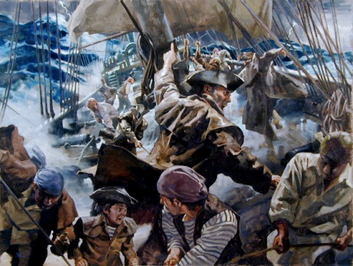
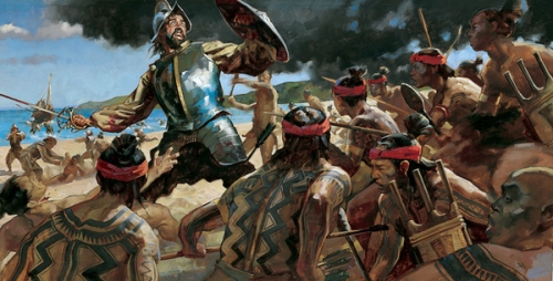
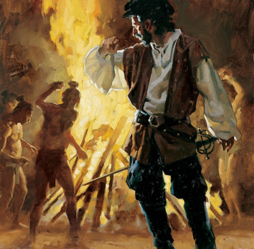
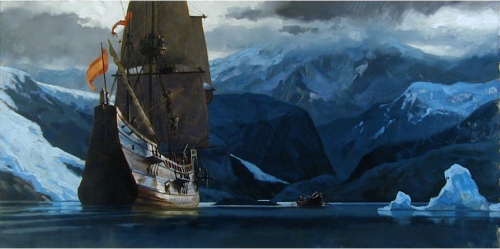
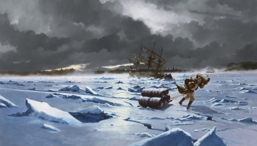
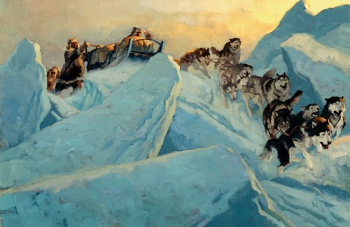
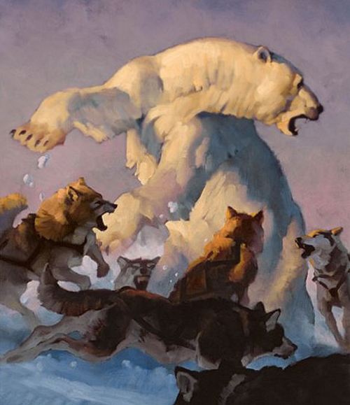
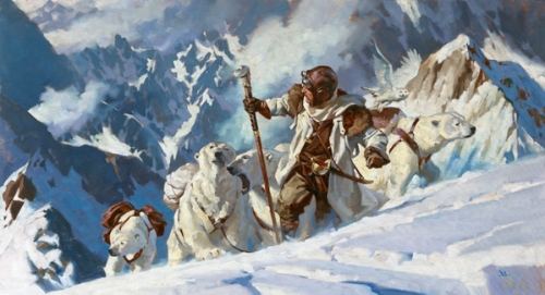
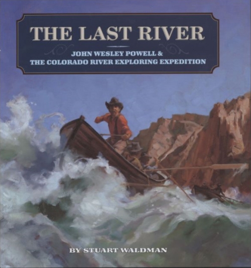
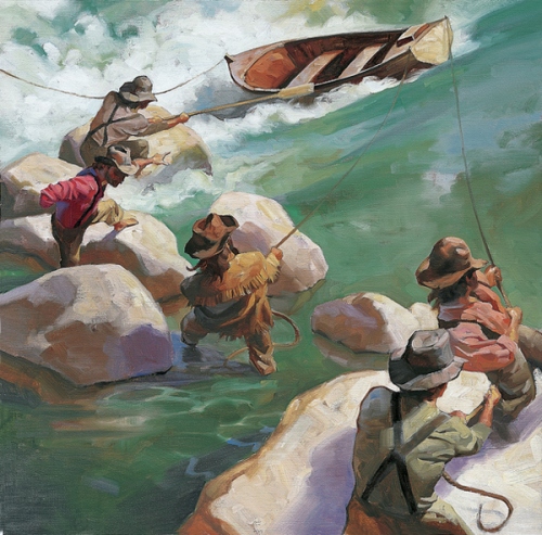
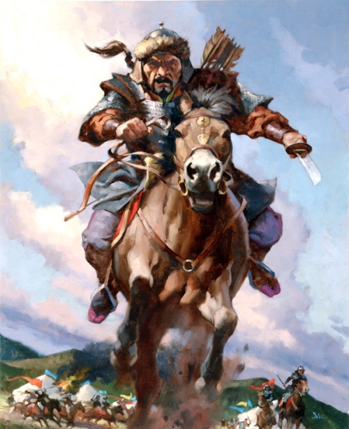
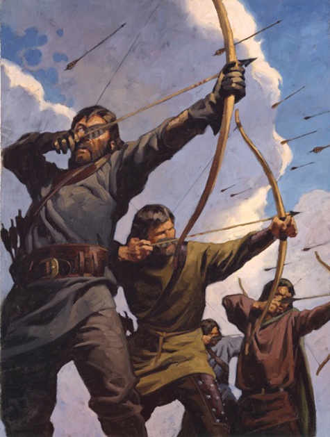
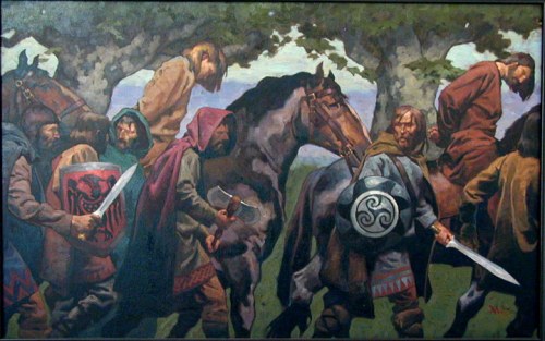
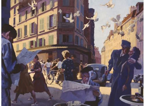
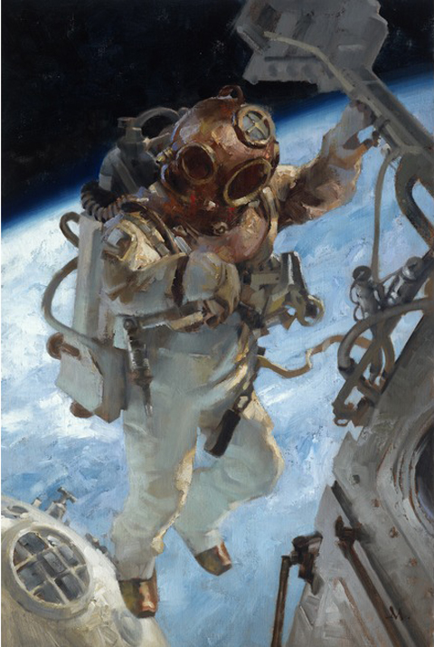
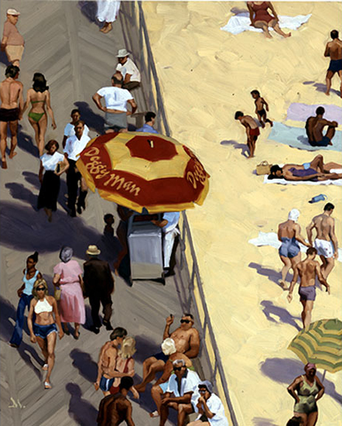
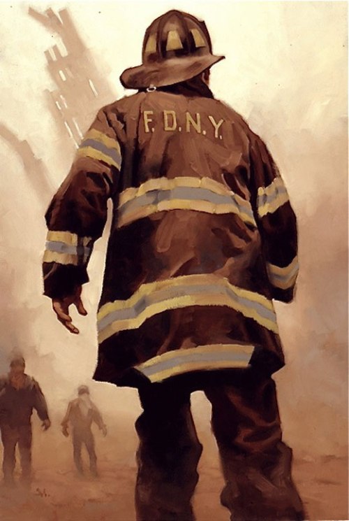
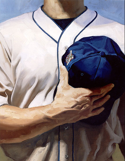
I have been trying to share Gregory Manchess’s art for most of this year. He is a very talented artist, but a very busy artist. He exhibits all over the world, teaches workshops, lectures at universities, plus everyone is trying to bang down his door for a little piece of his genius talent. I gave up on getting the answers to my too many interview questions and showing him off without the interview. But there is a lot of meat to this post with a lot of tips for illustrators, so take a look and don’t miss the link to his two hour “How to” video.

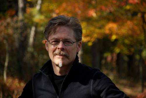
Creating a moment that communicates emotionally with the viewer is the essence of Gregory Manchess’ artwork. A native of Kentucky, he spent two years as a studio illustrator with Hellman Design Associates before striking out on his own in 1979.
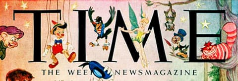
He combined his love for fine art and science fiction and began his freelance career painting for OMNI magazine. His versatility and broad range of interests allowed him to crossover to mainstream illustration. There he was able to expand his client work to include covers for Time, Atlantic Monthly, spreads for Playboy, Omni, Newsweek, and Smithsonian, and numerous book covers.
Manchess’ interest in history and his excellent figure work has made his paintings a favorite choice of the National Geographic Society on many occasions, including an expedition down the Fond du Lac river in Canada for the 1996 article David Thomson: The Man Who Measured Canada.
Widely awarded within the industry, Manchess exhibits frequently at the Society of Illustrators in New York. His peers at the Society presented him with their highest honor, the coveted Hamilton King Award in 1999, and a year later, the Stephan Dohanos Award.
Manchess’ work has also been recognized in the children’s book market. His latest children’s book illustrations narrate the story Cheyenne Medicine Hat about wild mustangs. A lavishly illustrated limited edition of Robt. E. Howard CONAN stories with over 60 paintings, is due out in 2010. He has recently finished 10 murals for a traveling exhibition on the Pirate ship, Whydah, for the Nat’l Geographic Society. His painting of the Oregon coast was used for the 2009 Oregon Statehood Stamp by the USPS.
Gregory is included in Walt Reed’s latest edition of “The Illustrator in America, 1860-2000.” He lectures frequently at universities and colleges nationwide and gives workshops in painting at the Norman Rockwell Museum in Stockbridge, MA, and the Illustration Master Class in Amherst, MA.
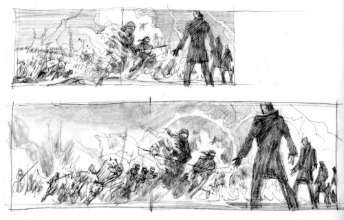
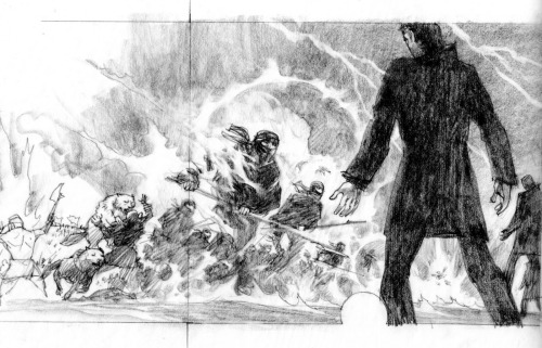
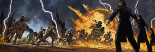
Here are a few pictures showing Gregory’s process:

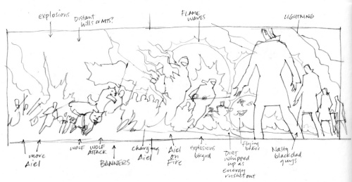
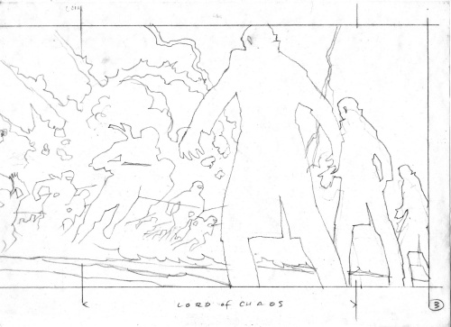
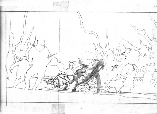
Thumbnail sketch for layout.

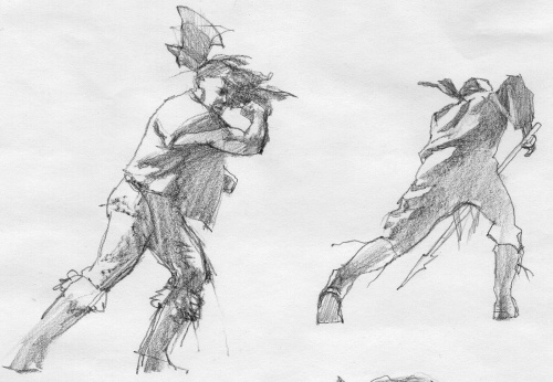
Character sketches

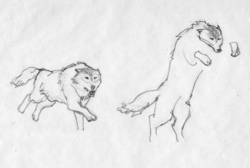
Sketches for the wolves

Cleaned up sketch

Sketching in more detail.

Adding Shadows

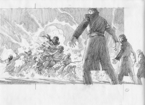
Adding foreground characters

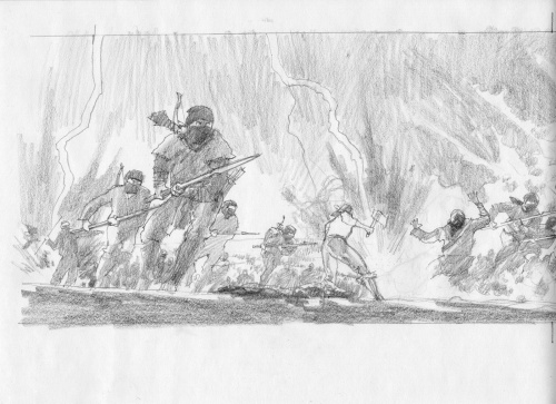
Continuing to develop sketch.

Final Sketch

Final Painting done in oil.

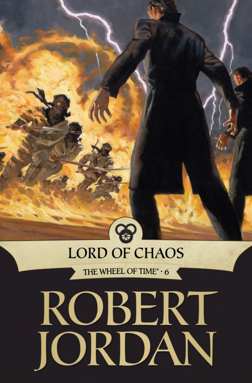
This is the final cover for LORD OF CHAOS published by Tor.

Gregory’s artist rep is Richard Solomon located in NYC. http://www.richardsolomon.com/

You can view a two hour video of Gregory’s painting process available as a download from http://Conceptart.org

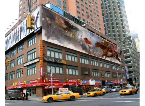
One of Gregory’s many murals. Must have been fun to see it on the top of a NYC building.

ABOVE and BELOW: Gregory’s illustrations have been in National Geographic Magazine.


Gregory also was chosen to do a few postal stamps.

The Society of Illustrators exhibited 50 of Gregory’s illustrations in 2013.


ELEVEN GREGORY TIPS:
Value range.
I start with darks first, to get the deep shadows laid in. Obvious places: nostrils, eyelids and eyebrows, mouth line. Next, I’ll put in broader, but slightly lighter shadow shapes like under the nose, under the eye sockets, under the bottom lip, chin, deep cheek bones, hair. I place the boldest shapes to establish deeper values, then work my way up through the darker values of color to the lighter values placed on top.


Avoid highlights.
Until the last bits of painting, I avoid the highlights as long as I can. Two reasons. One, I need to work my way up, so putting them in too soon will defeat that effort. Two, I leave something fun for the last. I delay gratification as long as I can. The best part of painting in oils occurs within the last few layers and strokes.


Vary forms.
Hair is a bold shape, not individual hairs. I study folds and constantly vary them. Repeating the same folds will kill a painting as dead as an assassin’s shot through a pillow. I don’t think about the object I’m painting. I separate myself from the subject and only paint the form. I won’t ‘follow’ the form either. I cut my strokes across the surface of the forms. This adds dimension and lets objects feel sculptured.


New painters: Avoid primary colors.
Ultramarine Blue. It’s deadly. It’ll make mud faster than 35 school kids running for the bus. And no, Cadmium Yellow Light is not a miracle color. Get over it. Using it straight from the tube does not show how brilliant one is at mixing paint. Same is true for Ultramarine. New painters seem to think they are phenomenal because they used Ultramarine Blue straight from the dang tube. They step back and declare, ‘look at me, The Genius. I have explained the essence of pure painting by opening a paint tube and using yellow next to blue. Admire me.’
Using primary colors as a statement of painting brilliance screams ‘AMATEUR.’


Amount of pigment.
I trained to know just how much pigment is on the end of my brush. No matter how large or small, my awareness of the amount is paramount to good layers, good coverage, good overall effect in any painting.
I studied calligraphy. It taught me how to make letterforms with a brush or pen. Knowing the amount of ink held on an instrument for calligraphy is critical to achieve a skilled work.


Brush angle.
Calligraphy also taught me how to angle a pen or brush. Making letterforms is a key factor in learning to paint. I know many great painters who also started by copying letter shapes, making signs, copying comics (bang! zoom! pow!). They learned to handle the brush and at what angle AT ALL TIMES.
The angle of the brush helps lay down the right amount of pigment, at the right angle, in the right direction, with the right pressure to achieve a free and confident stroke.


Brush size.
I start with the largest brush for as long as I can and work my way down to the smaller brushes. Many times, as I near the end of a painting, or even slightly before, I switch back and forth. It’s a good, general idea to keep things from getting too focused too early.


Stroke speed.
Painting fast and loose comes the same way as anything else: with time. I painted very slowly in the beginning, placing my strokes deliberately, to look as if they were painted fast. Once down, it’s usually hard to tell the speed the stroke was laid. Over the years, I built up speed through confidence. It’s just plain ol’ experience. And LOADS of training.


Patient strokes.
I don’t judge my strokes too quickly. I lay it down, and press on. I come back to that area after a bit to judge whether it was the correct feeling, size, color, etc. I don’t lay one down, hate it, and take it off. Or worse, try to keep changing it.
At this point in my career, I lay strokes down that don’t make sense, but I let them sit. I find that they are just fine once I come back to judge them in context, against other strokes that are adding to the whole piece. Judging too early destroys spontaneity.


Scale.
I decide how I want the paint to feel once a piece is finished. I scale the brush size to fit the scale of the painting. If it’s a small painting in a magazine, I have to decide how clearly the strokes will be seen and what feeling they project to a reader.
If it’s a large painting and I want it to feel loose, I have to decide on the size that feels best. Paint it too large with small brushes, and when it comes down in reproduction, it can look too detailed. Too small with large brushes, and the piece can look too loose, too unfocused.
New painters can make the mistake of painting too small with too large of a brush and vice versa.


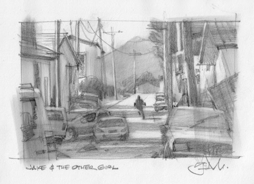
Below is Gregory explaining his thought processes for Jake and the Other Girl.

There’s another way to make successful thumbnails that can lead to a final sketch.
Get right to the research first. Instead of exploring small thumbnails on the page, searching for the right image design, there are times where I know that the assignment demands a clearer knowledge of the setting before an idea takes hold.
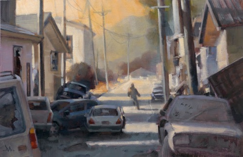
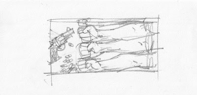
I read this short story for Tor.com, a follow-up for a previous story, “Dress Your Marines in White,” by Emmy Laybourne. I toyed with a short-lived idea that might connect with my illustration for the first story, based on a set of men’s arms.

But I had a clearer idea that I needed to know & show the environment for the piece. The mood needed to be established instantly. The story is post-apocalyptic. I quickly rejected that early approach after researching, at length, war-torn cities, destroyed cities, hurricane, tornado, and earthquake damaged city streets. There is only a brief scene where the main character is outdoors, but it gives the tale a sense of place and I wanted the reader to feel that.
I gathered abandoned cars, some parked, some wrecked, some neglected. I used the status of the cars to reflect the status of the story. I researched shots of broken buildings, street scenes, and abandoned towns. I put all of these images up on my computer and freehanded a large scale thumbnail as the main sketch.
With that much information, I only needed to hit it one time. Most times, you have to create your own luck.

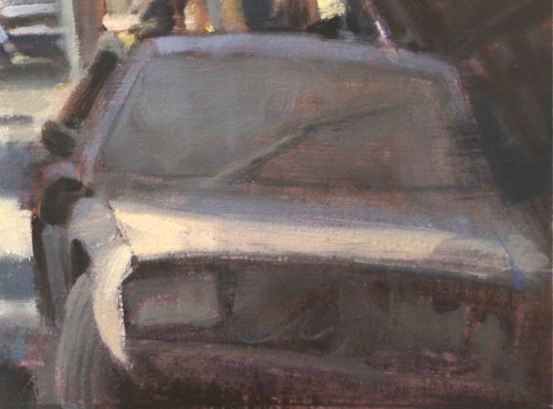
But the challenge after getting the idea was to pull it off. It must read fast and it must feel factual. Rendering cars is not so fun, but discovering and simplifying their shapes to read quickly was very gratifying. But I had to show more than just shiny cars parked. I wanted some to feel like they had just been abandoned, while others had been there for some time.Again, getting the value correct meant the difference here. Capturing that feeling meant I had to forget what it felt like, and pay more attention to exactly what it looked like. By doing that, I managed to capture the feeling of a dust covered car.
Not so intuitive. I had to study and mix the difference in value range to get shiny vs dusty. I wasn’t surprised to find out how much I learned from this painting about simplifying detail.

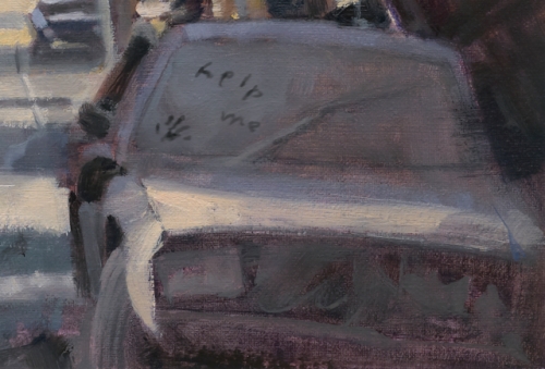
As painters, we must sometimes compartmentalize our feelings to actually capture those same feelings in the image. We start with the impression of feeling, reverse-engineer it methodically through observation and application that then re-communicates the feeling we were after originally. Using contrast was another way of projecting that feeling. I decided to have someone leave a cryptic message on the windshield, like a “wash me” note. The difference between the soft values of the dusty windshield and the crisp, hand drawn letters brought this across. To get that affect, I had to pay attention to exactly what value would be revealed if someone had haphazardly wiped away some dirt.

I could’ve added that passage after the oil was dry, but instead, I painted it digitally. This allowed me to give the art director, Irene Gallo, the choice to keep it or not.
This is yet another way in which digital is informing my analog painting development.
Click this link to read Gregory’s Ten Things About Painting in Oils: http://muddycolors.blogspot.com/2013/03/10-things-about-painting-in-oils.html
You can find Gregory Manchess on his website http://www.manchess.com and his facebook page: https://www.facebook.com/pages/Gregory-Manchess-Art/180916225410035
I would love to hear what you think about Gregory’s illustrations. Maybe you have taken a class with him or got to see his illustrations when he exhibited in NYC or for that matter in one of the many places he has exhibited around the world.
Talk tomorrow,
Kathy
Filed under:
Advice,
How to,
illustrating,
Illustrator Sites,
Illustrator's Saturday Tagged:
Gregory Manchess,
Illustrated USPS Stamps,
NYC MURAL,
Smithsonian,
Time Magazine 

We’re back with a new collection of our favorite stories from across all of WordPress.
Hannah Richell
Hannah Richell’s husband Matt was killed in a surfing accident in July. In a recent post, Richell writes about finding comfort in reading words written by people who have also experienced the shock of losing a loved one — people like Joan Didion, C.S. Lewis, and Cheryl Strayed.
Sarah Smarsh, Aeon
An essay about growing up poor in America, and the role of teeth as a class signifier.
Lynn Cunningham, The Walrus
Lynn Cunningham smoked cigarettes for fifty years before making a decision to quit and get help by visiting the Mayo Clinic’s Nicotine Dependence Center in Minnesota.
Adrian Chen, Wired
Adrian Chen travels to the Philippines, where he meets the employees who work for content moderation companies that scrub objectionable content from social media sites.
Ed Odeven Reporting
An interview with Baltimore-based author and sportswriter John Eisenberg.
Elisabeth Donnelly, Flavorwire
The beautiful thing about Texts From Jane Eyre, based on Ortberg’s original column for The Hairpin, is that it offers exactly what it says on the cover: the Western canon is parodied and spoofed through the silly modern invention of texting. Ortberg’s comedy is shot through with love and deep literary knowledge, highlighting the silly and outrageous subtext bubbling under classics from Lord Byron to Nancy Drew. It’s hilarious, wickedly smart work that also serves as a fantastic reading list.
Kate Pickert, Time Magazine
Inside the quasi-legal science-free world of medical marijuana for kids.
Anna Vodicka, Shenandoah
An essay about modesty that recalls the author’s girlhood in a conservative community and challenges the mixed messages of women as both “Eve” and “Jezebel.”
Jennifer J. Roberts, Boston Magazine
Memories of being a Southie kid and black in a mostly white neighborhood in Boston.
Eli Saslow, Washington Post
Pulitzer Prize-winning reporter Eli Saslow profiles Javier Flores, an undocumented immigrant who was hoping that an executive action by President Obama would prevent him from being deported to Mexico and forced to leave his wife and U.S.-born children behind in Ohio. Flores is now in La Mixtequita, Mexico, with few options to reunite with his family.
As always, you can find our past collections here. You can follow Longreads on WordPress.com for more daily reading recommendations, or subscribe to our free weekly email.
Publishers, writers: You can share links to your favorite essays and interviews (over 1,500 words) on Twitter (#longreads) and on WordPress.com by tagging your posts longreads.
Filed under:
Community,
Reading,
WordPress,
WordPress.com 

We are talking today with the author of Story Eight: God’s Counterpoints of the One series. Crystal Linn writes both fiction and non-fiction, as well as being an award-winning poet. In her story she shares an emotional journey of her husband’s ordeal with Adenoid Cystic Carcinoma, a rare form of cancer.
MM: To start things off Crystal, what inspired you to share this story?
CL: There were so many people involved and so many miracles preformed that it was incredible.
MM: It was a harrowing journey, but I was touched how all those people came together right when you needed them most. I imagine they support you in your writing as well. How long have you been writing?
CL: I’ve written all of my life and in the year 2000 decided to get serious about it.
MM: I get your meaning. It takes a lot of discipline. You and I both know that writing is not always serious. We have to find outlets for our creativity. What is one of your writing habits that helps you deal with the work?
CL: I color-code my writing projects. Yellow is the color for my fiction projects, blue is for non-fiction, pink is for my children’s projects, purple is for my journal/memoir-type projects and my poetry projects are multi-colored.
MM: That sounds fun. Your writing space must be a rainbow even on dreary days! Speaking of your w
| | Title: Time for Kids Big Book of How Author: Editors of Time for Kids Publisher: Time ISBN: 978-1603201841 |
From Amazon:
| TIME For Kids The Big Book of How presents kids 8-12 years old with answers to the kinds of intriguing questions that appeal to their sense of curiosity. Colorful graphics, spectacular photos and clear, engaging diagrams will help answer such questions as: How does a chameleon change colors?; How can a person survive in the jungle?; How do you build a teepee?; How do diamonds form?; How do light sticks work?; How are 3-D movies made?; How do astronauts train for a space mission?; How do we get cavities?; How does solar energy work? Divided by subject area-from animals, the human body and technology to sports, food and green issues-kids will discover the background behind the questions through the book’s photos, diagrams and art as well as its clear text. Of course, TIME For Kids goes beyond just answering the question, and engages kids with hands-on activities at the end of each chapter that bring life to a topic or idea they just read about. For example: If in the technology chapter kids learn how an airplane flies, the "How to" spread might include step-by-step instructions about how to fold a paper airplane or create a rotating helicopter. TIME For Kids The Big Book of How is a must-have book to satisfy the most curious of kids. |
Review:
I don’t usually read many non-fiction books, but this one had me a little intrigued. The cover blurbs of “How do elephants communicate?” and “How to keep your computer safe from viruses?” certainly grabbed my attention. I was interested to see how the book was put together, and how the information was presented to the intended audience of younger readers. And, hey, even I enjoy learning new things.
I love the way the book is set up. It’s divided into chapters, and each explains a topic of interest. My favorite is the first chapter, Animals. The chapters are further divided into 2-page spreads that explore smaller sub-topics, like “How do Animals See at Night” and “How Does a Spider Spin its Web.” To re-enforce each concept, the pages are packed with vivid, full-color photographs and illustrations. There are even activities at the end of every chapter, so young readers engage, hands-on, with the topics of discussion. Who doesn’t need to learn how to make a compass? Or how to make ice cream? You can even learn how to mark your territory at the end of the Animal chapter, and tell me, who doesn’t want to do that??
By keeping the explanations concise and meaningful, it’s hard to become bored while flipping through the book. The narrative is easy to understand, and the visuals make for a memorable read. Though the book is stuffed with information, it doesn’t overwhelm, and it never feels like a chore to read through the subject matter. This would be the perfect book to have on hand for those rainy summer days when your kids are stuck inside and need something to fight a bout of boredom. It will even keep finicky adults occupied with the broad range of topics included in this fun book.
Grade: A-
Review copy provided by publisher

Richard Corliss has compiled a list for Time Magazine of “25 All-Time Best Animated Features”. I’ve posted his choices below.
1. Pinocchio (1940)
2. WALL-E (2008)
3. The Bugs Bunny/Road Runner Movie (1979)
4. Dumbo (1941)
5. Spirited Away (2001)
6. South Park: Bigger, Longer & Uncut (1999)
7. Up (2009)
8. The Triplets of Belleville (2003)
9. Finding Nemo (2003)
10. The Little Mermaid (1989)
11. Toy Story 3 (2010)
12. Toy Story (1995)
13. Snow White and the Seven Dwarfs (1937)
14. The Adventures of Prince Achmed (1926)
15. Wallace & Gromit in the Curse of the Were-Rabbit (2005)
16. Happy Feet (2006)
17. Akira (1988)
18. The Lion King (1994)
19. Tangled (2010)
20. Paprika (2007)
21. Kung Fu Panda (2008)
22. Dr. Seuss’ Horton Hears a Who! (2008)
23. Yellow Submarine (1968)
24. Fantastic Mr. Fox (2009)
25. Lady and the Tramp (1955)
With all due respect, Mr. Corliss, this list is flawed. Very flawed. Where’s Bambi, The Incredibles, Toy Story 2, The Iron Giant, or Ice Age? What about Fritz the Cat or Heavy Traffic? Allegro Non Troppo and My Neighbor Totoro? Perhaps Nightmare Before Christmas or Mr. Bug Goes To Town?
And c’mon, even I can’t put The Bugs Bunny Road Runner Movie on such a list, much less at #3. It was essentially a compilation from classic shorts. Horton Hears A Who? You’ve got to be kidding.
Check out the original post on Time’s website. Each of his choices includes a brief write-up and an embed of the trailer. What else do you think Corliss forgot? Perhaps we’ll compile the Cartoon Brew Top 25 Animated Features as a rebuttal.
Cartoon Brew: Leading the Animation Conversation |
Permalink |
No comment |
Post tags: Richard Corliss, Time Magazine

Photo by Saverio Truglia for TIME
During the lazy, hazy days of summer, between the pool, video games and everything in the middle, children risk losing a significant portion of what they learned during the previous school year. While some children have access to resources to curb their summer reading loss, many, unfortunately do not. Without activities to keep these children’s minds sharp, they risk falling behind in school and beyond.
In Time Magazine’s “The Case Against Summer Vacation,” author David Von Drehle argues that students should have access to a school’s resources all year long so that children who cannot attend summer camps or educational field trips retain their knowledge. If the school year were extended over the summer months all students would have equal access to resources, preventing summer brain drain for all children, regardless of income.
First Book’s mission addresses one of the most important factors of literacy-access to books. By giving books to less privileged children First Book hopes to lessen the learning gap between low-income children and their higher income counterparts. If you know of a community which could benefit from First Book resources, please visit our website at www.firstbook.org to get them registered, or consider donating to First Book. Every $2 helps bring a new book to a child who needs it most!


By: Rebecca,
on 5/17/2010
Blog:
OUPblog
(
Login to Add to MyJacketFlap)
JacketFlap tags:
Edna Foa,
Most Influential,
treatments,
edna,
prolonged,
traumatic,
Health,
Science,
Time Magazine,
A-Featured,
Medical Mondays,
Media,
Psychology,
therapy,
exposure,
PTSD,
clinicians,
Add a tag
Edna Foa is a Professor of Clinical Psychology in Psychiatry at the University of Pennsylvania and Director of the Center for the Treatment and Study of Anxiety. Her most recent book, Prolonged Exposure Therapy for PTSD: Emotional Processing of Traumatic Experiences, was written with Elizabeth Hembree and Barbara Olaslov Rothbaum. The guide gives clinicians the information they need to treat clients who exhibit the symptoms of PTSD. Recently Foa was name by Time Magazine as one of the most influential people in 2010. Below she reacts to the honor.
My first reaction was that of disbelief when I learned that I had been selected for Time Magazine’s list of the 100 most influential people in 2010. I thought someone was pulling my leg. I called my husband and shared the news with him, he thought I was pulling his leg. My youngest daughter said: “get out of here, you must be joking”. But of course, we all know that the email was genuine. First, I was stunned. After all, I am not a rock star, not a head of state, not even a famous athlete. And then I was delighted. Isn’t it wonderful that someone at Time recognized the importance of the work we, clinical psychology researchers, do to help PTSD sufferers. I felt quite honored to represent our field.
As clinical scientists we know that we have a lot of powerful treatments. But we also are painfully aware of how difficult it is to make these treatments widely available. The treatments that we have for anxiety disorders are particularly efficacious and yet most clinicians do not deliver them. For many reasons it is hard to get mental health clinicians to adopt new treatments. As a result, countless individuals with anxiety and other disorders experience needless suffering that could be decreased or terminated via the application of the effective treatments we developed.
The cost of bad treatment reaches beyond individuals. Institutions and society as a whole suffer from what is a public health issue. For example, the VA, the military and insurance companies all have a stake in individuals receiving the most effective treatments for psychological disorders. And yet, there have been very few effective initiatives requiring practitioners to learn and deliver the best psychological treatments.
And so I hope that Time Magazine’s recognition of my work is in essence recognition of the tremendous importance of not only developing effective, evidence-based treatment, but more importantly, disseminating them among mental health professionals. The wars in Iraq and Afghanistan have brought home the awareness of how important it is to deliver effective treatments to the many soldiers who return from these wars with posttraumatic stress disorder (PTSD). I strongly believe that PTSD is not only a mental health disorder; it is also a societal problem. It is the responsibility of our society to help PTSD sufferers as a result of being injured at work, raped in our schools, physically assaulted in our streets, or experiencing the horror of war. We know that effective treatments for PTSD such as Prolonged Exposure (PE) can help patients regain their lives in as few as 10 sessions over the course of 5 weeks. It is no long
posted by Neil

I'm home.
When I left, it was winter. I've come home to the kind of Spring that means that Summer is just rumbling around like someone shuffling his feet waiting to be invited into a room: temperatures in the 70s, everything green and warm and welcoming.
The best news is that all four hives of bees survived the winter. I wasn't sure that they would -- was pretty certain that the red hive (which swarmed last year) would be empty (it wasn't), but all the lessons from the previous year had been learned, and luck was with us. (
Sharon Stiteler wrote about the bees here, while I was on the road.)
My dog and my daughter were both very happy to see me home again. One of them has started driver's ed. and has a driving permit.
(I didn't put up the picture of me and Neil Jordan far above London on Tuesday. Here it is...)
There were many amazing things waiting for me when I got home. I haven't even finished opening the mail from when I was away -- there are two large tubs sitting in the kitchen, not to mention random boxes, envelopes and just things. Things I have discovered in the mail so far include:
A proof copy of
STORIES, edited by Al Sarrantonio and me. The US edition looks like this:

(I am so very proud of this book, from Tom Gauld's wonderful cover on. Contributors are, in story order, Roddy Doyle, Joyce Carol Oates, Joanne Harris, Neil Gaiman, Michael Marshall Smith, Joe R. Lansdale, Walter Mosley, Richard Adams, Jodi Picoult, Michael Swanwick, Peter Straub, Lawrence Block, Jeffrey Ford, Chuck Palahniuk, Diana Wynne Jones, Stewart O'Nan, Gene Wolfe, Carolyn Parkhurst, Kat Howard, Jonathan Carroll, Jeffrey Deaver, Tim Powers, Al Sarrantonio, Kurt Andersen, Michael Moorcock, Elizabeth Hand, and Joe Hill. And the stories are remarkable.)
An advance copy of
Instructions, my poem illustrated by Charles Vess.

Interview conducted by Yuko Shimizu.
1) You had studied fine art and graphic design at Pratt Institute and Hunter College. What made you decide to go into the field of illustration and how did you start?
I majored in painting at Pratt Institute and Hunter College. I learned most of my graphic design skills at a job I had at the Pratt school newspaper for three years. When I left Pratt, I approached galleries as well as magazines and newspapers. I got a much warmer reception from the editorial art directors I met with. The response was also much more immediate and I began to do work for them right away. Gallery relationships take a long time to develop and I can be a bit impatient about that. I just wanted to get to work. Once I had a few images printed in The New York Times I was hooked with the idea of illustration and the number of people that were being reached. I really got a kick out of seeing my work in print. Galleries are fairly cloistered and don’t reach as many people. It was also great to feel that I could make a living from my work, I didn’t get the same feeling from my experience with galleries at that time. I decided to focus on illustration work and see if that led to interest from galleries. Some gallery shows have come over time so the thinking has worked out to some extent.

2) I always think of you as like Superman. You became one of the busiest illustrators, and yet you have kept your job as AD at TIME for 13 years until last year. I just wonder how did you manage to do this? Now you are a full time illustrator, how does the extra time off from the office work helping you develop your work and/or projects? Also, how does your experience as an AD help you as an illustrator?
I was an art director at TIME magazine from 1994-2008, all while having a busy illustration career. Both were wonderful opportunities and it was hard to choose one over the other, so I did both until I started to burn out. My wife helped out enormously over the years by taking care of our home and daughter while I worked, I think it helped to have a great partner. I did most of my illustration work at night or on weekends. I worked on sketches on my commute and even wrote and illustrated much of my first children’s book on the way to work. I come from a family of very hard working peasants and farmers, so I don’t think office work or drawing is hard labor. I laugh at it sometimes. There really isn’t much physical exertion when you think of it, one mostly needs to deal with the stress of deadlines or lack of sleep. But it’s nothing compared to what my parents or grandparents have done, so this keeps it all in perspective.
Being a full time illustrator is great. I now have time to develop projects that I didn’t have time for before. I used to be running from one deadline to the next, but now I have time to do some personal work and write and develop children’s books, illustrated novels, and so on. All of this takes time and free “mind space”, which I have a bit more of now.
I learned a lot about illustration by being an art director at TIME magazine, especially in the beginning. It was great to work with the best artists and see how they solved problems every week.

3) When I look at a body of your work, they are very consistent, yet each one is very different at the same time. Some look like they are drawings, some prints, some painting, some pastel… Can you explain to us about the process and medium you work in? If you change medium according to each image, how does the subject matter affect your choice of medium?
I get information about a project or assignment and try to figure out what is the best way to communicate what it is about. I develop a lot of these ideas in my sketches—should I be subtle or blunt, direct or coy? These words translate into graphic marks, so I might have some work that is very linear, soft and subtle, and other work that is bolder, graphic, with thicker lines and blocks or shapes. When I first started, I wanted to be able to do different things within illustration. Fortunately, the people I work for understand where I come from and hire me to do that. They call me for my ideas and not necessarily a specific style.
I do work in a number of media as you mentioned—paint, printmaking, pastel, drawing and digital. What I do is combine these mediums in my own way. I may do a part in paint and then lay a monoprint on top, or do a pastel and overprint oil ink through stencils that I cut out. Sometimes I scan the original art and separate the lines and colors and create a separate and new digital piece, which becomes the final art that I submit to the client. I’ve always mixed media in my paintings and I do the same with illustration. It’s very intuitive and I’ve found unique ways of working as I experiment. It sounds complicated but makes perfect sense to me!


4) Your family immigrated from Cuba when you were 9. Do you think your childhood in two completely different cultures affected your work as an artist? If so how?
Yes, I think it has. I grew up around Communist revolutionary images and posters, images of tanks, guns, Ché, etc. There were two channels on t.v. in Cuba in the 70s and a lot of the time they showed military parades and revolutionary, nationalist, anti-American propaganda. When I was a kid I drew a lot of tanks, missiles, and portraits of revolutionary heros. I then arrived in America when I was 9 years old. I was immediately taken with all of the new imagery I saw around me—Coke and Pepsi logos, advertising billboards on highways, graphics and illustrations on food packaging, characters on cereal boxes, etc. I was always interested in visuals and these two cultures, communist and capitalist, clashed when I was a child. I think the combinations of the two cultures still show up in my work to this day.

5) You had worked on children’s books before, and your first children’s book series as an author, Sergio series, just came out. The images feel new to us who are used to your work. Are they intentionally targeted toward a lot younger audience? I was wondering if your experience as relatively new father of two young daughters inspired you to come up with the series. Can you please explain a bit about it?
I got involved in children’s books about 10 years ago, before I had kids. I did three books that were stories about historical figures. Several years ago I wanted to illustrate something more fun for a younger audience and started writing and developing the story which became my first Sergio book. We then had our first child and I wrote the second book, and it was a lot of fun to show her what I was doing while I worked. The biggest highlight of my career so far came one day when I heard our four year old daughter reading my book aloud to herself as she sat in a corner of my studio.
Writing and illustrating children’s books was a new challenge for me. I’m always looking to experiment in new areas and develop as an illustrator. I know what I can do and after a while things get too comfortable. I’m more interested in trying to figure out things I haven’t done before, I like to surprise myself. Regarding the look of the Sergio book, the first thing that came was the idea, and the look and feel of the book followed after that. Form follows function, I suppose. I like to follow through on ideas and see where they lead and don’t get caught up in the trappings of ‘style’ and what I’m expected to do. One of the things I don’t like about both art and illustration is the lack of freedom to explore. Visual arts are supposed to be about experimenting and trying new things but many times artists get caught up in doing similar work their entire lives because they feel the marketplace requires it. I got into art to experiment and discover and I plan on continuing on that path. Half the fun is not knowing what’s next.

6) What’s on the horizon? New exciting work or personal projects?
I’m really excited about doing an illustrated memoir about my family’s life in Cuba and America. There are a lot of good stories there. I want to develop something different from a standard graphic novel approach, maybe essays with full page drawings, some panels, photographs, and documents. I’ve written some of it and a lot of it is in my head. I’m just looking forward to figuring it out and showing it to publishers. I have some ideas for limited edition packaging and so on, we’ll see how it goes.
I also have a number of preliminary story ideas and sketches for a few children’s books, which I’m developing with one of my publishers. I’ve recently started a book for Simon and Schuster that I have to finish by August. A very tight deadline for a children’s book but they want it out by the Fall.
I keep working on my own drawings and paintings and might have a show coming up next year, trying to figure it out with a gallery right now.
Beyond that, I plan on enjoying the free time I have with my family, it’s the best part of being a freelancer now.

Thank you thank you thank you.
Check out more of Edel’s inspiring work here, here and here.
The quote is from Penn's radio show. You can also get it free from iTunes (here's the URL).
Over at Time Magazine they have a round up of the top ten comics/graphic novels of the year. All good choices, although I was surprised by the appearance on the list of some fine reprints (Kings in Disguise, for example.). Still, it was nice for me to see Absolute Sandman on there, mostly because when I wrote it, in 1987-1989, it would have been unthinkable for Time Magazine, or any real-world magazine, to have devoted any space at all to graphic novels or comics on a Best of the Year list. http://www.time.com/time/topten/2006/comics/10.html
Locus's Recommended list for 2006 is up at http://www.locusmag.com/2007/2006RecommendedReading.html
NEIL: JUST READ YOUR NEW MAILING ADDRESS - BUT I SEND YOU SOMETHING AT DREAMHAVEN -WILL THAT GET TO YOUOR DID I IS JUST WASTED MONEY SPEND ON MAILING? ALSO, ARE YOU REALLY GOING TO BE SPENDING SO MUCH TIME IN HOLLYWOOD? LUV YA- CLARE
It'll get to me, don't worry. It just tends not to be a very fast thing.
And no, I'm not going to be spending so much time in Hollywood, that's just where Cat and her office is. The joy of the modern world is that things can move around it very easily, and we decided that it's far better if letters and suchlike go to someone who can look at them that day and figure out what's meant to happen next, rather than be put in a box with my name on it under the counter at DreamHaven and wait for the next time I decide I need a haircut and go down to Hair Police and stop in at DreamHaven to sign stuff for them on the way home.
...
Lots of artists and possibly someone who isn't an artist drew Spider-Man covers for a good cause. Details and you can pick out the blogging not-an-artist at:
http://www.comicbookresources.com/news/newsitem.cgi?id=9528
...
In honor of National Gorilla Suit Day, I did an artist trading card and thought you might enjoy it, a bit.Here's the url: http://www.mcmatz.com/2007/01/ebay_auction_at_4.html I will now slowly back towards the exit and fade away...--Madeline
Oh Mark Evanier and Don Martin, what have you wrought?
Dear Mr Gaiman, I've just finished watching the recording of the Cody's Books readings and Q&A session. I'd never heard you read your work before. It's distressing to find out that not only are you a fantastic author but you are also an evocative oral story teller. Surely you're not allowed to be both? On to my question. (I searched and couldn't find anything specifically on this topic but my apologies if I missed it.) As a writer, do you get a similar feeling of closure/reward/enjoyment when you've created the final climax of a story that you hope your readers will experience when reading it or do you always have one eye on the technicalities of writing? Thank you.Regards, Clare Milner
You're too kind.
And the only answer I can give is neither. Because you're not experiencing it at the same speed. There's a relief at getting to the end, but it's also the relief of getting to the end of something you've been working on for, often, several years. Which doesn't mean you're not affected on an emotional level by scenes or by what happens to characters, or that you don't feel what's happening while you write it. But a reader will read something in a few hours that might have taken you a couple of years or more to write. And that big moment of closure may have been followed by another six months of writing.
Neil,In a post a little while ago you mentioned the reading list John Crowley compiled - which looks absolutely fascinating. You said a couple of the books on the list were your favourites in the world. So that would seem to me a good place to start! Which were they though? Sorry if the answer should be apparent from elsewhere on the site but I couldn't find it...Best wishes
Dominic Hartley
They are Extraordinary Popular Delusions and the Madness of Crowds by Charles Mackay, a book I adore; and The Songlines by the brilliant Bruce Chatwin (do not write to me and point out that Songlines is factually dodgy sometimes. It's still an amazing book and Chatwin wrote astoundingly well).
...
Do you realise this blog will be six years old on February the Ninth? I've had some ideas of things that we could put up that would be fun and special to celebrate the birthday, but they may not be ready in time...
...
g'day mr. gaiman. or night. or whatever it is, where you're at.i've been going through your blog for a couple of days now... (...) here are a couple of questions that i sincerely want to know the answers to.with all the fame and joy you've attained from writing, aren't you afraid to lose it all in an instant? i don't want to be morbid and all, but with all the hard work you've put in to your works, are you afraid to die?sorry... i wanted to ask j.r.r. tolkien the same thing but he isn't around... you see, i'm scared of dying and i'm poor... what is it like for you who has all the things you've achieved in life?
I remember being scared of dying when I was on the plane from London to New York in mid 1988 with the first half of Dave McKean's Black Orchid art travelling in the plane cabin with me -- these were the painted originals, and there were no copies as Dave, barely out of art school, couldn't have afforded to get them all shot at that point. I was writing Sandman issue two or three back then.
And I knew that if the plane went down Dave would never have redrawn the Black Orchid pages, and it would never come out, and that even if the first couple of Sandmans came out no-one would have known where it was going or what it was going to be. I crossed the Atlantic sweating, mentally keeping that plane in the air all the way.
Nineteen years later, I'm remarkably sanguine about life and death. I'm really lucky, in that I've achieved an awful lot of the things I wanted to do, and some people noticed. If I died soon (something, I should add here, that I have no intention of doing; I like life and all the things that come with it), I'd leave a body of varied and interesting work and three amazing kids behind, and that's more than I ever set out to do or hoped for.
Does that help?
...
I'd like to ask a small favour of those of you who have read down this far. Would anyone reading this, anyone with a blog or a website that is, mind linking to the last post -- http://www.neilgaiman.com/journal/2007/02/and-in-time-it-took-to-say-that-neil.html -- with the link text Penn Jillette? Given Penn's recent rant about the power and ubiquity of this blog on his radio show, I'd like to mess with his head just a little and see if we can actually google-bomb it so that that entry shows in the top few entries if you google Penn's name.
And sshhh, don't anyone tell him. I want it to be a surprise.


