


 By: Chris Whetzel,
on 5/10/2011
By: Chris Whetzel,
on 5/10/2011
Blog: Chris Whetzel Illustration (Login to Add to MyJacketFlap)
JacketFlap tags: sports, advertising, landscape, editorial, interior illo, Add a tag
By: Chris Whetzel,
on 3/20/2011
Blog: Chris Whetzel Illustration (Login to Add to MyJacketFlap)
JacketFlap tags: editorial, conceptual, interior illo, Add a tag
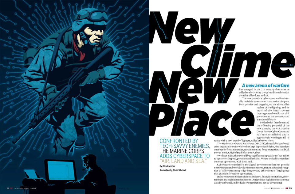
Howdy folks!
The Washington Post is a paper that I've unfortunately had to turn down for work on a few occasions due to a full schedule. It was always a bummer, and I always felt guilty doing so since I the topics were always of interest to me. So I was very happy when Kristin the AD called with a project just as I was wrapping up a few projects! The assignment was perfect for me as it was a great opportunity to draw some soldiers which I was hoping to do after recently watching the documentary Restrepo. I have mad respect for soldiers, and I always take great pride in creating artwork depicting these everyday heroes.
The subject of the article is about how the U.S. can remain a superpower while retaining a smaller wallet. With Congress looking to make drastic budget cuts, the article analyzes how military cuts would be beneficial to our economy as well as how the military could continue to operate at a high performance without unnecessary excess.
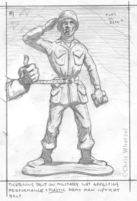
Sketches:

 By: Chris Whetzel,
on 3/10/2011
By: Chris Whetzel,
on 3/10/2011
Blog: Chris Whetzel Illustration (Login to Add to MyJacketFlap)
JacketFlap tags: landscape, editorial, conceptual, interior illo, cover illo, Add a tag


Now some folks might ask if I supported the Republican or Democratic side of the election. I will just say that I try to keep my personal viewpoints on the back burner in situations like this. I think it is more professional to be objective with assignments like this unless the article has a certain slant to it.
Enjoy the Day,
By: Chris Whetzel,
on 4/30/2010
Blog: Chris Whetzel Illustration (Login to Add to MyJacketFlap)
JacketFlap tags: advertising, people, portrait, interior illo, Add a tag
Sorry for the brevity today; it seems every time I plan to blog, I have multiple projects going. I did not blog last week because...I forgot. So this week you get two pieces of art that most likely will never be on the website :)
The first piece was done for USAA's customer magazine. USAA sponsors the Army/NAvy football game, and they wanted an opening image to celebrate 10 years of sponsorship. The AD requested a combination of the two uniforms on one victorious player.
Newly Nike-designed uniforms. Not much reference to work from as they had just unveiled the uniforms a few weeks before the assignment:
Sketch in provided layout:
The AD requested a sketch revision with the arm lowered so that the figure could be larger:
Final art in layout: Looking at the layout, I can't help but mention how much it changed from what I was provided to work with; I think my initial sketch could have worked in this layout nicely.
Here is an alternate design I submitted using the official colors of the Army/Navy game while still incorporating elements form both uniforms (number and lettering of Navy, camo of Army):
And completely unrelated, here is a 30-something homemaker I drew up for a deign studio to be used on a pinball game promoting the use of anti-depressants (there is no joke here, folks):
By: Chris Whetzel,
on 3/30/2010
Blog: Chris Whetzel Illustration (Login to Add to MyJacketFlap)
JacketFlap tags: landscape, editorial, conceptual, interior illo, cover illo, Add a tag
Hi guys! I won't be chatting much as I have a busy day. So here is a quick rundown of a recent commission from Connecticut Magazine. The article was their annual "Rating the small towns," in which the towns of Connecticut are judged on crime, culture, education, etc. Cover sketches:
The article also had a spot illustration. Note how these spots tie-in with the cover themes, and yet the art director also has a choice of mixing up themes if need be. Sketches:
The art director decided that she like the first cover sketch and the gauge-theme spot illo, but she wanted to place the cover sketch's #1 on something rather than it be a giant object itself. She asked for a hot-air balloon, and I did a quick revision. The art director tried it out with the text, and she liked it. After approval, I provided the refined drawing on the right to give her a better idea of the final art:
Final artwork:
 I mocked up this cover based on the text the art director tested on the sketch; I think its pretty close to the actual cover. I'll find out when the issue arrives!
Enjoy the Day,
Chris
By: Chris Whetzel,
on 3/22/2010
Blog: Chris Whetzel Illustration (Login to Add to MyJacketFlap)
JacketFlap tags: editorial, experimentation, conceptual, interior illo, Add a tag
Hello all! I apologize for not posting last week's tidbit on Friday, but it was a busy deadline day so blogging had to be pushed back. Also, I am going to be switching up the posts (basically reversing them) as I feel some people just want to skip my chatter and get to the art.
So here we go.
A few posts back I mentioned the Haiti Poster Project. I took this opportunity to do an experimental piece. Its pretty far removed from my illustration work in terms of medium, but I think its closer to my sketchbook which is quite interesting:
In mid-January, Ode Magazine contacted me seeking an illustration for an article about valuing green spaces. The article was mostly about how we are not assigning value to open spaces; we clearcut and destroy beautiful scenery for strip malls and housing.
The sketches: The final artwork:
And what else is going on? Well, its warm outside. So needless to say I cut back my work hours over the weekend to enjoy the sun. But now its back to it. I am retooling the website, and will most likely be uploading it in April or May.
Enjoy the Day,
Chris
By: Chris Whetzel,
on 2/19/2010
Blog: Chris Whetzel Illustration (Login to Add to MyJacketFlap)
JacketFlap tags: editorial, conceptual, action, interior illo, Add a tag
Hi and hello!
Hooray for Friday; the new day for blogposts in my schedule! So what are the current happenings? This week featured a very nice break from a heavy workload, but I am now back at nose-to-the-grindstone (before and after this post, of course). Regardless, I got some time in on some really rewarding experiment results, and I am eager to start working those outcomes into some artwork. I am planning out a summer (and beyond) project that will be artwork in a different vein from the illustration work; I am becoming very interested in working in a more narrative manner as opposed to my usual abstract-concept approach. Basically, with this summer project I hope to explore storytelling rather than conceptual communication. As Aliyah would say, it will be artwork of "content" rather than "concept." I guess this has spawned from the return of my reading interests.
But that will all be coming down the line eventually.
And now for some art. Here is a new editorial recently completed for Carli at Macworld. the subject of the article was about unexpected uses for the Esc key. Apparently, that key can be a lifesaver! Apparently, its more than just...escape.
Sketches: Sketch #1 was ato show how powerful the key can be; its exploding off of the keyboard. Sketch #2 was a play on the multi-function aspect of the key. Sketch #3 was a exploration of the key's helpfulness; I portrayed it as air-dropped relief. Carli chose the third sketch, and I went to finish.
Completed Artwork: I wanted to keep this artwork very warm and bright. I stayed away from a blue sky as I was simply using blue skies in several pieces during that time. This illo also ran in the same issue as the IMAP mailbox image from a few post back. That image was mostly blue as well so I wanted to make the two image look completely different since they would be in the same issue.
As I said before, it was a pleasure working with Carli and I even got a compliment from another AD at Macworld on the images. Good stuff!
Until next week!
Enjoy the Day,
Chris
By: Chris Whetzel,
on 2/10/2010
Blog: Chris Whetzel Illustration (Login to Add to MyJacketFlap)
JacketFlap tags: people, editorial, conceptual, interior illo, Add a tag
Hello, hello! My apologies for the brief hiatus in posts, but I have been very busy lately! The good news is there will be lots of art to share in March and April!
I was recently contacted by Vanessa at Education Week for another back page commentary. These are always enjoyable assignments as she gives me a lot of freedom with concepts as well as image format and composition. The assignment concerning gathering data on tutor performance was very similar to a previous commission, and so I had to find new creative ways to show "investigating education." The sketches: The first sketch features a Sam Spade-like detective doing some recon.
 Sketch #2 continued the spying theme with our detective using some binoculars to gather info from a distance.
 The third sketch was a step in another direction with a literal grading of an educator. Vanessa said this sketch "made her laugh out loud," but I think it was too humorous for the article.
 Vanessa went with the first sketch, and I worked up a final that I am very pleased with. I rarely work on white, and I rarely work with green! Thanks to Vanessa for a fun assignment; it always makes me feel good to do work for a good cause.
Speaking of which, I urge fellow artists to contribute to The Haiti Poster Project, a charity in which selected poster will be sold to benefit those dealing with hardships due the earthquake and aftershocks.
Enjoy the Day,
Chris
An excellent graphic. Well done.