Viewing: Blog Posts Tagged with: mural, Most Recent at Top [Help]
Results 1 - 25 of 56
Blog: E is for Erik (Login to Add to MyJacketFlap)
JacketFlap tags: Harts Pass, trailsend bookstore, acrylic, mural, good news, Add a tag
Blog: An Illustrator's Life For Me! (Login to Add to MyJacketFlap)
JacketFlap tags: library, children, illustration, mural, digital, Add a tag
I ran a workshop with each of the class groups in turn. When we had worked together originally, there was so much to do and so little time, there was not much opportunity for me to do more than gentle guidance, so this time I was able to spend a bit longer, showing them in detail how to use emotion and body-language in their drawings, to bring their characters alive (although, I think you'll agree, they did a pretty good job without my help!).
Blog: An Illustrator's Life For Me! (Login to Add to MyJacketFlap)
JacketFlap tags: libraries, mural, workshop, Add a tag
Can't wait to see it!
Blog: An Illustrator's Life For Me! (Login to Add to MyJacketFlap)
JacketFlap tags: libraries, illustration, mural, Add a tag
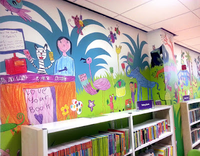
The problems will come if the corners of the room and the ceiling joins are not exactly square. Anyone who has done any wallpapering at home will know what I mean. As the paper turns the corner, any anomalies will change the angle of things and could make the illustrations for the adjacent wall travel up over the ceiling! When you are wallpapering round the corner with a normal, patterned wallpaper, you stop at the corner to create an overlap, levelling things up anew, to make the paper continue straight. But overlaps and changes of angle could mean tigers with lumps missing, headless librarians and all sorts - Aaaargggggggh!
It is an old building, so you can see why, as well as being excited, I am a little anxious, and why I am very, very, very glad that a professional is doing the installation, not me!
Blog: An Illustrator's Life For Me! (Login to Add to MyJacketFlap)
JacketFlap tags: libraries, illustration, Photoshop, mural, digital, artwork, planning, Add a tag
Because of World Book Day, I'm out visiting schools all this week (all over the place as usual) but, luckily, I just managed to get my mural artwork finished first. It was a skin-of-the-teeth thing - I didn't sign it off until 7pm last Friday night.
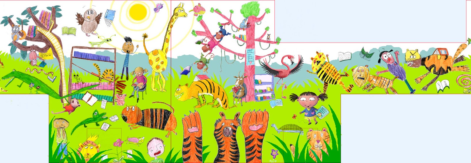
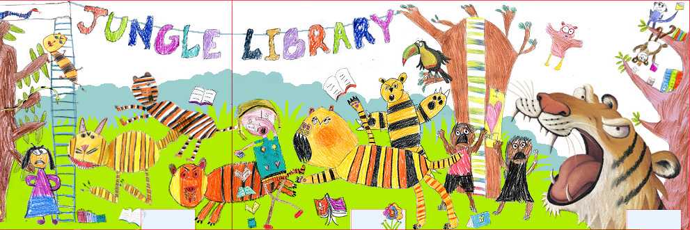
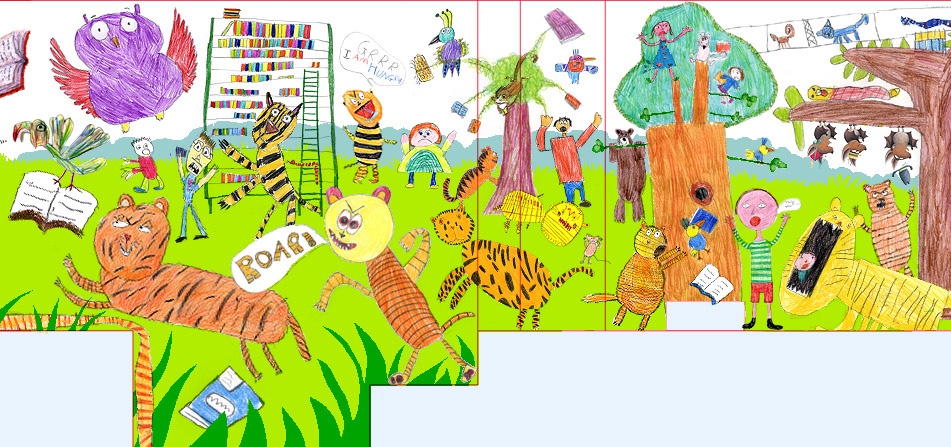
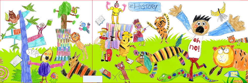
I'm enjoying being out and about again, as I have been locked at my computer for ages. The artwork stage has taken 3 weeks, working really long days mostly, but it is finally done. Hurrah! Below are the various sections, travelling around the walls anti-clockwise (ie from right to left), viewing what will be floor-to-ceiling once it's installed (though the emptier sections will be obscured by furniture):
There were so many different jobs to do and of course much of it took longer than expected - I think it's because I underestimated just how many individual characters and little objects I could cram into the huge space. Luckily, Wakefield Libraries have been absolutely LOVELY and said they will pay me for the time I've actually spent on it, rather than what I originally quoted them.
Every one of the new, high-res scans that John did of the various animals, books, trees etc had to be individually matched to their position on the low-res template I created earlier, re-sized to fit and then laboriously cut off the children's white, background paper in Photoshop.
Each component also had to have it's 'levels' balanced, to match the weight of the rest of the design, and then have extra colour added, so it was punchy enough. I even had to subtly go over some of the children's pencil outlines in Photoshop, thickening them up where they were too spindly.
And that's without all the graphic elements I had to draw for the background, like the distant forest and the various kinds of grasses and bushes.
Because I had to create the artwork in 6 sections (to keep the file sizes from blowing the brain of my computer), I also had the job of making sure the different sections joined accurately. That was a bit of a nightmare to be honest, as one millimetre's inaccuracy at each joint would obviously add up, and then the error would also be multiplied by 4, because of the artwork being 25% of the actual size. Yikes.
I was very good at remembering to 'save' all the time, not just to the computer, but also to an external hard drive, just in case any of the files decided to corrupt along the way. I got away without 'losing' anything, which is a great relief.
Then, just when I thought it was all finished, I realised I had forgotten the area of 'bleed' beneath the library's computer table! I had remembered to continue the design behind the bookshelves, so I don't know why I forgot the table. Tired I guess.
The colour boosting was the last job. I wanted to keep the mark-making from the children's colouring, so I made my final artwork translucent, then created a layer beneath the design, where I 'scribbled' half-opacity colour, so the effect was subtle and blended seamless with the children's coloured pencils. It was time consuming, but was worth it, as the boost made a huge difference. Look at the difference between the section above and part of the same section, before the extra colour:
Notice too, in some places I had to do extra tricksy things with the colour in Photoshop: look at the original colour of the desk, immediately above, then the colour it ended up.
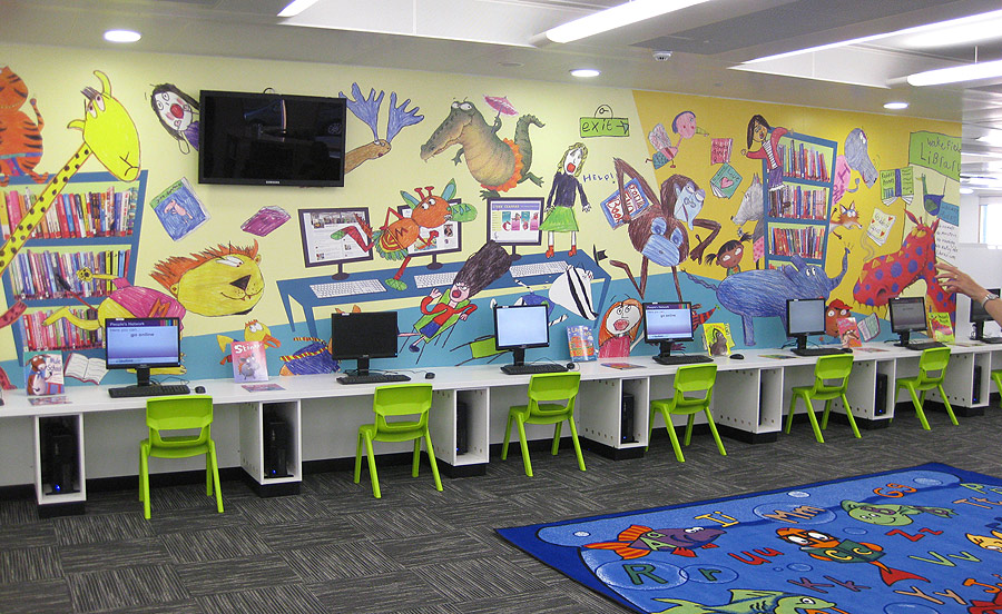
Did you notice by the way, in the 2nd section from the beginning, I left my 'signature' on the computer screen? Sneaky huh? Actually, I suspect that most of this area will be obscured by book-bags, but I only really put it in as an after-thought.
The next stage is a final chat to the printer who will be transferring my design to wallpaper, ready to paste onto the walls. I'm a little concerned about how on earth we will manage to get things to line up where they are supposed to, what with crooked walls and wonky ceilings. For instance, all the creatures' feet, which need to be on the level with the tops of the bookshelves.
I am crossing fingers it all works out okay, as there isn't much I can do about that side of things.
Blog: An Illustrator's Life For Me! (Login to Add to MyJacketFlap)
JacketFlap tags: children, libraries, illustration, Photoshop, mural, digital, planning, Add a tag
Blog: An Illustrator's Life For Me! (Login to Add to MyJacketFlap)
JacketFlap tags: children, libraries, illustration, mural, planning, hot tips, Add a tag
Blog: An Illustrator's Life For Me! (Login to Add to MyJacketFlap)
JacketFlap tags: children, libraries, illustration, mural, workshop, planning, Add a tag
You may recall, I decided on a tiger theme, because of the local rugby team and it was a small step from that to having tigers rampaging among the librarians and children in a 'jungle library'. So, I asked the morning group to focus on tigers. I demonstrated various quick techniques to help the children structure their animals and give them movement, then they were off!
They were so into it and all drew like demons for the entire time. I just love the one at the top by Riley Farrar from St Joseph's! Those that finished their tigers early, had a go at librarians. I showed them how to use body language and eyebrows to get across emotion. Not everyone finished colouring, so I will be getting out my Derwents soon!
For the afternoon session, I changed things slightly and asked children to be more general, drawing other jungle animals. We had some interesting discussions: 'Miss, can I draw a penguin?', 'I don't think you get penguins in the jungle, do you?', 'Well, how about a shark?'. Thank goodness for Jungle Grumble, to get some idea of the animals you might actually find in the jungle!
I also asked them to think about background details for the jungle library, whist being careful not to actual colour the background, as that will of course be done digitally by me, once the design is sorted out.
The afternoon group drew me some children and a few more librarians too. Bethany has definitely got to win the prize for best librarian illustration. Look carefully and you will see that she has also featured one of the library's 'talking books':
As well as having a well known rugby team, Castleford is an important archeological site (the museum is full of Roman artifacts, including the wheels of a chariot), so I have been asked to try and feature the Romans in the mural too. It's a hard match to the existing theme, but I wondered if a few Roman soldiers might come to life from the Ancient History bookshelves. They could help restore order and fight off the tigers perhaps. With this in mind, a few children drew Romans for me:
I did the return journey to Sheffield with a lovely, fat package of amazing illustrations. This week I have been scanning them into my computer, just as low-res images for now, so I can play around, dropping them into the templates I created, trying to combine as many of them as possible into what will ultimately be one big illustration, rampaging around the walls of Castleford Children's Library.
Blog: An Illustrator's Life For Me! (Login to Add to MyJacketFlap)
JacketFlap tags: Photoshop, mural, planning, hot tips, libraries, illustration, Add a tag
Blog: Children's Illustration (Login to Add to MyJacketFlap)
JacketFlap tags: Yusuke Asai, mural, Add a tag
Blog: castle-building (Login to Add to MyJacketFlap)
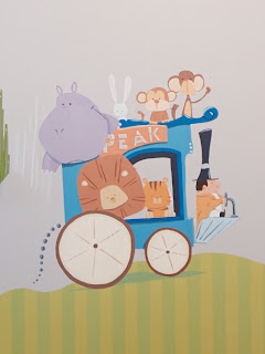
JacketFlap tags: Illustration, animals, circus, mural, children's illustration, dentist, wagon, peak, wall mural, Add a tag
Tootles.
Blog: DIANE SMITH: Illo Talk (Login to Add to MyJacketFlap)
JacketFlap tags: Town Center Gallery, Art 21, illustration, PBS, painting, mural, sketching, Fine Art, inspired, Add a tag
Time is ticking away - Christmas vacation is slipping away. But, I'm enjoying looking at the New Year, trying to plan how I can fit everything in that I want to do - especially art. As it stands, I will be the featured artist at the Town Center Gallery in October and I've got to get busy producing new work. Although it's a smaller-town member gallery, I'm excited about having a goal to work for. And, I'm really delighted to be taking steps back into the more "fine art" world - it can only enhance my illustration. I'm inspired by new ideas that I look forward to pursuing - I'll get more into that later.
Today, I carved out an hour OUTSIDE of the house, no less, to do a little sketching. I'm wanting to do some small still life paintings to get into the swing of things and play around with my new and improved understanding of acrylics (thanks to the mural).
Anyway, during my break I've been addicted to watching previous seasons of the PBS series Art 21 on Netflix Instant Watch. It has reawakened my interest in fine art and all of the discussion that goes with it that I miss from college (although I can't say that I took proper advantage of the opportunities for such discussion back then). I'm going to dust off my many sketchbooks from back then and see how my ideas have changed since then. Maybe I'll post more on those thoughts soon.
Blog: DIANE SMITH: Illo Talk (Login to Add to MyJacketFlap)
JacketFlap tags: Christmas, painting, mural, projects, daughter, Add a tag
Merry Christmas and Happy New Year to all! I was blessed this year with the means to purchase a new camera - nothing too high-tech, but my other camera was completely dead. So, now I can take pictures of things I've been working on again...
There hasn't been as much time as I'd hoped during this vacation period to pursue any projects - the week before Christmas was spent preparing, baking cookies, etc. and the week after has been recovery of the house and things like that. But, I have at least given some thought to new projects that I hope to complete in the next several months. The above picture is a sketch from a photo of my daughter - a pose that I always liked. It fits well with the concept I have for a painting. And, it's exciting for me to be going in a different direction than I have in the past - inspirations from the mural project.
Blog: DIANE SMITH: Illo Talk (Login to Add to MyJacketFlap)
JacketFlap tags: painting, mural, panels, Jill Martin Photography, Add a tag
The mural is now en route to a sign shop where it will be framed and then it will probably wait in storage until the corner of Cook and Broadway is ready for its placement.
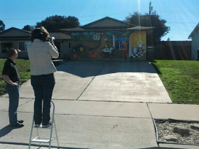 |
| Jill in action - with complicated back-lighting, no less... |
 |
| Saying Goodbye |
Blog: DIANE SMITH: Illo Talk (Login to Add to MyJacketFlap)
JacketFlap tags: mural, doodle, slumber, Town Center Gallery, Add a tag
It's been forever since I've been able to pick up a pencil and doodle something for fun. It was my turn to work in the Town Center Gallery which gave me a rare moment with my sketchbook, a little music, surrounded by art. So, I started with a doodle - as I always do - to get the juices flowing. Unfortunately, the camera that I usually use to photograph my drawings is no longer working. I was forced to scan this on my basic scanner/printer and I don't like the quality at all. But, what can ya do...?
 |
| Slumber |
And, regarding the mural, the city will be sending a couple guys to come and pick it up on Friday. When that happens, I'll be getting a photo of the whole thing put together.
Blog: DIANE SMITH: Illo Talk (Login to Add to MyJacketFlap)
JacketFlap tags: mural, studio, panels, Horizons, Granddad, art classes, varnish, writing, drawing, Add a tag
It's a bit crazy how we can jam-pack the fall season with so much busy-ness! This is the first weekend where I've been able to relax (a little), although there's still a ton on my plate - soccer season is in full swing with end-of-season parties & all-star tryouts on the horizon, the Horizons Family CoOp that I coordinate meets this Tuesday along with one of my art classes, and so on...
| Students busy in the California History class! |
| Panel laid out on sawhorses in order to seal all edges. |
| Studio "corner" - the garage is too cold in winter and there are too many spiders! I have plans for some bulletin boards and wall-hanging holders for pencils and stuff...I'll get there eventually. |
I know that the mural project is at an end as my mind has been buzzing with thoughts of other art and writing projects. It's time to transition backin to new creative work - not sure what exactly, though. I still don't have a lot of free time, but I did clean off the old drawing table corner of my room in preparation. Now, joining my drawing space is a caricature portrait that I recently acquired of my Granddad who passed away about 20 years ago - I think it was given to him as a retirement gift (or something like that). It's a nice addition to my workspace.
| Granddad watching over my work :) |
Blog: DIANE SMITH: Illo Talk (Login to Add to MyJacketFlap)
JacketFlap tags: study, mural, for sale, varnish, Town Center Gallery, Add a tag
Went forward with a 2nd coat of varnish on the backs again today. I'll be setting up the saw horses tomorrow. But first, I have to de-clutter the studio zone a little. Since it is in the garage, summer vacation sort of crept into my area - books, boxes, bikes, OH MY!
Anyway, while I had the varnish out, I also painted a coat on all of the studies I did during the mural process. Remember those? I shared them along the way. My plan is to frame them and probably put them up for sale in the Town Center Gallery. I don't see the need to keep them. Well, I might put a couple up for sale now and see how it goes.
Now that I'm anxious to paint other projects...I have no time. Oh well...
Blog: DIANE SMITH: Illo Talk (Login to Add to MyJacketFlap)
JacketFlap tags: homeschooling, mural, panels, memorial, Horizons, CoOp, varnish, Robert Smith, primer, tackiness, Add a tag
...screamed my daughter.
| Now you see it - now you don't! |
No, I've turned all of the panels around and I am currently painting a couple coats of clear varnish on the backsides. I wanted to do the backs first because I wasn't sure how tacky it would be for and for how long. The primer we used seemed to always have a certain degree of tackiness - even at this point. If that was to be the case with the varnish, then I wanted to do the fronts last and make sure they didn't lean up against anything while they awaited transportation.
I've now discovered that the varnish dries quickly and the finish isn't tacky at all. Good! Now, I plan to put the panels one at a time on sawhorses and paint a couple coats on the fronts and all edges.
 |
| In Loving Memory... |
| Past Horizons Group During Some Outdoor Activities |
Still, God is great and life is good! Just keep plugging away...
Blog: DIANE SMITH: Illo Talk (Login to Add to MyJacketFlap)
JacketFlap tags: painting, mural, field, vines, strawberries, creepers, touch-up, Add a tag
| You have to look close to see strawberries... |
| The field "before" |
| The field "after" |
Other things that were done were little touch-ups here and there, including the chef's shoes - he's now wearing creepers (a nod to my husband, Smitty).
Blog: DIANE SMITH: Illo Talk (Login to Add to MyJacketFlap)
JacketFlap tags: mural, green, lettering, blue, harmonious, Add a tag
"You know those letters that you did with the dark blue edging and light blue center were far to bold for mural? They real drew too much attention."
"Yes, I know. That's why I changed the centers to green and posted pictures. I thought the green would blend in a little bit better."
| Dark blue edging with a green center |
"Weeellllllll, it's still not working. That dark blue edging with the dark green is still too demanding."
"Oh, it's fine. Just live with it a little bit. You'll get used to it."
"Come on, who are you kidding? You should know to trust your instincts by now."
"Do you realize how long I've spent hunched over on the floor doing these letters over and over? My back is sore, I've got a kink in my neck..."
"Yes, I know. But, I think you're making excuses. Do you really want to drive by the mural for years wishing you had changed the color?"
(Grumbling...sigh)
"Alright, you win. I'll repaint the letters AGAIN. I'll use a dark green/light green comination so that it is more harmonious with the background...BUT THIS IS THE LAST TIME!"
| Dark green edging with light green center |
Blog: DIANE SMITH: Illo Talk (Login to Add to MyJacketFlap)
JacketFlap tags: panels, pumpkins, letters, leaves, garage, Santa Maria, harvest, painting, mural, Add a tag
Spent a good part of today kneeling and lying on the garage floor painting...and repainting...letters.
I think I already mentioned that I wasn't excited about painting letters and, yes, I did overfuss it. The more I tried to refine the letters, the less I liked them (and the more they seemed to draw attention away from the mural). In the end, I went back to fairly loose letters (sans serif). The title simply reads: Celebrate the Harvest - Santa Maria Valley (across the bottom of 3 panels)
I also worked on detailing the leaves around the pumpkins and building a little more contrast in that area.
Now, I'm a little more excited about working on the mural again. I will be moving some panels tonmorrow to (finally) detail the field beneath the wave. There'll be a little bit of greenery and some dots of red (strawberries) to pull a teensy bit more color into those first two panels.
At least I won't have to lay on the floor for the next phase!
Blog: DIANE SMITH: Illo Talk (Login to Add to MyJacketFlap)
JacketFlap tags: harvest, mural, lettering, vines, wine, Dionysus, wine glasses, Add a tag
Well, not only did the laptop get a virus, but the charger ceased charging. Then, the desktop computer got a really nasty virus, rendering it useless. And, on a sad note, my fathe- in-law, Robert Smith, passed away last weekend. Needless to say, no mural progress worth noting has happened...that is, until now.
Little details have been my focus - the bottle and wine glasses...
...the swirled hair and curling vines on the Dionysus character...
...and the vines reaching across the top of the arch.
Now, I've started some lettering along the bottom (the mural's title) and I'll show that when I've worked out some kinks. One thing I've realized is that I really don't like doing the lettering. Since it's along the bottom, I have to be down low on the floor and it gets uncomfortable quickly. Also, I tend to overfuss letters, so it can be tedious.
The only thing after that is the field beneath the wave - I have to line up the panels in order to put in the plants and some dots of red strawberries.
| The Studio Photo-Bomber Strikes Again! |
Summer is running out, so I'd really like to be done and work on some personal projects for a change. Unfortunately, I don't think much of that will happen. So, finishing the mural will be my summer goal.
Blog: DIANE SMITH: Illo Talk (Login to Add to MyJacketFlap)
JacketFlap tags: mural, panels, tiles, vines, Ultramarine, pthalo blue, touch up, Add a tag
Time to check in! Took a couple days off for the holiday (Happy Belated 4th of July), but I've just been touching up here and there - things I really can't photograph (like strawberry leaves and the black/white tiles that needed a 3rd coat).
But, I did continue work on the vines across the bottom, coming out of the ground, and up the wave - probably not much more I'd do there, except for a highlight here or there.
I did choose to switch out the splashes to Pthalo Blue (a much better fit than the ultramarine - too purple - and cerulean - not "deep" enough). This is still bright, but much more harmonious. Also, the only other place I used pthalo was in the cauliflower and broccoli, so this brings that hue in across the panels.
| Mommy's little "photobomber" |
Blog: DIANE SMITH: Illo Talk (Login to Add to MyJacketFlap)
JacketFlap tags: flowers, details, mural, trees, yellow, panel, shrubs, Add a tag
It's kind of hard to believe, but now that I've put in the trees, I feel like I'm nearing the end. I still have work to do in each panel, but at this point, it's details, fine tuning, and fairy minor adjustments. If all goes well, I'd say that I have about a week of additions and "fixings". I'll have to move the panels around in order to finish some parts - to make sure that the continuity from one panel to the next is accurate. Then, I'd give myself another week of obsessively staring, analyzing, and more fixing. After that, I guess it will be time to put the protective top varnish on and seal it.
Yesterday, I put in several more trees and shrubs and extended some of the yellow flowers. I may add a few more in, but probably not much.
I also started to put in the pumpkin stems, although I think I'll switch them to the browner side. But, as you can see, this panel has really come together!
Blog: DIANE SMITH: Illo Talk (Login to Add to MyJacketFlap)
JacketFlap tags: flowers, mural, trees, panels, hills, yellow, Add a tag
Finally got to spend a larger chunk of time on the mural again today. I've started building up the landscape in the first couple panels, particularly the hills. As you can see, I started by laying in some yellow to capture the flowers that come around every spring (and have gone at this point).
I'm so glad that I spent the time to work out the tree colors - it soooooo helped. And, as expected, I'm reworking the hill colors, or at least the brushwork. I'm using a more textured approach in the areas closer to the viewer. I still have a lot to do on them thar hills, but I like how it's started. Some I like, some needs to be adjusted. Our hills have such variety - many are bare, some have the occassional shrub or tree, while others seem to have a blanket of shrubbery.
View Next 25 Posts












Your work is just awesome....I can't believe you are so damn talented!!