post by Heather Ryerson


Grace Helmer uses strong brush strokes to create her rich, ethereal oil illustrations. The expressive color progressions in her paintings give the work a delicate, transient presence; the viewer can’t help but be caught up in the joy and beauty of Helmer’s brief captured moments. Her style is used to especially great effect in her animated pieces. Constantly changing textures and shapes create a depth and dynamism that one might feel could easily be drunk from the canvas. Helmer graduated from the Camberwell College of Art in 2012 and is part of the illustration studio collective Day Job.
See portfolio | Watch an animaton
a venture into the sci fi theme:


10" x 10"
oil on illustration board
created for the stoked sessions l.a. fundraiser show.
check out the interview in graphi magazine.
the inside features a new painting of wolverine:

the cover features the painting of 'brayne,' which was recently sold at distinction gallery.

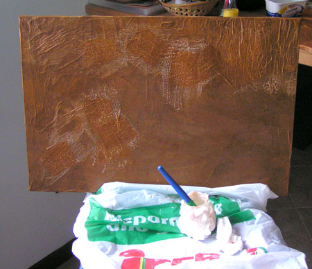
Ok I got back to my colors
and trying something more solar and funny !!!
Yet in progress...
(I cannot make nice picture in that class!!!)


Ok My teacher is trying to get me out of my block
so I tried, and experiment and that was what came out!

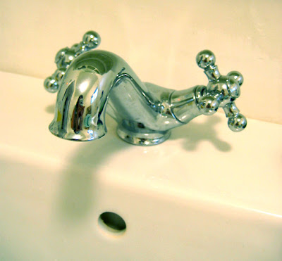 We moved back into our house last weekend and had nothing but the toilet in the bathroom. We used the shut-off valves from the sink to get water. It was like camping in our own home. But I needed to be home to be able to meet an illustration deadline and get ready for the craft sale - I had odds and ends for that tucked all over the place. Our furniture was crammed all over the place so that we had to climb over things to move around or find things. The bedroom had the watertank in the doorway so we couldn't even close the door.
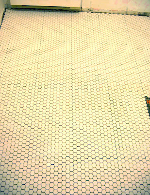
So you can imagine how thrilled we were when the plumber turned up and quickly put back the water tank (hot water! hurray!) and tub (bathing! I missed it!) and sink (heaven). The best part was finally seeing our new bathroom floors with the furnishings in the room, because without them I was wondering if the tile was too small - it looked a bit busy. But with the furnishings in there it's just right. The traditional style of hexagonal tile makes it look like those floors could have always been there and they work perfectly with the old clawfoot tub, and in short, I think they're beautiful. The porcelain also feels lovely, it's hard to describe but it's just very nice.
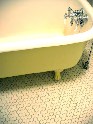 Also I was very happy with how the cream paint on the tub looked with the new floor - there aren't a lot of colour choices with Tremclad but the cream really works (it's not quite as yellow as the picture above). And finally the new IKEA vanity/sink is also beautiful and soooo much better than the old one. It's a bit taller which I find more comfortable and I even love the shiny chrome knobs we picked to match the rest of our fixtures.
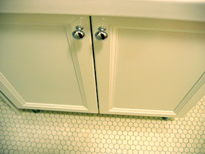 There are still a few small problems, our new faucet was bought out of the box and there was a small part missing. So for now we have a different stopper in there and it doesn't close all the way and isn't the right one. Also, the new flooring is higher than the old one, due to the Ditra and porcelain tile being thicker than vinyl tile. The plumber had no trouble adjusting the drain length, but the offset supply lines are too short (and it looks like they got a bit bent). So we need to buy new ones because for now the tub is installed on a bit of an angle in order to make it fit. Soon I'll be painting the walls, and once that's done I can do a full reveal.
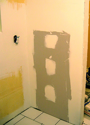
Our kitchen is looking very empty. When a room is bare you can really see it's qualities and it's really a nice space. The big window and sliding doors let in so much sunlight - I've been tempted to live without cabinets and turn it into an airy studio. But I guess I have to be practical. Anyway, now the walls are smooth and I can paint those too, and our cabinets are ready for pick-up at IKEA. Yesterday we put back our appliances and a little table, so we've created a kitchenette area that is all we need for now.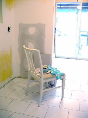 The dishes get washed in the bathroom so of course I had to buy this cute vintage mug for the scrubbie...
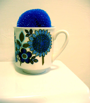 For the wall colours, I've been so inspired by the January Martha Stewart Living. I noticed a lot of pale blue and yellow, including mustard yellow which created a really fresh (but almost vintage style) colour scheme that appeals to me so much. You can even see it in our dishes on the chair in the kitchen photo, we have a pale blue Denby stoneware set, and a brown and mustard yellow striped vintage set of dishes that's more casual.
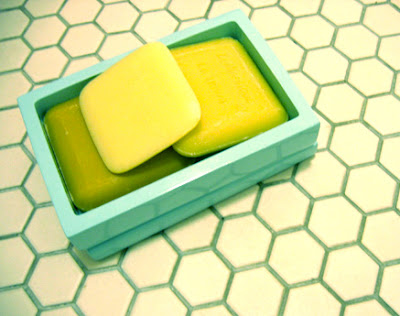 The bathroom isn't as sunny as the kitchen, there's a window but it faces a wall. So the white walls are too stark and it needs a bit of colour. I've been wanting pale blue walls, but I was wondering how pale blue would go with the cream floor and tub then realized this was the colour scheme I was seeing in the magazine and loving. It was even already there in my favourite soaps in my Jonathan Adler soap dish. So I've picked up a big can of Benjamin Moore's "ocean air" and I can't wait to see it on the walls!
 Finally a non-communal front door so we can have a wreath! I have some berries I can add later to make it more festive in December
Things have been so busy lately. I have three deadlines for work, and we have lots still going on with the home. I am still obsessed with fixing up our house, and while doing things I figured out some useful things, so I thought I would write about it.
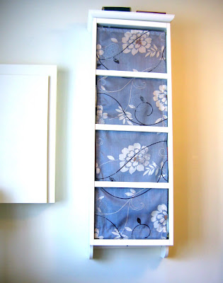 If you want to see how this looked before, it's in a previous post
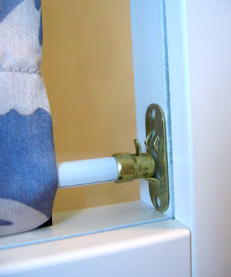
Our front room has so many things in it that I've been trying to simplify the decor a bit and make it look less cluttered. I've been wanting to add fabric to the inside of the cd case but as usual I have these ideas then no idea how to do them. So I spent a long time looking for hardware to do this, or possibly small tension rods. I finally found some simple white curtain rods with little brass attachments, and believe it or not they stay on with double-sided tape which means I didn't have to drill any holes which I didn't want to do. So now there's a pretty grey floral panel of fabric inside the glass door. Here's a detail:
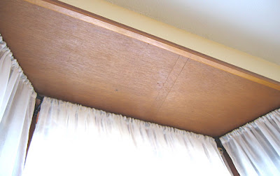
To improve the lighting in the room, I've added sheer curtains to the front window. The big find there was a bay window rod from Umbra. I found it at their new shop on John St. just up from Queen West. I didn't even know these existed until recently, but they're brilliant - each side telescopes so you can adjust the size, and the corners are bendy so you can match the rod to the curve of your window. This way you don't lose the extra space in a bay window and you don't have several rods and hooks cluttering up your window. The next step is to paint out that dreary wood!
Then I went to IKEA and found some plain white linen lampshades for two new lamps that we have at the corners of the sofa. This extra lighting has made the room much cosier and well lit. The lampshades were from Goodwill and had terrible shades, which it turns out are harder to find replacements for than you might think. A lot of stores only sell the lamps and shades together. Also these called for an "uno" shade style which most stores d0n't have at all (uno describes the way the shades are attached to the lamp).
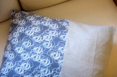
Anyway while I was at IKEA picking up my $8 shades I found some great fabric in the "as is" room. This inspired me to make matching cushions that go with the grey in the cd box fabric panel and the beige of our couch. All these little changes have created a nice soft colour scheme in the room: cream, white, and grey. Still working on those cushions (the right side is tan coloured linen):
So the other big reason we're so busy is that we were planning to retile the bathroom - I had picked out a lovely porcelain white hexagonal 1" mosaic tile (it has that vintage look, and it's nice and fresh and light.) But what we realized when we considered how we could install them is that we have vinyl tiles with older tiles underneath, and it turns out those older tiles have asbestos in them.
Apparently this is very common, we have an old 1930s house and it seems that decades ago they put asbestos into everything - stucco ceilings, tiles, insulation. But the asbestos in tiles is not too much to worry about because it isn't something that will get into the air unless you try to sand the tiles or break them up a lot. But suffice it to say it became a job for a professional. They're planning to take out the entire old subfloor.
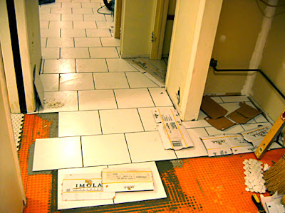
Anyway our tiler had a cancellation and is available to do the work starting next week which is sooner than we expected (but nice to get it done) so we've had to hop to it and clear things out. The whole kitchen area has the old tiles, as does two closets, so we decided to redo the whole area at once. This means making all that floor space clear so that the work can be done. They are even planning to move the kitchen cabinets to do the floor underneath. In a tiny home there aren't a lot of places to put things but I think we can work it out. A fridge in our living room, the stove on the deck - ahhh renovating..









what a beautiful portrait of an artist. wish I could have known him and learned from him