

This illustration is for the bottom half of the page that Santa (see previous post) sits on. As usual it was painted in Corel Painter after having drawn and inked it. I'm enjoying this book immensely, children's books are so much fun! I work in quite a few different styles, but i have to say that this kind of work seems to come out of me a lot easier than some of the other types of things I do.
new posts in all blogs.jpg)
Aaron Pocock's little corner of sketchy blogdom
Number of Readers that added this blog to their MyJacketFlap: 13
 By: Aaron Pocock,
on 8/26/2008
By: Aaron Pocock,
on 8/26/2008
Blog: sketchworld (Login to Add to MyJacketFlap)
JacketFlap tags: photoshop, drawing, pen and ink, book illustration, children's art, digital painting, digital, line art, Add a tag
 Add a Comment
By: Aaron Pocock,
on 8/25/2008
Add a Comment
By: Aaron Pocock,
on 8/25/2008
Blog: sketchworld (Login to Add to MyJacketFlap)
JacketFlap tags: children's books, illustration, children's, fantasy, drawing, painting, corel painter, digital art, Add a tag
 Add a Comment
By: Aaron Pocock,
on 8/24/2008
Add a Comment
By: Aaron Pocock,
on 8/24/2008
Blog: sketchworld (Login to Add to MyJacketFlap)
JacketFlap tags: fairy, children's, fantasy, drawing, book illustration, children's art, digital painting, digital, faery, Add a tag
 Add a Comment
By: Aaron Pocock,
on 8/18/2008
Add a Comment
By: Aaron Pocock,
on 8/18/2008
Blog: sketchworld (Login to Add to MyJacketFlap)
JacketFlap tags: Add a tag
 STEP ONE The rough sketch was drawn straight into painter using the pencil option. It's very sjketchy but there's enough info for me to read it and paint over.
 STEP TWO As usual, I start with a watercolour underpainting for a base to work from.


STEP NINE generally moving through and tightening it all up.

STEP TEN more work on the horse himself and general work throughout.
 STEP ELEVEN-FINISHED!!! I reverese the image as i work, as part of my standard working process to check to see if there are any 'off' elements, but today I liked it better reveresed, so that's how it'll stay. I enjoyed this painting very much. All in all, it took approx 8 hours from start to finish.
 Add a Comment
By: Aaron Pocock,
on 8/17/2008
Add a Comment
By: Aaron Pocock,
on 8/17/2008
Blog: sketchworld (Login to Add to MyJacketFlap)
JacketFlap tags: Add a tag


 STEP FIFTEEN
 Add a Comment
By: Aaron Pocock,
on 8/13/2008
Add a Comment
By: Aaron Pocock,
on 8/13/2008
Blog: sketchworld (Login to Add to MyJacketFlap)
JacketFlap tags: fantasy, drawing, mythology, pen and ink, book illustration, pencil, line art, creatures, digtal art, Add a tag
 Add a Comment
By: Aaron Pocock,
on 8/13/2008
Add a Comment
By: Aaron Pocock,
on 8/13/2008
Blog: sketchworld (Login to Add to MyJacketFlap)
JacketFlap tags: children's books, photoshop, fantasy, drawing, mythology, book illustration, children's art, digital painting, corel painter, Add a tag

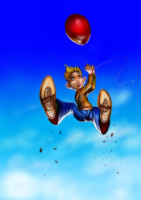
here's todays image. I've got a bit of a thing happening with 'flight' at the moment.
For the first time since I've started using them, I'm very comfortable with Photoshop and Painter. I've developed half an idea of a working procedure that really seems to suit me, it's rather like the way I used to work when I used traditional media.
 Add a Comment
By: Aaron Pocock,
on 8/11/2008
Add a Comment
By: Aaron Pocock,
on 8/11/2008
Blog: sketchworld (Login to Add to MyJacketFlap)
JacketFlap tags: oils, galleries, drawing, gallery, book illustration, painting, exhibition, acrylic, children's art, digital painting, Add a tag


 Add a Comment
By: Aaron Pocock,
on 8/11/2008
Add a Comment
By: Aaron Pocock,
on 8/11/2008
Blog: sketchworld (Login to Add to MyJacketFlap)
JacketFlap tags: corel painter, digital art, photoshop, drawing, book illustration, children's art, digital painting, Add a tag
 I've just come back from a long weekend with my wife and son and hadn't drawn all weekend. This is what came out of me upon my return.
 Add a Comment
By: Aaron Pocock,
on 8/8/2008
Add a Comment
By: Aaron Pocock,
on 8/8/2008
Blog: sketchworld (Login to Add to MyJacketFlap)
JacketFlap tags: children's books, illustration, children's, drawing, book illustration, painting, children's art, digital painting, digital art, Add a tag
 Add a Comment
By: Aaron Pocock,
on 8/4/2008
Add a Comment
By: Aaron Pocock,
on 8/4/2008
Blog: sketchworld (Login to Add to MyJacketFlap)
JacketFlap tags: step by step, children's books, book illustration, children's art, digital painting, digital art, Add a tag
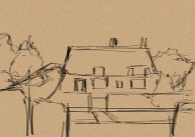
 STEP ONE Here's the reference I used for the image. Note, I turned the cottage around, just in case the owners ever saw it, I'm not sure if the M.I.L. got permission. I'll carry on as if she didn't.
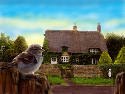
 Add a Comment
By: Aaron Pocock,
on 8/2/2008
Add a Comment
By: Aaron Pocock,
on 8/2/2008
Blog: sketchworld (Login to Add to MyJacketFlap)
JacketFlap tags: Add a tag
 Add a Comment
By: Aaron Pocock,
on 8/2/2008
Add a Comment
By: Aaron Pocock,
on 8/2/2008
Blog: sketchworld (Login to Add to MyJacketFlap)
JacketFlap tags: Add a tag
 Add a Comment
By: Aaron Pocock,
on 7/31/2008
Add a Comment
By: Aaron Pocock,
on 7/31/2008
Blog: sketchworld (Login to Add to MyJacketFlap)
JacketFlap tags: illustration, fantasy, digital art, elven, Add a tag
 This image is one of a few recent attempts to get a 'fantasy' fix out of my system. I used to do a lot of this kind of thing, every now and again, I get a real Jones and have to exorcise the ghost. This sketch took approx 2 1/2 hours in Photoshop and Painter.
  Add a Comment
By: Aaron Pocock,
on 7/28/2008
Add a Comment
By: Aaron Pocock,
on 7/28/2008
Blog: sketchworld (Login to Add to MyJacketFlap)
JacketFlap tags: Add a tag
 Here's an older image. I'd forgotten all about this one. It was one of my earlier digital efforts, just thought i'd post it here as I've been a little busy over the past week.
 Add a Comment
By: Aaron Pocock,
on 7/24/2008
Add a Comment
By: Aaron Pocock,
on 7/24/2008
Blog: sketchworld (Login to Add to MyJacketFlap)
JacketFlap tags: Add a tag
 Add a Comment
By: Aaron Pocock,
on 7/23/2008
Add a Comment
By: Aaron Pocock,
on 7/23/2008
Blog: sketchworld (Login to Add to MyJacketFlap)
JacketFlap tags: Add a tag
 Add a Comment
By: Aaron Pocock,
on 7/22/2008
Add a Comment
By: Aaron Pocock,
on 7/22/2008
Blog: sketchworld (Login to Add to MyJacketFlap)
JacketFlap tags: Add a tag
 Add a Comment
By: Aaron Pocock,
on 7/20/2008
Add a Comment
By: Aaron Pocock,
on 7/20/2008
Blog: sketchworld (Login to Add to MyJacketFlap)
JacketFlap tags: Add a tag
 STAGE ONE
 STAGE THREE
I know the background is going to be dark here (it's set in space), so I throw down a wash using the digital watercolour and airbrush brushes in painter.
 STAGE FOUR
Here I use the digital watercolour brushes to lay out the flat approximate colours I'll be using throughout the image.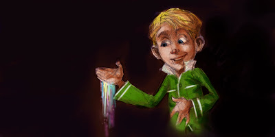 STAGE FIVE
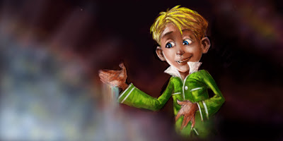 STAGE SEVEN
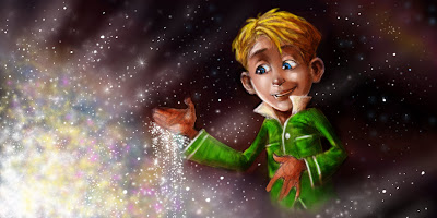 STAGE NINE
 Add a Comment
By: Aaron Pocock,
on 7/19/2008
Add a Comment
By: Aaron Pocock,
on 7/19/2008
Blog: sketchworld (Login to Add to MyJacketFlap)
JacketFlap tags: Add a tag
 STEP TWO
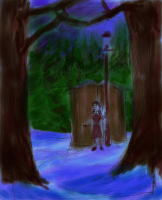
 Add a Comment
By: Aaron Pocock,
on 7/14/2008
Add a Comment
By: Aaron Pocock,
on 7/14/2008
Blog: sketchworld (Login to Add to MyJacketFlap)
JacketFlap tags: Add a tag
 Add a Comment
By: Aaron Pocock,
on 7/12/2008
Add a Comment
By: Aaron Pocock,
on 7/12/2008
Blog: sketchworld (Login to Add to MyJacketFlap)
JacketFlap tags: Add a tag
 Add a Comment
By: Aaron Pocock,
on 7/11/2008
Add a Comment
By: Aaron Pocock,
on 7/11/2008
Blog: sketchworld (Login to Add to MyJacketFlap)
JacketFlap tags: Add a tag
By: Aaron Pocock,
on 7/9/2008
Blog: sketchworld (Login to Add to MyJacketFlap)
JacketFlap tags: Add a tag
.jpg) STAGE FIVE... Now I'm generally moving through the image. Adding in detail to the face and the bed. Always trying to maintain a sense of tonal and colour balance. This is an intuitive thing, it has to feel right.
STAGE FIVE... Now I'm generally moving through the image. Adding in detail to the face and the bed. Always trying to maintain a sense of tonal and colour balance. This is an intuitive thing, it has to feel right.
.jpg) STAGE SIX... More highlights and general scratching away. The face is getting a lot more detail here. Unfortunately, the images are too small, so you'll have to trust me on this. I'm also adding more blue to the shadows, punching some stars in there too etc.
STAGE SIX... More highlights and general scratching away. The face is getting a lot more detail here. Unfortunately, the images are too small, so you'll have to trust me on this. I'm also adding more blue to the shadows, punching some stars in there too etc.
.jpg) THE FINISHED ILLUSTRATION. See below for a close-up.
THE FINISHED ILLUSTRATION. See below for a close-up.
 This next month or so, I'm teaching seven workshops, for kids, teenagers and adults. The subject matter ranges from cartooning to acrylic painting (which coincides with my gallery exhibition currently on show).
 Add a Comment
By: Aaron Pocock,
on 7/7/2008
Add a Comment
By: Aaron Pocock,
on 7/7/2008
Blog: sketchworld (Login to Add to MyJacketFlap)
JacketFlap tags: Add a tag
 As this blog's presently on the 'lean and meagre' side, I'm adding a few bits and pieces of old and new works.
 Add a Comment
Viewing Blog: sketchworld, Most Recent at Top
Results 1 - 25 of 26
Aaron Pocock's little corner of sketchy blogdom
Statistics for sketchworld
Number of Readers that added this blog to their MyJacketFlap: 13
By: Aaron Pocock,
on 8/26/2008
Blog: sketchworld (Login to Add to MyJacketFlap)
JacketFlap tags: photoshop, drawing, pen and ink, book illustration, children's art, digital painting, digital, line art, Add a tag
By: Aaron Pocock,
on 8/25/2008
Blog: sketchworld (Login to Add to MyJacketFlap)
JacketFlap tags: children's books, illustration, children's, fantasy, drawing, painting, corel painter, digital art, Add a tag
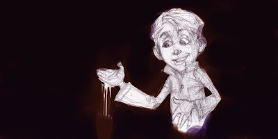
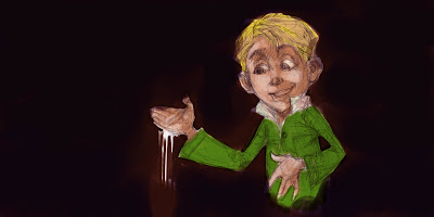
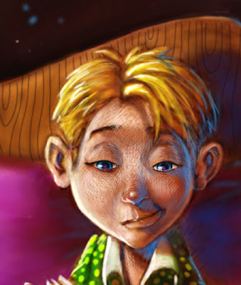
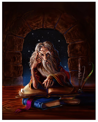
This image was painted today for a small part of the top of a page from a book I'm working on.I thought I'd add it here as it seems to fit with the general theme of this blog.
By: Aaron Pocock,
on 8/24/2008
Blog: sketchworld (Login to Add to MyJacketFlap)
JacketFlap tags: fairy, children's, fantasy, drawing, book illustration, children's art, digital painting, digital, faery, Add a tag

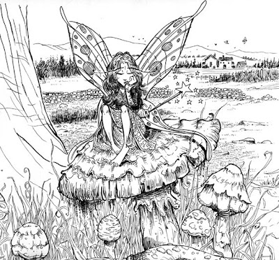
I've been a busy boy lately, haven't had much time for sketching and the like, but I did manage to paint up a rough sample or two for a publisher I'm in touch with..... here's one of those images....
By: Aaron Pocock,
on 8/18/2008
Blog: sketchworld (Login to Add to MyJacketFlap)
JacketFlap tags: Add a tag
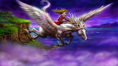
Here's another stepbystep Pegasus Painting. I'm having so much fun painting and drawing him, why would I want to stop. I painted this in Corel Painterx as usual but today I used the oil brushes for a change. I painted this entirely without reference.
STEP ONE The rough sketch was drawn straight into painter using the pencil option. It's very sjketchy but there's enough info for me to read it and paint over.STEP TWO As usual, I start with a watercolour underpainting for a base to work from. STEP THREE Details are added, tones are blocked in to help the form.


STEP FIVE Setails added to trees etc. Again , thinking form!form!form!

STEP SIX Moving to the back of the landscape here. adding detail and atmosphere to the background. Also moving through the image to add details and highlights throughout.
 STEP SEVEN More tonal work.
STEP NINE generally moving through and tightening it all up.
STEP TEN more work on the horse himself and general work throughout.
STEP ELEVEN-FINISHED!!! I reverese the image as i work, as part of my standard working process to check to see if there are any 'off' elements, but today I liked it better reveresed, so that's how it'll stay. I enjoyed this painting very much. All in all, it took approx 8 hours from start to finish.
By: Aaron Pocock,
on 8/17/2008
Blog: sketchworld (Login to Add to MyJacketFlap)
JacketFlap tags: Add a tag
This illustration was a lot of fun. I saved it in step-by-step stages as usual working habit now) and thought I'd post it on here along with my others.
This sketch is one from a few drawn and painted for an idea I have in mind that I'm working on in my spare time. This was drawn in my sketchbook, a rare feat at the moment as i'm doing so much digitally now, even inking.
STEP ONE
The sketch.
STEP TWO
Firstly, in my mind, I decide upon a colour pallette I'm going to use and keep it in mind at all times through the working process. i lay down scratchy, quick washes in the genral colours with the watercolour brushes in Painter X.
STEP THREE
Next come the tones. I work up the basic lights and darks with the watercolour brushes, laying darker tones over the underdrawing, although the sketch wasn't elaorately drawn, it does house enough info for me to just splash colour around.
STEP FOUR
I lay in darker areas here for the landscape. At this point, my mindset has changed from a light to dark, to a dark to light mindset. I've effectively switched from being a watercolourist to being an acrylic painter, or an oil painter here. The highlights will be gradually strengthened through the following steps.
STEP FIVE
Colours added, form starting to emerge from the lanscape... rocks etc.
STEP SIX
Adding details. I use a combination of the natural oil brushes and the airbrush at this point. Just adding gestures to guide me through the amount of detail I'll be adding. As you can probably guess, I don't always have a 100% idea of what it's going to look like. Note, the figure has gone from the top of the hill. It was unnecessary.
STEP SEVEN
I've thrown some cloud coverage down to give me an idea of the 'atmosphere' of the illustration. I find this a necessary step so I don't get to picky with detail etc. and I still get the 'feeling' I'm trying to evoke: height, weather conditions etc.
STEP EIGHT
Building up muscle tones on the horse and on the wings, generally looking through the image to strengthen weak areas and tighten detail. the clouds in the background have recieved treatment over the last few images too.
STEP NINE
Here I'm adding more detail to help 'sel' the scen e and add to the scale of the image... rocks, birds, and trees on the hill etc.
STEP TEN
As very often happens (and it's a joy to be able to do this digitally....) I don't like the tilt of the horses head, so i change it-as easy as that!
STEP ELEVEN
More detail and highlights added.
STEP TWELVE
More of the same. Note the clouds below the horse and girl are become more 'formed' and stylised.
STEP THIRTEEN
Here, i punch up the contrast a touch and sharpen the image for clarity. Note the trees on the hilltop are missing again. I didn't think they added anything to the image. Highlights added to the horse to make it stand out from the background, trying desperately hard to avoid a 'cut-out' look.
STEP FOURTEEN
The clouds are finished, and they are toned down by strengthening the 'purple' colour over the top via a 'glaze' from the watercolour brush., same with the hill, this pushes the horse and rider forward and helps them to stand out more.
STEP FIFTEENTHE FINISHED IMAGE...
Note the change to the horse's mane. I wasn't a fan of the 'unruly' look so I replaced some of it with a straighter look and blurred it off, hopefully giving it a look with even more movement.
By: Aaron Pocock,
on 8/13/2008
Blog: sketchworld (Login to Add to MyJacketFlap)
JacketFlap tags: fantasy, drawing, mythology, pen and ink, book illustration, pencil, line art, creatures, digtal art, Add a tag
I've been using Corel Painter for a couple of years now. I'm currently using PainterX, there are a few more thingies on it than it's predecessor. I've been doodling away at a project that's in the back of my mind in muy spare time and today, I wanted to have a play with Painter's inking pen functions. This is the before and after; from the drawing to the finished line art, for me, for digital media, it comes pretty close to the real thing.

By: Aaron Pocock,
on 8/13/2008
Blog: sketchworld (Login to Add to MyJacketFlap)
JacketFlap tags: children's books, photoshop, fantasy, drawing, mythology, book illustration, children's art, digital painting, corel painter, Add a tag

here's todays image. I've got a bit of a thing happening with 'flight' at the moment.
For the first time since I've started using them, I'm very comfortable with Photoshop and Painter. I've developed half an idea of a working procedure that really seems to suit me, it's rather like the way I used to work when I used traditional media.
By: Aaron Pocock,
on 8/11/2008
Blog: sketchworld (Login to Add to MyJacketFlap)
JacketFlap tags: oils, galleries, drawing, gallery, book illustration, painting, exhibition, acrylic, children's art, digital painting, Add a tag
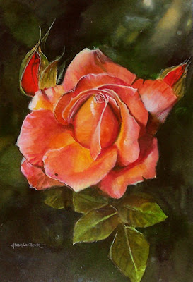
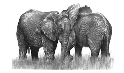
I've recently had a solo exhibition at the Region's gallery. It was fun, humbling, honest and the opening night was downright scary. But all in all it was a wonderful experience. I enetered 22 images in all, here are a few of them. I entered pieces using most of the tricks up my sleeve in various mediums including: acrylics, oils, graphite, watercolour and gouache. the exhibition was called 'The Eternal Student', the reason for the title was that I feel I'm forever learning. Thankfully I've been asked to come back for another exhibition, I'd like to focus on just one theme next time. Watch this space......
By: Aaron Pocock,
on 8/11/2008
Blog: sketchworld (Login to Add to MyJacketFlap)
JacketFlap tags: corel painter, digital art, photoshop, drawing, book illustration, children's art, digital painting, Add a tag
 I've just come back from a long weekend with my wife and son and hadn't drawn all weekend. This is what came out of me upon my return.
As usual, it was painted with Corel Painter and Adobe Photoshop.
By: Aaron Pocock,
on 8/8/2008
Blog: sketchworld (Login to Add to MyJacketFlap)
JacketFlap tags: children's books, illustration, children's, drawing, book illustration, painting, children's art, digital painting, digital art, Add a tag
This image took me nearly three days to 'paint'. some of it was hard work, some of it was an absolute joy. I'm pretty happy with the result. It was rendered in my usual photoshop and Painter.
By: Aaron Pocock,
on 8/4/2008
Blog: sketchworld (Login to Add to MyJacketFlap)
JacketFlap tags: step by step, children's books, book illustration, children's art, digital painting, digital art, Add a tag
Here's my latest step-by-step demonstration...
I've been asked by one of my publishers for some animal samples. Although I have a huge amount of wildlife drawings and paintings, I don't really have all that many animal illustrations, so I set about doing a few. (see the kookaburra image from a previous post...)
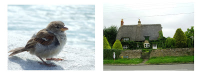
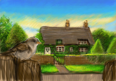
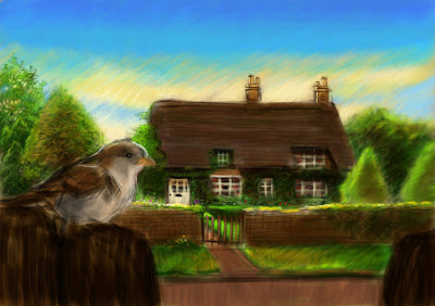
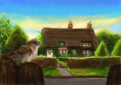
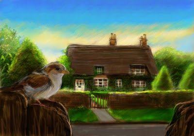
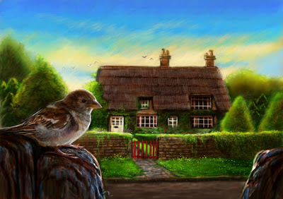
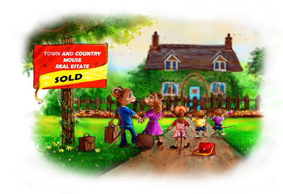
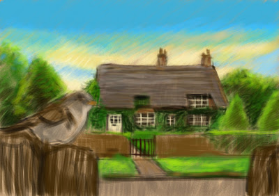
This one was an absolute joy to paint. I had great reference for starters... my Mother-in-law took the photos on a recent trip to the UK, it's very handy having relatives who take great photos and it's always worthwhile to keep a lot of files for reference, here's proof.
I call this image 'The Sparrows of Redgate Cottage".
STEP ONE Here's the reference I used for the image. Note, I turned the cottage around, just in case the owners ever saw it, I'm not sure if the M.I.L. got permission. I'll carry on as if she didn't.STEP TWO Here's the composited image with some painting done for the sky, the posts in the foreground and the road. Photoshop is fantastic for this purpose. It's a lot easier to put an image together this way.
STEP THREE Here I work out the the sketch to paint over. I keep it very basic as the photos have a whole heap of information. If I started this image from scratch, with no reference, I'd have to add a lot of info at this stage.
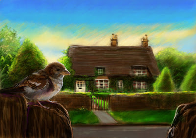
STEP FOUR I've added a colour overlay in Painter, I'm starting out using the 'chalk' option.
 STEP FIVE See the chalky look to the colour?I use the chalk option for ease of getting the colours down quickly.
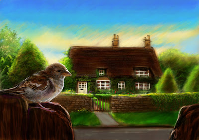
 STEP SIX Some details added and keeping a watchful eye on the tones at the same time.
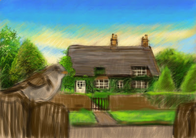
STEP SEVEN More detail. I start work from the back and gradually move forward.
STEP EIGHT I'm looking right through the image now and thinking about the relatiuonship between the background and the forefront. I begin adding a few highlights for clues and a little bit of work on the sparrow.
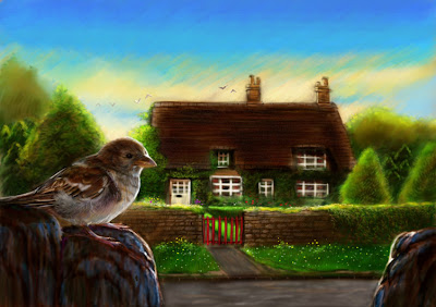
STEP NINE More tonal work to pull the whole thing together.
STEP TEN Tweaking some of the colours... the road, the path etc.
STEP ELEVEN Working right through the image, adding detail to the bird too at this point. This is the fun part for me, the finer detailing.
STEP TWELVE Lots more work on the foreground. Working out the relationship with the sparrow and the background, I want it to stand out so I add some gentle highlights, trying hard to avod the 'cut-out' look. I always bear try to bear this in mind.
STEP THIRTEEN Toning the whole thing and adding more detail, the image is really starting to come together at this point.
STEP FOURTEEN More of the same. The red of the gate really provides a nice break between the front and the back of the image and also, gives me a title.
STEP FIFTEEN The finished image. I'm pretty happy at this point, but no doubt, as I do, I'll go back and touch it up in the future. I forgot to mention that I painted this as a cover image, so I left a fair amount of space at the top for type. There's nothing worse than dodgy typestting over a lovely image. Another thing I try to bear in mind at all times.
By: Aaron Pocock,
on 8/2/2008
Blog: sketchworld (Login to Add to MyJacketFlap)
JacketFlap tags: Add a tag
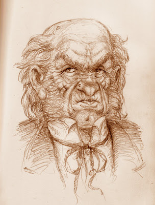
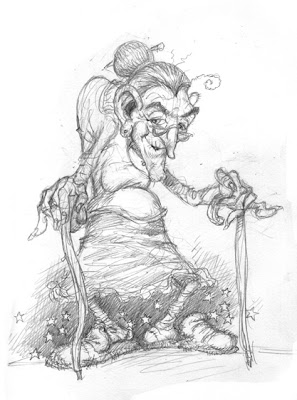
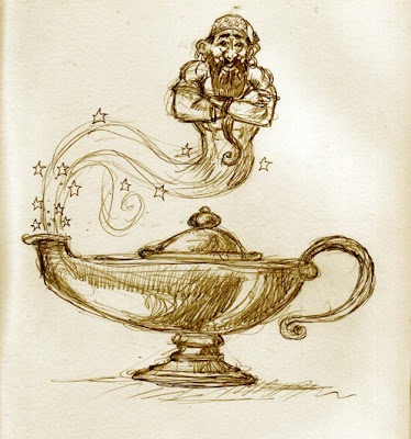
I love Scrooge's Character. I've said here before that "A Christmas Carol'is one of my all-time favourite stories. I've just been having a play and this is what I came up with......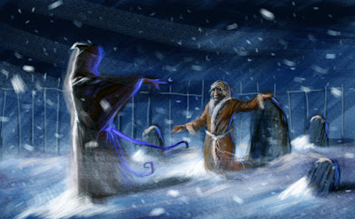
By: Aaron Pocock,
on 8/2/2008
Blog: sketchworld (Login to Add to MyJacketFlap)
JacketFlap tags: Add a tag
I had the urge to do some wildlife art this weekend. One of the publishers I'm dealing with wanted to see some more animal stuff, which I sent, but my portfolio doesn't seem to have enough of it, so I created this image.... and put some text on to pretend it's the cover of a children's picture book. 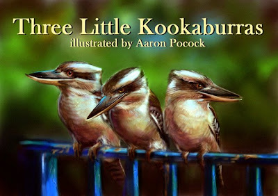
By: Aaron Pocock,
on 7/31/2008
Blog: sketchworld (Login to Add to MyJacketFlap)
JacketFlap tags: illustration, fantasy, digital art, elven, Add a tag
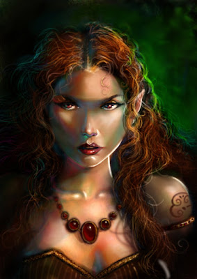
 This image is one of a few recent attempts to get a 'fantasy' fix out of my system. I used to do a lot of this kind of thing, every now and again, I get a real Jones and have to exorcise the ghost. This sketch took approx 2 1/2 hours in Photoshop and Painter.
By: Aaron Pocock,
on 7/28/2008
This image is one of a few recent attempts to get a 'fantasy' fix out of my system. I used to do a lot of this kind of thing, every now and again, I get a real Jones and have to exorcise the ghost. This sketch took approx 2 1/2 hours in Photoshop and Painter.
By: Aaron Pocock,
on 7/28/2008
Blog: sketchworld (Login to Add to MyJacketFlap)
JacketFlap tags: Add a tag
 Here's an older image. I'd forgotten all about this one. It was one of my earlier digital efforts, just thought i'd post it here as I've been a little busy over the past week.
This image was designed as a wraparound cover for a children's book, with the main centre of interest being the right hand side of the illustration, leaving room on the back for a blurb. It's a little more over-rendered than my newer stuff as I'm concentrating on my newer digital works having a more natural media look and I only used the 'airbrush' tool back then, still, I think it stands up ok for all that.
By: Aaron Pocock,
on 7/24/2008
Blog: sketchworld (Login to Add to MyJacketFlap)
JacketFlap tags: Add a tag
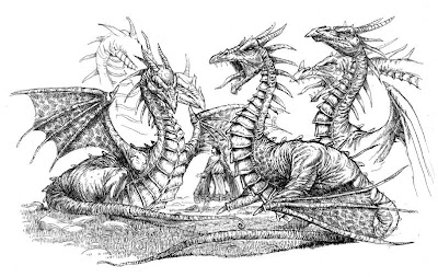
I've been playing around with Painter's inking brushes for a little while and thought I'd post a few examples on here. I'm very much a traditionalist when it comes to inking my stuff, I've been using pen and ink in a professional capacity for about 15 years now, but I'm very open to new things. I'll post the drawings all together, see if you can guess which ones have been inked digitally and which ones are good old pen and ink.
(Answers at bottom of post...no peeking!)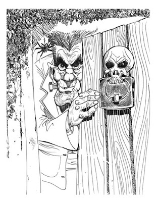
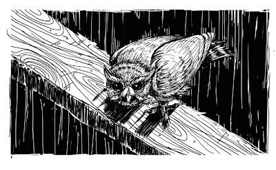
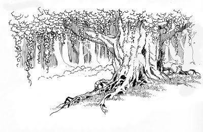
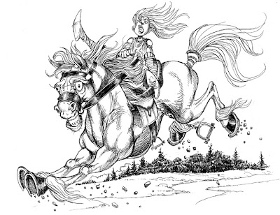
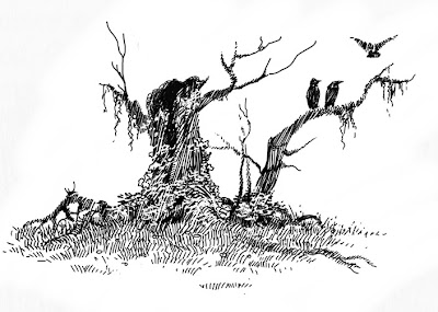
1) Frank-(traditional media) 2)Owl-digital 3)Tree-Digital 4)Horse and rider-Traditional 5)treestump-digital
By: Aaron Pocock,
on 7/23/2008
Blog: sketchworld (Login to Add to MyJacketFlap)
JacketFlap tags: Add a tag
Todays image started out as a sketch I did on the pc. I'll usually rough up a drawing on paper, but today I wanted to use the pencil tool in Painter.
This illustration took me approx. 2 hrs from start to finish.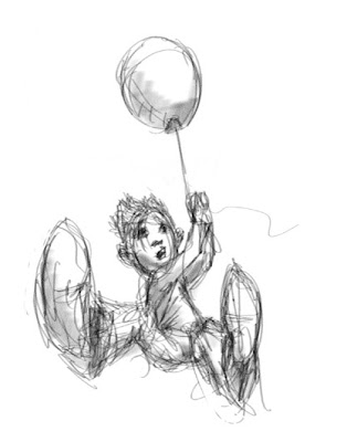
By: Aaron Pocock,
on 7/22/2008
Blog: sketchworld (Login to Add to MyJacketFlap)
JacketFlap tags: Add a tag
This is a recent sketch that I wanted to colour. I've been looking forward to doing some fantasy stuff for a while, so this is the first of (hopefully) a few new fantasy images. nothing overly serious, it took about five hours using my trusty photoshop and painter programs. I worked in a similar way to the step-by-step samples here in recent posts.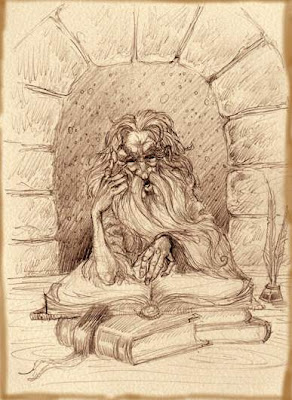
By: Aaron Pocock,
on 7/20/2008
Blog: sketchworld (Login to Add to MyJacketFlap)
JacketFlap tags: Add a tag
This here's one of the new images I've been working on. As usual, I've saved each stage to give a bit of a rundown of my working 'process' (term used loosely). (working details below each image.)
STAGE ONEThis is the sketch as it stood in my sketchbook. I'll generally work through the whole series of illustrations before I get to work on any one of the images. This is all a bit scratchy and loose, but I have enough info to keep me going.
 STAGE TWO
I've redrawn the sketch. This is enough detail for me to use. I layer it over the page template I've set up and position it on the page, allowing enough room for the text. (VERY IMPORTANT)
STAGE THREEI know the background is going to be dark here (it's set in space), so I throw down a wash using the digital watercolour and airbrush brushes in painter.
STAGE FOURHere I use the digital watercolour brushes to lay out the flat approximate colours I'll be using throughout the image.
STAGE FIVEMore of the same..... Note some tonal stuff happening.
STAGE SIX
Picking out details here, still using the airbrush and digital watercolour brushes to do this. I use the digital watercolour brushes at theis stage to glaze over existing colours.
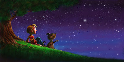
STAGE SEVENThe boy is on a star, so I gesture in the glow and approximate how it would look. Pure white would be boring, so i throw in a few colour for visual interest. 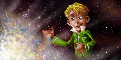
STAGE EIGHT
STAGE EIGHT
More details are added. I hint at lots of sparkly stuff and stars and try to set up a 'Universey' look at this point.
STAGE NINENote the green glaze over the boy's pajamas. It still shows the tonal work through the colour. I used the digital watercolour brush for this. He's got a handful of stardust, so i begin to paint in the sparkly dust on his hand. 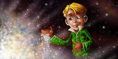 STAGE TEN
STAGE TENHere I begin to pick out highlights, the spots on his pajamas etc. I genrally use a dodge tool set on low (for ease of control). (I set most of my brushes when using the PC on a low opacity for this purpose...control))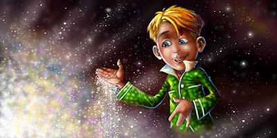 STAGE ELEVEN
STAGE ELEVENAT this point, I'm moving through the whole image, tidying up this and that, not stopping anywhere in particular. Although it may appear to be a tightly-rendered image, my working practise is very loose, allowing me work the way I noramally would on a traditional surface. I admire people who work with 3D and vector programs, but the two I use, (PHOTOSHOP and PAINTER) allow me to be me. I think that's fairly important-don't you?
 CLOSE UP
CLOSE UP
By: Aaron Pocock,
on 7/19/2008
Blog: sketchworld (Login to Add to MyJacketFlap)
JacketFlap tags: Add a tag
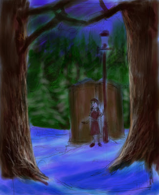
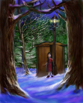
The scene in 'The Lion, The Witch and The Wardrobe' where Lucy steps out of the wardrobe is one that very much sticks in my mind. I've had dreams, astral trips and daydreams where I've 'stepped' from one place to another, I imagine I know how she must have felt seeing all that snow upon walking out of a closet full of fur coats.
As usual, I rendered the image using Corel Painter, with a little help from Adobe Photoshop.
I'll break the scene down into step-by-step parts.....
I'll break the scene down into step-by-step parts.....
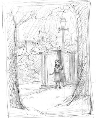
STEP ONE-(thumbnail sketch)
I scanned this little sketch into my pc straight from my sketchbook and blew it up in size. Saved at around 30x20 cms and at 300 dpi.(for ease with which to add detail).
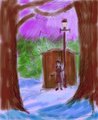
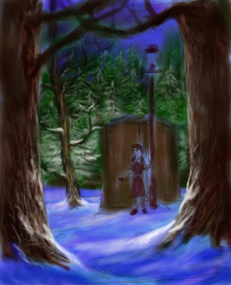
STEP TWOmy first steps with colour usually involve the 'digital watercolour' brushes. I like these as I am able to achieve nice, large washes and the sketch shows through, so I can still see what I'm working on. This is pretty much my standard working practice when using digital, in fact it isn't so different to when I use 'real' watercolours.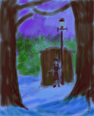 STEP THREE
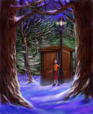
STEP THREEUsing Painters wonderful 'colour overlay' option, I lay down a flat wash of blue over the whole image to tie the scene together. Still the underdrawing/painting shows through.
STEP FOUR
Still using the 'digital watercolour' brushes, I begin to add the start of some tonal/colour work. I flip the switch in my mind and start thinking of the image as an acrylic/oil painting-that is: from dark to light-whereas watercolour techniques use a light to dark mindset.
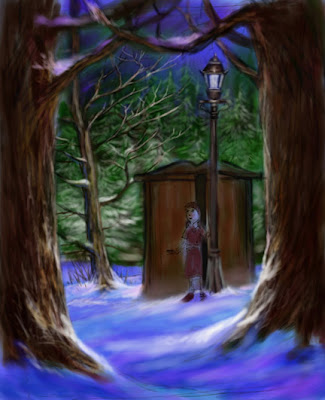
STEP FIVE
This is where the fun begins. I'm beginning to add details into the image. I'm kind of working backwards here, not sure why, but I do remember that I wanted the trees in the foreground to 'frame the scene'-so we'll go with that reasoning eh? I'm using the acrylic brushes and the airbrush in Painter (Painter X)
..... read on.....
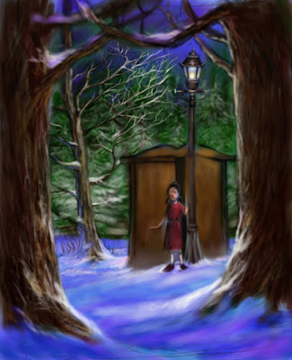
STEP SIX
Okay, at this point, I'm thinking that the scene is looking a bit 'minimalist', so I add the tree to the left of the wardrobe, this is very much a design element, I feel it complements the lampost and adds some very much needed life to the image, there is a hint of uncertainty in the shape of the branches , if you know the story, it's not all turkish delight for Lucy with what Tumnus has up his sleeve.
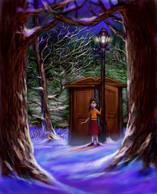
STEP SEVEN
When I work on ANY image, I'm forever casting my eye about the whole scene, trying to weigh up values, not over render certin areas etc, so with that in mind, I begin to work through the image adding detail to the whole thing. I'm not the kind of artist who can start in on one area, finish that, and then move on, I have to spalsh a bit here.... a bit there.... etc.
STEP EIGHT
More detail added, Lucy's look is starting to change, like many images I work on.... these things are subject to a certain amount of changes as I settle on a colour scheme and design elements that please me. Unless I have specific things to adhere to, I just go with the flow-intuition is an artist's friend.
I'm very much thinking about how the light falls and bear in mind not to have too many areas competing with each other. The more one things of these things earlier on, the less one has to change later on.
STEP NINE
More work on the light and small details, I add some detail to get a feel for Lucy's face, which has changed some since the initial sketch.
STEP TEN
In Photoshop, I use the colour adjusting tool and punch up the red and magenta. The whole image was too green and needed some warmth. I add details throughout the image, and realise I don't like the colours Lucy is wearing, so I use colours that'll make her stand out.... after all, she's a stranger in a strange land and doesn't exactly fit in at this point does she?
STEP ELEVEN
The whole scene is a little blurry, so I sharpen it in photoshop, this adds to the clarity of the image. more detail, a few highlights and Bob's yer Uncle.
I'll call it finished at this point, but I just know I'll be adding more detail and spending more time on it.
Watch this space, I'll be adding more of these over the weeks.
By: Aaron Pocock,
on 7/14/2008
Blog: sketchworld (Login to Add to MyJacketFlap)
JacketFlap tags: Add a tag
It's an ambition of mine to someday draw an illustrated version of 'A Christmas Carol'. It's just about my favourite story of all time. It's got it all: Universal themes, spirituality, Metaphysics, the Human condition. Old Ebeneezer Scrooge is a great character and through him, Dickens tells us that it's never too late to change, it's ll about...hope. I like that.
This is todays sketch. I've been scratching away at Scroogey for years now.
This is todays sketch. I've been scratching away at Scroogey for years now.
By: Aaron Pocock,
on 7/12/2008
Blog: sketchworld (Login to Add to MyJacketFlap)
JacketFlap tags: Add a tag
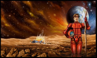
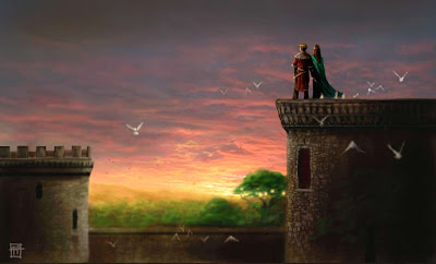
I had a bit of time to kill today and decided to have a play with photoshop. It's been pretty intense lately with illustration and I haven't done anything like this for a while and sometimes, it's just nice to do something different. This image is my attempt to portray how i see the 'Golden Age' of respect for the planet. When the people who dwelt on her actually lived in harmony with nature and were more in touch with the land. No Pagan or druid myself, I find myself empathising with them and deeply respect the way they not only commune with nature, but how many of them, even to this day can read nature. This understanding, to my mind, needs to be returned.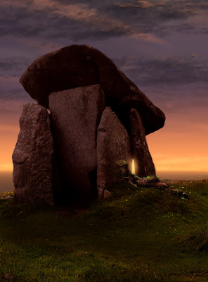
By: Aaron Pocock,
on 7/11/2008
Blog: sketchworld (Login to Add to MyJacketFlap)
JacketFlap tags: Add a tag
 By: Aaron Pocock,
on 7/9/2008
By: Aaron Pocock,
on 7/9/2008
Blog: sketchworld (Login to Add to MyJacketFlap)
JacketFlap tags: Add a tag
.jpg) STAGE ONE... The Thumbnail sketch. This comes after reading the text and having a bit of an idea as to what needs to go into the image. I keep it really loose at this stage.
STAGE ONE... The Thumbnail sketch. This comes after reading the text and having a bit of an idea as to what needs to go into the image. I keep it really loose at this stage..jpg) STAGE TWO.....The Preliminary sketch. This is the image I'll use to scan into the pc and paint over in photoshop and Painter. I work very much the way I would with a canvas or sheet of watercolour paper. I keep the layers down to a minimum for this reason. See how different the drawing is to the thumbnail... I change things at this stage, so I don't have to later. I was happy I knew what I was going to do with it. This was drawn by hand on cartridge paper and scanned in as an RGB image. the colour was tweaked to give me a coloured base to work on, rather like adding yellow to a sheet of watercolour paper to take the stark white away. It kinda looks like a weathered old piece of paper that Leonardo may have used eh?
STAGE TWO.....The Preliminary sketch. This is the image I'll use to scan into the pc and paint over in photoshop and Painter. I work very much the way I would with a canvas or sheet of watercolour paper. I keep the layers down to a minimum for this reason. See how different the drawing is to the thumbnail... I change things at this stage, so I don't have to later. I was happy I knew what I was going to do with it. This was drawn by hand on cartridge paper and scanned in as an RGB image. the colour was tweaked to give me a coloured base to work on, rather like adding yellow to a sheet of watercolour paper to take the stark white away. It kinda looks like a weathered old piece of paper that Leonardo may have used eh?
I've been careful to leave space for the text in the left hand side, over the bottom of the bed..jpg) STAGE THREE... I work on the background first. The space scene is blocked in and a hint of the elements are visible. I lay down flat washes of colour on the foreground at this stage using the digital watercolour brushes in painter.
STAGE THREE... I work on the background first. The space scene is blocked in and a hint of the elements are visible. I lay down flat washes of colour on the foreground at this stage using the digital watercolour brushes in painter..jpg) STAGE FOUR... Working on the tones and highlights. I also scratch away a little at the face. I've also added blue in the shadows, it gives it a 'cleaner' look, rather than just a boring, dirty tonal look. I find it gives it a 'lift'.
STAGE FOUR... Working on the tones and highlights. I also scratch away a little at the face. I've also added blue in the shadows, it gives it a 'cleaner' look, rather than just a boring, dirty tonal look. I find it gives it a 'lift'.
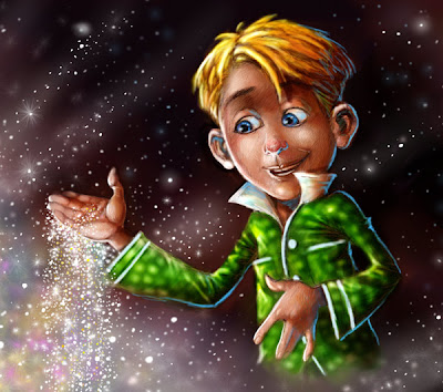
THE FINISHED ILLUSTRATION. See below for a close-up.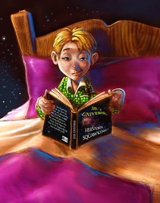
This next month or so, I'm teaching seven workshops, for kids, teenagers and adults. The subject matter ranges from cartooning to acrylic painting (which coincides with my gallery exhibition currently on show). For the acrylic workshop, I have to do a floortalk on my processes and inspiration, so I thought I'd get prepared and try to break down the thing I do, generally without much conscious thought and try to articulate a step-by-step run through of the creation of an image. This illustration was produced for the book I'm currently working on, I've never actually completed any of the stories I've written and illustrated, but this one looks set to be a goer.
Watch this space.
By: Aaron Pocock,
on 7/7/2008
Blog: sketchworld (Login to Add to MyJacketFlap)
JacketFlap tags: Add a tag


 As this blog's presently on the 'lean and meagre' side, I'm adding a few bits and pieces of old and new works.
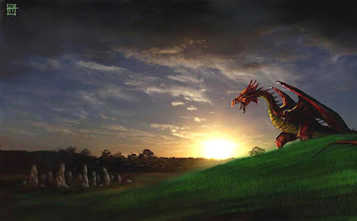
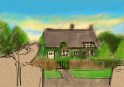
For those who don't know my work, I use many different media, for my fine art, Iuse watercolours, acrylics, oils and graphite (samples above). For my illustration, I use the aforementioned traditional media and am currently using the PC (photoshop and painter) for my children's book illustrations. I also use photographs and hand painted stuff mixed together, (see the Dragon and the lion illos above, the sky in the 'rooftops' image was a sunset photo I took too.)