
A little doodle of a sweet pair of doves, one pale blue and the other light pink, cuddled in an embrace shaped like a heart. It started out as a pencil sketch in my moleskine that I scanned and then digitally painted in Corel Painter, then played around with in Photoshop to create a pair of separate blue and pink hearts as well:


I've used them to design cards and matching gifts for ...
Weddings: Two Doves One Heart Wedding at Floating Lemons Events;
Baby Showers for twins: Twin Doves Heart at Floating Lemons Events;
and Valentine's Day: (coming soon!)
Cheers!

Mainly I work in the world of children's publishing so when I get a call from Square One Publishers to illustrate one of their books, it's always a new and exciting challenge for me. They don't do children's books but do publish wonderful books on food and cooking, parenting, health, the list goes on and on.
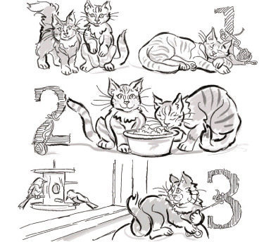
This time it's Cat Calls, Wonderful Stories and Practical Advice from a Veteran Cat Sitter, by Jeanne Adlon and Susan Logan. Here's a sneak peek of the art that will be used for Chapter Headings. I see it as a sort of Sex in the City tell-all about the extraordinary life of a well known cat sitter in NYC. But it's also full of valuable information and advice for cat owners. The coauthor is Susan Logan, editor of Cat Fancy Magazine and will have a foreword by Jim Davis, creator of Garfield. It's going to be such a great, fun book and I'm honored to be apart of it.
Look for it this fall!

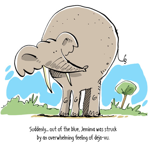
Here’s my new submission for this week’s Illustration Friday topic!

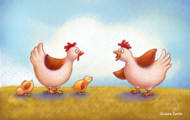
I'm busy working on increasing my digital portfolio right now by reworking some older work. These chickens have long been a favorite of mine, but I was never happy with the background. I love the new digital version. It's more happy and cozy, if that makes sense.
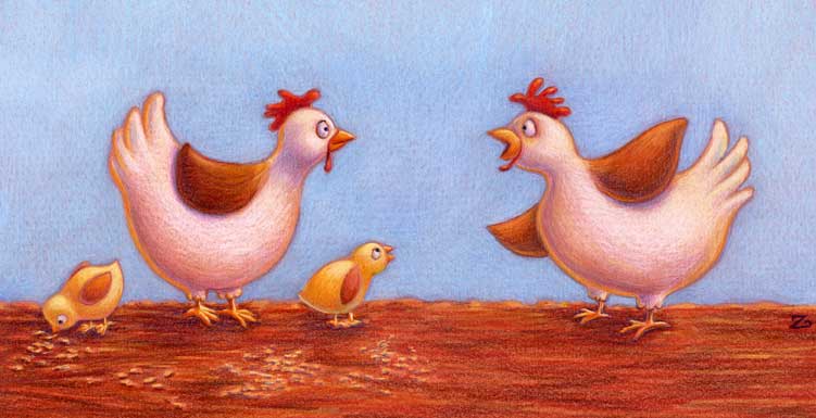
Here's the all color pencil version.
(click on image for full size)
A little whimsy for IF from my
BLOG.

I've been expanding my portfolio and my skills lately. Here's another anthropomorphic animal image in the new style. It is a pencil drawing, scanned, digitally colored in Photoshop. This is just the bottom portion of the image; I'm still fooling around with the top. I love doing these though still insecure about where exactly I am going. Tim is building a new portfolio site for me - just a splash page so far but I love it: www.karenleeillustration.com
 There’s nothing worse than losing a pretend race…
Oh how I love to play with textures and different patterns. Here’s a quickie for this week. A scene based on my childhood. For some reason I would always lose in these sofa races my cousin would make me play…she was really good ..
HAPPY MONDAY!
By Melissa Ackerman
 Soon the spring ’11 artwork will start pouring in to be digitalized, printed, and bound. Before our art director Nick becomes buried in a mountain of watercolor paintings I thought I would sit down and ask him about the art of, well, art.
AWC: How do you generate a pool of illustrators with whom we could work?
Nick: Agents, referrals, past illustrators, unsolicited postcards and slush pile submissions. I usually go online and check out their work on their website or blog and sometimes I link to the blogs they follow to find new people that way. I’m always looking for consistency in the work.
AWC: How do you and the editors decide which illustrator to assign to a book?
Nick: It’s all subjective. It’s about style, about what fits with the story. You might look at some art and say, ‘that’s too graphic’ or others and say ‘that’s too editorial.’ But regardless, the manuscript leads the illustration. We start with a mock-up book that is text-only and I decide how to block the art. Then I’ll offer guidance to the illustrator. For instance, with The Really Groovy Story of the Tortoise and the Hare (Spring 2011) I said, ‘Well, the rabbit is kind of cosmopolitan – maybe it should have a backpack of some sort.’
AWC: What are some of the trends we are seeing right now?
Nick: Well, the graphic novel is huge right now, and we are seeing it have some influence, but you have to be careful because sometimes it can look too cartoony for a picture book. Then there’s digital. Everything is going digital. Last year it was something like 60/40 or 70/30 traditional versus digital, but this year it’s the exact opposite. Take this one (pointing to The Three Bully Goats), the illustrator drew the outlines but painted everything digitally.
Click to view slideshow.
AWC: I bet the digital artwork makes it easier for the printers to get the colors exactly right.
Nick: Not always. With reproduction the CMYK colors are always muddier and darker than the Pantone versions. See the brightness of that green in the grass? We’ll never get it as fluorescent as that. It’ll look more like this color here. [See Below]
AWC: What did you do before you came to Albert Whitman?
Nick: I worked in advertising as an art director.
AWC: What about your own art work? Do you still paint or draw?
Nick: (Laughs). Not anymore, no. Not after looking at art all day.


 0 Comments on Illustration Station: Q&A with an Art Director as of 1/1/1900


.jpg?picon=364)


 When I was a boy attending elementary school in Maryland my teachers used to say, “stop day dreaming, sit up straight, pay attention, and stop drawing!” That was a time in my life when I thought drawing was bad. Were my teachers right? Would I really amount to nothing if I kept drawing all the time? How could something so fun cause so many of my teachers to freak out? I started to hide my drawings under my desk. I’d pretend to really be into the lesson so I could throw them off the scent of my almost finished fire dragon. I even remember one of them saying, “you’ll never earn a living drawing goofy characters.” Over thirty years later, 2000 freelance jobs, and 20 children’s books I think I’ve finally proved to myself that it’s possible to dream big, work hard, and find success and happiness drawing goofy pictures.


 10 Comments on Illustration Friday .:. Cocoon, last added: 5/3/2010

 10 Comments on Illustratio Friday .:. Detective, last added: 4/22/2010


yay chickens!
Looks great! I love the colors in the new version much more. I love the purples in the shadows. Thanks for sharing. :)