new posts in all blogs
Viewing: Blog Posts Tagged with: texture, Most Recent at Top [Help]
Results 1 - 25 of 42
How to use this Page
You are viewing the most recent posts tagged with the words: texture in the JacketFlap blog reader. What is a tag? Think of a tag as a keyword or category label. Tags can both help you find posts on JacketFlap.com as well as provide an easy way for you to "remember" and classify posts for later recall. Try adding a tag yourself by clicking "Add a tag" below a post's header. Scroll down through the list of Recent Posts in the left column and click on a post title that sounds interesting. You can view all posts from a specific blog by clicking the Blog name in the right column, or you can click a 'More Posts from this Blog' link in any individual post.

By: Jessica Holden,
on 2/15/2016
Blog:
Illustration Friday Blog
(
Login to Add to MyJacketFlap)
JacketFlap tags:
illustration,
illustration friday,
art,
color,
digital,
artists,
printmaking,
editorial,
texture,
freelance,
Add a tag


karolin schnoor is a German freelance Illustrator and designer, who uses screen printing as an integral part of her illustration practice. Inspired by a love of colour and pattern her illustrations can be found in magazines, stationary, calendars and mugs with a vast array of products to purchase in her Etsy shop. Some of her clients include; Harper Collins, Creative Review and The New York Times.
To see more from this artist visit her website.


Joe Mclean is an Illustrator from Norwich, who creates illustrations using a combination of hand drawn lines, scanned textures and Adobe Illustrator. His inspirations include traditional printing processes, hand drawn type and graphic illustration. His speciality is editorial illustration and greeting cards. His clients include; Computer Arts, Spindle Magazine and Loud and Quiet to name a few.
See more of Joes work on his website and Behance.
Do you ever find yourself struggling to remove the white paper-textured background from around your images? I used to, until I learned this incredibly simple method using the “Channels” function in Photoshop. Here’s what you need to do, step by step.
1. Open up your image in Photoshop. Today I’ll be using this bicyclist illustration. Click the “Channels” icon (circled in red below.) You should see four rows: RGB, red, green, and blue. (Unless your image is CMYK, in which case you’ll have a channel for cyan, magenta, yellow and black instead.)

2. Depending on the dominant colors in your image, one channel will likely be darker than the others. I like to start with that one, but really any of them would probably work. In my case, the darkest channel is the the “Blue” channel. When I click on it, I see a grayscale version of my image. I’m going to copy this channel by dragging it down to the “copy” icon in the channels box. (See red arrow.)

3. Now there should be a fifth row in the channels box called “Blue copy.” You can re-name it if you like. While this channel is active, go to Image -> Adjustments -> Levels. Use the sliders to adjust the levels so that everything you want to be deleted (the background) is white, and the image is black. Anything that appears gray will be semi-transparent.

4. Once you’ve adjusted the levels on your channel, use the brush tool to clean it up, making sure the interior of the image is completely black if you don’t want the background showing through. (I didn’t want my cyclist’s mustache to be transparent!) When you’re done, click on the “RGB” composite channel so that your image appears as normal.

5. Exit the “Channels” view by clicking back on the “Layers” icon. Now it’s time to make the mask. To do this, go to Select ->Load Selection.
6. You will see a pop-up box something like this. Choose your “Blue Copy” channel, and click the checkbox for “invert.” (If you forget to do this, you can always just go to “Select -> Inverse”)

7. Now your background should be selected. To make it transparent, make a mask by clicking on the “Add a Mask” icon in your Layers box.

8. That’s all there is to it! It’s super easy. From here you can add any background you want, or just leave it transparent. Here I’ve added a blue background so that you can see how my mask turned out:


By: Carter Higgins,
on 9/29/2015
Blog:
Design of the Picture Book
(
Login to Add to MyJacketFlap)
JacketFlap tags:
beyond the pond,
joseph kuefler,
blazer and bray,
design,
music,
trailers,
texture,
composition,
movement,
line,
banksy,
short film,
Add a tag

by Joseph Kuefler (Balzer + Bray, 2015)
Settle in for snippets of story so goosebumpy you’ll think the pages just paper-sliced your soul in two. It is an honor to introduce you to Joseph Kuefler and his gorgeous debut, Beyond the Pond. I love every single word he’s spilled out to us here.
Enjoy!
Can you talk about where this book came from?

My dearest childhood friend lived across the street from a picturesque pond — one of those charming bodies of water with just the right mix of long grass, cattails and critters. Early mornings almost always found its surface blanketed in a magical fog. In winter months, we would skate on its surface. That pond filled me with such wonder as a boy.
So many years later, the wonder of ponds came back to me when I found myself telling my son, Jonah, stories each morning as I drove him to school. Our route took us past a smaller but no-less-magical pond, sandwiched between a row of houses, almost as if it was forced there, like it didn’t belong. We both imagined what fantastical creatures lived beneath its surface. And so, an idea for a picture book was born.
In hindsight, I absolutely see the connection between these moments of inspiration in my life.
And what was your process like for creating it? How did you turn an idea for a story into a completed picture book?
One advantage of being an author/illustrator is that my words and images can reveal themselves together. I begin with a loose story skeleton and single completed illustration that captures the atmosphere of the book. Small thumbnails get created as I’m improving and iterating on the story. Sometimes a posture or scene in my thumbnails will inspire a change to the text, sometimes it’s the other way around. Once the story is tight, I return to my thumbnails and create much tighter pencils, focusing more on composition and type placement.


 When it comes to final art, I work digitally, more out of necessity than choice. At the moment, picture books aren’t my day job, so I need to work from anywhere and everywhere. I was traveling a lot for work in the early stages of illustrating POND. Much of the book was illustrated from airplane seats and hotel rooms, cramped rides on bus benches and stolen moments in the office.
As someone formally trained at art school, I long for the day I can rely solely on traditional materials. In some ways I still feel like I need to apologize for using a computer, which is silly, I suppose, because digital doesn’t save me time and is no less difficult. The only thing it affords me is more mobility and greater access to my creative process.


I read on your website all about Hum, and I’m so interested in that. Not so much as a musician myself, but because I think picture books function the same way a song does, as a complete and full narrative that can transcend that small space. What do you think?
I love this question because I absolutely agree. Prior to moving into my career as a creative director, I spent years working as a serious musician playing in an indie rock band. Songwriting and record producing is core to who I am and informs so much of all of my creative processes, both personal and professional.
Writing a great song begins with two questions: What do I want them to know? And how do I want them to feel? Nostalgia? Fear? Melancholy? Vulnerability? Defining the emotional arch predetermines so much about your palette—key, tuning, scale, effects, chord progressions, even mixing decisions. Once that’s defined, you need to reduce all of it, your whole vision, into between three and five minutes of music. It’s such a challenge.
This is true of great books. The books we love tell us a story, but they also tell us feeling. They teach us, adults and children alike, what it feels like to experience something, and they do it in 32 pages, give or take. A songwriter has chords. A picture book maker has paints and pencils. A songwriter has a small collection of seconds or minutes. A picture book maker has pages. Both artists curate their palettes to breathe the right mix of mood into whatever it is they are making.
More than any other mediums I’ve explored, children’s books and songs are the most related.
Like you suggest, great songs and picture books transcend their small spaces. They live on in your mind and heart and come to mean or represent so much more long after the final chord has rung and last page has turned.
Reviews have called this debut reminiscient of Maurice Sendak, Jon Klassen, and Wes Anderson, all huge story heroes. Who are your own story heroes?


I know this is a picture book blog, but my greatest passion is cinema. I love movies and have my whole life. My dad encouraged me to explore the classics, with a particular emphasis on the defining films of the 60s and 70s. Many of my story heroes are filmmakers. I am a huge fan of Jean-Pierre Melville because he found a way to steal the best parts of Hitchcock and blend it with that kind cool only the French possess.
As a child, I loved Spielberg and the wonderful films Amblin would produce because they seemed to understand children in a way few other films did. I do love Wes Anderson for his vision and wit but also for the expert way he handles melancholy. When I begin a new picture book, I typically dive into the films that I feel share a similar atmosphere or message. It’s intentionally obvious I’ve included a few homages to Anderson’s films and style in POND—I wanted to thank him for inspiring me, and I wanted to give moms and dads something of their own to discover within the book.
Animation is also a huge source of inspiration for me. Words can’t describe how much Miyazaki inspires me. His films are somehow massive in scope and incredibly intimate and personal.


I can’t say that I have any specific story heroes in the picture book space. I love the Steads and Klassen and Jeffers and all of the other usual suspects, but I don’t look to picture books to inform my own work as much as I do film or literature, even photography. I’m not trying to suggest that other picture books don’t influence my work—they most certainly do. They’re just not my primary source and I typically look to them much later in the process to help me work through a very specific problem.
I would, however, be remiss if I didn’t mention JK Rowling. Sometimes I close my eyes and hope that when I open them I will have somehow grown a scar on my forehead and transformed into Harry Potter. Rowling succeeded in revealing a hidden magic in our own world, something tucked away just around the bend, something you hadn’t realized was there all along. I love that so much about those books. Turning a pond into a portal seemed to transform the everyday and reveal a hidden magic in a similar way.
Can you tell us a little about the trailer for Beyond the Pond and how you created it? It’s such a perfect piece, and I always think trailers that feel like short films are some of the best!
Thank you for the compliments. I am a creative director who has spent many years in the branding and marketing industries working for clients we all know and love. Making films and telling their stories is a skill I’ve developed over time. When I began considering my own trailer, I knew it needed to feel a little more like a movie trailer than a “book” trailer. It was the only way I felt I could capture the spirit and scope of the book in such a short period of time.
Some are surprised to learn that the voice actor is me. The trailer simply HAD to be narrated by an old, English gentleman because, well, old, English gentlemen are the most magical of men. I didn’t have any on hand, so I put on my Dumbledore hat and effected one.
I love animating. It’s something I don’t get to do as often now, but I was thrilled to be able to dig back into After Effects for this little piece and am pretty happy with how it turned out, all things considered.
What do you remember about picture books from your childhood?
I remember my school library and, Ms. Geese, the world’s crabbiest librarian (if you’re reading this, Ms. Geese, I’m sorry, but you really were frightening). She demanded that we extract library books from the shelves with such expert precision you’d think they were Fabergé eggs. But since we were all so afraid of her, we would hide away in corners with our books. In some ways, her terror forced us to have a more intimate relationship with our books, and for that I am grateful.
I remember the pictures and wishing I could draw like those artists. Like all boys, I was so in love with WHERE THE WILD THINGS ARE. I would try to replicate the wild things over and over and wondered how in the world anyone could ever draw like that. All these years later, I am still left wondering.
What is your favorite piece of art hanging in your home or studio?

I have two favorite walls in my home. One is a quiet corner of my house filled with family photos and texture studies I made over this last year. The family photos feature some of our favorite memories and experiences. It’s something we will continue to grow and add on to over the years.

The second is a Banksy print hanging in my dining room. It’s big and bold and probably doesn’t belong in a space where people are meant to enjoy meals, but I like that about it.
What’s next for you?
A nap. Honestly. Between my day job, working to support POND’s release, welcoming our third child, Augustine, into the world four months ago, and breathing life into a new picture book, this year has been full, so incredibly, exhaustingly full. But it’s been a good kind of full.
Alessandra Balzer and Balzer + Bray were kind enough to buy two more books from me immediately after we finished POND. By the time this feature runs on your blog, I will have just completed final art for my next book. Then, it will be onto the third. I’m also developing a middle grade book and young reader series.
Beyond that, what’s next is experiencing what it feels like to release my very own picture book into the world. This whole thing continues to be so surreal. One of my lifelong dreams is in a state of becoming, and I couldn’t be happier.

—
That story about Ms. Geese is one of the greatest library stories I’ve ever heard! Joseph, thanks for the music and the glimpse at the pond and beyond it all.

A big thank you to Joseph Kuefler for the images in this post.
By: Chloe Baldwin,
on 9/13/2015
Blog:
Illustration Friday Blog
(
Login to Add to MyJacketFlap)
JacketFlap tags:
texture,
freelance,
buttercrumble,
saskia rasink,
illustrator,
design,
illustration,
art,
artists,
graphic design,
maps,
Add a tag
Post by Chloe


Saskia Rasink is an illustrator, based in Rotterdam, The Netherlands. Her work has a bold, graphic style and the warm, sophisticated colour palettes used gives her work a mid-century feel. She often depicts maps and architecture inspired by her passion for traveling. She is also inspired by Scandinavian design, interiors and nature.
If you would like to see more of Saskia’s work, please visit her portfolio.
By: Chloe Baldwin,
on 8/25/2015
Blog:
Illustration Friday Blog
(
Login to Add to MyJacketFlap)
JacketFlap tags:
illustrator,
design,
illustration,
food,
drawing,
digital,
sarah,
editorial,
texture,
chloe,
freelance,
editorial submissions,
buttercrumble,
ferone,
sarah ferone,
Add a tag
Post by Chloe


Sarah Ferone is a freelance illustrator based in Philadelphia. Sarah Ferone’s background in painting and art history, and experience in designing for advertising has allowed her to develop a distinct, individual style. In addition to editorial, Sarah Ferone also works on packaging and books. Her work often has deep narrative and a beautiful handmade feel.
If you’d like to see more of Sarah Ferone’s work, please visit her portfolio.

Henri!, Character design concept.
I think I fell for the socks on this one. I had to get out my 'french toast brush' to correctly render the breakfast. It was interesting working from the rough sketch to a rough finish - with lots of fun on the way getting there.
And this child reminded me of my own child way back when... at the start when life was all wonderful.
By: Carter Higgins,
on 4/17/2015
Blog:
Design of the Picture Book
(
Login to Add to MyJacketFlap)
JacketFlap tags:
design,
chronicle books,
blog tour,
texture,
composition,
color palette,
guest post,
elsa mora,
shape,
papercuts,
k.e. ormsbee,
the water and the wild,
Add a tag

by K.E. Ormsbee, illustrated by Elsa Mora (Chronicle Books, 2015)
From the publisher:
A green apple tree grows in the heart of Thirsby Square, and tangled up in its magical roots is the story of Lottie Fiske. For as long as Lottie can remember, the only people who seem to care about her are her best friend, Eliot, and the mysterious letter writer who sends her birthday gifts. But now strange things are happening on the island Lottie calls home, and Eliot’s getting sicker, with a disease the doctors have given up trying to cure. Lottie is helpless, useless, powerless—until a door opens in the apple tree. Follow Lottie down through the roots to another world in pursuit of the impossible: a cure for the incurable, a use for the useless, and protection against the pain of loss.

I’m so excited to be a stop on the blog tour celebrating the release of The Water and the Wild, which includes a chance for you to win a copy of this beautiful (literally and figuratively!) book.
First, let’s hear from K.E. herself. Welcome, K.E.!

Visualizing Limn: The Real-World Inspirations Behind Lottie Fiske’s World.
In The Water and the Wild, twelve-year-old Lottie Fiske travels through the roots of an apple tree into the magic-soaked world of Limn—a land filled with bustling cities, dense woods, magical yew trees, and giant spider webs. World building Limn was one of the most fun and challenging aspects of writing The Water and the Wild, and my inspiration for the look and feel of the fantasy landscape came from very real places.
Today, I’d like to share some of those inspirations and take a moment to gush about just how perfectly artist Elsa Mora captured the magic of Limn in her cover art and illustrations.
New Kemble – York, England
I’m a huge anglophile, and one of my favorite places in all of England is York. The city is rich with layer upon layer of history, as evidenced in its walls, its giant cathedral, and its winding streets. I remember first setting foot in The Shambles and feeling certain that something ancient and magical was at work there.
When I first drafted The Water and the Wild, the story actually took place in York. Over time and a number of subsequent revisions, York became New Kemble, a fictional island town off the coast of Massachusetts. But the inspiration for New Kemble remained thoroughly English. I still envision The Barmy Badger—home of Lottie’s best friend Eliot—on a street similar to The Shambles. And Lottie’s home in the boardinghouse on Thirsby Square is based on the real St. Paul’s Square in York.

Iris Gate – The Biltmore Estate
When Lottie first arrives in Limn, she stays at the home of the Wilfers—an old money family with royal connections and a fair share of secrets. The Wilfer family home is called Iris Gate, and Lottie is overwhelmed by the size and grandeur of the place. When describing Iris Gate, I tried to capture the intimidation I felt upon first walking into the Biltmore Estate in Asheville, North Carolina.
The Biltmore is an imposing mansion even to full-grown adults, and I was ten when my family visited. I remember gaping at the soaring ceilings, ornate decorations, and sprawling gardens. Though Iris Gate is nowhere near as extensive as the Biltmore, its architecture and landscaping were written to resemble that of the Biltmore Estate.

Wisp Territory – Springtime in my childhood neighborhood
I grew up in Lexington, Kentucky. The city is surrounded by rolling green hills, black fences, and horse farms. It experiences four distinct seasons, and the springtimes there are lovely. In my neighborhood, there were many dogwoods, magnolias, and Bradford pear trees. When all of those trees were in bloom, white petals would blow loose into the wind, and everywhere I turned the world seemed awash in white. I called it my Warm Winter.
I never shook those springtime images, and when I was creating Wisp Territory—home to the mysterious will o’ the wisps—I wanted to convey a similar aesthetic. The world of the wisps is, by and large, colorless. The grass, the trees, and the leaves are all white. The royal home is made entirely of glass. This wintry appearance does not vary with the seasons, and it’s my homage to the Warm Winters I experienced as a kid.
* * *
Clearly, I have some very distinct ideas about how the world of Limn looks. What I was most nervous and excited about during the publication process was seeing how an artist would render a world that had for so long existed only in my imagination. As it turns out, I had absolutely nothing to worry about. When Melissa Manlove, my fabulous editor at Chronicle Books, first gave me Elsa Mora’s name, I of course went straight to Google to do some major image stalking. After only a minute, I knew I was in the best of hands.
Elsa’s papercuts are pure magic. There is so much detail, care, and whimsy in each of her creations. The cover of The Water and the Wild conveys not only the fantasticalness, but also the danger of Lottie’s journey. The way in which the characters and their natural surroundings blend so effortlessly captures my own attempt to make the world around Lottie as much a character as she is.
Inside the book, you’ll find a papercut plant accompanying each chapter heading. These illustrations reinforce the importance of the natural world throughout the book. And, you know, they just so happen to be GORGEOUS.
It’s been almost seven years since I first wrote down the image of a magical green apple tree. Now, as Lottie Fiske’s story officially hits bookshelves, I couldn’t be happier with the way that image and others came to be realized in the art and text of The Water and the Wild.
——–
If you’re anything like me, you’re dying to read more about Lottie and Limn. So! Tweet this post anyway you’d like on Twitter, and include the hashtag #dpb for a chance to win a copy! I’ll be in touch with a winner in a week.
Check out The Water and the Wild’s teacher guide here, and a sneak peek at its beginning here.
And be sure to check out tomorrow’s stop on the tour at Green Bean Teen Queen, where K.E. talks libraries!

by Matthew Burgess and Kris Di Giacomo (Enchanted Lion, 2015)
This book is the author’s debut picture book, and as a poet and creative writing teacher he found a perfect venue for these words. And here’s a great look at the illustrator’s work over at This Picture Book Life. (If you haven’t seen Brief Thief, RUN to the library. Now.)
Then there’s Enchanted Lion. Smart, beautiful, well-crafted books. This small Brooklyn publisher is fresh off a huge and deserved recognition in Bologna.
So. Let’s take a look.

Layers of letters and piles of words make up some of the best endpapers I’ve seen this year.
Before I flip another page, I’m keenly aware of this texture. What an exceptional way to visualize the poetry of E.E. Cummings. It makes perfect sense. A jumble of words and sounds and feelings are the foundation for E.E.’s work.
Words as art themselves.


Here’s a simple sentence, spare but lovely, stating facts and straightening out his family tree. Understated, but lively is for sure in that ensemble. Can you see rambunctious Uncle George there, turning a cartwheel or just plain standing on his hands?
The handwritten labels, the cattywampus text layout, the warm texture. All so inviting.

A happy home for spilling words.

A poet, catching words like a bunny through a hoop.
An author, echoing exactly what young E.E. loved.
Estlin looked around
as if his eyes were on tiptoes
and when his heart jumped,
he said another poem.


An illustrator, wrapping it all up in carefully crafted texture that smacks a bit of haphazard beauty.
It’s pretty. It’s intentional. It’s rich and wonder and a treat to take in.


A remarkable slew of back matter includes a timeline, additional poetry, a fascinating author’s note, and another really great elephant illustration.
Magic.
Lots to see and learn and celebrate here.
Out today.
I received a copy from the publisher, but opinions are my own.

By: Metin Seven,
on 3/31/2015
Blog:
Sugar Frosted Goodness
(
Login to Add to MyJacketFlap)
JacketFlap tags:
character,
animation,
metin seven,
scene,
3d,
amigurumi,
texture,
crochet,
figure,
crocheting,
crocheted,
Add a tag

3D version and animation scene mockup of a crocheted Dendennis amigurumi figure.
More: MetinSeven.com.

by Greg Pizzoli (Viking, 2015)
I’ve read lots and lots and lots of books for kids. I’ve read lots of questionable ones and I’ve read lots of spectacular ones. And then I’ve read a handful that are simultaneously spectacular and fresh and inventive and completely honor how smart kids are.
This is one of those.
You might know Greg from that burping crocodile or the hound with a need for speed, but did you know a book about an impossible con is exactly what the world of kids’ books needed? Meet this Greg.
Actually, meet Robert Miller.

(click to enlarge)
A normal kid, one who leaves home to become an artist despite his parents’ best efforts. A normal kid with a penchant for billiards, poker, and gin.
A grifter known as Count Victor Lustig.

(click to enlarge)
This liqour induced pow-wow below the Totally Legit delivery truck might be one of my favorite moments in this thing. It’s accompanied by a sidebar of Totally Legit information about the Prohibition. This blend of grit and truth and history hangs right in the suspense of Vic’s story. It feels like Saul Bass made one of those The More You Know PSAs right there on the page.

(click to enlarge)
One of the greatest tricks in this whole book is how we see the silly, unsuspecting faces of Vic’s marks, but never his. Only a thumprint. Both the clearest and fuzziest identification.
Mixed-media collage always yields great texture, just by its very nature. But Greg adds custom-made rubber stamps, actual photo texture from the floor of the Eiffel Tower, and like we’ve already seen, his very own thumbprint. This approach is as layered and grungy as Vic himself. This book can’t be slick and clean and soft–it needs depth and dirt and intrigue. That’s what it’s got.
That’s no con.
Check out these endpapers. Brick wall, posted bills, danger, and suspense.

(click to enlarge)
Why does that not look like the full width of the book, you ask?
Because then there’s this:
 In the best of places, that sneaky space under the dust jacket, where unsuspecting grownups don’t dare peek. Kids do. They know where the good stuff is. And this is the good stuff: The Ten Commandments for Con Artists by our hero.
I think 8 is my favorite. Or 5. Or 10.
And now, don’t miss Greg and Julie’s chat about this book over at Seven Impossible Things. Lots to digest. Commandment 2 will be an impossibility.
I received a copy of Tricky Vic from Viking, but the comments are all my own. And speaking of Viking, huge kudos to the publicity team that sent the book like so:

 by Karina Schaapman (Dial, 2014; originally published in the Netherlands in 2011.)
This book.
This book is massive and mini all at once.
Its press release calls it Beatrix Potter meets I Spy. A fitting description, that one, but I might call it George and Martha meets The Ultimate Alphabet meets a craftier Cardboard Challenge.
This is the Mouse Mansion. Karina Schaapman spent years creating this architectural wonder, dreaming up more than 100 rooms and passageways and outdoor spots to explore.
She also dreamed up Sam and Julia, the teensy mice who live in its walls. Here they are. (Click to enlarge.) The Mouse Mansion is oversized and so is its book. It holds the best of treasures to look at and imagine. Sam and Julia have seventeen chapters of adventures together. They are small stories with big trouble, small creatures with big heart.
Sam and Julia don’t have enough pennies for the white chocolate with rice bubbles, so they buy broken cookies.
They smile about it.
Sam plays the violin and gives Julia the shivers.
But she’d never tell him how terrible he is.
They burn pancakes and make powdered sugared messes, but agree that pancake day is the very best day. That’s what best friends do.
My favorite of all of their escapades is their interaction with Sam’s grandpa, down at the fish market. Julia is shocked to see the pictures of an anchor on his arm and a pirate on his tummy.
Julia is very curious. “Why do you have all those drawings?” she asks. “What are they?”
Grandpa smiles. “They are not drawings,” he says. “They’re tattoos. And each one tells a story.”
Yes, you do. You need this treasure chest of a picture book. You need to see these two critters overload the washing machine and hoist barrels of lemonade up to the loft.
Just try not to squeal too loudly. The triplets are sleeping.
For more pictures of the Mouse Mansion’s bitty charm, check out this post by Julie Danielson at the smorgasbord that is Seven Imp.
Thanks to Amanda and Caitlin at Penguin for the images and a review copy of the book. Thoughts my own.

The Story of Frog Belly Rat Bone (Candlewick, 2003)
by Timothy Basil Ering
I have a feeling this is one of those books that you either adore to hyperbolic proportions or is completely off your radar.
I’m in the hyperbolic proportions camp, but it’s still a book I forget about. And then when I remember, I wonder how I forgot?!
So this is an origin story, one that starts in Cementland and ends in gritty beauty.
The first spread is so perfect. A wide shot of Cementland, described as a dull, gray, endless place. A boy, arms open and striped in red, stands at your attention in the midst of all that gray. All of the lines and the stress and the mess lead you right to him.
This red-striped fellow believes treasure hides among the heaps of junk in Cementland, and in a triumphant moment finds a box bursting with color. Bright colored packages, but filled only with tiny gray specks. Hundreds of them. Not wondrous riches.
He plants anyway. And after two or three minutes, nothing happens.
While he’s gone, thieves root and loot the plot. So this boy–this treasure hunter, gathers smelly socks, scraggly wires, and of course, a crown, and dubs his creation Frog Belly Rat Bone, the monster who will protect the specks.
They are a duo with a mission and a patched together friendship that pays big rewards.
That’s why Timothy Basil Ering’s use of texture is the only possibility for this type of storytelling. The art is the story. It’s stitched up. It’s not slick. It’s piled up and layered and cobbled together just like Frog Belly Rat Bone himself. There’s warmth in the mess and intention in the scatter. It’s as beautiful as that treasure that the red-striped boy finds. And creates.

“…[W]hen I first made the dummy book for Frog Belly Rat Bone, naturally, I beat up some wood and sewed it all together. It gave it that nostalgic, cobbled-together look that’s just plain interesting to me. I wanted it to look like it was made the same way the little boy in the story makes Frog Belly, with just raw hand-stitching and splashes of paint.”
(That’s from here, which is a great read!)
It’s definitely one I want to share early in the year with our fourth graders who are the school’s expert gardeners. It would pair well with The Curious Garden (for obvious reasons) but also classic unlikely friendship stories. Isn’t a trash-made monster-thing with picky underwear a pretty unlikely friend? I’m thinking about Amos and Boris and Leonardo the Terrible Monster.

Giveaway Update: Thanks for playing! I’ve picked the winners, but I’m going to wait until my order comes in from the bookstore to share the spoils. We had to special order a few titles. Did you know your local indie will do that for you?! And then you get to go back. Stay tuned!
Tagged:
candlewick,
color,
texture,
timothy basil ering 
today i found this drawing i did as an exercice for art school back in 2008 and thought i had uploaded it, but no, i had not.
i guess i was much more selective back then... so maybe i 'll start seaching for some old stuff that never pusblished. who knows?
anyway, i just saw in my blogger account that my last entry yesterday the 500th.! I started it back in march 2007 and has been a fun thing to do, even though there were times i didn't have anytime or anything to upload.
You can have a quicker glance at most (not all) of the images in only one screen here http://dibujandoarte.blogspot.com/.
Post by Chloe


Ben Javens is an illustrator from Yorkshire, England. Graduating with a degree in Fine Art in 1997, he has gone on to work with an impressive array of clients such as Warburtons, Anorak and Hugo Boss. His work captures quirky characters in a beautiful textural and bold style.
See more of Ben Javen’s work on his website: Portfolio
By: Carter Higgins,
on 4/21/2014
Blog:
Design of the Picture Book
(
Login to Add to MyJacketFlap)
JacketFlap tags:
balance,
etsy,
rhythm,
penguin,
texture,
composition,
color palette,
kit chase,
oliver's tree,
Add a tag
 written and illustrated by Kit Chase
published 2014, by G.P. Putnam’s Sons, an imprint of Penguin I’ve always had a soft spot for elephants, ever since I had a sweet stuffed one as a kid. He played ‘You Are My Sunshine,’ so of course, Sunshine was his name. And I don’t know who I’m kidding with the kid thing, cause Sunshine still lives with me. He’s a dear.
And lately, I’ve had a tender thing towards trees and how much they give us. Some are big enough to hug, and some snap at the landing of a songbird. All are homes.
 Add a little Beatrix Potter-esque art, and a story that stays endearing without dipping into the saccharine side, and I’m completely charmed. The dust jacket says it best: ‘there’s a reason we don’t see elephants in trees.’
I love this elephant, Oliver. I love that when all he sees is despair, he takes a nap. Spectacular coping skill, Oliver! Thank goodness that his friends aren’t defeated, and they get to work searching and gathering.
 I’m adding the spread below to my inner rolodex of perfect picture book spreads. The words and the illustrations balance each other and don’t compete for attention. It slows down the action, builds suspense, and gives the reader a chance to predict what happens on the other side of the page turn. And the twig frames are just plain lovely. So: pretty perfect.
 I hope this isn’t the only story Kit Chase is brewing with Oliver, Charlie, and Lulu. I feel like they have a lot to say and share.
Want to see more of her art? A dash of dear and a pinch of perfect? All of the pieces below are in her Etsy shop, trafalgar’s square. Huge thanks to Kit for sharing these with us!


Review copy provided by G.P. Putnam’s Sons.
Tagged:
etsy,
kit chase,
oliver's tree,
penguin 
By: Carter Higgins,
on 3/31/2014
Blog:
Design of the Picture Book
(
Login to Add to MyJacketFlap)
JacketFlap tags:
balance,
pattern,
rhythm,
black and white,
value,
texture,
composition,
line,
repetition,
perception,
contrast,
who needs donuts?,
mark allen stamaty,
design,
color,
Add a tag
 By Mark Alan Stamaty
Published 1973 by Dial Press, reprinted 2003 by Alfred A. Knopf, an imprint of Random House Children’s Books.
At first glance, the answer to this book’s title is pretty clear. Because, everybody. But do you know this book? When I mention it to someone, I either hear about their favorite jelly donut (the one with strawberry), or they lose their sprinkles over the magnificence of this screwy tale.
The simplicity of the setup:
Sam lived with his family in a nice house.
He had a big yard and lots of friends.
But he wanted donuts, not just a few but hundreds and thousands and millions — more donuts than his mother and father could ever buy him.
Finally one day he hopped on his tricycle and rode away to a big city to look for donuts.
The scattered spectacle of the scene, a commotion in black and white. On those initial pages alone:
A bird in swim trunks
A roof-mowing man
A chimney blowing ribbons
A man in the window reading a newspaper with the headline, Person Opens Picture Book Tries to Read the Fineprint
Two donuts
And a cinematic, get-ready-for-your-close-up page turn. (Be sure to look closely in the blades of grass.) There’s almost a calm in the chaos. It’s regular and rhythmic and pandemonium and patterned all at once. Perfect for a story that’s a little bit bonkers and a whole lot of comfort.
So. Then what? The relative calm of Sam’s neighborhood yields to an even madder and mayhem-ier sight.

 Then Mr. Bikferd and his wagon of donuts shows up.
And a Sad Old Woman. And Pretzel Annie.
Sam continues to collect donuts. Stocks and piles of donuts.
 A wagon breaks. A repairman helps. A love story. Abandonment.
(A fried orange vendor. A bathing zebra. Rollerskates. A Sad Old Woman.)
Who needs donuts when you’ve got love? When Sam rides home, the words that began his story are on the sidewalk. I get the shivers about that.
The starts of stories are carved in concrete.
P.S. – These pictures remind me a little of what I’m seeing for Steve Light’s new book, Have You Seen My Dragon? Check out this review where Betsy Bird notices the same, and this post at Seven Impossible Things Before Breakfast, because it’s always a treat. I also think of the hours I’d spend as a kid studying each square centimeter of The Ultimate Alphabet. Like Waldo, but weirder.
Tagged:
black and white,
color,
line,
mark allen stamaty,
pattern,
repetition,
rhythm,
texture,
who needs donuts? 
By: Carter Higgins,
on 10/29/2013
Blog:
Design of the Picture Book
(
Login to Add to MyJacketFlap)
JacketFlap tags:
rhythm,
barefoot books,
comparison,
texture,
britta teckentrup,
shape,
contrast,
design,
color,
balance,
color palette,
line,
Add a tag
 by Britta Teckentrup
{published 2013, by Barefoot Books}
I just lost myself on Britta Teckentrup’s portfolio. Entirely charmed and swept away by every single piece. She’s new to me, and I’m happy to have flailed around in her brain for a bit. And it looks like I have a lot to catch up on!
I have an unusual affinity or board books. Proof: here and here and here. And that’s just a select smattering! But everything that is perfect about a picture book is even more so in a board book.
Smushier, sweeter, chewier.
And these are especially delicious.

 Fast and Slow shows those opposites side by side. Directly in contrast, varying by speed. The comparison is limited to that spread only, which is a detail that I love. One of the later spreads shows a train and a bus, which of course is double decker and European and fancy. But isn’t a bus faster than even that motorbike up above? Sure, but one spread isn’t competing with others. Little brains noodling that out? Smart.
And speaking of the motorbike page – total favorite. That scarf! The colors are saturated and leap into your eyes.
The type! It’s that perfect teacher-handwritten-style.
But it’s the texture that I love the most. Clean shapes, easy lines, and the slightest bit of grit. Smooth, flat color might have been an easy choice to match those shapes and lines. But in a book about contrast, splashing in some texture is smart.
And it looks awesome.
 Big and Small’s pairs are tightly knitted. Inside a giant apple is an itty-bitty seed. On top of a vast mountain are individual snowflakes. Those connections are beautiful, and the cat-lion standoff might be my very favorite spread.
 A perfect addition to your baby-shower rotation, your art class, your tiny one’s library, or just the ever-growing stack surrounding you.

Review copy provided by Barefoot Books.
Tagged:
barefoot books,
britta teckentrup,
color,
comparison,
contrast,
texture 
By: Carter Higgins,
on 10/22/2013
Blog:
Design of the Picture Book
(
Login to Add to MyJacketFlap)
JacketFlap tags:
design,
color,
balance,
pattern,
texture,
composition,
layout,
paul thurlby,
unity,
Add a tag
 by Paul Thurlby
{published 2013, by Templar}
You know you have a book problem when you forget what lives in your piles. I bought this book when it pubbed back in March, and that tiger’s binocular’d glare stared me down the other day. I snatched it from the pile with the furious preying eyes of the creatures bound in this book.
(Dramatic? Sorry. You must not have heard Carmina Burana playing in the background of my opening monologue. Do you hear it now?!) In the early days of this blog (almost two years ago!), I wrote about Paul Thurlby’s Alphabet. I made lame jokes about Thanksgiving (‘if you’re stuffed, feast your eyes on this!’), so as you can see my wit and humor hasn’t improved much since.
Good thing Paul Thurlby has.  And that statement is a stretch as commentary on his genius, but I do think I might like this one even more than his last. This is a mashup of pictures and words in the most clever of ways.
 Each page shows us an animal bursting with personality. Look at that rat! (Reminds me of these rodents a little bit!) And each is captioned with a quirky fact which explains just what the heck is happening in the illustration. Here, it’s:
Keeping their skin moist by showering is important for elephants’ health.
and
Rats spend a third of their lives washing themselves.
Dolphins sleep with one eye open, while resting one half of their brain at a time.
Lions hunt at night, thanks to their ability to see well in the dark.
 Because the factoids lean toward kooky, the pictures’ silliness both shine and remain surprising.
 When I talked about Paul Thurlby before, I mentioned unity. Still holds. Still a package wrapped up in perfect pictures and words. But what I am most drawn to in his work are his textures.
  The grid, the distressed edges, the scratches, tape, and imperfections – all of those design decisions add a layer of warmth and grit to a bunch of terrifying but desperately adorable creatures.
Watch out for giraffes if you’re on stilts and run across them in the wild. They have 21-inch tongues!
Tagged:
color,
paul thurlby,
texture 
By: Carter Higgins,
on 10/8/2013
Blog:
Design of the Picture Book
(
Login to Add to MyJacketFlap)
JacketFlap tags:
design,
illustration,
color,
chronicle books,
suzy lee,
concept,
scale,
texture,
composition,
shape,
levar burton,
jesse klausmeier,
Add a tag
 written by Jesse Klausmeier, illustrated by Suzy Lee
{published 2013, by Chronicle Books} Did you see that teensy update on my bio over there? I took out the former, cause I’m back to the library, y’all. It’s such a dream. My natural habitat. I see students for the first time next week, and have been anxious to share this with the littlest. I want it to be our signature story, the one that represents what we do together – opening book after book after book.
I’m also trying to figure out how to recreate this thing as a bulletin board. The engineering and the math and the genius and whoa. Stay tuned.
Check it out in action:
 Jesse Klausmeier dedicated this to Levar Burton, which is especially sweet given that this little book is a real love letter to books everywhere.
  Color distinguishes each character’s little book. Distinct and vibrant, belonging to each reader.
 Shape and scale do, too, and not in the most obvious way. The first character we meet is Ladybug. She’s in a red book, reading a green book. And inside the green book is Frog, who opens an orange book.
So, the bigger the character, the smaller the book! And that’s what causes a bit of sticky situation when it’s time for a Giant to join the fun.
 Oh, and the texture! There’s a vintage and well-loved appearance to the pages. It feels like a book that’s already been well-loved and flipped through so many times. Such a small choice, such big heart behind it.
This book’s design is a frame that allows the connectedness of story and readers to shine. I bet you won’t be able to stop opening and closing this little book. It’s addicting.
Tagged:
chronicle books,
color,
illustration,
jesse klausmeier,
levar burton,
scale,
shape,
suzy lee,
texture 
By: Carter Higgins,
on 5/20/2013
Blog:
Design of the Picture Book
(
Login to Add to MyJacketFlap)
JacketFlap tags:
color,
nature,
space,
texture,
form,
shape,
design,
scale,
rhythm,
line,
Add a tag
 by Janice Lovoos
{published 1966, by Golden Gate Junior Books}
I was in Seattle a few weeks ago. You remember the library, right?
I went to Pike Place Market, because of course, but also because flying fish and dudes in galoshes are a spectacle worth checking out. And I also wanted to get up close and personal with some bluefin tuna eyeballs.
There’s a real reason for that, trust me. But they didn’t have any tuna, so this happened: 
There’s not a real point to that story except that I adore that tweet (and those two Favoriters) and it’s what I did just before I wandered into Lamplight Books.
It’s like I stole something. Fifteen dollars? Sixty quarters? It still has that magical, musty smell of hidden secrets. And it was mine in a fraction of a split second. That fast.
Because…behold:


 I’m in love. From the texture of a porcupine, to the form of mountains and weeds, to the repetition inside a squash, design is everywhere.


Design is a Dandelion ends like this, with truth and a charge:
Design is everywhere. It is for everyone. All you have to do is to learn to see it. Open your eyes and take a big, long look.
Tagged:
design,
form,
line,
nature,
shape,
space 
By: Carter Higgins,
on 5/13/2013
Blog:
Design of the Picture Book
(
Login to Add to MyJacketFlap)
JacketFlap tags:
color,
book trailer,
concept,
trailers,
texture,
composition,
color palette,
screenprinting,
guest post,
shape,
greg pizzoli,
the watermelon seed,
design,
illustration,
picture book,
Add a tag

by Greg Pizzoli
{published 2013, by Disney Hyperion}
I’ve been looking forward to this book for a long time, mostly because that cover is SPECTAZZLING. But also cause I follow Greg Pizzoli on Twitter, where he is clever and quippy and shares things like THE ENDPAPERS. And then this is what the publisher teased us with, so I was pretty much in love with this book right away:
With perfect comic pacing, Greg Pizzoli introduces us to one funny crocodile who has one big fear: swallowing a watermelon seed. What will he do when his greatest fear is realized? Will vines sprout out his ears? Will his skin turn pink? This crocodile has a wild imagination that kids will love.
Yeah. SO INTO THAT. The Watermelon Seed hits stores TOMORROW, May 14th, so you might want to go ahead and get in line. After you meet Greg, of course.
So I’ve also been looking forward to this post for almost as long. I’m thrilled to have Greg Pizzoli in for a visit. Welcome, Greg!


I call him “Kroc”. Sometimes my editor calls him “K-Roc” or “The Krocster”. Boy, does he hate that. My background is in printmaking, and I built a silkscreen shop in my studio, which is how I generate a lot of my work. I think my preference towards limited and deliberate colors comes from the printmaking. It could be laziness, but I’m going to say printmaking.
Even the first sketches of this book were in just a few colors. It just made sense to make the whole book feel like a watermelon. Plus, he’s a crocodile, so the green is already there.
Everyone at Disney*Hyperion was very supportive of my trying out different inks and paper choices to get the feel just right. We did CMYK v. Spot color tests and there was just no comparison. I think it would be tough to get that pink, and that green with CMYK. At least for me. We tried a few different paper stocks, too. I’m super picky.
 Basically you make a drawing in black and use that to make a stencil on a screen. Doesn’t matter how you make that drawing – by hand on tracing paper, with construction paper, in Photoshop – whatever you can use to get a drawing in black. Your screen, which is a frame of aluminum with a fine mesh stretched across it, is covered in photographic emulsion, and you expose the screen to light. Wherever the light hits the emulsion, it hardens and becomes water resistant.
BUT if you put your black drawing between the screen and the light source, the emulsion that is blocked by your drawing (which remember, is black, thus very light blocking-y), that emulsion stays soft. And you can wash it out with water. So everything that wasn’t blocked by your drawing is water resistant, and your drawing washes out of the screen, making a water resistant stencil in the shape of your drawing. You make one of those for each layer, or usually, color. WATERMELON was offset printed obviously, but I did a lot of screenprinting textures, etc to make it feel very printy. The spot colors definitely help there, too.
I’ve been teaching screenprinting for about 4 years at The University of the Arts in Philly. It’s where I met Brian Biggs. He took a continuing ed class I was teaching in 2009. He introduced me to my agent. I dedicated a book to him, but it hasn’t come out yet. I still owe him big time. I still teach! I love it.


Humor usually keeps me interested in whatever I’m doing.


I like to work with texture for sure, too. And shapes. Shapes, yeah, shapes are good. I know this is great interview material here. Breaking news, Greg Pizzoli “like shapes”. Today on Buzzfeed, 23 shapes Greg Pizzoli likes most.
Anyway . . . I was really into shapes and texture with THE WATERMELON SEED, and the next book I’m doing with Hyperion (NUMBER ONE SAM, Summer 2014) comes from a similar place. We’re doing spot colors for that one, too. But four this time, which opens up a lot of possibilities in terms of overlapping layers and colors.


Like most people, I like lots of stuff. I never get tired of looking at Eduardo Munoz Bachs posters. He obviously had a lot of fun making his work. A lot of people you’d suspect probably, Sendak, Ed Emberly, Tove Jansson, Charles Schultz, etc.

 I’m really lucky to have so many talented buddies in the Philly area, too. I host occasional drink ‘n’ draws at my studio and Zach Ohora, Matt Phelan, Bob Shea, Tim Gough, Amy Ignatow, Brian Biggs, Lee Harper, Gene Baretta, Eric Wight, and several others have come by. It’s a good time. Sometimes we do this thing where we each draw for five minutes and then pass the paper to the right and draw on top of that drawing for five minutes, until we get all the way around the circle or run out of beer. You can imagine just how bad these things look. Joe Strummer, Iggy Pop, David Bowie. They’re my heroes.

No way! I love coffee. I think I quit for a while last year and it just floated around my online profile for a bit. I did stop drinking as much. I am down to like 2-3 cups a day which feels great for me. I was drinking like 8-10. Oh yeah. I’m nicer now.
Greg Pizzoli, people. Is he awesome or what?

So yeah. That’s pretty much my favorite thing on the internet right now. Did you catch the part where the period at the end of the sentence becomes a spotlight for good old K-Roc?! I love that detail.
The Watermelon Seed! Greg Pizzoli! Thanks for hanging out here! We love your book. And you are top notch, too.
Tagged:
book trailer,
color palette,
greg pizzoli,
illustration,
picture book,
screenprinting,
shape,
texture,
the watermelon seed 
.jpg?picon=1621)
By:
DIANE SMITH,
on 1/14/2013
Blog:
DIANE SMITH: Illo Talk
(
Login to Add to MyJacketFlap)
JacketFlap tags:
woman,
tree,
drawing,
pencil,
sloppy,
texture,
values,
tooth,
palm frond,
Add a tag
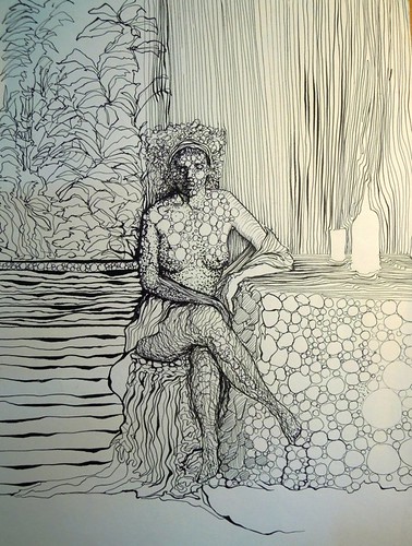
...Three times a lady...
If you recall, I'd completed and study for my summer tree/woman and was well on my way into a "final" version. I thought it would go quickly - and the initial drawing did - but, I really got stuck on some things.
First of all, I did the study on a different paper than the one I'm using for this series. It was a very smooth texture while the final has a bit more tooth. It's always a bit of an adjustment, getting used to the different result. But, the hardest part was that it was more difficult to get extreme darks that came so easily in the study because of the texture - the white of the paper shows through, lightening whatever value I put down.
I also struggled with the palm fronds, for some reason. They came together so easily in the study - not so for the drawing that followed. And then, I realized that I had really confined myself to almost only B-range pencils. I really didn't use the the lighter values that I like to use in my drawings. I flashed back to a college drawing class - I'd spent weeks on a poster-sized detailed still life and the professor commented that it appeared to consist mostly one value. When I realized that, I started erasing to see if I could fix it, and this resulted in dirty, smudgy-looking work (not consistant with the other drawing in this series and rather sloppy for the subject matter).
So, much to my chagrin, I knew that this second drawing was not a final but another study. There were elements in both drawings that I've taken and put into what will hopefully be the final drawing. This time, I've started by laying down my light values - 4H, 2H, and HB - on the palm fronds. I'll insert more dark shadows where needed, but I'm in the building of values stage. This will take some time, depending on how much time I can carve out in the next few days.
In the meantime, I will continue to chip away at the mess of toys, shoes, and family stuff that always seems to pile up too quickly. I'm teaching our writing co-op tomorrow - it's my turn and it's research paper time.
By:
happy chinchilla,
on 7/17/2012
Blog:
.:happy chinchilla:.
(
Login to Add to MyJacketFlap)
JacketFlap tags:
illustration,
animal,
weird,
exercise,
creature,
letter,
texture,
digital illustration,
ilustracion digital,
ilustracion,
Eulalia Mejia,
textura,
Illustration Ilustracion,
bicho,
ejercicio,
letra,
raro,
Add a tag

Este bichito nació de un ejercicio que estoy haciendo. Dibujé todas la letras del alfabeto y a partir de sus formas básicas ilustré personajes. Este es el primero y está basado en la letra A. Eventualmente tendré una familia completa de bichitos raros.
This creature was born from an exercise that I´m doing. I drew all the letters in the alphabet and from their basic forms illustrated characters. This one is the first and it´s based on the letter A. Eventually I´ll have a complete family of weird creatures.
View Next 16 Posts


Diane, You're such a clever artist. I love the long flowing lines that you use.