new posts in all blogs
Viewing: Blog Posts Tagged with: contrast, Most Recent at Top [Help]
Results 1 - 15 of 15
How to use this Page
You are viewing the most recent posts tagged with the words: contrast in the JacketFlap blog reader. What is a tag? Think of a tag as a keyword or category label. Tags can both help you find posts on JacketFlap.com as well as provide an easy way for you to "remember" and classify posts for later recall. Try adding a tag yourself by clicking "Add a tag" below a post's header. Scroll down through the list of Recent Posts in the left column and click on a post title that sounds interesting. You can view all posts from a specific blog by clicking the Blog name in the right column, or you can click a 'More Posts from this Blog' link in any individual post.

by Mac Barnett and Patrick McDonnell (Roaring Brook Press, 2015)
The Skunk is a book I’ve been wanting for ages but I had no idea that I was.
I’m going to spoil this podcast interview for you, and you should still listen to it anyway, but when asked where he got the idea for this book, Mac said it was a writing prompt on an old poster in a school library:
A skunk won’t stop following you.
A fun thing is knowing Mac, and hearing his booming and contagious laugh, and picturing his long, lean self hunched over a desk with eight-year-olds hunched over their desks, writing about a skunk who won’t stop following you. I think Mac would love that too, because there’s a thing that resonates in all of his work for kids, which is a true and uncanny understanding of kid-ness, and a willingness to give them stories that grownups can’t observe in their own natural habitats.
(Sidenote: I wrote a whole thing about this recently, about honesty as a necessary thing in picture book writing and a necessary part of understanding the audience. Check it out here!)
I’m also going to spoil a big design piece of this book, so if you like to read things untainted, unspoiled, and fresh, bow out now. You’ve been warned!
But: the skunk and his man. A story you didn’t know you were dying for.
Mac Barnett and Patrick McDonnell didn’t collaborate on this book; rather, in publishing’s traditional sense, Mac did words and Patrick did pictures, and they didn’t speak of it until it was finished. In that same podcast, you’ll hear them speak of what an honor it was to work with lumps of clay the other had thrown down.
That, of course, is the very nature of a picture book. The text is incomplete without pictures; both parts are needed for the dance. 100
Here’s how I read a book.
First the endpapers.
 Then the case cover. (Have I told you how angry my students get when a book does not have a secret underneath?! Also, see Travis Jonker’s latest post on this for more. A treat for sure.)
 And the title page.
 This is so interesting to me, this differently styled skunk here. His etched-ness gives me pause, and is a little bit dizzying. Because here’s the thing: this small moment gives the whole story true plausibility. This skunk, this real skunk, did all of the things in this book. But I’m seeing it through an artist’s lens who might have represented it in a way that I can understand, that I can see.
Curious.

 The color palette here is a smart choice. It maintains this noir experience, but also serves to connect the duo physically: the skunk’s red nose, the man’s red bowtie. The skunk’s black and white tail, the man’s tuxedo tails. (Both of those with a flip and a flourish.)
There is no other color, save for a muted peach, a brightness in the shadows.
Soon, the man understands what’s really happening. His eyes speak fear.

 This standoff is one of my favorite parts. The offerings here–an apple, a saucer of milk, a pocket watch–are of no interest to a skunk. But it’s a moment of connection, the first time the man has turned to face his follower. That’s some bravery.
 Then things get dire and the pace quickens, and if you haven’t felt it by now, we’re talking some serious Twilight Zone stuff.
This man moves to a different part of the city, buys new things, and perhaps breathes a bit easier.

 The man misses the skunk, because things like that worm and weasel and skunk their way into your routine, and all of a sudden, the missing it part is very real.
And here’s what else you probably noticed. The color!
Without the skunk, in a new house, with new things, the man is different. Transformed? Suddenly aware? What’s happening?

As he searches for his skunk, the colors mute. The world returns to whatever that normal was before.
My skunk.
And the endpapers again. Bookends, that duo.

There’s a thing that happens with books when your eyebrow wrinkles and you’re not quite sure where you are anymore. Those are the best kinds of stories–the honest and the daring ones and the ones that make you look at your own world with a mix of wonder and skepticism.

Thanks to Mary Van Akin at Macmillan for the images!

by Nikki McClure (Abrams, 2015)

This is one of those books where the cover convinces you that you’ll love it. It’s both bright and cozy. Spare and warm.
A teensy giraffe peeks out of this boy’s hiding spot and you can see its smiling face, but only eager anticipation in this boy’s eyes.
Open.


This is my kind of kid. It looks like a grownup is over his shoulder, offering an open door and a pair of shoes. But he’s got a tower of bricks, a colander kingdom, and the very best pair of pajamas.
In is best.
Until out is.


And when out is cold and wet, in you go.

Nikki McClure’s paper cuts are intricate and exquisite, but they are also all-embracing. Not common artwork, but a reminder of the universal comforts of childhood and play and home.
A stark black and vibrant yellow are perfect patches of color to explore these opposing wishes. They balance, they tug, and they leave enough room for us to journey with him. By day and until nightfall.
In and out.
A perfect choice to celebrate curiosity, imagination, and the way we explore our world.
Another Nikki McClure favorite is here!

By: Carter Higgins,
on 2/4/2015
Blog:
Design of the Picture Book
(
Login to Add to MyJacketFlap)
JacketFlap tags:
Uncategorized,
germany,
balance,
rhythm,
fable,
white space,
janosch,
contrast,
northsouth books,
just one apple,
Add a tag

by Janosch (NorthSouth, 2014; originally published 1965 in Switzerland as Das Apfelmänchenn.)
I love a good pen name, and Janosch has one. His real name is Horst Eckert, and he is one of Germany’s most beloved children’s book authors and illustrators. He was new to me until NorthSouth revived this classic in late 2014. I’m so glad they did.
This is Walter’s story. He was the poorest man in the entire kingdom and he only had one single apple tree. A strong and beautiful tree, a nice home for a solitary cardinal. But no fruit. No blossoms. No bending branches.
Walter wishes for an apple. Just one. And when you wish with all your might, things change.
And his wishes came true, as wishes sometimes do.

(click to enlarge)
The art is loose and fiery. Full of motion and an eery calm.
But I love how this book breathes.
A page of art, a page of text. A page of text, a page of art. The contrast between Walter’s colorful (and worrisome) world and the spare white space of the words sets a comforting rhythm to a familiar story.
And the apple grows. So Walter goes to the market.

(click to enlarge)
The very worst feeling in the whole world is when other people don’t believe in your wishes.
Walter loses interest in his apple and in his wishes and in his life.
Until the dragon comes to town.

(click to enlarge)
Here’s where the breathing hitches and the white space/art space tempo gives way to one glorious spread of Walter’s wish saving the kingdom. It’s startling and ridiculous and wonderful.
And after that, Walter was careful what he wished for.
By: Carter Higgins,
on 12/1/2014
Blog:
Design of the Picture Book
(
Login to Add to MyJacketFlap)
JacketFlap tags:
harmony,
color,
balance,
candlewick,
endpapers,
color theory,
nicola davies,
the promise,
contrast,
laura carlin,
Add a tag

by Nicola Davies and Laura Carlin (Candlewick, 2014)
The Promise is on this year’s New York Times Best Illustrated Books list and I’m so glad it captured a spot. I imagine weeping and gnashing of teeth to pare down a year into a handful of notables, but they got this one so right.


Here you have bleakness. Bare and raw. And a girl who doesn’t have much but the desolate things. The words themselves pierce the brightness.

The people, too, dry and dusty.
And then.
Some seeds and a promise and a reluctant okay.
I pushed aside the mean and hard and ugly, and I planted, planted, planted.


Everything works in this book. The text is exquisite. The pictures haunting and heartbreaking and hopeful. The paper is luxurious. The case cover differs from the jacket itself. Dig in. Look around. Don’t miss the endpapers that start as stone and end as spring.
There’s a little Frog Belly Rat Bone here, in this fragile world in need of color and life.
(Also, there’s a lot of great stuff about this beautiful book here, and this post is so, so lovely as well.)
And PS! Add a comment by Wednesday, December 3rd to this post for a chance at winning all ten of those books from Chronicle. Don’t forget your pledge to #GiveBooks this year!

by Ruth Krauss and Maurice Sendak (HarperCollins, 1953)
School’s been back in the swing of things for a couple weeks, and it has been bananas. But I’ve got this beautiful new space and some read-in-me-for-hours lounge chairs and the kids named our bright new sitting area The Birdhouse. This week: shelves and books. The heart and soul.

That’s why I needed to visit a book that is about all of those things: comfort and wonder and imagination and a very special place.

I love this little dancer-dreamer: dee dee dee oh-h-h.

This book is the hope of yellow and the broken-in-ness of blue overalls and the loose lines of childhood. This book started with two masters but belongs to the rest of us. It’s root in the moodle of our head head heads.

And this is what I want for anyone who finds a story in our very special place: 
They and I are making secrets
and we’re falling over laughing
and we’re running in and out
and we hooie hooie hooie
then we think we are some chickens
then we’re singing in the opera then
we’re going going going going ooie ooie ooie.


Tagged:
color,
libraries,
maurice sendak,
ruth krauss,
stories 
By: Carter Higgins,
on 9/2/2014
Blog:
Design of the Picture Book
(
Login to Add to MyJacketFlap)
JacketFlap tags:
design,
color,
balance,
cut paper,
color theory,
color palette,
contrast,
enchanted lion books,
complementary colors,
princesse camcam,
Add a tag

by Princesse Camcam (Enchanted Lion, 2014)
It’s hot in Los Angeles. Like, super really really hot. That’s why this book is an especially welcome reprieve. A book with snow in it? Please. A book with cool blues and winter scenes? Yes.
This is Fox’s Garden.
It’s a lovely little book.
A lone fox, stark red against the white forest. A house in the distance, swirling with the colors of home and twilight. Frightened grownups chase him away. A boy cloaked in red, watching and waiting and caring. 

This boy loves animals. They are in sketches, framed on his wall. They are in mobiles and stuffed friends, in bookshelves and toy chests. 
This fox, followed by her brood, leaves blossoms of kindness right back for the boy. It’s a tale of sharing and growth and unlikely accomplices. No words, all heart.
And the pictures. My French is un peu rusty, but according to Princesse Camcam’s blog, these have got to be cut paper illustrations, lit and photographed. They are intricate and textured, perfect layers for this story of a fox and his friend.
Remember when we talked about complementary colors setting the tone and mood? The rich red of the fox is set apart so dramatically from the snowy scene and the stark greenhouse. It’s a mood, and it’s a strong one. It’s so pretty, too.
Keep an eye on Enchanted Lion, folks. They are in the business of making beautiful books.
Be kind to a chased-away stranger today.

Review copy provided by the publisher.
Tagged:
color theory,
complementary colors,
cut paper,
enchanted lion books,
princesse camcam 
By: Carter Higgins,
on 8/13/2014
Blog:
Design of the Picture Book
(
Login to Add to MyJacketFlap)
JacketFlap tags:
color,
chronicle books,
concept,
negative space,
color palette,
shape,
flashlight,
contrast,
die cut,
lizi boyd,
inside outside,
Add a tag

by Lizi Boyd (Chronicle Books, 2014.)
I really love Lizi Boyd’s work. It’s this perfect mix of oh, of course and oh, I never. Once upon a time I wrote about Inside Outside over on Design Mom, and I’ve been looking forward to this new book for a good while. It’s a great thing to have room for more.
And can you stop looking at that cover? I can’t. It’s beckoning, it’s comforting, it’s hurry-up-and-get-adventuring.
So I was lucky enough to have a chat with Lizi Boyd about creating books, the sound of picture books, her process, and her dogs. Thanks for welcoming your book to the world with us this way, Lizi.
(Click any of the images to enlarge.) Can you talk about where this book came from? Was it always in the pipeline along with Inside Outside, or did working in that form spark the idea for Flashlight?
One night when I was working on Inside Outside I realized the dogs had been out for a long time. It was very dark and I took a flashlight to look for them. I heard noises in the field and when I flashed the light suddenly there was color; their eyes, collars, the apples and grasses. It was so cool! And then I thought, oh, a book. I couldn’t wait to get inside and google around to see if it had been done. It seemed so utterly simple and wonderful. I began the sketches for it the next day. So, yes, Inside Outside influenced the idea because in working on that book it was utterly quiet and still in my studio and that encouraged the idea for Flashlight. How do you know when something is working, and how do you know when something is overworked?
When it’s a wordless book I need to just go along with a very quiet head and allow the idea to tell itself. I actually have to ‘see’, by making the drawings, where it’s going to take me. And I need a completely empty house because my studio is in our house.
Mostly I know when to pause and wait it out or take the dogs for a good long walk and think about what I’m working on. That being said I just filled up a box with sketches for other projects that are little beginnings and seem not to be ready to tell me what they’re about and where they’d like to go.
Why do you think your stories are best suited to the form of the picture book? And specifically in Flashlight, I feel like a sensibility exists with the excitement and adventure of something so seemingly dangerous: the night, the dark, the strange creatures. Can you talk to that a bit?
It hadn’t occurred to me until I was making Inside Outside that a book and its story could belong to the readers ‘telling of the story’ not just the one the author is writing and illustrating. Picture books are all about this but I want to see how far I can stretch this idea. So I’ll surprise you by saying that the nighttime element; the dark, the strange creatures, a sense of danger was never part of my thinking. My sons weren’t afraid of the dark. The notebook I kept while working on Flashlight has these words; story + imagination + silence. Sound/elemental. A book one can ear if one really listens. (One does ‘hear’ books!) Can you talk about the physical design of the book? The paper, the ink, how you got such lush blacks (which I think is difficult!) and how you engineered the peeks and surprises of the die cuts? Did the design of the book drive what had to happen in the story or vice versa?
I tried out several shades of gray / black papers and settled on the blackest one. I loved the way the beam of the light popped and the colors too, all of which needed to be painted over several times to get their finished strength. The die cuts were made with templates so on the finished illustrations there weren’t any holes just a tracing of where the cuts would be made. This part was difficult and there were quite a few changes done by Sarah Gillingham, art director, with her brilliant eye and computer skills! Many of the die cuts surprised us.
What are some of your favorite books and/or art from childhood? What is your favorite piece of art hanging in your home or studio?
I grew up in an artistic, visually inspired house. Our mother was a mid-century potter who moved her studio from NYC to VT. There were lots of books every kind; art, nature, children’s books and interesting objects of design all around us.
I love primitive masks and have a few real beauties. (A man recently came with his five-year-old son and said, “Do these masks frighten you?” – something that hadn’t occurred to me. His son was so busy with his iPad that I don’t think he noticed them. Maybe they could have frightened him away from his iPad for a moment?) What modern picture books do you look to for inspiration and encouragement?
I have a stack of picture books in the studio. My friends, far and wide, send me books from everywhere; France, Italy, Germany. And I have some new ones from Chronicle, all exquisite; the printing, the paper and the design. Flashlight became the book it is because of Chronicle’s eye, care and hand in the myriad production details.And take a look at this lovely trailer for more of a sense of Flashlight’s magic.
To all of our boxes of little beginnings!
Thanks to Chronicle Books for the images, a review copy of the book, and connecting me to Lizi Boyd. Thoughts and opinions my own.
Tagged:
chronicle books,
color,
contrast,
die cut,
flashlight,
inside outside,
lizi boyd,
shape 
By: Carter Higgins,
on 7/1/2014
Blog:
Design of the Picture Book
(
Login to Add to MyJacketFlap)
JacketFlap tags:
color,
space,
balance,
color theory,
color palette,
line,
Phaidon,
shape,
white space,
Jean-Jacques Sempé,
size,
contrast,
Martin Pebble,
Add a tag
 Martin Pebble (Phaidon, 2006; first published in French, 1969)
by Jean-Jacques Sempé
I love this book.
I love the type on the cover.
I love the yellow.
I love the shape and the size and the story.
I love Martin Pebble.
He’s loveable.
(I picked this up on a recent trip to Once Upon a Time in Montrose, CA, which is exactly why shopping in stores is the greatest thing. I had to touch this thing to believe it, and I might not have seen this thing if it weren’t for the bookseller. Bookstores are like story petting zoos and museums that don’t give you the stinkeye if you get too close to the art.)
(Something like that.)
But poor Martin Pebble.
Martin Pebble could have been a happy little boy, like many other children. But, sad to say . . . he had something that was rather unusual the matter with him:
he kept blushing.
 Martin Pebble blushes for all the usual reasons and for no reason at all. The brilliance of Sempé’s color here is hard to miss. Black and white line work contains the red of Martin’s face, and that red occasionally extends to the text as well.
Subtle. Striking. The contrast Sempé crafts between Martin’s red face and all that black and white makes that blushing even worse.
Martin is in a pickle. He’s tiny and nearly lost on the page save for his giveaway condition.
He dreamed of fitting in. But he always stood out.
 Then comes a series of sneezes, some very loud A T I S H O O s, and there he is.
Roddy Rackett, the new neighbor.
 When the story changes, and the hardships knock at the door, Sempé doesn’t just use the suspense of a page turn. He stops the story cold.
 Roddy Rackett’s family moves away.
When you are a boy, and when you are made normal in the quirks of another, you never really forget about it. You think about A T I S H O O s while you are doing grownup things like riding taxis and elevators.
 Sometimes things get back to normal.
 I won’t spoil past that pink-lettered page.
But I love it.
And!
Sempé himself sounds like a storybook character. He sold tooth powder door-to-door salesman! Delivered wine by bicycle! (More here.)
Click here for some of Sempé’s covers for The New Yorker. Lovely.
And this Pinterest board is a feast for the eyes, too. Enjoy!
Tagged:
color,
contrast,
Jean-Jacques Sempé,
line,
Martin Pebble,
Phaidon,
shape,
size 
By: Carter Higgins,
on 4/30/2014
Blog:
Design of the Picture Book
(
Login to Add to MyJacketFlap)
JacketFlap tags:
color,
space,
balance,
light,
negative space,
composition,
color palette,
abrams,
layout,
nikki mcclure,
white space,
paper cut,
contrast,
collect raindrops,
design,
Add a tag

by Nikki McClure
published 2014 by Abrams Books (reissue)
Every soul who has seen Nikki McClure’s art has loved it. I’m sure there are studies and statistics on that, trust me. It looks as elegant on an iPhone case as it does on a gift tag or greeting card.
But then there are books, and thank goodness she makes them. This edition of Collect Raindrops has been reissued in an expanded form and a new format. It’s based on her ongoing calendar series, and begs to take up permanent residence on your coffee or bedside table. Don’t just stick it on the shelf. You’ll want this one at easy reach. It’s gorgeous to touch, to see, and to behold.

 Here, her pictures are gathered by their season, each introduced with love letters to their very time and place.
“Some people just need help to see the obvious. And that’s what artists are for.”
That sentiment comes from this short film that demystifies her process but reveals a lot of magic. She calls it corny, but I call it lovely:
She says her paper cuts are like lace, and everything is connected. Before it’s in a book, can’t you picture what that art looks like held up against a light? Physically, the paper that remains envelops the paper that is gone. Like knots, or filaments, or branches. How beautiful then, that her subject is often community. Shared memories and experiences.

 The contrast is what connects us. As much story lives in what’s been carved away as what sticks behind. But by simple definition, contrast means difference, and in design, your brain is searching for dominant elements. This art contrasts light and dark, filled and white space, and in those separations paints a portrait of community.

 And then there’s the case cover itself. A web, a symbol itself of creativity and connection, binds the pages together.
 Isn’t that remarkable?
Tagged: abrams, collect raindrops, contrast, light, negative space, nikki mcclure, paper cut 
By: Carter Higgins,
on 3/31/2014
Blog:
Design of the Picture Book
(
Login to Add to MyJacketFlap)
JacketFlap tags:
balance,
pattern,
rhythm,
black and white,
value,
texture,
composition,
line,
repetition,
perception,
contrast,
who needs donuts?,
mark allen stamaty,
design,
color,
Add a tag
 By Mark Alan Stamaty
Published 1973 by Dial Press, reprinted 2003 by Alfred A. Knopf, an imprint of Random House Children’s Books.
At first glance, the answer to this book’s title is pretty clear. Because, everybody. But do you know this book? When I mention it to someone, I either hear about their favorite jelly donut (the one with strawberry), or they lose their sprinkles over the magnificence of this screwy tale.
The simplicity of the setup:
Sam lived with his family in a nice house.
He had a big yard and lots of friends.
But he wanted donuts, not just a few but hundreds and thousands and millions — more donuts than his mother and father could ever buy him.
Finally one day he hopped on his tricycle and rode away to a big city to look for donuts.
The scattered spectacle of the scene, a commotion in black and white. On those initial pages alone:
A bird in swim trunks
A roof-mowing man
A chimney blowing ribbons
A man in the window reading a newspaper with the headline, Person Opens Picture Book Tries to Read the Fineprint
Two donuts
And a cinematic, get-ready-for-your-close-up page turn. (Be sure to look closely in the blades of grass.) There’s almost a calm in the chaos. It’s regular and rhythmic and pandemonium and patterned all at once. Perfect for a story that’s a little bit bonkers and a whole lot of comfort.
So. Then what? The relative calm of Sam’s neighborhood yields to an even madder and mayhem-ier sight.

 Then Mr. Bikferd and his wagon of donuts shows up.
And a Sad Old Woman. And Pretzel Annie.
Sam continues to collect donuts. Stocks and piles of donuts.
 A wagon breaks. A repairman helps. A love story. Abandonment.
(A fried orange vendor. A bathing zebra. Rollerskates. A Sad Old Woman.)
Who needs donuts when you’ve got love? When Sam rides home, the words that began his story are on the sidewalk. I get the shivers about that.
The starts of stories are carved in concrete.
P.S. – These pictures remind me a little of what I’m seeing for Steve Light’s new book, Have You Seen My Dragon? Check out this review where Betsy Bird notices the same, and this post at Seven Impossible Things Before Breakfast, because it’s always a treat. I also think of the hours I’d spend as a kid studying each square centimeter of The Ultimate Alphabet. Like Waldo, but weirder.
Tagged:
black and white,
color,
line,
mark allen stamaty,
pattern,
repetition,
rhythm,
texture,
who needs donuts? 
By: Carter Higgins,
on 10/29/2013
Blog:
Design of the Picture Book
(
Login to Add to MyJacketFlap)
JacketFlap tags:
rhythm,
barefoot books,
comparison,
texture,
britta teckentrup,
shape,
contrast,
design,
color,
balance,
color palette,
line,
Add a tag
 by Britta Teckentrup
{published 2013, by Barefoot Books}
I just lost myself on Britta Teckentrup’s portfolio. Entirely charmed and swept away by every single piece. She’s new to me, and I’m happy to have flailed around in her brain for a bit. And it looks like I have a lot to catch up on!
I have an unusual affinity or board books. Proof: here and here and here. And that’s just a select smattering! But everything that is perfect about a picture book is even more so in a board book.
Smushier, sweeter, chewier.
And these are especially delicious.

 Fast and Slow shows those opposites side by side. Directly in contrast, varying by speed. The comparison is limited to that spread only, which is a detail that I love. One of the later spreads shows a train and a bus, which of course is double decker and European and fancy. But isn’t a bus faster than even that motorbike up above? Sure, but one spread isn’t competing with others. Little brains noodling that out? Smart.
And speaking of the motorbike page – total favorite. That scarf! The colors are saturated and leap into your eyes.
The type! It’s that perfect teacher-handwritten-style.
But it’s the texture that I love the most. Clean shapes, easy lines, and the slightest bit of grit. Smooth, flat color might have been an easy choice to match those shapes and lines. But in a book about contrast, splashing in some texture is smart.
And it looks awesome.
 Big and Small’s pairs are tightly knitted. Inside a giant apple is an itty-bitty seed. On top of a vast mountain are individual snowflakes. Those connections are beautiful, and the cat-lion standoff might be my very favorite spread.
 A perfect addition to your baby-shower rotation, your art class, your tiny one’s library, or just the ever-growing stack surrounding you.

Review copy provided by Barefoot Books.
Tagged:
barefoot books,
britta teckentrup,
color,
comparison,
contrast,
texture 
By: Carter Higgins,
on 9/24/2013
Blog:
Design of the Picture Book
(
Login to Add to MyJacketFlap)
JacketFlap tags:
design,
graphic novel,
picture books,
comics,
color,
concept,
trailers,
wordless,
composition,
shape,
jacques tati,
contrast,
northsouth books,
david merveille,
mr. hulot,
Add a tag
 by David Merveille, based on the character brought to life by Jacques Tati.
{published 2013, by NorthSouth Books}
I was smitten by the looks of this book at first glance. Perhaps it was a bit of that orange and blue thing, and a bit of it just being so spectacular. But first, I had to introduce myself to Monsieur Hulot, the comical character from French cinema, and the spirit and subject of this book.
His trademarks are his raincoat, umbrella, pipe, and sheer ineptitude.
I loved him immediately. Here’s a trailer (love those title graphics!) for Les Vacances de Monsieur Hulot (Mr. Hulot’s Holiday.)
So now that you are entirely delighted and heartwarmed, isn’t it the greatest news ever that a nearly wordless picture book contains this nutty dude? Yes. I know. These endpapers are reminiscent of the title graphics in the trailer as well as the movie poster, so, of course we love that.
 The shapes of his raincoat-suited-self-H and an umbrella-O set you up for the hysterical stories inside. This title pages sets you up for humor, heart, and charm, and the following pages do not disappoint.
Here’s what I mean. It’s a series of stories told through pictures. Two pages contain witty puzzles and a complete visual narrative. This one, French Riviera, is one of my favorites. You think Monsieur Hulot is floating underneath the waves and gallivanting with sea creatures.
But no. He’s just biking next to a fish truck.
Brilliant might be an understatement. The Crossing also had me in stitches, and reminded me a teensy bit of The Other Side. What seems to be true might not be at all!
What a treat to be surprised and delighted by this goofy guy! You’ll never guess what preceded this page.
 And you’ll be shocked by the conclusion of this one.
If you are a picture book writer, be sure to grab this one. It is a master class in the suspense and payoff of the page turn.
Sly, subversive, and completely unexpected. A thrill to read! And perhaps a good pair with Matt Phelan’s Bluffton: My Summers with Buster Keaton?
Review copy provided by NorthSouth Books.
Tagged:
comics,
david merveille,
graphic novel,
jacques tati,
mr. hulot,
northsouth books,
picture books,
wordless 
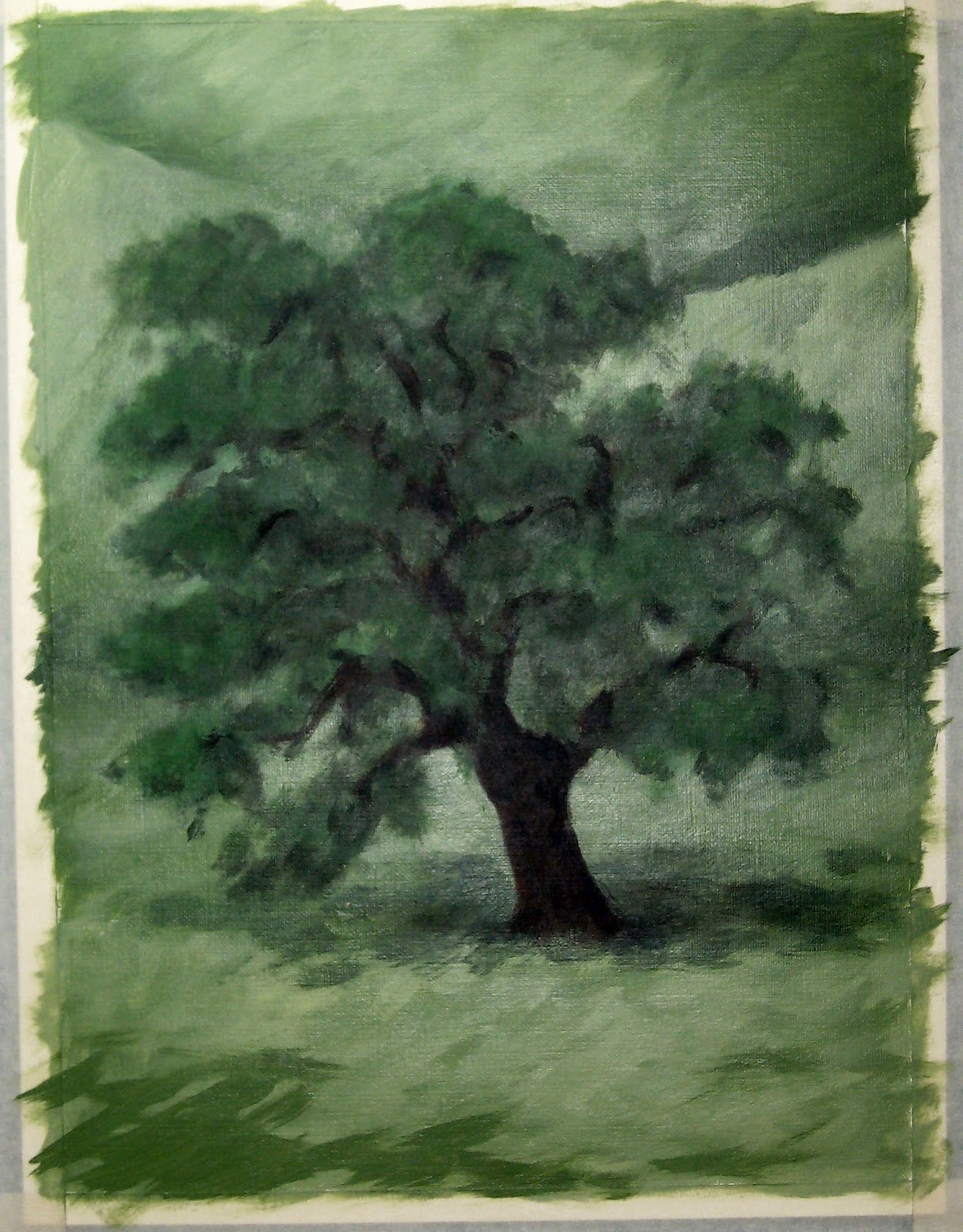
Last night was spent working on the study of the tree again. I think I've worked out the solution to all the green on green - enough contrasts in light/dark, saturation, value... there are such nuances to deal with. I thought my hills were pretty much done, but now I realize that once I get the trees in there, there'll be some adjusting of surrounding colors to do and possibly some texturizing that I like from the study.
 |
Again, hard to get accurate color with a flash at night -
I've got to try it with the flash off |
I'm hoping to start work on it tonight while it's all fresh in the memory. However, I spent the day at the park with the kids (all day...without sunscreen), and now I'm really tired. There's something about spending time in the sun that just drains all energy from you. Hopefully, I'll get a second wind.
.jpg?picon=1621)
By:
DIANE SMITH,
on 6/18/2012
Blog:
DIANE SMITH: Illo Talk
(
Login to Add to MyJacketFlap)
JacketFlap tags:
tree,
Mouse,
green,
panel,
splash,
chef,
paints,
contrast,
grape leaves,
Add a tag
I've been working on a couple of different things lately. I've stepped back into the chef panel, doing a little here and a little there. I put in a layer of color on the architectural elements and started the grape leaves creeping across the top. I added a couple of minor veggies and filled in the purple grape at the bottom.
My challenge here was the splash. I originally started using cerulean blue and was horrified - blech! Switching to ultramarine was much better...but, wait a minute! I didn't try pthalo. Might have to try that tomorrow.
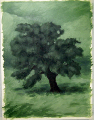
Another thing I started was a study of a tree - the type of tree that will go in panels 1 and 2. This is especially challenging because it's a truck load of green, green, and more green. I have 3 different greens in the hillside and another 3 (or more) greens that make up the tree. I'm having to find ways to create contrast, even though in the reference pictures that I'm using, it does blend together at times. I need to work on it a bit and work out the kinks.
 |
Not very accurate color, but wanted to share
what I have so far |
I think I have a studio guest at night. I'm not sure, but I think it might be this guy:
I've heard him rustling around here and there. I suppose we can share the space for now...so long as he doesn't start using my paints.
By:
DIANE SMITH,
on 6/14/2012
Blog:
DIANE SMITH: Illo Talk
(
Login to Add to MyJacketFlap)
JacketFlap tags:
hand,
dress,
figure,
talking,
contrast,
mural,
muralist,
wine bottle,
focused,
Dumbo,
Add a tag
I'm getting to the point in this panel where changes are smaller, so they may not be so obvious - little things here and there.
The most obvious addition was to start mapping out the wine bottle on the table. I plan to add something else on the table, but I haven't decided what exactly that's going to be (decisions, decisions). Also, you might notice that I've finally filled in the red dress, bringing that closer to completion.
Less obvious is the repaint touch-up of the purple grapes that was needed after previous adjusting of the figures. Also, I detailed the male figure's hand that's resting on the table - it had no definition and just blended in with the tabletop.
Last, but not least, I mixed up a darker dark for the grape leaves to add some deeper shadows and more contrast. Happier with the look of it now, but I may add another dark before the job is done.
One revelation that I had tonight was how much focused thought goes into painting (for me anyway). I know this because it seems that whenever I go out to paint, I am followed by a couple of kids - one that feels the need to be talking about everything that passes through her head (and this from the one we wondered if she would every talk)! I love having my kids by my side, but it's very hard to think about what I'm doing AND respond to her. I don't think I ever realized just how focused I am when working. I am now thinking that when my art class students are busy working, I should probably just shut up because they're probably not listening to anything I'm saying.
My other painting partner likes to buzz around on her own. But, tonight she thought it would be fun to "help" with the mural. She has her own paint brush, used to Disney Dumbo book as a "palette," climbed up on the step ladder, and got to work.
 |
| Future muralists of America - UNITE! |


 Then the case cover. (Have I told you how angry my students get when a book does not have a secret underneath?! Also, see Travis Jonker’s latest post on this for more. A treat for sure.)
 And the title page.
 This is so interesting to me, this differently styled skunk here. His etched-ness gives me pause, and is a little bit dizzying. Because here’s the thing: this small moment gives the whole story true plausibility. This skunk, this real skunk, did all of the things in this book. But I’m seeing it through an artist’s lens who might have represented it in a way that I can understand, that I can see.
 The color palette here is a smart choice. It maintains this noir experience, but also serves to connect the duo physically: the skunk’s red nose, the man’s red bowtie. The skunk’s black and white tail, the man’s tuxedo tails. (Both of those with a flip and a flourish.)
 This standoff is one of my favorite parts. The offerings here–an apple, a saucer of milk, a pocket watch–are of no interest to a skunk. But it’s a moment of connection, the first time the man has turned to face his follower. That’s some bravery.
 Then things get dire and the pace quickens, and if you haven’t felt it by now, we’re talking some serious Twilight Zone stuff.
 The man misses the skunk, because things like that worm and weasel and skunk their way into your routine, and all of a sudden, the missing it part is very real.


 T
T