new posts in all blogs
Viewing: Blog Posts Tagged with: color palette, Most Recent at Top [Help]
Results 1 - 25 of 36
How to use this Page
You are viewing the most recent posts tagged with the words: color palette in the JacketFlap blog reader. What is a tag? Think of a tag as a keyword or category label. Tags can both help you find posts on JacketFlap.com as well as provide an easy way for you to "remember" and classify posts for later recall. Try adding a tag yourself by clicking "Add a tag" below a post's header. Scroll down through the list of Recent Posts in the left column and click on a post title that sounds interesting. You can view all posts from a specific blog by clicking the Blog name in the right column, or you can click a 'More Posts from this Blog' link in any individual post.

by Keith Negley (Flying Eye Books, 2015)
Heads up, email subscribers: my blog took a bit of a tumble so I’m reposting what was lost in the shuffle. Apologies, and thank you for reading!
The kind folks at Flying Eye sent over a preview of this book, thinking it was right up my alley.
It’s right up my alley.
The theme: yes. The design: yes. The snappy, bold, in-your-face look at tough guys plus the snappy, bold, in-your-face look at feelings: yes.
I chatted with Keith Negley, and learned a lot about this debut effort. I hope there’s more from him, and I hope you enjoy this peek into the brain of a picture book creator.


Hi Keith! Can you talk about where this story came from? And what the process was like for its creation?
It all started when my son Parker who was 6 at the time stole a soccer ball from a friend during soccer practice and his friend got upset and they fought over it. Parker was angry at first, but then felt embarrassed and ashamed because he knew he did something wrong. I could tell he was struggling with how to handle all these new emotions that were happening to him at the same time. He walked away from the group and sat down to be by himself because he didn’t want anyone to see him cry. Later that night, I explained to him that it was totally natural to cry and that everybody does it. I told him sometimes even I cried, and he looked up at me and asked, “grown ups cry too?”
It blew his mind that even adults cried because he thought it was something only kids did. I wished I had a book I could read to him that let him know that frustration and crying is a natural thing not to be ashamed of. The next day the idea for the book popped into my head.
You’ve done a lot of editorial illustration, but this is your first children’s book. Can you tell us the how and why you got into books?
I always liked the idea of making picture books for children, but it wasn’t until I became a parent and started reading a ton of picture books to my son did I realize there was a lack of the kind of books we enjoyed. Honestly the books I’ve been working on were born out of necessity because I wanted to read them and no one else had made them yet.
Your tumblr tag line is spectacular: part man, part negative space. Can you explain where that came from and why it represents you so well?
Ha, I find tragedy to be the greatest muse. The subjects I enjoy working with the most are the ones that break my heart. It’s cathartic somehow, and I feel like I really get to put a piece of me into the work. What ends up happening is I have a portfolio of rather depressing subject matter. But I’m always striving to create beautiful images with it. That juxtaposition is challenging and rewarding for me.
Add to that I tend to utilize negative space as a compositional tool fairly often and so I thought it tied the content in with the image making nature of the blog.
 Who are some of your story heroes?
I’ve been a huge fan of Lane Smith for years and years. Jon Scieszka is another one. Ezra Jack Keats. Jack Kent’s Socks For Supper is one of my all time favorites as a kid and it still holds up today.
What do you remember about picture books from your childhood?
I remember my mom reading them to me and how she would make different voices for all the characters. I try to do that for Parker but he’s not into it at all unfortunately.

What is your favorite piece of art hanging in your home or studio?
Not sure if this counts, but I like to make music in my spare time and I’m a huge nerd for vintage synthesizers. I currently have a 1979 Korg 770 sitting in my studio and just looking at it makes me very happy. I consider them works of art.
What’s next for you?
Trying to schedule some reading events for the fall/winter and I’m in the middle of working on my second book for Flying Eye which should be out in time for Father’s Day next year!

Thank you, Keith! And vintage synthesizers totally count as works of art.
PS: Congratulations to the winner of the The Story of Diva and Flea giveaway, Ashley! And thanks to Flying Eye for the images used in this post.


by Bijou Le Tord (Four Winds Press, 1984)
Did you know I am a school librarian? I’m in my third year, at my second school, and have done it for about a decade with a break for graphics in between. Hashtag old.
And speaking of old, that’s what my current school is. That’s great for things like traditions and history, but it’s really great for things like stories. I’ve had a bit of a triage situation on my hands, and the thing that has taken the biggest chunk of time is massive weeding and collection development. (And undoing the work of the packiest rat that ever packed.)
I’ve been brutal in nonfiction and biographies because poor old Pluto has had better days and a 1970 biography of Peggy Fleming isn’t triple-lutz-ing off the shelves. But then there are picture books. And I haven’t tossed a single one. I need to, for reasons of both space and sanity. But when your library is old, there’s a lot that sparkles under all that dust. And I want to be careful because of things like early, early editions of the Nutshell Library.
Here’s one I found that I’d never heard of before, and wow. If you can get your hands on a copy, it would be a great pair with The Little Gardener.


This is the story of a rabbit, a gentle, shaky, line of a thing.
And it’s the story of his garden. He bids adieu to the snow and ice, and welcomes the warming sun.
These beginning spreads are so simple, so uncluttered, so spare. Those black lines on white, framed by spring’s pastels.
And the words! So unfussy. So beautiful.

When the day cools, he waters his seeds. The sun and the earth begin their work.

He patiently waits, and watches for a first ripple or a crack on the ground.

He patiently sits, until the first seedlings shoot up.
That last spread has a surprising detail, one that fits perfectly into the rabbit’s world but one that is unusual for this particular sequence of images: that star. The sun has been a small circle, hovering over the garden, doing its work. But while the rabbit waits, a star. It must be night. He’s taken his picnic basket and he’s patiently sat, and when the sun dropped, the star showed up.
The seasons take over, as they do, and soon it’s time to welcome back winter. The last time we see the rabbit, he is happy. His work is done.
This rabbit and his work are both sweet and slow and dear, and this book is a quiet little wonder.

 by Annemarie Van Haeringen (available 10/1/15, NorthSouth Books)
Here’s a fun book: a stylish story both in look and in theme.
That cover, the signature shape of Chanel No. 5, juxtaposed not-so-glamourously with a girl scrubbing floors in a raggish kind of dress. The title, a crash course in fashion.
Coco Chanel.
This book was originally published in the Netherlands, and coincided with a museum exhibition of some original Chanel designs. Yet even apart from that collaborative effort, this book is a beautiful glimpse at the life of a girl who saw things a little bit differently.


First up: endpapers. From beginning to ending, from scraps to something refined.


Coco, fragile as an eggshell, a mistake, a nothing, an orphan.
But the nuns saw her talent for sewing, and Coco was happy.


When she grew up, she surrounded herself with fancy ladies in crazy hats. How can you think with a dead pigeon on your head?

Coco was a problem solver, and when she saw these fancy ladies riding sidesaddle in complicated skirts, Coco figured out how to sew trousers.
But when you sew trousers and are invited to the races, you need a fancy hat. One without a dead pigeon on your head.

So Coco created a hat shop. She created comfortable, easy clothing for women.


And the women tossed out their corsets.
With her little black dress, Coco figured out how to celebrate what a woman looks like, when it’s the woman you look at and not her clothes.
Her angel-like sewing skills, her observation and celebration of women, and her style: iconic.
Though if you want biographical information on Coco Chanel, you might want to supplement this book–it’s quite literally a lovely place to start, but there is no author’s note or bibliography of sources available for the reader aside from a small paragraph on the back cover.
But for everything this book is, it’s a luxurious simplicity.
I received a review copy from NorthSouth Books, but all opinions are my own.

By: Carter Higgins,
on 8/25/2015
Blog:
Design of the Picture Book
(
Login to Add to MyJacketFlap)
JacketFlap tags:
interview,
storytelling,
Uncategorized,
creative process,
balance,
pacing,
composition,
perspective,
color palette,
white space,
emily hughes,
everything you need for a treehouse,
flying eye,
Add a tag
 by Emily Hughes (Flying Eye Books, 2015)
Friends, I am beyond awe with this conversation with Emily Hughes. If you aren’t familiar with her work yet, I guarantee you will fall in love with it, with her, with a storytelling brilliance that is out of this world. Here, she lets us know both where stories come from and why they do.
And a note, you’ll definitely want to click on all of these images to enjoy them at their full resolution.
Enjoy!

 Can you talk about where this book came from? And what the process was like for its creation?
Lots of things were swimming around in my head when The Little Gardener was being made.
I was back home rereading a book I love, The Growth of the Soil, about a simple self-sufficient man dealing with societal pressures that seem unnecessary. He was the symbol of The Little Gardener, he’s not the personality powerhouse Wild is, he is really just a symbol for the everyman, the underdog, you, me, (my brother thinks the 3rd world) our place as a human. It’s not about him, it’s about his vision, his hopes.
There are a lot more nuances to that, but that is what it is in a very small nutshell.
The process for Gardener was an outpouring, I drew and drew and drew. Because the images are so dense it was a meditative book to make- almost like making a mandala. The story process took a while, but with the images I worked on steadily through, and luckily they worked out with little drafting. That isn’t the usual, but this one felt natural to make, intuitive.


Why do you think your stories are best suited to the form of the picture book? What can you do in this form that you might not be able to in another?
If you look at my bedroom, my backpack, my email inbox, my general manner, you would be able to figure out a good deal about me. Totally scatter-brained.
It is an affliction that makes it tricky to get work done in general. What makes children’s books an appealing medium for me is that there is text to dance with. There is the written skeleton to adhere to- oftentimes my stories have layers that I have built up depending on where I am or what I’ve been thinking of while I work. There is not just one story being told in The Little Gardener. Having text keeps my brain focused when there are other ideas floating about. Because I also draw, I am able to tell the other story lines as well- they are quieter, but are still present for others to interpret if they have patience. It is a good compromise for me.
Narrative has always been an interest, I think telling stories is what I like to do- so the things I’d compare it to would be film, theater, animation, etc. I like doing illustrations for picture books because it’s 2D and doesn’t move. However, if you are really invested you can move them within your head and expand it’s boundaries to a world you truly are interacting with.
One of my favorite things is the cola can that says MADE IN HILO, HI on it. I know that’s where your roots are, and I wonder how that home has shown up in the work that you do? Or if there are other easter-egg-y things that you stick in your work?
Good spotting! Hawaii is always present in my work. I left home for university in England when I was 17, and at that time I was eager for new experiences. Nevertheless, absence makes the heart grow fonder, and I miss the Big Island always. Drawing things from home is indulgent for me- it is time spent reminiscing, it is a means for me to keep connected, grounded.
The cola can was initially modelled after a local company- Hawaiian Sun. The label looks nothing like the original (and I used the non-existent ‘cola’ because I thought it would be easier to translate), but the sun made a symbolic appearance. Those cans are always around- refreshments after soccer games, trips to the beach, the park with cousins. It reminds me of happy outings. I’ll add this bit to my advertising resume…
The house that the humans live in is based on my family home. It’s a plantation-style house that my Grandmother grew up in, as my siblings and I have also done. It’s a special place.


In the scene where the gardener is chasing away the snails, there’s a ‘rubber slipper’ (you guys would call it ‘flip flop’- Hawaii’s preferred footwear of choice) strewn about. It even has the ‘Locals’ tag on it which is the same kind you get at the grocery store. There’s lots of little things from home hidden. I like having the sentimentality there, even if it’s for my own benefit.
It seems like the girl in Wild and this little gardener have some sensibilities in common, like the hope and comfort in this un-tapped-into nature. Are there big-picture-stories you are drawn to creating, both in text and in art?
There are a lot of stories I’d like to tell. I think I start off with a general character and theme and it evolves- the writing is the last part, I think the feeling needs to be understood first.
In my journal these are a few themes I’d written that I want to explore:
Does ‘evil’ exist? Really?
You can, will, should feel every horrible emotion and that’s fine
Kindness trumps all
Looks vs Expectations
It’s all chance for me I think- I might read something, or watch something, or sit blankly staring at the wall even, and most times it is nothing but a murmur. But once in a good while something speaks up.
As for Wild and Gardener, nature serves as a backdrop because it is an ideal to be in sync within our most natural of habitats. Something we all still strive for- a place where we’re needed. Wild is about acceptance and tolerance, issues I was trying to practice myself. Gardener was about keeping hope alive when I was faltering with my own.
They are stories coming from a place of trying to understand, rather than a place where it is understood.

—
Carter, here.
You guys. I keep reading these answers over and over and feel like it’s such a gift to get this glimpse into a storyteller’s heart. Because Emily is fascinating and brilliant and our conversation gave me so much to wrestle with and enjoy, there’s more! Come back tomorrow for the second part. More pictures, more process, more book love.
Whatever you do, get your hands on this book as soon as you can, for hope and home and heart.
Huge thanks to both Emily and Tucker Stone at Flying Eye Books for the images in this post!
By: Carter Higgins,
on 8/11/2015
Blog:
Design of the Picture Book
(
Login to Add to MyJacketFlap)
JacketFlap tags:
chronicle books,
balance,
wordless,
negative space,
wordless picture books,
color palette,
line,
white space,
jihyeon lee,
Add a tag

by JiHyeon Lee (Chronicle Books, 2015)
Hello to you! And you! And you!
Here I am, ready to flip my g o n e f i s h i n g sign back around.
First, have you had a nice summer? I have been away from the grind, sitting on a deck, writing books and reading them, and it’s been so very nice to be off the grid for a while. But I do miss my books.
You might have seen today’s floating around this summer, and I can’t think of a better one to celebrate the season.
Pool. The word itself conjures up both serenity and splashing chaos, and both of those things exist inside this book.
At its heart, this is a tale of a friendship. Even as grownups there’s a dance to the early moments of togetherness, and this story is that thing in book form.
A boy at the edge of a pool, all the hope of his day before him. A crowd, scary with its wacky floats and almost-tentacles.

(click to enlarge)
That’s when he dives, under it all and to the quiet, and that’s when he meets his friend. And that’s when things get weird. Isn’t that how it is with friendship? You see new things together, you name the new things together, you create a new kind of community together. The fish and plants and the world under the crazies is bizarre to us, but is it to them? Perhaps not.

(click to enlarge)
That’s the beauty of finding a friend in the quiet places, whether or not you were looking.
And at the end, when the crowd is exiting to the left, the friends leave to the right. Those two, going forward. Together.

(click to enlarge)
This is one of those books that I fell in love with when I first saw the cover. And it’s worth wondering why.
I love that the face could belong to either the girl or the boy. I like to think it’s after the magic, both because of the sweet smile and the still-dreamy fish, reflected and real. And I love that by staring at us, it’s almost an invitation. To play, to swim, to step away from the crowd at the edge of the pool.
Can’t get enough of this book? Me either! Here are some other places I loved reading about it. Danielle at This Picture Book Life paired it with the most adorable pool floats (ice cream sandwich!), and there’s still enough summer left to make that dream a reality! JiHyeon Lee is over at Picturebook Makers talking about the story behind the story and shares some process pictures, which I can’t ever get enough. And you can download some free Pool wallpapers at Chronicle’s happy home online. Enjoy the swim!
Thanks to Chronicle for the images in this post!
By: Carter Higgins,
on 7/9/2015
Blog:
Design of the Picture Book
(
Login to Add to MyJacketFlap)
JacketFlap tags:
color,
trailers,
composition,
color palette,
pixar,
shape,
size,
disney-hyperion,
disney animation,
case cover,
mike wu,
Add a tag
 by Mike Wu (Disney Hyperion, 2015)
Before anything else, this (full screen!):
Ellie’s endpapers start us off like this: long and lonely and barren.

 There she is, a little hint of her. And if you want another one, take the dust jacket off to reveal the case cover.
 Ok.
Ok.
We learn quickly why the zoo was so sullen and gray. Because the story happened visually, to start, we don’t need to linger in introductions and routines and the way of this world.
We know.


 Heartbroken.
Home.
Hope.
 Ellie, and a hint again, carrying something with her trunk, wishing and wanting to help.
But a small elephant isn’t a tall giraffe or a burly gorilla.
She’s just Ellie.
 But in that curlicue grip, that same hope.
Does she see it? Do you?
Linked by color and purpose and quite possibly definition, this happens next:
 Does she notice? I don’t know. I’d like to think she did.
Watching and waiting, a wise little elephant.
 This is the first spread without Ellie in it, without her sweet, sad eyes.
But now we get to see through them, and I’d bet a reader’s eyes do the same awe-pop that hers must be doing right now. That’s something I’m sure is true.

 Turns out, Ellie found her thing.
And here’s where I’d recommend finding a copy of this yourself, because the final spreads are something you should see and feel through your own eyes. But be sure to notice the back endpapers and their stark difference to the front. The progress is literally told in colors.
This book is rectangular, and so open, it’s an expanse. That trim size gives the zoo a little room to breathe, to extend, to become the physicality of Ellie’s journey. There’s space in that shape, space in the story.
Mike Wu’s film background (did you notice the zookeeper’s name?) may have influenced that trim size. What we call trim size they call aspect ratio, and aspect ratios in film are far from the standard definition of once upon a time.
Maybe? I don’t know. But I’d guarantee a visual storyteller thinks of those things, and it’s for us to appreciate, to wonder about, and to call beautiful.
 Ok.
Ok.
I received a review copy of Ellie directly from the author, but all opinions are my own.
 by Ruth Krauss and Margot Tomes (Four Winds Press, 1973)

I’m not a real wild-and-crazy kind of person.
Last Saturday I took a Pilates class at 3:30, and the teacher said it’s always such a weird time because most people like to spend their afternoons at the beach or the ballpark. Or perhaps they have to get ready for their evening cocktail hour, and finishing close to 5:00 doesn’t work. But I told her that it’s my favorite time, because then I can be home in pajamas having sort-of-flat champagne before it’s even dark out.
She looked at me funny.
But on some of those pajamas and champagne Saturday nights, I go vintage book shopping online and find things like this.
I love this book.
I love Ruth Krauss.
I love the way her words describe the bizarre and complex world of kids’ heads. And their perfectly simple and sensible world. It’s kind of all wrapped up together for kids anyway, which is strange and endearing and other-worldly.


Each spread has one line, a bright orange to the illustrations’ muted browns. The only other color is the blue on the cover.
And the page turn acts as a sort of puzzle: the last bit from the page before starts the new thought.


Each thing is little. Each thing snuggles up right under the towering mushroom. Each thing is so firmly kid.


The tiny stories ramble on underneath, in those playful monologues that might seem like nonsense. This is where kids are experts.
Grownups, consider this. You might not understand. You might not have any use for a little potato. But, as the girl with the bow in her hair promises, “Little potatoes are especially nice.”

It’s weird. It’s wonderful. And if it fits under a mushroom, it’s fair game.
By: Carter Higgins,
on 4/28/2015
Blog:
Design of the Picture Book
(
Login to Add to MyJacketFlap)
JacketFlap tags:
joohee yoon,
paper weight,
spot colors,
color,
printmaking,
paper,
composition,
color theory,
color palette,
shape,
binding,
enchanted lion,
pantone,
Add a tag

by JooHee Yoon (Enchanted Lion, 2015)


(click to enlarge)
This book is something. A mashup of poetry and pictures, washes of color and words.


(click to enlarge; this is an example of a spread that folds out to reveal an entirely new and more expansive illustration.)
Some thoughts from JooHee on the art and creation of Beastly Verse:
I wanted to create a book that not only tells wonderful stories, but one that is beautiful to behold. For me, the design of the book is just as important as its content; they are inseparably linked. I believe all elements of a book–its paper, binding, size and weight–create an atmosphere that plays an important role in the experience of reading.
The printing process fascinates me. Not only traditional printmaking, but also industrial processes as well, since these are just a further development of the old printmaking techniques. I have always been drawn to printmaking, and rather than mixing colors on a palette and putting them on paper, I enjoy working with flat color layers overlapping one another to create the secondary colors. My experience with printmaking informs almost all of my artwork today. I wanted to take advantage of the industrial printing process so the printer is not just reproducing the image I make, but in a sense creating the image itself.


This book has been printed using just three colors. The areas where the main colors overlap create secondary colors, resulting in a book that seems very colorful even though only a limited palette was used. Seen alone, each layer is a meaningless collection of shapes, but when overlapped, these sets of shapes are magically transformed into the intended image. To me the process of creating these images is like doing a puzzle, figuring out what color goes where to make a readable image.
I am very inspired by books from the early 1900s – 1950, when artists were forced to work with spot colors since reproduction methods weren’t as developed as they are today. It is amazing what some artists could do with just two or three colors, and this is exactly the same process I am using, but one from choice rather than necessity. There is a luminous brilliant quality to the colors when images are reproduced this way that I love.


(click to enlarge; this is an example of a spread that folds out to reveal an entirely new and more expansive illustration.)
It’s fascinating to pull the curtains back on an illustrator’s process, and I’m thankful to JooHee for her words here. Her explanation of something so simple, so exquisite, and so complex is as brilliant as those colors she creates.
And the book itself is definitely a work of art. Uncoated, thick pages. Slightly oversized. There’s a non-uniform feeling to the ends that isn’t quite a deckled edge, but a bit more raw and tactile. Hand-crafted almost.

(click to enlarge)
Beastly Verse’s dedication reads simply, For the Reader.
Here, the reader is also the design enthusiast, the art collector, and the wordsmith. A book for book lovers.
Huge thanks to Claudia Bedrick at Enchanted Lion for the images in this post.

by Claire Keane (Dial Books, 2015)
Here’s one to hand to any kid that still can’t get enough of Frozen. And when you do, give them a little wink-nudge that this book’s creator worked on what Elsa and Anna’s world looked like. And she worked on Tangled. And then they will see the lush purple cover anyway, and sometimes that’s all it takes.

(click to enlarge)
Meet Celeste. She wants the perfect gift for her mom. Big eyes. Big dreams. (Sweet bear expression. And do you see those little shoes she’s kicked off? Even sweeter.)
Celeste is stumped. When she’s about to fall asleep, the Wind carries her away.
She sparkles with the Stars and then meets the Moon and the Sun.

 (click to enlarge)
There’s something musical about the pace of the pictures here. Sweeping and epic and enchanting. The colors wash over Celeste’s celestial quest, slowly spinning one into another.
And then, she’s home again. But her heart is new and her eyes are fresh, and the same things that have always been there shine a bit more than they did before once upon a cloud.
Simple in story. Arresting in art.

Review copy sent by the publisher.
By: Carter Higgins,
on 4/17/2015
Blog:
Design of the Picture Book
(
Login to Add to MyJacketFlap)
JacketFlap tags:
design,
chronicle books,
blog tour,
texture,
composition,
color palette,
guest post,
elsa mora,
shape,
papercuts,
k.e. ormsbee,
the water and the wild,
Add a tag

by K.E. Ormsbee, illustrated by Elsa Mora (Chronicle Books, 2015)
From the publisher:
A green apple tree grows in the heart of Thirsby Square, and tangled up in its magical roots is the story of Lottie Fiske. For as long as Lottie can remember, the only people who seem to care about her are her best friend, Eliot, and the mysterious letter writer who sends her birthday gifts. But now strange things are happening on the island Lottie calls home, and Eliot’s getting sicker, with a disease the doctors have given up trying to cure. Lottie is helpless, useless, powerless—until a door opens in the apple tree. Follow Lottie down through the roots to another world in pursuit of the impossible: a cure for the incurable, a use for the useless, and protection against the pain of loss.

I’m so excited to be a stop on the blog tour celebrating the release of The Water and the Wild, which includes a chance for you to win a copy of this beautiful (literally and figuratively!) book.
First, let’s hear from K.E. herself. Welcome, K.E.!

Visualizing Limn: The Real-World Inspirations Behind Lottie Fiske’s World.
In The Water and the Wild, twelve-year-old Lottie Fiske travels through the roots of an apple tree into the magic-soaked world of Limn—a land filled with bustling cities, dense woods, magical yew trees, and giant spider webs. World building Limn was one of the most fun and challenging aspects of writing The Water and the Wild, and my inspiration for the look and feel of the fantasy landscape came from very real places.
Today, I’d like to share some of those inspirations and take a moment to gush about just how perfectly artist Elsa Mora captured the magic of Limn in her cover art and illustrations.
New Kemble – York, England
I’m a huge anglophile, and one of my favorite places in all of England is York. The city is rich with layer upon layer of history, as evidenced in its walls, its giant cathedral, and its winding streets. I remember first setting foot in The Shambles and feeling certain that something ancient and magical was at work there.
When I first drafted The Water and the Wild, the story actually took place in York. Over time and a number of subsequent revisions, York became New Kemble, a fictional island town off the coast of Massachusetts. But the inspiration for New Kemble remained thoroughly English. I still envision The Barmy Badger—home of Lottie’s best friend Eliot—on a street similar to The Shambles. And Lottie’s home in the boardinghouse on Thirsby Square is based on the real St. Paul’s Square in York.

Iris Gate – The Biltmore Estate
When Lottie first arrives in Limn, she stays at the home of the Wilfers—an old money family with royal connections and a fair share of secrets. The Wilfer family home is called Iris Gate, and Lottie is overwhelmed by the size and grandeur of the place. When describing Iris Gate, I tried to capture the intimidation I felt upon first walking into the Biltmore Estate in Asheville, North Carolina.
The Biltmore is an imposing mansion even to full-grown adults, and I was ten when my family visited. I remember gaping at the soaring ceilings, ornate decorations, and sprawling gardens. Though Iris Gate is nowhere near as extensive as the Biltmore, its architecture and landscaping were written to resemble that of the Biltmore Estate.

Wisp Territory – Springtime in my childhood neighborhood
I grew up in Lexington, Kentucky. The city is surrounded by rolling green hills, black fences, and horse farms. It experiences four distinct seasons, and the springtimes there are lovely. In my neighborhood, there were many dogwoods, magnolias, and Bradford pear trees. When all of those trees were in bloom, white petals would blow loose into the wind, and everywhere I turned the world seemed awash in white. I called it my Warm Winter.
I never shook those springtime images, and when I was creating Wisp Territory—home to the mysterious will o’ the wisps—I wanted to convey a similar aesthetic. The world of the wisps is, by and large, colorless. The grass, the trees, and the leaves are all white. The royal home is made entirely of glass. This wintry appearance does not vary with the seasons, and it’s my homage to the Warm Winters I experienced as a kid.
* * *
Clearly, I have some very distinct ideas about how the world of Limn looks. What I was most nervous and excited about during the publication process was seeing how an artist would render a world that had for so long existed only in my imagination. As it turns out, I had absolutely nothing to worry about. When Melissa Manlove, my fabulous editor at Chronicle Books, first gave me Elsa Mora’s name, I of course went straight to Google to do some major image stalking. After only a minute, I knew I was in the best of hands.
Elsa’s papercuts are pure magic. There is so much detail, care, and whimsy in each of her creations. The cover of The Water and the Wild conveys not only the fantasticalness, but also the danger of Lottie’s journey. The way in which the characters and their natural surroundings blend so effortlessly captures my own attempt to make the world around Lottie as much a character as she is.
Inside the book, you’ll find a papercut plant accompanying each chapter heading. These illustrations reinforce the importance of the natural world throughout the book. And, you know, they just so happen to be GORGEOUS.
It’s been almost seven years since I first wrote down the image of a magical green apple tree. Now, as Lottie Fiske’s story officially hits bookshelves, I couldn’t be happier with the way that image and others came to be realized in the art and text of The Water and the Wild.
——–
If you’re anything like me, you’re dying to read more about Lottie and Limn. So! Tweet this post anyway you’d like on Twitter, and include the hashtag #dpb for a chance to win a copy! I’ll be in touch with a winner in a week.
Check out The Water and the Wild’s teacher guide here, and a sneak peek at its beginning here.
And be sure to check out tomorrow’s stop on the tour at Green Bean Teen Queen, where K.E. talks libraries!

by Nikki McClure (Abrams, 2015)

This is one of those books where the cover convinces you that you’ll love it. It’s both bright and cozy. Spare and warm.
A teensy giraffe peeks out of this boy’s hiding spot and you can see its smiling face, but only eager anticipation in this boy’s eyes.
Open.


This is my kind of kid. It looks like a grownup is over his shoulder, offering an open door and a pair of shoes. But he’s got a tower of bricks, a colander kingdom, and the very best pair of pajamas.
In is best.
Until out is.


And when out is cold and wet, in you go.

Nikki McClure’s paper cuts are intricate and exquisite, but they are also all-embracing. Not common artwork, but a reminder of the universal comforts of childhood and play and home.
A stark black and vibrant yellow are perfect patches of color to explore these opposing wishes. They balance, they tug, and they leave enough room for us to journey with him. By day and until nightfall.
In and out.
A perfect choice to celebrate curiosity, imagination, and the way we explore our world.
Another Nikki McClure favorite is here!

by Yann and Gwendal Le Bec (Flying Eye Books, 2015)
I’m a big fan of Flying Eye Books. They put out a list that’s so unique and unusual and weird and beautiful. This guy comes out in April of this year, and I tend to not write about things before you can get them at your local bookstore or library, but I had to make an exception here. I’m eyeballing an upcoming dental appointment with cringing and gnashing of teeth. (Ha.)
But here’s a story that’s oddly comforting.

Danny’s expression is so full of joy and naiveté and hope, which is hilarious. A two-toothed hippopotamus antsy for a good scrub? Even funnier. And a school of cleaner fish to get the job done? Of course!
The setup here is so weird and wonderful.
And then.
Danny overhears the cleaner fish worry he may have a lisp, on account of that massive gap in his teeth. He doesn’t, of course, but that darn dentist fish’s comment spirals him into self-doubt and worry. The snakes he turns to for comfort do agree that he speaks strangely, but Danny doesn’t know they were a terrible choice for speech comparison.
To the city.

I love this spread. It reminds me of Richard Scarry or The Little House and this color palette is so perfect. The browns of the marsh yield to the yellows and oranges of the city. Danny looks comfortable up in that double decker bus but he’s obviously going to an unfamiliar place. Also, any book with a pink limousine can stick around for a while.
This lithe and lanky dentist gets right to work fitting Danny with some braces for that massive gap. (His office gear is so perfect here: funky wall art, oversized tooth models, and a bookshelf probably more for show than for reading.)
And then:

Now here’s a huge shift in pacing, in main character, and in drama. And it works. Danny settles back into marsh life, the snakes assure him his speech is back to better, and the crocodile heads off to the city for his own newfangled tooth-contraption.
Except:


It’s a picture book about the horrors of dentistry. And not really, of course, but for a dent-o-phobe like me, this story about a tooth doctor and his comeuppance is absurdly satisfying.
Danny is not without its translation quirks, but because the French are so bizarre anyway a clunk here or there is pas trop grove. (And since I Google Translated that, mine might be a bit clunky too. No matter.)
Look for Danny. You’ll smile. But maybe try that without showing your teeth.
Available April 2015. I received a review copy from the publisher, but all thoughts are my own.
.png.jpg?picon=3640)
By:
Sara Burrier,
on 1/22/2015
Blog:
warrior princess dream
(
Login to Add to MyJacketFlap)
JacketFlap tags:
sara burrier,
sara b illustration,
color chart,
glazing,
design seeds,
the daily sketch,
fairy,
art,
drawing,
painting,
watercolor painting,
sketching,
mermaid,
color palette,
techniques,
Add a tag
Today I embarked on combining techniques, process, and drawing developed throughout last year. I started a personal piece, but now it's time to apply it to the real world, a custom request. I did my research and concept sketch, now ready to paint.
I had to start with my color palette. As much as I love color, my head spins very fast and gets dizzy when trying to figure out the best combination of colors. I know what WORKS, but until I see it visually, I'm a jumble of thoughts.
This is where Design Seeds color palettes come into play. They're amazing! At first I didn't really care for them because most show subtle or value changes. This time I went to pinterest and found many palettes with variety. I'm stoked!
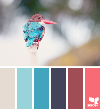
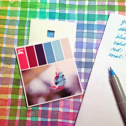
I based my choices on the photo being used for the color swatches. If the photo works...which is usually nature...then I know the color works. I also like how you have more colors to choose from BECAUSE of the photo. They don't swatch every color. Having those extra choices are great for backgrounds.
Once I print out the palette I go to my home made glazing color chart and view finder. I search for the colors within the palette and jot down the colors I need to re-create it. This takes a lot of the guess work out so I save time in the long run.
• • • • • • • • • • • • • • • • • • • • • • • • • • • • • • • • • • • • • • • • • • • • • • • • • • • • • • • • • • • • • • • • • • • • • • • • • • • • • • • • • • • • • • • • • • • • • • • • • • • • • • • • • • •
There are two charts I'd like to point out. One is a mixed color chart. Here each square has been individually mixed and applied. Very grueling, especially if you have 20 colors in a palette like I do! I started this one years ago when I first stumbled upon
this method by Suzie Short. I never finished it. :( Unfortunately my palette has changed so I can't use most of it.
The second one is a glazed color chart. Here you paint one set of color strips vertically, let them dry, and paint a second one horizontally, "glazing" one color on top of the other. I prefer this method and I grabbed it from
this video by Kelly Eddington. Although it's for laying color on top of one another, not mixing, I can work from there and mix on my palette. I usually test the color out on a scrap piece of paper and alter it just a tad if I need to. Very rarely.
The other brand new approach to painting is the skin. I did a very traditional technique, wet onto wet. It's usually quite difficult since I paint so small, but thought I'd give it a go instead of my usual wet onto dry. To my surprise, it worked very well, and gives me a great base to start with. Yay! I used my usual gold, rose, and phthalo blue too. :)
• • • • • • • • • • • • • • • • • • • • • • • • • • • • • • • • • • • • • • • • • • • • • • • • • • • • • • • • • • • • • • • • • • • • • • • • • • • • • • • • • • • • • • • • • • • • • • • • • • • • • • • • • • •
The Daily Sketch
I have discovered I'm not too chic about keeping up with a daily commitment. It's the effort that counts right? Numbering the Daily Sketches has already been off several times, so instead, I'm simplifying it more and NOT numbering them. They are dated, and that's enough for me. Just assume they'll be in each post. ;)
By: Carter Higgins,
on 10/21/2014
Blog:
Design of the Picture Book
(
Login to Add to MyJacketFlap)
JacketFlap tags:
analogous color,
jim lauderdale,
design,
harmony,
color,
balance,
rhythm,
song,
meter,
color palette,
bluegrass,
eric von schmidt,
Add a tag

by Eric von Schmidt (Houghton Mifflin Company Boston, 1964)
Okay. It’s time for a teensy bit of name dropping. I have this cousin who is a brilliant singer and songwriter and he’s racked up a few Grammys as well. (Do you say Grammies? I don’t think so.) If you are into good, old-fashioned bluegrass and Americana, check out Jim Lauderdale. Musicians are such great storytellers, don’t you think? Sometimes I wonder if I can pack the same amount of heart and soul into a 500-word picture book that he can in a 3-minute song.
That’s partly why I was so drawn to this book, The Young Man Who Wouldn’t Hoe Corn. And that was even before I realized that there were all kinds of connections to song. That title begs to be picked and strummed, right?

I purchased this book a while back from Elwood and Eloise on Etsy. The owner, Mallory, also runs an excellent illustration blog, My Vintage Book Collection (in blog form), which is an incredible archive of gorgeous out of print materials. Thank goodness she sells some of her collection, cause I’ve added some sparkle to my own thanks to her shop. (Also, the images in this post are courtesy of her post here.)
This is the story of Jeremy Sneeze. Where he fails as a farmer he succeeds at making children laugh. (Which is to say by wiggling his ears.) He replaces fallen birds nests and makes pictures and poems. And so, of course, the elders of his town denounce his slack and shifless ways. A town meeting. A crow. A spell is cast. A sneeze. A surprise.


This book’s design is reminiscent of a song. Here’s what I mean. That color—washes of analogous color in oranges and yellows and greens, those are the harmonies to the stark black’s melody. It’s steady and rhythmic like the downbeats of an upright bass. Unless they are splashed and chaotic like a mandolin’s intricacies.


On top of stellar bookmaking, the story itself is a sweeping epic wrapped up in the short pages of a picture book. Listen to some of its lines:
Just about then he would get to puzzling about other things like “How high is up?” or “Who plants the dandelions?” or “Where do the stars go during the day?”
And every year all Jeremy had to offer was a big weedy field filled with assorted brambles and unchopped briars, bounded by dirty broken boulders.
Flap-flap, past bats that watched with eyes like razors, past lizards, toads, and laughing spiders, down past rats and rattlesnakes and monkeys dreaming evil dreams of moons.
We have specials today on stars that dance or boiling oceans, and a bargain rate for setting mountains into motion.
He hurled himself at the brambles and flung himself at the weeds with such speed you couldn’t tell which was hoe and which was crow.
True enough he is a sorry farmer. But in his head dwell pictures and in his heart are poems.

The listen-ability, the meter, the storytelling grumble. It’s all here. What a gem.
P.S.—A bit of poking around online still left me slightly confused about the history of this book and the similar-ly titled song. Did the book inspire the song? Did the song know about the book? I think the song inspired the nitty-gritty backstory of the young man who wouldn’t hoe corn. I can’t really tell, so I’ll just be sitting here enjoying both. Hope you are too.

by Ruth Krauss and Maurice Sendak (HarperCollins, 1953)
School’s been back in the swing of things for a couple weeks, and it has been bananas. But I’ve got this beautiful new space and some read-in-me-for-hours lounge chairs and the kids named our bright new sitting area The Birdhouse. This week: shelves and books. The heart and soul.

That’s why I needed to visit a book that is about all of those things: comfort and wonder and imagination and a very special place.

I love this little dancer-dreamer: dee dee dee oh-h-h.

This book is the hope of yellow and the broken-in-ness of blue overalls and the loose lines of childhood. This book started with two masters but belongs to the rest of us. It’s root in the moodle of our head head heads.

And this is what I want for anyone who finds a story in our very special place: 
They and I are making secrets
and we’re falling over laughing
and we’re running in and out
and we hooie hooie hooie
then we think we are some chickens
then we’re singing in the opera then
we’re going going going going ooie ooie ooie.


Tagged:
color,
libraries,
maurice sendak,
ruth krauss,
stories 
By: Carter Higgins,
on 9/2/2014
Blog:
Design of the Picture Book
(
Login to Add to MyJacketFlap)
JacketFlap tags:
design,
color,
balance,
cut paper,
color theory,
color palette,
contrast,
enchanted lion books,
complementary colors,
princesse camcam,
Add a tag

by Princesse Camcam (Enchanted Lion, 2014)
It’s hot in Los Angeles. Like, super really really hot. That’s why this book is an especially welcome reprieve. A book with snow in it? Please. A book with cool blues and winter scenes? Yes.
This is Fox’s Garden.
It’s a lovely little book.
A lone fox, stark red against the white forest. A house in the distance, swirling with the colors of home and twilight. Frightened grownups chase him away. A boy cloaked in red, watching and waiting and caring. 

This boy loves animals. They are in sketches, framed on his wall. They are in mobiles and stuffed friends, in bookshelves and toy chests. 
This fox, followed by her brood, leaves blossoms of kindness right back for the boy. It’s a tale of sharing and growth and unlikely accomplices. No words, all heart.
And the pictures. My French is un peu rusty, but according to Princesse Camcam’s blog, these have got to be cut paper illustrations, lit and photographed. They are intricate and textured, perfect layers for this story of a fox and his friend.
Remember when we talked about complementary colors setting the tone and mood? The rich red of the fox is set apart so dramatically from the snowy scene and the stark greenhouse. It’s a mood, and it’s a strong one. It’s so pretty, too.
Keep an eye on Enchanted Lion, folks. They are in the business of making beautiful books.
Be kind to a chased-away stranger today.

Review copy provided by the publisher.
Tagged:
color theory,
complementary colors,
cut paper,
enchanted lion books,
princesse camcam 
By: Carter Higgins,
on 8/26/2014
Blog:
Design of the Picture Book
(
Login to Add to MyJacketFlap)
JacketFlap tags:
design,
color,
adam rex,
balance,
pattern,
concept,
rhythm,
perspective,
color palette,
repetition,
zack rock,
creative editions,
Add a tag

by Zack Rock (Creative Editions, 2014)
Zack Rock and I haunt some of the same circles on the internet. I have a tshirt with his work on it thanks to Vintage Kids’ Books My Kid Loves (how cool is that header?), and I have long admired his work thanks to some tea time at Seven Impossible Things here and here. And once upon a time in 2012, Zack wrote a hilarious joke for a Hallowtweet contest run by Adam Rex and Steven Malk.
I remember that well, cause in fun-facts-here-at-Design-of-the-Picture-Book both Julie Falatko and I were runners-up in that contest, and the real prize was getting her friendship. Start of an era, for sure. (Although Zack did get an original piece of Adam Rex art, and we’d both admit to coveting that a little. See below!)
So. I’ve had my eye out for this book for years. Years! And I was so happy that Zack spent some time chatting with me about this smorgasbord of stuff and story. He also said he “answered the living daylights” out of these questions, so I sure hope you enjoy the living daylights out of them like I did.
Welcome, Zack! (That jovial picture is from his blog, where he has killer posts like this one on bad drawings and perspective. Check it out!)


One thing I know that’s true of kids is that they love a billion teensy and scrutinize-able details in books. Your book starts out with such cool stuff on the endpapers, that I almost (only almost) don’t want to keep going! Do you have any kind of catalog for these curiosities, or did you just create anything and everything that felt right? Is there a backstory for each of these elements?!
I drew whatever felt right, “right” being subject to how exhausted my imagination was at the time. And though I’d like to leave the history of the curios up to the readers’ interpretation, I carry a backstory for each in my mind—some more convoluted than others.
For instance, in the museum there’s an antique, penny arcade cabinet inspired by the Musée Mécanique, which houses scores of these old contraptions in San Francisco. So to honor them, I fitted my museum’s machine with a tiny, top-hatted automaton of one of SF’s most curious citizens: Norton I, self-proclaimed Emperor of the United States of America (a real guy). So plenty of thought went into that curio.
On the other hand, another curio is an apple with a faucet sticking out of it because I was thirsty when I drew it.
(I love the way this whole book starts. I feel like I’m in really good hands.)
Thanks! I like to consider myself the Allstate of illustrators.
What’s your studio like? Do you have trinkets and tschotskes or a cool window view?
Believe it or not, I’m allergic to collecting stuff, so my studio is bare as a monk’s cell. My mother, however, has a fondness/compulsion for antiquing in bulk; almost none of her massive collection of furniture and doodads got past the door of my childhood home without having first seen several generations of use. It lent the crowded house an air of the same well-worn nostalgia that permeates the pages of my book.
Surely you’ve hidden some easter eggs in these pages. Any hints? Any behind-the-scenes stories?
Now I regret not hiding an actual Easter Egg in the museum. Honestly, nearly everything in the book is an Easter Egg, since there’s a secret story encased in each curio. But instead of cracking those open, I’ll share a behind-the-scenes tour of the book’s present day setting.
I created the book while living in Seattle, and Pacific Northwest references are littered throughout it. The license plate on the VW Bug in the first scene reads “FRMTTRL,” an allusion to the massive concrete Fremont Troll lurking beneath the Seattle’s Aurora Bridge. The museum exterior is based on the old town hall in Bellingham, WA, and the fictional island it crashed on is named for Washington State’s notorious children’s writer, Sherman Alexie. A Washington State ferry, the Olympic Mountains, a totem pole from Pike Place Market, and a handful of other Puget Sound souvenirs also make an appearance in the book.
This book has a real undercurrent of ignored things being a treasure with a story. Are you a treasure hunter or a treasure-leaver-for-somebody-else? (I think that’s what making books is, so you are that one for sure. I guess what I’m asking is why do you think HHH was such a collector of stories, and do you see any parallels in your own life of creative curating?)
Ooo, books as treasures to be discovered, I like that! Makes me sound like a pirate.
Homer is an underdog; nobody would look at him and assume his adventures extend beyond an expedition to the local sushi restaurant. He identifies himself with the object’s he curates, so he surrounds himself with the lost and neglected, and by exhibiting their rich history to the world he literally shares his own biography.
And I’ll leave the parallels with my own life to the armchair psychoanalysts.
What came first to you in this story: words or pictures? Can you talk to being a picture book creator who deals with both parts? (And in case anyone’s wondering, my favorite line is this one: My luggage may be dusty. But my hat still fits.)
Ha, that’s the one line written entirely by my editor Aaron! He suggested it while editing the book, and I thought it was great too, so we kept it in.
Being an author/illustrator isn’t terribly different than being solely a writer, the main distinction is that you have a visual language to express the story as well. So I can employ the duel butterfly nets of text and images to capture the picture book ideas that flutter into view, jotting notes alongside small thumbnail sketches as I try to pin down plot/character/theme details. It becomes a balancing act of seeing which of the two, words or images, best conveys what needs to be communicated.
 What’s your creative process like? Any weird routines? What’s your medium of choice?
My only real habit—creative or otherwise—are the nightly walks I take after work, allowing my legs and mind to wander. In fact, I got the original idea for Homer Henry Hudson during one of these constitutionals.
And for picture books I work almost exclusively in watercolor, though for other projects I work in pen and ink, digitally, or with accidental food stains.
Who are your literary and artistic heroes?
They’re all in the book! Along with Shaun Tan, Maurice Sendak and Lisbeth Zwerger—who I painted into a restaurant scene—there’s references to Søren Kierkegaard, Jorges Luis Borges, Franz Kafka, Renee Magritte, Herman Melville, JD Salinger, George Orwell, Ingmar Bergman, Charles Schulz, and of course, Homer. Even my favorite comedian, Paul F Tompkins, whose podcasts kept me company during the long hours of illustrating the book, has a cameo as a pipe-smoking painting.
Do you have a favorite piece of artwork hanging in your house? Or a favorite tune that feels like art?
A few years ago, Adam Rex held a contest to see who could fit the best Halloween haiku into the constraints of a tweet. To my surprise he picked mine, and to my utter flabbergastination he went on to illustrate it and sent me the original art! It’s incredible. I framed it above my art desk as a reminder that, with hard work and dedication to my craft, I may one day hope to be the poor man’s Adam Rex.
Why books for kids?
One of the most valuable skills to possess is the ability to approach the world and its inhabitants with wonder, curiosity and interest. What’s great about kids is that they do this naturally and without being self-conscious. My hope is that Homer Henry Hudson’s Curio Museum and future books will be something readers carry with them as they grow older and are tempted to lose that wonder, reminders there’s so much more to the world, the things in it, and yourself to discover if you approach life with an open heart.
Plus, I have nothing to say that couldn’t be said by a talking dog. What’s next for you?
Another book for Creative Editions about the power of stories, this time from the perspective of an acrobatic pig.
How can we buy your book?
Through your local struggling independent bookseller. Or Powells.com. Or, sigh, Amazon.com.
What did I miss?
There are humanoid pears hanging in the first illustration of the museum interior, bottom of the page. Look past the table leg and Grecian urn. See that? It’s a butt! I’m pretty sure that’s the first butt mention on this blog. Have any treasure-hunters? Or fans of hidden picture art? Since we all love talking dogs, this book is a great choice for all readers everywhere.
Tagged:
adam rex,
color,
creative editions,
pattern,
repetition,
zack rock 
By: Carter Higgins,
on 8/18/2014
Blog:
Design of the Picture Book
(
Login to Add to MyJacketFlap)
JacketFlap tags:
design,
printing,
color,
composition,
color palette,
dahlov ipcar,
CMYK,
lithographs,
remastering,
flying eye books,
Add a tag
 (image here.)
by Dahlov Ipcar (Flying Eye Books, 2014; originally published 1958.)
The great folks at Flying Eye sent me this book a while back, and I’ve been staring at it for weeks. Months. It’s enchanting. And simple. And complex. And a huge restoration effort, which was a bit mind-blowing to understand. That’s why I consulted the experts.
But if you don’t know Dahlov Ipcar and her bright body of work, check this out first:
Because her original plates were lost long ago, Flying Eye figured out a way to bring this story to many new readers. It’s remarkable. Here’s my conversation with Sam Arthur, Flying Eye’s Managing Director. And of course, some really beautiful art. (Click any of the images to enlarge.)

Can you describe the original way the art was created? I understand it to be color separated plates, but is that the best way to describe it? Sort of like a silkscreen process?
The original separations would have been created on drafting film or trace paper. In this way the process is very similar to preparing artwork for a silkscreen process. The main difference being that offset lithography allows for subtler more detailed textures than most screen printing processes as the ‘screen’ (meaning dots that make up the image – also known as half tone) is made up with smaller dots. I think Dahlov made her original artwork using mixed media, collage, pastel brush and wash.
So the original art was unavailable, I assume? Can you describe the steps in the process to remaster the work?
The original artwork had been lost over the years, so our challenge was to recreate the new book using artwork from finished books that were from the original print runs (printed in the early 60s). All of the information we required was in these books. Most publishers would have simply scanned the images and printed them using standard CMYK reproduction (a composite image made up of dots using cyan, magenta, yellow and black). Our intentions were different, we wanted to produce the book in the same way as the original, which used 4 different special spot colours (or Pantone colours as they are now called).
In order to reproduce the book using the original printing technique, we had to recreate the original separations from the flattened, printed artwork. That was the tricky bit, we had to scan the artwork at very high resolution and then using photoshop un-pick the colours and put them into separate layers. The difficult thing is where the colours overlap each other, sometimes it’s difficult to see and it helps to have the original book to hand. So in the end the process uses photoshop selection tools, but also hand retouching. It’s a skilled job. 

How many people worked on this? How long did it take and how long was it in the works?
The first book we did was The Wonderful Egg and it took 5 weeks to complete all of the images. There were two of us working on it, but we had a tight schedule and when it came to working on I Like Animals we had to call on three others to help us meet our deadline.
Was the way color was printed in the 1950s and 1960s drastically different from today? How?
In the 50s and 60s most of children’s books that were illustrated were printed using separations created by the illustrator. As time went on and technology improved illustrator’s artwork would be photographed and translated into CMYK separations using a photographic process. In the early days presumably this process was more expensive than simply asking illustrators to provide their own separations. Many children’s books also had a 4/2 colour scheme – meaning half of the book would include 4 colour images and the other half would have 2 colour images. This would save money in the printing process and also give the illustrator slightly less work to do on the 2 colour images. It does give these books a nice rhythm as you turn the pages. It was a practical consideration that has fed into the aesthetic, that’s quite interesting in itself.
(image here.)
I’m curious if you got any backlash for republishing something with incorrect factual information? As a reader (and a librarian!) I love the choice, and see such value in preserving a particularly lovely era in picture books, but I wonder if you received any negative feedback. (Hope not.)
We have had a few comments, not really negative ones, more observations of the change in thought on the origin of dinosaurs etc. I think most people realise quickly that it’s an old title, so there is different kind of appeal when reading it. Also as I stated above the key story behind the egg, is still relevant in today’s thinking.

Why did you all decide to remaster this book, and are there plans for others as well? (We are thankful and we are hopeful, too!)
We decided to remaster this book as it felt quite contemporary in it’s treatment of the subject matter even though knowledge of the subject has changed, but the key message is still widely accepted in palaeontology. The illustrations are beautiful and we wanted to Dahlov’s this work to a new generation. This year we also released her book I Like Animals, next year we will be re-publishing Black & White and Wild & Tame Animals also by Dahlov Ipcar.
Cool, right? What a legacy! Big thanks to Flying Eye for gathering us all around the campfire in celebration of great stories.
And speaking of color separations, check out this post at Seven Impossible Things for a look at how Jonathan Bean is doing the same thing in a contemporary picture book. Unreal. But very real, which is the great news.
Thanks to the folks at Flying Eye (Tucker, Sam, and Emily!) for the images in this post. I received a copy of The Wonderful Egg, but all thoughts are my own.
Tagged:
CMYK,
color,
dahlov ipcar,
flying eye books,
lithographs,
printing,
remastering 
By: Carter Higgins,
on 8/13/2014
Blog:
Design of the Picture Book
(
Login to Add to MyJacketFlap)
JacketFlap tags:
color,
chronicle books,
concept,
negative space,
color palette,
shape,
flashlight,
contrast,
die cut,
lizi boyd,
inside outside,
Add a tag

by Lizi Boyd (Chronicle Books, 2014.)
I really love Lizi Boyd’s work. It’s this perfect mix of oh, of course and oh, I never. Once upon a time I wrote about Inside Outside over on Design Mom, and I’ve been looking forward to this new book for a good while. It’s a great thing to have room for more.
And can you stop looking at that cover? I can’t. It’s beckoning, it’s comforting, it’s hurry-up-and-get-adventuring.
So I was lucky enough to have a chat with Lizi Boyd about creating books, the sound of picture books, her process, and her dogs. Thanks for welcoming your book to the world with us this way, Lizi.
(Click any of the images to enlarge.)Can you talk about where this book came from? Was it always in the pipeline along with Inside Outside, or did working in that form spark the idea for Flashlight?
One night when I was working on Inside Outside I realized the dogs had been out for a long time. It was very dark and I took a flashlight to look for them. I heard noises in the field and when I flashed the light suddenly there was color; their eyes, collars, the apples and grasses. It was so cool! And then I thought, oh, a book. I couldn’t wait to get inside and google around to see if it had been done. It seemed so utterly simple and wonderful. I began the sketches for it the next day. So, yes, Inside Outside influenced the idea because in working on that book it was utterly quiet and still in my studio and that encouraged the idea for Flashlight. How do you know when something is working, and how do you know when something is overworked?
When it’s a wordless book I need to just go along with a very quiet head and allow the idea to tell itself. I actually have to ‘see’, by making the drawings, where it’s going to take me. And I need a completely empty house because my studio is in our house.
Mostly I know when to pause and wait it out or take the dogs for a good long walk and think about what I’m working on. That being said I just filled up a box with sketches for other projects that are little beginnings and seem not to be ready to tell me what they’re about and where they’d like to go.
Why do you think your stories are best suited to the form of the picture book? And specifically in Flashlight, I feel like a sensibility exists with the excitement and adventure of something so seemingly dangerous: the night, the dark, the strange creatures. Can you talk to that a bit?
It hadn’t occurred to me until I was making Inside Outside that a book and its story could belong to the readers ‘telling of the story’ not just the one the author is writing and illustrating. Picture books are all about this but I want to see how far I can stretch this idea. So I’ll surprise you by saying that the nighttime element; the dark, the strange creatures, a sense of danger was never part of my thinking. My sons weren’t afraid of the dark. The notebook I kept while working on Flashlight has these words; story + imagination + silence. Sound/elemental. A book one can ear if one really listens. (One does ‘hear’ books!) Can you talk about the physical design of the book? The paper, the ink, how you got such lush blacks (which I think is difficult!) and how you engineered the peeks and surprises of the die cuts? Did the design of the book drive what had to happen in the story or vice versa?
I tried out several shades of gray / black papers and settled on the blackest one. I loved the way the beam of the light popped and the colors too, all of which needed to be painted over several times to get their finished strength. The die cuts were made with templates so on the finished illustrations there weren’t any holes just a tracing of where the cuts would be made. This part was difficult and there were quite a few changes done by Sarah Gillingham, art director, with her brilliant eye and computer skills! Many of the die cuts surprised us.
What are some of your favorite books and/or art from childhood? What is your favorite piece of art hanging in your home or studio?
I grew up in an artistic, visually inspired house. Our mother was a mid-century potter who moved her studio from NYC to VT. There were lots of books every kind; art, nature, children’s books and interesting objects of design all around us.
I love primitive masks and have a few real beauties. (A man recently came with his five-year-old son and said, “Do these masks frighten you?” – something that hadn’t occurred to me. His son was so busy with his iPad that I don’t think he noticed them. Maybe they could have frightened him away from his iPad for a moment?) What modern picture books do you look to for inspiration and encouragement?
I have a stack of picture books in the studio. My friends, far and wide, send me books from everywhere; France, Italy, Germany. And I have some new ones from Chronicle, all exquisite; the printing, the paper and the design. Flashlight became the book it is because of Chronicle’s eye, care and hand in the myriad production details.And take a look at this lovely trailer for more of a sense of Flashlight’s magic.
To all of our boxes of little beginnings!
Thanks to Chronicle Books for the images, a review copy of the book, and connecting me to Lizi Boyd. Thoughts and opinions my own.
Tagged:
chronicle books,
color,
contrast,
die cut,
flashlight,
inside outside,
lizi boyd,
shape 
By: Carter Higgins,
on 8/5/2014
Blog:
Design of the Picture Book
(
Login to Add to MyJacketFlap)
JacketFlap tags:
color,
space,
composition,
color theory,
color palette,
shape,
size,
helen stephens,
complementary colors,
how to hide a lion,
Add a tag

How to Hide a Lion (Henry Holt, 2013. Originally published 2012 in the UK.)
by Helen Stephens
One hot day, a lion strolled into town to buy a hat.
Of course he did. That frilly blue thing in the window is pretty fancy after all. This beast only has eyes for that bonnet, and bypassed the bakery without even a side eye. But while the beast has eyes for the bonnet, the townspeople have eyes for safety and decorum. They chase him out.
And like any smart wild animal, he finds refuge in a kid. A kid who was not scared of him in the least. A kid who saw a problem that needed solving. A kid who saw her world differently. She knows he needs hiding, and I think that’s such a beautiful example of what it must be like to be a kid. You have this vague awareness of things that are problems for grownups, and yet you attack them as if those grownups are absurd.
That’s kid truth. That’s a great thing for this lion.
There’s smushing behind the shower curtain, there’s lounging on the limb of a tree, and there’s plenty of bed-jumping. And still, when he overhears Iris’s parents saying there’s no such thing as a kind lion, there’s sadness.
But.

The way Helen Stephens is using color in this book is both sweet and striking to me. This lion, large and yellow, takes up a lot of space on pages of close ups. And his girl, Iris, matches him a bit with her yellow arms and brown mane. That’s sweet. That’s friends who can see themselves in each other.
But the blues. Loose complements to the wild yellow of the beast, the wild brown of Iris’s hair. Ever notice when a book is cracked open, the edges of the cover frame it a bit? This one is blue, a lovely turquoise. The endpapers are a shade of sky and a deep navy. Those pages and that cover peek around the story itself.
A little touch of blue, giving this lion a hug.
Just like Iris. 

These vignettes! The gag is a an unhide-able lion, right? It’s an impossibility that’s highlighted with the use of these orange-yellows and blues.
After the lion escapes his Iris-refuge, he blends in to his surroundings. A camouflaged cat, if you will. He holds his breath between two marble-sculpted friends. I don’t want to show you the spread, cause Big Things Happen, but take a look at the colors of that page. His hiding is a success. No need for blues to offset his presence.
Also, I love how this book is pretty big. That’s obviously not a very technical or artistic term to to reference trim size, but it’s true. A lion is tricky to hide, and the physical space this book takes up is the gentlest nod to the absurdity of that task. Besides, a lion wouldn’t fit in a smaller book, right?
He’d be much harder to hide that way.
PS: Be sure to visit this post from Danielle at This Picture Book Life. There’s some secret-spoiler-y-easter-egg things on the pages of this book, and her post is the coolest.
Tagged:
color,
color theory,
complementary colors,
helen stephens,
how to hide a lion,
shape,
size 
By: Carter Higgins,
on 7/10/2014
Blog:
Design of the Picture Book
(
Login to Add to MyJacketFlap)
JacketFlap tags:
color,
concept,
rhythm,
jutta bauer,
color theory,
color palette,
line,
size,
north south,
Add a tag
 by Jutta Bauer (NorthSouth, 2014; originally published in Germany, 1998, as Die Königen der Farben.)
I love the work NorthSouth is doing, and this book in particular has stuck with me for a while. So it’s a funny little book, but it’s also literally little, and there’s a lot of mayhem happening in such a small package. I think that’s smart.
 Color’s been on the brain a lot this week because I’m in the thick of teaching an Intro to Photoshop and Graphic Design class to kids. This has been a fun one to show them, because the colors in this book take on such a clear identity.
 Blue is soft and gentle. I love how the Queen is giving it a hug and kiss.

 Red barrels in and nearly knocks her over. It’s wild and dangerous.
 And then there’s Yellow. Warm and bright and sunshiny on her toes.
These colors have purpose, but when Matilda can’t control them, the whole mess turns Gray.
 It’s the same in art. Too many colors competing leaves you a whole lot of buzz and confusion. It doesn’t work.
 (image source.)
This Gray sticks around for a while. It doesn’t work. 
 But it does make the Queen of Colors sad. Not gentle, not wild, not warm. Not colorful.
So she cries. You’ll have to see for yourself what her tears do to the gray. Here’s a hint: it’s scribbles and stars and swirls. It’s a happy ending.
Color has a story, and it’s a story that matters.
P.S.—Does Queen Matilda remind you a little bit of Queen Ursula from the Little Mermaid? I think it’s part her bossiness, and part her curves. I’m awful at remembering lines from films, but this is one that has stayed with me a long, long time. I think it’s thanks to the bubbles that shimmy out of her hind parts!
Tagged:
color,
color theory,
jutta bauer,
north south 
By: Carter Higgins,
on 7/1/2014
Blog:
Design of the Picture Book
(
Login to Add to MyJacketFlap)
JacketFlap tags:
color,
space,
balance,
color theory,
color palette,
line,
Phaidon,
shape,
white space,
Jean-Jacques Sempé,
size,
contrast,
Martin Pebble,
Add a tag
 Martin Pebble (Phaidon, 2006; first published in French, 1969)
by Jean-Jacques Sempé
I love this book.
I love the type on the cover.
I love the yellow.
I love the shape and the size and the story.
I love Martin Pebble.
He’s loveable.
(I picked this up on a recent trip to Once Upon a Time in Montrose, CA, which is exactly why shopping in stores is the greatest thing. I had to touch this thing to believe it, and I might not have seen this thing if it weren’t for the bookseller. Bookstores are like story petting zoos and museums that don’t give you the stinkeye if you get too close to the art.)
(Something like that.)
But poor Martin Pebble.
Martin Pebble could have been a happy little boy, like many other children. But, sad to say . . . he had something that was rather unusual the matter with him:
he kept blushing.
 Martin Pebble blushes for all the usual reasons and for no reason at all. The brilliance of Sempé’s color here is hard to miss. Black and white line work contains the red of Martin’s face, and that red occasionally extends to the text as well.
Subtle. Striking. The contrast Sempé crafts between Martin’s red face and all that black and white makes that blushing even worse.
Martin is in a pickle. He’s tiny and nearly lost on the page save for his giveaway condition.
He dreamed of fitting in. But he always stood out.
 Then comes a series of sneezes, some very loud A T I S H O O s, and there he is.
Roddy Rackett, the new neighbor.
 When the story changes, and the hardships knock at the door, Sempé doesn’t just use the suspense of a page turn. He stops the story cold.
 Roddy Rackett’s family moves away.
When you are a boy, and when you are made normal in the quirks of another, you never really forget about it. You think about A T I S H O O s while you are doing grownup things like riding taxis and elevators.
 Sometimes things get back to normal.
 I won’t spoil past that pink-lettered page.
But I love it.
And!
Sempé himself sounds like a storybook character. He sold tooth powder door-to-door salesman! Delivered wine by bicycle! (More here.)
Click here for some of Sempé’s covers for The New Yorker. Lovely.
And this Pinterest board is a feast for the eyes, too. Enjoy!
Tagged:
color,
contrast,
Jean-Jacques Sempé,
line,
Martin Pebble,
Phaidon,
shape,
size 
By: Carter Higgins,
on 5/13/2014
Blog:
Design of the Picture Book
(
Login to Add to MyJacketFlap)
JacketFlap tags:
design,
illustration,
typography,
book trailers,
color,
balance,
trailers,
composition,
movement,
color theory,
color palette,
CMYK,
shape,
greg pizzoli,
disney-hyperion,
spot color,
Add a tag
 by Greg Pizzoli
published 2014 by Disney-Hyperion
I’m honored and thrilled to have Greg Pizzoli back to the blog this week. About a year ago we talked about Kroc and The Watermelon Seed, and in the many weeks since, that thing (and Greg!) won the Geisel Award! My kindergarteners call him ‘the BURRRRPPP man’ which I’m pretty sure is the highest praise any mere mortal can achieve.
But today! Today is the birthday of Greg’s latest and greatest, Number One Sam. This is my favorite tweet about it: (And side note, you should follow Matt Roeser at Candlewick cause he has impeccable taste and eyeballs.)
And this (!) is the trailer:
Greg chatted with me about process and art and picture books, and I’ve read these answers about a billion times and am still learning. Enjoy!
Your spot color. Wow! Can you talk about why such a stripped-down design with a limited color palette is such a powerful visual device?
Great question!
To be honest, I’m not sure. But, I think it comes down
to working from an intention, and just having a plan, or restrictions
set in place from the beginning. You can’t just grab another color
from somewhere – when it comes time to make final art, we’ve done
rounds of pantone tests and paper tests, and the limitations and
possibilities are in place, so nothing is casual. Maybe it makes you
consider things in a way that is unique to working in that way?
I know for me, if I’m doing a book that is printed in a limited color
palette, it can feel restrictive in one sense, but there is a real
freedom within the limitations, if you know what I mean. There’s not
endless guessing the way there might be with a CMYK book. Obviously we
do lots of tests and make sure we get the base colors right for the
book, but once that is done, I can start carving out the drawings and
not worry too much about the colors, because we’ve done so much work
on the front end. It’s a challenge I enjoy.
Here’s a photo of a spot color test proof.
Why do you think your stories are best suited to the form of the picture
book. What can you do in this form that you might not be able to in another?
This is a tough one, Carter. Boy, I come to your blog looking to have
a good time, maybe show a video or something, and you slam me with
this “why picture books” stuff. Sheesh. “Gotcha blogging” right here.
But that’s fine, I’ll play along.
I’m kidding, of course. But, it is a tough one. I guess it’s not all
that complicated for me. I’ve always loved picture books and I think
it’s because there are so many possible ways to solve the problem of
telling a story with text and images. It’s a cliche I think, but you
really can do anything in a picture book. But here again, I like the
restrictions. As much as I might complain to my editor that I “just
need one more spread” to tell the story, it’s actually nice to have a
structure where you have to fit a complete world, with a character, a
problem, and (maybe?) a solution to that problem in only 40 (or so)
pages.
There’s something about how deliberate every decision has to be
that is super appealing to me. I’ve been working on writing a longer
thing recently, a series, and it’s not as though I’m not deliberate
when working on it, but I’ll admit that it feels as though not as much
is hinging on each line or picture in the same way. With picture
books, you don’t have room for anything to feel arbitrary. I like
that.
Also, I thought you might want to see these. Sam started out as a
print of a weird dog (top) and then I made a print of another
(cuter) dog, and he kept coming up in my sketchbooks until he became
Number One Sam (bottom).

What do you think are the most important considerations when creating a book trailer?
How do you think through compressing an already spare narrative into a short
animation? Are there aspects to animation you wish you had access to in
picture book art or vice versa? (I guess mostly I’m curious about how book
trailers share storytelling space with picture books and what they can do
differently. Does that make sense?!)
Ya know, it’s a complicated thing this book trailer business. I am
really happy with the two we’ve done so far, but I definitely can’t
take all the credit. Jimmy Simpson, directed and animated both the
trailer for The Watermelon Seed and for Number One Sam, and he is
pretty incredible to work with. Both times we started working, I had
already finished the book, and I had a very basic sense of what I
wanted the trailer to be, but he figures out all of the transitions
and added all of the touches that make them work as well as I think
they do. For example, the “wink” shot from the Number One Sam trailer –
that’s all Jimmy. And of course, he does all of the animation.
I draw the stuff, which is somewhat complicated because you have to
keep everything separated, meaning draw the arm on a different layer
from the body, and the hand on a different layer than the arm, and the
ear on it’s own layer, etc. Basically everything needs to move
independently of everything else, but my characters are pretty simple,
so it’s not too big a deal.
And the music is key. My buddy Christopher Sean Powell composed the
music special for both trailers. What a talent, right? He plays in the
band Man Man, and has his solo music project called Spaceship Aloha,
and was a part of a pretty seminal band from these parts called Need
New Body. I’m thrilled we get to work together on this stuff.
But, to your actual question, I see the trailer and the book as
completely separate things. They have their own pacing, and their own
objectives. With the book, you want everything to feel complete, and
have an emotional pay off of some kind. And you have the narrative arc
to keep things together. With the trailer, it’s more of a tease. You
don’t want to give it all away. And I guess our objective is to just
make them fun and unique.
Book trailers have become more popular, and there is a sort of
template for how they are done that we have tried to stay away from.
We just want them to feel different enough to maybe stand out. It’s a
super small community in some ways, and my book trailers certainly
aren’t racking up millions of views or anything, but we enjoy making
them for their own sake, partly I think because we all just like
working together. If other people dig them, and check out the book on
top of that, that’s icing.
What types of trophies do you have lining your shelves? What kind do you
wish you had? Side note: What would a book called Number One Greg be about?
Beyond my published books, which I kind of think of as trophies in a
way, there are a couple. Last year when I finished the art for Number
One Sam, my editor Rotem sent me a trophy that I keep on my bookcase.
And recently I was looking through some old family photos and found a
first place ribbon that I had won for a school wide art contest in
the 1st grade. My family moved around a ton when I was little, so the
actual winning piece was lost. I remember it though! It was a big
piece of yellow poster board with a marker drawing of outer space.
Maybe it’s time to do a space book?
 And now for some art from Number One Sam. Thank you, Greg! (Click to make any of them larger.)


Tagged:
book trailers,
CMYK,
disney-hyperion,
greg pizzoli,
illustration,
spot color 
By: Carter Higgins,
on 4/30/2014
Blog:
Design of the Picture Book
(
Login to Add to MyJacketFlap)
JacketFlap tags:
color,
space,
balance,
light,
negative space,
composition,
color palette,
abrams,
layout,
nikki mcclure,
white space,
paper cut,
contrast,
collect raindrops,
design,
Add a tag

by Nikki McClure
published 2014 by Abrams Books (reissue)
Every soul who has seen Nikki McClure’s art has loved it. I’m sure there are studies and statistics on that, trust me. It looks as elegant on an iPhone case as it does on a gift tag or greeting card.
But then there are books, and thank goodness she makes them. This edition of Collect Raindrops has been reissued in an expanded form and a new format. It’s based on her ongoing calendar series, and begs to take up permanent residence on your coffee or bedside table. Don’t just stick it on the shelf. You’ll want this one at easy reach. It’s gorgeous to touch, to see, and to behold.

 Here, her pictures are gathered by their season, each introduced with love letters to their very time and place.
“Some people just need help to see the obvious. And that’s what artists are for.”
That sentiment comes from this short film that demystifies her process but reveals a lot of magic. She calls it corny, but I call it lovely:
She says her paper cuts are like lace, and everything is connected. Before it’s in a book, can’t you picture what that art looks like held up against a light? Physically, the paper that remains envelops the paper that is gone. Like knots, or filaments, or branches. How beautiful then, that her subject is often community. Shared memories and experiences.

 The contrast is what connects us. As much story lives in what’s been carved away as what sticks behind. But by simple definition, contrast means difference, and in design, your brain is searching for dominant elements. This art contrasts light and dark, filled and white space, and in those separations paints a portrait of community.

 And then there’s the case cover itself. A web, a symbol itself of creativity and connection, binds the pages together.
 Isn’t that remarkable?
Tagged: abrams, collect raindrops, contrast, light, negative space, nikki mcclure, paper cut 
By: Carter Higgins,
on 4/21/2014
Blog:
Design of the Picture Book
(
Login to Add to MyJacketFlap)
JacketFlap tags:
balance,
etsy,
rhythm,
penguin,
texture,
composition,
color palette,
kit chase,
oliver's tree,
Add a tag
 written and illustrated by Kit Chase
published 2014, by G.P. Putnam’s Sons, an imprint of Penguin I’ve always had a soft spot for elephants, ever since I had a sweet stuffed one as a kid. He played ‘You Are My Sunshine,’ so of course, Sunshine was his name. And I don’t know who I’m kidding with the kid thing, cause Sunshine still lives with me. He’s a dear.
And lately, I’ve had a tender thing towards trees and how much they give us. Some are big enough to hug, and some snap at the landing of a songbird. All are homes.
 Add a little Beatrix Potter-esque art, and a story that stays endearing without dipping into the saccharine side, and I’m completely charmed. The dust jacket says it best: ‘there’s a reason we don’t see elephants in trees.’
I love this elephant, Oliver. I love that when all he sees is despair, he takes a nap. Spectacular coping skill, Oliver! Thank goodness that his friends aren’t defeated, and they get to work searching and gathering.
 I’m adding the spread below to my inner rolodex of perfect picture book spreads. The words and the illustrations balance each other and don’t compete for attention. It slows down the action, builds suspense, and gives the reader a chance to predict what happens on the other side of the page turn. And the twig frames are just plain lovely. So: pretty perfect.
 I hope this isn’t the only story Kit Chase is brewing with Oliver, Charlie, and Lulu. I feel like they have a lot to say and share.
Want to see more of her art? A dash of dear and a pinch of perfect? All of the pieces below are in her Etsy shop, trafalgar’s square. Huge thanks to Kit for sharing these with us!


Review copy provided by G.P. Putnam’s Sons.
Tagged:
etsy,
kit chase,
oliver's tree,
penguin 
View Next 10 Posts


 Who are some of your story heroes?


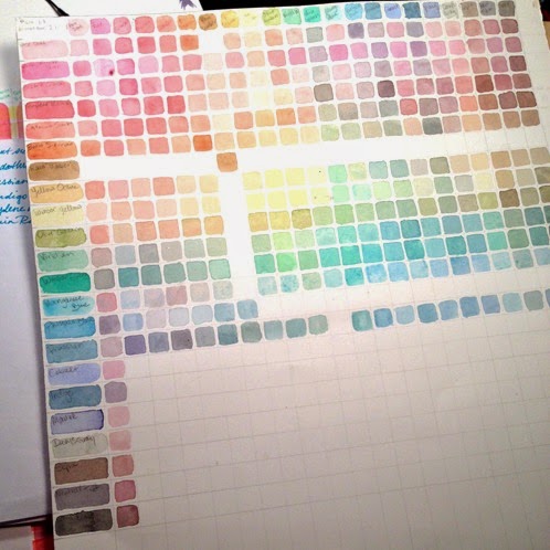

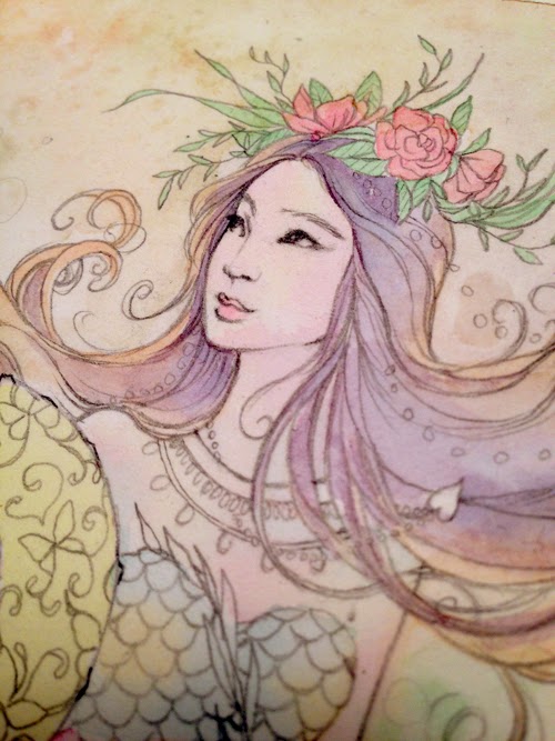


 T
T


