new posts in all blogs
Viewing: Blog Posts Tagged with: Art and Architecture, Most Recent at Top [Help]
Results 1 - 25 of 30
How to use this Page
You are viewing the most recent posts tagged with the words: Art and Architecture in the JacketFlap blog reader. What is a tag? Think of a tag as a keyword or category label. Tags can both help you find posts on JacketFlap.com as well as provide an easy way for you to "remember" and classify posts for later recall. Try adding a tag yourself by clicking "Add a tag" below a post's header. Scroll down through the list of Recent Posts in the left column and click on a post title that sounds interesting. You can view all posts from a specific blog by clicking the Blog name in the right column, or you can click a 'More Posts from this Blog' link in any individual post.

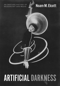
“Artificial Darkness Was Not a Medium”*
Artificial Darkness does not advance the medium of darkness in place of the medium of painting or the medium of film. The histories of art and film presented here demonstrate not only that artificial darkness could operate between media but, more so, that it could only operate between media. Implicit in these histories, therefore, is a more radical proposition—asserted expansively by media theorists like Eva Horn—that there are no media. That is, there are no media “in a substantial and historically stable sense.” Joseph Vogl elaborates:
“Media are not reducible to representations such as theater or film or to techniques such as printing or telegraphy. Nor are they reducible to symbols such as letters or numbers. Nevertheless, media are present in all of these things. They cannot be comprehended simply as a method for the processing, storing, or transmission of data. One can, however, reach their historical mode of existence through a special form of questioning: by asking how media determine the conditions they themselves created for what they store, process, and transmit.”
Artificial darkness was not a medium. Instead, it was a “thoroughly heterogeneous ensemble consisting of discourses, institutions, architectural forms, regulatory decisions, laws, administrative measures, scientific statements, philosophical, moral and philanthropic propositions—in short, the said as much as the unsaid. Such are the elements of the apparatus [dispositif]. The dispositif itself is the system of relations that can be established between these elements.” Michel Foucault’s conceptualization of the dispositif—the French, as addressed below, is decisively more accurate than “apparatus” or “mechanism”—encapsulates the workings of artificial darkness in the nineteenth and early twentieth centuries. But in order to transpose Foucault’s verbal genealogy to our visual one, his definition must be extended from the said and the unsaid to the seen and the unseen. For artificial darkness was, above all, a technology of visibility and invisibility. At Bayreuth and in the spaceless darkness of the cinema, spectators “disappeared from the auditorium.” Black-clad subjects similarly vanished before Marey’s black screen. Pepper, Méliès, Schlemmer, Man Ray, and countless others mobilized artificial darkness to render bodies invisible, in whole or in parts. The invisibility engendered by artificial darkness required specific architectures, insensitivities to specific light spectra, specific physiological thresholds, or the reflectivity of specific paints. But it was not medium specific. A matter of ontics rather than ontology, invisibility was among several qualities and subject effects endemic to artificial darkness that were not only the product of any one medium but rather the product of heterogeneous elements assembled in a certain order—in short, the product of a dispositif.
The term dispositif can be traced back millennia. I will limit this inquiry to two centuries. In its modern technological usage, a dispositif is an arrangement of devices or apparatuses (appareil). In nineteenth-century manuals of photography, science, or magic, for example, a camera might be called an appareil, whereas a black screen, photographic darkroom, or theatrical attraction was more likely to be described as a disposition or dispositif. Controlled darkness was almost always an arrangement, a dispositif, rather than a self-contained device. At its most modest, a dispositif is neither more nor less than a proper arrangement. The term’s two other modern meanings, however, point toward the broader network of relations central to this study. In military use, the dispositif is the proper arrangement of equipment and troops. In a juridical context, it is the legal decision, independent of the opinion. At its most forceful, a dispositif disciplines bodies and shapes discourses.But just as there are no media in a substantial and historically stable sense, a dispositif is always provisional, strategic, and historically specific.There was no dispositif of artificial darkness independent of the architectural and artistic forms, regulatory and administrative decisions, scientific and philosophical statements, discourses, institutions, and subjects that produced it and that were produced by it. The recursion inherent in this definition serves as a firewall against axiomatic first causes,such as the autonomy, specificity, and ontology tirelessly—and tiresomely—claimed for modernist arts. Artificial darkness was exploited by modern artists and filmmakers but it was not a modernist medium. In other words, this study of artificial darkness is anchored not in the false bedrock of ontology but in an ocean of discourse and praxis, tethered to a historically contingent dispositif.
Exclusions/Elaborations
Throughout Artificial Darkness we will encounter individuals, techniques, and sites that advanced the positive value of modern darkness. At this introductory stage, however, artificial darkness may be most legible as a negative image of its ancient counterpart. These negations are nuanced throughout the book but warrant brief and schematic summary here. Not total darkness. Not night. Not shadows. Not black. Not race. Not artificial light.
Not total darkness. As a technology of controlled darkness, artificial darkness was incompatible with total darkness. When black screen techniques were exploited for magic performances, for instance, the stage was ringed with dazzlers—gas or electric lights with reflectors directed at the audience—to intensify the contrast and enhance the illusion. Audiences recalled bright lights rather than darkness.
Not night. Artificial darkness was divorced from its natural counterpart, night, and representations thereof in nocturnes or nightscapes—subjects with extensive historiographies of their own. Early seminal manifestations of artificial darkness—such as the Diorama or Marey’s black screen—functioned exclusively by daylight. Others, like cinemas,were essentially blind to nocturnal and diurnal cycles.
Not shadows. Artificial darkness demanded the concentrated presence and strict separation of light and darkness and so suffered few shadows—a penumbral phenomenon with a massive historiography that rarely overlaps with the phenomena in question here.
Not black. Artificial darkness was distinct from the color black and its abundant symbolism. Black monochromes were irreverent jokes or aesthetic provocations that marked the limits of established art, but they rarely channeled the operations of artificial darkness. What is more, the products of artificial darkness were often iridescent. Méliès regularly shot trick films before the black screen only to have them hand colored for distribution. And while most of Schlemmer’s costumes were sewn from light-absorbent black fabrics, they invariably included glistening blue-green-silver overlay, cardinal red tucking, or dazzling yellow spheres. Techniques of artificial darkness often produced variegated, even gaudy color images.
Not race. The history of artificial darkness unfolded by and large independently from discourses on race. Nevertheless, a promising avenue for further critical scholarship is the uncomfortable union of artificial darkness and race instantiated only sporadically in the late nineteenth and early twentieth centuries but explored potently by a number of contemporary artists. Darby English establishes the terms through which any such discussion would have to unfold in his analysis of David Hammons’s Concerto in Black and Blue (2002): “How to see a work of art in total darkness? One cannot, of course, except in the most extraordinary of circumstances, such as when darkness itself forms the condition of the work’s visibility.”
Not artificial light.In name and in practice, artificial darkness was much more proximate to artificial light than to other forms of darkness. Substantial scholarship has chronicled the industrialization of light in the nineteenth century and the use of artificial lighting in art, architecture, and theater. But these histories, too, must be disentangled from that of artificial darkness. At a technical level, artificial darkness could and did function independently of artificial light; as already mentioned, sunlight powered many of the early dispositifs of artificial darkness, not least Marey’s Physiological Station. More interestingly, photographic and cinematic studios erected in the nineteenth and early twentieth centuries were consistent in their deployment of artificial darkness, even as they amalgamated or alternated between natural and artificial light. The histories of artificial light and artificial darkness overlap at important junctures; but ultimately they are distinct.
Nevertheless, the history of artificial darkness cannot be hermetically sealed off from total darkness, night, shadows, black, race, or artificial light. Commonalities could certainly be found in baroque tenebrism; Étienne-Louis Boullée’s Temple of Death; the Claude glass or “black mirror”; the mutual imbrication of gothic tropes and modern media; James Whistler’s nocturnes and “black portraits”; blue tinting or day-f0r-night shooting (nuit américaine); and hosts of recent projects in and around the ascendent black box gallery. (This book’s coda makes a few preliminary gestures in this direction.) Artificial Darkness focuses on the late nineteenth- and early twentieth-century rise and consolidation of artificial darkness around a specific circuit—black screens and dark theaters—and certain of the art, media, and subjects formed therein. Artificial Darkness does not endeavor, however, to be the last word on artificial darkness.
*This excerpt was adapted (without endnotes) from Artificial Darkness: An Obscure History of Modern Art and Media by Noam M. Elcott (2016).
***
To read more about Artificial Darkness, click here.

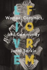
“Craft as Collective Practice”*
One way of characterizing the social turn in contemporary artistic practice is to foreground its history in the pedagogical practices of previous generations, in this case, women ceramists whose careers throughout the mid-twentieth century expand and enrich our current understanding of what socially engaged artistic practice is today. This book argues that is was modern craft and not modern art that spearheaded nonhierarchical and participatory experiences, through the experiential properties endemic to craft practices and, in particular, ceramics. This runs counter to the existing genealogies of participatory art charted by Claire Bishop and Boris Groys, which are wholly tied to a European model of performance and non-object avant-garde practice. Today, many artistic practices focus heavily on “socially engaged art,” “institutional transformations,” and “knowledge-exchange” between artist and audience. Mid-century craft is an important but unacknowledged antecedent to the activist principles that service such contemporary ideologies. Moreover, it was women artists, many of whom were affiliated with social reform movements and spearheaded radical educational initiatives, who performed the teaching and transmission of craft skills and ideologies at midcentury.
This study is a thematic and gendered history of postwar American ceramics, which resituates a presently isolated and self-contained field as a malleable medium that could be manipulated to suit simultaneously avant-garde, nationalist, and regionalist constituencies. The tensions between these competing interests are compelling not just for their historical significance but for the prominent role craft has played in the political economy throughout the twentieth century.
Accordingly, the perpetuity of the art/craft divide is better understood politically, rather than aesthetically: craft is most often linked to fiscal policy, a redistribution of labor, production, and skill resulting in improved economic conditions, while avant-garde art is linked to social policy and its ensuing debates of morality.The circulation of handmade goods, no matter how expensive or inefficient their production, have markedly more potential for bestowing pride upon a nation through mass ownership and collection. In both formats of production, it is public efficacy that is a t stake, turning on questions not of usefulness but of use, as political propaganda, the inherent attributes of craft’s materialism, its sustainability and durability, is potent as a metaphor for community and nation-building. In this way, craft becomes the ultimate service discipline, its utopian and communal values both politically alluring and easily appropriated by ethnic, religious, diasporic, or cultural nationalisms.
In the book, I focus on three American women ceramicists: Marguerite Wildenhain (1898–1985), a Bauhaus-trained potter who taught form as process without product at her summer craft school Pond Form; Mary Caroline (M. C.) Richards (1916–1999), who renounced formalism at Black Mountain College in favor of a therapeutic model she pursued outside academia; and Susan Peterson (1925–2009), who popularized ceramics through live throwing demonstrations on public television in 1964. These three artists were chosen in part for their direct relationship to teaching and writing—all left behind written legacies—and for their heavy involvement in the creation of alternative circuits and new forms of pedagogy.
At a time when women were virtually excluded from both the teaching and making of painting and sculpture, craft provided a vital arena as teachers, thinkers, and makers. It became a viable alternative to the mainstream, urban art worlds of New York City and Los Angeles, a space in which women could innovate, teach, and create lasting pedagogical structures. Ceramics in particular, with its emphasis on self-sufficient rural living, offered women unprecedented social freedoms, with the opportunity to live and teach in nontraditional settings, such as cooperative, experimental, or self-initiated communities. This unorthodox, largely rural livelihood was beholden to the formal requirements of their craft: the making, storage, and most importantly, firing of ceramics. Due to the strict fire codes and zoning laws that made kilns illegal in most cities, the medium itself was ill-suited to an urban setting. Infinitely more private, these off-the-grid situations were more conducive to alternative lifestyles and sexualities, minimizing the social pressure, judgment, and community policing endemic to the sexist and repressive 1950s. Able to barter their unique wares and skills sets, women, too, found varying degrees of financial autonomy in the informal economies of exchange that existed through pottery’s social and pedagogical networks.
But to have chosen craft at that moment required a heightened awareness and rejection of conventional artistic structures, institutions, and hierarchies. As women foregrounded in both pedagogical and theoretical constructions of their shared discipline, Richards, Wildenhain, and Peterson were craftswomen engaged not just in highly skilled labor but, moreover, in the language of that labor. Their stories prefigure, or parallel, the masterful male pedagogical narratives now so well known—the ABCs, in effect—to scholars and students of the late twentieth and early twenty-first centuries: Josef Albers, Joseph Beuys, John Cage. In studio ceramics, as well, a version of this narrative has also been propagated, centered firmly on Peter Voulkos and his cadre of all-male students in the mid-1950s. As a parallel medium, ceramics offered a tantalizing proximity to the avant-garde movements of the era, including, but not limited to, abstract expressionism, Happenings, experimental music, minimalism, and, as I will argue, even early video art.
Indeed, its artists engaged in similar midcentury tactics: the expression of form through a suppression of narrative content, the embattled and sometimes exalted status of the artist as a maverick, the ambivalent relationship between artist and industry, and the increasing disregard for traditional artistic skills such as draftsmanship. In my project, the ceramic vessel becomes, in one sense, a foil, the shell object loaded with metaphorical and symbolic values of female labor, and, on the other hand, dematerialized, in tandem with the larger conceptual practices of the 1960s and 1970s, in which artists saw fit to engage with different forms of aesthetic experiences not limited to traditional object making.
The similarities between the formation of craft and media discourses during the postwar era are striking. As a hand-based, ancient technology, ceramic became a powerful metaphor for encouraging critical awareness and adaptation in the face of new technologies such as radio and television,and its performativity developed alongside, not in spite of, this sensoria. If one of the criteria for newer media is remediation, that is, the ability to generate an adaptation, translating from one format to another, ceramics itself is marked by variability and transformation, no more consigned to its basic materiality than is a computer chip, originally derived from metals and sand (silica). Beyond art and aesthetics, clay consistently transforms into media formats that seem unimaginable, at the forefront of advanced technological innovation in fields such as dentistry, automotive, oil and gas, solar, industrial, electronics, and defense industries.
*This excerpt has been adapted (without endnotes) from Live Form: Women, Ceramics, and Community by Jenni Sorkin (2016).
***
To read more about Live Form, click here.

By: John Priest,
on 4/9/2016
Blog:
OUPblog
(
Login to Add to MyJacketFlap)
JacketFlap tags:
timeline,
buckminster fuller,
futurism,
Art and Architecture,
Timelines,
*Featured,
Art & Architecture,
Arts & Humanities,
20th Century Philosophy,
Modern American Art,
Famous Inventors,
jonaton keats,
modern american architecture,
you belong to the universe,
design,
Literature,
Technology,
Philosophy,
tech,
art and design,
Multimedia,
Add a tag
A self-professed "comprehensive anticipatory design scientist," the inventor Buckminster Fuller (1895-1983) was undoubtedly a visionary. Fuller's creations often bordered on the realm of science fiction, ranging from the freestanding geodesic dome to the three-wheel Dymaxion car.
The post The life and work of Buckminster Fuller: a timeline appeared first on OUPblog.

The Essential Paul Laffoley: Works from the Boston Visionary Cell publishes this May (*super exciting*), but the meantime, here’s a teaser featuring a few of Laffoley’s paintings and video of the documentary The Mad One (Jean-Pierre Larroque/Doublethink Productions), after the jump.
***

Cosmolux, 1981. Oil, acrylic, and lettering on canvas. 73 1/2 x 73 1/2 in. © Paul Laffoley.

The Living Klein Bottle House of Time, 1978. Oil, acrylic, and lettering on canvas. 73 1/2 x 73 1/2 in. © Paul Laffoley.

Geochronmechane: Time Machine from the Earth, 1990. Serigraph on rag paper. Edition of 75. 28 in. x 28 in. © Paul Laffoley.
To read more about The Essential Paul Laffoley, click here.

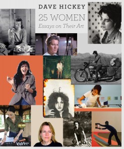
What follows below is a very brief excerpt from a feature-length interview with Dave Hickey, whose book 25 Women: Essays on Their Art published this fall, over at Momus.
***
Tell me about the timing. Why did you decide to produce 25 Women when you did?
I was putting together a book of what I considered to be my best essays about what I considered to be the best art. I got up to about ten or twelve essays and I realized that most of these essays were about the art of women artists, so I shifted my hand on the tiller. Also, I wanted to memorialize Marcia Tucker, so I did that. I thought it would be a kick.
You say in your introduction that it’s not “a fair book.” What do you mean by that? How would it look if it was fair?
Well, there are lots of women artists whose work I like, about whom I never had a chance to write. Agnes Martin, Cindy Sherman, and Hannah Wilke come to mind. This was mostly in the seventies when men couldn’t write about women artists if a woman writer was available, and there always was. I also wrote some essays that weren’t salvageable, in my opinion, because the writing was not good. I have essays about Joan Snyder, Patricia Tillman, Helen Frankenthaler, and others that I really screwed up. Also I have written about some women artists whose work has changed so dramatically that what I had to say was irrelevant.
So the book is not fair, nor does it embody a singular theme about the plight of women artists. I’m like Donald Trump in that: I like winners. So the book is not about the plight of women artists in general. This is a flaw I cannot fix. The tenor of contemporary criticism is sociological, and since I am neither clairvoyant nor a sociologist, I have no insight into what is called the issue of “women’s identity.” I don’t understand women, but I don’t understand a lot of things. The rule today is that you can’t write about the art of women artists without having a foundational opinion of all women artists. I don’t have that.
To read the interview in full, click here.
To read more about 25 Women, click here.

The University of Chicago Press: you’ve got the answer(s), we’ve got the question(s).
(And by questions, I mean Dave Hickey’s other books.)

To read more about The Invisible Dragon, click here.
To read more about 25 Women: Essays on Their Art, click here.

Just a snippet from a fab piece by Jennifer Tyburczy for Artforum on the research informing her recent book Sex Museums: The Politics and Performance of Display, which places the museum in its spatial, political, and sexual contexts, each imbricated by the other, as well as our notions of public and private. You can read more from her “500 Words” piece here.
***
The big surprise, though, was that as soon as I started to write about sex museums, they started to close. The latter part of my book is dedicated to an ethnography of these spaces. It was disconcerting when I would plan out a visit to Los Angeles to see an erotic museum that then closed mere months before I could make the trip. Part of the book became about the failure of these ventures, and I don’t mean in a Jack Halberstam, Queer Art of Failure kind of way. Ultimately, many of these museums could not provide what visitors wanted, which was a really raw experience with sex drawn from the archive and arranged in displays. A lot of the museums I discuss—whether in New York, Denmark, or Spain—had an ingrained idea of who their normative visitor was and where their threshold of shock was located. Without fail, they always set the bar too low. People wanted more! The demands of being a twenty-first-century museum taking on the onus to display sex overwhelmed a lot of the museum planners. Typically they censored themselves in some way that visitors noted. The heartening message here is that we shouldn’t assume that people will be shocked and turned off by displays of diverse sexual cultures and people. Museum visitors are smart and savvy, and ready and willing to have that experience. My work makes an argument for the emotional and sexual intelligence of a viewer.
To read more about Sex Museums, click here.

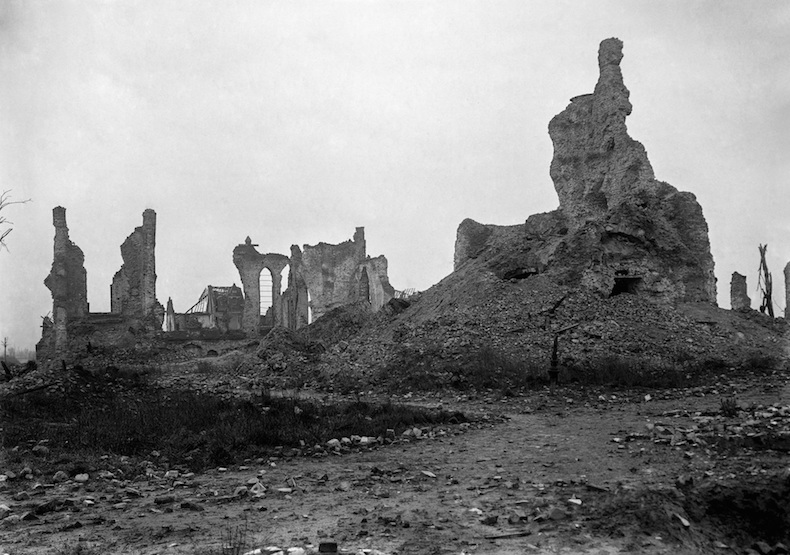
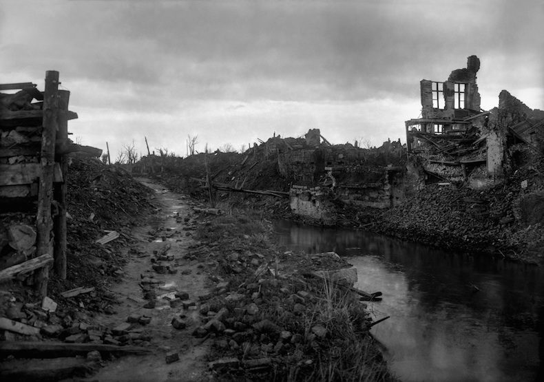
Carl De Keyzer’s The First World War reproduces newly restored glass-plate images (scratches and flaws meticulously removed, which involved De Keyzer’s pursuit of the original glass plates from international archives, private collections, and museums), depicting the experience of WWI from vantages and perspectives previously lost to history. A recent post at Slate‘s history blog, The Vault, featured several images from the book taken by the photographer Arthur Brusselle, who was commissioned by the Belgian government to travel to those sites that had seen the most devastation and document his encounters (these particular plates are held in the archive of the City of Bruges).
From Rebecca Onion’s post at Slate, with a couple of accompanying images below:
Two of the towns in the photographs below—Diksmuide and Nieuwpoort—were the sites of the Belgian Army’s final stand against the invading German Army, in October 1914. Pushed to the coast, the Belgians, accompanied by British and French troops, created a 22-mile defensive line from Nieuwpoort to a village named Zuidschote. The nearly monthlong Battle of the Yser, during which the Belgians purposefully flooded part of this landscape in order to deter German advances, ended in defeat for the Germans and allowed Belgium to keep a small percentage of its land under its own control.
***

Arthur Brusselle, Diksmuide (1918–19). Photo copyright: City of Bruges.

Arthur Brusselle, Diksmuide (1918–19). Photo copyright: City of Bruges.
To read more about The First World War, click here.
To see more sample images from the book, click here.

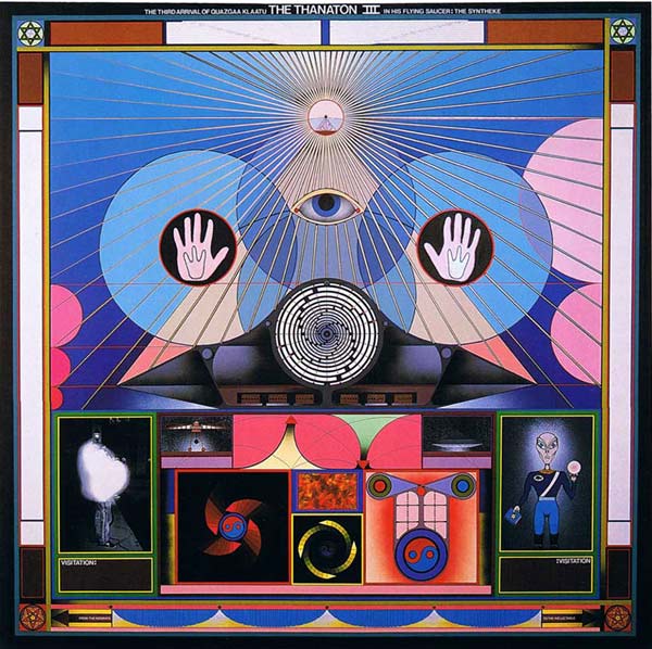
Paul Laffoley, Thanton III, 1989.
We’ve long been set to publish the closest volume yet to a catalogue raisonné for the visionary artist Paul Laffoley (1940–2015) in Spring 2016, and thus, were all the more saddened to hear of Laff0ley’s death last week. If you’re unfamiliar, even the tone and pitch of his NY Times obituary should offer a lens into his work—it’s titled, “Paul Laffoley, Painter Inspired by Time Travel and Aliens, Dies at 80.”
Although working in what practically redefines the nature of “liminal space”—engaging in visual and textual inquiries positioned someplace between New Age theology, mathematical abstraction, mystical systems, and all senses of the term extraterrestrial (he claimed to have seen the film The Day the Earth Stood Still 873 times)—Laffoley’s work was also uncannily prescient, as you can note from the NYT obit below:
“It is kind of like taking money out of a bank machine, when you’re looking at a screen and you’re called upon to touch the screen,” he said of “Thanaton III,” a painting from 1989, in a 1999 interview shown on “Disinformation,” a television series on Channel 4 in Britain. “You know that you can’t go through the screen, but you do also know that there’s something behind the screen that’s organizing the experience that you have, only in this case the payoff is not money but a type of knowledge.”
The Essential Paul Laffoley contains almost 100 of his paintings, reproduced in full color, each accompanied by a “thought-form,” or text specific to their making, in addition to an introduction by editor and gallerist Douglas Walla, a biography by fellow artist Steven Moskowitz, and essays by scholars Linda Dalrymple Henderson and Arielle Saiber.
To read more about The Essential Paul Laffoley, click here.


Lost German Zeppelin, slightly hovering above a field of French peasants, October 1917. Photo by: Albert Moreau. Credit: ECPAD/France/Albert Moreau.
***
The first Armistice Day, which celebrated the one-year anniversary of the end of hostilities on the Western Front, and ultimately, the conflict-based dissolvement of World War I, took place on November 11, 1919, and marked that moment a year earlier, the “eleventh hour of the eleventh day of the eleventh month” of 1918. Fast forward nearly a century. Desensitized via the ubiquity of war photography and new forms of media circulation to the strangeness, the horrors, the portrayal of foreign terrain, and the shocks of bearing witness to conflict, we can point to any number of examples of now classic photojournalism that portray the terror of warfare in the twentieth and twenty-first century, including work by Robert Capa, Joe Rosenthal, Nick Ut, Gary Knight, Benjamin Lowy, and Ashley Gilbertson.
The First World War: Unseen Glass Plate Photographs of the Western Front is different. Carl De Keyzer’s meticulous reconstruction of photographs—including many authentic color images, the result of early autochrome technology—makes available glimpses of the First World War, as never seen before. We’re accustomed to grainy, scratched, blurred images in monochrome of the devastation of trench warfare, but these images, taken by some of the war’s most gifted photographers producing glass plate images in lieu of film from crude cameras, offer more distinct moments: from Belgian soldiers in training to African colonial troops on the Western Front, from the everyday minutiae of civilians’ lives to women making 75mm shells on the assembly line in the factory in Saint-Chamond, all accompanied by an Introduction from Geoff Dyer and an essay by historian David Van Reybrouck.
More of De Keyzer’s process is explained in an interview between Getty curator Nancy Perloff and De Keyzer at Places:
My team and I searched all over Europe — all over the world, in fact. We discovered that original negatives are available for fewer than five percent of the existing images. Most were destroyed during or after the war; some were recuperated for the silver used in the old collodion process, and many were simply badly treated or lost.
We made a list of about fifty different museums and collections worldwide, which over the course of several years we visited or contacted. These included the Library of Congress, the Smithsonian Institution, and the Hoover Institution, in the United States; the War Office/National Archives, in the United Kingdom; the Musée Albert-Kahn, in Paris; the Bundesarchiv, in Berlin; and many places in Belgium. I spent weeks hunting through wooden boxes with dust-covered glass plates and containers packed with old prints, and poring through old albums. Most museums have not even begun to archive and digitize these collections.
We posed two key questions to the archival institutions. Could we scan the originals? And then would they allow me to restore the originals according to my own professional standards and personal perspectives? Only a few museums responded affirmatively to both questions.
And from a recent profile of the book in the Telegraph, which teases some of the book’s content:
These images were taken between 1914 and 1921, in places of which we have likely never heard, by photographers – Tournassoud, Aubert, Moreau, Antony, Gimpel, Castelnau – whose names are unfamiliar. Here, male and female factory workers weld fins to mortar grenades, or stack thousands of mess tins. Red-trousered regiments bathe almost leisurely in a pond, in a scene that recalls the pastoral idylls of Giorgione or Manet; a bugle hangs on a nearby tree. Elsewhere, children look on as soldiers parade in country fields, or play at airmen and prisoners on the streets of Paris.
To read more about The First World War, click here.
To see sample pages from the book, click here.
***
Also, today we continue the 2015 University Press Week blog tour. Read up on previous contributions from member presses here, and in the meantime, look for some great posts on the history of university press design from Northwestern University Press, Princeton University Press, MIT Press, the University of Kansas Press, Georgetown University Press, Syracuse University Press, Stanford University Press, Harvard University Press, Athabasca University Press, and finally, Yale University Press.
To read more about 2015 University Press Week, click here.

In sad news, scholar, media artist, and writer Svetlana Boym (1966–2015) died on August 5, 2015, following a year-long struggle with cancer. The Curt Hugo Reisinger Professor of Slavic and Comparative Literatures at Harvard University, Boym’s voracious and wide-ranging intellectual pursuit of our iconic, burdensome, and occasionally off-kilter inheritances from modernism led to engagements with the works of such artists “as Vladimir Tatlin, Kazimir Malevich, Ilya Kabakov, Victor Shklovsky, Osip Mandelshtam, Marina Tsvetaeva, and Joseph Brodsky, among others.” Included in her own writings was Another Freedom: An Alternative History of an Idea, published by the University of Chicago Press in 2010, which explored freedom’s cross-cultural and utopian possibilities drawn from a personal and historical examination of the relationship between art and politics. Boym had previously been awarded a Guggenheim Fellowship, an American Academy in Berlin Fellowship, a Bunting Fellowship, and Harvard University’s Everett Mendelsohn Award for excellence in mentoring.
From the Department of Slavic Languages and Literatures at Harvard University:
Our memory of her remains of one who was brimming with vitality, brilliance, and wit. Her warm yet fiercely independent personality together with her influential scholarship attracted students and colleagues from around Harvard, and indeed around the world. We will miss her terribly.
To visit Boym’s personal website (and her “Off-Modern Manifesto”), click here.
To read more about Another Freedom, click here.

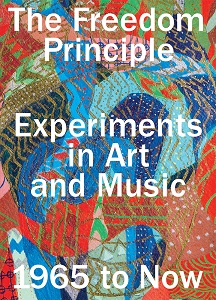
This past weekend, the Museum of Contemporary Art Chicago launched the exhibition The Freedom Principle: Experiments in Art and Music, 1965 to Now, co-organized by Naomi Beckwith and Dieter Roelstraete. An easy explication for the impetus behind the show takes the viewer to the South Side of Chicago in the 1960s, where African American artists and musicians grappled with new language and forms inspired by the black nationalist turn in the Civil Rights movement. I’m plucking that line from the jacket copy, but the show (and its associated book) goes beyond [its important] cultural inventory and instead repositions the wide-ranging experimental works and the community of artists who made them in one particular canon to which they have long-belonged: the history of avant-garde collectives engaged equally in art and social justice.
You can view sample pages from the book here.
From a very brief description via the Art Newspaper:
This year, the Association for the Advancement of Creative Musicians (AACM), an avant-garde jazz collective founded on the South Side of Chicago, celebrates its 50th birthday. Chicago’s Museum of Contemporary Art is joining the festivities with the exhibition The Freedom Principle: Experiments in Art and Music, 1965 to Now. Hingeing on the themes of improvisation, experimentation and collectivity, it looks at the 1960s avant-garde African-American arts scene of the South Side, including the AACM and visual art collectives such as the African Commune of Bad Relevant Artists (AfriCOBRA) and art that responds to and continues this legacy.
And from a more fleshed-out version at the MCA Chicago’s website:
The exhibition, which takes its title from a 1984 book by Chicago jazz critic John Litweiler, showcases the multifaceted world of the black avant-garde in Chicago during the 1960s alongside a selection of contemporary artists’ interpretations of this heritage. It includes works of music and art from, among others, AACM-founder, pianist, and painter Muhal Richard Abrams; Art Ensemble of Chicago bandleader Roscoe Mitchell; and AfriCOBRA cofounders Jeff Donaldson, Jae and Wadsworth Jarrell, Barbara Jones-Hogu, and Gerald Williams. Archival materials—brochures, banners, photographs, posters, sheet music, record covers—provide a rich context for the exhibition. Recent works by artists such as Terry Adkins, Nick Cave, Renée Green, Rashid Johnson, Lili Reynaud-Dewar, Cauleen Smith, and Stan Douglas present an ongoing intergenerational conversation about experimentation, improvisation, collective action, and the search for freedom. Working together across multiple platforms, Catherine Sullivan, George Lewis, Charles Gaines, and Sean Griffin are collaborating on an opera, to be presented on the MCA Stage, and on a related installation within the exhibition.
Long story, short: the sample pages are tantalizing, because the show is quite stunning in its breadth and depth. If the art, images, marginalia, and artifacts gathered here don’t immediately grab you, then, I just don’t know. You should go back and read George E. Lewis’s communal history, A Power Stronger than Itself: The AACM and American Experimental Music? And then think to yourself: I wonder how this looked. And felt. And how it worked. And what it all means now.
Read more about The Freedom Principle here.

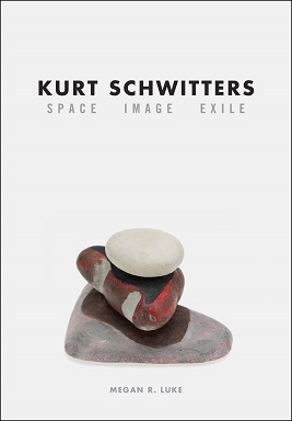
Fresh off an embargo of the news, we’re delighted to announce that Megan R. Luke’s Kurt Schwitters: Space, Image, Exile is the recipient of the 2015 Robert Motherwell Prize from the Dedalus Foundation. The Motherwell Prize, accompanied by a $10,000 award, “honors an outstanding publication in the history and criticism of modernism in the arts.” Luke’s book contextualizes, for the first time, the multidisciplinary work produced by one of modernism’s foremost innovators during the last years of his life, both during the Nazi regime and while in exile in Western Europe.
From the official announcement:
The Dedalus Foundation is pleased to announce that Megan R. Luke is the winner of the fourteenth annual Robert Motherwell Book Award, for Kurt Schwitters: Space, Image, Exile, published by The University of Chicago Press. The award, which carries a prize of $10,000, honors an outstanding publication in the history and criticism of modernism in the arts for the year 2014.
German artist Kurt Schwitters (1887–1948) is best known for his pioneering work in fusing collage and abstraction, the two most transformative innovations of twentieth-century art. Considered the father of installation art, Schwitters was also a theorist and a writer whose influence extends from Robert Rauschenberg and Eva Hesse to Thomas Hirschhorn. But while his early experiments in collage and installation from the interwar period have garnered much critical acclaim, his later work has generally been ignored. In the first book to fill this gap, Megan R. Luke tells the fascinating, even moving story of the work produced by the aging, isolated artist under the Nazi regime and during his years in exile.
Combining new biographical material with archival research, Luke surveys Schwitters’s experiments in shaping space and the development of his Merzbau, describing his haphazard studios in Scandinavia and the United Kingdom and the smaller, quieter pieces he created there. She makes a case for the great relevance of Schwitters’s aesthetic concerns to contemporary artists, arguing that his later work provides a guide to new narratives about modernism in the visual arts. His late works, she shows, were born of artistic exchange and shaped by his rootless life after exile, and they offer a new way of thinking about the history of art. Packed with images, Kurt Schwitters completes the narrative of an artist who remains a considerable force today.
Megan R. Luke is assistant professor of art history at the University of Southern California. Her research focuses on the advent of abstraction and collage, the history of photography and art reproduction, and the intersection of avant-garde art and mass culture, particularly early cinema.
To read more about Kurt Schwitters, click here.

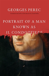
An excerpt from Portrait of a Man Known as Il Condottiere by Georges Perec
***
Madera was heavy. I grabbed him by the armpits and went backwards down the stairs to the laboratory. His feet bounced from tread to tread in a staccato rhythm that matched my own unsteady descent, thumping and banging around the narrow stairwell. Our shadows danced on the walls. Blood was still flowing, all sticky, seeping from the soaking wet towel, rapidly forming drips on the silk lapels, then disappearing into the folds of the jacket, like trails of slightly glinting snot side-tracked by the slightest roughness in the fabric, sometimes accumulating into drops that fell to the floor and exploded into star-shaped stains. I let him slump at the bottom of the stairs, right next to the laboratory door, and then went back up to fetch the razor and to mop up the bloodstains before Otto returned. But Otto came in by the other door at almost the same time as I did. He looked at me uncomprehendingly. I beat a retreat, ran down the stairs, and shut myself in the laboratory. I padlocked the door and jammed the wardrobe up against it. He came down a few minutes later, tried to force the door open, to no avail, then went back upstairs, dragging Madera behind him. I reinforced the door with the easel. He called out to me. He fired at the door twice with his revolver.
You see, maybe you told yourself it would be easy. Nobody in the house, no-one round and about. If Otto hadn’t come back so soon, where would you be? You don’t know, you’re here. In the same laboratory as ever, and nothing’s changed, or almost nothing. Madera is dead. So what? You are still in the same underground studio, it’s just a bit less tidy and bit less clean. The same light of day seeps through the basement window. The Condottiere, crucified on his easel . . .
He had looked all around. It was the same office—the same glass table-top, the same telephone, the same calendar on its chrome-plated steel base. It still had the stark orderliness and uncluttered iciness of an intentionally cold style, with strictly matching colours—dark green carpet, mauve leather armchairs, light brown wall covering—giving a sense of discreet impersonality with its large metal filing cabinets . . . But all of a sudden the flabby mass of Madera’s body seemed grotesque, like a wrong note, something incoherent, anachronistic . . . He’d slipped off his chair and was lying on his back with his eyes half-closed and his slightly parted lips stuck in an expression of idiotic stupor enhanced by the dull gleam of a gold tooth. Blood streamed from his cut throat in thick spurts and trickled onto the floor, gradually soaking into the carpet, making an ill-defined, blackish stain that grew ever larger around his head, around his face whose whiteness had long seemed rather fishy, a warm, living, animal stain slowly taking possession of the room, as if the walls were already soaked through with it, as if the orderliness and strictness had already been overturned, abolished, pillaged, as if nothing more existed beyond the radiating stain and the obscene and ridiculous heap on the floor, the corpse, fulfilled, multiplied, made infinite . . .
Why? Why had he said that sentence: “I don’t think that’ll be a problem”? He tries to recall the precise tone of Madera’s voice, the timbre that had taken him by surprise the first time he’d heard it, that slight lisp, its faintly hesitant intonation, the almost imperceptible limp in his words, as if he were stumbling— almost tripping—as if he were permanently afraid of making a mistake. I don’t think. What nationality? Spanish? South American? Accent? Put on? Tricky. No. Simpler than that: he rolled his rs in the back of his throat. Or perhaps he was just a bit hoarse? He can see him coming towards him with outstretched hand: “Gaspard—that’s what I should call you, isn’t it?—I’m truly delighted to make your acquaintance.” So what? It didn’t mean much to him. What was he doing here? What did the man want of him? Rufus hadn’t warned him . . .
People always make mistakes. They think things will work out, will go on as per normal. But you never can tell. It’s so easy to delude yourself. What do you want, then? An oil painting? You want a top-of-the-range Renaissance piece? Can do. Why not aPortrait of a Young Man, for instance . . .
A flabby, slightly over-handsome face. His tie. “Rufus has told me a lot about you.” So what? Big deal! You should have paid attention, you should have been wary . . . A man you didn’t know from Adam or Eve . . . But you rushed headlong to accept the opportunity. It was too easy. And now. Well, now . . .
This is where it had got him. He did the sums in his head: all that had been spent setting up the laboratory, including the cost of materials and reproductions—photographs, enlargements, X-ray images, images seen through Wood’s lamp and with sideillumination—and the spotlights, the tour of European art galleries, upkeep . . . a fantastic outlay for a farcical conclusion . . . But what was comical about his idiotic incarceration? He was at his desk as if nothing had happened . . . That was yesterday . . . But upstairs there was Madera’s corpse in a puddle of blood . . . and Otto’s heavy footsteps as he paced up and down keeping guard. All that to get to this! Where would he be now if . . . He thinks of the sunny Balearic Islands—it would have taken just a wave of his hand a year and half before—Geneviève would be at his side . . . the beach, the setting sun . . . a picture postcard scene . . . Is this where it all comes to a full stop?
Now he recalled every move he’d made. He’d just lit a cigarette, he was standing with one hand on the table, with his weight on one hip. He was looking at the Portrait of a Man. Then he’d stubbed out his cigarette quickly and his left hand had swept over the table, stopped, gripped a piece of cloth, and crumpled it tight—an old handkerchief used as a brush-rag. Everything was hazy. He was putting ever more of his weight onto the table without letting the Condottiere out of his sight. Days and days of useless effort? It was as if his weariness had given way to the anger rising in him, step by certain step. He was crushing the fabric in his hand and his nails had scored the wooden table-top. He had pulled himself up, gone to his work bench, rummaged among his tools . . .
A black sheath made of hardened leather. An ebony handle. A shining blade. He had raised it to the light and checked the cutting edge. What had he been thinking of? He’d felt as if there was nothing in the world apart from that anger and that weariness . . . He’d flopped into the armchair, put his head in his hands, with the razor scarcely a few inches from his eyes, set off clearly and sharply by the dangerously smooth surface of the Condottiere’s doublet. A single movement and then curtains . . . One thrust would be enough . . . His arm raised, the glint of the blade . . . a single movement . . . he would approach slowly and the carpet would muffle the sound of his steps, he would steal up on Madera from behind . . .
A quarter of an hour had gone by, maybe. Why did he have an impression of distant gestures? Had he forgotten? Where was he? He’d been upstairs. He’d come back down. Madera was dead. Otto was keeping guard. What now? Otto was going to phone Rufus, Rufus would come. And then? What if Otto couldn’t get hold of Rufus? Where was Rufus? That’s what it all hung on. On this stupid what-if. If Rufus came, he would die, and if Otto didn’t get hold of Rufus, he would live. How much longer? Otto had a weapon. The skylight was too high and too small. Would Otto fall asleep? Does a man on guard need to sleep? . . .
He was going to die. The thought of it comforted him like a promise. He was alive, he was going to be dead. Then what?
Leonardo is dead, Antonello is dead, and I’m not feeling too well myself. A stupid death. A victim of circumstance. Struck down by bad luck, a wrong move, a mistake. Convicted in absentia. By unanimous decision with one abstention—which one?—he was sentenced to die like a rat in a cellar, under a dozen unfeeling eyes—the side lights and X-ray lamps purchased at outrageous prices from the laboratory at the Louvre—sentenced to death for murder by virtue of that good old moral legend of the eye, the tooth and the turn of the wheel—Achilles’ wheel—death is the beginning of the life of the mind—sentenced to die because of a combination of circumstances, an incoherent conjunction of trivial events . . . Across the globe there were wires and submarine cables . . . Hello, Paris, this is Dreux, hold the line, we’re connecting to Dampierre. Hello, Dampierre, Paris calling. You can talk now. Who could have imagined those peaceable operators with their earpieces becoming implacable executioners . . . Hello, Monsieur Koenig, Otto speaking, Madera has just died . . .
In the dark of night the Porsche will leap forward with its headlights spitting fire like dragons. There will be no accident. In the middle of the night they will come and get him . . .
And then? What the hell does it matter to you? They’ll come and get you. Next? Slump into an armchair and stare long and hard until death overtakes into the eyes of the tall joker with the shiv, the ineffable Condottiere. Responsible or not responsible? Guilty or not guilty? I’m not guilty, you’ll scream when they drag you up to the guillotine. We’ll soon see about that, says the executioner. And down the blade comes with a clunk. Curtains. Self-evident justice. Isn’t that obvious? Isn’t it normal? Why should there be any other way out?
To read more about Portrait of a Man Known as Il Condottiere, click here.

An excerpt from In Search of a Lost Avant-Garde: An Anthropologist Investigates the Contemporary Art Museum
by Matti Bunzl
***
“JEFF KOONS <3 CHICAGO”
I’m sitting in the conference room on the fifth floor of the MCA, the administrative nerve center which is off limits to the public. It is late January and the temperatures have just plunged to near zero. But the museum staff is bustling with activity. With four months to go until the opening of the big Jeff Koons show, all hands are on deck. And there is a little bit of panic. Deadlines for the exhibit layout and catalogue are looming, and the artist has been hard to pin down. Everyone at the MCA knows why. Koons, who commands a studio that makes Warhol’s Factory look like a little workshop, is in colossal demand. For the MCA, the show has top priority. But for Koons, it is just one among many. In 2008 alone, he will have major exhibits in Berlin, New York, and Paris. The presentation at the Neue Nationalgalerie is pretty straightforward. Less so New York, where Koons is scheduled to take over the roof of the Metropolitan Museum, one of the city’s premiere art destinations. But it may well be the French outing that most preoccupies the artist. With an invitation to present his work at Versailles, the stakes could not be higher. Indeed, when the show opens in the fall, the photos of Koons’s work at the Rococo palace, shockingly incongruous yet oddly at home, go around the world.
But on this morning, there is good news to share. As the marketing department reports, Koons has approved the publicity strategy for the MCA show. Most everyone in the group of curators, museum educators, and development staffers breathes a sigh of relief, not unlike the response of Don Draper’s team after a successful pitch. Mad Men, which made its widely hailed debut only a few months earlier, is on my mind, in fact. Sure, there is no smoking and drinking at the MCA. But the challenge faced by the museum is a lot like that of the fictional Sterling Cooper: how to take a product and fit it with an indelible essence, a singularity of feeling. Jeff Koons is hardly as generic as floor cleaner or facial cream. But given his ubiquity across the global art scene, the MCA presentation still needs a hook, something that can give it the luster of uniqueness.
Koons has history in Chicago, and that turns out to be the key. Yes, he may have been born and raised in Pennsylvania, graduated from the Maryland Institute College of Art in Baltimore, and settled in New York, where, after working as a commodities trader, he became a professional artist. But in between, for one year in the mid‑1970s, Koons lived and studied in Chicago, taking courses at the School of the Art Institute and serving as an assistant to painter Ed Paschke. Enough to imagine the MCA show as a homecoming, and the second one at that. The first, it now appears, was the 1988 exhibit, which had paved his way to superstardom and cemented an enduring relationship between artist and city. No one in the room can be certain how Koons actually feels about his old stomping grounds. But the slogan stands: Jeff Koons Chicago.
***
It’s a few weeks later. The group is back on the fifth floor. The mood is determined. On the agenda for today is the ad campaign. It will be a “communications blitz,” one of the staffers on the marketing team says. It will start with postcards sent to museum members urging them to save the date of the opening. “We need to communicate that it will be a real happening!”
“Koons is like a rock star,” someone seconds, “and we need to treat him like that.” Apparently, Justin Timberlake stopped by the MCA a few weeks ago, causing pandemonium among the school groups that happened to be touring the museum at the time. “Koons is just like that!” one of the marketers enthuses. “No, he’s not,” I’m thinking to myself. But for what seems like an endless few seconds, no one has the heart to burst the bubble. Finally, someone conjectures that, Koons’s art‑star status notwithstanding, people might not know what he looks like. It is suggested that the postcard feature a face shot.
The graphics for the ad campaign and catalogue cover are central to the conversation. We look at mockups, and the marketers share their excitement about the splashy images. There is much oohing and aahing. But, then, a minor hiccup. A curator notes that one of the pieces depicted in the copy will not actually be in the show, the loan request having been refused. Another image presents an issue as well. That piece will be on display, but it belongs to another museum. Maybe it, too, should be purged. No one is overly concerned, though. Given a virtually inexhaustible inventory of snazziness, Koons’s oeuvre is certain to throw up excellent replacements.
Splashy images would also be the focal point of an advertorial the marketing department is considering for a Conde Nast publication. Such a piece, to be run in eitherVanity Fair or Architectural Digest, would be written by the MCA but laid out in the magazine’s style. It would complement the more conventional press strategies, like articles in local newspapers, and would be on message. This, as signs from the real world indicate that Koons may, in fact, truly like Chicago. He wants to attend a Bulls game with his kids while in town. From the standpoint of marketing, it’s a golden opportunity. “This artist likes Chicago sports,” one staffer gushes, something people would be “pleasantly surprised by.” The narrative that emerges is that of the local boy who made good. Indeed, when the official marketing copy arrives a few weeks later, it features sentences like these: “The kid who went to art school in Chicago and loved surrealism, dada, and Ed Paschke and the imagists—that kid made it big.”
***
A few weeks later still, back in the conference room on the fifth floor. Today’s topic: tie‑ins and merchandizing. Some of it is very straightforward, including a proposed relationship with Art Chicago, the local art fair. Other ideas are more outlandish, like a possible connection to The Incredible Hulk. The superhero movie, based on the Marvel Comics and starring Edward Norton, is set to open in mid‑June, and the staff member pitching the idea seems to be half joking. But as I look around the room, there are a lot of nods. The show, after all, will feature several pieces from Koons’s Hulk Elvis series, large paintings that juxtapose the cartoon character with such Americana as the Liberty Bell.
More concrete is a tie‑in with Macy’s. This past fall, a large balloon version of Koons’sRabbit made its debut in New York’s Thanksgiving Day Parade. For the MCA show, it could make a trip to Chicago, where it would be displayed at the Macy’s store in the Loop. I’m wondering if that might be a risky move. After all, the company is considered something of an interloper in the city, having taken over Marshall Field’s beloved flagship store in 2006. But the marketers are ecstatic about the opportunity. “This will really leverage the promotional aspects,” one of them exclaims. The word that keeps coming up is “cross‑marketing,” and I take away that Jeff Koons stuff might soon be everywhere.
Stuff, in fact, is what really gets the group going today. Koons, it turns out, is a veritable merchandizing machine, which means that a lot of things can be sold in conjunction with the show. The list of products bearing his art ranges from the affordably populist ( beach towels from Target) to the high‑end luxurious (designs by Stella McCartney). But the news gets even better. Koons has given the MCA permission to manufacture a whole new line of T‑shirts featuring Rabbit. We pass around production samples, and everyone agrees that the baby tees, in light blue and pink, are too cute for words.
Then it’s time for the food. As early as January, I heard about plans to delight museum patrons with Koons‑themed cuisine. Initially, there was some talk of cheesecake, but more recently, the word in the hallways has been cookies. Turns out, it’s a go. Koons just approved three separate designs. We’re back to oohing and aahing, when one of the marketers suggests that some of the cookies could be signed and sold as a limited edition. Another joke, I think. But he goes on, noting that some people would choose not to eat the cookies so they could sell them at Sotheby’s in a couple of decades. The atmosphere is jocund. So when one of the curators points out that worms would be crawling out of the cookies by then, it’s all taken as part of the general levity.
***
The concept of marketing is quite new to contemporary art museums. In the good old days, it was simply not seen as a necessity. Giving avantgarde art a place was the objective, which meant that institutions catered to a small group of cognoscenti and worried little about attracting the general public. All this changed once the spiral of growth started churning. Larger museums required larger audiences, not just to cover ever‑increasing overhead but to validate contemporary art museums’ reinvention as major civic players.
The MCA is paradigmatic. Until the late 1970s, there was no marketing operation per se. What little advertising was done ran under the rubric of “public relations,” which was itself subsumed under “programming.” Public relations became a freestanding unit in the 1980s, and by the end of the decade marketing was officially added to its agenda. But it was not until the move into the new building in 1996 that a stand‑alone marketing department was added to the institution’s roster. The department made its presence felt immediately. Right away, its half dozen members began issuing a glossy magazine, initially called Flux and later renamed MCAMag, MCA Magazine, and eventually MCA Chicago. A few years later, a sprightly e‑news enterprise followed, keyed to the ever‑expanding website.
But marketing is much more pervasive in the contemporary art museum. Just before I arrive at the MCA, for example, its marketing department spearheads the museum’s fortieth‑anniversary celebration, a forty‑day extravaganza with numerous events and free admission. Some of the first meetings I attend at the institution are the postmortems, where the marketers take a lead in tallying the successes and failures of the initiative. There is much talk of “incentivizing membership.” Branding, too, is emphasized, particularly the ongoing need to “establish the museum’s point of view” by defining the contemporary. The latter is especially pressing in light of the imminent opening of the Art Institute’s Modern Wing. But the key word that recurs is gateway. The MCA, the marketers consistently argue, needs shows that appeal to “new and broader audiences” and signal that all Chicagoans are “welcome at the museum.”
Jeff Koons is their big hope for 2008. In a handout prepared for a meeting in February, they explain why: “Jeff Koons is by far one of the (if not the) most well known living artists today.” With the recent sale of Hanging Heart making “news even in InTouch Weekly” and his participation in the Macy’s Thanksgiving Day Parade, he “is doing what no artist has done since Andy Warhol.” He is becoming part of the “mainstream.” Even more importantly, “the art itself helps to make this a gateway.” The “images of pop culture icons and infl atable children’s toys democratize the art experience. Even the most novice of art viewers feel entitled to react to his work.”
With this, the marketing department takes a leading role in the preparations for the Koons show. Its members help organize and run the weekly meetings coordinating the museum‑wide efforts and rally the troops when morale is down. This is done corporate‑style, as in an exercise in which staffers go around the table to share what excites them personally about Jeff Koons. The curators can be conspicuously silent when marketing talk dominates the agenda. But that doesn’t mean there aren’t any tensions.
***
I’m having lunch with one of the curators. We’re sitting on the cafeteria side of Puck’s at the MCA, the vast, high‑ceilinged restaurant on the museum’s main exhibition floor. The conversation circles around a loaded topic, the frustrations with the marketing department. “I understand where they’re coming from,” she tells me, only to add that they may not “believe in the same things I do.” I ask for specifics and get a torrent that boils down to this: The curator sees the MCA as a space for adventure and experimentation where visitors encounter a contemporary culture they don’t already know. What marketing wants to do, she says, is to give people a pleasant experience amidst items they already like. “If they had their way, it would be Warhol all the time.” Individual viewpoints vary, of course. But I’m hearing similar things from other members of the curatorial department. Marketing, they tell me, can be fecklessly populist and insufficiently attuned to the intricacies of contemporary art and artists.
The feelings are mutual, or, to be more accurate, inverted. To the marketers, the curatorial department sometimes comes off as elitist and quixotic. When its members talk about some of the art they want to show, one of them tells me, it can “just sound crazy.” “Sometimes,” she continues, “I don’t even know what they are doing.” Even more exasperating, however, is the curators’ seeming disinterest in growing the museum’s audience. “They never think about how to attract more viewers” is a complaint I hear on more than one occasion.
If there is a convergence of views, it is only that the other side has too much power and influence.
***
For a while, I think that the fretting might be personal. Every institution, after all, breeds animosities, petty and otherwise, and the ever‑receptive anthropologist would seem to be the perfect outlet. But I am struck that the grievances are never ad hominem. The MCA’s employees, in fact, seem to genuinely like and respect one another. This is not surprising. The museum, after all, is a nonprofit whose staffers, no matter how “corporate” in orientation, could pursue eminently more lucrative careers elsewhere. The resulting feeling is that “we are all in this together,” a sentiment I hear expressed with equal regularity and conviction.
What, then, is it between curation and marketing? Over time, I come to see the tensions as intrinsic to the quest of bringing contemporary art to ever‑larger audiences. The issue, in other words, is structural.
***
When marketers look at contemporary art, they see a formidable challenge. Here is a product the general public knows little about, finds largely incomprehensible, and, occasionally, experiences as outright scary. This is as far as one can be from, say, introducing a new kind of soap. There, the relevance and purpose of the generic product are already well established, leaving marketers to work the magic of brand association. Maybe the campaign is all about fragrance or vitality or sex appeal—what it won’t be about is how soap itself is good for you.
Much of the marketing in the domain of high culture works in this very manner. When Chicago’s Lyric Opera advertises its new season, for example, it can safely assume that folks have a pretty accurate sense of the genre. What’s more, there is little need to justify the basic merits of the undertaking. Most people don’t go to the opera. But even those who find it boring or tedious are likely to accede to its edifying nature.
The same holds true for universal museums. In Chicago, that would be the Art Institute, whose holdings span the globe and reach from antiquity to the present. Marketing has relevance there, too. But much like at the Lyric, the value of the product is readily understood. So is its basic nature, particularly when it can take the form of such widely recognized icons as Georges Seurat’s La Grande Jatte or Grant Wood’s American Gothic.
At its most elemental, the marketing of a museum is orchestrated on the marquees at its entrance. With this in mind, the Art Institute’s advertising strategy is clear. It is the uncontested classics that get top billing, whether they are culled from the museum’s unparalleled collection or make an appearance as part of a traveling show. Mounted between the ornate columns at the majestic Michigan Avenue entrance, a typical tripartite display, as the one from April 2007, looks like this: In the middle, bright red type on a blue banner advertises Cézanne to Picasso, a major show on the art dealer Ambroise Vollard, co‑organized by the Art Institute and fresh from its stop at the Metropolitan Museum in New York. On the left, a bisected flag adds to the theme with apples by Cézanne and Picasso’s The Old Guitarist, one of the museum’s best‑loved treasures. On the right, finally, a streamer with an ornately decorated plate—horse, rider, birds, and plants—publicizes Perpetual Glory, an exhibit of medieval Islamic ceramics. A couple of months down the road, the billboards announce a show of prints and drawings collected by prominent Chicago families, an exhibit on courtly art from West Africa, and free evening admission on Thursdays and Fridays. A little later still, it is an exhibit of sixteenth‑and seventeenth‑century drawings, a display of European tapestries, and the Art Institute’s logo.
What’s not on the Art Institute marquees is contemporary art. Sure, a canonized living master like my good friend Jasper Johns can make an occasional appearance. But the edgy fare served up by the museum’s contemporary department is absent. Nothing announces William Pope.L in 2007, Mario Ybarra Jr. in 2008, or Monica Bonvicini in 2009. The contemporary art market may be booming, but the Art Institute’s marketers assume that the general public cares only so much.
Their colleagues at the MCA don’t have that option. Tasked with marketing a contemporary art museum to an ever‑expanding audience, they have to find ways to engage the general public in their rarefied institution. It is an act of identification. “Often I, myself, don’t understand the art in the museum at first,” one marketer tells me, “but that gives me an advantage. I get where our audience is coming from.”
The issue goes far beyond marquees, then, although they are its perfect representation. For what’s at stake is the public imaginary of contemporary art. This is where marketing and curation are at loggerheads. The two departments ultimately seek to tell fundamentally different stories about the MCA and its contents. For the curators, the museum is a space for the new and therefore potentially difficult. For the marketers, that is precisely the problem. “People tend to spend leisure time doing something that is guaranteed to be a good use of their time,” they implore their colleagues. “That often means sticking with the familiar.” And so the stage is set for an uneasy dance, a perpetual pas de deux in which the partners are chained together while wearing repelling magnets.
***
To read more about In Search of a Lost Avant-Garde, click here.

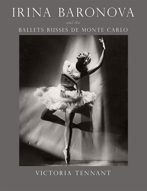
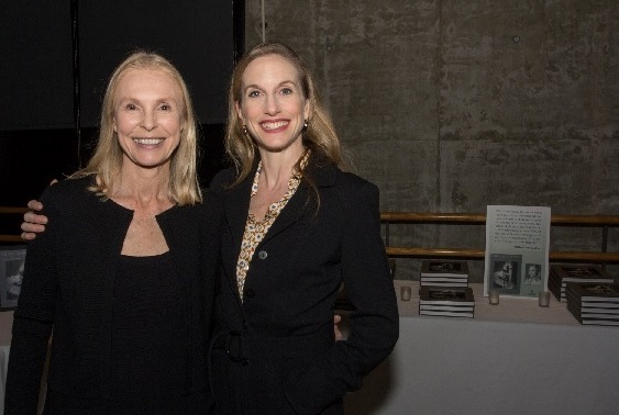
Irina Baronova and the Ballets Russes de Monte Carlo chronicles one of the most acclaimed touring ballet companies of the twentieth century, along with its prima ballerina and muse, the incomparable Irina Baronova. Along the way, it expands upon the rise of modern ballet as a medium, through an unprecedented archive of letters (over 2,000 of them), photographs, oral histories, and interviews conducted by Victoria Tennant, the book’s author and Baronova’s daughter. Earlier this month, the book was feted at a launch by none other than Mikhail Baryshnikov at his eponymous Arts Center in New York City. Although less sumptuous than those collected in the book, below follow some candid photos from the event:

Victoria Tennant and ballerina Wendy Whelan

Mikhail Baryshnikov, Tennant, and Blythe Danner (L to R)

Bebe Neuwirth, Tennant, and Chris Calkins (L to R)
To read more about Irina Baronova and the Ballets Russes de Monte Carlo, click here.

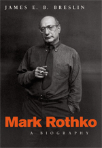
James E. B. Breslin’s book on the life of painter Mark Rothko helped redefine the field of the artist’s biography and, in its day, was praised by outlets such as the New York Times Book Review (on the front cover, no less), where critic Hilton Kramer ascribed it as, “the best life of an American painter that has yet been written.” On what would have been the artist’s 111th birthday, Biographile revisted Breslin’s work:
In Breslin’s book, we follow Rothko’s search for the approach that would become such a significant contribution to art and painting in the twentieth century. He was in his forties before he started making his “multiforms,” and even after he started painting them in his studio, he didn’t show them right away. Breslin dissects and details the techniques Rothko developed upon creating his greatest works. He rotated the canvas as he worked, so that the painting wouldn’t be weighted in any one direction. He spent much more time in the studio figuring out a painting than actually painting it, and he filled a canvas as many as twenty times before feeling it was done. Maybe most important, he worked tirelessly to eliminate any recognizable shapes from the multiforms. They needed to come into the world fully formed, not as interpretations of any real-life objects, but meaningful visions in and of themselves.
Nathan Gelgud, the author behind the Biographile piece, accompanied his writing with a couple of illustrated riffs on the artist, one of which we feature below, and the other you can seek out (and read the review in full) at Biographile.

Mark Rothko by Nathan Gelgud, 2014. Image via Gelgud’s Biographile review.
To read more about Mark Rothko: A Biography, click here.

For nearly twenty years now, Blair Kamin of the Chicago Tribune has explored how architecture captures our imagination and engages our deepest emotions. A winner of the Pulitzer Prize for criticism and writer of the widely read Cityscapes blog, Kamin treats his subjects not only as works of art but also as symbols of the cultural and political forces that inspire them. Terror and Wonder gathers the best of Kamin’s writings from the past decade along with new reflections on an era framed by the destruction of the World Trade Center and the opening of the world’s tallest skyscraper.
Assessing ordinary commercial structures as well as head-turning designs by some of the world’s leading architects, Kamin paints a sweeping but finely textured portrait of a tumultuous age torn between the conflicting mandates of architectural spectacle and sustainability. For Kamin, the story of our built environment over the past ten years is, in tangible ways, the story of the decade itself. Terror and Wonder considers how architecture has been central to the main events and crosscurrents in American life since 2001: the devastating and debilitating consequences of 9/11 and Hurricane Katrina; the real estate boom and bust; the use of over-the-top cultural designs as engines of civic renewal; new challenges in saving old buildings; the unlikely rise of energy-saving, green architecture; and growing concern over our nation’s crumbling infrastructure.
A prominent cast of players—including Santiago Calatrava, Frank Gehry, Helmut Jahn, Daniel Libeskind, Barack Obama, Renzo Piano, and Donald Trump—fills the pages of this eye-opening look at the astounding and extraordinary ways that architecture mirrors our values—and shapes our everyday lives.
***
Download your free copy of
Terror and Wonder here.

The Fourth of July will be marked tomorrow, as usual, with barbecues and fireworks and displays of patriotic fervor.
This year, it will also be marked by the publication of a book that honors patriotism–and counts its costs–in a more somber way: Ashley Gilbertson’s Bedrooms of the Fallen. The book presents photographs of the bedrooms of forty soldiers–the number in a platoon–who died while serving in Iraq or Afghanistan. The bedrooms, preserved by the families as memorials in honor of their lost loved ones, are a stark, heartbreaking reminder of the real pain and loss that war brings. As NPR’s The Two-Way put it, “Never have empty bedrooms looked so full.”

{Marine Corporal Christopher G. Scherer, 21, was killed by a sniper on July 21, 2007, in Karmah, Iraq. He was from East Northport, New York. His bedroom was photographed in February 2009.}
A moving essay by Gilbertson tells the story of his work on the project, of how he came to it after photographing the Iraq War, and about the experience of working with grieving families, gaining their trust and working to honor it. As Philip Gourevitch writes in his foreword, “The need to see America’s twenty-first-century war dead, and to make them seen–to give their absence presence–has consumed Ashley Gilbertson for much of the past decade.” With Bedrooms of the Fallen, he has made their loss visible, undeniable.
More images from the book are available on Time‘s Lightbox blog, and you can read Gourevitch’s essay on the New Yorker‘s site. Independence Day finds the United States near the end of its decade-plus engagement in Afghanistan, but even as the men and women serving there come home, thousands of others continue to serve all over the world. To quote Abraham Lincoln, “it is altogether fitting and proper” that we take a moment to honor them, and respect their service, on this holiday.

Deborah Solomon’s American Mirror: The Life and Work of Norman Rockwell takes on the touted icon of American normalcy with a bit of a charge—paralleling the illustrator’s rise at the Saturday Evening Post with the unraveling of his marriages (some occasioned by loss) and his close friendships with other men. By the time the artist was invited to dinner with the Eisenhowers, he was deeply engaged in therapy with Erik Erikson. There are lots more anecdotes from Solomon over at the Smithsonian Magazine, including a bit about Andy Warhol’s fascination with and attendance at Rockwell’s first, late-in-life gallery show.
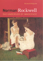
Before there was Solomon’s biography, there was Richard Halpern’s Norman Rockwell: The Underside of Innocence, which argues that that the sense of innocence we locate in Rockwell’s work arises from our reluctance—and also Rockwell’s—to acknowledge its often disturbing dimensions (lust, desire, voyeurism, perversion), even though these acts remain more or less hidden in plain sight. As Halpern notes:
“To lay my cards on the table right away: the kinds of material that Rockwell’s work both exposes and disavows are to no small degree sexual in nature. The claim that forms of sexuality, often perverse, find a place in so wholesome and apparently innocent a figure as Rockwell maybe prove shocking and repellant to some of this more traditionally minded fans. It may be tempting to defend against the idea by chalking it up to the perversity of the interpreter, namely me, or to certain obsessions inherent in Freudian thinking itself. I counsel only patience and an open mind while I make my case. Individual readers may then decide whether, and to what degree, the case is convincing. This is not, in any event, an exercise in orthodox Freudianism, since I often criticize or modify Freud’s thinking. Freud offers nothing more than an initial way into Rockwell—a useful starting point for thought, not its goal. My argument relies not on psychoanalytic dogma bu ton a careful attention lavished upon the images themselves. My reading of Rockwell aims to be, in the end, a Rockwellian rather than a Freudian one. At the same time I feel that Rockwell and Freud are, in certain respects, kindred spirits—unrelenting analysis of the self and culture who often pose similar kinds of questions.”
Halpern’s book is worth a look if you’re interested in exploring this deviously brilliant artist and want to further consider the complexities of his treatment of young boys and women, the displacement of guilt and humiliation found in his portrayal of courtship and marriage, and the “repudiated underbelly” of his happy, painted world.


By: Kristi McGuire,
on 12/21/2012
Blog:
The Chicago Blog
(
Login to Add to MyJacketFlap)
JacketFlap tags:
Anthropology,
Art and Architecture,
History and Philosophy of Science,
Politics and Current Events,
Black Studies,
Music,
Poetry,
Literature,
Fiction,
Biography,
Sociology,
Books for the News,
Add a tag
In wrapping of the year’s best-of-2012 lists, we couldn’t help but single out the University of Chicago Press titles that made the cut as reads worth remembering. With that in mind, here’s a list of our books that earned praise as cream of the crop here and abroad, from scholarly journals, literary blogs, metropolitan newspapers, and the like. If you’re looking, might we (and others) recommend—


A Naked Singularity by Sergio De La Pava
***
A World in One Cubic Foot: Portraits of Biodiversity by David Liittschwager
***
Alive in the Writing: Crafting Ethnography in the Company of Chekhov by Kirin Narayan
***
And Bid Him Sing: A Biography of Countée Cullen by Charles Molesworth
***
The Art of Medicine: 2,000 Years of Images and Imagination by Julie Anderson, Emm Barnes, and Emma Shackleton
***
Bewilderment by David Ferry
***
Book Was There: Reading in Electronic Times by Andrew Piper
***
Dangerous Work: Diary of an Arctic Adventure by Arthur Conan Doyle
***
Dreaming in French: The Paris Years of Jacqueline Bouvier Kennedy, Susan Sontag, and Angela Davis
***
The Last Walk: Reflections on Our Pets at the End of Their Lives by Jessica Pierce
***
Other Criteria: Confrontations with Twentieth-Century Art by Leo Steinberg
- announced as a book of the year by the Art Newspaper (originally published in 2007: TIME WARP)
***
The Romantic Machine: Utopian Science and Technology after Napoleon by John Tresch
***
The Sounding of the Whale: Science and Cetaceans in the Twentieth Century by D. Graham Burnett
***
The Structure of Scientific Revolutions: Fiftieth Anniversary Edition by Thomas S. Kuhn
- made Nature magazine’s Top Twelve of 2012 list
***
The Timeline of Presidential Elections: How Campaigns Do (And Do Not) Matter by Robert S. Erikson and Christopher Wlezian
***
Vegetables: A Biography by Evelyne Bloch-Dano
included as one of the best books of 2012 by Audubon magazine
***
You’ll Know When You Get There: Herbie Hancock and the Mwandishi Band by Bob Gluck
“Put another way, tradition and community are not mere inheritances passively received form the past and certainly not merely fetters on human freedom. Tradition, to early nineteenth-century workers, included both their craft skills and the rights they claimed for this “human capital” against the incursions of inhuman capital. Tradition is in part the process by which successful claims to rights are reproduced in each generation. Some of these rights may be encoded in formal law; all are underpinned by transmissions of culture and understanding. Not only does the reproduction of tradition require action (and therefore always involves the production of new culture at the same time). It may also require struggle, when the claims posed within tradition—to justice, for example, or fairness or food when hungry—are attacked by other ideas—say of efficiency or one-sided revisions of property rights. Likewise, community is both an achievement and a capacity. It constitutes a field of action within which people can pursue the objects of their lives. It may be more or less egalitarian but usually empowers some more than others. It constrains more than enables. But is also incorporates investments made—sometimes over generations—in building it. It is not only a ground for individual and family projects but also the basis for much collective action. And communities were basic to the struggles of nineteenth-century workers against the incursions of capitalism, perhaps more basic than class, though the two are not contradictory.”
—Craig Calhoun, The Roots of Radicalism: Tradition, the Public Sphere, and Early Nineteenth-Century Social Movements
Robbins Barstow was a pioneering maker of home movies—Disneyland Dream (1956), which you see above, is one of literally hundreds of films he completed from 1929 (when he first received a camera) until his death in 2010, many of which star his immediate family. Disneyland Dream was named to the National Film Registry of the Library of Congress in 2008, with the following citation:
The Barstow family films a memorable home movie of their trip to Disneyland. Robbins and Meg Barstow, along with their children Mary, David and Daniel were among 25 families who won a free trip to the newly opened Disneyland in Anaheim, Calif., as part of a “Scotch Brand Cellophane Tape” contest sponsored by 3M. Through vivid color and droll narration (“The landscape was very different from back home in Connecticut”), we see a fantastic historical snapshot of Hollywood, Beverly Hills, Catalina Island, Knott’s Berry Farm, Universal Studios and Disneyland in mid-1956. Home movies have assumed a rapidly increasing importance in American cultural studies as they provide a priceless and authentic record of time and place.
I watched the 35-minute film (which features a cameo by a very young Steve Martin at the 20:20 mark, wearing a top hat and hawking guidebooks) for the first time yesterday and was struck by its seeming perversion of techniques later perfected by the experimental video artists of the 1970s—or highbrow art in general, in this most quotidian form of hamming-it-up for the camera. Part of that is probably triggered by the instant nostalgia now, more or less obviously, shopped around by our contemporary culture—indeed, there’s a lot to say about Barstow’s 16mm-amateur outtakes that lines up with issues of public vs. private intimacy, the ubiquity of the non-place (Marc Augé’s ever determinate/indeterminate anthropological positioning), and the secular pilgrimage. But there are also moments in the film that directly echo the verité techniques of filmmakers like Shirley Clarke
Welcome to a new era of Mark Rothko–fixation. This presupposes, of course, the longstanding cultural caché of what has come to be known as the Rothko Case, from its late 1960s origins to the more recent insider piece “A Matter of Rothko,” penned by David Levine for Triple Canopy. We note Bert Cooper’s office-befuddling investment in an early Rothko abstraction during an episode of Mad Men (which viewers would see give way to Hokusai’s The Dream Of The Fisherman’s Wife); we watch Alfred Molina’s star-turn in John Logan’s play Red (2009), which fictionalized Rothko’s creation of a series of murals for the tony (no pun intended) Four Seasons restaurant in Midtown Manhattan’s Seagram Building; we narrate along with Simon Schama‘s Power of Art television documentary, which profiled the murals project as one of eight masterworks by eight artists with Schama’s occasionally unrestrained literary flair (“Just how powerful is art? Can it feel like love or grief?”).
And next month, we’ll reprint James E. B. Breslin’s Mark Rothko: A Biography, a 707 pp. (“a book of heroic dimensions,” reads the marketing copy) tome originally published in 1993 by the author of a previously acclaimed biography of William Carlos Williams:

When the book was first published, scholar and critic (and Guggenheim Fellow and Dedalus Foundation president) Jack Flam took it to task on several points in a #longreads review published by the New York Review of Books. What follows are snippets from the review and its resultant letters to the editor, in which Flam and Breslin, along with curator Sam Hunter, responded to each other’s points of address:
From Jack Flam’s review, “The Agonies of Success,” published in the December 2, 1993 issue:
Sometimes, however, Breslin displays a lack of familiarity with other works of art. In his discussion of an early watercolor landscape, for example, he becomes involved in a rather more complicated analysis than this essentially derivative picture warrants, relating it to Cézanne’s watercolors, apparently without seeming to realize that the subject, composition, and rendering of Rothko’s painting are clearly similar to the watercolors of John Marin. Moreover, Breslin sometimes gives verbose and repetitive descriptions of Rothko’s paintings (as well as of many of the people Rothko knew), and he supplies biographical interpretations that can strain one’s credulity as well as patience. For example, Breslin unconvincingly relates Number 10, 1950 to Rothko’s memory of being constricted by swaddling clothes as an infant. Rothko himself, like the painting, is said to be “also soft-edged and sensitive,” and the structure of the picture is said to be an attempt to recover “a lost relationship” after the death of his mother. These seem more like free associations based on Breslin’s biographical research than comments about painting.
From
 Gabrielle Plucknette/New York Times
The NYT’s 6th Floor blog ran a post yesterday by Amy Kellner about the installation of Yayoi Kusama’s career-spanning retrospective, which opens this July at the Whitney Museum of American Art. The show, the first to present a hearty selection of Kusama’s work to the West since LACMA’s Love Forever: Yayoi Kusama 1958–1968 (1998), was curated by Frances Morris, head of collections at the Tate Britain, where the show originated. Along with some excellent behind-the-scenes shots of “Fireflies on the Water,” originally installed for the Whitney’s 2004 Biennial and now a part of the Museum’s permanent collection, the post included an introduction to Kusama as an “adorable, polka-dot-obsessed Japanese artist.”
No one would argue with the obvious presence of dots, minimalist pop-blobs, flickering lights, and the omnipresence of concentric circles in Kusama’s oeuvre. But the use of the world “adorable”—in regards to an artist who has openly struggled with psychiatric problems, including obsessive and suicidal thoughts, hallucinations, and the decision to voluntarily commit herself to the Seiwa Hospital for the Mentally Ill, where she has lived since the mid-1970s—seems a bit more problematic. Or is it? Is it problematic to label Kusama, cloaked in art-pop attire, sometimes hippie-robed, other times blending in with the haute-chic female artists of her day—sometimes appearing slight, other times ferocious—adorable? Is it a problem to label anyone whose illness intertwines with their public and private persona—as descriptively as their curiosity-drenched art, seemingly as much and a little a part of them as any other set of atoms triggering their chemical reactions—adorable? I don’t know. Maybe the argument is against “adorable” in general, for any artist. Because it strips away the complexity of the person behind the work, and because we catch ourselves in a creator’s grand narrative and lose focus on the intricacies and complications of the work (and Kusama’s work was nothing if not primed for all kinds of human experience).
The Whitney’s official press release calls Kusama “legendary, semi-reclusive, and still vibrant,” and a quick Google search adds a strand of adjectives to that short list: prolific, incessant, avant-garde, significant, influential, important, controversial, suffering, celebrated.
Reading Kusama’s autobiography Infinity Net might shed some light on the issue of her appearance, and our own tendency to focus on her signature component:
By covering my entire body with polka dots, and then covering the background with polka dots as well, I find self-obliteration. Or I stick polka dots all over a horse standing before a polka-dot background, and the form of the horse disappears, assimilated into the dots. The mass that is “horse” is absorbed into something timeless. And when that happens, I too am obliterated.
So, yes, sensorially: Kusama is dotty. And in terms of word choice, she is worthy of admiration, as evidenced by the gesture of “adorable.” But the langua

Jules Feiffer, cartoonist-raconteur born in an era when caricature could be scathing, indicative, deeply personal, and most definitely not post-irony, is the author of Backing into Forward: A Memoir. The cult of Feiffer, which hinges on two of the versatile writer-artist’s best-known personas—illustrator of the beloved children’s book The Phantom Tollbooth and the man behind a much more adult-oriented series of comics, often penned for the Village Voice—revs up in Chicago this weekend in preparation for Feiffer’s conversation with Christopher Borrelli at the Printer’s Row. On the heels of this event, as Feiffer finishes up work on his graphic novel Kill My Mother, our own Miranda Sklaroff asked him a few questions about his process, inspirations, and the decision to make zillions by penning a work of pot-boiled realism:
MS: What made you decide to do an original graphic novel now?
JF: Pure avarice. About a year and a half ago, having made all sorts of changes in my life, I decided it might be a really good idea to make a lot of money fast. Therefore I was going to write a pot-boiler. It was going to be an action thriller, full of all the noir touches that I had grown up reading, adoring in Chandler, Hammett, et. al., and the movie versions thereof. Having written many of the scripts for Will Eisner’s The Spirit from 1949 to 1951, I thought it would be fun to return to an old form, this time strictly in prose, and that I could probably knock it out in a couple of months, sell it for a zillion, not to mention the movie sale, and after that, sit back and relax into my dotage. As it turned out, my pot-boiler never started to even simmer, and in rethinking what I could do about this, and still make zillions, it occurred to me that it might go faster (and be truer to the spirit of Eisner) if I turned it into a graphic novel. But, of course, get someone besides me to illustrate it. Because that sort of realism was not my style. And besides it would take much too much time—a couple of years at least—for me to draw, while there were all these other things that I would much rather do, like lie back and enjoy my dotage.
As it turned out, what I first envisioned as a hack job got more and more interesting, and I became more and more serious about it as I got further and further into the complexities of character and story. And by the time I had finished the first draft of the book that I had named Kill My Mother from the beginning, without a clue as to what the title meant, I had spanned a ten-year period from 1933 and the Great Depression to 1943 and the war in the South Pacific. And I had a cast of characters, larger than life, intricately involved, and most of them women. None of this was planned, it just decided to happen on its own. What happened after that is that WW Norton (and Bob Weil, my editor) loved the manuscript, and took it for granted that, of course, I was going to be the illustrator. I tried to explain to them that I would be 102 before I finished the book, but no one was listening to me, so I went home and started drawing pages that demanded a style that I had serious doubts that I could handle. I had, since early childhood, loved the a
View Next 4 Posts
