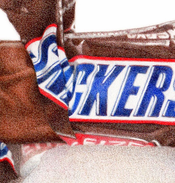
Snickers "fun size" bar
6" x 8", colored pencils on paper
Did I tell you my dream about Einstein? A while back I dreamed I called him up, and after introducing myself and telling him I was an illustrator, somehow (through the magic of dreams) we were sitting across a table from each other at a cafe or something. I started showing him my chocolate drawings, and he says to me (in that affable, smiley way, with the goofy hair) "You should do more!".
And right after that, I had this commission! The client wanted the wrapper torn 'just so', similar to my
Heath Bar drawing I did a while back. So I had the arduous task of tearing open wrappers and taking pics to email over, until I got one that was just right. (Of course 'someone' had to eat all those opened Snickers bars - good thing they were 'fun size'.)
I thought it was finished at this stage, below. I even signed it. The client loved it, but wondered very gently if maybe the wrapper could be darker?
She was right. Sometimes when you look at something for too long, you can have trouble really 'seeing it' properly. I went out shopping or something for a while, then came back and added some color to both the wrapper and the chocolate, and voila - perfect!
I used mostly Polychromos on this, except for the red on the wrapper (LOVE Prismacolor's Permanent Red), but then came back in with some Prismacolor chocolatey browns to add a little 'more' to it over all.
This was done on Stonehenge paper, since all of my other candy drawings have been on that, and I wanted it to look the same (I've been switching over to Fabriano Artistico Hot Press for other work lately.)
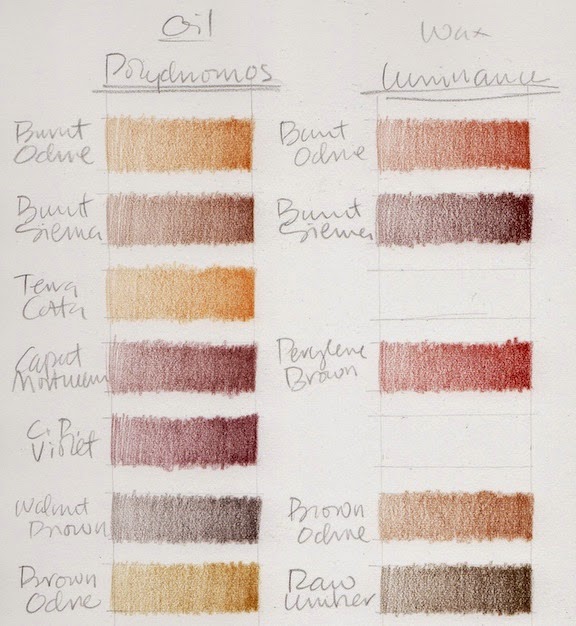
I decided to make a swatch chart of all my chocolate colored colored pencils, so I'll really know what I have to work with. Sometimes chocolate is orangey, sometimes purpley, and the shadows can go almost black. The wrappers aren't always chocolate colored, but when they are, the same thing applies.
Terrible scans of how the whole chart looks ...
And terrible close ups of them (sorry) so you can kind of see what I did.
I did Prismacolors, Pablos, Polychromos, and Luminance.
There are gaps, because at first I was going to try to match colors by name across brands, but that all fell apart pretty fast, and I ended up with a sort of disorganized mess. But it works for me.
(Every time I do swatches I have flashbacks to Illustration 2 class at the
Academy of Art, where we had to make watercolor and gouache swatches of all our new paints - and they had to be
perfect, an exact size, all lined up in straight rows ... actually I think we did them on watercolor paper, then cut them out and pasted them onto a sheet of illustration board with rubber cement - crazy, but they were beautiful, and I used them for years and years. But I digress ...)
This is what they look like when I just do them for me, and just want to get a splotch of color down so I can see what I have. It still surprises me sometimes when I think a color is going to be one thing, based on the casing or lead, then it looks totally different when it goes down on paper. Luminance are the ones that do that the most I think.
I have
Alyona Nickelson's
Colored Pencil Painting Bible, and in it she shows how she swatches her pencils. GURL, she be crazy (I mean that in a good way), but very thorough and totally impressive. She does color 'mixes', as well as un-burnished and burnished. I considered doing something like that with these, since its the mixture of colors that will make just the right chocolate color for each drawing, but then couldn't wrap my brain around how to do it without making it my life's work.
Alyona does have a cool tip about printing your swatches out onto clear paper (like overhead projector transparencies) so you can then lay them over a partially rendered drawing, and see exactly how a new color applied will look. I think that's worth a try.
But I know myself, and figure I'll just do tests as I go along, each time I do a drawing.
For fun, I just googled "drawings of chocolate", and found this
Pinterest page which has a lot of cool art (and a few of my pieces too).
I've made prints of this piece available in my
etsy shop.
Next up is a small architectural food piece . . .
Maraschino Cherries
8" x 10" (20.32 x 25.4 cm)
Every brand of pencils under the sun, on Stonehenge paper
I felt like making a new drawing, and looked in the cupboard for a subject. At first I thought I would do anchovies, but for some reason they grossed me out. Then I saw this little jar of maraschino cherries hiding in there which I'd forgotten about, and was so happy.
I always start with a line drawing, then start laying in some shadows or values just to get it going. I've darkened this up quite a bit so it would show up for you here. In real life it was a lot lighter.
This is a very RED drawing. Red is for me the hardest color to do with colored pencils. I really picked my way through this in the first several layers - kind of a 'Sunday painter approach', dawdling along, enjoying the subtle building up of color and value.
By the time I finish I will have used Coloursofts, Prismacolor, Luminance, Pablos and Polychromos.
At this point (above) I've used: Polychromo Burnt Carmine, Coloursoft Rose, Red, Deep Red, Scarlet, and Polychromo Green Gold. All really really light tentative layers.
I'm going back and forth between deepening the color, and re-establishing the forms in the jar.
At one point I got out my Prismacolors, against my better judgement. They've been breaking so much that I put them away and vowed to never use them again, no matter what. But they have the best reds. The best. So I pulled a Permanent Red, and started doing a layer. Then it came time to sharpen, and it broke, instantly. Grrrrrr. Try it again. Broke again. Pulled a whole NEW pencil out of a spare box, more breaking. Break, break, break, break break. I had to finish the one layer though, since I'd started, so I muddled through, but I was not a happy camper.
So now, by about this point, I've used all of the above, plus: Polychromo Purple, Fuschia, Middle Purple, Violet and Pablo Light Purple and Purplish Red. I know, hard to believe.
Then some Polychromo Geranium Lake and Pablo Reddish Orange. I think its here that I let it go for the night, and sat down to watch Downton Abbey.
The next day I was fully out of 'Sunday painter' mode, and very much in a "let's get this DONE" mode, so finally got serious about committing to putting down some real values. That required a bit of burnishing, which I always try to avoid until its the only thing left to get the piece where it needs to go. I skipped a few steps here in the scanning, because I just wanted to tuck in and get it done.
These couple of scans show the addition of: Luminance Permanent Red, Carmine Aubergine, Alizarin Crimson, Scarlet, Pablo Ruby Red, Luminance Green Ochre, Polychromo Olive Green and Green Oxide, Zinc Yellow, and maybe a couple more that I forgot to write down.
I just kept tweaking with a little of this and that until I was happy with it.
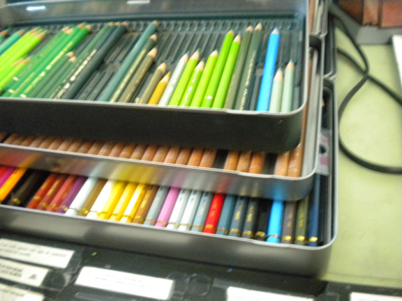
I thought you might like to see how un-glamorous my work set up is. I know there are people who have pristine, organized, "let's take a photo for the magazine" kinds of work spaces. How nice for them. Not me.
I stack all my tins of pencils that I'm using up on top of each other, like this, on my slanted drawing table. In the above pic you can see two tins of Polychromos, on top of Luminance, on top of Pablos.
I've separated them out a bit here below so you can see them better. I just pull up a tray when I need to search for a color in a tin below. The Polychromos are all organized neatly by color. The others are not.
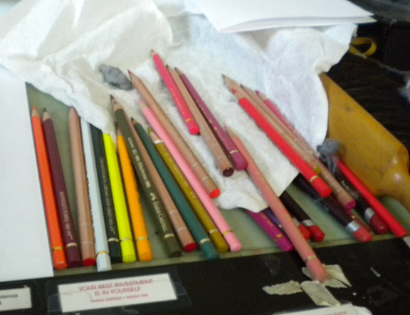
And here's a shot of how the 'used' pencils look off to the right side of the board. Not neat. Not organized. They often fall off onto the floor (but I have carpet, so they don't get broken). I honestly don't know how you neat people keep everything all perfect. I admire it, but it doesn't work for me. Of course I'll clean them all up and put them back in their tins now, and the board will get cleared off for the next piece. And it will start all over again.
I'll put prints in the shop at some point. I'm searching for a new paper to do prints on in addition to the semi-gloss I've been using. I would like to offer an option for a more matte paper for some of my pieces. There are just way too many papers to choose from! I want to keep the cost down, so my prints will not be expensive. I do have some fancy paper that turned out to be too thick to feed through my Epson - boo. So I'll keep looking.
The sun is out here, its like Spring. Crazy. Nice, but crazy. People are mowing lawns and watering, washing their cars, wearing t-shirts. Gotta love California.


There's a printmaker in Colorado who works in similar fashion,layering her inks and building up to the final.
http://brushandbaren.blogspot.com/
I break pencils, too. I've always sharpened with a knife as those little twisty sharpeners make it worse.
Paula, you're step-by-step posts always fascinate me. It is such a help to see how other artists work, no matter what the medium. As usual, I love the drawing. P.S. I'm not a neat worker either.
I love, love seeing the step-by-steps. And I always love seeing how others organize their pencils and workspace. Since I've always used just Prismas, I keep them in jars on my desk, but I just bought a little set of Coloursofts to try. I'm dying to "sample" some new treats. But I'm a little worried that I'm not organized enough to keep multiple brands going...we'll see!
I had been using Canon Matte Photo paper for prints, but it's a very bright white, and it's not as heavy as I'd like. Then I got a new wide format printer for Christmas which led me to a new paper that I really like: Epson Premium Presentation Paper, Matte. (The box is kind of a teal color.) It's a bit heavier (44 lb.) but sails thru my printer just fine, and it's a nice clean white. It comes letter size, 11 x 17, and 13 x 19. And my local Fry's Electronics carries all sizes!
Marschino Cherries makes my mouth water--loved seeing the step-by-step.
Paper I use for small inexpensive prints and note-cards is Staples matte Photo Supreme, which is double sided, and 61 lbs. About $15for a 50 sheet pack.
Your drawing table looks well organized to me-I made a shelf from a 12" board to place at the far edge of my drawing table, with wedge-shaped wood pieces under each end to bring it to level, then bought three plastic turntables which sit on it,each turntable holds about 5 inserts from "tran" pencil cases (Blick)Each insert folds onto itself with velcro,all pencils vertical,I keep Polychromos,A.Durer,and Prismas separately on each turntable which keeps all colors at my fingertips, yet out of the way.then, like you, I keep a tin on the table for pencils I'm using at the time. If I need to take my pencils for a demo,or class,I just open each triangle and stack them flat in my bag and go. The shelf lets me have more open work space on my drawing table because the slant top leaves the space underneath open. Sorry to make this so long, but wanted to share. :-)
your work is beautiful and i really enjoy seeing your artistic process!
This is amazing! I really love the vibrant colours you've achieved, and your lovely soft texture. (also, anchovies would gross me out too, and that smell!).
So glad I found your blog!