new posts in all blogs
Viewing: Blog Posts Tagged with: Polychromos, Most Recent at Top [Help]
Results 1 - 25 of 36
How to use this Page
You are viewing the most recent posts tagged with the words: Polychromos in the JacketFlap blog reader. What is a tag? Think of a tag as a keyword or category label. Tags can both help you find posts on JacketFlap.com as well as provide an easy way for you to "remember" and classify posts for later recall. Try adding a tag yourself by clicking "Add a tag" below a post's header. Scroll down through the list of Recent Posts in the left column and click on a post title that sounds interesting. You can view all posts from a specific blog by clicking the Blog name in the right column, or you can click a 'More Posts from this Blog' link in any individual post.

By:
Paula Pertile,
on 7/30/2014
Blog:
Drawing a Fine Line
(
Login to Add to MyJacketFlap)
JacketFlap tags:
cats,
summer,
mouse,
sick,
Polychromos,
Prismacolors,
hot,
Pablos,
Fabriano Artistico paper,
berry tart,
Add a tag
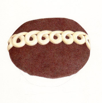
Its all done! Phew. I thought I'd never finish. Being sick is a drag (some kind of 'bug', requiring lots of naps and 'lie downs'). But I managed to pick at this in bits of being up and around and finally gone it done.
The paper is 11 x 17. I used Polychromos, Pablos, and Prismacolor colored pencils, on Fabriano Artistico Hot Press paper.
Not too much else to share. Its so #&* hot here, 100 or over for I've lost count how many days now. The cats have gone wild, insisting I keep the cat door open so they can roam around at night when it cools off. Charlie brought me a mouse, on the bed, at 3:00 am one night, which I did not appreciate.
Sigh. Cats. Summer. Maybe I should eat this tart - its still in the fridge.
Stay cool!
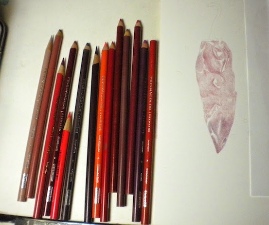
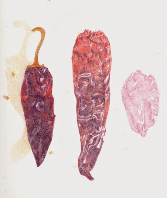
I bought this package of dried chili pepper pods a while back, thinking they'd be a good drawing. I'm finally getting around to doing them! That's the nice thing about dried stuff - its lasts a good while in the cupboard, patiently waiting, until you get around to using it.
I've gone back to Prismacolors for this. Before I bought my new electric pencil sharpener (
Bostitch SuperPro 6), I had all but given up on these. They were breaking like crazy (in my old duller sharpener), and I thought I might never use them again. But now that I have the new sharpener, which only rarely eats one, they're back on my list of usable pencils. And I'd forgotten how much I love them.
I laid out three of the best chilis in the package, and am trying to work 'left to right' as best I can, to avoid smearing the parts I've already done (I'm right handed - if you're left handed, you would work the opposite direction). I don't always do this, but sometimes it works out to be the best way.
I started with a Raspberry pencil, and kind of mapped out the wrinkle patterns in each chili. Now I'm going back in to each one and rendering it out. The last chili is very very dark, almost black. I've been avoiding using actual black to get the darks dark enough, but I may have to break down and use it. So far I've stuck to Black Grape and Black Cherry to do the darkest darks. I'll wait until I have them all to the same point of finish, then do the final tweaking at the end.
I tend to stick with one brand of pencil when I start working on a piece - I'm not sure why. Maybe I'm just lazy! I could try some Polychromo Indigo I think, or something else to do the darkest darks. I'll figure it out when I get there!
By:
Paula Pertile,
on 5/20/2014
Blog:
Drawing a Fine Line
(
Login to Add to MyJacketFlap)
JacketFlap tags:
Polychromos,
colored pencils,
Prismacolors,
Stonehenge,
Pablos,
Luminance,
Alyona Nickelsen,
chocolate bar,
chocolate candy drawing,
color swatches,
Colored Pencil Painting Bible,
fun size candy bar,
Snickers bar,
Add a tag
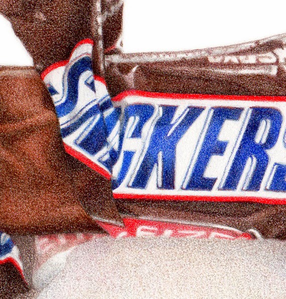
Snickers "fun size" bar
6" x 8", colored pencils on paper
Did I tell you my dream about Einstein? A while back I dreamed I called him up, and after introducing myself and telling him I was an illustrator, somehow (through the magic of dreams) we were sitting across a table from each other at a cafe or something. I started showing him my chocolate drawings, and he says to me (in that affable, smiley way, with the goofy hair) "You should do more!".
And right after that, I had this commission! The client wanted the wrapper torn 'just so', similar to my
Heath Bar drawing I did a while back. So I had the arduous task of tearing open wrappers and taking pics to email over, until I got one that was just right. (Of course 'someone' had to eat all those opened Snickers bars - good thing they were 'fun size'.)
I thought it was finished at this stage, below. I even signed it. The client loved it, but wondered very gently if maybe the wrapper could be darker?
She was right. Sometimes when you look at something for too long, you can have trouble really 'seeing it' properly. I went out shopping or something for a while, then came back and added some color to both the wrapper and the chocolate, and voila - perfect!
I used mostly Polychromos on this, except for the red on the wrapper (LOVE Prismacolor's Permanent Red), but then came back in with some Prismacolor chocolatey browns to add a little 'more' to it over all.
This was done on Stonehenge paper, since all of my other candy drawings have been on that, and I wanted it to look the same (I've been switching over to Fabriano Artistico Hot Press for other work lately.)
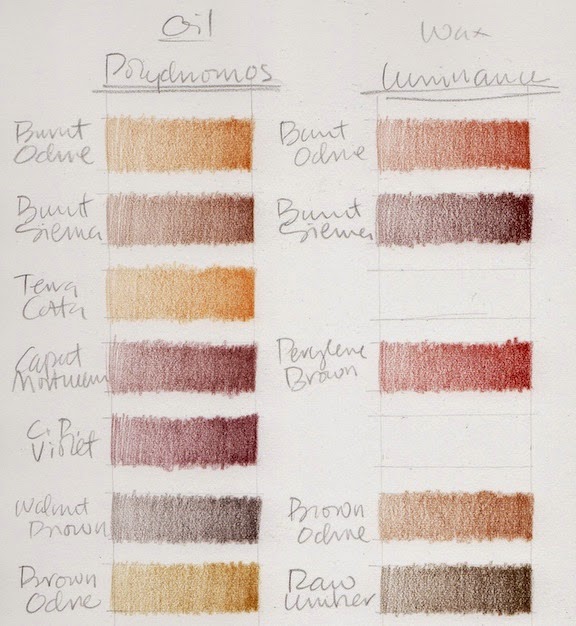
I decided to make a swatch chart of all my chocolate colored colored pencils, so I'll really know what I have to work with. Sometimes chocolate is orangey, sometimes purpley, and the shadows can go almost black. The wrappers aren't always chocolate colored, but when they are, the same thing applies.
Terrible scans of how the whole chart looks ...
And terrible close ups of them (sorry) so you can kind of see what I did.
I did Prismacolors, Pablos, Polychromos, and Luminance.
There are gaps, because at first I was going to try to match colors by name across brands, but that all fell apart pretty fast, and I ended up with a sort of disorganized mess. But it works for me.
(Every time I do swatches I have flashbacks to Illustration 2 class at the
Academy of Art, where we had to make watercolor and gouache swatches of all our new paints - and they had to be
perfect, an exact size, all lined up in straight rows ... actually I think we did them on watercolor paper, then cut them out and pasted them onto a sheet of illustration board with rubber cement - crazy, but they were beautiful, and I used them for years and years. But I digress ...)
This is what they look like when I just do them for me, and just want to get a splotch of color down so I can see what I have. It still surprises me sometimes when I think a color is going to be one thing, based on the casing or lead, then it looks totally different when it goes down on paper. Luminance are the ones that do that the most I think.
I have
Alyona Nickelson's
Colored Pencil Painting Bible, and in it she shows how she swatches her pencils. GURL, she be crazy (I mean that in a good way), but very thorough and totally impressive. She does color 'mixes', as well as un-burnished and burnished. I considered doing something like that with these, since its the mixture of colors that will make just the right chocolate color for each drawing, but then couldn't wrap my brain around how to do it without making it my life's work.
Alyona does have a cool tip about printing your swatches out onto clear paper (like overhead projector transparencies) so you can then lay them over a partially rendered drawing, and see exactly how a new color applied will look. I think that's worth a try.
But I know myself, and figure I'll just do tests as I go along, each time I do a drawing.
For fun, I just googled "drawings of chocolate", and found this
Pinterest page which has a lot of cool art (and a few of my pieces too).
I've made prints of this piece available in my
etsy shop.
Next up is a small architectural food piece . . .
I'm back to my old drawing self, after a couple of detours.
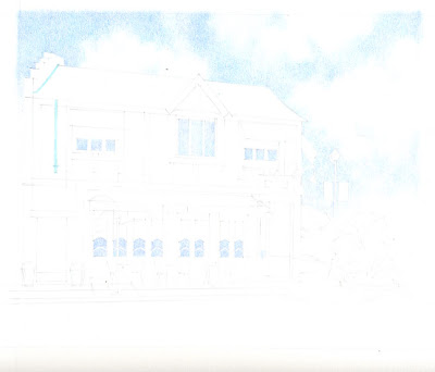
First up is a newly completed house portrait, of a residence in San Francisco.
I did this one with Polychromo colored pencils on Fabriano Artistico hot press paper. WOW WOW WOW I LOVE THIS PAPER!!!!!!!
There are so many papers to choose from to work on, and I've heard about this one before, but for whatever reason never ordered any to try. I have a draw full of other papers - lots and lots of pads of Stonehenge (which I still love), other watercolor papers, hot press and cold press, watercolor blocks, different sizes, colors, you name it, as well as a ton of illustration board.
Well this one wins. Its 'crisper' than Stonehenge, and takes a million layers with no complaining. Its just gorgeous stuff, and I couldn't be happier with it.
Before I did the house above, I did a couple of little circus animal cookies, just for fun. These were Polychromos and Pablos on Stonehenge.
The first one is a camel, and I'm pretty sure the second one is a lion. These cookies fascinate me - they are just the weirdest little things. The cookies themselves are nice, and then they cover them is this sickeningly sweet frosting and the little doohickies (there's a name for those that's escaping me at the moment). These come in white and pink frosting, and they taste the same, but the pink ones make a better picture.
I actually laid out every cookie in the bag, and organized them by 'animal'. I considered doing a huge drawing of every cookie in the bag, including all the broken bits and stray round thingies. I thought documenting them like that would be a cool 'art piece'. And it would. Then I decided I didn't want to make that my life's work, and just drew these two instead.
By:
Paula Pertile,
on 3/17/2013
Blog:
Drawing a Fine Line
(
Login to Add to MyJacketFlap)
JacketFlap tags:
cats,
Photoshop,
Polychromos,
colored pencils,
kitties,
Pope,
Rome,
children's book art,
botanical art,
Pablos,
red rose leaves,
Catholic Cardinals,
etsy shop thoughts,
digital colored pencil,
cats in costumes,
Add a tag
I had this drawing on the board back when the conclave first started, but then the cats all got sick (they're fine now - BAD head cold, BAD BAD BAD) and that went on for an endless couple of weeks, and I got a little behind, playing nurse and all.
(please click on this to see it bigger)
These are some of the CATholic cardinals who didn't get elected Pope, out for a stroll through Rome, seeing the sites, and scouting for a place to have a nice plate of fishy pasta.
I had a lot of fun doing this one! Its a combination of colored pencil and Photoshop. A while back I figured out how to do a 'digital colored pencil' technique, but then got sidetracked with something else and never really developed that idea. I think now that I will go back to it, and see if I can put together a portfolio of children's book pieces that are all done that way. TALL ORDER. But hey, one piece at a time. I'll blog as I go, so you can stumble along with me.
I also finished this red rose leaves piece. This is ALL colored pencil, the old fashioned kind. I have some photos of other leaves and buds that I would like to do, and make this a series. This one was done with Polychromos and Pablos (both oil based), on Stonehenge paper, and is just under 8"x 8" (20.32 x 20.32 cm). I will do prints in the
shop as soon as I am able. Today maybe.
Speaking of the shop - I'm changing the paper I use for prints from the semi-gloss I've been using, to Epson Presentation Matte. I like it a lot better. Its a lighter weight, but I love the crisp images it produces. It also works really well for less "shiny" subject matter (like candy in foil wrappers). I still have some of the semi-gloss though, so if you would prefer that for something, please let me know.
I have to tweak my whole shop (today's chore) to include the new paper, as well as adjust some prices for shipping. I'll think I have it all sorted out, then I'll get a sale to a new (to me) country that has crazy expensive shipping, and I'll have to include that in all the listings. Like Australia, for example. What I could send here in the US for $3.50 will cost $9 to Australia sometimes. I hate having to charge so much to ship things, but I also hate to get a rude surprise at the post office, and find out I've just lost all my profit on the sale to under-charged shipping. Those of you with shops know what I'm talking about. Its the least fun part of having a shop. I just want to make the art!
By:
Paula Pertile,
on 2/12/2013
Blog:
Drawing a Fine Line
(
Login to Add to MyJacketFlap)
JacketFlap tags:
Coloursofts,
Stonehenge paper. 8 x 10 colored pencil drawing,
Luminance,
red drawing,
Colored pencil drawing of Maraschino cherries,
Polychromos,
food drawing,
Prismacolors,
Pablos,
Add a tag
Maraschino Cherries
8" x 10" (20.32 x 25.4 cm)
Every brand of pencils under the sun, on Stonehenge paper
I felt like making a new drawing, and looked in the cupboard for a subject. At first I thought I would do anchovies, but for some reason they grossed me out. Then I saw this little jar of maraschino cherries hiding in there which I'd forgotten about, and was so happy.
I always start with a line drawing, then start laying in some shadows or values just to get it going. I've darkened this up quite a bit so it would show up for you here. In real life it was a lot lighter.
This is a very RED drawing. Red is for me the hardest color to do with colored pencils. I really picked my way through this in the first several layers - kind of a 'Sunday painter approach', dawdling along, enjoying the subtle building up of color and value.
By the time I finish I will have used Coloursofts, Prismacolor, Luminance, Pablos and Polychromos.
At this point (above) I've used: Polychromo Burnt Carmine, Coloursoft Rose, Red, Deep Red, Scarlet, and Polychromo Green Gold. All really really light tentative layers.
I'm going back and forth between deepening the color, and re-establishing the forms in the jar.
At one point I got out my Prismacolors, against my better judgement. They've been breaking so much that I put them away and vowed to never use them again, no matter what. But they have the best reds. The best. So I pulled a Permanent Red, and started doing a layer. Then it came time to sharpen, and it broke, instantly. Grrrrrr. Try it again. Broke again. Pulled a whole NEW pencil out of a spare box, more breaking. Break, break, break, break break. I had to finish the one layer though, since I'd started, so I muddled through, but I was not a happy camper.
So now, by about this point, I've used all of the above, plus: Polychromo Purple, Fuschia, Middle Purple, Violet and Pablo Light Purple and Purplish Red. I know, hard to believe.
Then some Polychromo Geranium Lake and Pablo Reddish Orange. I think its here that I let it go for the night, and sat down to watch Downton Abbey.
The next day I was fully out of 'Sunday painter' mode, and very much in a "let's get this DONE" mode, so finally got serious about committing to putting down some real values. That required a bit of burnishing, which I always try to avoid until its the only thing left to get the piece where it needs to go. I skipped a few steps here in the scanning, because I just wanted to tuck in and get it done.
These couple of scans show the addition of: Luminance Permanent Red, Carmine Aubergine, Alizarin Crimson, Scarlet, Pablo Ruby Red, Luminance Green Ochre, Polychromo Olive Green and Green Oxide, Zinc Yellow, and maybe a couple more that I forgot to write down.
I just kept tweaking with a little of this and that until I was happy with it.
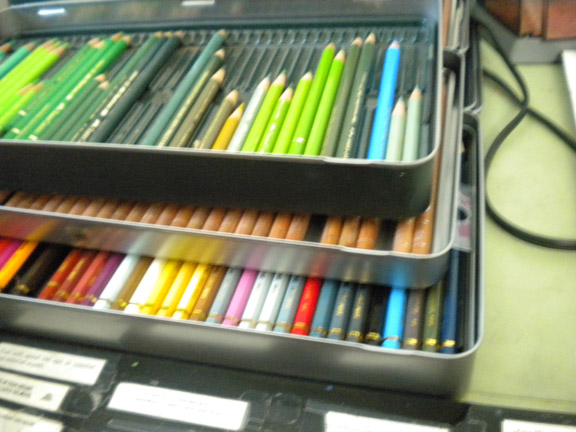
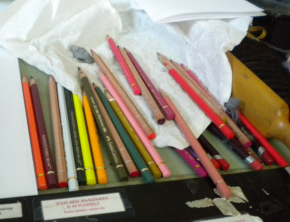
I thought you might like to see how un-glamorous my work set up is. I know there are people who have pristine, organized, "let's take a photo for the magazine" kinds of work spaces. How nice for them. Not me.
I stack all my tins of pencils that I'm using up on top of each other, like this, on my slanted drawing table. In the above pic you can see two tins of Polychromos, on top of Luminance, on top of Pablos.
I've separated them out a bit here below so you can see them better. I just pull up a tray when I need to search for a color in a tin below. The Polychromos are all organized neatly by color. The others are not.
And here's a shot of how the 'used' pencils look off to the right side of the board. Not neat. Not organized. They often fall off onto the floor (but I have carpet, so they don't get broken). I honestly don't know how you neat people keep everything all perfect. I admire it, but it doesn't work for me. Of course I'll clean them all up and put them back in their tins now, and the board will get cleared off for the next piece. And it will start all over again.
I'll put prints in the shop at some point. I'm searching for a new paper to do prints on in addition to the semi-gloss I've been using. I would like to offer an option for a more matte paper for some of my pieces. There are just way too many papers to choose from! I want to keep the cost down, so my prints will not be expensive. I do have some fancy paper that turned out to be too thick to feed through my Epson - boo. So I'll keep looking.
The sun is out here, its like Spring. Crazy. Nice, but crazy. People are mowing lawns and watering, washing their cars, wearing t-shirts. Gotta love California.
By:
Paula Pertile,
on 1/29/2013
Blog:
Drawing a Fine Line
(
Login to Add to MyJacketFlap)
JacketFlap tags:
ebay,
etsy,
Polychromos,
Stonehenge paper,
Hostess cupcake,
colored pencil drawing,
chocolate cupcake,
childhood memories of the Wonder Hostess plant.,
burnishing,
Colousofts,
Add a tag
How could I not draw one of these?
5.5" x 4.5"-ish on 8"x 8" Stonehenge paper
If you don't know, its a Hostess Cupcake. Its an iconic American snack food. We all remember eating these as kids. And recently, Hostess announced they were going out of business. NOOOOOOOOOOOOOOOOOOOOOOOOOOOOOOO!!!!!!!!!!!!!!!!!!!!!!!!!!!!!!!!!!!!!!
So there was a run on these at the stores, and I managed to get the last package at my local grocer's.
I have a fond memory of touring the Wonder / Hostess plant here on a school field trip in about the second grade. The place smelled so wonderful! And we were all given a wee tiny little loaf of freshly baked Wonder Bread to take with us. I always loved driving by the place, rolling down the windows to catch that heavenly freshly-baked scent. But now, alas, its quiet and empty and there are no more fresh bread smells. Very sad. Very sad indeed.
So I drew a cupcake for posterity. (I also have a loaf of Wonder Bread and some other goodies in the freezer that may become drawings as well, we'll see.)
I scanned this a few times along the way as I was drawing it, so you can see how it developed.
I started with Coloursofts - this was a layer of Brown Earth.
Then I added more browns, and a layer of Loganberry.
The icing is Polychromo Bistre, Cream, and Ivory.
Then a layer of my beloved Polychromo Caput Mortuum. I love love love that color!
And more of the same on the icing.
To finish off the top I added some PC Sepia and Burnt Sienna.
The icing just got "more".
The cupcake itself was a combination of all the already mentioned colors, just done to look like cake instead of frosting.
I'm not really a fan of burnishing, just because once you 'go there' there is no turning back. And doing a lot of it can hurt your hand (well, mine, anyway). But to get the frosting to look really smooth, I had to burnish a bit. Then the rest of it had to get burnished as well, just so it all looked the same. So this piece was pretty fussy, but it was still a lot of fun to do.
I've put it up for auction on ebay,
here. I started the bidding high, because I'm rusty on 'ebay-ing' and couldn't find the reserve listing thing they used to have (with that, you can start bidding low, but set a reserve price so that if the bidding doesn't go high enough, no one will get it). I don't want it to sell
too cheap. It may not sell at all! And if not, I'll put it in my etsy shop.
I did do prints in the
etsy shop though.
Not sure what's next - maybe a Twinkie? All I could get on that last day were chocolate cream ones, not the white gooey ones, so I'm dithering about whether to do them or not. Wait, I think I have some Ho-Hos ...
In the last two posts I was talking about all the work I have / want to do with cat art and architectural renderings. And then what do I do? Draw cheese.
(please click this to see it full size)
These are Parmigiano Reggiano rinds. Aren't they lovely? The cheese itself is probably my favorite. I grew up on that powdery stuff in the green can that most Americans eat because they don't know any better. It wasn't until I moved to San Francisco and was exposed to all good things that I discovered this food of the gods.
You should have seen me at Whole Foods when I found these in a little tub. You can buy the cheese shaved, or grated, or in whole chunks of various weights and sizes. But this was the first time I'd ever seen rinds for sale. Most (normal) people use these to flavor stews or soups or sauces, but of course I immediately thought of a drawing! (And then I stood there and looked at all the little tubs, picking each one up and turning it around, trying to get a good look at exactly what was inside, to see which one had the best pieces. I do this with the produce too, and always wonder what the people on the security cameras are thinking as they watch me.)

This drawing is 8 x 10 inches (20.32 x 25.4 cm) on Stonehenge paper. I used Polychromo and Coloursoft colored pencils. Mostly Coloursofts, because the soft leads helped me build up the slightly grainy texture I was going for. A nice Caput Mortuum Polychromo did most of the work for the lettering. All in all I used a dozen different colored pencils to render this.
I'll have the original and prints available in my etsy shop soon.
* * * * * *
Downton Abbey is back!! (here in the US, anyway) I'm reading
The Real Life Downton Abbey right now, which is all about how people
really lived back in Downton times, both above and below stairs. It goes into detail about rules, duties, salaries and lots of other nitty gritty details. I'm loving it.
By:
Paula Pertile,
on 12/30/2012
Blog:
Drawing a Fine Line
(
Login to Add to MyJacketFlap)
JacketFlap tags:
goals,
architectural rendering,
Polychromos,
colored pencils,
Stonehenge,
house portrait,
Pablos,
teapot illustration,
Just Draw It online drawing course,
Add a tag
The end of another year. Where did it go? This one really seemed to whoosh by.
I finished a nice house rendering commission just before Christmas. Isn't this a charming home? Its so nice to work on a piece that's something you like drawing. This was a special portrait of a family home for the owners, who will (sadly) be moving. So it was kind of bittersweet.
This was done with Polychromo and Pablo pencils on Stonehenge paper.
One big goal for 2013 is to expand my architectural rendering / house portrait business. I have samples done in different styles, and want to put together a commission page on my website, or maybe even a whole separate site, just for this. I work in color as well as black and white, and do colored pencil, ink, and watercolor. I also have some new exciting ideas for "alternative", more decorative styles that are not so photo realistic. So that's a BIG "to-do" thing on my list!
* * * * *
I posted this Teapot illustration a while back, and have now listed it as a print in the
shop.
Another goal for this next year is to keep working on all my shops. I have ideas for oodles of art and designs, but only two hands and 24 hours in a day. You know how it is! Guess we all have that. So I'm trying to balance out what I want to make (just because I want to make it), with what people will actually want to buy. (Sometimes they're not the same thing.)
I've also raised my print prices just a hair, especially on the really "ink heavy" pieces. I've learned the hard way that printers really love to drink ink! Especially magenta. I am very thankful for Office Depot's free home delivery service, which I have taken advantage of many times over the past couple of months!
Its a constant learning curve, crunching the numbers on selling things you make yourself, making sure you stay in the black. But that could be another whole post in itself. Prices for similar things on etsy can vary wildly, and I'm always amazed that some people charge what they do and seem to sell a lot, while others practically give it away and set the bar way too low. Don't even get me started on what people charge for knitting!
Anyways.
* * * * *
One of my artist followers, Koosje Koene in the Netherlands, has let me know about a new online drawing course she's offering.
"It's a six week course in which the participants will get weekly updates with tutorials, step-by-step instructions, video's, photos, and lots of practical tips on drawing techniques and illustrating. Unlike many other online courses, each participant will be provided with my feedback on exercises and assignments they do. Apart from that, the course is full of unique content, practical tips, tricks and fun."
Looks like fun. I hope lots of people sign up Koosje!
* * * * *
So guess that's about it for me, for now. Like you probably are, I'm half relaxing, and half making big plans for next year. We're having some nice California sun here, which is lovely. The cats are out sunning themselves on the back porch or in windows, while I make yet another cup of Peet's coffee and either draw or knit or do this or make lists.
I sincerely hope this next year is full of good health and prosperity and joy for everyone. Things have been rough for too long. There will always be challenges, but hopefully they will just be little bumps, not mountains.
Happy New Year everyone!
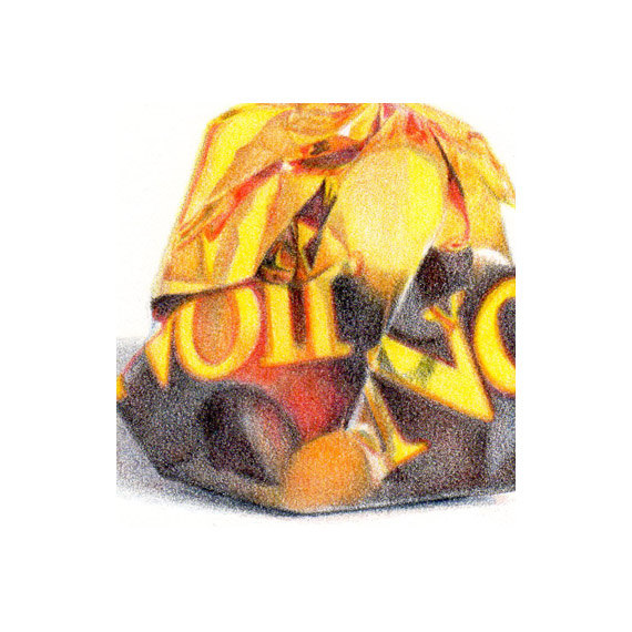
I've been drawing candy again. I found this assortment of chocolates from around the world at Costco, and you know I did a little silent squeeing as I popped them into my cart. All those shiny wrappers! And ones I'd never seen before!
This first one is a Witor's NOIR, dark chocolate. omg. Its really really good. It has some chopped hazelnuts (I think) on the top, just a few. Just enough. And that wrapper. It is just too beautiful, with that gold and brown. Yummy all the way around.
I used all Polychromos on this.
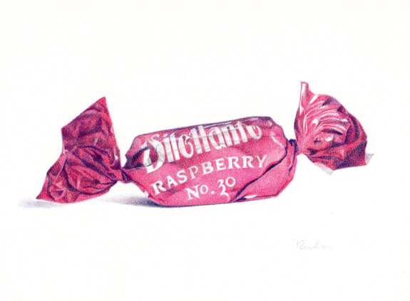
Then this one. Its a Dilettante Raspberry No. 30 chocolate. No. 30? What's that all about? I looked it up on their website but it offers no clue. In fact, it doesn't even have this one listed. So I don't know. But I loved this one too (both the wrapper and the candy).
I used Polychromos and Pablos on this one. They're both on 6" x 8" paper, and larger than life.
They're both in the
shop.
There are a few more to do, so in between other projects and assignments I will get to them as soon as I am able. I think I'd better make a trip to Cost Plus too, because they always have good holiday treats to draw. Then there's Whole Foods ... actually I want to go there for my annual mincemeat pie. So many treats, so little time!
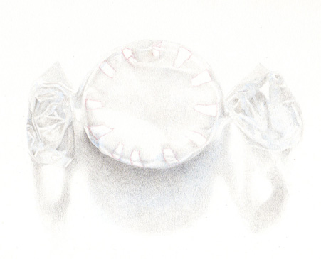
Drawing a little peppermint candy. Its starting to 'get there'. There's really not much there, colorwise. Its all white and clear, then those pops of red. So its a challenge! I'm using Polychromos and Lyras so far. And its 6 x 8 (well, the paper is 6 x 8. The candy is about 5.5" wide. Which is about 3 times actual size.)
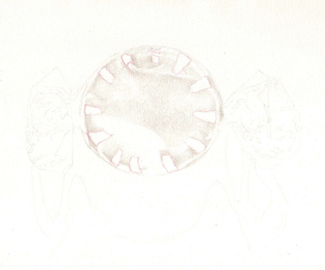
Here's how it looked before I started adding the red. I wanted to establish the values in the twists and fold and shadow before I got into the fun color part.
And here's how it looked when I'd barely started - and this is darkened up quite a bit just so it would show up on the screen. Very very very light applications of soft greys to get it going.
What's funny is that I don't even like these candies. I'm not a 'mint' person at all. But I think these are really pretty to look at, and after all, it is almost Christmas, so I thought I'd do something seasonal. I'm thinking of doing some little cards with this image, if there's time. Meanwhile, I have a whole bag of these in the cupboard, which are in no danger at all of ever being eaten (which I can't say for anything chocolate!).
"ta-da!" (as the waitress at the coffee shop I go to always says when she brings the food)
Usually I do things with a white background.
I guess I felt I had something to prove.
This is 8 x 8 inches (20 x 20 cm), Prismacolors and Polychromos on Stonehenge paper.
Phew. What made me decide to do this, I can't remember.
This is about 4,000 layers of Polychromos and Prismacolors.
Its a Chinese floral design. The original reference is darker and more "contrast-y", but I muted it some so it would 'stay back'.
This is what it looked like before I added the dark. Its pretty, but spotty. It needed the dark to tie it all together, to make a unified background that won't fight with the main subject matter.
Now its onto the stars of the show.

This is finished. I'm happy with how the color finally turned out. Like I said in the last post, I had taken it as far as it could go with the Lyras, and they just weren't doing it. So I got out the Polychromos and voila, instant success.
 (** ha ha, I misspelled Polychromos in the pic above -
they are
not Polycr - homos. Gay pencils? Well why not.)
They're both oil based pencils, and worked well together. I now know that the Lyras are good for a very soft look, whereas the Polys can do it all. If anyone has any thoughts on the Lyras they'd like to share, I'd love to hear them.
This is
for sale, if anyone's interested. And I will be doing prints.
I need to have a good sampling of small food still lifes done for a little show coming up in October. I also have to go back to being a children's book illustrator for a while. This should an interesting couple of months!

"Roots, Untitled" © Paula Pertile
11 x 17, Polychromo pencils on Stonehenge paper
Its done. *Whew*
I'm stuck on the title. I've come up with every obvious, lame, 'trying too hard' pun on 'roots' or anything related. Roots en route. Roots Unbound. Flying veggies. I may just keep "Roots, Untitled ". I don't know.
But I'm pretty happy with it. I learned a lot on this one, and did a lot of discovery and felt like I was actually making art, rather than just rendering something, the same old way. The beets were particularly challenging. There are a lot of colors in them thar beets. A
lot. Caput mortuum came to the rescue, once again. Its my favorite color in the box.
I was going to put a rectangle of color behind part of the stems to make them 'pop', and tie them in to the last piece, but decided against it.
Oh! And as
Leslie mentioned in the comments in the last post, yes, the 'roots' and hairs do bring to mind my yarn pieces with all the little fuzzies. I guess I have a thing for doing squiggly wild haired things, how weird is that.
And
CC, I did roast the veggies along with some potatoes, and they were yummy. Thanks for the suggestion!
Now its back to being a children's book illustrator for a while.

"Not From Around Here" © Paula Pertile
I finished the tomatoes, as you can see. I had fun with this, and will be developing this whole idea more in future pieces. "This idea" being things floating, weight, levitation, that sort of thing. Not sure where I'm going with it exactly, but it will be fun to explore.
Its done with Polychromos and a wee bit of Prisma red, on Stonehenge paper. 11 x 17 inches.
I love that weird muted tint of pinkish mauve against the big heirloom tomato. I wasn't sure what I was going to do there. I knew I wanted something sort of grey or purple, but didn't decide on the value or exact hue until I had the tomatoes all done. Thankfully, the values work without color - I was concerned that it would be too close to the tomato value, and not read well.

And so now its onto something else. I need to finish up the kitties from a couple of posts back, and work on a book project.
See ya!
By:
Paula Pertile,
on 12/23/2009
Blog:
Drawing a Fine Line
(
Login to Add to MyJacketFlap)
JacketFlap tags:
children's book illustration,
Prismacolor,
Polychromos,
colored pencils,
fancy homes in Sacramento,
organic food is better than Tater Tots,
Fabulous 40s,
The Forgotten Brush,
Sierra Oaks,
Add a tag
 © me, colored pencils on bristol board
Not new, but fitting for the season. I sure wish there was such a thing as "healthy" candy. I mean that also tastes good. Like this stuff.
I think one of my new resolutions (no, not a new year's thing, I don't like those) is to start eating healthier. I mean, I love my Tater Tots, but I get lazy and eat that stuff too much. Organic veggies and fruits are so lovely, and even though they may pinch the pocket book a bit, in the end they're so much better. I was reading an article last night by a man who had cancer and eschewed chemo or radiation treatments, and instead went on a complete organic diet to get his body to heal itself,
and it did. He's cancer free. That's impressive.
I'm also trying to get my cats back on a healthier food plan after struggling with my Isabella and her digestive troubles which I think stem partly from eating too many people treats for too long. So I'm on a mission.
Sorry, I know I'm supposed to be wishing everyone a Merry Christmas, and instead I'm writing about healthy eating. I've just had a few days to slow down and not be so stressed and to kind of let the spirit of the holiday and season and universe and all of that in, in a way that usually doesn't happen in our day to day hurried lives. And that's the message I'm getting from 'somewhere', so just thought I'd share.
I had a nice email from
Laura at The Forgotten Brush who included the above ribbon candy piece in her list of
etsy Christmas things she liked. How nice. Thanks Laura! I really do love perusing etsy and seeing all the wonderfully creative and inspired and quality things that people make. I often think "ooh, I wish I'd thought of that!". If you sign up for their updates you can get inspired collections they put together on their 'front page' delivered directly to your email box. This year I sold one of my braided scarves to someone who was giving it as a gift, which was nice. I also a few other pieces to different people, not on etsy, which felt good too. Its always nice when someone actually wants what you create!
On the art front, I'm working on some new simpler children's book pieces, like this:
 © me, colored pencils on Stonehenge
I'm trying to work faster, but still using my colored pencils. I've gone back to using Prismacolors after not using them for a long time. They do go on faster than Polychromos, and some of the colors are brighter. But they break more often in the sharpener because they're softer. I've been using the old old
old mixed up set I've had for over 20 years, which also includes other odd pencils in other brands like Venus and some that don't even have a label! A motley bunch of colored pencils, for sure. I even have some of the now
Here's where I am on the TWIX bar so far.
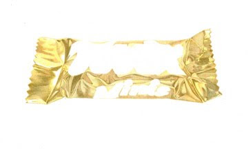
Its 7 x 12 on Stonehenge. I'm using Polychromos, of course.
I'm having so much fun!
First I did a drawing, laying out all the main shapes of shadows, type, etc.
This is WAY darkened up so it will show up here. In reality, the drawing is super super super light.
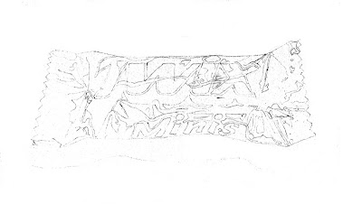
The first layer of color was with Canary Yellow and a Light Ochre, just to start establishing the pattern. There are very few actual white highlights, but I left them blank. And I'm doing everything but the type for now.
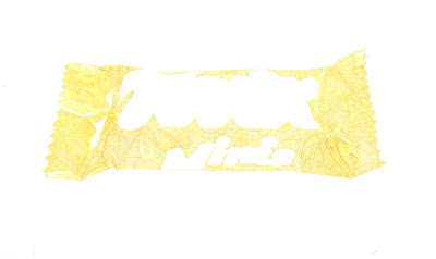
Next up was a layer of Pompeii Red
Then some Olive Green Yellowish.

With each color I add a bit more detail. I started with the bigger shapes, and am breaking it down smaller as I go, paying attention to hard and soft edges and values.
It has a ways to go, and I'm looking forward to the rest of it!
Stay tuned ~

5 x 7
Polychromos and mineral oil on illustration board, fixed with matte fixative
Hmmm. This is what I worked on this afternoon. I wanted to try a piece in this new pencil + oil technique, but with a dark background. I set the cherries up on a purple/plum colored plate and worked from life, in natural light.
Here's what I learned:
The oil over the dark background didn't bleed into the cherries, which is a good thing.
If you're going to do a dark background, save it for when you have time to really get into it, and not for a shorter study, like this.
In theory a dark background can make something colorful pop ~ it can also dull it down. Hard to tell which way its gonna go.
Make sure you can finish the piece before the light changes too dramatically, or else you're going to have problems.
You can do layers of pencil, oil, more pencil, more oil, more pencil, blend with a blending stump, more pencil, then spray fixative, with no bleeding or problems.
Be focused, and not thinking about snacks, or that turkey that was in the yard again, or a nap, or what that weird dream about marrying that guy from the past was all about.
If anyone is super crazy about this I will put it up for sale, gladly. I'm so used to working with a light background, I'm not sure how I feel about this one. I might do another one of the cherries with a white background, not sure. I have other work I have to do tomorrow, and then something else the day after, so not sure how long the cherries will hold up in the frig. I may have to eat them before I get to draw them again.
Now its back to rendering bricks, oh boy!
 © Paula Pertile
Another one done with Polychromos and mineral oil (I decided to just refer to the baby oil as mineral oil, since that's what it is, plus 'fragrance'.)
This one is 5 x 7 on illustration board.
I almost think I like working on Stonhenge paper better, but its a close call. I do find that there is a certain amount of finessing required when painting on the oil, and if there is too much pencil layered up it can make 'muck' very easily. So its not as dainty and easy as it may seem.
Funny, the thing that gave me the most trouble was my signature. I realized that I don't usually sign things, and decided I'd better start. I was never one to sit and practice my 'art signature' like a lot of folks in school did. I usually just went with my first name on things, and that was good enough. I was reading somewhere (someone's blog no doubt, and who's I can't remember now, so if it was yours, please speak up) about how important your signature is, and how you really do need to have both names on there so that future generations will be able to identify the work.
So this one started in color, and its was TOO MUCH, so I erased it, but it didn't erase well, being colored pencil, so then I put oil over it, on and on, and finally settled for a signature over the stained bit. It will have to do, since anything else at this point would just make it worse. Luckily I can photoshop it out if I use it for anything. But if someone buys it, they'll be stuck with it. Maybe some artful matting can cover it up.
I'm thinking of putting small pieces like this up on ebay again, and/or maybe a separate blog. Can't decide tonight, but sometime this week hopefully I'll figure it out. I really do like making these small pieces, they're very satisfying and scratch an itch I have that doing a whole illustration doesn't. Illustrations take sooooo much longer to do, and there is no immediate gratification. With these, I can spend an afternoon and have a finished piece. That feels good.
This morning I worked out the better part of a sketch for a new children's book self promo piece, then I needed a break and switched over to this. Tonight I will knit while I watch Miss Marple.
Tomorrow the cable man is coming to switch my phone over. I can't believe how complicated these things are now, and all the wires and cables and connectors and what all I have streaming into my house. Or at least it feels complicated. I can remember (said in a shaky old person voice) back when I had just one phone line, and no cable or anything, and it was a big deal to have the phone guy come and install a second line for that newfangled contraption, the fax machine. Recently I just had them delete my second line, and the dead fax machine is sitting on a pile of stuff that's trying to decide where to be buried. I do not feel old, no....
Are you in the mood for another building rendering step-by-step?
OK good. Cause I have one for you.
This here is a restaurant I need to render up nicely. This is the sketch I give the art director, showing which 'view' I'm doing and how I'm going to crop the image (he sends me a pack of photos from different angles, and I pick the one I like best.)

So here it is with just the sky done, and some of the reflections in the windows.
I should add that I traced that rough sketch above onto my Stonehenge paper with a lightbox, and am doing the final art on that. I'm not coloring that sketch above. I have a very light drawing I'm working on. (Guess that's obvious ~ just making it clear.)
I use Light Ultramarine, Light Pthalo Blue and Sky Blue Polychromos for the sky. There are no clouds in the original photo, just milky white blah sky, so I'm doing my own thing with it.
Yesterday I bought a treadmill. Well, I ordered one, and it'll be delivered in a couple of weeks. Sitting at the drawing table and sitting at the computer are taking their toll! Its too hot to walk now (its supposed to hit 100 this weekend), and I'm not a "get up early before its hot and get out and exercise" kind of person. So I'm doing the next best thing. I'm proud of myself. Now let's just hope it doesn't turn into one of those furniture hangers that gets sold at a garage sale next summer...

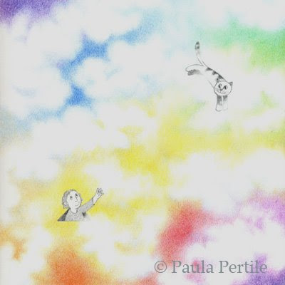
8x8, Polychromo colored pencils on Stonehenge paper
This idea just came to me the other day. I love doing clouds all of a sudden, and thought "what if the sky wasn't just blue?" Maybe this is what it looks like on "the other side". So I put in a kid popping up for a look, reaching out to his kitty who is happily flying through the clouds.
The above image is how it really looks, without any Photoshopping.
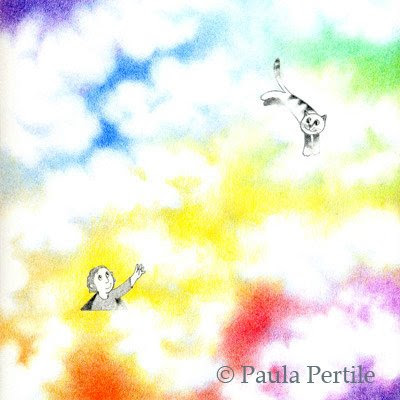
I fiddled with it some in these next three, to see what would happen if I popped the color, or darkened it down.
This one is muted down. I kinda like it.
This is what 'auto color' did to it. Bright!
And this is what "auto levels" did. WOW. I'm not sure I like it so much, but WOW.
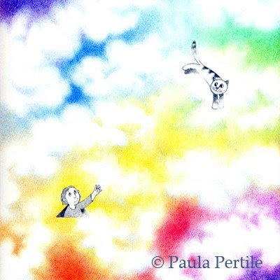
I have such a delicate touch, my work sometimes comes out a little light. For the life of me, I can't see it until its been scanned. I always think things look just right, then I see them printed and I want to bump them up some.
Opinions welcome.
Continuing with the "Diversity" theme I started a while back, I decided to do some small pieces in the same vein. They will be studies in shapes and colors, and all done (like this one) with Polychromos on illustration board. 
This is 5 x 7, and took way longer to do than I care to admit. Its several layers of pencil, built up slowly. I had a general idea of the color family I wanted to use (plummy reds) but beyond that I just let it develop on its own. I used a very sharp pencil and enjoyed doing it a lot. So I will do more!
I'd like to do some in different colors, and also explore some other geometrics.
I think I'll put these for sale somewhere at some point, but haven't decided exactly where or how yet. I'll let you know.
In other news, much less exciting news, today was the dreaded JURY DUTY DAY. Good lord. I couldn't even draw, that's how draining it was. But at the very end when I was back in the jury room staring at this wall, I sketched this image. It perfectly sums up the day. A lot of blank nothing, then what was there wasn't even interesting.
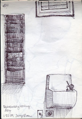
A white wall, drinking fountain, magazine rack with one magazine (SKI) and a framed thing with rules about jury service. All very inspiring (not).
Some people are actually crazy, did you know that? They look normal until they sit in a jury box and are asked a simple question. Then they short circuit. Scary.
I did meet a nice lady at lunch who also used to live in San Francisco, in my neighborhood even, with whom I commiserated about not being able to find good bread here, so that was a highlight in the otherwise very tedious day.
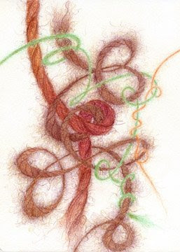
I know I said I was going to get to some childrens book art, but I've been obsessed with my etsy shop this week, and knitting, and all things "yarn".
So here we have another in the Yarn series.
5 x 7, done with Polychromos on illustration board, and matted.
Do you work like this too? Get obsessed with one thing for a while? Maybe its a certain subject matter, or media, or size, or genre.... I'd love to hear that I'm not the only one.
I have a couple more 'yarn' ideas that I have to do, then I absolutely HAVE to turn back into an illustrator for a while.

5 x 7, Polychromos on illustration board
I had about 24,000 things to do today, and instead of doing any of them (well, I did a few) I drew this.
When I drew my little cow the other day I realized how cute all my stuffed animals are, and thought "Why haven't I ever drawn these, for real?" So now I am.
There's a Mr. Bear that goes with Mrs. Bear here. He's on the drawing table as we speak. He'll probably show up here tomorrow.
I'll probably put them up on ebay, since I haven't ebayed for a while. I still have my shop up with almost nothing in it. Maybe I'll do prints of these too, I dunno.
~~~~~~~
Two of my cats love "chicken and chicken liver" wet cat food. So I thought I'd treat them to some real chicken livers! I cooked them up, going "oooh, YUM, look what I have!" thinking they'd be all over them. But no. They sniffed, and walked away. I couldn't believe it.
So now I'm having a shortcut version of Spaghetti ala Caruso for dinner, which is fine because I happen to love it. (Some of you are gagging, I know, I can hear you from here.)
View Next 10 Posts


Glad the kitties are better! Love the new illustrations - those cats are awesome :)