new posts in all blogs
Viewing: Blog Posts Tagged with: Stonehenge paper, Most Recent at Top [Help]
Results 1 - 11 of 11
How to use this Page
You are viewing the most recent posts tagged with the words: Stonehenge paper in the JacketFlap blog reader. What is a tag? Think of a tag as a keyword or category label. Tags can both help you find posts on JacketFlap.com as well as provide an easy way for you to "remember" and classify posts for later recall. Try adding a tag yourself by clicking "Add a tag" below a post's header. Scroll down through the list of Recent Posts in the left column and click on a post title that sounds interesting. You can view all posts from a specific blog by clicking the Blog name in the right column, or you can click a 'More Posts from this Blog' link in any individual post.
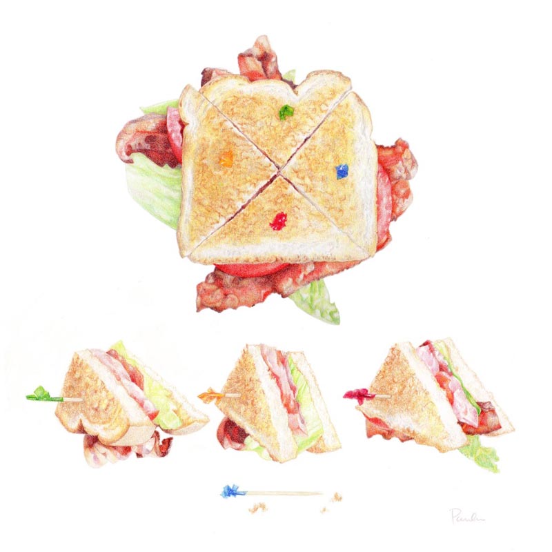
"BLT"
15" x 15"
Prismacolor colored pencils on Stonehenge paper
BLT stands for Bacon, Lettuce and Tomato. I honestly don't know if that's just an American, or English-speaking thing, or if it translates to other languages or cultures. Here, you just go into a restaurant and order a "BLT" and you might be asked what kind of bread you want it on, and maybe "toasted?", but otherwise they know what you're ordering.
Some places have fancied-up versions with avocado, which to me makes it something else altogether. A proper BLT should be on white toast, with mayo.
I had fun putting together the reference for this! I fried up some bacon, sliced some nice 'off the vine' tomatoes, rinsed some leaves of head lettuce, toasted up some plain white bread, and cracked open a jar of Best Foods mayonnaise. (It HAS to be Best Foods. )
The other fun thing was shopping for the frilly toothpicks. I am now the proud owner of a box of 1,000 of them, since that's the only way they come, apparently. So I am well stocked for a lifetime of BLT making!
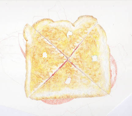
This was the first work-in-progress scan I did. The toast was the most challenging part of the drawing. Lots of nooks and crannies.
And then the next, with the toast done, the toothpicks in, and the bacon and tomatoes partway there.
And then I didn't do any more work in progress shots. I wanted to just get it done, so I glued myself to the chair and didn't feel like getting up to scan.
I purposely did this drawing a little looser in style than my previous 'architectural food' pieces. It still has a formal layout, with the top, and section views. But I combined the "side" and "section" views by doing the individual quarters this way, and also let the sandwich itself be a little sloppy - the way they are in real life.
And then I thought it would be fun to show one of them eaten, with just the toothpick left.
Are you craving one now? :~)

By:
Paula Pertile,
on 6/15/2014
Blog:
Drawing a Fine Line
(
Login to Add to MyJacketFlap)
JacketFlap tags:
children's book art,
Stonehenge paper,
popsicles,
Christmas art,
Hoarders,
cleaning and purging old art,
Fabriano Artistico paper,
planning art,
caran d'ache Pablo colored pencils,
Add a tag
Summer hasn't officially started yet, if you go by the calendar, but if you go by the weather, its definitely here! It was 107 one day last week, and if that's not a reason to break out the popsicles, I don't know what is.
This is a little promo piece for my children's book portfolio. I thought I might break out the watercolors, but at the last minute reached for my colored pencils after all.
This was done with Caran d'ache Pablos (oil based) on Fabriano Artistico Hot Press paper. I'm still getting used to the grain of this paper. I love it - but its very different than Stonehenge, which I've been using for so long. Stonehenge has a kind of 'over all' bumpy, sandpaper-like grain - except its not at all like sandpaper. Its just an even, more 'dotted' texture. Fabriano has a more 'grid-like' back and forth, woven sort of grain. So the pencils make a different kind of mark on each of them. I work in a circular stroke (mostly), so there's been a bit of a learning curve in getting them to work the way I want them too. No complaints! Just sharing fiddly details.
Last night I found myself thinking about Christmas art. I know, right? Every year I wait until the last minute to get my act together, but not this year! I'm going to start
right now, as soon as I finish typing out this blog post. Really. No, I mean it.
OK, but seriously, there's a lot on the board - some in the planning stages, and some half or more than half done. The new website is almost there, but not quite. There's a whole new line of art for a whole new 'thing' that's gestating in various stages around the studio. I've been doing a good deal of purging of old stuff that's been taking up space in file drawers for too long, and it feels really good! The tax people are never going to audit me for 2006, so good-bye old receipts; and no one must ever find the art for those old projects - the ones you do for the money but never admit to or show the art from. Every now and then I watch an Episode of
Hoarders, just to keep myself from 'going there' (don't worry, I'm nowhere even on the same planet as that, but when I get even a little bit of clutter starting on a desktop or drawer, I think, "this is how it starts . . . ").
I'm also knitting, getting stuff ready for my little
etsy knitting shop for Fall and Winter. Every evening my kitties come out on the porch with me and hang out while I knit a bit, after a day of coloring and cleaning. The rest of the day they do this. If they're not hunting. The one on the left caught a huge lizard yesterday - omg - but I was able to rescue it and put it back outside. Never a dull moment . . .
I'm back to my old drawing self, after a couple of detours.
First up is a newly completed house portrait, of a residence in San Francisco.
I did this one with Polychromo colored pencils on Fabriano Artistico hot press paper. WOW WOW WOW I LOVE THIS PAPER!!!!!!!
There are so many papers to choose from to work on, and I've heard about this one before, but for whatever reason never ordered any to try. I have a draw full of other papers - lots and lots of pads of Stonehenge (which I still love), other watercolor papers, hot press and cold press, watercolor blocks, different sizes, colors, you name it, as well as a ton of illustration board.
Well this one wins. Its 'crisper' than Stonehenge, and takes a million layers with no complaining. Its just gorgeous stuff, and I couldn't be happier with it.
Before I did the house above, I did a couple of little circus animal cookies, just for fun. These were Polychromos and Pablos on Stonehenge.
The first one is a camel, and I'm pretty sure the second one is a lion. These cookies fascinate me - they are just the weirdest little things. The cookies themselves are nice, and then they cover them is this sickeningly sweet frosting and the little doohickies (there's a name for those that's escaping me at the moment). These come in white and pink frosting, and they taste the same, but the pink ones make a better picture.
I actually laid out every cookie in the bag, and organized them by 'animal'. I considered doing a huge drawing of every cookie in the bag, including all the broken bits and stray round thingies. I thought documenting them like that would be a cool 'art piece'. And it would. Then I decided I didn't want to make that my life's work, and just drew these two instead.
By:
Paula Pertile,
on 1/29/2013
Blog:
Drawing a Fine Line
(
Login to Add to MyJacketFlap)
JacketFlap tags:
ebay,
etsy,
Polychromos,
Stonehenge paper,
Hostess cupcake,
colored pencil drawing,
chocolate cupcake,
childhood memories of the Wonder Hostess plant.,
burnishing,
Colousofts,
Add a tag
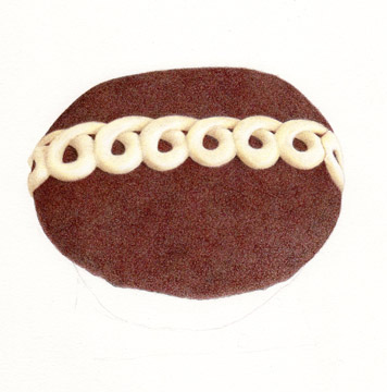
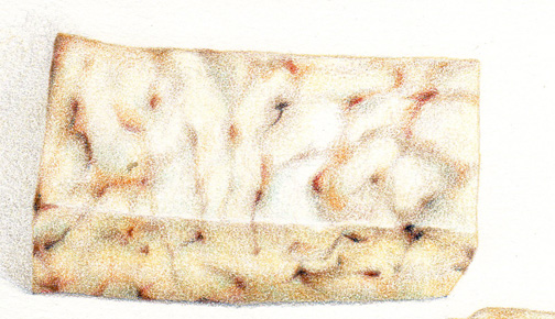
How could I not draw one of these?
5.5" x 4.5"-ish on 8"x 8" Stonehenge paper
If you don't know, its a Hostess Cupcake. Its an iconic American snack food. We all remember eating these as kids. And recently, Hostess announced they were going out of business. NOOOOOOOOOOOOOOOOOOOOOOOOOOOOOOO!!!!!!!!!!!!!!!!!!!!!!!!!!!!!!!!!!!!!!
So there was a run on these at the stores, and I managed to get the last package at my local grocer's.
I have a fond memory of touring the Wonder / Hostess plant here on a school field trip in about the second grade. The place smelled so wonderful! And we were all given a wee tiny little loaf of freshly baked Wonder Bread to take with us. I always loved driving by the place, rolling down the windows to catch that heavenly freshly-baked scent. But now, alas, its quiet and empty and there are no more fresh bread smells. Very sad. Very sad indeed.
So I drew a cupcake for posterity. (I also have a loaf of Wonder Bread and some other goodies in the freezer that may become drawings as well, we'll see.)
I scanned this a few times along the way as I was drawing it, so you can see how it developed.
I started with Coloursofts - this was a layer of Brown Earth.
Then I added more browns, and a layer of Loganberry.
The icing is Polychromo Bistre, Cream, and Ivory.
Then a layer of my beloved Polychromo Caput Mortuum. I love love love that color!
And more of the same on the icing.
To finish off the top I added some PC Sepia and Burnt Sienna.
The icing just got "more".
The cupcake itself was a combination of all the already mentioned colors, just done to look like cake instead of frosting.
I'm not really a fan of burnishing, just because once you 'go there' there is no turning back. And doing a lot of it can hurt your hand (well, mine, anyway). But to get the frosting to look really smooth, I had to burnish a bit. Then the rest of it had to get burnished as well, just so it all looked the same. So this piece was pretty fussy, but it was still a lot of fun to do.
I've put it up for auction on ebay,
here. I started the bidding high, because I'm rusty on 'ebay-ing' and couldn't find the reserve listing thing they used to have (with that, you can start bidding low, but set a reserve price so that if the bidding doesn't go high enough, no one will get it). I don't want it to sell
too cheap. It may not sell at all! And if not, I'll put it in my etsy shop.
I did do prints in the
etsy shop though.
Not sure what's next - maybe a Twinkie? All I could get on that last day were chocolate cream ones, not the white gooey ones, so I'm dithering about whether to do them or not. Wait, I think I have some Ho-Hos ...
I'm really in a cheese mood lately. Not sure why, but its been fun.
This is a Hennings Cranberry Chipolte Cheddar. Wow! Imagine biting into a piece of cheese, and having it be a little sweet, then *kapow!* hot right after that. Did you ever have that Halapeno Jelly over Cream Cheese dip/spread that used to be really popular (maybe it still is, I don't know). Its kind of like that. Except different.
What really attracted me to this (before I'd tasted it) was the beautiful rind. I have my suspicions about this though - although the cheese was labeled as being Hennings, the rind in no way looks to be anything about Hennings. Right? You can't get "Hennings" out of what cryptic bits are stenciled there.
There's no doubt its cranberry chipolte cheddar. None. And Hennings does make a cranberry chipotle cheddar. But as for the actual maker of this piece? Not too sure. The person who labeled this may have goofed. I guess it doesn't really matter, and may just have to remain a mystery.
I had fun building up the marble-y bits of stuff with colored pencils. This was done with Coloursofts on Stonehenge paper. Its 8 x 10 inches.
And now its onto something else ...
© Paula Pertile
8x10, Prismacolors and Polychromos on Stonehenge paper
I think I'm back to my old self, drawing-wise.
This is what I do best - simple still lifes, with a clean background. I went on a bit of a "draw about" (like a walkabout, except with drawing - and yes, I just made that up) there for a while, and scratched a couple of itches. Its good to get out of your comfort zone now and then and try new things, because that's how you discover new ideas, techniques, or approaches to things. But then its nice to take whatever you learned and come back to your real self.
I noticed there for a while I was drawing things with a muted palette, and I was struggling with some of the "out of my comfort zone" pieces. I started to wonder what was up with that. Was I depressed? Were my eyes going? Was it the lighting on my drawing table? Were the planets lined up funny, or was Mercury in Retrograde for a way long time? Or what?
I'm pretty sure my eyes are OK, and the lighting on my table is good (although I do prefer to draw in natural light rather than with studio lights, but of course that's not always possible, when you're forced to work at night so much.) Depressed? Well, let's see. The economy is down, the house next door and across the street are empty and in foreclosure, people come around and pick through the recycling on garbage night (which they did all the time in the City, San Francisco, but never used to here in the suburbs where I am now), all the news is bad, and I could go on. But actually, no, I don't think that's why I was drawing muted pictures. Not consciously, anyway. Maybe its seeped into my psyche some. Mercury goes in and out of retrograde all the time, so I can't always blame that.
I think (no, I know) sometimes we artists have 'off' periods, where we're not as productive, or things aren't turning out as brilliantly as we would like. Sure, inspiration takes a holiday sometimes, but also, if you just sit down and work every day, and keep doing something, it all comes back around eventually.
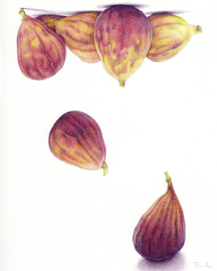
I think I'll take this idea of an un-still life and run with it. I knew I wanted to draw these figs, but didn't know what I wanted to do with them. I was trying to create an interesting arrangement, and it just came to me to have them floated up to the top of the page. I started this idea of flying food a while back with my "Pulling Up Roots" piece, then for whatever reason didn't keep going with it.
5 Comments on Figs, an "Un-still life", last added: 7/22/2012
"ta-da!" (as the waitress at the coffee shop I go to always says when she brings the food)
Usually I do things with a white background.
I guess I felt I had something to prove.
This is 8 x 8 inches (20 x 20 cm), Prismacolors and Polychromos on Stonehenge paper.

"Roots, Untitled" © Paula Pertile
11 x 17, Polychromo pencils on Stonehenge paper
Its done. *Whew*
I'm stuck on the title. I've come up with every obvious, lame, 'trying too hard' pun on 'roots' or anything related. Roots en route. Roots Unbound. Flying veggies. I may just keep "Roots, Untitled ". I don't know.
But I'm pretty happy with it. I learned a lot on this one, and did a lot of discovery and felt like I was actually making art, rather than just rendering something, the same old way. The beets were particularly challenging. There are a lot of colors in them thar beets. A
lot. Caput mortuum came to the rescue, once again. Its my favorite color in the box.
I was going to put a rectangle of color behind part of the stems to make them 'pop', and tie them in to the last piece, but decided against it.
Oh! And as
Leslie mentioned in the comments in the last post, yes, the 'roots' and hairs do bring to mind my yarn pieces with all the little fuzzies. I guess I have a thing for doing squiggly wild haired things, how weird is that.
And
CC, I did roast the veggies along with some potatoes, and they were yummy. Thanks for the suggestion!
Now its back to being a children's book illustrator for a while.

"Not From Around Here" © Paula Pertile
I finished the tomatoes, as you can see. I had fun with this, and will be developing this whole idea more in future pieces. "This idea" being things floating, weight, levitation, that sort of thing. Not sure where I'm going with it exactly, but it will be fun to explore.
Its done with Polychromos and a wee bit of Prisma red, on Stonehenge paper. 11 x 17 inches.
I love that weird muted tint of pinkish mauve against the big heirloom tomato. I wasn't sure what I was going to do there. I knew I wanted something sort of grey or purple, but didn't decide on the value or exact hue until I had the tomatoes all done. Thankfully, the values work without color - I was concerned that it would be too close to the tomato value, and not read well.

And so now its onto something else. I need to finish up the kitties from a couple of posts back, and work on a book project.
See ya!

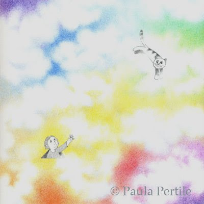
8x8, Polychromo colored pencils on Stonehenge paper
This idea just came to me the other day. I love doing clouds all of a sudden, and thought "what if the sky wasn't just blue?" Maybe this is what it looks like on "the other side". So I put in a kid popping up for a look, reaching out to his kitty who is happily flying through the clouds.
The above image is how it really looks, without any Photoshopping.
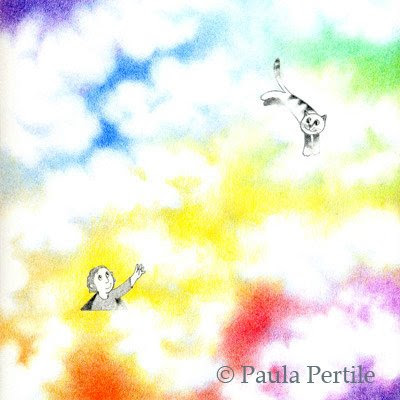
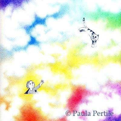
I fiddled with it some in these next three, to see what would happen if I popped the color, or darkened it down.
This one is muted down. I kinda like it.
This is what 'auto color' did to it. Bright!
And this is what "auto levels" did. WOW. I'm not sure I like it so much, but WOW.
I have such a delicate touch, my work sometimes comes out a little light. For the life of me, I can't see it until its been scanned. I always think things look just right, then I see them printed and I want to bump them up some.
Opinions welcome.
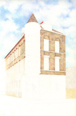
Here's today's progress:
I started with the sky. I loved doing the sky. A lot.

~~~~~~~~~
Then I started in with the building. I'm doing the bricks and roof first, and will save the black tower for last, since its darkest. I'm not doing every brick, just the impression of them.
~~~~~~~~~~
Here I just did "more".
I'm blocking in shapes of color, putting in some detail, more color, etc.
I'm saving all the fussy detailed linework until the very very end.
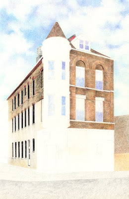
I'm really loving this Stonehenge paper! I love it as much as I hated the mylar from a few posts back, if you remember. The tooth is lovely, reminds me a lot of illustration board. Its like what linen is to cotton, as far as how it compares to bristol. If that makes sense. I can see this being my new favorite surface!
Today was the most lovely Spring day, with open windows and birdies tweeting and kitties napping and the ice cream truck going by. I sat and colored on this all day and enjoyed the peace and quiet and serene feel of it all. Tomorrow we're supposed to get hit with a nasty wind storm, so I guess April will be coming like a lion. Isn't that supposed to be March? Hmmm....


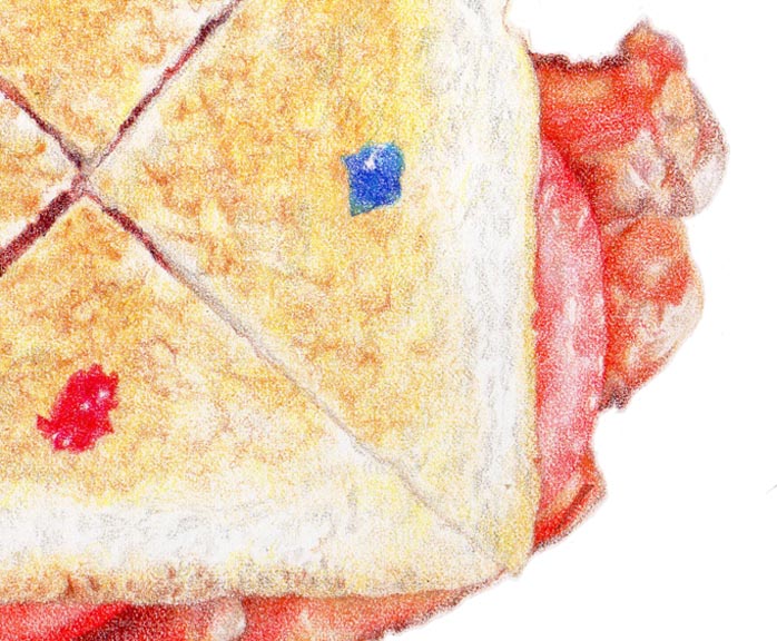


Oops, you dropped a crumb! Around here, no crumbs went to waste. :-)
Looks sooo real from here, thanks for the tutorial too.
Now that looks tasty - at first glance, I thought it was a photo! As for what next, I say work on both a twinkie and an ho-ho :) Can't go wrong with either.