new posts in all blogs
Viewing: Blog Posts Tagged with: Mid-century, Most Recent at Top [Help]
Results 1 - 14 of 14
How to use this Page
You are viewing the most recent posts tagged with the words: Mid-century in the JacketFlap blog reader. What is a tag? Think of a tag as a keyword or category label. Tags can both help you find posts on JacketFlap.com as well as provide an easy way for you to "remember" and classify posts for later recall. Try adding a tag yourself by clicking "Add a tag" below a post's header. Scroll down through the list of Recent Posts in the left column and click on a post title that sounds interesting. You can view all posts from a specific blog by clicking the Blog name in the right column, or you can click a 'More Posts from this Blog' link in any individual post.

Cow Plus Boy Equals CowboyI have three banners being created for the local town's brick paved walking mall. It's a nice venue, well shaded with the banners hung for two wide city blocks from Victorian posts. The pieces will be hanging through the fall of 2012, so my work should be well viewed. I love to do pieces that will make a young family have to stop and chat about the contents. I chose to do this particular banner in the mid-Century feel of the old Dick and Jane Elementary books.
Drawn with my Palomino Blackwing 602 on Strathmore, scanned and worked at high resolution (720ppi) in Adobe Photoshop with my Wacom Intuos3.
By: Dave,
on 6/28/2010
Blog:
inspiration from vintage kids books and timeless modern graphic design
(
Login to Add to MyJacketFlap)
JacketFlap tags:
1960s,
USA,
Mid-century,
industrial-design,
BOOKS,
illustration,
Off our book shelves,
modern,
architecture,
Add a tag
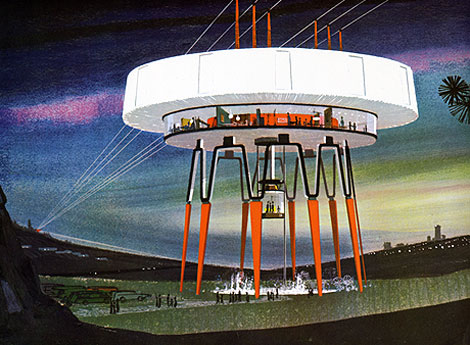
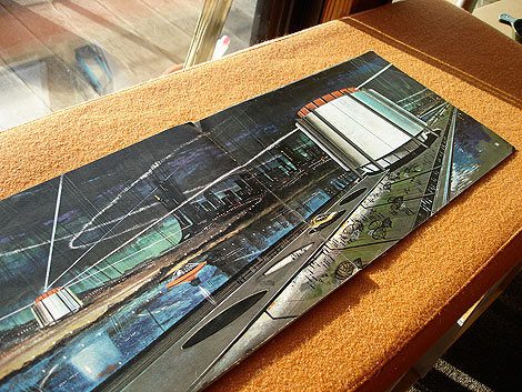
In 1964 United States Steel called upon the nation’s electric utility companies to reconsider the current look of our power stations and transmission towers to be both functional and beautiful. Two years later, Henry Dreyfuss and Associates were commissioned to investigate possible design alternatives, and I believe they were documented in a book entitled “Power Styling” which was produced by United States Steel in the mid-to-late 1960s. I discovered a copy not long ago, and the inside illustrations are absolutely amazing. Unfortunately, there is very little information listed, so I can’t say for sure if the concepts belong to Henry Dreyfuss and his team. I contacted the office of Syd Mead, who did several illustration projects for US Steel, to confirm the artwork, and sadly he was unfamiliar with this piece. If anyone has information on the Power Stylings project or the mysterious illustrator, please drop a note in the comments.
More images after the jump. Don’t miss this one!
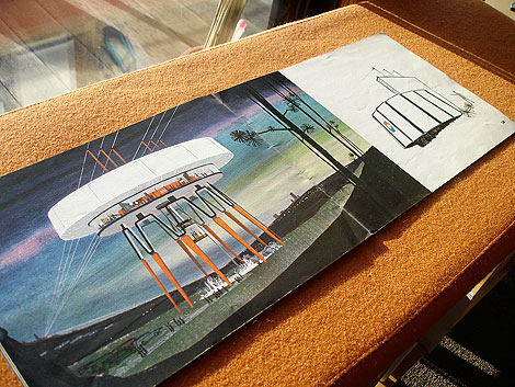
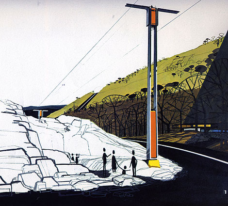
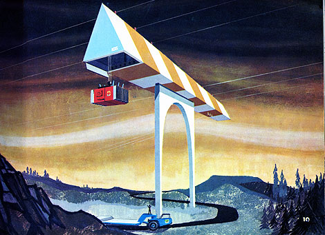
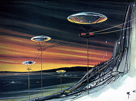
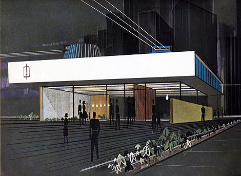
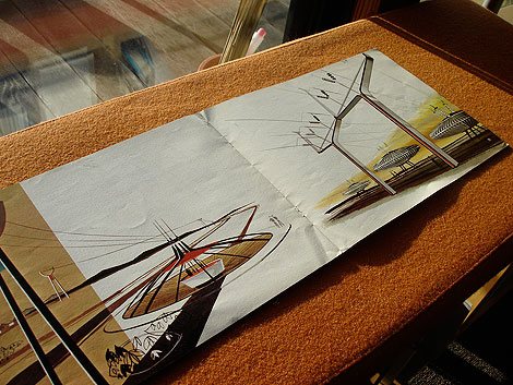
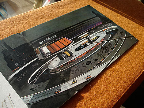
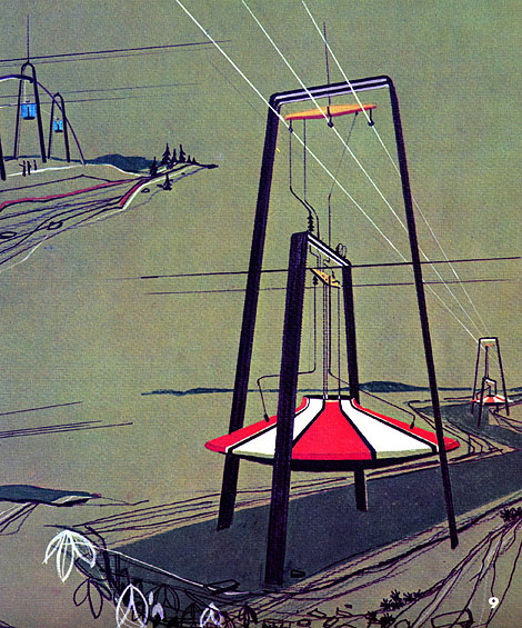
This could double as a giant floor lamp. I’d buy one!
By: Dave,
on 6/22/2009
Blog:
inspiration from vintage kids books and timeless modern graphic design
(
Login to Add to MyJacketFlap)
JacketFlap tags:
Design,
Uncategorized,
ART,
modern,
vintage,
prints,
1960s,
Found design,
Charley-Harper,
Mid-century,
Add a tag
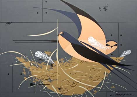
I’d like to thank Rena Hopkins of the Charley Harper Art Studio for passing on the good news that a lost trove of original Charley Harper paintings have been rediscovered. These paintings were commissioned for the Ford Times and Lincoln Mercury Times Magazines and include many pieces from Charley’s beloved bird series. You can find out more info at the studio’s exciting new blog. Original Harper prints for Ford Times magazine are available for purchase here.
Charley’s son Brett will be on hand to personally introduce this new collection at an opening at Fabulous Frames and Art, one of our longest standing retailers, from 11 am-5 pm Saturday, July 11th. This local show will run from July 11th through August 8th.
Fabulous Frames and Art
10817 Montgomery rd
Cincinnati, OH 45231
No Tags
Share This
Congrats to Jenny Eng. She is the winner of the Kevin Dart giveaway.
©2009 Grain Edit

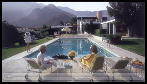
Kaufmann House designed by Richard Neutra in 1946
This looks like its going to be a must see flick for modern architecture fans.
Filmmakers Michael Bernard and Gavin Froome have created a documentary that will take you on a journey through three generations of modern architecture on the West Coast of North America.
This film speaks with the architects and their patrons, and asks if Modernism’s time has finally come or did it ever really go away.
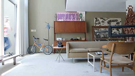
Opdahl House designed by Edward Killingsworth in 1957

Smith House designed by Arthur Erickson & Geoffrey Massey in 1964
You can see the trailer for the film here. They have a blog as well.
——–
Also worth checking: Arthur Erickson: Graham House
& Saul Bass Case Study House #20
Not signed up for the Grain Edit RSS yet? Give it a try. Its free and yummy.
——–
No Tags
Share This
Congrats to our two winners in the Human Empire/Andreas Samuelsson t-shirt giveaway. 1st place winner jessicat - 2nd place winner - Hamsterfish
©2009 Grain Edit

By: Dave,
on 3/17/2009
Blog:
inspiration from vintage kids books and timeless modern graphic design
(
Login to Add to MyJacketFlap)
JacketFlap tags:
germany,
1950s,
modern,
vintage,
Found design,
Furniture,
Mid-century,
industrial-design,
chairs,
Add a tag
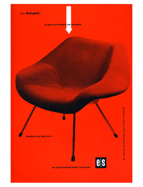
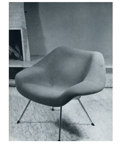
I want this chair! It was designed by Jupp Ernst and manufactured by Polstermobelfabrik Eugen Schmidt Gmbh during the 1950s. If the chair wasn’t cool enough, Helmut Lortz nailed it on the design of the AD. Someone needs to buy me this chair along with a Robin Day Form Unit Sofa. Please?
also worth checking Hans Hartmann: Swiss Graphic Designer.
Not signed up for the Grain Edit RSS yet? Give it a try. Its free and yummy.
No Tags
Share This
Enter the Grain Edit Design Stimulus Giveaway! featuring goodies from Steven Harrington, Aesthetic Apparatus, 2K Gingham and many more! We're giving away over $1000 worth of goods. Enter now!©2009 Grain Edit

 My chair "after"
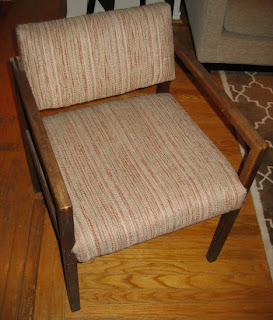
So recently I was in a shop coveting some refurbished mid-century modern armchairs but they were over $500 each and we're feeling poor lately. Just like everyone else I'm guessing?
 the chair "before"
But a few days later I found a chair at Goodwill that was really similar. The arms didn't have the exact shaping of the other chairs, but the joins were dovetailed rather than butt-joined which I liked. Of course the upholstery was really shabby and the wood finish was also very worn and patchy.
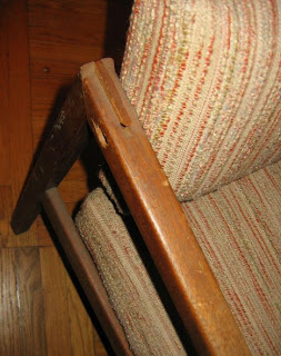
Also one of the arms was dislodged at the join. The woman at the cash looked at me like I was a bit pathetic for buying this dodgy chair and charged me $5.99.
So I bought the chair, took it home and took it all apart. The first step was using some carpenter's glue to fix the arm at the join. After adding the glue, it was just a matter of tapping it gently back into place with a hammer over a tea towel (so as not to mark the wood).
Then I sanded the whole thing with a fine sandpaper to keep the smoothness of the wood. Then I stained the wood with a dark colour (Royal Mahogany) then varnished with Polyeurethane. Then one last sanding and one last coat of varnish. I think the wood is mahogany but I really don't know my woods. It's definitely a nice hardwood.
The last step was reupholstering the chair. I really wanted to use something I already had, so there wasn't a lot of choice. I actually got the fabric I used at the workroom fabric swap, it's a creamy white chenille that has a texture of tiny squares. I had just enough! This kind of upholstery is quite easy, just wrap the fabric and staple on the underside. Just take care to tuck the fabric neatly around the corners.

The final touch was a pillow made from an old cashmere sweater. I've been meaning to do this for ages, I see them in magazines all the time and they always look so nice. The best part is this one is also so soft and cosy because of the cashmere. Perfect for that last little patch of winter.

Anna Sui has teamed up with the Estate of Alexander Girard to present a series of T-shirts for Spring 2009. One of the T-shirts features an image very similar to this Girard Nativity Poster we featured here last year. You can see all the T-shirts here.
No Tags
Share This
New giveaways coming soon at Grain Edit ©2008 Grain Edit

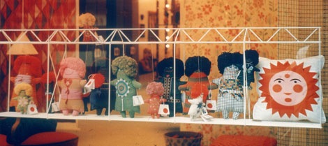
Marilyn Neuhart dolls for the Textile & Objects shop circa 1961 - photo credit Todd Webb of maXimo
The Scout has an excellent interview with Marilyn Neuhart. Marilyn along with her husband John worked as designers in the Eames Office during the late 1950s. She also worked with Alexander Girard in developing the graphics as well as a line of dolls for Girard’s Textile & Objects Shop in New York City. In part of the interview, Marilyn mentions that she would drive around Los Angeles with Girard looking for toys and folk art. That must of been a blast.
Well enough of me rambling. Read the whole interview here. Check out the rest of the Scout while your there. It’s a great site.
No Tags
Share This
We have our winners in the Grain Edit 1 Year Anniversary Giveaway Shindig thing! WINNER #1 is Colleen Redmon. She will get first pick from all the prize options - WINNER #2 is Adam Mullet. He will get 2nd pick - WINNER #3 - Caroline Armijo. She will get 3rd pick. WINNER #4 is Stacee Millangue
Thank you everyone for taking part in our giveaway! ...and thanks to all our wonderful sponsors. Without them this wouldn't of been possible. Stay tuned for our next giveaway, coming soon.
©2008 Grain Edit

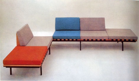
‘Form’ Unit Furniture by British designer Robin Day for Hille 1961
I thought I’d switch it up a little bit today and post my dream sofa for the workplace. I love the color combinations and the black finished steel base frame. The unit has wide generous seats, yet doesn’t look bulky or heavy. The table top can be surfaced with a mahogany veneer. A drink cabinet can added instead of the corner table.
No Tags
Share This
Drop a comment and enter to win lots of cool prizes in the Grain Edit 1 Year Anniversary Giveaway Shindig thing! ©2008 Grain Edit

By: Dave,
on 7/2/2008
Blog:
inspiration from vintage kids books and timeless modern graphic design
(
Login to Add to MyJacketFlap)
JacketFlap tags:
BOOKS,
japan,
out-of-print,
exhibitions,
packaging,
Off our book shelves,
1950s,
modern,
retro,
vintage,
posters,
ephemera,
graphic-design,
Mid-century,
Add a tag
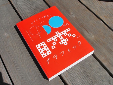
1950s Japan: The blossoming of the graphic designer exhibition book
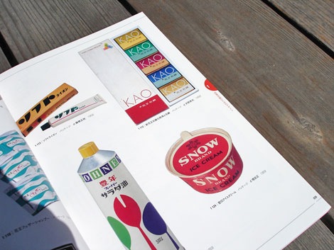
Packaging - Honen salad oil - design by Kenji Ito 1959, Snow ice cream -design by Tadashi Masuda 1959, KAO soap - design by Hideo Amano 1958
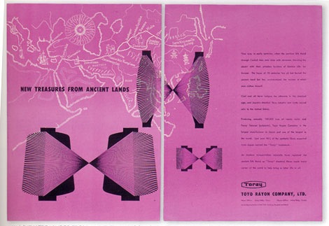
Advertisement for Toyo Rayon fiber co. - design by Yusaku Kamekura 1950
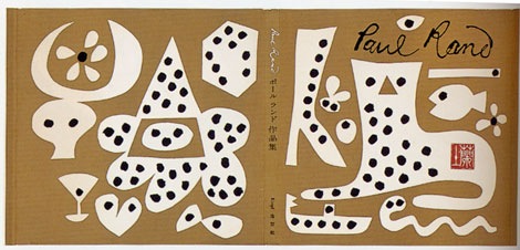
Paul Rand: His work from 1946 to 1958 - cover design by Yusaku Kamekura
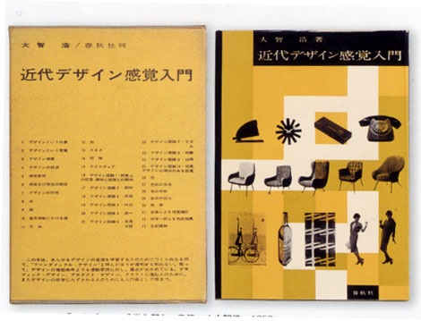
Sense in Modern Design - design by Hiroshi Ochi 1959
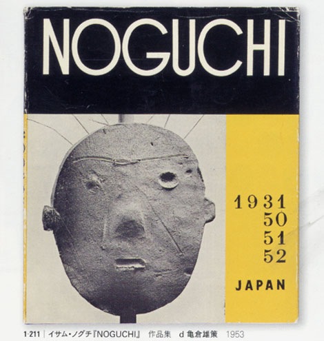
Isamu Noguchi Photography book 1953 - cover design by Yusaku Kamekura
If your planning to be in or near Tokyo within the next few days it would be worth your while to visit the Japanese graphic design in the 1950s exhibit at the printing museum. The exhibition features over 400 items, including newspaper and magazine advertisements, pamphlets, wrapping paper, packaging, and books, in an attempt to demonstrate all aspects in the development of graphic design in the 1950s as the foundations of postwar design were being laid.
I was able to get my hands on the catalog for the exhibit (seen above). I’m so sad that I won’t be to see this collection in person. The work is astounding. Lots of pieces by Yusaku Kamekura, Hara Hiromu, Takashi Kono, Ayao Yamana, Ryohei Yanagihara and others.
The exhibition runs through July 6th, 2008. You can get all the details here.
Also worth checking:
1960s Japanese book cover design
1960s Japanese magazine cover design
No Tags
Share This
©2007 -Visit us at Grain Edit.com for more goodies. 
By: Dave,
on 6/19/2008
Blog:
inspiration from vintage kids books and timeless modern graphic design
(
Login to Add to MyJacketFlap)
JacketFlap tags:
modern,
vintage,
1960s,
Found design,
USA,
graphic-design,
Mid-century,
book-covers,
out-of-print-books,
Add a tag
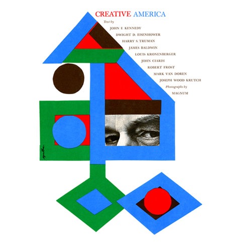
Creative America: Art director- Albert Squillace c1962
Thanks to Chad for sending this in. Looks very similar to the book cover design work of Paul Rand.
Also worth checking:
Modern Dutch book cover design
1960s Penguin books
No Tags
Share This
©2007 -Visit us at Grain Edit.com for more goodies. 
By: Dave,
on 6/18/2008
Blog:
inspiration from vintage kids books and timeless modern graphic design
(
Login to Add to MyJacketFlap)
JacketFlap tags:
records,
modern,
owls,
vintage,
1960s,
Found design,
accessories,
homes,
Mid-century,
Scandinavian,
collections,
Add a tag
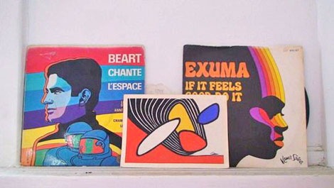
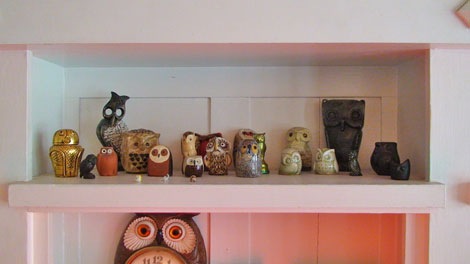
Apartment Therapy posted photos of Sam Grawe’s apartment yesterday as part of their 2008 home tour series. Sam is the Editor-in-Chief at the San Francisco based Dwell Magazine. If you are unfamiliar with Dwell, it is a magazine that focuses on modern architecture and design.
Sam has lots of goodies in his house. The place is filled with Danish modern furniture, Bertoia chairs and Scandinavian nic nacs. What did me in was the record covers and the owls. This is a man that loves owls! He has a slew of these Edvard Lindahl looking ceramic miniature birds of prey. Too be fair, it looks he holds no Owl biases. I see examples of Strigidae (Heck yea, I’m name dropping) as well as the barn yard variety. I actually know nothing about Owls. I picked all this up in a two minute search at Wikipedia. Anyways, I’m getting off track. To sum up, just check out the house tour.
No Tags
Share This
©2007 -Visit us at Grain Edit.com for more goodies. 

By: Kirsty,
on 2/27/2008
Blog:
OUPblog
(
Login to Add to MyJacketFlap)
JacketFlap tags:
UK,
A-Featured,
international,
IPY,
polar,
OUPblog,
year,
Scott,
singly,
surface,
pulling,
sledge,
sastrugi,
cheerful,
misfortunes,
Literature,
Biography,
Current Events,
Titus,
Oates,
Add a tag

It may be called the International Polar Year, but it actually runs for two years. This time it is March 2007 to March 2009, so we’ll shortly be right in the middle of it. The IPY involves over 200 projects in the Arctic and Antarctic, with thousands of scientists from over 60 nations examining a wide range of physical, biological and social research topics. I was reading about this recently, and saw that the BBC website is running its own Antarctic Diary to coincide with the IPY. This put me in mind of OUP’s edition of Robert Falcon Scott’s Journals, edited by Max Jones, so I thought today I would bring you an excerpt from the last chapter: The Last March.
(more…)
Share This

By: Rebecca,
on 1/18/2008
Blog:
OUPblog
(
Login to Add to MyJacketFlap)
JacketFlap tags:
A-Featured,
sunday,
singing,
rendition,
bowie,
glad,
heads,
surface,
trace,
Add a tag
Time may change me but I can’t trace time.
Sorry, I’ll stop singing now (be glad you can’t hear my off-key Bowie rendition.) I wanted to give all you wonderful OUP readers a heads-up that some surface changes will be taking place on Sunday night and the blog may be a bit wonky. Try and do your blog reading beforehand, or wait until Monday and let us know what you think of the greener OUPblog.
Share This


What a great chair! I feel so funny when I buy something at the Goodwill that I am super excited about, but many people don't see the potential. I love that look, I get by the register... I am laughing out loud inside. :)
Awesome job!
claire
the 'new' chair looks great
love the pillow too
I think you need your own show - your makeovers are always so tasteful and inspiring :)
That's just beautiful, Claire.
That looks lovely! How clever.
Beautiful work!
What a beautiful job you did. It looks so modernly pretty now!
wow! You are so INCREDIBLY handy and crafty! Its the kind of stuff I wish I can do, but for me it will turn into a disaster lol.
The chair is looking so awesome and perfect sweatery pillow. I want a whole set! :-)
It looks beautiful! And that pillow is a nice added touch.
You did a fantastic job, really professional looking! I applaud your work, I would never get past the sanding stage!!
That is such a nice renovation! Being able to identify a treasure that needs a little work when looking at something shabby is a great ability.
wow claire, that chair is great :)
That's fantastic - both the chair AND the pillow!
What a fantastic job you did! The cushion is the icing on the cake!
I love this! I have a chair similar to this that needs to be refinished. You've inspired me!
this is amazing!
really nice re-do! i hope this doesn't show twice. i wrote one comment and it sort of disappeared. :o)
Wow, that's incredible! I'm generally terrified of big projects but you took that on like a pro! And in winter! Good for you :)
Your chair is lovely! I like how you refinished the wood, too--I would have never thought of that.
Beautiful!!!!!!!!