From my friend Lisa Alvarado, the following bit of news. Congratulations Lisa!!
Lisa Alvarado's Mexican Woman's Toolkit, Sin Fronteras is a large floral
tote bag hanging on wooden pegs, which visitors are invited to rummage
through. The bag belongs to a Mexican domestic in WWII-era Chicago: her
life is service to others, she has no privacy.
http://www.flickr.com/photos/markart/2414858942/
Reimagining The Distaff Toolkit
"Reimagining the Distaff Toolkit" is an exhibition of contemporary art,
each of which has, at its visible core, a tool that was important for
women's domestic labor in the past (the 18th century through World War
II). The old tool becomes the fulcrum for a work of art. Each work and the
exhibit as a whole have the power to speak to viewers independently,
Artists are placing objects such as a dressmaker’s figure, diapers,
graters, grinders, needles, pins, pots, pans, baskets,
garden-seed-packets, rakes, hoes, dress patterns, dish-rags, rolling pins,
brooms, buckets, darning eggs, knives, rug-beaters, and other tools at the
center of their work. One piece will have an early 19th century distaff at
its visible core. Part of the point of this exhibition project is to
explore the idea of "seeing as context." As I imagine the process here, I
look at a tool that facilitated very hard and repetitive labor and that
evokes women's degradation as domestic drudges. I look again, through my
early 21st century eyes, at a moment when "old tools" have become
commodified and expensive, and I see costly beauty. Reimagining the
distaff toolkit for the purposes of this exhibition might include
(overlapping) gestures in any of the following directions – or other
directions – history / memory / gender / labor / material culture /
household objects / family relations / power and powerlessness / drudgery
/ craft and beauty. Reimagining the Distaff Toolkit puts utility in
conversation with art, the past in conversation with the present.
March-May 2008 Bennington (VT) Museum
Oct-Dec 2008 The Mead Museum, Amherst College
Jan-Feb 2009 Morris Museum, Morristown, NJ
March 2009 Oklahoma State University
Sept-Dec Union College, Schnectady, NY
http://ionarts.blogspot.com/2008/04/double-double-toil-and-trouble.html
--
Lisa Alvarado, poet, novelist, literary critic
Viewing: Blog Posts Tagged with: Reimagining The Distaff Toolkit, Most Recent at Top [Help]
Results 1 - 15 of 15
Blog: AmoxCalli (Login to Add to MyJacketFlap)
JacketFlap tags: art, Lisa Alvarado, Mexican women, installation art, museums, woman in the mexican military, Reimagining The Distaff Toolkit, Add a tag
Blog: Gurney Journey (Login to Add to MyJacketFlap)
JacketFlap tags: Color, Plein Air Painting, Lighting, Plein Air Painting, Lighting, Add a tag
Before electricity, there were basically two colors of light at night: blue-grey moonlight (or twilight), and orange lamplight. Below is a painting by the French boulevard painter Edouard Cortes (1882-1969), who specialized in Paris by lamplight. As electric lighting replaced flame-based light, new colors entered the nightscape. Fluorescent light has a yellow-green cast. Sodium vapor gives off a harshly monochromatic orange. Mercury vapor’s blue-green color drains the blood out of flesh tones. Other kinds of lights: metal halide, LED, neon, and arc lamps, each have their own color qualities. You’ve probably noticed the variety when flying over a city at night.
 I painted this little oil sketch from observation while balancing on a hotel balcony in the predawn light in Anaheim, California. The technique is fairly crude—and a bit smudged from when I accidentally dropped it. What interested me was the contrast between the orange sodium vapor (foreground) and the green mercury vapor (middle ground).
I originally did this 8x10 inch oil sketch in 1995 as a concept for a Dinotopia theme park. Recently I reworked the central boat and reused the image in Dinotopia: Journey to Chandara. It has three different regions of colored light: blue in the foreground, red-orange across the canal, and blue-green through the arch. The colors are arbitrary; I don't know what kind of lights Dinotopians are using.
Syd Mead, the “visual futurist” who helped design Blade Runner, is an inventive colorist who orchestrates colored light in many of his science fiction paintings. In this futuristic street scene, yellow, green, and blue light each occupy different spatial regions. In this concept sketch by Mead, a mechanical creature stands above a circle of warm light, while a saturated, monochromatic cyan illumination infuses the rest of the scene. The effect is magical and otherworldly.
Japanese artist Teppei Sasakura also specializes in colored illumination, which he uses here to create a playful, exotic, kaleidoscopic effect.
Here are some tips if you want to experiment with colored light:
- Try painting a plaster cast, a figure, or a still life lit by two or three contrasting gel-covered lights. Try to shield the motif from all other light influences.
- Keep in mind that mixtures of colored light are different from paint mixtures. For example red plus green equals yellow.
- Try some urban night painting, using a portable LED light to illuminate your palette.
- Set your camera to daylight (rather than white balance) and photograph a color wheel under different street lights; then compare the digital photos side by side to see how the colors are skewed.
- Start a scrap file of magazine photos that show modern cityscapes at night.
Wikipedia/History of Streetlighting, Link.
Sky and Telescope article with a spectral output chart, Link.
Joe Maurath's gallery of vintage streetlighting, Link
More boulevard scenes by Edouard Cortes at ARC, link
More on Syd Mead, link.
For more on Teppei Sasakura, link.
Blog: Gurney Journey (Login to Add to MyJacketFlap)
JacketFlap tags: Color, Plein Air Painting, Lighting, Add a tag
Most of the time we think of shadows as blue. Surfaces in shadows do tend toward blue if they are facing upward beneath an open stretch of sky. We can make a general rule if we hedge it a bit: “Upfacing planes in shadow are relatively blue on a sunny day.” In the sketch of the library in Millbrook, New York, I observed plenty of bluish color in the cast shadows on the sidewalk, for example.
 But planes in shadow that face downward are different because they pick up the warm reflected color of illuminated surfaces below them. You can see this effect in the white pediment. Where the projecting forms faced downward, they’re distinctly orange, not blue at all.
 So let’s revise that quick rule of thumb about the color of shadows: “In shadows, upfacing planes are cool, and downfacing planes are warm.“ If you click on the photo above, taken at Bryce Canyon by Tobey Sanford, you can see the cool upfacing planes (1), and the warm downfacing planes (2). What you can't see is my knees shaking.
Tomorrow: Baseball Cap Space Helmet
Blog: Gurney Journey (Login to Add to MyJacketFlap)
JacketFlap tags: Color, Academic Painters, Golden Age Illustration, Lighting, Add a tag
Moonlight is about 400,000 times weaker than direct sunlight. It’s so dim that the color receptors in our retinas, called the cones, can barely function.
In moonlight the other retinal cells called rods are doing most of the work. Rods detect relative lightness and darkness, but they are entirely color-blind.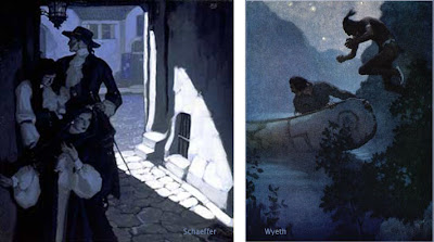
Moonlight is simply the white light of the sun reflecting off the gray surface of the moon. There’s nothing in that interaction to give the light a bluish or greenish quality. In fact, scientific instruments have shown that the light from the moon is very slightly redder in color than direct sunlight.
These facts added together suggest a mystery at the heart of how we as artists choose to portray moonlight in paintings. If moonlight is just gray-colored light, and if it’s close to the minimal threshold of our color receptors anyway, then why do so many artists paint moonlight as bluish or greenish? Do we really see it that way? Is it some kind of illusion, or perhaps is it just an artistic convention?
Let’s look at some paintings by master painters of moonlight. As you look at them, consider your own perception of the colors at night, and ask yourself which of the paintings best convey your own experience.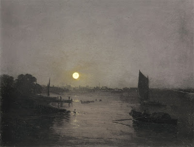 Here’s a painting by J.M.W. Turner. It’s fairly gray, with just a hint of warm color around the moon. Notice that there isn’t much detail in the shadow area. All you really see clearly are the silhouettes of the sail and the boat on the water.
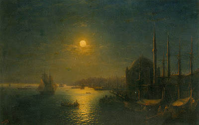
Russian seascape painter Aivazovsky painted this night scene lit by a golden moon. The sky, the water, and the shadows all sink into blue-green tones. He doesn’t show very much detail, and he stops well short of black in the shadows.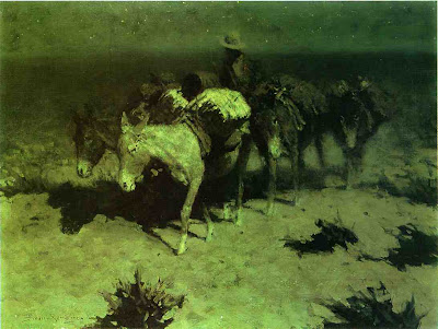
This lightening of darks was also a feature of Remington’s nocturnes. The cast shadow to the left of the pony’s nose is composed of dull umbers and greens. These luminous shadows lighten and liven the obscurity. Except for the light saddle cover, Remington has left most of the edges soft and undefined, especially on the donkey on the right.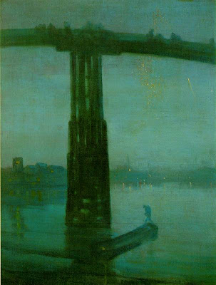
This famous nocturne by Whistler of the Battersea Bridge uses a fairly saturated blue-green color, especially in the water and in the silhouetted figure. The detail is blurred throughout, even in the areas where the bridge appears against the sky, setting up for the tiny sparkles of light in the distance.
One of the reasons for softening the edges is that we depend on the cones for fine discrimination of edges. Unfortunately the cones are located on the fovea, the centerpoint of vision, and with them off-line in the darkness, we just can’t sort out small details.
If you take a book or newspaper outdoors in moonlight, you can see that there is writing on the page, and you might be able to read headlines or other large type, especially when you glance around with your peripheral vision. But reading normal size text is almost impossible. When you look directly at the words, the blind spots get in the way.
I said earlier that our cones are barely functioning in moonlight. In fact, contrary to what some authorities have claimed, most people’s cones can make basic color judgments by the light of a full moon. But how much variation in color can we really see?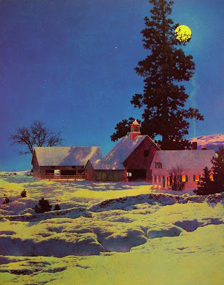
Maxfield Parrish rendered this moonlight scene with quite a bit of color saturation. He painted the yellow moonlight, the reddish cupula on the barn, the deep blue of the sky, and the orange color on the shadow side of the house. Did he really see such colors in moonlight, or did he invent them for pictorial effect? Too bad he’s not here to ask.
Direct plein-air painting is virtually impossible in moonlight. Every artist has to work from memory and imagination. We may try to convey our actual optical sensations, but we’re not scientists. Each of us is also trying to make a subjective aesthetic statement intended to evoke a particular mood or emotion. Any moonlight painting is an attempt to translate a “rod experience” into a “cone experience,” an image that will be seen in a brightly lit environment.Here’s how you can test how your cones actually respond to color in moonlight. Paint a set of separate, matching, unmarked color swatches or find some construction paper at about the same value. Take them into full moonlight (this Tuesday) and let your eyes adjust (it takes about 30 minutes). Shuffle the cards, and while you’re still outdoors, mark on the back what colors you think they are.
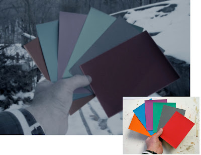 I have used Photoshop to manipulate a photo of the swatches (actually shot in daylight) to simulate how they appeared to me under the full moon: dulling, darkening, and blurring them. Both Jeanette and I could easily identify the basic hue family of each swatch. But beyond that basic classification, we weren’t sure, and the gray swatch confused us both.
When I looked at the same swatches in the much dimmer light of a half-moon, or in a moon shadow, I found my cones went sub-threshold and shut down completely, and the swatches became completely monochromatic.
Although the rods of the eye can’t actually see color, scientists have shown that they are most sensitive to greenish wavelengths of light. As a result blue-green hues appear lighter in tone in dim conditions. There’s a name for this: the Purkinje Shift. It’s a different phenomenon from, and often mistaken for, the perception of moonlight as blue.
You can demonstrate the Purkinje Shift by comparing a red and green swatch that start out indoors at the same value. If you take them outdoors in moonlight, the greenish one will seem much lighter in tone. Many observers have noticed that red roses look black in the moonlight.
If you scroll back up to my Photoshopped version of the moonlight color swatches, you can see I’ve adjusted the values to simulate the way the red and green looked to me as a result of the Purkinje Shift.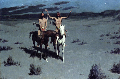
Here, Remington shows a scene with Indians in moonlight. We see their flesh tones and some clear red touches in their costumes. Throughout, the edges are much crisper than his other painting.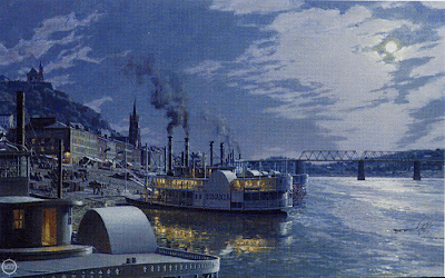 This nocturne of old Cincinatti by contemporary artist John Stobart has a distinctly bluish cast. He introduces much more detail than we’ve seen in the other examples, reminiscent of the “day-for-night” film shoots in old westerns. You can even read the name “Bonanza” on the shadow side of the ship.
In addition to the moonlight, there’s a secondary source of yellow-orange lamplight. In this case, one could argue that the blue cast to the picture may be a complementary color induced in opposition to the color of the lamplight.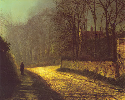 Atkinson Grimshaw was famous for his poetic moonlight studies. Here the shadow masses at the left are fairly soft and impenetrable, but the bricks and branches show up very clearly. The moonlight on the road is an intense yellow-orange, assuming this reproduction is accurate. The shape of the patch of light points to the lovers standing in silhouette at left.
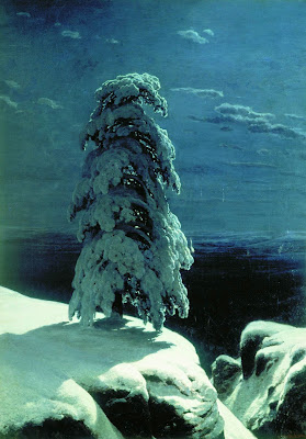
Russian landscape realist Ivan Shishkin, painted this haunting image of a winter night in the wild north. The snow in moonlight is relatively brilliant, with a soft halation along the edge at left, but it’s not yellowish. The cast shadow gradates in tone, getting lighter as it catches more sky fill and bounced light. There’s quite a bit of detail in the tree form, but he has kept the foreground and background description to a minimum.
So, to get back to the question posed earlier, why do we see moonlight as blue?
Saad M. Khan and Sumanta N. Pattanaik of University of Central Florida have proposed that the blue color is a perceptual illusion, caused by a spillover of neural activity from the rods to the adjacent cones.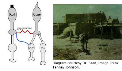 A small synaptic bridge between the active rods and the inactive cones touches off the blue receptors in the cones, kind of like an insomniac turning over in bed and rousing his sleeping spouse.
This influence of rod activity on the adjacent cones tricks the brain into thinking we’re seeing blue colored light, even though we’re really not.
As the authors put it: “We hypothesize that the rod cells predominantly synapse onto the S-cone (cone cells sensitive to bluish light) circuitry resulting in the visual cortex perceiving a tinge of blue.”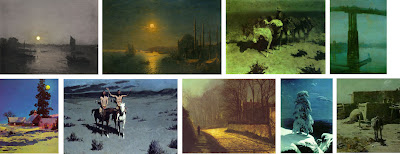
So moonlight isn’t blue; our eyes are just playing tricks on us.
Unfortunately, this tantalyzing hypothesis remains untested. I contacted Dr. Khan and he told me that because of other projects he hasn’t had time to prove the hypothesis in controlled conditions. I hope that he can shed more light—of whatever color—on this elusive topic.
Until then, moonlight remains a mystery at the meeting point of art and science.
Further reading:
- Khan and Pattanaik’s summary article in Journal of Vision, 2004. Link.
- Related discussion on the NASA web site. Link
- "The Eye and Night Vision," from American Optometric Association. Link.
- More on Remington’s nocturnes at David Apatoff's blog. Link
Blog: Gurney Journey (Login to Add to MyJacketFlap)
JacketFlap tags: Color, Plein Air Painting, Lighting, Add a tag
Here are two plein-air paintings I made during of the last hour of the same day, as the sun was setting over the Hudson River. I painted them about 15 minutes apart. In the second painting, on the right, the sun was sinking into a bank of clouds. The air was full of haze and mist, which reduced the intensity of the sun, allowing me to look safely directly towards it.
Photographers call this time of day the golden hour, or magic hour. The sun is so low in the sky that its light travels almost parallel to the surface of the earth. Or to put it more another way, the rays of light are intersecting the sphere of the earth on a line of tangent, like a needle pushed into an orange peel at a very shallow angle. Sunlight travels through much more atmosphere at this angle than when it’s coming steeply down to earth at noontime. Because of this greater distance traveled through the air, more bluish wavelengths are scattered out of each parcel of light. This makes the sky above a richer blue. The remaining sunlight is weaker in overall brightness, and more orange or red in color.
In the sky itself, there’s a noticeable progression of color from the blue above to the soft yellows and dull reds near the horizon.![]()
If you face away from the sun, the sunlight shines on forms with a golden color, and the shadows are relatively bluish. In this painting from Dinotopia: First Flight (1999), I chose to light the scene with this warm golden hour light. The bottom half of the forms are beginning to be covered with a soft-edged cast shadow. Note that light hitting the top of the clouds behind the figures remains relatively white compared to the light that’s closer to the ground.
In fact whenever there are several layers of clouds at various altitudes, the higher clouds are always whiter because the light touching them has traveled through less atmosphere and therefore has had less blue light removed from it. I painted these plein air sketches after the sun had set. But it’s still during that golden hour. If you face toward the spot where the sun set, there’s a bold red-orange glow in the sky. The ground below is dark and cool.
Here’s where a painter can beat the camera. Our eyes can see so much more color than the camera can see because they can accommodate to huge range of brilliance.
Gradually a grey layer rises up from the horizon opposite from the sun. This is the plane of the cast shadow of the earth itself.
When you’re painting golden hour colors from life, it helps to premix the colors before the moment arrives, anticipating the effect you want to capture. Then, as the light fades, you can work almost from memory as you look at the darkening colors on your palette. Or you can use a little fluorescent flashlight to illuminate your work area. Eventually the warm colors drain out of the sky entirely. Sometimes a soft violet glow is all that remains. At this point of dusk, artificial lights begin to stand out, like these streetlights in the small town of Corofin in Ireland. From the doorway of a little pub behind me, the sound of accordion and fiddle was just starting up for the night.
During the first hour of morning, these color progressions are reversed.
I'm usually sleeping in, but the early riser is lucky enough to behold what Wordsworth called the “vision splendid” before the colors “fade into the light of common day.”
Blog: Gurney Journey (Login to Add to MyJacketFlap)
JacketFlap tags: Plein Air Painting, Lighting, Add a tag
Yesterday we looked at how the French academic masters used overcast light to orchestrate complex scenes. Those artists are a tough act to follow, but I thought you might like to see how I’ve tried to put these lessons to work in my own paintings.
To get the hang of it, I’ve done some plein air sketches in overcast weather. An example is White Church, which I showed in an earlier post.Here’s an 8x12 inch sketch I did at a boatyard with the overcast sky just beginning to break up. I love painting in this light because it doesn’t change much, even in four or five hours. This is not the case with direct sunlight, where in the span of two hours the light completely changes.
 When it came to inventing a complicated fantasy panorama like Dinosaur Parade, (1989, detail above) I used overcast light. I was also influenced by Sir Lawrence Alma-Tadema, who loved to set his scenes in indirect light, (in his case, usually open shade).
I used it again on Dinosaur Boulevard, shown in a detail below. Link for full composition. This light made it easier to show the patterns of the costumes and to render most of their forms close to their true local colors. I put a lot of haze in the air to push back the background planes.
In art school you don’t often get a chance to paint overcast light conditions because there’s no way to simulate it perfectly indoors. A very large north-facing window comes close, but studio north light is still quite directional compared to actual overcast light. Even a bank of fluorescent fixtures across the ceiling doesn’t match it exactly because the light needs to be coming equally and evenly from above.
Lighting experts in the CGI animation field told me recently that overcast light is one of the hardest light conditions to simulate on the computer because it involves such a vast number of mathematical calculations.
P.S. Thanks to Grant Butler of the Oregonian for naming Dinotopia “one of the 10 great moments in dinosaur pop culture.” Link.
Blog: Gurney Journey (Login to Add to MyJacketFlap)
JacketFlap tags: Academic Painters, Lighting, Add a tag
When a thin veil of clouds covers the sky, sunlight is diffused and indirect.
The sky appears light grey or white. It gives a soft overall illumination that lightens all the upward-facing planes. As planes face progressively downward, they get darker. But there’s no sharp demarcation between light and shadow, and there aren’t any definite cast shadows.
Overcast light is ideal for complicated outdoor scenes. It was a favorite with the French academic painters, like Edouard Detaille (1847-1912), above. One of its virtues is that it allows you to paint forms in their true local color with a minimum of modeling (description of form using light and dark values).
Ernest Meissonier (1815-1891) was a leading academic painter who frequently made use of this kind of light. With overcast light his picture is simpler than it would have been with direct sunlight.
For example, here’s a painting by Meissonier in the full sunlight. You can see how the shapes of the cast shadows become new elements that he has to manage in the composition.
Technically speaking, this painting by Meissonier is set in open shade—note the sunny window on the other side of the house—but it’s the same basic effect as overcast light.
I believe Meissonier was a huge inspiration for Howard Pyle (above). Meissonier was the artist that every history painter was talking about during Pyle’s formative years, but he’s still in eclipse among most American art historians, unfortunately.
Pascal-Adolphe-Jean Dagnan-Bouveret (1852-1929) used overcast light to beautiful effect in this painting of Breton women. The light allowed him to reduce modeling. The white headdresses appear as simple silhouettes first.
Dagnan-Bouveret used shape welding in both the light and dark areas to unify the tonal masses even further. Painting a scene with nine major figures and still keeping it simple is very, very difficult to do.
You can survey more work by these artists, some in very large files, at the website artrenewal.org. Links to: Detaille, Meissonier, Pyle, Dagnan-Bouveret.
Tomorrow: Overcast light in plein-air and fantasy.
Blog: Gurney Journey (Login to Add to MyJacketFlap)
JacketFlap tags: Watercolor Painting, Lighting, Add a tag
Here’s a study from life of a giant albino bullfrog from an aquarium. The creature was the size of a plucked chicken, and about the same color. He held still for twenty minutes while I did this study. I drew him in pencil on gray mat board, and then laid a milky wash of opaque watercolor over his whole body, saving the brightest whites for the accents and highlights. When the overall light wash was dry, I added the dark accents in pencil. These include the pupil of the eye and the places where forms push together in the folds and wrinkles.
Lighting specialists in the 3-D CG animation field call these dark places “occlusion shadows.” Wherever two forms touch each other, or a form touches a floor, a dark line or accent results. You can see the effect by pressing your fingers together and looking at the little dark line where they touch. Not much light makes it to that point of contact. You’ll also notice it gets darker in the inside corner of a room where the walls meet.
Computer lighting programs don’t create this dark accent automatically. Until recently it had to be added by hand. But software pioneers have recently made lighting tools that can anticipate when the light will be occluded and such an accent will appear.
As a traditional oil painter, I'm fascinated by such new terminology and visual analysis developed my brother artists in the CG arena. I wonder if one of you who is familiar with 3-D CG lighting might be willing to comment on the challenges presented by occlusion shadows.
Blog: Gurney Journey (Login to Add to MyJacketFlap)
JacketFlap tags: Dinosaurs, Journey to Chandara, Lighting, Add a tag
One of the most common mistakes in painting dinosaurs is to make the skin texture equally prominent throughout the form.
In digital work, the appearance of overall equal texture can happen when a bumpy 2-D pattern is mapped equally over a form. The texture appears in the shadow essentially the same as it does in the light, but in a reduced value or tone. Traditional painters are tempted to do the same. That way of doing texture doesn’t look real because it’s not how the eye sees it.
In fact, the textural relief is not equally apparent in the light and shadow. Texture is very difficult to see at all in the shadow region, and it’s only slightly more visible in the fully lit areas.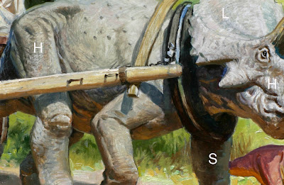 The place to see texture is in the halflight.
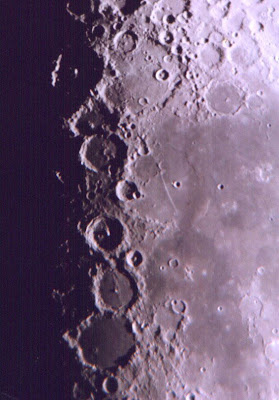 The halflight is sometimes called the halftone or demi-teinte. This is the area where the form transitions from light into shadow. Astronomers looking at photos of the moon call this region the terminator. It’s the area where the raking light brings out the detail of the craters.
On this photo of a dinosaur model, I’ve marked the fully-lit areas with an L, the shadow with an S, and the halflight with an H.
Here’s another detail of a painting from Journey to Chandara, showing the halflight in comparison to the light and shadow. Note that the texture in the reflected light (RL) should also be downplayed compared to the halflight. With traditional opaque painting media, you can suggest halflight texture by dragging pigments over bumpy impastos, or in this case, canvas texture.
In more transparent media you can suggest halflight texture with a drybrush handling. This painting was also done in oil, but the paint is used more thinly.
Blog: Gurney Journey (Login to Add to MyJacketFlap)
JacketFlap tags: Journey to Chandara, Miniatures, Lighting, Add a tag
This painting from the Dinotopia: Journey to Chandara shows Will Denison flying through the mists of Waterfall City on his giant pterosaur Cirrus. I wanted to give the painting a feeling of lightness and airiness, so I stuck to pale tones in the distance, and a warm palette of color overall. It’s another example of the weird principle of reverse atmospheric perspective brought on by edge lighting in a moisture laden environment.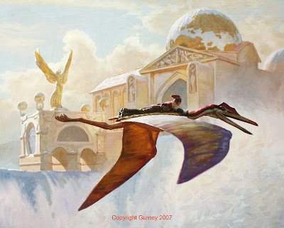
To figure out how the edge lighting would appear on the architecture and the flying figures, I put my maquettes to work in real sunlight. Here’s a little model of Will flying on Cirrus that I've used many times before. The pterosaur model is made from a variety of materials: Sculpey, wood, pipe cleaners, and cardboard. It has poseable wings, which are made from a pair of old stockings that have been painted with latex to give them a membranous surface.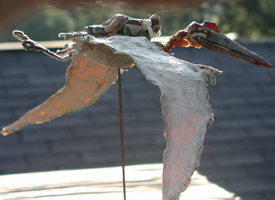
With the model set up in the real sunlight you can see clearly how the top side of the near wing picks up the cool of the sky, while the far wing is warm from the transmitted light shining through it.
Blog: Gurney Journey (Login to Add to MyJacketFlap)
JacketFlap tags: Portraits, Lighting, Add a tag
A couple of posts ago the topic was lighting equipment and the basic relationship of the two basic sources of light: key and fill. The third light source, entirely optional, comes from behind.
Often called an edge light, it lights up the fringes of the form, separating it from the background. It’s also called a “rim” or “kicker” in the TV business, and it usually requires a source that’s stronger than either of the others. The form has more snap if the edge light doesn’t overlap too much with the key light, leaving the dark turning of the form (sometimes called the “core” or the “hump” of the shadow) intact.
This oil study from the model has the key and rim lights placed just far enough apart so that you can see the core of the shadow on the forehead.
If you want to introduce an edge light source, it should be a different color from the key. By applying contrasting gels to the key and edge lights, you can generate some interesting effects with skin tones. On this portrait I used a warm key light and a cool edge light.
On a future post I’ll suggest some painting methods to make it possible to do these quick oil studies in the standard 20 or 30 minute poses that you get in most sketch groups.
Blog: Gurney Journey (Login to Add to MyJacketFlap)
JacketFlap tags: Lighting, Portraits, Add a tag
Before there was light, utter darkness moved upon the face of the world.
That might sound sort of biblical, but it’s the best way to think about lighting. Everything starts out as black as night until the light comes into the scene.
It’s easy enough to see how the main light source illuminates the form. But it would be a mistake to think of the shadow side as the absence of light. There’s light filling the shadow, too, but it’s just another kind of light from a weaker source.Here’s an example. I’m posing here with a turban as a reference for a painting of Arthur Denison on page 119 of Dinotopia: Journey to Chandara. The main light, from the baby spot, is coming from above and to the right. The shadow side is getting weak, cool light coming from the skylight and the north window at left. The shadow side of the form wouldn’t be anywhere near black unless I was in a windowless room with black velvet wallpaper.
 Here’s an oil study of a model lit from a low light coming from the left. Photographers call this main light the “key” light. The shadow is getting greenish light bouncing back from a cloth that was behind the model. This light that enters the shadow is called the “fill” light. In TV and movie lighting, a second, weaker electric light usually provides the fill light. But most often we painters use natural reflected light for the fill.
 This head in profile has the key light coming from the left, shining directly in the face of the model. The fill light is much weaker, making an extreme “lighting ratio” of key to fill light. The greater the ratio, the more low-key or dramatic the form will appear.
Note that I placed the light in the direction of the subject’s gaze. I think we all have a basic instinct to look toward the light of a window or a doorway, and to me it is satisfying in some deep way to look at a face that is oriented toward the light. Next time you’re sitting absent-mindedly in a dark room, take note of the fact that you instinctively rest your gaze on the lightest area of the scene.  On this half-hour oil sketch from life, I used the baby spot with an orange gel for the key light coming from the right. I set up a second fill light with a contrasting blue-green gel. The brightness of the fill light almost equals the key light, leading to a close or “high key” lighting ratio. It looks unnatural and weird simply because such a relationship could not happen under natural conditions.
Only a few places on the face are not touched by either the key or fill lights: the side of the nose, the edge of the eye, the lower cheek, and the neck. As a result those areas are quite a bit darker.
Check back in a couple of days for the last in the studio lighting series: edge lighting.
Blog: Gurney Journey (Login to Add to MyJacketFlap)
JacketFlap tags: Portraits, Painting Gear, Lighting, Add a tag
When you’re setting up a model to paint from life, it helps to use a strong light source, placed well away from the model. If the light is set too close, you get a variation in light intensity: a hotspot on the top half of the figure, and the feet lit dimly from a different angle. Painting is hard enough! We don’t need obstacles like that.
The standard clamp-on reflector lights from the hardware store don’t cut it. Their light is just too weak. But they’re used all the time, even in art schools, which should know better.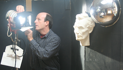
It’s well worth investing in a professional light designed for use on the stage or movie set. Here’s a Mole Richardson Baby spotlight, a good solid workhorse for a small to medium-sized studio. It attaches to an adjustable tripod that lets you lift the light up to 14 feet in the air.
It will easily take a 600 watt bulb (about $30 each), which shines through a fresnel lens. If you want a lower intensity, you can use a smaller bulb. You can place the baby spot 20 feet away from a model and twirl a knob to zoom in the light just where you want it.
The baby spot also has adjustable “barn doors” to control how much light spills to the sides, and a rack for hanging the plastic gels or color filters in front of the light. The gels are made to withstand heat, but with a really hot light, you might want to clip the gels to the barn doors, farther from the heat of the bulb. In the photo I’m putting a blue gel in the rack.
It’s shining on a plaster cast of Abe Lincoln and a plastic chrome hemisphere. I mentioned the mirror ball on a previous post. It’s useful for recording the source and character of the light influences in a given scene.
Art supply catalogs don’t usually carry these lights, instead stocking wimpier equipment that isn’t worth investing in. I don’t want to sound like I’m giving anyone a commercial plug, so I’ll leave it to you to hunt down sources and brands. Try googling “stage or theater lighting supply” or search Ebay. The retail stores also sell C-stands, mentioned in an earlier post.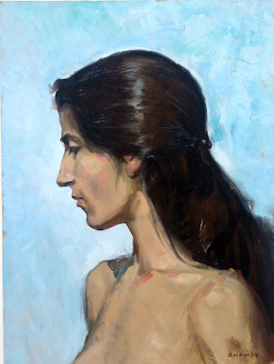
This 30-minute oil study of a model was painted using the baby spot set right up behind and above me for a fairly simple frontal lighting.
In tomorrow's post, (Studio Lighting II: Key, Fill and Edge) we'll take a look at strategies for placing the lights.
Blog: Gurney Journey (Login to Add to MyJacketFlap)
JacketFlap tags: Journey to Chandara, Academic Painters, Lighting, Add a tag
Contre-jour lighting is a type of backlighting where you place the subject right in front of a bright, sunny sky. In French the phrase literally means “against the day,” a poetic way to express this mysterious and powerful effect.
The term is still in common use among photographers. But cameras can’t deliver this effect as powerfully as painters can, because cameras are unable to respond to a wide enough range of intensities, and the silhouettes tend to go to black.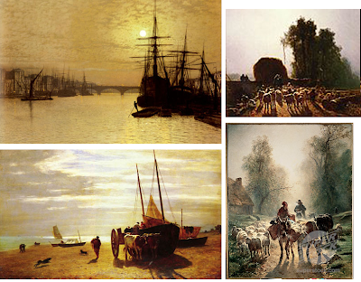 Artists of the 19th Century did wonders with contre jour. You’ll find it with Royal Academicians like Atkinson Grimshaw (upper left), Barbizon painters like Constant Troyon (the other images here), and American landscapists like Frederick Church.
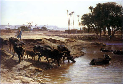
Troyon’s student Leon Belly used this effect to capture a feeling of dazzling, intoxicating illumination in several of his Orientalist paintings, like this one of water buffalo in a desert oasis. I learned about contre-jour lighting from art historian Kristian Davies, who discusses it in his brilliant book The Orientalists (Laynfaroh, 2005).
When a form is placed contre-jour, it goes into silhouette. The colors weaken. Shadows stretch forward. Details disappear as the glare of the light spills over the edges of the form. The sun itself often shines from inside the frame of the picture, making the viewer’s eyes squint involuntarily.
I’ve been fascinated by the idea of contre-jour since starting work on Dinotopia: Journey to Chandara, and it crops up in quite a few of the paintings in the new book, like the one above, where Arthur and Bix are approaching the Imperial Palace.
Today I visit Rhode Island School of Design. Stay tuned in a couple of days for the report.
Blog: Gurney Journey (Login to Add to MyJacketFlap)
JacketFlap tags: Lighting, Plein Air Painting, Add a tag
When sunlight travels through a semi-transparent material, the light becomes richly colored. Light that just bounces off the surface is fairly dull by comparison.
This “stained-glass-window effect" is called transmitted light, and you often see it when the sun shines through the green or yellow leaves of a tree. You might also see transmitted light when the sun backlights colored balloons, a sailboat’s spinnaker, or a translucent nylon awning. This on-the-spot oil painting of a skunk cabbage plant is a study of transmitted light. The bright yellow-green area is much more intense than the other greens.
Here’s the picture again, with numbers superimposed in each area of the foliage to analyze what’s going on with the light and color:
1. Transmitted light, with intense chroma or saturation in the yellow-green range.
2. The leaf in shadow, facing downward. This is the darkest green, and would be even darker if it wasn't picking up reflected light from the adjacent leaf seen edge-on.
3. The leaf in shadow, facing upward. These ‘up-facing planes’ are blue-green, because they are picking up the blue light from the sky.
4. Sunlight reflecting off the top surface of the leaf. This is the highest tone or value, and the most textural, especially where it transitions to shadow. But the chroma is not very intense, because most of the light bounces off the waxy cuticle of the leaf.
When you are painting a faraway tree backlit by sunlight, it’s good to keep in mind these four conditions: transmitted, downfacing shadow, upfacing shadow and sunlit. These colors, visible in the skunk cabbage up close on a micro scale, are present here, too, mixed together like tiny pixels even if you can’t really see the component leaves.
The distant foliage is a composite of all four color elements, blended with the atmospheric effects. As you can see in this faraway view of autumn maples, there are more leaves shining with transmitted light at the lower left margin of the tree. The leaves in the central area are darker and duller because they’re lit by the cool skylight.


There's something strange about the first painting.
Something I learned in optica class : our eyes tend to 'white-balance' themselves.
This means that during the 'twilight hour' grey clouds will appear blueish under yellowish street light.
This is because the yellow street light is our 'reference' neutral colour, and thus everything 'to the left' of this center will appear blue : including grey.
Sorry, this probably isn't clear enough, but I guess this is a topic by itself.
Rule of thumb is that a landscape background tends to have a complementary coloured cast in respect to the artificial lighting of the foreground.
But the first painting doesn't comply. The sky is still grey. It should be blue-green (compl. of orange).
Why is it still grey ?
The street lights in those days weren't bright enough to 'dominate' a scene, and also, daylight was still too bright at the given hour of the painting.
So the 'grey light' remained dominant and thus also the 'neutral center'.
The painting shows a special moment within the twilight-hour, that we hardly ever get to see nowadays with those strong dominating streetlights.
Hey, you can test this yourself on a grey evening. Look outside through the window. Once the grey sky appears blue, turn of the lights in the room (hopefully there's not too much street light) and you will see the clouds turn grey again after a dozen seconds.
Put on the light again, look a bit around the room first to adjust and the grey clouds turns to blue again.
I just love the twilight hour !
Soory to be spamming with even a second post after such a long one, but I got scared after the first post.
I'm slightly colour-blind, so maybe I got the first painting all wrong !
I checked with the color picker tool in Photoshop.
Phewww...I was right : street light is orange, very red-ish orange actually.
And the background is indeed grey BUT...(and reason for this second post) :
It DOES have a blue-green cast, but only so slightly that it's hardly noticable (for me at least).
Great points, Erik. That Cortes really is grey, and a bit atypical for him, maybe because he was trying to evoke rainy weather. You're absolutely right about the dimness of real lamplight and the white balance of the eye. The same grey sky would look red violet the moment you leave a room lit by fluorescent.
In fact you anticipated a future post that I was planning about my theory for the intense "Maxfield Parrish blue." It's the color you see outdoors at dusk for about two minutes after you leave a room lit by incandescent light. Both Parrish and Cortes grew up in the lamplight era and conveyed a nostalgia for it into the electric age.
Illumination other than sunlight is a fascinating topic. Of special interest to me is night painting; I just finished writing an article for The Artist's Magazine on painting the nocturne en plein air. (It'll be out in October, I think.)
One key element you mention that I had forgotten is that mixing light is different from mixing pigment. (Mixing pigment color is a subtractive process; mixing light color is additive.) It's not such an issue when you're painting under moonlight and that's your only source of illumination, but it can be critical when you have different types of illumination shining on an object, as you mention. This is where painting from life helps; you'll observe that a red light and a green light will make yellow rather than a (theoretically) neutral grey.
Thanks, Michael,
I can't wait to read your article in Artist's Magazine.
Everyone should also check out the blog of Craig Stephens, who just posted a new streetlight nocturne at craigstephens.blogspot.com/