new posts in all blogs
Viewing Blog: Gurney Journey, Most Recent at Top
Results 1 - 25 of 3,392
.jpg)
Creator of "Dinotopia"!
This daily weblog by James Gurney is for illustrators, comic artists, plein-air painters, sketchers, animators, art students, and writers.
Statistics for Gurney Journey
Number of Readers that added this blog to their MyJacketFlap: 31
What is represented by these black and white compositions?
Perhaps it would be easier if we rotated the images 180 degrees:
It doesn't take much information for our visual system to be able to recognize a face.
We're hardwired to find faces in patterns of information. Even if the information is highly degraded, the face emerges. However, our performance drops off considerably with inverted faces.
At the moment we recognize the face, the facial recognition areas in our brain become active.
That moment of recognition is called perceptual closure by Craig Mooney, who developed this test for his research on perception.
----
Read more

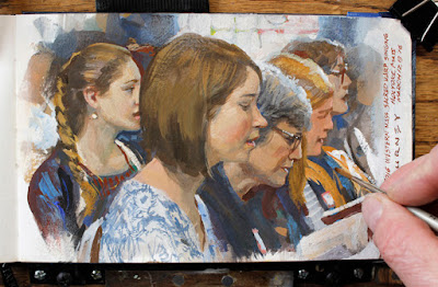
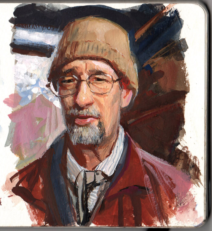
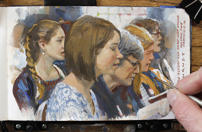
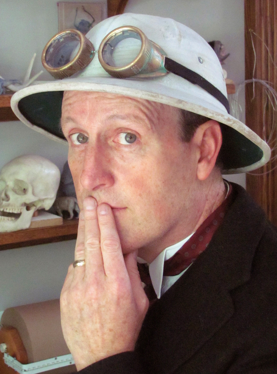
On Monday the 13th I'll be releasing a new video about painting portraits in the wild. This isn't your usual studio portrait demo. It's about people who are
not posing.
Painting portraits from life takes on a new intensity when your subjects are talking and moving around in their natural environment.
In this unique video workshop, I'll bring you along as I paint people in four dynamic situations: fairgoers in a lunch line, a historical re-enactor at an outdoor museum, a farmer in a barn, and a gathering of Sacred Harp singers.
 |
Scott Corey, historical interpreter at Sturbridge Village
Gouache, 5 x 5 inches. |
I'll use a variety of media: colored pencils, watercolor, gouache, casein, and oil. Each image develops from the first sketch to the final painting, with closeups of palette and brushstrokes juxtaposed with shots of the moving model.
 |
| Sacred Harp Convention, casein |
You’ll hear and see the subjects talking and singing, alternating with my voiceover explaining what I'm thinking at each stage. I paint this group portrait from the sidelines of a singing convention, as the subjects move around and change seats.
At various points in the video, people get up and move, or I screw up, and I show how I fix it.
Advance Praise for Portraits in the Wild“With words and paint Jim Gurney demonstrates the joy of sketching and painting people from life. A must view for all artists!”—
Everett Raymond Kinstler, N.A., AWS“Portraits in The Wild is a supremely inspiring video to watch and an invitation to all aspiring artists to venture out and give it a go no matter where you are in your creative journey.”—
Garin Baker, Carriage House Art Studios"The thing that truly impresses however, is that the viewer can apply these techniques to any medium. Clearly, James has his own style, but these videos help to impart basics on HOW to approach these subjects. This is especially important with painting people in public, since painting people is difficult even for the best of us." —
Michael Mrak, Design Director, Scientific American "Aside from his step by step demonstrations, Jim teaches as much by his calmness and humor in the face of artistic challenges as he does with technical information. His special emphasis is to return again and again to clear artistic thinking amid the chaos of the passing parade; the timeless fundamentals of gesture, value, drawing and suggestion."�
Kev Ferrara,
artist of Dead Rider-----
66 minutes running time. It will be available in two forms:
Download (1080p HD widescreen MP4 video, 2.1G) $14.95.
DVD (includes narrated slide show of more examples) $24.50
Tune into Facebook Live on Monday the 13th at noon EST for a live demo with prizes and discounts. 
.jpg?picon=1009)
By: James Gurney,
on 6/7/2016
Blog:
Gurney Journey
(
Login to Add to MyJacketFlap)
JacketFlap tags:
Add a tag
In this short video, paleo sculptor Gary Staab documents all the steps required to a life-size bronze mammoth (
Link to YouTube). The piece was commissioned by the Omaha Zoo.
Gary Staab's
website explains the steps involved in his sculpture of a super croc.

I just reached an important milestone: 30K followers on Instagram and YouTube at around the same time. To thank everyone—for following, commenting, and sharing, I made this little video (Link to video YouTube).
JamesGurneyArt on Instagram
GurneyJourney YouTube Channel

The
theme for the exhibition this summer is American Impressionism, so I thought I'd choose a favorite subject of garden painters, the rose. They're in peak abundance at the moment. I set up next to a variety called "Carefree Beauty."
 |
| Shrub Roses (plus spent alliums), casein 8x10 inches |
I wanted to be close enough to see the structure of individual flowers and leaves, but far enough back to allow them to group into masses. I chose casein because it allows for brisk and direct handling with plenty of opacity and quick drying time.

By: James Gurney,
on 6/4/2016
Blog:
Gurney Journey
(
Login to Add to MyJacketFlap)
JacketFlap tags:
Add a tag
A few weeks ago, I did an interview for an online article, but the author didn't publish the interview—just used it for background, so here it is
1) Tell me a little about your creative process. Once inspiration hits, how do you approach the panel/canvas? In other words, do you always start a piece the same way even if the source of inspiration is different? How do you know when a piece is completed; is it that sense of fulfillment or that a particular experience/idea is re-achieved? I don't always start the same way, but let me give you the overview of my typical creative process for an imaginative painting. I start with small thumbnail sketches in pencil, pen, or watercolor. If it’s an architectural subject or a dinosaur, I’ll often build a little maquette to establish shadows and angles. Sometimes I’ll do a small color study or comprehensive sketch.
If the painting requires scientific or historical accuracy, I consult with experts at every stage of the process and incorporate their suggestions. After all these studies, I work up the line drawing—and sometimes a full charcoal drawing—and finally begin the final painting.
The final painting is usually in oil, and may take anywhere from a couple days to a month to complete, depending on complexity. If I do my planning right, the finish won’t take very long, and I won’t have to change or rework any areas. But paintings don’t always go according to plan, and they almost never live up to my purest vision of the scene.
2) Could you dive into the process of a specific work that will be featured in the article? Perhaps you could recall when/where/how you were moved to create it and the process involved in its realization?(Image: Waterfall City: Afternoon Light) Waterfall City is a combination of two places that always fascinated me: Niagara Falls and Venice. It's a place at the center of my imagined world of Dinotopia, the island where humans and dinosaurs coexist. The creation of the original painting predated the conception of Dinotopia, and my earlier career set the stage for it.
I began my professional art career painting animation backgrounds, paperback covers, and National Geographic illustrations. I had only vague inklings of lost worlds and utopias and epic stories. Looking back, I suppose that illustration work was an ideal training ground for the kind of visual world I was trying to develop, because I was called upon to paint all sorts of subjects: dinosaurs, ancient cities, space ships, aliens and mermaids. I particularly enjoyed painting scenes from archaeology and paleontology that were accountable to the truth of fact. My specialty became painting realistic images of scenes that can’t be photographed.
I traveled to Jerusalem, Athens, and Rome on assignment for National Geographic. It was a huge inspiration to see those famous old cities. I spent time with Rick Bronson, an archaeologist who was just like Indiana Jones. He led me through overgrown jungles to find little known Etruscan ruins, and we descended down ladders into newly-discovered tombs. Sitting around the campfire at night, Dr. Bronson and I would talk about dreams of discovering a lost city along the lines of Machu Picchu or Troy. I realized that I could always make a painting of such a lost city, and that led to painting Waterfall City, an image that took me several months to complete.
3) There are, obviously, infinite ways in which the body can express different ideas, narratives, and feelings. Can you talk about your attraction to figurative work what it means to you and your art? Perhaps you could extend this discussion to your plein-air / imaginative realism?I don't think in terms of painting bodies or figures or heads, but rather people. I’m usually motivated to capture a specific character or individual. This is important to me because I think art students often get stuck thinking of people in generic or anonymous terms. When that happens, they miss out on the chance to animate their subjects with living souls.
Not that I do that every time, but it’s what I’m trying for. If I'm painting a portrait from life, I'm usually talking to the person to try to understand how they tick in addition to how they look. I'll be documenting that process in a new video called "Portraits in the Wild."
If I'm creating a work of imagination like Dinotopia, I enlist models to act out the characters. Usually my models are friends or neighbors, but I have hired professionals. I’m trying to imagine a certain person doing something for a particular reason. I either take photos or do tone paper sketches of the models. I have a large mirror mounted in the studio and often draw myself posing in costume to get the basic action.
4) What are your primary goals in art making? What do you hope your audiences take away from your paintings? If I’m doing paleoart, my goal is to create a bridge to a forgotten world, to be an eyewitness to life that has long since vanished. Paleoart is wildlife art for the time traveler.
I’ve always been interested in creating an alternate universe that my readers can travel to during those moments of daydreaming during the day. I’m not conscious about morals or hidden messages; I simply enjoy telling a good old adventure story.
Another big goal for me is capturing the world in my personal sketchbooks and location painting. It’s the flip side of my imaginative work. The one side of my art feeds the other.
5) Which artists, historical or contemporary, have influenced you the most and why? Is it purely conceptual or aesthetic? Both?When I was a student, I read everything I could find about Salon and Royal Academy artists like Alma Tadema, Bouguereau, and Gerome. As much as I love those guys, I also adore painterly realists like Repin, Kroyer, Sorolla, and Zorn. From a young age I recognized that all these artists were part of a tradition that continued unbroken through the Golden Age illustrators, particularly in the work of Rockwell, Cornwell, and Lovell. I pored over editions of the Famous Artist’s Course from the 1950s, where great story illustrators shared the secrets of their craft. I also read avidly about the life in the ateliers, particularly the Prix de Rome images and the history paintings. I was very curious how they painted such lifelike scenes from their imaginations.
Lately I’ve been extremely inspired by the the drawings and the gouaches of Adolph Menzel, and I edited a book of his work that will be released later this year from Dover Publications.
The appeal of all those artists is more basic that just being just conceptual or symbolic. It’s a very deep response to sensual life that pulses through the work of all these artists.
6) Talk to me about your surfaces. How important is the surface to your art? Why or why not?I work on everything from watercolor paper to illustration board to canvas. I prime it in a variety of ways. But surface is not a huge preoccupation for me. I’m always trying to pass through the surface. It’s easy to make a painting look like paint. The challenge is to dissolve the surface and see into the depths. If people praise my brushstrokes or my canvas texture, something is wrong with the painting.
7) What has your journey to becoming a successful artist been like? Were you always interested in art? I went to the University of California at Berkeley, but I didn’t take any classes in the art department there. I sought out the archaeology and paleontology professors and asked them if they needed an artist to render artifacts. They let me loose in the vast Kroeber Museum collection. One of the things I was permitted to do for school credit was to render Egyptian scarab carvings for a scientific publication. After participating in an actual archaeological dig, I decided to major in anthropology. I then went on to study drawing and painting at the Art Center College of Design in Pasadena, California, but I soon was hired out for paying work in the movie industry, and that’s where I learned to paint.
As a kid, I liked dinosaurs and ancient civilizations because I knew they were once real, even though I couldn’t see them with my own eyes. Outside my bedroom door was a shelf of old National Geographic magazines dating back to 1915. I would tiptoe into the hallway late at night and read about pilots in biplanes flying over uncharted Incan ruins. After school I would dig excavation pits in my suburban back yard, hoping to find a dinosaur bone or maybe even a lost temple. The neighborhood moms quit letting their kids play at my house because they always came home covered with dirt. Even though I didn’t find much of what I imagined, I made up for it by sculpting it out of clay or drawing it on paper.
I wanted to be an artist, but I was interested in so many other things. I was interested in that place where art intersects science and engineering. I find most scientist are kids at heart, with a sense of wonder and imagination about worlds that they must imagine from scraps of evidence.
8) Finally, where are James and his art in 5 years? How do you see your career and artwork evolving in the future and what are some things you seek to achieve?
I have kept several doors open all through my career: writing, freelance illustration, and books published the traditional way, and I’ll continue to do those. I’ll continue writing for the art magazines and for the art instruction press.
But lately I’ve been doing more self publishing, particularly in the video art instruction category. I have released six DVD / downloads already, with three more in the pipeline. I also have new story worlds that I’m developing, and I expect to continue with my blogging, which I’ve done daily since 2007.

By: James Gurney,
on 6/4/2016
Blog:
Gurney Journey
(
Login to Add to MyJacketFlap)
JacketFlap tags:
Add a tag
His grand
boubou or bubu was a fun costume to sketch. I liked the big pipe folds on the back and the half-lock folks on the right.

By: James Gurney,
on 6/3/2016
Blog:
Gurney Journey
(
Login to Add to MyJacketFlap)
JacketFlap tags:
Animals,
Add a tag
Yesterday I was down at the barn painting a goat and a sheep. It wasn't a sketchbook page this time, but rather full size profiles painted in acrylic on plywood. Luckily I had Sofie to advise me.
The farmer, Lenny, asked me to help him with a farm-to-table display that he's setting up for the
Country Living Fair starting today at the Rhinebeck Fairgrounds.

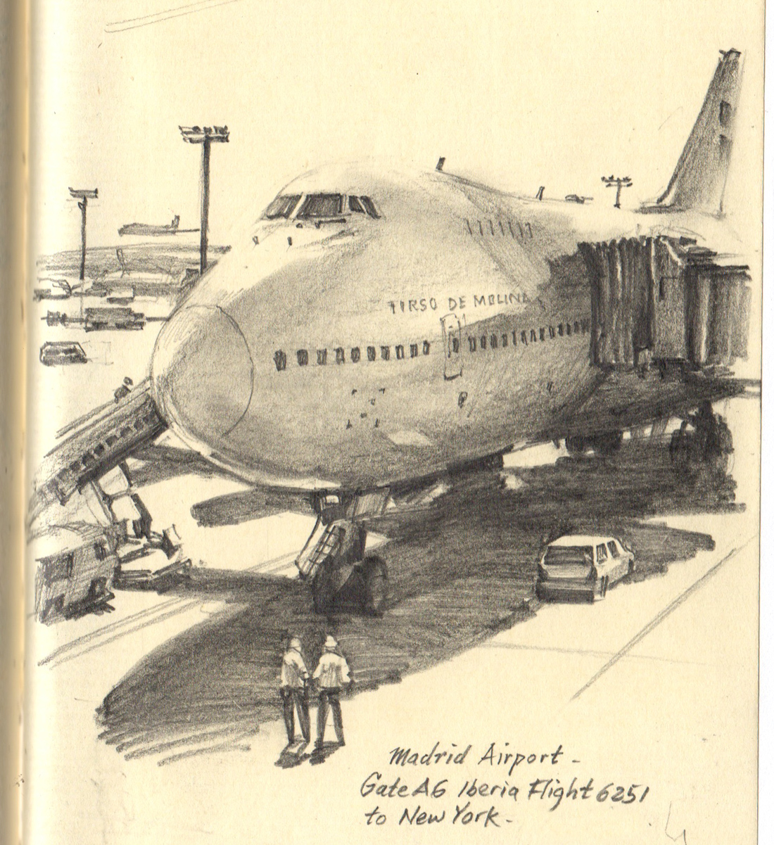
This is a small pencil drawing, only about four by five inches. But I wanted to give it scale, to make the airplane look as big as possible.
What I did was alternate the big shapes (the fuselage and the big shadow shape) with some very small, delicate touches: the windows, poles, railings, and figures. I also left off the contour lines on the top of the airplane's form, letting it blend into the sky.
Scale has nothing to do with the size of the drawing itself. It's all about the contrasts within the drawing.

(Link to YouTube)
Yesterday I painted a plein-air sketch of a flower garden using transparent watercolor. I also added a few touches of colored pencils, white gouache, and chalk.
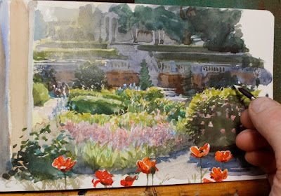
-----
HD tutorial Watercolor in the Wild

By: James Gurney,
on 5/31/2016
Blog:
Gurney Journey
(
Login to Add to MyJacketFlap)
JacketFlap tags:
Add a tag
A couple of the guys that go to the diner are veterans, and they love to talk. I sketch them and write down what I hear.

I shared this sketch a few years ago, but just found some video clips so you can see what the scene looked like. (Link to video) Previous post: A Family Eating Dinner, 1760 style
By: James Gurney,
on 5/29/2016
Blog:
Gurney Journey
(
Login to Add to MyJacketFlap)
JacketFlap tags:
Add a tag
(Link to Video) Barnaby Dixon has come up with a clever new way of articulating a puppet.
Not only can the little fellow dance with his feet and move his arms and head, he can point, grab things, and even scratch his face.
"My philosophy for puppetry is to get the fingers and the hands operating as directly as possible," says Dixon.
The hand articulation is cleverly built, using fine cable articulation, with a spring running inside the cable tube to cut down on friction. Here's another video explaining how the hand mechanism works.
"Symphony of Two Minds" is a short film about CG animation finding its own style amid a variety of influences. (Link to YouTube)
It begins with two cartoon characters eating a meal in an aristocratic dining parlor. They remark on how sophisticated their world is. It is visually sumptuous indeed, with hand-held photographic camera work and richly rendered textures.
But the low-class young man hasn't fully elevated himself from his origins in a hyper 2D anime universe, and he keeps experiencing flashbacks to it.
Director Valere Amirault says: "How do we choose to mix influences when dealing with a medium as new as CG animation? From live action independent movies to Japanese anime, CG animation is still a new form of media trying to find its own style, to differentiate itself from traditional cartoons."
-----
Via Cartoon Brew
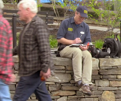
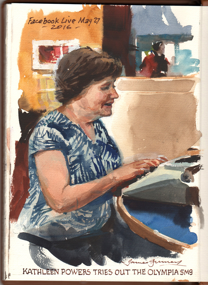
Yesterday Jeanette and I decide to try out an experiment.
It's the day before graduation at Bard College. Students are roaming around campus with their parents. We place the typewriter on a table in the student center, and I arrange the sketch easel.
We hope the typewriter will lure someone to pose for an impromptu portrait. First Cullan, and then his mom, try it out.
We set up the iPad to webcast the action via Facebook Live. The first session has audio issues due to problems with our old iPad (sorry). We switch over to an Android cellphone, and then it works fine. Here's the 16 minute webcast. (Link to video).
I start sketching Jeanette, but abandon the start and turn the page when Kathleen sits down. I lay down a few lines in watercolor pencils, then launch off with brush and watercolor to place the main shapes. With progressively smaller brushes, I place the smaller details.
 |
| Kathleen, watercolor and gouache |
Thanks to everyone who joined the webcast and left a comment. Let me know in the comments what you'd like to see on a future webcast. Thanks to Kathleen, Cullan, and Joe for lending a hand and being such good sports.
-----
My next video tutorial "Portraits in the Wild" comes out June 13. It's full of moments like this.
"Gouache in the Wild" HD MP4
Download at Gumroad
Subscribe and follow and you won't miss a future webcast.
GurneyJourney YouTube channelMy Public Facebook page
GurneyJourney on
PinterestJamesGurney Art on
Instagram@
GurneyJourney on Twitter

By: James Gurney,
on 5/27/2016
Blog:
Gurney Journey
(
Login to Add to MyJacketFlap)
JacketFlap tags:
Add a tag
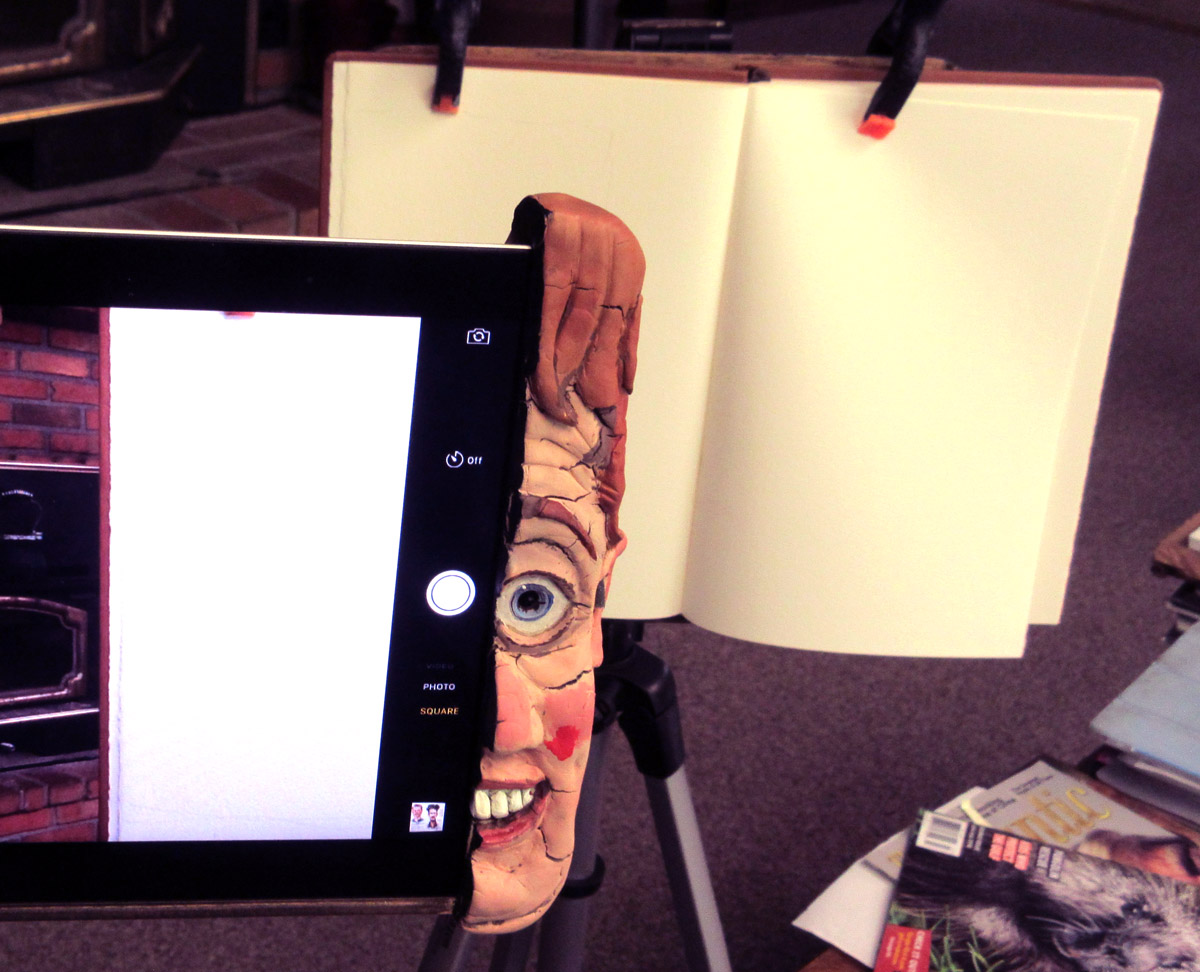
I'm about to do an experimental demo on the new platform Facebook Live at 2:55 EST.
It will be a clash of technologies: iPad meets typewriter meets sketchbook. Tell your friends!

Welcome to the GJ Book Club. Today we'll cover pages 237-242 of the chapter on "Materials," from Harold Speed's 1924 art instruction book Oil Painting Techniques and Materials .
.
I'll present Speed's main points in boldface type either verbatim or paraphrased, followed by my comments. If you want to add a comment, please use the numbered points to refer to the relevant section of the chapter.
In this section of the chapter, Speed discusses the brushes for oil painters.
1. You can use cheaper paints when you're a student, but even if you're poor, you shouldn't skimp on brushes.I totally agree with Speed on this one. He says "A cheap brush is useless from the start and has, luckily, a very short life as they wear very badly. The best brushes last much longer."
2. Cleaning brushes. "Soap and water cleans them most thoroughly and is the best way of cleaning them. But it is a most tedious process after a hard day's work."Here's a previous post on "
How to Clean out a Brush"
3. After washing them out, the brushes "should be lovingly sucked to bring the hairs together." Never heard that one before. One would want to make sure to remove all the lead, cobalt, barium, and cadmium first. Or maybe pass on that idea.
4. "When thoroughly dry they have plenty of spring in them, whereas the slightest dampness gives them a flabbiness."He's talking about bristle brushes here. It's really true. Damp brushes are flabbier.
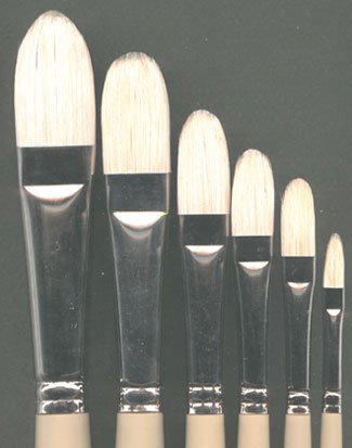
5. Flats and Rounds: Flats are better for "laying a perfectly even tone, but give a nasty thin sharp edge...For figure work and form expression generally, one wants a brush that will lay the paint in even, flat tones without thin sharp edges." He's referring to flat brushes with rounded corners, alternately the modern
filbert
option, which has a flat cross section but a rounded tip. The image above shows a set of
Simmons filberts.
 6. Fashion for soft haired brushes used for flowing strokes (in the 1920s).
Speed notes that some of the inspiration came from studying Frans Hals, who apparently used such brushes. Speed generally prefers stiffer hogs' hair bristles.
7. "Always work with the biggest brush that will do what you want."Then choose the next size bigger. Speed notes that a big flat brush is really several brushes in one, because you can use the corner and the edge for very different strokes.
8. "The brush makers have an absurd habit of making the size of the handle fit the size of the brush, instead of the size of the hand that will have to hold it." He continues, "Very small brushes need a very firm grip to control them as they are only used for very delicate work. And yet they are often given a handle no thicker than a match."
I totally agree, and I've always wondered about this, too. Pencils, pens, knives, and golf clubs have constant sized handles. Why don't brushes?
9. Only German brushes have an indented ring round the metal holder (ferrule) to prevent the tip falling off the handle.Now crimped ferrules are pretty standard even on cheap brushes.
10. Cheap brushes "appear to have been sharpened off to make them a good shape, after being roughly put together; instead of the good shape being the result of a careful placing of the individual hairs."Here's a video about how they make
Escoda brushes
(Link to video)
More on brushes at:
MacPherson Arts / "Brush Basics"
By: James Gurney,
on 5/26/2016
Blog:
Gurney Journey
(
Login to Add to MyJacketFlap)
JacketFlap tags:
Add a tag
(Via BoingBoing) There's some interesting camera work and sound design in this portrait of Hong Kong by filmmaker Brandon Li.
---
If you like this, you'll also like his other film "Tokyo Roar," set against the poem by A.D. Hope.

Here's something in the works for a July release — a Spanish edition of
Imaginative Realism.----
Previously:
Luz y Color, "Color and Light" in Spanish
Three tips for painting twilight streetscapes in opaques (gouache or casein):
1. Bring a battery-operated LED light so you can see what you're doing.
2. When you start, try to anticipate where the scene will be at peak color, and aim for that in your layin.
3. Paint a big yellow area under windows first and then paint the dark areas over them.
----
"Gouache in the Wild" at Gumroad $14.95
GurneyJourney YouTube channel
My Public Facebook page
GurneyJourney on Pinterest
JamesGurney Art on Instagram
@GurneyJourney on Twitter
By: James Gurney,
on 5/24/2016
Blog:
Gurney Journey
(
Login to Add to MyJacketFlap)
JacketFlap tags:
Add a tag
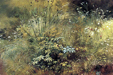
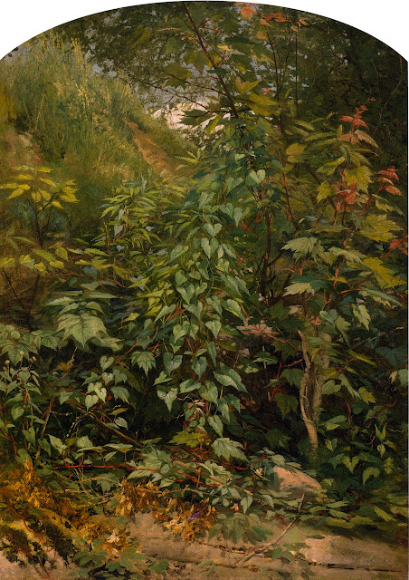
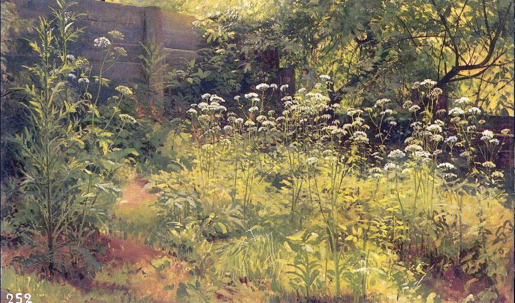
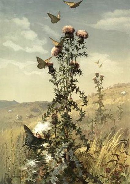
It's time for the next GurneyJourney painting challenge. Let's paint some weeds.
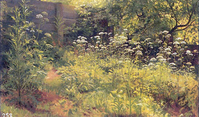 |
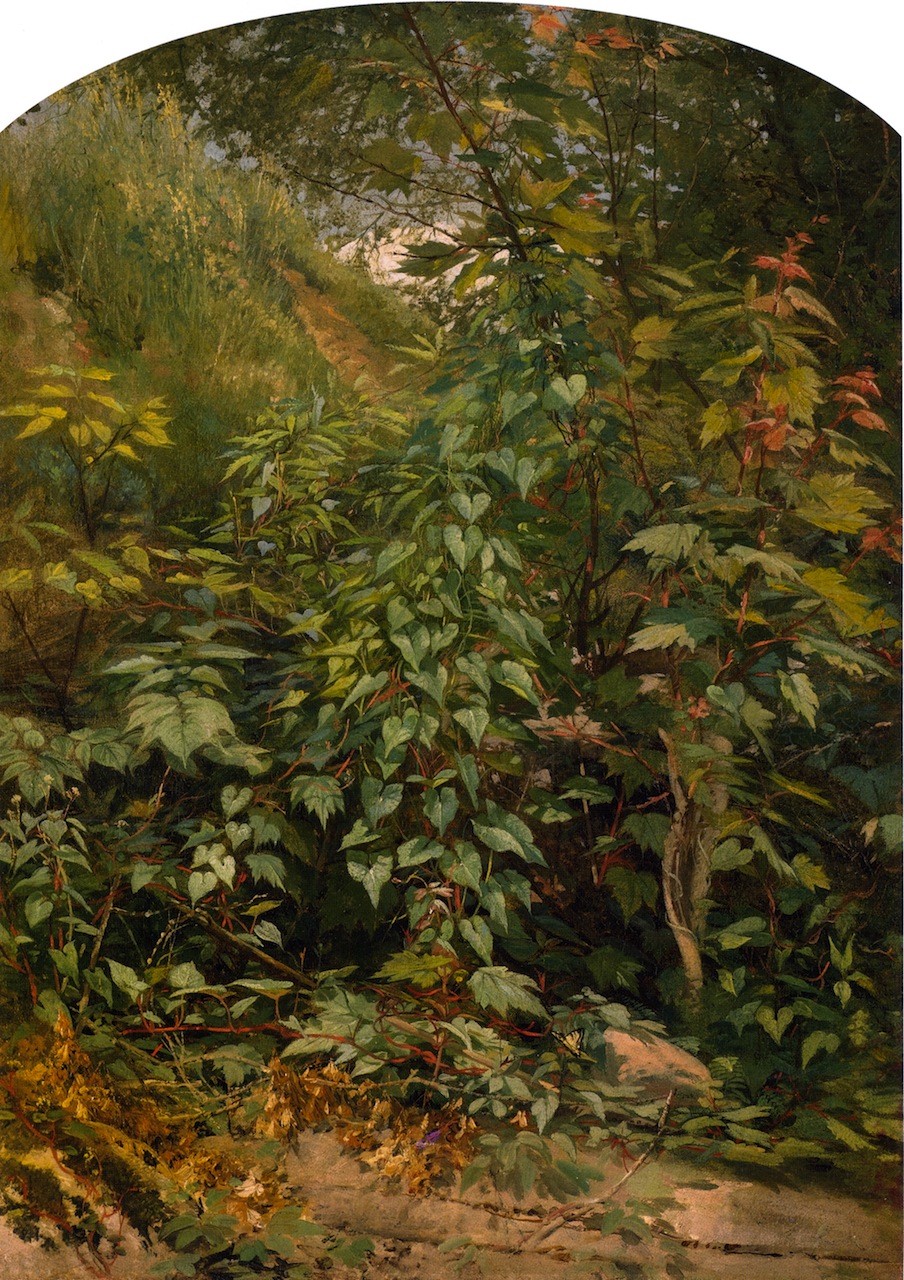
| Ivan Shishkin, Aegopodium, Pargolovo (study) 1884, 35x59 cm |
This time we'll paint some weeds on location. Everyone can upload their examples to
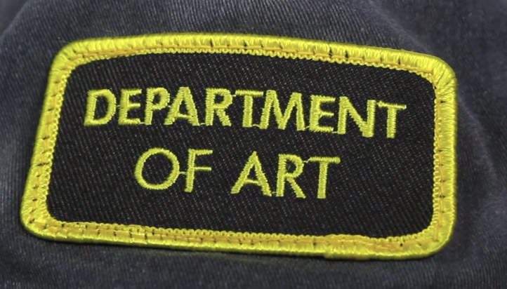
this special Facebook event page. I'll choose a Grand Prize winner and five Finalists. Each receive a coveted "Department of Art" embroidered patch, and the Grand Prize winner will also receive a free tutorial download.
I hesitate to call it a "contest" because there's no entry fee and the spirit is more about cooperation, community, and camaraderie than competition. We're all at different levels of skill and experience, but we're all out there braving the elements and trying out new painting ideas.
 |
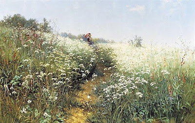
| Ivan Shishkin Grasses |
How do you define a weed?
• By "weed" I mean any naturally growing herbaceous plant. For example: wildflowers, cattails, vines, lily pads, grasses, dandelions, ferns, mushrooms—really any natural plants.
• That excludes anything planted, cultivated, or tended by humans, such as nursery or garden flowers or food crops.
• Nothing too big: no woody plants and no trees.
 |
| Ivan Shishkin A Woman Under an Umbrella |
• Must be painted outdoors with the weeds in situ. The weeds can't be cut and brought indoors or painted from photos.
• The scene can include a landscape background, but the emphasis should be on the foreground with the plant carefully observed, with some botanical detail.
• You can put a piece of white or black board behind a weed if you want to isolate it against a simple flat background. But I'm not looking for botanical studies so much as weeds in natural (or man-made) settings.
• OK to include some trash, insects, signs or other things you find around the weeds.
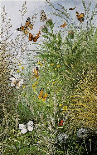 |
William Scott The Butterflies' Haunt--
Dandelion Clocks and Thistles |
What media are OK?
• All painting media accepted, such as oil, watercolor, acrylic, gouache, acryla-gouache, alkyd, casein, or water-soluble colored pencils.
• No limits on palette of colors.
Deadline
• You can enter as soon as you finish the piece, but no later than the deadline: Friday, June 24, 2016 at midnight New York time. Winners will be announced on Sunday, June 26.
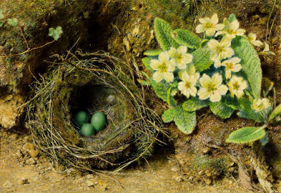 |
| William Henry Hunt Birds Nest and Primroses |
 |
Fidelia Bridges
Thistle in a Field |
Submission Guidelines
• Free to enter
• It must be a new painting done for this challenge. In addition to a scan of the final painting, your entry must include a photo (or video) of your painting in progress in front of the motif.
• Please include somewhere in the title or description the name of the weed, either a common name or Latin name.
• Upload the images to
this Facebook Event Page. If you don't have a Facebook account, please ask a friend with an account to help you. Please include in the FB post a mention of what medium you used, and if you want, a word about your inspiration or design strategy, or an anecdote about your painting experience.
• In addition to the Facebook event page, you can use the hashtag #weedpaintingchallenge on Instagram or Twitter to see what other people are doing.
• If you end up doing more than one entry, please delete your weaker entry so that we end up with just one entry per person.
 |
| Aaron Draper Shattuck Leaf Study with Swallowtail |
PrizesI'll pick one Grand Prize and five Finalists. All six entries will be published on GurneyJourney, and all six will receive an exclusive "Department of Art" embroidered patch. In addition, the Grand Prize winner receives a video (DVD or download) of their choice. Everybody who participates will have their work on the
Facebook page, too.-----

Yesterday I painted a group portrait in our local diner. I captured a video snapshot to give you the atmosphere of the moment: (
Link to YouTube)
The gouache has a very receptive matte surface that takes the pastel well. You can rub it in firmly with your fingers if you want the rough texture to disappear and look like airbrush. If you put on too much pastel, you can lift it off with a kneaded eraser.

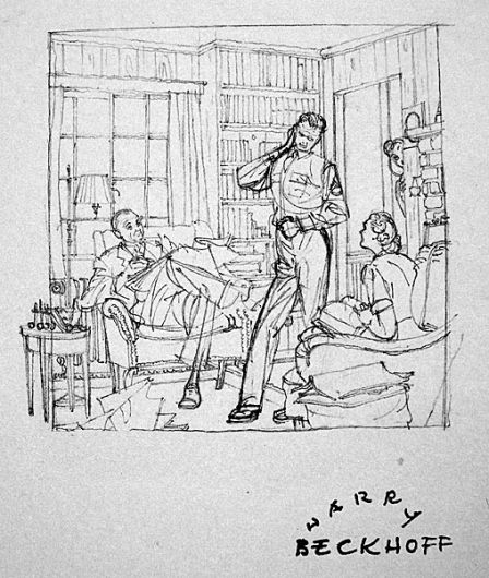
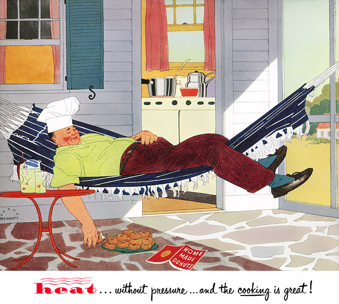
The new issue of Illustration magazine (Issue 52) has a feature on American illustrator Harry Beckhoff (1901-1979). Although he studied with Dean Cornwell and Harvey Dunn, he didn't pursue the style of painterly brushstrokes and impastos.
Instead, he defined his forms with flat shapes, whose internal forms are defined by thin lines. The emphasis is more on silhouette and line than it is on texture and lighting.
His style is more reminiscent of the
ligne claire ("clear line") style of European comic artists like
Hergé (Tintin), and of illustrators like
Pierre Brissaud (1885-1964) or
André Marty (1882-1974).
As with all of the articles in Illustration magazine, this one is comprehensive (47 pages long) and amply illustrated (89 images, most color).
There are a lot of examples of his photo references and his preliminary sketches, which were famous for being exquisite and tiny. The one above is typical, no bigger than a business card.
The bio by publisher Dan Zimmer fills an important gap in American illustration history. Even though Beckhoff was busy and in demand, his work isn't well enough known. There's no book on him and
there's not even a Wikipedia page for him.
The new
Illustration magazine (Issue 52) also contains the articles "The Art of John La Gatta" and "Artists for Victory."
-----
Read more
(Print)
(Online sources)

Where are we headed with augmented reality? This short film by Keiichi Matsuda presents an unsettling vision of a possible future. The film superimposes digital animations over a mundane live action video showing a person's point of view as they ride a bus and shop for food. (Link to Vimeo)
Apps address us as personal assistants. Rewards and bonuses tally up like in a video game. Ads and offers leap out from products. Guidelines appear on sidewalks. The person interacts with this hybrid reality by using voice and hand gestures.
At the website
Hyper Reality, Mr. Matsuda says: "Our physical and virtual realities are becoming increasingly intertwined. Technologies such as VR, augmented reality, wearables, and the internet of things are pointing to a world where technology will envelop every aspect of our lives. It will be the glue between every interaction and experience, offering amazing possibilities, while also controlling the way we understand the world. Hyper-Reality attempts to explore this exciting but dangerous trajectory. It was crowdfunded, and shot on location in Medellín, Colombia."
----
via
Cartoon Brew
By: James Gurney,
on 5/20/2016
Blog:
Gurney Journey
(
Login to Add to MyJacketFlap)
JacketFlap tags:
Add a tag
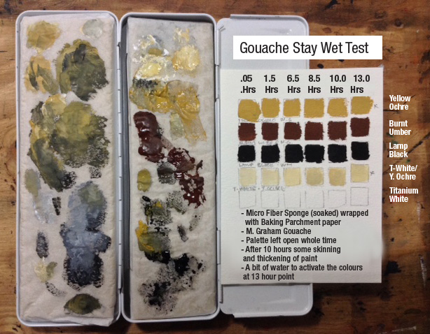
He says: "I have tested different
'Sta-Wet' palette
options with gouache and found the following to be very effective.
 |
| Glenn Tait's DIY 'stay-wet' palette tests |
"Take a piece of soaked
micro fiber sponge
and tightly wrap it with
baking parchment paper
. I placed mine in a medium sized
watercolour tin box
so I could take it on location.
"It works really well, especially with the tube squeezed colours. The mixed colours don't last as long due to their being thinned out more. Even after a couple of hours working outside on a windy day the colours were still fresh.
"I did a test to see how long they would last inside. I was surprised that they were still fresh after about 10 hours and usable up to 13. My test chart is included below along with some photos of the sponge.
"The sponge is the type used to put under dish racks to absorb excess water - I picked this one up at a Dollar store. The sponges come in different colours, this one was a medium gray which worked nicely as a palette surface colour, as opposed to the typical yellow cellulose sponges from regular Sta-Wet palettes.
"Another advantage is that when the micro fiber dries it doesn't twist out of shape or go hard like the cellulose tends to do."
Thanks,
Glenn!
------
Links to materialsQuilted micro-fiber dish clothWaffle weave dish cloths (gray) Baking parchment paperWatercolour tin box

View Next 25 Posts


