new posts in all blogs
Viewing: Blog Posts Tagged with: Golden Age Illustration, Most Recent at Top [Help]
Results 1 - 25 of 134
How to use this Page
You are viewing the most recent posts tagged with the words: Golden Age Illustration in the JacketFlap blog reader. What is a tag? Think of a tag as a keyword or category label. Tags can both help you find posts on JacketFlap.com as well as provide an easy way for you to "remember" and classify posts for later recall. Try adding a tag yourself by clicking "Add a tag" below a post's header. Scroll down through the list of Recent Posts in the left column and click on a post title that sounds interesting. You can view all posts from a specific blog by clicking the Blog name in the right column, or you can click a 'More Posts from this Blog' link in any individual post.
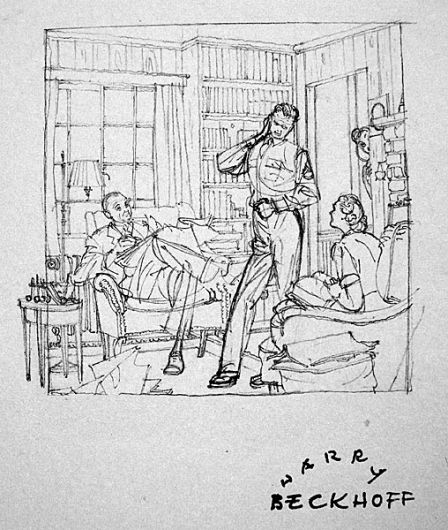
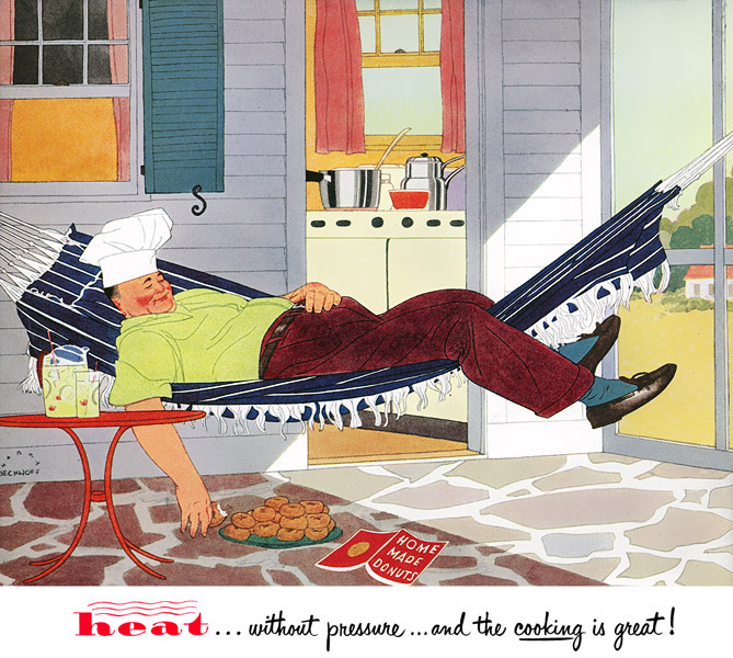
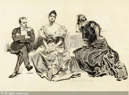
The new issue of Illustration magazine (Issue 52) has a feature on American illustrator Harry Beckhoff (1901-1979). Although he studied with Dean Cornwell and Harvey Dunn, he didn't pursue the style of painterly brushstrokes and impastos.
Instead, he defined his forms with flat shapes, whose internal forms are defined by thin lines. The emphasis is more on silhouette and line than it is on texture and lighting.
His style is more reminiscent of the
ligne claire ("clear line") style of European comic artists like
Hergé (Tintin), and of illustrators like
Pierre Brissaud (1885-1964) or
André Marty (1882-1974).
As with all of the articles in Illustration magazine, this one is comprehensive (47 pages long) and amply illustrated (89 images, most color).
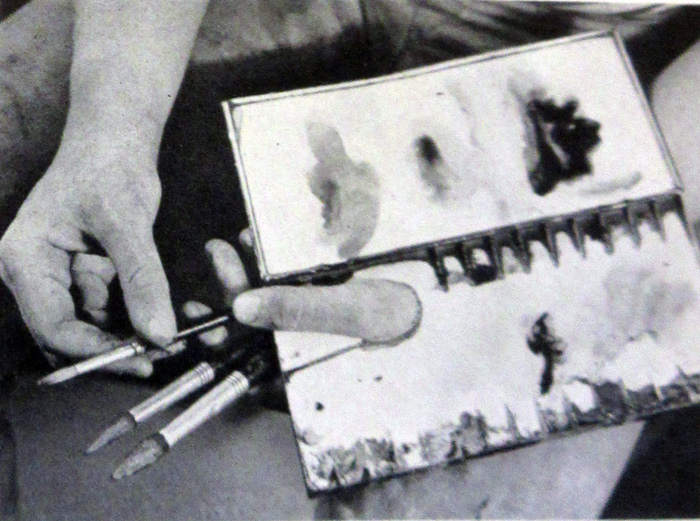
There are a lot of examples of his photo references and his preliminary sketches, which were famous for being exquisite and tiny. The one above is typical, no bigger than a business card.
The bio by publisher Dan Zimmer fills an important gap in American illustration history. Even though Beckhoff was busy and in demand, his work isn't well enough known. There's no book on him and
there's not even a Wikipedia page for him.
The new
Illustration magazine (Issue 52) also contains the articles "The Art of John La Gatta" and "Artists for Victory."
-----
Read more
(Print)
(Online sources)

Before you scroll down any farther, what does the style of this sketch remind you of? Can you think of any other art genre that the shapes and colors evoke?
About the sketch itself, this guy was looking out the window of a noodle shop, and I had about five minutes to paint him.
To get the soft edge around his "love handle" area, I painted the gouache wet into wet. The white edge lighting is made up mostly of the white of the paper. I used Venetian red for the background color because the walls were painted that color.
What it served up was a whole bunch of World War II posters from several countries, including the USA, Nazi Germany, Communist China, and Soviet Russia. There's also a Saturday Evening Post cover and a Western movie poster thrown in.
These results are narrowly focused on a particular period of illustration with a particular purpose, that of arousing the energy of the people to work and fight.
What does that tell us about the style of my sketch? Did any of you think of propaganda art from the 1940s? Poster art from WW II is not a big study of mine, and certainly wasn't in my conscious mind when I was doing the sketch.
I also wonder what this tells us about the visual intelligence behind Google's image search algorithm? It seems to be based purely on abstract colors and shapes, and it pays no heed to subject matter, other than the fact that it was a figure in a setting.
-----

At the blog "Today's Inspiration," illustration historian Leif Peng is doing a series of posts interviewing
Shannon Stirnweis (b. 1931) about his years painting pictures for the advertising, men's adventure, western, and romance markets.
Shannon Stirnweis, Part 1: "I wanted to be an artist when I grew up"Shannon Stirnweis, Part 2: "The (men's) adventure begins"
Most of the books about Golden Age illustrators have been produced by a very small number of ardent fans working out of their homes or understaffed offices, and creating quality books as labors of love. Dan Zimmer, of
The Illustrated Press, is one of those people.
Zimmer has published an extraordinary book on
The Art of Dean Cornwell. I'll tell you upfront that the book was produced as a limited edition and sold out before I received my copy, so unfortunately you can only get one on the secondary market.
Measuring 9x12 inches with 224 pages, the book resembles some of the other books in the
Golden Age series published by the Illustrated Press. Although it has a complete biographical summary of Cornwell's life and working methods, the emphasis is on the art itself, with over 260 published full page and in full color, almost entirely from the original paintings and drawings.
Cornwell was born in Kentucky, the son of an engineer who tragically became deranged after being hit by a streetcar. Cornwell came to New York and studied under Harvey Dunn. His early paintings are notable for their drama and mysterious tonal organization. His skills in drawing and mural design, honed after an apprenticeship with Anglo-Welsh artist Frank Brangwyn, brought about a stylistic evolution that favored a more colorful and patterned work in his later career.
A few years ago, I produced a video showing some blurry but fascinating footage of Cornwell at work.
The previous book on Cornwell from a few decades ago, called
Dean Cornwell: Dean of Illustrators, has fewer images, and they're generally not as well reproduced as those in this book. Hopefully the success of this venture will encourage another publisher to do a book on Cornwell, or will embolden a museum to give him a much-needed solo museum exhibition.
If you're interested in future books from the Illustrated Press, be sure to get on their mailing list so that you can get notice in advance of publication. Also, check out
The Illustrated Press quarterly magazine on illustration history.
The Art of Dean Cornwell from the Illustrated Press
My YouTube video about Cornwell's method
Dean Cornwell Wikipedia
 |
| Andrew Wyeth, The Coot Hunter, 1941 |
In 1942
 American Artist Magazine
 introduced the 25-year-old Andrew Wyeth as “One of America’s Youngest and Most Talented Painters." The article describes his painting methods, providing a valuable document, because Wyeth was mysterious about his technique in later years. Here is an excerpt:
Watercolor technique"He works on a medium rough watercolor paper which he has made up in blocks (22x30 in). He objects to stretched paper, says he believes it loses its capacity for brilliant effects. All his painting is done with three sable brushes, Nos. 5, 10 and 15. The never uses those broad flat brushes so many artists employ for large, covering washes.
 |
Andrew Wyeth’s palette and the three brushes
with which he paints all his watercolors. |
"In view of the gusto with which Wyeth works, one is surprised to see such a small palette in his hand, especially since in his rapid painting he must require a quantity of “runny” washes on short order.
"In beginning a watercolor Wyeth very rapidly lays in the large masses in their approximate colors, but without detail definition. This may or may not have been preceded by a slight pencil indication.
 |
Wyeth often makes rapid ink sketches like this,
on the spot, and then does the watercolor in his studio. |
"Thus the paper is entirely covered in the first few moments, except for white areas which are untouched by the brush—Wyeth never uses white body color. Occasionally white, or near white, is obtained by a heavy stroke of the brush-handle in a still-wet wash.
"Working back into the wet areas he develops his picture, pulling definition out of the blurred color masses, working all over the picture while it is still moist.
"The technic of watercolor—that is, in the fluid method—presupposes rapid and skillful execution. Yet working within the limitations of its properties some artists proceed with a degree of deliberation. It is quite possible, technically,—and without sacrificing freshness—to work on a picture over a considerable period, even to come back to it the next day. Many artists spend at least two or three hours on a picture. Wyeth’s practice is to skim off the white heat of his emotion and compress it into a half hour of inspired brush work. He is the first to admit the presumption of this kind of attack, and is ready to confess that it fails more often than it succeeds.
 |
| Andrew Wyeth, Pennsylvania Landscape, egg tempera on board, 1942, 35x47 inches |
Egg Tempera Technique"Mindful of the dangers inherent in practiced facility with his watercolor brushes he has put them away in moth balls for a season and, during the past year, has been devoting himself to tempera painting, employing a technic that imposes strict disciplines.
"In his temperas Wyeth’s objective is to cover up his brush strokes and obtain a sense of freedom through pattern rather than technic. He paints these pictures with a single sable brush not over 3/4 of an inch long.
"These are done on Masonite upon which three coats of whiting mixed with casein glue are applied as a ground. The pulverized glue is heated, in water, in a double boiler. Wyeth sandpapers the final coat to a very smooth finish. The panel is made rigid by a framework attached to the back. He paints with dry colors mixed on his palette, as he works, with distilled water and egg yolk.
"His procedure is to make a monochrome underpainting in black ink. The colors, applied over this black and white, have a quality of weight and depth preferred to the result of direct painting in color. This is in accordance with the traditional method of old masters who used this medium.
"This turning from the freedom of watercolor to the exactions of tempera illustrates the intelligent purpose of a young artist in seeking strength and breadth as foundation for the work he hopes to do later on. Through his tempera paintings he is acquiring the habit of accuracy and is seeking an intimacy with nature which he feels he cannot attain with his watercolor brush alone. Thus fortified he believes his watercolors, though painted in a burst of enthusiasm, are more likely to be informed and interesting in every detail.
"�Too often,’ he says, ‘a watercolor appeals solely by virtue of tricks and fortuitous beauties inherent in the medium itself. My aim is to make every part of the picture alive, interesting.’
"The casual observer, turning from Andrew Wyeth’s impulsive watercolors to his tempera paintings, executed in the spirit of old master craftsmanship, might well be puzzled. They appear in temperament as well as in technic like the work of two separate individuals. They are, in the sense that the well-rounded man is a different man at different times, as he takes devious directions to arrive at a goal that cannot be approached by a single paths. Only the artists himself can see the map whereon those divergent paths finally meet in the ground strategy of a single purpose.
"We shall watch for the meeting of those paths in the work of Andrew Wyeth."
——-
Excerpted from "Andrew Wyeth, One of America’s Youngest and Most Talented Painters,"
American Artist Magazine, 1942.

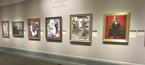
Dunn was a vital link between Howard Pyle's teaching and a generation of story illustrators in the Golden Age of Illustration. The exhibit includes a room showcasing Dunn's students, including Dean Cornwell, Harold Von Schmidt, and Dan Content. They produced big canvases brimming with color, character, and drama.
For example, here's a painting of "The Count of Monte Cristo" by
Mead Schaeffer (from the Kelly Collection of American Art). The head is lit from above by a greenish light, shadowing the brows, and the bright yellow / white slash of light behind is applied boldly with a painting knife.
Dunn's precepts were forthright and positive, leaving no room for weak or tentative handling. He emphasized the same kind of mental projection that Pyle advocated. For example:
Everything must be positive. Never in doubt.
Put yourself in the picture and the situation.
To eliminate takes a great deal of study.
A man cannot lie unless he knows the truth.
Two of the rooms show the work of Harvey Dunn himself, and the work is beautifully presented by the museum staff. His students made a life cast of his face and hand, and those are displayed in a vitrine in the show.
Unfortunately, even though I came to the show wanting to love his paintings, I found them less inspiring than the work of his students. Although many of Dunn's initial ideas had epic potential, the execution often suffers from awkward drawing and heavy-handed paint application.
We found a letter in the museum archives where Tom Lovell summed up the problem: "Harvey Dunn could draw when it suited his purpose—all the "old ones" were well drawn. Later he became more crude in drawing and value."
This crudeness, I believe, comes from skipping over preparatory steps and proceeding directly from idea to the finished canvas. Many of the Golden Age illustrators produced such a volume of work on such short schedules that they often dispensed with preliminary steps. Illustrators who neglect those stages are more hit-or-miss, producing work that is often sub-par.
I think the consistently high quality of the work of Norman Rockwell, J.C. Leyendecker, and Tom Lovell results from the thoroughness and professionalism of their intermediate stages: sketch, color sketch, figure study, charcoal comp, etc.
We finished the day visiting the Museum archives and the classrooms with
Patrick O'Donnell, a game designer and
teacher. He's doing a program called "
Art in Motion" where he demonstrates drawing for families who visit the museum. He'll be doing it again on February 13.
----
"
Masters of the Golden Age: Harvey Dunn and His Students" will be at the Norman Rockwell Museum in Stockbridge, Massachusetts through March 6, 2016
More on
Mead Schaeffer on Illustration ArtPDF of Dunn's teaching "An Evening in the Clasroom"
The 50th issue of
Illustration Magazine is completely dedicated to Leyendecker, with a staggering collection of 162 illustrations of the life and work of both Leyendecker brothers, J.C. and Frank.
About 100 of those are of J.C.'s art, taken from high-rez scans of the original art and reproduced full page, making this one of the best collections of his work in print.
The biography by David Saunders is well-researched and well-balanced. One of the things that fascinated me most were the insights into the Leyendeckers' French training, and I'll focus on that aspect in this post.
J.C. wrote home to Chicago describing the work he was doing in the
Académie Julian under Benjamin-Constant, Lefebvre, Bouguereau, and Laurens:
"Thoroughness is the principle upon which the French Art Schools have won their success. It doesn't take long to discover that style and dash will not make a drawing or painting go here as it will an illustration back home."
"Serious work —getting right down to the foundation principles—is the demand which is laid upon every student over here. If I learned anything it was that a picture is really only valuable for the thought behind it. There is little talk of 'handling' and of the catch tricks of the trade, and much emphasis upon a deep and serious significance in everything attempted."Students are accepted into the program without an entrance portfolio, but instead they are evaluated after attempting a study from life:
"Three models pose at the same time in each room, and the new pupil takes his materials and begins work upon the subject which attracts him. But some time in the first week the professor comes around and takes a first look at the beginner's study. That is an important moment, for if the teacher does not approve of it the nouveau is assigned to work from casts instead of from life."
"The mornings are devoted to class study from models and casts, and the afternoons to composition work. The subject of the composition is announced in the class, and it is briefly explained by the teacher. The students are not allowed to consult with any authorities bearing upon the subject, but must make their composition wholly from the meager data given them by the professor."
"The pupil is at liberty to do his composition in his own atelier or combination lodging-room and studio. Saturday afternoon is looked forward to as the great occasion of the week. Then the compositions are brought to the classroom and the teacher passes from one easel to another giving his criticism to the pupils, who crowd around him, clambering upon chairs and stools to secure points of vantage from which to view the pictures."
----
In the future, I'll share a couple other excerpts from this special issue. If you like this kind of stuff, pick up a copy before it sells out.
Illustration Magazine issue 50, which contains 112 pages and costs $15.00.

Fans of illustrator Tom Lovell (1909-1997) can now sample from an online gallery of more than 200 images spanning his remarkable career, from the women's and adventure magazines to National Geographic and Western art.
Lovell was an artist's artist who produced work that was consistently well crafted in terms of design, perspective, and figure work, and it always delivered the dramatic mystery required of a magazine illustration.
The website is an outgrowth of the magazine tearsheet archives of Jim Pinkoski, who has amassed similar collections of the published work of
John Berkey and
Harry Anderson.Jim Pinkoski's Tom Lovell CollectionPrevious GJ Posts on Lovell
One of the paintings in tomorrow's auction of American Art at Christie's is "
Norman Rockwell Visits a Country Editor."
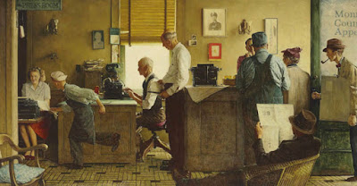 |
| Norman Rockwell Visits a Country Editor, 1946, oil, 33 x 63 in. |
It was published in Saturday Evening Post in 1946, one of a series of portrayals of American life that Rockwell did for the magazine in the guise of artist/reporter.

The mural-like painting commemorates Rockwell's visit to the
Monroe County Appeal, a small-town newspaper in Paris, Missouri. Rockwell took photos of the setting and then assembled the composition back in his studio.
He donated the painting to the National Press Club, which is now putting it up for sale. It is estimated between $10 and 15 million, though it will probably exceed the estimate. The proceeds will benefit the National Press Club and the National Press Club Journalism Institute.
-----

An exhibition of the work of Golden Age illustrator Harvey Dunn has opened at the Norman Rockwell Museum.

Dunn grew up on a South Dakota farm and studied with Howard Pyle. He became an artist reporter in World War I, and then spent the balance of his career as an influential story illustrator and teacher.
The exhibition includes work from throughout his career, as well as paintings by some of his noteworthy students such as Dean Cornwell, Henry C. Pitz, Mead Schaeffer, Harold von Schmidt, Frank Street, Saul Tepper, John Clymer, Lyman Anderson, and James E. Allen. There will also be public talks by experts on Dunn.
They'll be showing the little film I put together using footage by Frank Reilly. (
Link to Video)
Dunn said, “We think of art as sort of a flimsy thing,” he said, “but do you realize that the only thing left from ancient times is the art… The Greek statues that are armless and nameless are just as beautiful today as they were the day the unknown sculptor laid down his hammer and chisel and said, ‘Oh, hell, I can’t do it!'”
The exhibition will be up through March 13.
NRM presents:
Harvey Dunn and His Students
American illustrator
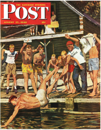
Austin Briggs (1908-1973) says: "When working out an idea for an illustration, it is essential to keep in mind the shape of the finished painting at all times. Otherwise you are likely to develop a composition that simply won't fit the picture space."
"If you become too fond of an unworkable idea you may find it hard to start over on a new approach. The sketch above was sone quite spontaneously for a [Saturday Evening]
Post cover. A momentary pose of the group suggested the compositional pattern—sort of a hammock design with the body suspended, so to speak, between the supporting figures at left and right."
"I sketched the idea with great satisfaction, thinking I had the answer to the picture problem."
"When it came to working out the rough, however, I soon realized that this idea could not be made to conform to space requirements. It was very difficult for me to get this approach out of my head and find a design that would work. If I had kept the shape of the picture in mind from the start, I would have discarded this idea before I became too attached to it."
-----

Note: We'll do the Harold Speed Book Club tomorrow.
Yesterday we read
how Austin Briggs took time away from his busy illustration career to spend four months in the Gaspé Peninsula painting from nature. In this Part 2, he'll tell us how this sabbatical paid dividends when he returned.
"My landscapes became more alive and convincing and I knew that I was no longer dependent on other artists for a point of view. In a way, that landscape painting trip to Canada was my declaration of independence."
"While on the Peninsula I used my camera a great deal to record information which I believed I could use later. I was right as you can see here. I painted this sample illustration upon my return from Canada with a feeling of confidence. In painting this picture, I relied entirely on my personal reactions to a subject and on my stored up experience in actually observing and painting from nature."
"My studying began to pay off handsomely because many assignments I received required some landscape in the background. In doing this job for the
Woman's Home Companion, I felt that I could see the actual sunlight and shadow on the men as they advanced through the jungle."
"The sky pattern in this Cosmopolitan illustration is one remembered from my Gaspé trip."
"Here is another example of the useful information you can store away in a photograph and eventually use. The shadow pattern in the photograph served as a springboard for the structure of this illustration for The Post. Notice the manner in which the figures follow this pattern. As a result, the picture appears to be 'of a piece.'"
"Here is one illustration from a serial done for
The Post. The locale was Charleston, South Carolina and for a long time I struggled to illustrate the story with the help of photographs and studio props The job just wouldn't come off, so I went to Charleston and in a short time had plenty of information as well as a personal knowledge of the countryside."
"This picture was planned with the landscape of a nearby hill in mind. After I had worked out my arrangement, I moved my easel and the model to the hill and painted directly from nature. The sky is as it appeared on the day I painted it and adds much to the mood of the picture. I heartily recommend painting on location whenever circumstances permit it — particularly if the picture is predominantly a landscape. Keep in mind, however, the necessity of integrating the figures into the landscape, rather than slavishly copying the landscape as it appears.
-----
We'll do the Harold Speed Book Club tomorrow.
Previously:
The Artistic Revival of Austin Briggs, Part 1Quoted from
Famous Artists Course (1954 Edition)
Lesson 16.
Austin Briggs Flickr set by Leif Peng

Albert Dorne,
, one of the founders of the Famous Artist’s School correspondence course, shared his thumbnail sketches for a magazine illustration called "Six Greedy Loafers."
The finished picture was used to illustrate a story about an old farmer on his deathbed surrounded by his six lazy sons.
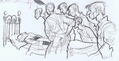
1. In his developmental sketches Dorne first thought of the symbol of vultures sitting around the bed, and wanted to make the sons actually look like vultures with long, scrawny necks and beaky noses. His first sketch tried for that feeling of macabre whimsy.
He says: “As I studied the sketch, it no longer appeared very exciting to me. Despite the outstretched necks, the figures didn’t seem to be doing anything in particular.”
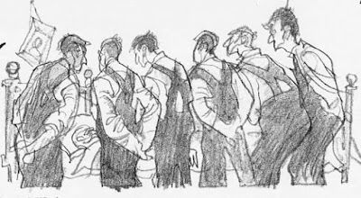
2. Then he thought of the sons as pallbearers alongside a coffin, but he worried that the arrangement put too much emphasis on the foreground, and spaced them out too equally.
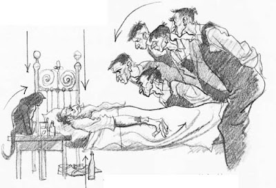
3. He had a breakthrough as he decided to put the sons in a group leaning over the bed. They make a dark, angular mass that contrasts with the light, horizontal shape of the old man. He added the cat to frame the scene from the left. The bottle, the bedspread, and the folds of the bed are all related to the compositional movement.
4. In the next version, he got rid of the black cat and brought two of the figures to the left. Covering up the old man’s face adds to the feeling of mystery. But Dorne was now worried about the empty space in the middle and the feeling that the base of the picture was dropping off to the right.
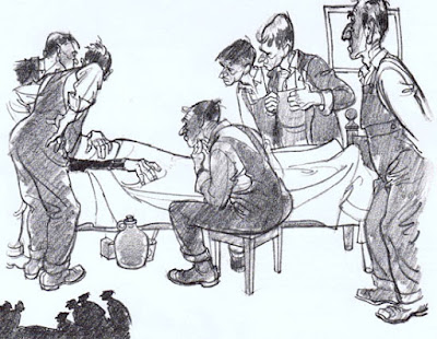
5. In the final arrangement, (which like the others was drawn without reference to models or photography) he tightened up the elements, added the chest of drawers in the background and the rug in the foreground.
Done concludes: “For me, this job teaches an important point. And that point is:
Choose an appropriate, effective symbol—here it was the vultures—and stay with it. Regardless of how much you rearrange or discard, never lose sight of the basic feeling or symbol you want to communicate.”
-----

Will Davies was the premier Canadian illustrator of the Mad Men era. He's 91 years old now, not painting anymore, but he's still going strong, sharp as ever. (link to video)
Leif Peng, right, created the
Today's Inspiration blog which spotlights illustrators from the mid-century era. He has been working to create a full-color, hardbound art book celebrating Will Davies' career.
With three days to go, The Kickstarter campaign is already funded, but Leif and Simon want to get the word out to make sure everybody is aware of the project and its rewards.
Their dream is to put this book in the hands of Mr. Davies and let him know how much we all love his work.

In Ye Good Old Days, artists formed social events called "Sketch Clubs." The purpose of these social groups was conversation, smoking, music, conversation, comic speeches, and imaginative picture-making.
There were similar men-only sketch clubs in New York and Philadelphia, both of which are still active today, though perhaps with different agendas. Membership in the
London Sketch Club included newspaper illustrators and cartoonists like
Cecil Aldin and
Phil May, profiled earlier on the blog.
Howard Pyle had a similar
sketch club for his students, a stag evening with ginger ale, beer, food, and a sketch competition. The winning sketch received the drawing that Mr. Pyle did that evening.
The sketching activity wasn't focused on observational sketching, such as the plein-air practice or urban sketching we think of today, but rather pen-and-ink or pencil sketches of assigned topics.
Pamphlets from the Slade School of Art in London describe how to enter artwork in each month's competition. Sketches would be submitted on or before the first Monday of the month, and they must be marked with the member's number on the lower left-hand corner with no other indication of the artist's name. Monetary prizes were awarded.
Each month, the Slade Sketch Club assigned subjects in five categories. Here are some examples of topics:
Special Figure: (Pluto carrying off Prosperine, Rape of Europa, Atalanta's Race)
Figure: (A Ball Room, The Music Lesson, A Family Group, Reconciliation)
Animal: (The Chase, Milking Time, At the Zoo, Danger, A Market)
Landscape: (Windy Day, Winter, River Scene, A Ruin, Seascape with Stormy Sky)
Modelling (Sculpture): (Door Knocker, Clasp, Letter-Box, Lectern)
The idea is still good—though maybe we can invite the ladies and forgo the smoking. There's no substitute for hanging out in a clubhouse with other kinds of artists—painters, cartoonists, illustrators, animators—and drawing from the imagination just for fun, in a low-risk setting. When I was an art student, we had similar gatherings at the
Golden Palms Apartment. Sometime I'll have to show you the "E.T. Sketchbook"�wacky drawings of "rejected concept sketches for E.T." by Thomas Kinkade, Paul Chadwick, Syd Mead, and others.
W.M.R. French, Director of the Art Institute of Chicago, wrote about the importance of imaginative sketching in the context of a complete artist's education. "From the beginning," he said, "a student should practice composition or picture-making, even in a rude way, in the classes of illustration and composition. Memory drawing should be stimulated by the assignment of subjects for illustration in which the student relies upon material accumulated in his studies elsewhere. He should learn to present a given subject in agreeable form with regard to line, arrangement, and balance of light-and-shade. This study gradually develops until it eventuates in a completed picture."
-----
Howard Pyle's Sketch Club on the Howard Pyle blog
London Sketch Club's current website
Slade Archive Project, which is archiving ephemera
Previous related posts:
Cecil Aldin,
Phil May,
Drawn Together,
Golden PalmQuote by Mr. French from
Art Education in America by W. M. R. French, "Brush and Pencil" Vol. 8, No. 4 (Jul., 1901), pp. 197-206

Anatomy instructor
George Bridgman (1865-1943) was famous for drawing directly on the bodies of the models who posed for his figure drawing classes at the Art Students League in New York.
According to Norman Rockwell, Bridgman would dig a piece of soft red chalk out of his shirt pocket, and then would "walk to the model stand and draw the muscles of the stomach and the line of the rib cage right on the model with his chalk. The models disliked this. They say it gave them a queasy, squirmy sort of feeling to have their muscles marked on their skin in soft red chalk. And then there was no place at the League where they could wash properly and they'd have to go home with their muscles outlined in red."
-----

Late in his life, academic painter and teacher
Jean-Léon Gérôme (1824-1904) wrote a statement of his beliefs about art.
"The fact is that truth is the one thing truly good and beautiful; and, to render it effectively, the surest means are those of mathematical accuracy. Nature alone is audacious above anything human; she alone is original and picturesque. It is, then, to her that we must become attached if we wish to interest and enthuse the spectator."
 |
| Illustration by Howard Pyle |
"The art of illustration has made progress. It is more documentary, but none the less artistic. From this point of view the Americans excel. They have learned how to make use of the document and to make it serve their purpose. In this, instantaneous photography has been of inestimable assistance…. From all this one must conclude that our sense of sight is not as well developed as that of the Greeks or of the Japanese, and that it is not one of our gifts to observe with sufficient attention the various aspects of nature when in rapid motion."
"When one is young and inexperienced one prefers the art of sentiment, and has even the false idea that too much study, too much truth, take away from work its light and its movement. When one has grown old in the harness, when one has worked for many years, observed well, compared well, ideas change. The artist should be a poet in conception, a determined, honest, and sincere workman in the execution. One must put into his work an artistic probity, and, above all, work, work. But there can be no serious and durable work if it is not based upon reason and mathematical accuracy.—if, in a word, art is not allied to science."

Here's a rare archival sound film from 1949, showing Golden-Age illustrator
Arthur William Brown (1881-1966) as he tells the story of his career and the principles behind his pictures. (
Link to YouTube)
He says: "I think I was one of the first to realize the advantages of the camera, whether to get natural attitudes, telling expressions, and quick accidental poses that a model couldn't hold long enough for an artist to get on paper. Today, with a few exceptions, every illustrator uses the camera in some way. We don't copy the photograph. We use it as a guide."
"If I were giving advice, I would say, be sincere in your work. If you admire the work of a great illustrator, learn from him, but don't imitate. You won't last long if you do. If you admire the work of a great illustrator, learn from him, but don't imitate. You won't last long if you do. And if you really want to be popular, make your girls beautiful. Then you can't miss."
Sorry the quality isn't any better. I added subtitles to make it a little clearer. It has been duplicated a few times, and I'm not sure if the original film even exists.
The footage was shot by Frank Reilly, part of his "Artists at Work" series. According to Reilly himself, the purpose of the film "is to impress upon us the accomplishments of those among us now and to perpetuate their memory for the inspiration of those who are to follow." Thanks to Mr. Reilly, and to the individuals and institutions who have preserved his legacy. If anyone knows where the original motion picture film copies are, please let me know.
If you like this, you might also like the ones on
Dean Cornwell and
Harvey Dunn-------

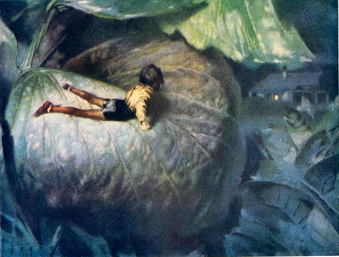 |
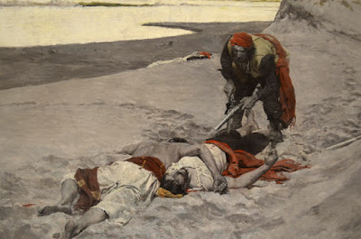
| José Segrelles Tom Thumb |
An art museum in Valencia, Spain, has opened an exhibition called "The Labyrinth of Fantasy" about the dreamlike paintings of
José Segrelles (Spanish, 1885-1969—His name is sometimes written as "Josep Segrelles Albert").
Segrelles worked as an illustrator for The Illustrated London News, Cosmopolitan, Redbook, Fortune, The American Weekly, and The New York Times. He lived in New York between 1929 and 1935.
The exhibition features more than a hundred watercolors, oils, and pen-and-ink pictures, as well as copies of the magazines and books in which his illustrations appeared.
 |
| José Segrelles illustration from Wagner |
Many of his pictures evoke the mysterious realms of music, particularly Beethoven and Wagner. He would have been a killer concept artist for Disney's Fantasia.
He was also renowned for his illustrations of Cervantes, H.G. Welles, Dante, Poe and other writers of the mysterious and the macabre.
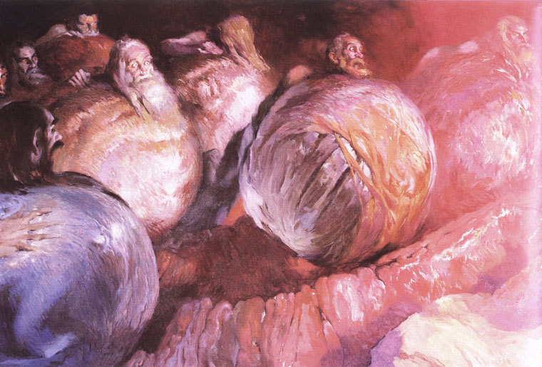 |
| José Segrelles The Greedy, illustration from Dante's Inferno |
Many artists and movie directors have acknowledged an influence from Segrelles, including Guillermo Del Toro, William Stout, and John Howe.
I hear there's an extensive catalog of the exhibition, and I'll review it if I can get a copy.
-----

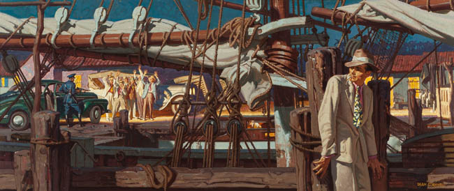 |
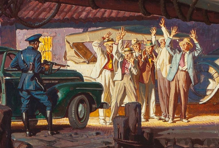
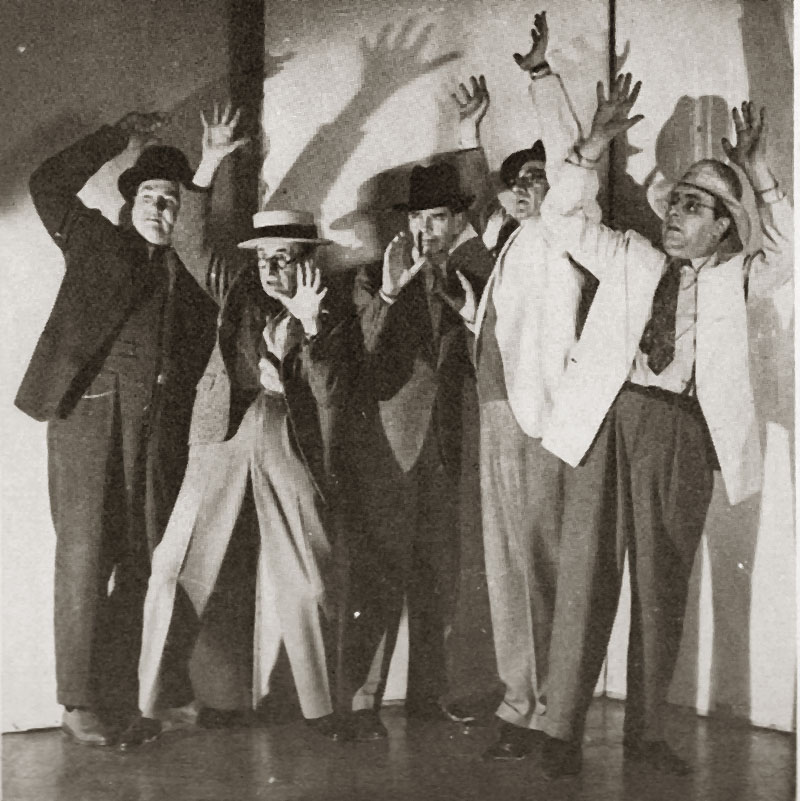
| Dean Cornwell, Saturday Evening Post, 1947, "Night Boat from Havana" 21x58 in. |
At their upcoming May 2 sale of American Art,
Heritage Auctions is offering an illustration by Dean Cornwell (1892-1960).
A car's headlights shine on a group of captured Cuban gangsters at the waterfront. Cornwell "saved $50 in models' fees" by having a group of his illustrator friends—some of the top talent in the business—pose for him as the smugglers.
The models include: Frank Reilly, Arthur William Brown, Gilbert Bundy, Harry Beckhoff, and John Gannam. Cornwell took a photo as a convenience, though in his earlier days he would have worked from life. Cornwell said, "Life models are soft these days and don't like to hold a pose long." Plus, they had deadlines.
-----

Main Street Magazine just released an interview in connection with the Stamford Museum show. The interview was by artist Brandon Kralik.
Kralik: It seems to me that by working in a representational style, by "breaking the rules," it goes to follow that we are actually operating under different rules, an alternative aesthetic criteria for judging what is good and what is valuable. Would you agree with this, that Illustration is something different than what we see in Post Modern aesthetic?
 Gurney: I don’t think that painting representational images or telling stories with pictures necessarily breaks any rules. Who would make such rules? Telling stories and representing nature is what artists have been doing all through history.
Kralik: What are your "rules" that decide if a picture is good or not?
Gurney: My appreciation of art doesn’t follow any pre-set rules. I find myself moved by great works in all sorts of categories—landscapes, comic art, adventure illustration, landscape painting, portraiture. There’s good and bad art in every category, and I'm always ready to be surprised. I don’t spend much time evaluating what’s good or bad, because I’m a painter, not a critic. The best cure for bad art is good art.
Kralik: Do you make a distinction between Illustration and Fine Art?
Gurney: No, I don’t, because both terms are impossible to define. By fine art, do you mean gallery art? For some people the term "fine art" suggests a branch of art that's supposedly free from commercialism. Having been in the trenches in all sorts of art-making, I can attest that gallery art can often be the most commercial form. Gallery artists are always reminded of what's selling, and what's not, and are pressured by the marketplace to repeat successes more than any other kind of art. It's possible for a gallery artist to be unaffected by such things, but it's not easy. The least commercial art form I've ever experienced is magazine illustration, where the individual work of art has little influence on the ultimate commercial success of the larger work, namely the magazine. So if any art is fine in that sense, it is illustration.
If “fine art” means art that is created at the artist’s own initiative, then that would include illustrated books that the artist/illustrator creates.
“Illustration” is a term that means different things to different people. It can mean work that’s commissioned, work that tells a story, or work that is reproduced. Those are very different criteria, and there have been great works of art that fit one, two, or even all three of these measures.
A more meaningful distinction for me is between observational work and studio work—or you might say outdoor work versus indoor work, the outer eye versus the inner eye. Both aspects of the artistic life are essential to me, and always have been.
Kralik: Something that you have said, and which Mort Kunstler reiterated in his talk was that in part the goal is to create something, a painting, that cannot be photographed. You have done this with your Dinotopia series and in your numerous illustrations for National Geographic. Is this a primary concern or thought behind your work? What is the greatest benefit that realist painting has to offer us? To show us what we cannot see any other way, or to copy nature, or both?
Gurney: I agree with Mr. Kunstler—painting the things that we can only imagine is one of my favorite challenges as an artist. I did a lot of work for National Geographic, including pictures of the the legendary voyages of Jason and Ulysses, and reconstructions of the kingdom of Kush in Nubia and the civilization of the Etruscans in Italy. Each project was a stimulating chance to travel for research and to work directly with experts to recreate a world that could never be photographed.
I like to call this kind of painting “imaginative realism.” Imaginative realism is different from what we usually think of as fantasy. It’s a broader term, including any scene that can’t be photographed or observed directly.
Imaginative realism comes into play when reconstructing a scene from ancient Rome, a dinosaur in its habitat, a battle from the Civil War, or a portrayal of the Titanic on the sea floor. These are modern versions of what used to be called history painting.
Most wildlife art falls into this category, too, because wildlife artists can’t just snap a photo and interpret it in paint; they have to develop a scene first in their imagination and use their knowledge of nature to create a believable composition. What all these kinds of pictures have in common is that the artist begins with an imaginary idea, and then works hard to make the resulting picture as realistic as possible.
But I have also always painted and sketched from life at every opportunity. I’m currently working on a series of instructional documentaries on painting on location. The first one is called “Watercolor in the Wild,” and the next two will cover gouache and casein.
Kralik: What is the role of representational painting in our society?
Gurney: I can’t speak in general terms about what painting means for other artists or for society as a whole. I only know what motivates me to paint, and that’s the excitement that comes while making an image come to life out of the physical materials that I move around with my hands.
Whether it’s an imaginary scene or a portrayal of something I’m observing, each picture is a kind of conjuring process, and an illustrated book like Dinotopia combines my love of writing, lettering, book design, storytelling, and painting into a larger act of creation.
Kralik: For myself, I am interested in what connects us, as human beings from different cultures but also as societies and cultures existing in different times. Rockwell once said that he was not concerned about this. "Let future generations create their own artists," he said. Is timelessness something that you think about? Do you think about communicating with future generations through your work?
Gurney: I remember reading that statement about Rockwell, which suggests that he didn’t care about his legacy. Perhaps that was true early on. But once he realized that his paintings were taking on a life beyond their function as magazine covers, I believe he did care a lot about his legacy. Why would he bother to set up the Norman Rockwell Museum, and why would he write his autobiography and teach in the Famous Artists School? I think what he was saying with the quote about future generations was that artists should create their own art for their own times, and not copy him or anyone else. Rockwell was certainly concerned with connecting with his public. He painted the Four Freedoms completely on his own initiative, and it became a decisive factor in the war effort.
We live now in an age of transient technology and passing fads, but at least two things have the capacity of lasting: books and original paintings. Personally I’ve always preferred making art that has a physical embodiment, such as a drawing or painting, as opposed to digital art. I have no way of knowing whether my paintings will survive fires or floods, or whether they’ll speak to future generations.
 Kralik: The idea that an artist must express themselves is paramount in Post Modern ideology and with representational painters it seems that it is partly this but also that it is important to "connect" with viewers using more universal symbols than purely subjective imagery. How much of your work is for yourself and how much is for your viewer? As if that were a measurable thing.
Gurney: Expression plays a role in my art certainly, because I have strong feelings that I bring to my paintings, and I like my art to communicate them. But expression isn’t as important for me as observation.
I love to capture the world around me, and I do that for my own pleasure, though more and more I’m sharing my sketchbooks through video and other new media.
I have literally dozens of pencil sketchbooks filled with studies of people that I’ve met and places that I’ve traveled. My studio is crowded with boxes full of small oil studies from faraway places and local vistas from the Hudson Valley. Sometimes the goal in an outdoor study is to capture a particular atmospheric effect or a color relationship, or to document the rapids in a stream or the unique quality of a sunset.
Kralik: How do you view the changes within the representational art world in the past 25 years or so? Realist painting seems to definitely be making a comeback it could be said. Do you agree? Why is that?
Gurney: Realist painting is certainly making a comeback, but I’ve also noticed a huge rise in interest in animation, graphic novels, and concept art when I visit art schools. Along with the return of realism as a mode of painting, popular forms of art are finding their way into academia and museums.
The Museum of Modern Art had huge successes with the exhibitions of Pixar and Tim Burton, and we’ve been fortunate to have had over 25 one-man museum shows on the art of Dinotopia. More and more people are realizing that illustration, comics, and animation are the mainstream story of twentieth-century American art. You couldn’t talk about 20th century music without telling the story of jazz and rock 'n' roll. The same is true in the visual arts.
That’s why we’re seeing more and more popular-culture college courses, not only on Bob Dylan and the Beatles, but also about children's literature, animation history, and the history of comics. All of these popular forms have dealt with the big topics—love and death—often with wit and humor.
Kralik: You have given a number of talks at universities and high schools. How can we, as painters, best encourage and educate students interested in representational art and, against the apparent rules of the art world, convince them and patrons who might support them, that it is ok to work in a realist or illustrative fashion?
Gurney: There’s no need to convince art students of any of this. They’ve grown up with the Internet, where they follow their own eyes to stuff they like. There are no rules in the art world. Old-school tastemakers and gatekeepers are getting swept away by new forms—and forums—of patronage and criticism. It’s not like it was in the old days, where you had to hope for the approval of the Pope or John Ruskin or the Salon Jury or Clement Greenberg. Art is wide open now, and there’s no single kind of art that’s dominant. The important trend is that for the first time ever, artists can connect directly with their audience and paint whatever they want to paint, supported by the people who love what they do.
-----
Dinotopia exhibit at the Stamford Museum and Nature Center through May 25
Brandon Kralik has an exhibit of his work at the Hotchkiss School in Connecticut, and will be giving a talk there on April 27.

I'm sad to hear that Walt Reed, renowned historian of American illustration, died early this morning.
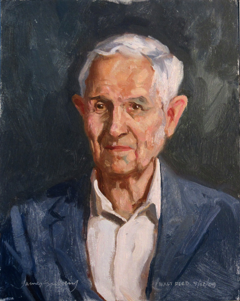 |
| Walt Reed, painted by James Gurney in 2009 |
An artist himself, Walt studied at Pratt Institute and worked for a time as a freelance illustrator. Walt served on the faculty of the correspondence course called the
Famous Artists School, working closely with mid-20th century masters such as Norman Rockwell, Robert Fawcett, and Al Dorne.
Genial, good natured, and enthusiastic, he almost singlehandedly pioneered illustration history as a field of research, and he legitimized original illustration artwork as a category for collectors.
He cultivated relationships with working professionals, and he helped to revive the reputations of nearly forgotten illustrators such as J.C. Coll. He wrote the classic survey of illustration history
The Illustrator in America, 1900-1960's
.
I discovered
The Illustrator in America when I was just nine years old, and it awakened my interest in illustration as a profession. In 2009 I had the privilege of painting his portrait from life at the Society of Illustrators.
In 1974 he founded the
Illustration House, one of the first galleries in America to specialize in original illustration art. If you were lucky enough to visit Illustration House, he would let you hold an original J. C. Leyendecker or Tom Lovell in your hands.
Walt Reed advised the
New Britain Museum in Connecticut as they built the Sanford Low collection, one of the finest museum collections of illustration art. He wrote two later editions of his illustration history book, including
Illustrator in America, 1860-2000, which still stands as the best illustrated survey of the history of the field.
He also wrote
The Figure: The Classic Approach to Drawing and Construction
,
Harold von Schmidt Draws and Paints the Old West
,
The Magic Pen of Joseph Clement Coll
, and
Harvey Dunn: Illustrator and Painter of the Pioneer West.

Have a look at this picture, and try to self-monitor how you experience it.
The editors of the
Famous Artists Course included this illustration by Robert Fawcett (1903-1967) along with an explanatory diagram to demonstrate some design principles. They say: "The scroll is the important point of interest in this picture. Robert Fawcett has skillfully used lines to direct our eye to it. The line formed by the arm of the foreground figure draws our attention almost irresistibly across the upper right of the picture, down to the scroll, and finally to the head of the king. Notice how we are forced to look back and forth from the king's head to the scroll."
I think it's a successful composition, but I don't agree with their analysis of why it works. To me the driving force of the picture's abstract design is the contrast between clutter and emptiness. At first I saw the busy detail surrounding the blank space, and I thought the empty space was a 2D shape left for design reasons.
A split second later, I realized that it was a piece of paper being held up by a soldier in chain mail, and that I was looking at the back of the paper. Once I saw the angry face of the seated figure, and I understood that he was a king, it dawned on me that he was being faced with a challenge by the knight, perhaps showing the Magna Carta to King John.
With the story in mind, my eyes scanned the picture driven by its human premise. I looked at the ecclesiastical figure, whose characterization isn't very well developed. I checked out the face of the soldier, and couldn't get much from him either. My eye then went to the various weapons on display to see if there was a foreshadowing of violent action.
Although I'd need to see an eye-tracking scanpath study to be certain, I'm quite sure my eyes never followed the pathways diagrammed by the FAC's editors, and I never spent much time in parts of the picture that had no story purpose.
My point is that I don't believe it when composition teachers suggest that my eyes are passively moving through a picture, led purely by design considerations. Design does play a role, but if there are faces and a human story, the viewer is operating on a much higher and more active level.
Your experience of the picture may have been totally different from mine, and I'd be interested to hear from you in the comments.
-----
Books: Robert Fawcett: The Illustrator's Illustrator Famous Artists CoursePreviously on GJ: Eyetracking and CompositionEyetracking and Composition, part 1Eyetracking and Composition, part 2Eyetracking and Composition part 3

The upcoming issue of Illustration magazine (Issue #46) features the work of Charles Dana Gibson.
Gibson (1867-1944) was an illustrator from the Golden Age whose portrayals of self-confident women became a style icon known as the 'Gibson Girl.'
Gibson's painterly pen-and-ink illustrations captured the attitudes and postures of the characters he portrayed, often in amusing or awkward situations.
The article by Gary Land tells the story of his life, from child prodigy to celebrity artist. It is well illustrated with 35 images, shot from original art. This issue also a feature article on pin-up illustrator George Petty.
It's not a history or a textbook, but a picture book with over 218 color illustrations by 154 different artists. The book is a 9 x 12 inch hardcover and costs $44.95. It will ship in March, and
you can preorder now.------
Illustration magazine
Blog reader Walt Morton, asks:
"Did Howard Pyle teach or endorse a particular palette of colors? He was so methodical and analytical, I believe he had an ideal palette underlying his methods.
Yet I find no printed evidence."
Offhand I didn't know the answer, so I reached out to my lifelines.
Kev Ferrara says:
"It is my understanding that Pyle's emphasis was always on values, and color was of secondary consideration. [Harvey] Dunn said that Pyle 'preached tonal values 24-7' and had a very negative view of his own abilities with color. In fact Dunn reported that Pyle claimed he didn't really understand color at all. Given the many beautiful pictures in color by Pyle, we may take this anecdote with a grain of salt... something Dunn said which was designed more to drive home to his own students the preeminence of values in picture making.
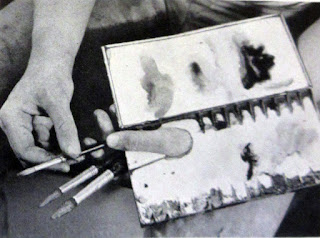
"Regarding actual palette set up, Harvey Dunn said that Pyle taught his students to 'Keep shadows and light absolutely separate both on palette and on picture.' Dunn elaborated elsewhere: 'Keep light colors and shadow colors separate on palette, shadow colors on left, leaving a division between, and then light colors on the right.'"
 |
| Howard Pyle, The Dancer, 1899 |
Ian Schoenherr, author of the Howard Pyle blog, says:
"I have almost nothing to add to what Kevin said. In my transcribed records, there’s little mention of the specific pigments Pyle used.
"However, in a letter Gertrude Brincklé wrote from Italy on March 12, 1911, she said: 'Mr. Pyle colored a print of Holbein’s ‘Richard Southwell’ for me - not just tinting, [but] modeling with water colors, white, vermillion, cerulean blue, thick colors.'
"And two observers assumed that Pyle added vermillion to his black and whites (starting in the early/mid 1890s). Likewise, an 1897 news item said, 'He even uses color sparingly where that will add to the ‘value’ of his scheme. Black and red is his favorite combination, with the introduction now and then of blue and yellow.'"
Like Kevin said, there are a few photos of Pyle with palette in hand - and I think only one (from early 1899 - above) shows the paint side - but that doesn’t help much.
-----

View Next 25 Posts


.jpg?picon=1009)


 .
.


