new posts in all blogs
Viewing: Blog Posts Tagged with: Painting Gear, Most Recent at Top [Help]
Results 1 - 25 of 33
How to use this Page
You are viewing the most recent posts tagged with the words: Painting Gear in the JacketFlap blog reader. What is a tag? Think of a tag as a keyword or category label. Tags can both help you find posts on JacketFlap.com as well as provide an easy way for you to "remember" and classify posts for later recall. Try adding a tag yourself by clicking "Add a tag" below a post's header. Scroll down through the list of Recent Posts in the left column and click on a post title that sounds interesting. You can view all posts from a specific blog by clicking the Blog name in the right column, or you can click a 'More Posts from this Blog' link in any individual post.
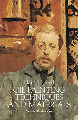
Welcome to the GJ Book Club. Today we'll cover pages 237-242 of the chapter on "Materials," from Harold Speed's 1924 art instruction book Oil Painting Techniques and Materials .
.
I'll present Speed's main points in boldface type either verbatim or paraphrased, followed by my comments. If you want to add a comment, please use the numbered points to refer to the relevant section of the chapter.
In this section of the chapter, Speed discusses the brushes for oil painters.
1. You can use cheaper paints when you're a student, but even if you're poor, you shouldn't skimp on brushes.I totally agree with Speed on this one. He says "A cheap brush is useless from the start and has, luckily, a very short life as they wear very badly. The best brushes last much longer."
2. Cleaning brushes. "Soap and water cleans them most thoroughly and is the best way of cleaning them. But it is a most tedious process after a hard day's work."Here's a previous post on "
How to Clean out a Brush"
3. After washing them out, the brushes "should be lovingly sucked to bring the hairs together." Never heard that one before. One would want to make sure to remove all the lead, cobalt, barium, and cadmium first. Or maybe pass on that idea.
4. "When thoroughly dry they have plenty of spring in them, whereas the slightest dampness gives them a flabbiness."He's talking about bristle brushes here. It's really true. Damp brushes are flabbier.
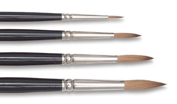
5. Flats and Rounds: Flats are better for "laying a perfectly even tone, but give a nasty thin sharp edge...For figure work and form expression generally, one wants a brush that will lay the paint in even, flat tones without thin sharp edges." He's referring to flat brushes with rounded corners, alternately the modern
filbert
option, which has a flat cross section but a rounded tip. The image above shows a set of
Simmons filberts.
 6. Fashion for soft haired brushes used for flowing strokes (in the 1920s).
Speed notes that some of the inspiration came from studying Frans Hals, who apparently used such brushes. Speed generally prefers stiffer hogs' hair bristles.
7. "Always work with the biggest brush that will do what you want."Then choose the next size bigger. Speed notes that a big flat brush is really several brushes in one, because you can use the corner and the edge for very different strokes.
8. "The brush makers have an absurd habit of making the size of the handle fit the size of the brush, instead of the size of the hand that will have to hold it." He continues, "Very small brushes need a very firm grip to control them as they are only used for very delicate work. And yet they are often given a handle no thicker than a match."
I totally agree, and I've always wondered about this, too. Pencils, pens, knives, and golf clubs have constant sized handles. Why don't brushes?
9. Only German brushes have an indented ring round the metal holder (ferrule) to prevent the tip falling off the handle.Now crimped ferrules are pretty standard even on cheap brushes.
10. Cheap brushes "appear to have been sharpened off to make them a good shape, after being roughly put together; instead of the good shape being the result of a careful placing of the individual hairs."Here's a video about how they make
Escoda brushes
(Link to video)
More on brushes at:
MacPherson Arts / "Brush Basics"
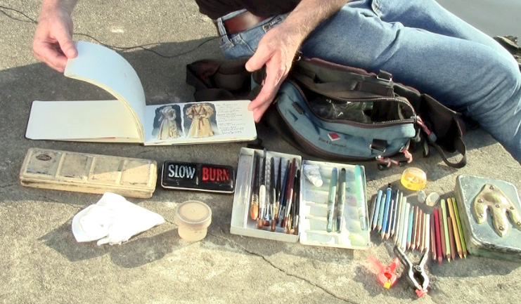
Portable expedition rig for both painting and making videos. This kit fits on my belt or shoulder straps so that I can walk through any museum.
Lightweight tripod
for video camera, Zoom recorder, or LED light, strapped to chair with bungie cord.
Paint rag tied to the outside to allow it to dry (looks a bit weird).
Belt pouch. Contains: pencils, brushes, water cup, gouache set, mini watercolor set, watercolor sketchbook, and LED headlamp.
Flip video camera replaced by Canon point-and-shoot now.

 |
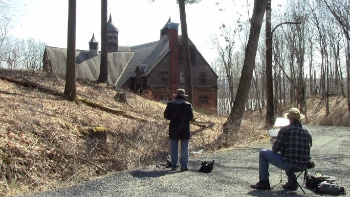
| Street painting in Hudson, New York. |
To paint a view from the street sometimes means standing in the street. The advantage of the street position is that your view is not blocked by parked cars. Standing in the street means following basic safety precautions. I like to use a
traffic cone
and a
safety triangle
(links to Amazon).
The safety triangle sits on a weighted base and the triangle pieces fold down. I cut the "Department of Art" stencil to customize the traffic cone. You can also wear a
reflective safety vest
or even
reflective suspenders
over your clothes to allow cars to see you.

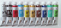
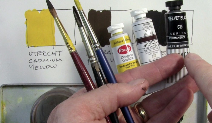
A lot of you have asked which is my favorite brand of gouache, and I have to answer that I can't say yet. I've been trying out a lot of different brands, such as:
M. Graham,
Holbein,
Winsor and Newton,
Utrecht,
Lukas Gouache Schmincke
,
 Pebeo
Pebeo,
Royal Talens, and I've been having fun with all of them.
But my experiments haven't been very systematic, and I often mix several brands on a given painting outing.
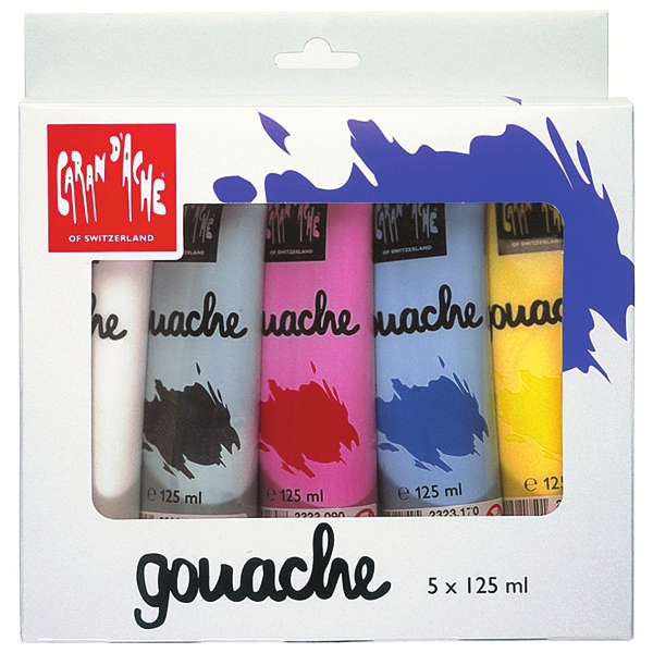
One of the brands of gouache I just haven't tried out yet is
Caran d'Ache, though I use their
water-soluble colored pencils
all the time.
Adrian Weber, a fine-art product developer from the Caran D'Ache company in Geneva, wrote me with further answers to the questions I posed to representatives of all the gouache manufacturers. I had inquired what ingredients they used and what qualities they thought were important. (See their answers in my post about
Gouache Ingredients)
Mr. Weber started by offering three important "gouache criteria":
"
A. Opacity : As you say, our definition of « gouache » (from Italian « guazzo ») means a rather opaque, covering « sauce » with a certain covering power on dark undergrounds."
"
B. Water-solubility : According to our definition, gouache needs to be water soluble and stay water soluble. We do not understand how other producers can label colours writing things like : « Acrylic Gouache ». It can’t be both! Either it’s acrylic and permanent after drying (I call it a « liquid plastic » that hardens when water evaporates ; polymerization), or it’s gouache and you can always dissolve layers underneath."
"C. Matt surface : Typical for a good gouache should be it’s matt aspect when dried. It should be close to the pure pigment powder aspect and by this make a distinction to satinated, creamy or oily aspects of other types. This characteristic makes gouache so unique and essential for studying and teaching « colour mixing » based on primaries etc.!"
"To clarify this, I think you need to explain to your readers the terms « Gouache », « Plakatfarbe [in English we'd say "poster paint"] », and « Tempera » that all mean a kind of opaque water colour."
"Even in our own range, we’ve known and still know different types of « gouache ». We only speak for our own gouaches:"
 "1. Gouache in tablets/cakes (dry)
To produce our dry gouache tablets, we extrude them with pressure from a highly pigmented, humide paste (unlike most other producer from dry powder similar to medical pills). In order to provide the right consistency and to make it extrudable, this gouache contains kaolin and calcium carbonite, not just as filler, but as « consistency provider ». We use vegetable binders without plastifiers here."
Retail info on pans sets here
"2.
Gouache extra-fine in small tubes (consistency like tooth paste)Gouache extra-fine is close to a water colour, as the binder is arabic gum and that the quantity of mineral filler is just minimal."
Retail info here
"3. Gouache studio in small tubes (consistency like tooth paste)Gouache studio contains some kaolin and calcium carbonate, some colours containing white also titanium White PW6 which serves as pigment but also as « filler » at the same time."
Retail info on gouache studio sets
 "4. Gouache studio in bottles (liquid)
Liquid Gouache in bottles, mainly used by schools contains bigger quantities of these above mentioned mineral fillers, we use natural binders such as corn or potato starch. As regulations have become so strict on toys, this type of gouache nowadays is close to a food product, as there’s just a minimal quantity of conserving agent against spoilage (20 years ago, formaldehyde was used by most producers !)"
Retail info on Caran d'Ache Fancolor Tempera
"Last remark : Our philosophy is that a good gouache colour, despite its covering qualities, should still be luminous and powerful. This is the reason why we use a strong concentration and a high quality of pigments that we carefully refine in our mills and grinders in our Genevan factory."
"I often compare a colour with coffee or chocolate : Concentrated black coffee made with the best beans has got power and makes an « explosion of taste» in your mouth and throat (similar effect on paper with highly concentrated watercolour without filler !). Now, some people like to add some milk in their coffee or producers add water to decrease the costs of the expensive coffee powder. That’s all ok, but if you add too much milk (filling material !) or too much water in your coffee, it loses its original power and taste, it just gets a characterless muddy sauce!"
"In other words : You can always break down a highly concentrated colour and lighten or darken it, but you can never « pimp up » a colour with too much filler, white or similar ingredients."
"Wishing you all the best for your great project, with kind regards from Geneva, Adrian"
----
Thanks, Adrian!
Previously on GurneyJourney:
Gouache Ingredients: Info from ManufacturersVisit the Caran d'Ache website at
carandache.comOwn the 72-minute feature "Gouache in the Wild"
• HD MP4
Download at Gumroad $14.95
• or HD MP4
Download at Sellfy (for Paypal customers) $14.95
• DVD at
Purchase at Kunaki.com (Region 1 encoded NTSC video) $24.50

(Link to trailer on YouTube)
"Gouache"�hard to spell, but fun to paint with.
Today is the release of the new video tutorial about painting on location in gouache, or opaque watercolor. I'll tackle six different subjects, with each episode focusing on a different approach to the medium. The subjects include a neon sign, a snowy landscape at dusk, a convenience store, a swamp, some antique character toys, and a Formula 1 race car. Some of the studies are precise and controlled, and others are bold and painterly.

Gouache is a time-honored and versatile medium, a favorite with both professionals and beginning painters because of its portability, opacity and suitability for fine detail. But it also presents its own unique challenges, so I share plenty of practical information about formulations, materials, and painting exercises. For example, painting in black and white is a good way to get accustomed to the medium—or to paint in tight quarters, such as a concert hall or a restaurant.
Here's a small sample from a 12-minute segment (
link to the video on YouTube) where I show the most straightforward way to paint in gouache: a careful pencil drawing, with the paint applied to finished effect, area by area.
Stay tuned this week, as I'll share other samples from the video. And mark your calendar: On Wednesday at 4:00 pm Eastern Time, I'll do a free streaming demo of gouache on location via ConcertWindow.
Click the link to see my page there.---
Own the video and be in on the discussionDownload at Gumroad (GurneyJourney readers get 10% off all Gumroad products this week only
at this link)
$14.95 This week only $13.45or
Download at Sellfy (for Paypal customers)
DVD at Kunaki.com 10% off this week only—
$24.50. This week only $22.00
(Ships anywhere worldwide. Region 1 encoded NTSC video)


Amanda Williams from Western Australia says, "I've been using this home-made steering-wheel easel for a few years—great when it's uncomfortable outside. Easily made with scraps of wood and a couple of old drawer knobs."
Thanks, Amanda. I'm glad you pulled over before using it! This would be especially good on a car where you can adjust the tilt of the wheel.
---------
Tomorrow begins Gouache Week.
Monday: Release of the new 72-minute video tutorial "Gouache in the Wild." On Monday only there will be a 10% discount from the normal sales price of $24.50 (DVD) or $14.95 (HD download).
Tuesday: New 3-minute YouTube sample—Painting a Snow Scene at Sunset. Secrets on gouache formulation from several manufacturers.
Wednesday: New 3-minute YouTube sample—Painting a Gas Station / Convenience Store. Announcement of contest.
Thursday: New 3-minute YouTube sample—Painting Antique Toys called Brownies. Pros and cons of acrylic gouache.
Friday: New 3-minute YouTube sample—Painting Dan Gurney's Race Car. (Plus the GJ Book Club).
Here's what the pros are saying:
"I so enjoyed my copy of James Gurney's
Gouache in the Wild! The practical painting knowledge is intensely useful and the insight he offers about his subjects makes you feel that you haven't lived until you've captured your experiences in paint!”
—
Nathan Fowkes, concept artist and professor at LAAFA “Gurney has provided a much needed guide for painting in gouache — an often overlooked artists' medium that is deservedly gaining in popularity; every section is overflowing with his wealth of location painting knowledge and experience.”
—
Charley Parker, Lines and Colors James Gurney has put together another wonderful video for beginning student and seasoned professional alike, packed with information and insights. This time he takes on the rarely discussed medium of gouache, handling it with both precision and abandon, taking the mystery and apprehension out of it. As always he offers useful tips with humor and excitement, sharing his experiences with both the medium and the pitfalls and enjoyment of painting outdoors. The sequence with the Brownies is pure painting magic. This video may bring an entirely new audience to the medium. Now we will have to learn how to spell gouache.
—
Dennis Nolan, Professor, Hartford Art School.
"James Gurney takes us on a fun and educational journey. It was such an enjoyable experience to be a fly on his shoulder as he creates one masterpiece after another. Makes me want to get out there and paint!"
—
Stan Prokopenko, founder of proko.com"James Gurney's video
Gouache in the Wild is an amazing mix of educational, aspirational and inspirational fun. James brings the concept of painting in gouache to life in a simple and light-hearted manner. I highly recommend this series.”
—
Jon Schindehette, Creative Director at Treehouse Brand Stores 
After World War II ended, Ogden Pleissner (1905-1983), who had been an Air Force captain, was commissioned by Life Magazine to sketch some of the battlefields of Europe.
He was able to catch rides on Jeeps and airplanes, but he couldn't carry much gear. Most of the time he was working under challenging conditions. In the February, 1949 issue of
American Artist magazine, Pleissner described the painting gear that he used.
"Regarding the equipment I used in making these drawings, I will say that the fountain pen was soon discarded for some goose quills that I picked up at a farm in Normandy. I find that the line obtained by the use of the unmechanical quill or reed has, to me, greater variation and a rich quality that adapts itself completely to the wash and drybrush that is used throughout the drawings. The remaining articles are a bottle of sepia ink; two tubes of watercolor, one sepia and the other monastral [phthalo] blue; a very small watercolor palette; a medium-sized pointed sable brush and, of course, water and a block of paper."
"The general design of the drawing is lightly suggested in pencil on a piece of buff paper. This part of my procedure is quite definite; but from here on it varies. I may at times apply the washes first, thus accenting the form with the pen line, or vice versa. No doubt the orthodox method would be to draw with with the pen first and then apply the washes, but I find many interesting effects are obtained by working the ink line into the wet washes."
"My preference for using a sepia watercolor instead of the continual use of the ink is probably a very personal one; I have better control over it and find it more sympathetic to the various ways in which I handle my brush. I must add here that, if ink and watercolor are to be used, it is quite essential that they be the same color."
"It will be noted that light washes of blue are introduced in parts of the drawing, such as in the sky and here and there in the shadow planes of the landscape. This is entirely a matter of preference, but I find the introduction of a second color has great power in subtly suggesting many colors."
The best book on Pleissner is The
Art of Ogden M. Pleissner from 1984.
Previous
GJ posts on Pleissner
John Constable (1776-1837) was one of the pioneers of plein-air oil painting in England. He became convinced around 1802 that he should paint in oil outdoors, believing that Claude Lorrain had done so, even though Claude actually used only water-based media or drawing tools in his outdoor work.
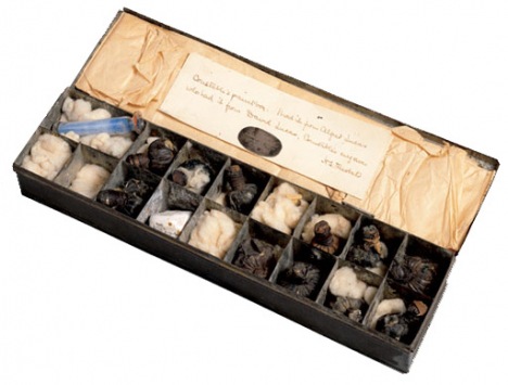
Paint BoxesHere is one of Constable's surviving oil sketch boxes. The glass vials were a way to carry medium and pigment, as tubed paint didn't come along until 1841. Another way to carry mixed paint was the urine bladders from pigs or other animals, something you could pick up from a butcher.
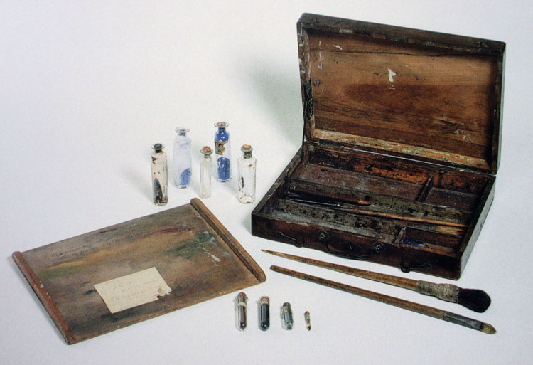 |
| One of Constable's wooden sketching boxes, 9.25 x 12 inches. |
According to an
exhibition catalog of his oil sketches, this paint box "shows the removable panel that fits into the lid, creating a separate compartment, that Constable used for carrying small pieces of paper, canvas and board. Wet sketches were piled in here on the homeward journey. The panel could also be used as an impromptu palette or as a flat surface for standing bottles of oil, turpentine, and other materials during painting."
I don't know if I would agree with the authors that wet sketches were "piled in" to such a box. My guess is that Constable would have used a box like this open in his lap with the lid away from him as he sat on a tripod stool. The sketch would be pinned into the open lid, and kept pinned there until it was dry enough to handle. This was how Americans, such as Thomas Cole, Albert Bierstadt, and William Trost Richards did it.
Here's another paint box, divided into "seventeen compartments and contains a cork-stopped glass phial with blue pigment, a lump of white gypsum probably used for a variety of purposes including drawing and roughening paper, and various bladders with the artist’s own or commercial ready-mixed paint." Try getting this one through the TSA.
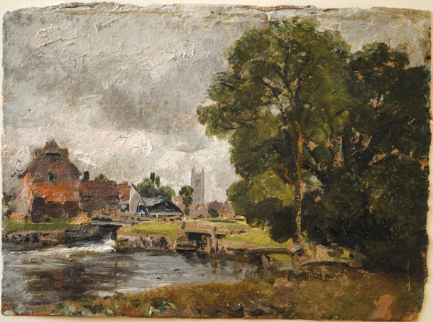
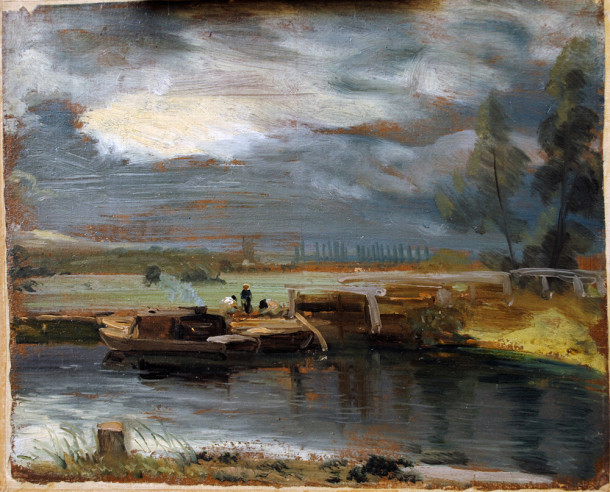 |
| Constable plein-air study showing red-brown colored ground |
SurfacesConstable's studies were usually painted on heavy paper or millboard. Millboard was made from a mixture of cotton, flax, wood, and other fibrous material. The priming was a "viscous medium-rich oil ground containing a small amount of red and black pigment."
(Source)The priming, prepared in batches in advance of his painting sessions, saturated and sealed the sheets. I couldn't tell from my research whether he sized his surfaces before applying the oil ground. Later painters typically sized (or sealed) the paper or board with shellac or rabbit skin glue. By the 1820s, Constable was using commercially-prepared millboard or "Academy board," which was specially made for artists.
(With modern materials, I would use
acrylic matte medium
to size the paper or board before applying an
oil ground
. You can use the matte medium over brown- or gray-toned paper to keep that natural paper color, or make up your own toned oil-based ground over the sizing. Allow time for it to dry thoroughly.)
Color PaletteOne of his surviving plein-air palettes was analyzed for paint ingredients, including vermilion, emerald green, chrome yellow, cobalt blue, lead white and madder, ground in a variety of mediums such as linseed oil mixed with pine resin.
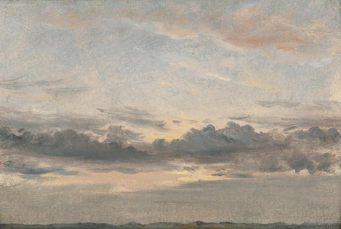 |
| Constable sunset study, probably painted all in one session (or alla prima) |
Working MethodAt times it can be hard to tell whether a given sketch was done entirely on location or whether he touched them up after returning to the studio. Chemical sleuths have found that some sketches contain slow-drying mediums, such as poppy oil, which would have allowed him to rework his surfaces over extended periods of time, but that doesn't prove anything. To my eye, based on the efficiency and urgency of the paint handling, the ones shown in this post look to be done entirely on location.
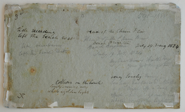
Written NotesConstable often jotted notes on the back of his paper or boards. For example: "Very lovely evening—looking Eastward—cliffs (and) light off a dark grey sky –effect-background-very white and golden light."
Sources and further readingBooks:
Constable's Oil Sketches 1809-29
, edited by Hermine Chivian-Cobb, Salander-O'Reilly Galleries, New York, 2007
The Painted Sketch: American Impressions From Nature, 1830-1880
. Well researched exhibition catalog which focuses on American plein-air practices.
Websites:
Constable Sketches Up Close and Personal (Victoria and Albert Museum, London)
Constable's Techniques (Tate Museum, London)
Lines and Colors Blog "
Constable's Oil Sketches"
Constable paintings at the
Yale Center for British Art 
A couple of GurneyJourney blog readers shared some studio tips:
Doug Goodale says: "I recently built a lightweight sketch easel
according to your specs and added some Velcro strips so it could hold a 1/4 sheet of watercolour paper. I had a plastic palette, so glued some rare earth magnets on the mixing surface to affix it to the easel."
Lawrence Roibal says: "Having had the privilege of being in the presence of the great
Steve Assael painting from life, I witnessed how he utilizes the theory of the
parallel palette without the expense. He would just fashion a makeshift palette right on his painting surface or utilize a clamp, and a simple masonite palette."
----
Thanks, Doug and Larry

Painting in oil from observation is a lot easier if the painting surface is next to the line of sight, and roughly the same visual size.
It makes life easier still if the palette is adjacent to the painting surface and if it's more or less parallel to it. The adjacent position reduces the amount of wasted effort between mixing a stroke and applying it, and the parallelism ensures that a mixture of color on the palette matches a corresponding stroke on the painting.
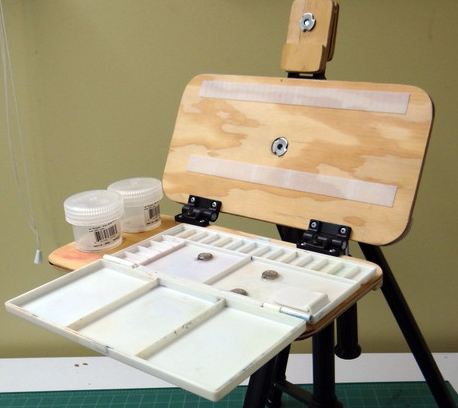
I prefer to have the palette on a hinged surface directly below the painting. I often tilt the palette up a few degrees so that it's perpendicular to my line of sight, and also to reduce the tendency of some paint to run or drip. The Open Box M pochade easel that I'm using allows for that configuration. I use white freezer paper (polyethylene coating) for my mixing surface, which makes for easy cleanup.
Over the years, portrait painter
David Kassan has been developing what he calls a "Parallel Palette" which sets up next to his easel on its own tripod. He has been refining the design and, together with a partner, has just launched a version on Kickstarter.
Here's Max Ginsburg using a prototype. The palette attaches to its own separate support, not necessarily to the easel directly. It has rubber bumpers on the back so that you can set it down horizontally on a taboret.
I have not seen or tried out the product, but here's my take on it based on the Kickstarter pitch. The gray plastic box has a rather small mixing area in the center. Following the rule of thumb that the mixing surface should be no smaller than 25% of the size of the painting, I wouldn't recommend this palette for any painting larger than 12 x 16 inches.
The mixing surface is covered with a clear plastic panel that can be removed for cleaning—as long as you clean it before the paint dries. Because of oil paint's powerful adhesion to plastic, I would imagine that it's a lot harder to clean than glass would be because it can't be scraped with a razor blade.
On the upper area and sides are gray areas with shallow ledges that are supposed to reduce the dripping paint. But some paint is very oily and will inevitably drip on any steep slope. Even with those ridges, I would expect that some paint or oil will get into those slots that hold in the mixing surface. So it would be wise to squeeze out any oily paint first on an absorbent surface to extract the excess oil.
In the bottom section are four elastic bands designed to hold rectangular mixing cups; I don't know if those cups are included. Below that is a narrow shelf to hold an extra paint brush or two. To hold more brushes, most painters use a more substantial
brush tray
or
folding brush holder. What I do sometimes is drill graduated holes in a horizontal panel to hold unused brushes.

A clear plastic lid fits over the whole thing, so that you can safely carry the wet paint around or pop it in the freezer overnight.
Again, I haven't tried one out — so this isn't a review, just some comments based on what I've seen in the marketing materials, and I wish the Daves all the best.
----

Joaquín Sorolla y Bastida (Spanish, 1863-1923) executed many of his famous paintings outdoors under the most challenging conditions, and fortunately there are photographs to show his ingenious panting setups.
I can't imagine a more dynamic and difficult subject: children, fabric, moving water, animals, and boats in the surf, contre-jour lighting, and probably sand, spectators, and worst of all, wind. All in a day's work for Sr. Sorolla.
He's working on a folding wooden tripod easel that was pretty typical for his times. His palette is resting on a low folding chair or table to his left. Even with the wide stance of the tripod, a gust of wind would blow this thing over. He always has a nice suit of clothes, good shoes, and a different hat.
The palette is in the left hand, and there's a chair on the right with the paint and brushes easy to reach. There's probably a farmer out of frame with a bowl of scraps doled out slowly to keep the pigs in place.
He's sitting this time, which lowers the center of windage. The paint box is on the chair at right. If that's an assistant, he seems to be holding another chair.
The kids are taking turns as models. There seems to be a weight hanging from the easel to stabilize it, and the top of the panting appears to be resting against the rope. Judging from the fabric bellying out at right, the wind is a factor.
Now he's working much larger. The stretched canvas is mounted on a hefty wooden base structure, perhaps with some wood pieces driven down into the sand. The ladder/scaffold lets him reach higher in the picture. A couple of assistants are there to help.
Here's what he is working on. Even with models for the kid and the horse to look at, there's a lot of memory work involved here.
Now he's working on the epic mural project on the peoples of Spain. He has enlisted local models to pose outdoors in costume. The large canvas is held vertical with weighted diagonals, and the base of the canvas is about a foot off the ground.
In his studio, he often has his palette on a low table and used long brushes to be able to paint with a full arm reach, backing up as far as he could to compare the painting to the model.
Here he's painting in the garden of the manor "Vista Alegre." He has portable stairs to stand on and a wooden box for his paints. There's a box-like structure built around the whole gigantic painting, and some shear fabric held up on both sides, which was described as "an awning to protect the paint."
It looks like a set-up that he could leave deployed for a while. An observer recalled seeing "the construction of a large boardwalk outdoors where he could install his paintings and a scaffold to support the frame weight." The models were employees of the estate, and he also needed to hire a translator because he had difficulty understanding Galician. (
Read more about this on a Spanish website.)
The big painting seen in the photo is "Galicia," one of the murals from the
Hispanic Society in New York.
----


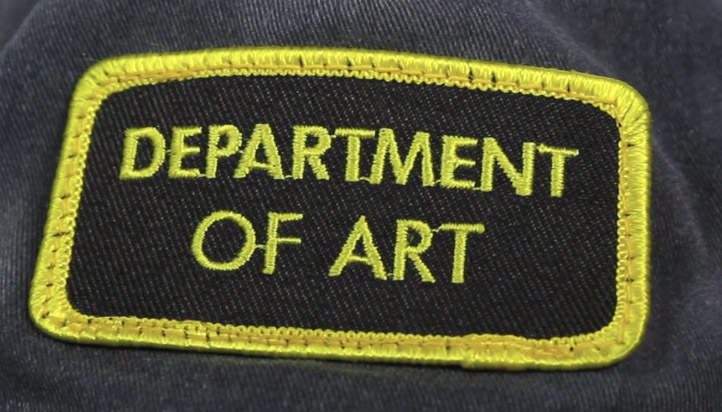
Last month after sharing my own lightweight sketch easel design, I put out a call to all you Do-It-Yourselfers to share your home-built sketch easels, and you came through with some extraordinary innovations.
I promised to pick my favorite entry, but I couldn’t narrow the field down to one, so I picked seven. Each of the following submissions will win an official GurneyJourney “Department of Art” patch.
I’ll also award a D of A patch to the best FB share of this blog post.
Bryan Coombes
Bryan Coombes says: “I’m in the Vancouver BC area, been painting for about 5 years in oil and acrylic. I LOVE painting and now- thanks to you, I love painting in watercolour. I’m looking forward to trying out casein next."
Here’s Bryan Coombes’ design fully deployed.
Bryan improves my design in various ways, including by having a place to attach the pencil sharpener, and a pencil- or brush-holding groove on the front. Good point about the silicone for attaching stuff to the plastic cups. The rest of the notes speak for themselves.
 ERC
ERCERC sent me photos of two ideas that he and his friends came up with.
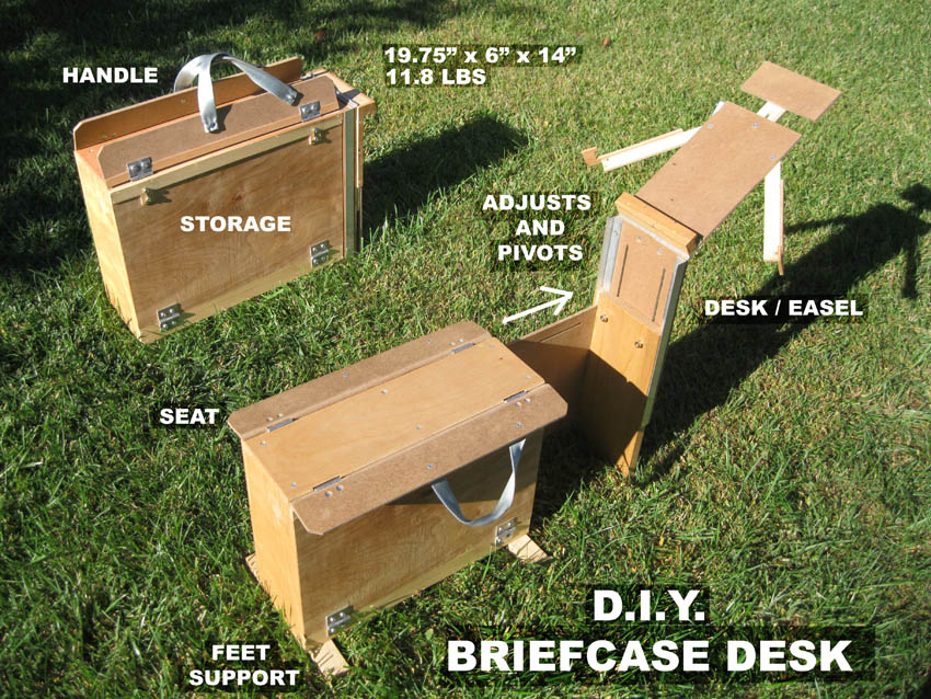
The first is a folding drawing horse. It looks like a big wooden briefcase — with storage inside — but it folds out to a stable and sturdy drawing bench that you can take to any sketch group.

ERC’s second design rolls on skateboard wheels like a modern suitcase. Or you can carry it like a backpack to a painting location. Then the legs fold out to a wide tripod stance, holding any size canvas and a double-wide palette.
Jason PeckJason says, “Here is my most recent lightweight watercolor palette. I had a friend cut and drill the wood pieces for me."

"All I had to do was glue it all together, and stain it. It measures 9X10 inches, and weighs less than one pound. I’m still using the old hinges that you used on your first pochade rig, but I will be swapping them for the
Southco adjustable torque hinge
s soon.”

“This palette is lightweight and easy to pack and carry, but I have one more idea for an even lighter palette. I’m thinking of making one from old clipboards. My plan is to polyurethane the clipboards to waterproof them.”
Steve
Steve says: "My casein mixing tray that I already had happens to be made out of aluminum, so magnets will have to be replaced with Velcro, not my favorite choice. Maybe I'll glue sheet metal strips on the bottom."

"I've found the easel kind of evolves as you go along. Because of the tension hinge thickness I couldn't get it to fold completely flat, so I came up with the water cup hole/piano hinge/spacer idea."
Randall CogburnRandall Cogburn of Texas uses his lightweight sketch easel for various media.
Here it is in oil mode.

He has also adapted it for use with gouache. “This is the first time I used gouache and loving it,” he says.
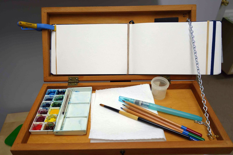
Nancy Vance made this easel from an old checkerboard. The boxlike interior, once used for holding the game pieces, forms a tray to keep brushes and cups from falling off.
It stays open as far as you want it to with a length of chain looped over a cup hook. If you want to paint on the right side of the book, you could mount the chain on the left side of the box.
Jeff Allen
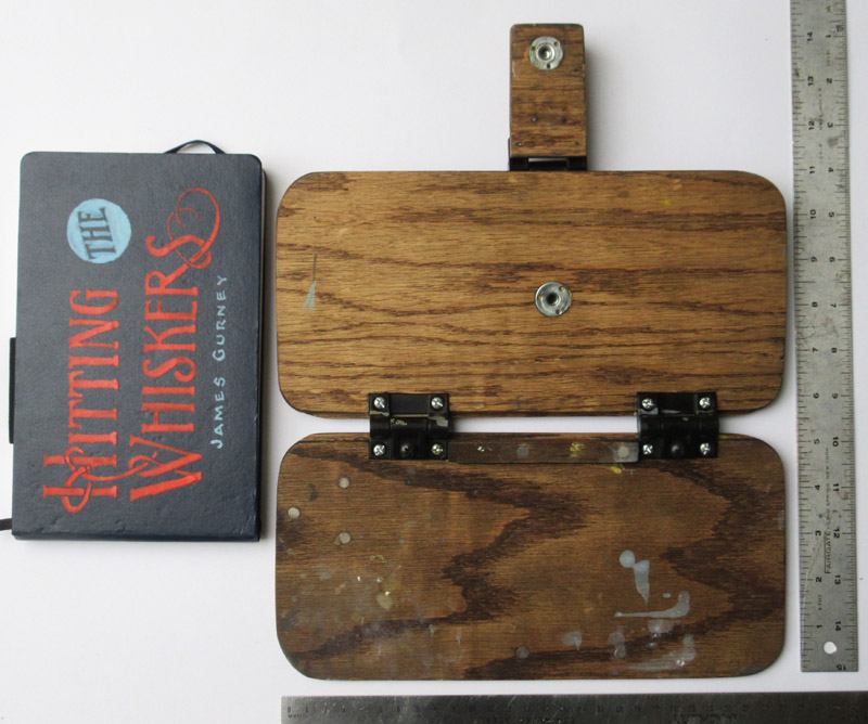
Jeff Allen says, “I made this box for a trip to Hawaii. It was designed to fit into a USPS "if it fits it ships" box."

"That way I could ship all my painting equipment to the post office in Kauai where I could pick it up when I arrived. At the time it was $7.00 per box for shipping to Hawaii! It was constructed in oak with a standard thread for a tripod and saw a lot of use in Hawaii. It will hold 6 x 8 to 12 x 16 panels. The pallete is removable for cleaning.”
-----
Thanks to everyone who entered, and sorry I couldn’t include all of them. I'm glad we can keep this all open-source to benefit the entire maker community.
To the seven winners, please email me your mailing address with the subject line "ART PATCH," and I'll send an embroidered "DEPARTMENT OF ART" patch out to you.
LinksMy original
Lightweight Sketch Easel.Earlier post on
Your DIY Watercolor Easels.
More info on my easels and watercolor materials
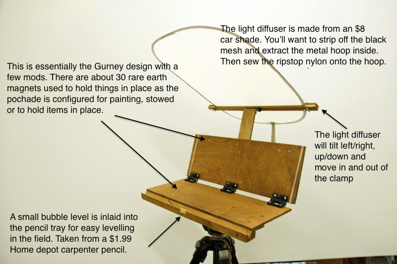
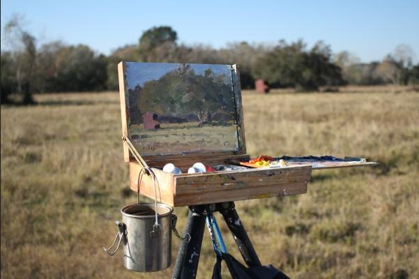
Several of you asked about how to build the lightweight sketch easel that I've been using lately.
One blog reader, who is an artist and a builder with a form of Muscular Dystrophy said, "It's difficult to find art manufacturers that make lightweight equipment for people with disabilities."
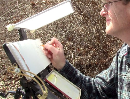
Here's how my easel looked when I set it up to show some workshop students. It fits on a camera tripod, which allows you to control the height and slope of the painting surface.
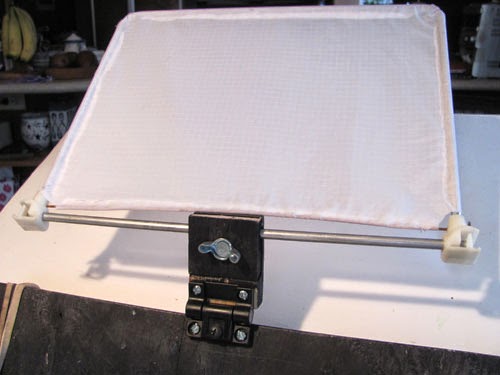
The white thing is a DIY nylon diffuser to shield direct sun or dappled light.
Here are the front surfaces (the ones facing me as I work) laid out flat. Each panel is 5.25 inches (13.3cm) by 11 inches (28cm). The panels are 1/4 inch oak plywood finished with Tung oil.
The long dimension of each panel only needs to be about 3 inches wider than the sketchbook in order to support it when open flat and clipped. The whole thing is small enough to fit into my belt pouch when it's folded.

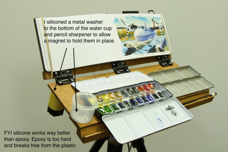
The palette panel (the one on the left in the photo above) has recessed Neodymium magnets to hold mixing tray or watercolor set. The triangle of magnets matches corresponding magnets on the base of the water cup.
The adjustable torque hinges stay open to whatever position you want. You can adjust the resistance of the hinges. I wanted to construct it so that the upper flange of the hinge was recessed to the level of the oak panel.
In order to recess the hinges so that the sketchbook lays over the hinges and the easel folds flat, I glued two 1.25 inch wide plywood strips along the back side. I also glued a wood base for the quick release plate to add strength and to allow the T-nut flange to be recessed on the other side.

Here's the back laid out flat. The support point is positioned close to the center of the sketchbook page on the other side. The closer it is to that point, the less the whole rig will wobble when pushed with the brush, pencil, or hand.
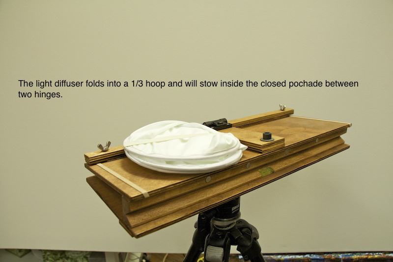
The diffuser gripper is made of two pieces of plywood with a T-nut on one side and a thumb screw on the other. The two pieces are held together with a hinge and grooved to hold the diffuser bar. The wedge mounting base allows the gripper bar to fold down flat when not in use.
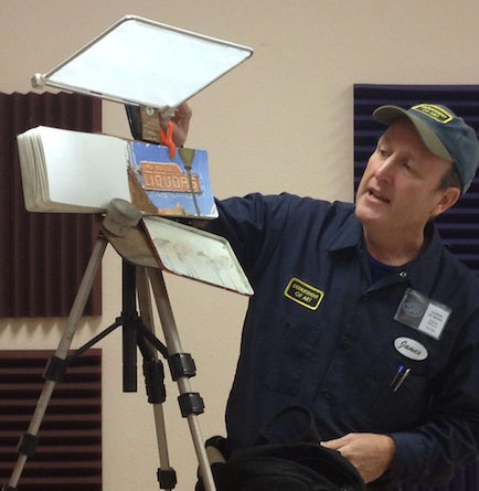
Here it is set up with a camera extension bar coming from a second tripod. I just wrote an article for International Artist magazine about how to shoot and edit video art tutorials.
This sketch easel can be used not just for sketchbooks, but also for small paintings on panels. Here I'm working in casein on an 8x10 panel clipped to the easel.
Please send me photos with captions of your own DIY sketch easel. My design uses some of the refinements you came up with in the last round (see post called
Your DIY Sketchbook Pochades).
I'll award a prize of a "Department of Art" embroidered patch to my favorite submission.
------
Suggested parts:Tee NutSouthco adjustable friction hingeNalgene 2-Ounce Jar 1/4 x 1/16 inch Neodymium MagnetsTung oil
Tripods:
Vista Explorer 60-Inch or
Velbon Sherpa 200 Tripod
Diffuser:
White Rip-Stop Nylon Fabric

Francis Russell Flint (1915-1977) was the son of the more famous watercolorist
Sir William Russell Flint. He wrote a book called "
Water-Colour for Beginners
" which explains his suggested plein-air gear.
"There are many good types of easel available but I suggest the best is a small compact easel, not too light, and sufficiently strong not to be troubled by the wind. An aluminum or light wood easel may look very nice in a shop, but they are quite different in a strong breeze. The easel should have three telescopic legs with spikes at the ends, and at the apex of these a flat arm which can be firmly secured in any position, that will tip up and down on a hinge, and slide backwards and forwards."
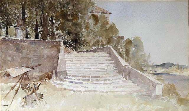 |
| Francis Russell Flint (1915-1977) 'Steps in the Sun ' St. Jean - de - Cole' |
He preferred to stand rather than sit, so if he brought a stool, it was generally to use as a place to lay out his gear if he was painting in a wet or muddy place.
He said that the thing to look for in a watercolor box is deep wells for mixing generous washes, and the wells or depressions in the mixing area should have the deepest part toward the center, so that colors don't get mixed up with each other. He used a large sable brush for broad washes and an aluminum flask for extra water.
It's probably a safe bet that the son modeled this setup after the father. A vintage British Pathe film (linked below) showing Russell Flint's palette, which also has three deep wells.
-----

Marque Todd says:
"I bought your WC video and have been avidly following all of the posts this week - a couple of things I am still grappling with for my kit and I hope you can answer:
"1) How do you protect your brushes from damage with all the jostling they get in a to-go pack? If they are loose in a container the tips can get damaged and that seems a pity particularly for expensive sable brushes. I am also having a problem finding something big enough for short handle brushes that isn't so long that it is hard to pack - any suggestions?"
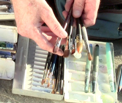
Thanks, Marque. I keep my brushes loose in a box. The tips are safe as long as the box stays parallel to the ground, but in my belt pouch the box never tips on end. Sometimes if I'm worried about a delicate brush I keep the plastic protector from when it was new and slip that on. I keep the brushes all facing one end of the box. If one needs a good washing out later, I face it the other way in the box so that I'll recognize it right away.
I'm always on the lookout for a box that's just long enough for most short handled brushes but not too big, and one that opens quietly. If a brush is too long to fit in the box, such as an oil brush, I chop it down.
Jeanette uses a
brush holder made of stiffened fabric. The brushes tuck into elastic bands, and the whole thing folds open to display the brushes while you're working. When in transit it rolls up and is held with Velcro. I like it except that it's a little too long for my belt pouch.
"2) If you are holding your sketchbook on your lap (vs. using the stiff board behind) how do you manage that with the landscape format? It is pretty floppy and somewhat of a balancing act. The only thing I could think of was to put a binder clip across the gutter/hinge area to help stabilize it."
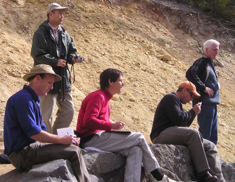 |
| Sketching at Yellowstone with friends from the ASAI |
I've used the binder-clip-across-the-spine idea, and that works fine. Otherwise I just try to rest the middle of the book's covers on the tops of my thighs to keep it from flopping. If I have to, I steady the book with my left hand.
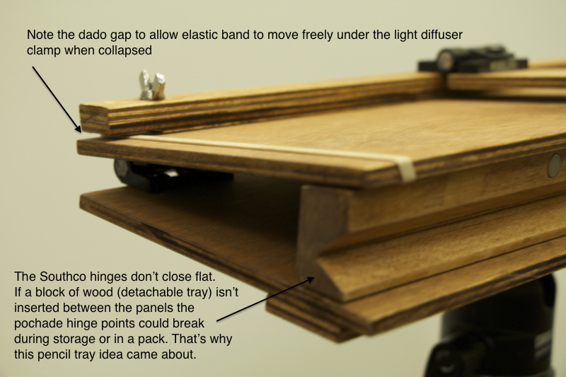
Glenn wondered about the sketchbook pochade rig, asking if I countersunk the T- nuts (Those are the threaded nuts with a flange that fits through the plywood, holding it to your tripod.)
Glenn, Yes, I countersink the T-nut flange using a 3/4 inch spade bit, then glue the T-nut in with
Gorilla Glue
, so that it doesn't work its way loose. But since it's getting pulled tight from the back, it holds really well. If I was using 1/4 plywood for the backboard, I probably wouldn't countersink for fear of weakening the wood.
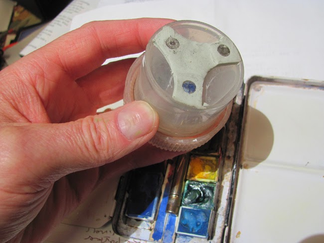
For you scratch builders, here's the pochade laid out flat. The red dots on the paint tray are magnet positions, which hold on the metal mixing trays or watercolor kits.

Here is the underside with two quick release plates attached. My new iteration of the rig has three T-nuts, one just right of center and one on each end. I use the central support point if I only have one tripod, and I use the two on the end if I need two tripods to keep the rig more stable when filming.
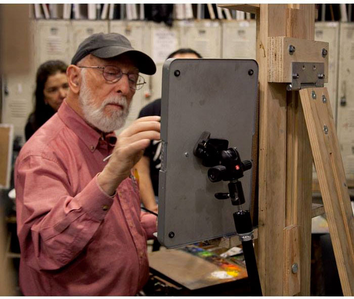
Here's how the rig looks set up. Every angle and slope is fully adjustable: diffuser, sketchbook, paint tray, and camera bar. The camera I'm using is a
Canon VIXIA HF
series. It shoots 1080p to flash memory and has the all the essential features: focus lock, custom white balance, and exposure controls, plus an external microphone jack that yields less noise than my DSLR. For a mike I use the inexpensive corded
Audio-Technica lav microphone
, sometimes clipping it to the sketchbook itself to pick up the scratchy pencil sound cues.
In this view you can see the two tripods. The diffuser panel, which is covered with white rip-stop Nylon, can slide right or left in its gripper to eliminate the direct sun. On the left is the
Mighty Bright HammerHead Book Light
, which clips on for night sketching.
And here's the the painting that's on the easel, the one that you can watch being painted in the "Watercolor in the Wild BONUS FEATURES" video, drawn with a brush and sepia watercolor in a museum.
Here are the links to that 28-minute video, available only as a download.

Here are the results of the Watercolor Pigment Poll, which closed yesterday. The poll asked you to: "Vote for your 8 Absolutely Indispensable Watercolor Pigments." Thanks for voting. There were 147 votes in all.
Most Indispensable Watercolor Pigments
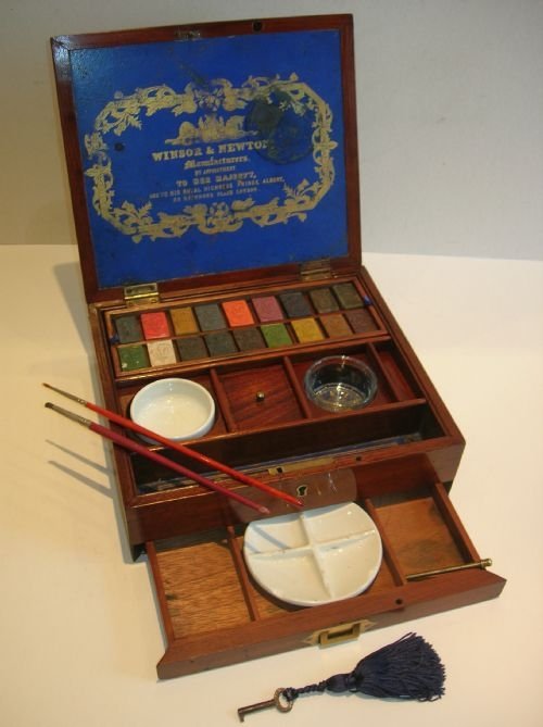 |
Antique English inlaid mahogany watercolour box made by Winsor & Newton around 1850.
|
1. Ultramarine Blue—109 votes (74%)
2. Burnt Sienna—76 (51%)
3. Alizarin Crimson—72 (48%)
4. Cadmium Red—68 (46%)
5. Cadmium Yellow—66 (44%)
6. Burnt Umber—58 (39%)
7. Yellow Ochre—57 (38%)
8. Lemon Yellow—48 (32%)
9. Cobalt Blue—45 (30%)
10. Paynes Grey—44 (29%)
11. Cerulean Blue—43 (29%)
12. Raw Sienna—35 (23%)
13. Opaque White—34 (23% (tie))
14. Sap Green—34 (23%)
15. Gamboge—30 (20%)
16. Phthalo Blue—28 (19%)
17. Quinac. Rose—26 (17%)
18. Prussian Blue—23 (15%)
19. Viridian—22 (14%)
20. Raw Umber—20 (13%)
21. Hansa Yellow—17 (11%)
22. Perm. Magenta—17 (11%) (tie)
23. Hooker's Green—16 (10%)
24. Sepia—16 (10%)
25. Bone or Ivory Black—16 (10%)
26. Phthalo Green—11 (7%)
27. Other (in comments)—10 (6%)
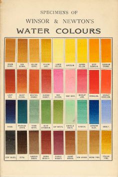 |
| Winsor and Newton color chart from 1910 |
Fewer than 10 votes
Pyrrole Red
Vermilion Red
Carmine Red
Venetian Red
Scarlet Lake
Cobalt Violet
Perm. Violet
Neutral Tint
Indian Red
Terre Verte
Emerald Green
Perm. Green
Manganese Blue
Lampblack
Conclusions
1. No greens made the top ten. Nor did black or white. Perhaps that's as it should be because it's quite easy to mix greens and blacks, and doing so offers the benefit of attractive variegation in the mixtures. And the question of whether, when, and how to use white—well, that's a whole 'nuther topic.
2.
Ultramarine was #1 by a wide margin, and for good reason. It's an extraordinary pigment, nowadays synthesized cheaply by modern chemistry. But centuries ago when they had to mine it in Afghanistan as lapis lazuli, it was more valuable than gold.
More about ultra's history here.
3. You could make a good palette out of the top 12. It would include warm and cool reds, warm and cool yellows, three fine blues, and some good earth colors. You could even get by with a palette made the top five.
4.
Alizarin Crimson was #3, but before you buy it, remember that true Alizarin (PR 83) is prone to fading. Read more at
this previous GJ post. But if you're painting in sketchbooks, you don't have to worry as much about lightfastness.
A Note about Cadmiums
Cadmium red and cadmium yellow both appeared in the top ten. The cadmium pigments have been the subject of some controversy, because of the toxicity of the pigments, the regulatory requirements governing the manufacture, and concerns over environmental impacts after disposal.
Usage has been dropping, and there have been proposed cadmium bans. Those bans have been successfully opposed in most regions, largely due to exemptions of art supplies from banned products lists, but that may change eventually.
There are worthy modern alternatives, such as pyrrole red and hansa yellow, but they're not as well known.
Previous Poll
I conducted a similar pigment poll back in 2008, without specifying the medium. Back then, most people probably assumed I meant oil paint. The top ten in that poll did include black and white, which are more commonly used by oil painters, but otherwise the results were fairly similar.
Results of the 2008 Poll (which didn't specify the kind of paint)
1. Ultramarine Blue 180
2. Titanium White 172
3. Yellow Ochre 161
4. Cadmium Red 158
5. Cadmium Yellow 150
6. Burnt Sienna 150
7. Alizarin Crimson 141
8. Burnt Umber 126
9. Black 98
10. Raw Umber 97
11. Raw Sienna 81
12. Cerulean Blue 79
13. Cobalt Blue 73
14. Viridian 64
15. Naples Yellow 60
16. Sap Green 56
------

In the 1830s,
J.M.W. Turner carried a watercolor sketch kit in a wallet. "It's a simple leather case with gauze that Turner would have literally stuck the pigments onto,"
says Julia Beaumont-Jones, Collection Registrar for the Tate Britain.
Some of you have been sharing the amazing sketch kits you've made.

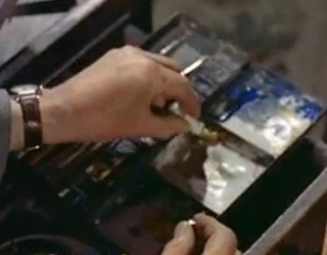
Joe Ongle says: "This is my custom Altoids mini palette, using self-hardening clay and tube watercolors. Half pans work as well."

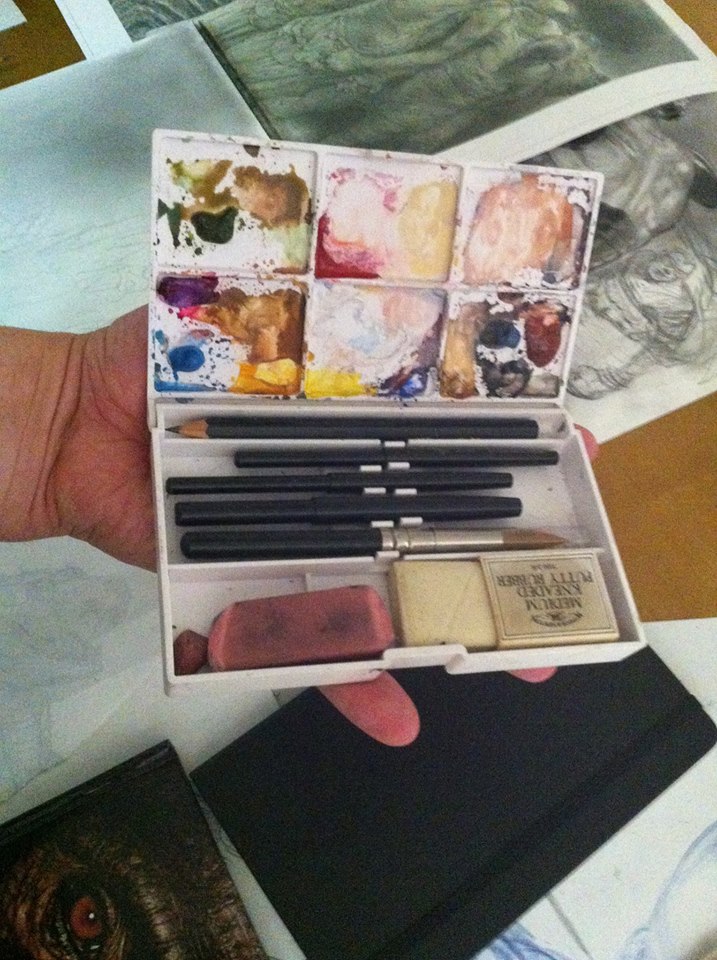
Chuck Pell says: "My kits are compact for pockets, using custom leatherbound archival sketchbooks and repacked watercolor chips...."
Michelle Spalding made one from a mint tin, "with a retractable cosmetic brush - keychain size with half-pans"
Carlos Huante adapted a cosmetic style brush kit. "I bought this set for 40 bucks back in the day and use it all the time."
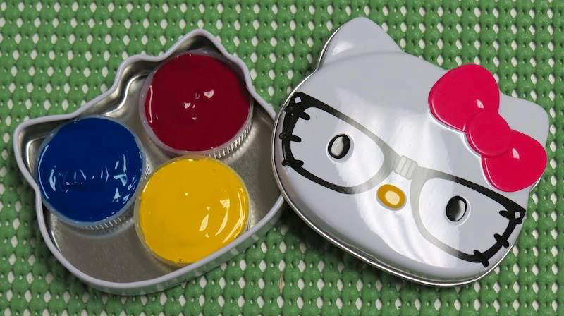
Carole Pivarnik made one from a Hello Kitty tin: "It has just three primaries: perm yellow, magenta, and cyan. It uses water bottle caps for pans. They are essentially free, hold a generous amount of paint and with less adjacent edges than rectangular pans, there tends to be less color pollution. A little blue tack holds them in place. I would like to add a dollop of neutral tint in one corner for faster mixing of darks but I can mix just about anything with these three colors. I carry this tin, a mini waterbrush, a mini black Sharpie, and a short HB pencil in a little pouch. Very portable!"
Have you made an unusual watercolor kit? We'd all love to see it. Please share yours with a link in the comments.
Plus: I'm honored that Marc Holmes of Urban Sketchers wrote a
review of my DVD "Watercolor in the Wild."

(Link to video excerpt)
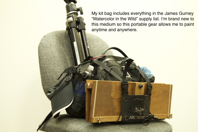
Here's a complete list of materials and a buyer's guide for plein-air watercolor painting.
This is a supplement to my instructional video "Watercolor in the Wild."
I carry these art supplies practically everywhere. The basic elements are pretty simple: a sketchbook, a paint box, a few brushes, watercolor pencils, a rag, and some water. They're all listed in detail below.
Watercolor Sketchbook
• I have often used the
Moleskine Watercolor Album (5 x 8.25 inches) 
I like the fact that it opens flat and I like the horizontal (landscape) format. It has 36 pages—72 if you paint on the facing pages. It has a fake leather hardbound cover, an elastic strap, and a pocket in the back. The paper is 90-pound weight, which is rather lightweight for very wet watercolors, but it's OK if you're doing mostly drawings rather than juicy paintings.
• I also recommend the
Pentalic Aqua Journal (5 x 8 inch)
, which is priced about the same as the Moleskine but has better paper — 140 lb (300gsm) cold press, acid-free paper. With the heavier paper, it has just 24 pages. But they'll hold up to wet washes or even light impasto, such as with casein. It has generous extras, such as an elastic strap, a back pocket, an elastic brush-holding sleeve, and a placeholder ribbon.
• The
Stillman and Birn Beta Hardbound Sketchbook (5.5 x 8.5 inches)
is a vertical book with 26 pages of cold press 180lb. archival paper. The paper is substantial, but it doesn't open flat easily. It can be held flat with clips. If you're thinking of working in casein, the heavier paper reduces the chance of impastos cracking.
• The
Pentalic Watercolor Field Book (7 x 10 inches)
, is well suited those who prefer a spiral binding. It's bigger, so check to make sure it will fit in your belt pouch or purse.
To decorate the cover, I use the oil-based
One-Shot Sign Painter's Lettering Enamel
, which is very opaque. Paint markers also cover fairly well, but they tend to wear off faster. I usually title the sketchbook with a phrase taken from the first page of the sketchbook.
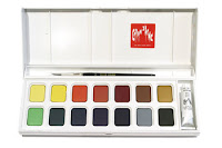
Watercolor Sets
Quality Metal Pan Sets
Custom Sets Made from Empty PansYou can get exactly the colors you want by buying an empty metal box and filling it with colors that you choose. When the colors run low, you can refill the pans with tube colors.
Large size empty box. In my videos, I'm using an old Talens box from the 1960s. You can get a similar
large empty metal watercolor box, which holds 24 half pan colors or 12 full pans. This box opens up to 9 x 8 x 1 inches. You can combine half pans and full pans in the same box, using full pans for colors you use more often. Sometimes I put in two pans of the same color if I use them a lot.
Small size empty box (left). The
smaller empty metal watercolor box
opens up to about 5 x 8 inches, which fits the left side of a Moleskine or Pentalic sketchbook. This box will hold 12 half pans or six full pans.
Empty half pans. The most economical route is to buy plastic
empty half pans
and fill them with tube colors. The empty pans cost only 34 cents each. For students or anyone on a tight budget, you can get the
12 Tubes of Student Grade Winsor and Newton Watercolor Tubes
for just $30.00. If you have dried up watercolor tubes, don't throw them out; cut them open and scrape out the tar-like pigment to fill empty half pans. Even if they're dried hard you can reactivate them with water once you cut the tube open.
Alternately, you can fill your box with factory-filled pans.
Colors--Here's a basic set of 12 half pans. These are really all you need.
Eight more classic colors if you have room for them.
Economical options
If you're looking for a super-compact pocket rig, or if you're a student, a first-timer, or on a budget, I recommend the
Winsor and Newton pocket watercolor set with 12 colors
, which you can get for around $15.00. This has a plastic box containing
Cadmium Yellow Pale Hue, Ultramarine, Yellow Ochre, Cadmium Yellow Hue, Cobalt Blue Hue, Burnt Sienna, Cadmium Red Pale Hue, Sap Green, Burnt Umber, Alizarin Crimson, Viridian Hue, and Chinese White. That's a pretty good assortment, and the quality of the paint is OK. Note that when it says "hue," they're replacing an expensive pigment with a cheaper pigment of a similar hue.
A lot of field artists and urban sketchers love the
Sakura Koy 12-Color Field Set with Water Brush
, which is under $20. It includes the brush and fits in your pocket. The case is made of plastic, so you can't use magnets on it, but the lid has mixing wells, which helps if you're laying down larger washes. Two cautions: the lid doesn't open all the way flat, and when the colors are wet they can spill over into each other.
There's kind of an arms race for small sets. Some of the smallest watercolor sets are the size of a business card, and easily fit into a pocket. At left is the
Pocket Palette by Expeditionary Art. The metal pans can be filled with tube colors, and they're held in place by a magnetic backing inside the case. The flip-up metal lid has a white surface for mixing colors. The downsides are: 1. The lack of mixing wells to hold wet washes, 2. The reflective metal, which can be blinding on bright days, and 3. The overlapping flange on the left side that covers part of the pans.
At lower right is a 30-year-old Winsor and Newton "Bijou Box," which they no longer make. It has an enameled steel case with 18 colors and a tiny travel brush. The pans are tiny, and I think there are more colors than necessary. I'd rather see 6 or 8 for a box this size. The lid has four mixing wells, which is a big plus. If you can find one of these used for a good price, grab it, but a comparable super-mini set that you can get in USA is the
Winsor and Newton Cotman Water Color Mini, or you can make your own equivalent of the Bijou with an old Altoid tin, some spray enamel paint, and some extra half pans.

Water Cup and Rags
I keep a second jar with clear water handy, and often just a regular drinking water bottle, and I use an old plastic "Tupperware" basin or yogurt cup for a brush cleaning bucket when I'm painting with the tripod easel.
I cut up old cotton T-shirts for paint rags, or use paper restaurant napkins or paper towels.
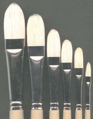
BrushesHere's a good inexpensive starter set of brushes:
Richeson Sable Hair Watercolor Brush Set/5
I like sable flat brushes, such as:
1/2-Inch Sable Brush 3/4-Inch Sable Brush
I also use a
1/4-Inch Synthetic Watercolor Flat Brush
, which work well for architectural detail.
For laying bigger washes and wetting the paper, a
Cat's Tongue Wash Brush is a good tool. It has a flattened ferrule similar to a filbert brush.
Round Kolinsky sables (note: some brands may become discontinued in the U.S. as the
Kolinsky ban exhausts stock on hand):
Winsor and Newton Series 7  Richeson Siberian Kolinsky brushes
 Escoda Optimo KolinskyDa Vinci Maestro Series Kolinsky Red
If you have a very compact kit and can't carry a box of brushes, you might want to use a
Sable Round Travel Brush
, which safely stows the brush tip inside the handle.
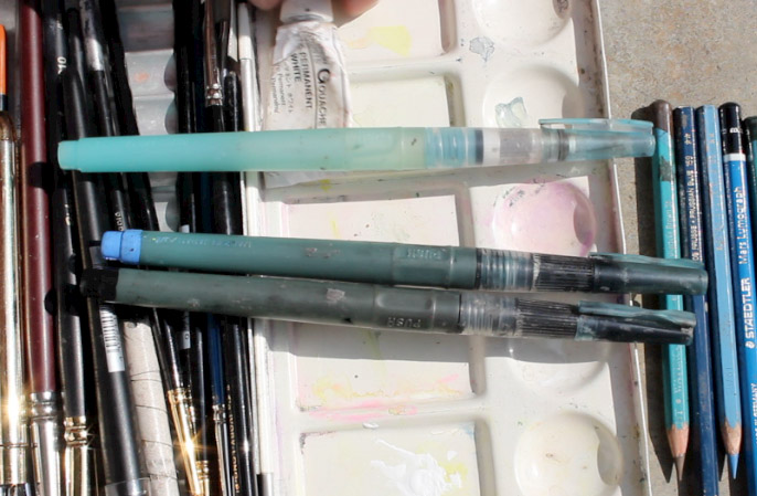
Water BrushesI always try to carry four
Niji Water Brushes with large round tips
. They're the best brand I've found, and stand up to a lot of hard use. For info about filling them with ink, please scroll farther down this post.
I also carry a tube of

white gouache, such as
Holbein Permanent White Gouache.
Winsor and Newton is also good. Sometimes I bring a whole set of
gouache colors to supplement the transparent watercolors, but gouache will be the topic of future posts.
Plastic clampsHere's a
2-Inch Plastic Clamp
and a
3.75-inch Clamp
. Of all the clips and clamps that I've tried, these seem to be the most versatile for holding the book open or clipping the watercolor box to the easel.
Sharpener
I use a
Kum Pencil Sharpener
, which not only catches the shavings, but also has a little flap that covers the hole, so the shavings don't leak out and pollute the pages of the sketchbook.
Eraser
Water-Soluble Colored PencilsThese add a lot of options and variations to traditional watercolors. I recommend trying a few test pencils from several different brands to see which ones you like. My favorite brand is
Caran D'ache Supracolor, but I also like
Derwent Inktense Pencils
for rich, saturated colors.
I started with a
Caran d'Ache Supracolor Set of 18
. Over the years I have added and subtracted individual colors from the standard set. Below are the colors I take with me most often. It emphasizes warm colors that I like for portraits and animal drawing.
Caran d'Ache Supracolor watercolor pencils
#001 White
 Pencil Box
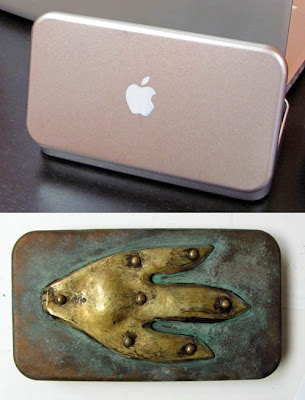
The pencil box I use was customized by armorer
Tony Swatton. It began as a metal box I bought at a Japanese bookstore called
Kinokuniya in Los Angeles. (I painted the
Apple logo as a gag.)
Tony then added the hammered brass piece with rivets and I aged it with paint.
Waist Pack / Fanny Pouch / Belt Bag
[The Explorers] Multi-Purposes Fanny Pack
looks pretty similar. I recommend that you buy the pack at an outdoor store
after you select the contents to make sure everything fits. A quiet zipper and minimal Velcro is a consideration if you plan to sketch in quiet places where you don't want to attract attention.
I use a
Velbon CX-444 Tripod
because it's lightweight, folds small, and reaches up to a reasonable standing height when fully extended.
Three legged stoolA
Tripod Stool
is something I carry in the car or in a backpack when I plan to sit. Sometimes I bring an extra to use as a field taboret for art gear.
Sketchbook Pochade The simplest sketchbook holder is a piece of 1/4 inch or 5/16 inch thick plywood cut to the dimensions of the sketchbook opened up flat. I call it a "sketchbook pochade." I drill a hole in the back of the panel and insert a
1/4-20 Tee Nut
which will attach to the tripod and securely hold the plywood. The sketchbook attaches to the plywood base with rubber bands or plastic clamps.
Homemade EaselI made this device, which I call a Sketchbook Pochade Easel to hold the paint set, the water, and the sketchbook. I also use this for gouache and casein. The diffuser frame attaches to the top, and it uses
White Rip-Stop Nylon Fabric that I sewed onto an old aluminum Pendaflex file folder frame, a holdover from the dinosaur era.
Here's a clearer shot of the sketchbook pochade. It attaches to the tripod (I use a
Velbon CX-444 Tripod) with a
Tee Nut, and uses a
Southco SC-773 Adjustable Torque Hinge and a furniture slider to hold the parts at the proper angle. The "camera bar" for holding the video camera swings out from the front, held at a constant position by a piece of brass furniture hardware called a
Friction Lid Support.
The palette area is made from the lid from a pencil box, primed and then spray-painted with white enamel, and held on with Velcro. That way it can be removed for cleaning, especially when I use it for casein or gouache.
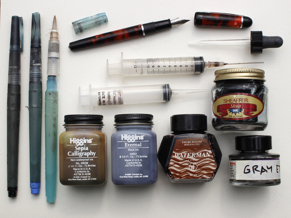
 Refilling Water Brushes and Fountain Pens
Water Brushes I've tried several brands, but none seem as reliable as
Niji Water Brushes. I recommend the ones with
round tips, but you can also get them with
a 12mm Flat Tip
. I normally carry between three and five water brushes. One is filled with water, which fills easily under a normal faucet by unscrewing the handle and squeezing the barrel.
The others are filled with blue, black, brown, and gray. I mix the gray myself, put it in an empty bottle, and mark the bottle. To identify which water brush is which, I paint the back end tips with acrylic (see lower left of photo above).
InkThe ink in a brush pen should be water-soluble so that it doesn't clog the brush fibers. I use
Higgins Eternal Ink
0 Comments on
Watercolor in the Wild Materials as of 8/11/2014 10:58:00 PM


.jpg?picon=1009)
 Next week— Painting Grounds
 ." Unfortunately it's not available in a free edition, but there's an inexpensive print edition that Dover publishes under a different title "Oil Painting Techniques and Materials


Great idea! But even if it was a shell of a PC, I would never use a PC for art. : )
I can't wait for MacBook Pro to become obsolete.
In my country (Indonesia), laptop is still very necessary for the advancement of education, especially for children. It is too valuable if the laptop should be dismantled as it
Slamet, yes, of course. I assume that one would not modify an old laptop unless it didn't work anymore.
In my country (Indonesia), laptop is still very necessary for the advancement of education, especially for children. It is too valuable if the laptop should be dismantled as it.
In my country, laptop is still very necessary for the advancement of education, especially for children. It is too valuable if the laptop should be dismantled as it. Goedkope tablet covers