new posts in all blogs
Viewing: Blog Posts Tagged with: Sketching People, Most Recent at Top [Help]
Results 1 - 23 of 23
How to use this Page
You are viewing the most recent posts tagged with the words: Sketching People in the JacketFlap blog reader. What is a tag? Think of a tag as a keyword or category label. Tags can both help you find posts on JacketFlap.com as well as provide an easy way for you to "remember" and classify posts for later recall. Try adding a tag yourself by clicking "Add a tag" below a post's header. Scroll down through the list of Recent Posts in the left column and click on a post title that sounds interesting. You can view all posts from a specific blog by clicking the Blog name in the right column, or you can click a 'More Posts from this Blog' link in any individual post.
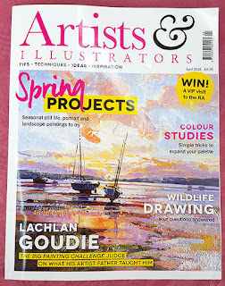
I had an email arrive out of the blue a while ago, from the editor of Artists and Illustrators magazine. He had noticed my new Sketching People book was out (well, that's great, before we start...) and he wondered if he might come to Sheffield to do an interview with me in the studio.
Well, I rarely turn down the opportunity to tell someone new all about what I'm up to, but also, the chance to appear in the UK's best selling magazine for artists was way too good to miss. I was flattered too that Steve was happy to come up to Sheffield in person. Turns out he was here as a student. Small world.
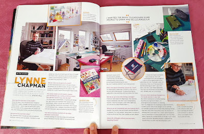
We spent a happy couple of hours chatting away and Steve took loads of photos. I talked about my Sketching People book of course, and showed him a copy, then I unpacked my urban sketching kit for him to photograph. Steve was very taken with my midget stool (and I notice that made it into the final article).
I also told him all about my year as artist-in-residence at the Morgan Centre and showed him some of my sketchbooks. It was lucky that the one I mounted on the wall as a test for the exhibition, was still up, so he could see the full effect.
At that time, I hadn't yet started on my artwork for Class One Farmyard Fun, but I showed him the roughs and we talked about how I create my artwork. I had to do the obligatory photo, where I sit at my drawing desk, pretending to be working. It always looks good though, even though it feels a bit odd.
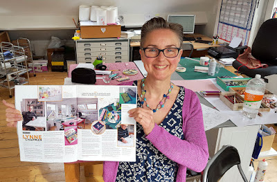
Last week, a copy of the magazine arrived with my double page spread. Hurrah! Steve has done a lovely job.
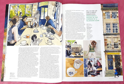
There's a great article about Will Freeborn in this issue too. If you haven't come across his work, take a look. He is another UK Urban Sketcher, based up in Scotland:
I shall take my magazine on the train with me to Manchester: it's the only time at the moment when I get to indulge in reading magazines!
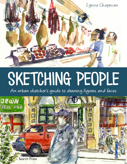
Yep, today is the official publication day for my new book Sketching People: an Urban Sketcher's Guide. Hurrah!
So, if you have pre-ordered a copy, it should be with you today or tomorrow. If this is the first you have heard about it (though that would be hard, the way I have been banging on about it...), you can read all about it and see lots of sample pages here.
If you are in the US, your co-edition isn't quite published yet, I'm afraid, but you only have to wait another 3 weeks. This is where you pre-order the American edition.
Happy sketching everyone! Don't forget to leave me some lovely reviews on Amazon :-)
The advance copies of my urban sketching book just arrived - hurrah! They should have been here a couple of weeks earlier it turns out, but they went astray in the mail and the publisher didn't realise I hadn't had them.
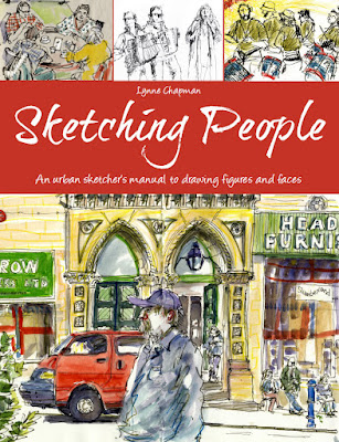
It's been a bit fraught with technical hitches to be honest because, when they resent my package this week, someone put in the American edition and one by a Singapore publisher (below), but left out the UK one (above). Never mind - they look gorgeous and glossy and I am very pleased. The contents on the inside of the different editions are more or less the same, it's just odd words and grammatical variations - it's mainly the covers which look different.
It's lovely to see how all the content looks, in it's proper form. I spent so long putting it all together and now here it is, looking like a real book!
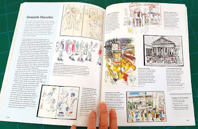
I thought I'd take some snaps to give you a sneak preview, though you probably have a pretty good idea by now, since I've talked about it in progress often enough (hit the Sketching People label on the right, if you're interested).
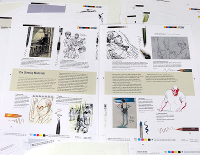
There a section which looks at art materials, with a specific eye on how you choose tools which are appropriate to the problems of drawing people out on location:
I look at how you choose your subject, which is hugely important. There are some locations and activities which are virtually impossible, but plenty of others which make things a lot easier for you, especially if you are cutting your teeth:
Then there are the different possible angles to tackle. I would rarely advise drawing people front-on. It's much more interesting and far easier on the whole, to tackle them in profile or in three-quarter view, particularly when you are concentrating on faces:
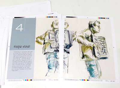
I write a fair bit on techniques to deal with the fact that people move about a lot, which is of course one of the main things which makes them so tricky. I can't stress enough the benefits of trying contour drawing, both for warming up your arm and eye and for tackling your subject as swiftly as possible:
Plus another technique, handy particularly if you are drawing groups of people or people passing by, is using composites - sketches made up of a little of one person and a bit of another, with maybe the head of someone else again!
There is a lot more too, of course. I tried to think of everything I know. It's hard when you have been doing something for so very many years. It all becomes second-nature. Writing the book has been really interesting, because it has helped to make me analyse what I know. Which has actually really helped for when I am teaching workshops, like the ones I am doing at the moment for the Morgan Centre as part of my Artist-in-Residence year, and of course the work I do with Urban Sketchers.
I received a package from my publisher just the other day, with some very exciting contents...
It was the colour proofs of my Sketching People book.
I seem to be juggling lots of different projects at the same time right now, but the urban sketching book is at least one which is very nearly finished.
The colour proofs are when you finally get to see what it's going to look like. Even though I've been very hands-on throughout the progress, I've been dealing with it in batches, so never had the chance to look at it as a complete project. Plus I'd never seen the final design of many of the spreads, so I couldn't wait to get a look.
By this stage, all the design has been finalised, all the text is in place, exactly as it will look, and all the images, whether photos or sketches, are in their final positions on the spreads. It was lovely to see everything looking gorgeous!
But I wasn't just sent them to admire: my job was to go through the whole thing with a fine tooth-comb, checking it over and making any final notes about alterations that needed making, or errors I noticed. That meant reading the entire book, which took a while, as you can imagine.
There were actually lots of little things I picked up, both to do with images and text: I made two pages of notes!
One slight complication was that this was the US version - the text has been Americanised throughout, which does not just involve changes to words, but also some big changes to punctuation. I was surprised to discover for example, that in the US, a colon is followed by a capital letter! There were also many differences over where comas are used.
The text will be re-Anglicised after the proofs have been approved, which means Quarto employing someone to make all the changes: apparently less complex than trying to re-instate my original text. All a bit odd, but everything is, as usual, very US-led. That's where the biggest market for the book will be, despite it originating in the UK.
The biggest single issue I picked up, was the placement of annotation arrows: used to point to where I am making specific comments about particular elements of a sketch. Many of them were not quite pointing to the right place, because my designer didn't always quite understand where I was referring to.
All sorted now though. I am very pleased with how it looks. The quality of the colour is great and the design really sets everything off beautifully (thanks Moira!).
I'm told that it should be ready for publication sometimes around the end of February. You can pre-order already, but don't worry - I will definitely be letting you know when it's ready.
Last week I officially finished work on my urban sketching book. Last Monday, my editor sent me a print-out (just done on their office printer) of how it looks so far. This was for us to go through together, over the phone, ironing out any remaining issues.
This is the first time I have seen the design of certain elements, like the title page and contents above. I just chose images, then the fairies turned them into something lovely! I am very pleased with how the chapter headers are all looking too. These were the images I chose when I was at the meeting down in London, but the graphics has now been fine-tuned and they are looking really punchy:
There are still the colour proofs to check, which are due in 2 or 3 weeks, and my final job will be to check over the re-anglicised version of the text, in just over a month. My English text has already been Americanised for the Barron's edition. All the main proofing and checking is done on this version, then it is turned back again to UK English. At which stage, I will quickly run my eye over things, to make sure the punctuation fits with the meaning I want to get across (control freak...).
As far as the real work is concerned though, I finished it off on Saturday. Hurrah!
Earlier in the week, I went though my print-out, troubleshooting remaining anomalies and marking it up in red. I was looking at the image placement and graphics, re-reading through my text and looking at 'holes'. The holes were problems with guest images - people whose work I had selected, but who could not be contacted, or couldn't find the sketchbook the work was in.
I was on the phone to my editor for nearly 2 hours last Wednesday afternoon, going through the whole book, pointing up things I felt still needed tweaking and talking through any last-minute text which needed writing to fit the new, replacement guest images we were choosing to fill the holes. Then on Saturday, I spent the day doing all the bits and pieces of final work.
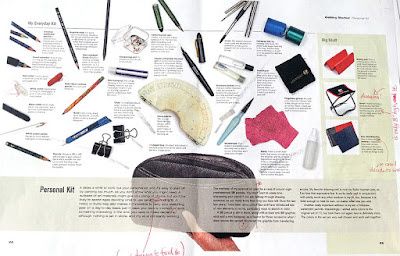
The design team did a great job on the kit-list page, don't you think? Remember when I was talking about it
all being photographed? My print-out is only A3, but the actual book is larger, so I can't wait to see the full-size proofs, where it will be all glossy and gorgeous too!
While I was away having my adventures in Denver, my Sketching People book went off to our US publisher, Barron's, for a pre-publication evaluation. It's standard procedure apparently. They have a list of questions they check against, to decide if they think the book needs any changes before they publish it in the States.
The check-points cover quite fundamental quality issues. They include questions like:
Is the writing style, reading level, interest level, and level of detail appropriate for the intended audience?
What is the general quality of scholarship and accuracy of the text?
Is the coverage of topics thorough and well balanced?
Under each question, the evaluator at Barron's writes a paragraph or two of feedback, before sending the report back to Quarto in the UK. Any problems then come back to me, via my editor, and changes need to be made to fit in with their requirements.
I got the email this morning from my editor at Quarto. She was so delighted, she sent me a copy of the Barron's evaluation report.
Turns out, they loved it. We passed with flying colours - no changes at all. The opinion was that everything was extremely clear, without being overly technical and that I had done 'an excellent job of offering many different approaches and techniques' with 'exactly the details that will help and inspire readers to draw people in urban settings', covering my subject 'well and completely'.
They believe my audience will be find it a 'lively and colourful read'. Best of all was in the summing up at the end, where it says: 'I am ...very familiar with all of the books about onsite drawing that have been published in recent years. "Sketching People" is one of the best books on the subject of urban sketching that I have seen... I am sure (it) will be popular and will sell well.'
That's such a wonderful vote of confidence, especially from somebody as all-powerful and in-the-know as Barron's. Let's hope that you guys, my 'gentle readers' think the same.
The only bit of bad news is that, because Quarto got very behind with things, they have changed the publication date. Instead of being ready in time for Christmas, Sketching People is now not going to appear until around February. Oh well, something to brighten those long, winter evenings...
While I was in London with the publisher of my Sketching People book, we sorted out various other jobs, as well as photographing all the demos I showed you last time.
One task I had deliberately left until the end was selecting images to use for the chapter headers. Most of the pages in the book have 6 - 8 sketches per spread, but at the start of each chapter, I can have one sketch taking up a whole spread.
I'd created a shortlist and emailed it down in advance. It was tricky, because only landscape or square format sketches would work across the double-page spread, but an awful lot of my sketches are portrait format. Moira, my designer, printed my various suggestions out on mock layouts, to see how different possibilities might look:
It was a difficult decision, but easier with other people's input. In the end, none of the ones in the photo above made the grade. You'll have to wait and see what I chose!
There was also another photography job to get sorted. One early section of the book looks at which art materials are most suitable for location-sketching and give tips for travelling light. So, I took all my gear with me and Phil took photos of every single item in my sketching kit. I love this picture of my grubby paint palette:
It feels good to have such a monster project wrestled into submission.
I need a photo of me to go in my sketching book: I always think it's more friendly to be able to see the person who is 'talking' to you in a book of this kind. I have loads of publicity shots (I've never been a shrinking violet), but the more perceptive amongst you might have noticed that I changed my hairstyle about a year ago: my spikes have given way to a quiff. Which means older photos are not so good.
So, while I was visiting my publisher, all kitted out in my best frock and with photographer Phil Wilkins on hand, I suggested we take a picture of me 'in action' with my sketchbook. I thought we would do something in the street, but my designer thought the local cafe, where we had just had our lunch, might be fun.
Quarto's offices are 100 yards from Pentonville Prison and the cafe is literally opposite the prison's main gate, which is why it's called the Breakout:
We went just before closing, so we wouldn't be disturbing any punters, and I sat at a table in the window on the far right of this photo. We shot loads of subtle variations on the theme. We tried a serious 'I'm concentrating on sketching' pose:
...and an 'I'm just sketching whatever is outside this window' one:
We also of course did the standard 'smiling at the camera' pose:
At one point a man came rushing in from the street, said: 'Don't take my picture, I just escaped!' then ran off again.
I am not sure yet which picture we are going to use in the book. They are all nice (thanks Phil), but I think the last one is the most friendly and welcoming. What do you think?
As regular readers will know, I am very close now to the deadline for my book, the full title of which is now decided: Sketching People, an Urban Sketchers Manual for Drawing Figures and Faces. All the scans from my archive of sketchbooks are done, as well as various additional drawings, created specifically for the book (like for how to draw hands and using colour as a framework instead of pencil).
But one BIG ELEMENT has been waiting until the end... the photographed sequences. These are needed to show how sketches are built up:
But that's really not something that can easily be done at home, so I took the train down to London and spent two days with my publisher and with Phil Wilkins, a freelance photographer.
To better explain how I draw different elements of people and how I tackle specific tricky situations, we wanted to show my sketches in stages. But for my style of working, where a sketch is done very fast, stopping at various stages was a problem. Which is why we got Phil to stand behind me, capturing the work in progress.
There was a bit of a spanner in the works too - a tube strike. This meant we had no models, so had to press-gang various people from the surrounding offices to come and sit for me. We started off by drawing the Senior Editor Kate. She was very unsure about the whole thing, but reassured when she saw it was just her hair I was focussing on:
I did someone's ear, as you can see at the top, then someone else's nose and mouth. We scoured the building for someone glam enough to be wearing high heels, then got her to clamber up on a table so I could draw her legs and feet:
The most scary sketch I had to do was left to day 2: to demonstrate a technique for drawing movement, by superimposing different elements over the top of one another. I thought a violinist would be a good option. Luckily, my editor Lily could play. Unluckily, the only violin we could lay our hands on was a child's one which had been gathering dust in someone's attic, so it's slightly smaller than it should be in the sketches. Hey ho. Probably nobody but another violinist would notice.
Once again, Phil set up over my shoulder so he could take pictures all the way through, from first marks to finished drawing. I did two different versions, first with my Koh-i-Noor rainbow pencil, so Lily ended up with lots of arms:
Then I tried again with my Inktense pencils, using different colours for the different overlaid arms. I think it's this one I like best as it's a more interesting teaching technique:
We finished off with a long pose. I wanted to do something on how to plan out a more complex situation, where you have more than one characters and a bit of background. We mocked up a meeting with Lily and one of the interns. I sketched a little thumbnail first, to plan the composition, which Phil photographed for the book, then I used this plan to create an under-drawing in my sketchbook, in lilac coloured pencil, before beginning in ink with my trusty Sailor pen:
Every minute or so I paused for a photo. It was really quite an odd way to sketch!
Once the line drawing was complete, I used watercolour to pull out the light and shade and give splashes of colour. It's not the way that I would normally work, but it's a good technique to demonstrate for beginners and so something that needed to be covered in the book:
The final sketch is not as exciting as I personally like - it's interesting how the more formalised approach made it harder for me to be expressive - but it will do the job. I gave it as a present to the intern, as a reminder of her time at Quarto, as she is heading home to new Zealand shortly. I also gave individuals the pictures of their ears, noses and legs etc.
We had some other jobs to do while I was in London, bit I'll talk about them next time, or we'll be here forever. See you in a few days...
The final, must-have-it-all-done deadline for my urban sketching people book is August 21st and I am delighted (and relieved) to say that everything is on track to be ready in plenty of time. Cue round of applause...
The whole timing thing has been a tad tricky though. I am used to the world of picture book publishing, where I can predict pretty accurately how long things will take me at each stage, but the planning, writing and illustration of this book has been totally different. With no previous experience, it was impossible to know how long I'd need for any of it, which has made it very hard for me to plan my time this year, particularly with weaving it around other projects.
All a wee bit stressful, especially as, I must confess, I am a bit of a control-freak (ask John).
One last-minute job I've just sorted, was to find some extra images from European sketchers. This is an interesting ploy by my publisher. Other sketchers who have done books will tell you that there is a big issue with having text on your drawings: it creates problems with foreign co-editions, because the handwritten text can't be translated. Now, if you know my work, you will know I use quite a lot of text...
The discussion started early on, when I wrote a section on how to add value to your drawings by writing snippets of overheard conversation, or any other elements which seem pertinent to the moment. I often like to record incidents (see above), sounds and smells (see below) as an intrinsic part of the image, to better conjure the slice of time, or the place I am recording.
It was obvious the text needed to stay in place for sketches in this chapter of the book, but then I realised that it would look slightly odd if, having recommended the technique, there was no hand-written text to be seen anywhere else.
My team at Quarto had a bit of a think. My editor said we might be able to get away with keeping English text on my sketches, if we also had lots of other work with handwritten text in a range of other languages. I had already included some foreign language text on the work of guest sketchers - one of my all-time favourite people-sketchers is Marina Grechanik from Israel, who uses loads of text:
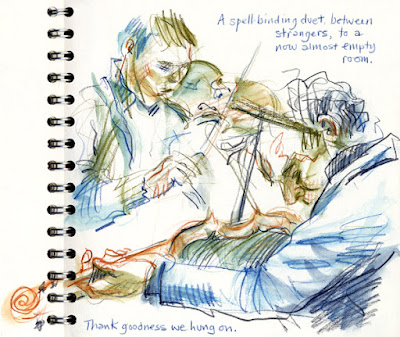
But the foreign sales team said that the translation issue is more to do with Europe than anywhere else. So I went on the hunt. It was not easy: most urban sketchers don't feature people much and those who do, don't usually use text. I found several brilliant music ones from a website link someone sent me, like this one by Nicolas Barberon:
But I needed more variety of subject matter. In desperation, I put up messages on various Facebook groups. It worked!
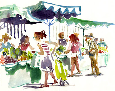
The wonderful thing was that they came in from lots of sketchers who weren't necessarily well known outside their own country. From the outset, I wanted to feature less high-profile sketchers in the book, alongside the old favourites like Marc Holmes and Inma Serrano. The sketch above is by Enrique Flores, the one below is one by Juan Linares and the bottom one is by Ana Rafful.
The only remaining difficulty was finding space to fit these extra images in, when the book is already pretty much written and the sketches for inclusion already chosen. A bit of last-minute jiggery-pokery was needed.
Some of the European sketches have been substituted for guest ones I chose previously, some have been squeezed into relevant chapters. We also dropped an idea I was going to include and instead created a new spread, looking more generally at how urban sketching works, where I can talk about the brilliant way the movement has pulled together people from around the globe.
I am expecting another batch of layouts any day, the latest version of the whole book, which will help me to see any holes, where bits of text are needed, and give me the chance to make any amends before we go to proofing stage. I've seen most of it already, in bits and bobs, but this is the first time I have seen the whole thing together.
I have finally tackled the remaining teaching-drawings for the book. The publisher calls them step-by-steps and some of them are exactly that, like the one I did on using colour as a framework. There's also one on 3 stages of drawing eyes.
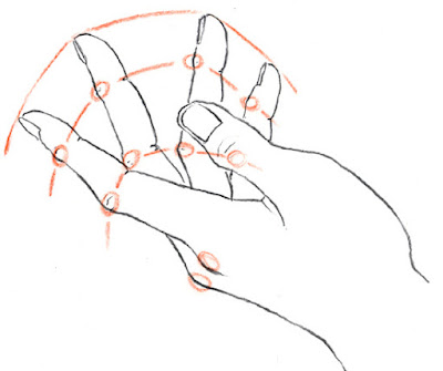
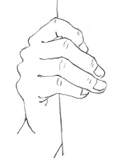
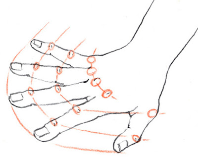
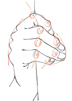
However, quite a few of the so-called step-by-steps are not actually a series of stages, but sets of little graphic features, to help explain how to draw certain aspects. Since hands are always so tricky, I thought I would do some teaching-drawings, looking at how you can use the position of the knuckles to help judge whether you are getting things right or not.
It's a trick I always use. Though the knuckles are staggered, rather than in line, the shape you get when you join them up is echoed in the next set of knuckles, as well as the finger ends. This helps you get finger length right - another thing that is easy to misjudge.
I sketched three line-drawings, (actually, I drew 5: the other 2 were a bit rubbish). I tried to get really different poses. Then I placed a bit of tracing paper over each sketch and circled the knuckles in a coloured pencil. As soon as I joined them up and then drew in the finger-end line, I knew the drawings would work really well.
I scanned both drawings and tracings, then put them together in Photoshop.
Job done.
The rest of the spread on How to Sketch Hands uses drawings from my archive of sketchbooks to talk through some other ways of thinking about the various problems, including creating montage sheets, drawing just hands, over and over for practice. This is useful for stopping you getting frustrated when people move. It's also good for making the individual sketches seem less 'precious', so you are less inclined to worry if they go a bit skew-whiff here and there:
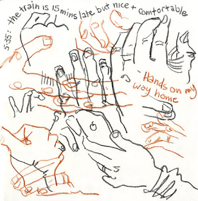
It's a great way to pass the time on a train. Try using a couple of different coloured pencils, to stop things getting too confused.
I think (think...) I have now done the last of the scanning for the urban sketching people book (hurrah!). We lost one drawing completely though. This boy was going into a new section I added last month, on things to look out for when drawing people of different ages.
Because he was a last-minute addition, he didn't get sorted out with a reference number when we tagged everything, to remind me which sketchbook he was in. John and I scoured the pile several times (now nearly 100 books). We had a clue - we could tell from when I originally uploaded the sketch to my website sketch-space that it was done in 2012, which narrowed the field at least. We couldn't find it anywhere though. Total mystery.
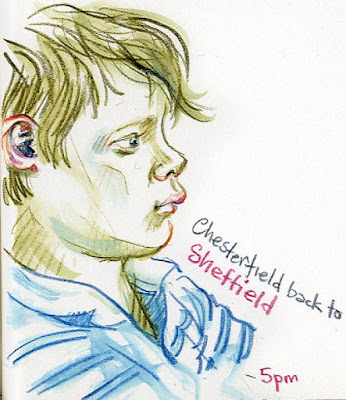
In the end we gave up and I substituted this one instead, which is a nice sketch, but not as clear for demonstrating the teaching-point: how children's lower lips are often set back, so the upper lip protrudes slightly. Hey-ho.
I don't have many drawings of children, because they are generally such a pain to sketch. Babies are even scarcer in my sketchbooks. Luckily I did find this page, done on a plane:
The montage system is definitely the easiest way to deal with the constant motion of babies and it was great for the book, as all the different angles gave me loads of observations to talk about.
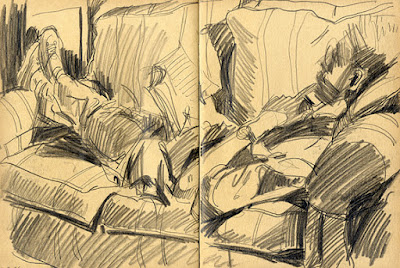
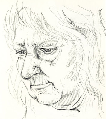
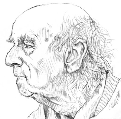
Things might be a bit thin on the ground for younger ones, but I have plenty of examples at the other end of the scale - I just love drawing older faces. So much character. As we age we get more and more individual.
Fortunately, there are some constants to watch for when you're drawing older people, like the tiny, vertical creases we women get above our top lip, the deepening shadow between eye and nose, the loose neck... oh goodness, I've got to stop - it's all too depressing!!
Goodness: the deadline for the book has suddenly jumped out of the bushes and is frantically waving its arms at me! I have until August 20th to get everything done. It's about a month, but counting only the free days I have to work on it, it's actually 3 weeks. Trouble is, that is also the only remaining time I have to prepare for filming the Craftsy class too - same deadline. Yikes.
I clearly need to get my skates on. I hate to be so busy when it's summer though. I spent last Sunday working at my computer with the blinds down, while other folks were prancing around in the sunshine. Sob.
I have gone through the design layouts for almost all the book now. There are about a dozen new images to scan, because of rejigging the content at the design stage, then I have to choose sketches I want to feature as full page images for each of my chapter-header pages. It's hard to do that without having a proper overview of the content, so Quarto are about to send me a definitive version of what we have done so far.
Once the final sketches are scanned, I will at last be able to get rid of all the sketchbooks piled around the studio. I'm really looking forward to a good tidy up.
There are still a few little bits of text that need doing: extra sections that have appeared as we have made changes (it has been very much a project that you have to allow to evolve as it goes along). That won't take long though. The main job left is all the step-by-step drawings dotted through the book.
I am going to do some of them live to camera, so we can choose stills from the film to use to illustrate stages of the process. It's a wee bit scary, to be honest. I am going down to London to sort that out in a fortnight. We have 1.5 days to work on the filming and sort any photography, like taking pictures of all the elements of my sketching kit for instance.
Right. Back to it...
Last week, my publisher sent another big batch of draft spreads through for my Sketching People book. It's so exciting to see it coming together. It has been a very interesting learning process. It's so different to writing a picture book. Okay, there are an awful lot more words, of course, but that's not really what I mean. It's the process which is new.
Organising all my ideas was probably the biggest challenge and that is behind me now. All the text has been created to fit within specific chapters, each of which is subdivided into spreads - remember the Flat Plan? I have never worked in that way before and it has been interesting to watch how the plan has evolved as we've gone along. We are onto our 4th Flat Plan now.
About half of my text was generated by that process of organising my ideas, the rest revolves around specific sketches, selected from my archive of sketchbooks or from guest artists, chosen to help underline particular teaching points in the plan. Those decisions have been mine, but made with the advise and guidance of the editorial team at Quarto. As with any publishing project, it is far more of a team effort than it appears from the outside.
The bit where the rest of the team have really come into their own though, is with the design. I have written my text and chosen my sketches, spread by spread, concentrating on informative content, rather than how it will look. Now all that has to be organised visually, placed on the page in a way which is both clear and (hopefully) gorgeous to look at.
The sketches in these layouts are still using mostly my quickie photos by the way, which is why they are horribly grey. The gleamy, high res scans will be dropped in next, which will look better still:
A batch of initial layouts, for a small section of the book, came through back in March, but my team at Quarto are working on many more books at once than I am used to with picture books, so there has been quite a long gap, where I have been waiting my turn. Now though, things are really motoring.
This new batch is about a third of the book. I went through them last week, adding notations for changes, then we talked it all through on the phone.
You can see from the layout above, that sometimes there are greyed-out areas, where images are to be dropped it later. That's because I have yet to do the filmed sections. Yes... filmed! It's all a tad daunting: I will be filmed in action, then stills will be taken from the film, to use as step-by-step illustrations, in sections like the Colour Before Line step by step I showed you a while ago. Sometimes that's the only way to create something in stages: as with the section above, which is about drawing motion.
Anyway, still some bits to work on as a result of these layouts, so better get on.
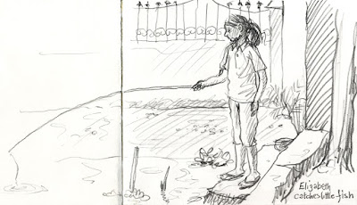
One of the very pleasing by-products of the drudgery of all the scanning I have to do at the moment, is that I am getting to look back over all my favourite sketches of past years - well, the ones of people anyway. It's been an interesting journey. Every image is imbued with memories. Some are a record of an important or touching occasion, like the day I came across this little girl and her brother fishing for their dinner in Kerala and ended up in their home, singing carols with their family:
Some are interesting because I tend not to work in the same techniques any more. Some are just old favourites that make me feel good about myself. It's never a bad thing to look back at work you are proud of: it's great for the confidence, which is in turn good for feeding back into new creativity.
It's rather ironic but, since I have been working on this book, I seem to have been drawing people far less. I don't know if you have noticed, but I have got rather into architecture this last year and have been far less prolific on train journeys than I was in 2013/14. I'm not sure why. Anyway, looking back through the archive has inspired me to get back to it.
I need to get some people-practise in to be honest. I have a 2-day job coming up next month, as Artist-in-Residence at a conference, at Manchester University. There'll be nothing but people to draw and I have volunteered to do a short presentation of my work at the end, to show the delegates what I have been up to. No pressure...
It's a good job that I am a show-off!
Yes, it's definitely a bit of a monster, scanning all the artwork which I have selected from my archive of sketchbooks. I haven't counted how many individual sketches I have picked out to go into my urban sketching people book, but it's quite enough to keep John and I busy.
Originally, we had thought that John would do all the scanning for me, but I am working on the computer so much at the moment that he's having trouble getting sufficient time on the scanner.
So we tried a bit of teamwork this week, which really speeded things up. I found the low res version of each of the images on the computer, which was tagged with a reference number to remind me which sketchbook it was in, then John ferreted through the sketchbook piles to find the right book...
...then he flicked through the book to find the sketch. We had marked the possibles with post-its right back at the beginning of the project, so that helped too:
John held the sketchbook down flat on the scanner bed for me, while I set the scan parameters, then saved and filed the final file, while he was trying to find the next one in the sketchbook piles. All very dull, but it's got to be done (and over 400 times...).
Then of course, I still had to spend a while on each of the images later, correcting the tonal balance and touching up anomalies, like unwanted marks which had transferred from the opposite page or other sketches showing through from the reverse. I also have to get rid of unwanted text - my publisher is keen to remove any text that is not essential, so it doesn't create problems with co-editions.
We've made a fair old hole in the job now and I feel much better for it. I was originally going to wait until all the layouts were back, so I would know for certain that all the sketches I have chosen are in fact going into the book. It's possible that, by doing the scanning early, we have scanned some artwork unnecessarily, but I was getting a bit concerned, as time is passing and the deadline is looming. It's one of those tasks - very hard to know if you've allowed enough time for it, because it's impossible to judge how long you'll need. At least this way, hopefully I won't get caught out!
I have now officially finished the text of the new book. Hurrah!
Judging on the response to what I have been submitting over the last 6 months, we probably won't be changing the text that much - more tweaks that re-writes I should think - but that doesn't mean I'm done. There will still be a little jiggery-pokery with my image choices, once the layouts have all been designed, and there's also some new artwork to create specifically for the book (like the 'colour before line' step-by-step I did for the original presentation for the US co-edition).

The other big job that's left to do is the scanning. So far, we have been working with low-res images: either the photos I took of my tagged sketchbooks, or low-res scans lifted from the website. All those images now have to be located in the original sketchbooks and scanned at 300ppi, ready for print. John is helping with that, but I still have to go through all the scans individually, tweaking things, as my scanner picks up a lot of 'background noise' like paper texture and sketches coming through from the other side, much worse than you see with the eye.
Unfortunately there's another issue too. In 2010 I was rather into digitally tinting my pencil sketches, like this one of my new shoes (a reward after the first op I had on my poor feet). This means that there is another job for some of the scans from that period: because I was only playing, not consciously creating 'artwork', I only tinted the low-res scans I'd made for my website. Now that I want to feature some of those images in the book, I am having to create the coloured versions all over again.
This image is going into the 'drawing feet' section, because of the way the shoes are sculpted through shadow and highlights. Above is the new high-res scan of the original sketch, with a not very white background.
Once I had played with it in 'Levels' in Photoshop, it looked better. I moved the date across to the right a bit while I was at it, so it would better balance against the text (even though I suspect that the publisher will crop the text off this one):
Better. But the line-work in the old, tinted version was beefed up a bit and given a slightly blue tint, to help it to hold its own better against the colour, so I altered my new scan the same way (Photoshop is wonderful - how on earth would we have done something like that before?):
Then I painted the colours on a layer beneath the line work. The result was the sketch at the top. It was quite therapeutic actually - a nice bit of colouring in, with guaranteed success, so no brain power needed.
Sadly, those lovely red shoes have now bitten the dust. I did very recently buy myself another pair of bright red shoes though, so all is well.
If you have been following the project, you will remember that I have a handful of spreads which are more or less finished - the ones we did as samples, to get the US edition signed up, including this painting before you draw spread:
Then, at the start of the year, I sent off a good chunk of the text, along with all the images that will go with it (just photos of my sketchbook pages for now). My publisher has been working on it while I have been doing other things. About two thirds of what I submitted has now been set into very rough spreads and sent back with some suggestions for changes. I had an long phone call with my editor, where we went through everything in fine detail and I scribbled notes all over the spreads:
It's not too bad at all actually. All the text is intact without changes, it's pretty much all suggestions for either squeezing in more images or adding step-by-step breakdowns here and there.
The publisher also sent out a call for other sketchers to submit work for possible inclusion and I have sheets and sheets of gorgeous guest work to choose from. That's going to make things easier. So far, I have been trying to collect potential guest images by trawling Flickr and saving things into Pinterest.
I have mostly addressed the changes now. I just have some captions and annotations to write, to go with the added images, but I'm waiting until my suggestions have been given the green light before I do that.
For now, I have moved on and begun writing a new section of the book. This one looks in detail at how to draw specific parts of the body. We did sketching the eyes as one of the sample spreads. I took a couple of days to get my head back into things, after such a lengthy pause, but I am motoring nicely now and have already written 'feet', 'hair' and 'ears'. Still got mouths, hands and noses to do. Better get on...
I am still writing my book for most of the working day at the moment, taking advantage of the opportunity to focus on one task, while I can. It's a bit like writing this blog actually, in that I am sharing tips and hints about how I work, but with a slightly different focus and format.
I'm enjoying the opportunity to talk about other people's work sometimes as well, but for the most part I am analysing what I do when I am drawing people in various situations, which of course makes me think differently about things which I have learned to take for granted.
This week, I decided to go back to basics and talk about how a fluid line is so much more useful that straight lines, when it come to sketching people, because basically, people are curvy. Straight lines tend to make them look stiff and lifeless. So, a couple of spreads in the book are dedicated to looking at how you can develop a more instinctive, fresh line, which will bring your characters to life and help communicate the sense that you have captured them mid-movement.
For the more hesitant sketchers amongst you, those who tend to twitch their pencil back and forth, barely moving, I talk about drawing from your wrist, elbow and even shoulders because, if you don't move your arm, you can't move your pencil expressively.
I demonstrate blind-contour drawing too, which is a great way to get your line loosened up, and I show how contour drawing helps you to hang onto the principles of instinctive eye-to-pencil sketching on an everyday basis.
Not forgetting of course, how a quick, linear sketch can be done with a paintbrush too - what a gorgeous, expressive line watercolour can give you if you keep your hand fluid!
We have a title now by the way. It's going to be Sketching People, with the subtitle, an Urban Sketcher's Manual to Drawing Figures and Faces.
Happy New Year! Are you all having a lovely holiday? Looking forward to getting back to work tomorrow?
Actually, I am. I'm really enjoying writing my book on sketching people and it's coming on really well. I am well ahead of schedule, which is good news, because I won't have much time once the work for the new children's library mural kicks in, not to mention all the school visits I have lined up between now and mid March.
My deadline for delivering the text is staggered. It's divided into 5 stages. I have to upload 20% of the content each month, between February and June. Since the spring will be tricky, I uploaded my first 20% just before Christmas. Because of the holidays, I've not had any feedback yet.
As well as the Drawing Strangers is Scary chapter I was telling you about last time, I have now completed the book's final chapter, called Capturing the Moment (if you remember, I am not taking them in order). After all the sections with more specific tips about how to draw people, which I've mostly yet to write, I finish up by sharing techniques for getting more out of your sketches.
This section talks briefly about the difference between an urban sketch of a person and a portrait. Urban sketching is not so much about getting a likeness when you draw someone, as presenting a snapshot of them: a person as part of a time and place. That's why I never ask permission when I sketch people - it has to be natural, because I want to catch someone going about their life, not posing.
I talk about ways to soak up all sorts of peripheral information, to help place your sketch in-the-moment: bits of conversation, things that happen while you are drawing, observations about the weather etc, so that your sketchbooks don't only paint a very rich picture, but always take you straight back to where you were, like a visual diary.
As you know, I love incorporating this extra information, so I share techniques for adding text and having fun with the way you arrange things on a page, because the contents of your sketchbook does not have to match what's out there: you are free to experiment and play.
I think next, I might tackle the section which talks about how to cope with the fact that people move. It's very inconvenient, but inescapable: they do it all the time. But fear not - I have lots of tips to share!
At last! This week I have finally started properly writing my book.
I don't need a massive amount of text per spread. I am typically writing 200-300 words of general text on each spread and then the rest is explanation and teaching points attached to specific sketches. That's why the sketch-selection is so important.
The tagging system John devised is working really well. At the touch of a button, it shortlists each category for me, pulling from a pool of over 430 sketches we photographed last week (very glad that job is over), which makes it SO much easier for me to pick the 3 or 4 images I need for each spread.
I don't have to start from the beginning and work my way through chronologically as, for the most part, sections stand alone. My editor explained that, for this kind of publication, people rarely read from start to finish anyway: they tend to dip in and out all over the place. She suggested I begin where I feel most confident.

So I started with a chapter called Drawing Strangers is Scary. I find that sketchers are very inhibited by the thought that they might be 'caught in the act' while drawing someone, so I have written about tricks for keeping a low profile, but also what happens when you are discovered. The chapter then goes on to look at how you choose people to sketch, thinking about different locations and activities and how easy or tricky they typically are. I couldn't go through every possible option of course, so narrowed it down to 10, which are either recommendations or which have unexpected advantages of disadvantages. This is the chapter where the spread we did for the presentation, about drawing on the train, will go.

Meanwhile, my publisher has sent out a call to various urban sketchers, asking for examples of people-sketches. We won't need many more guest contributors, as I have already selected quite a few, as I mentioned previously, but they say it's good to do, as the perfect image for one of my teaching points may drop into our lap.
These are all sketches which have made the grade into that initial chapter, as far as I am concerned at least (but of course everything still has to be run by my editor and set by my designer - I am not even thinking about layout).
By the way, if you missed the beginning of this project and want to follow the progress of this book from the start, just use the Sketching People label on the right hand panel and scroll down. There have been 10 posts so far.
Now that the basic structure of my sketching book is sorted, I have to go back to all the piles of sketchbooks which John and I waded through when I first got started on the project in the summer. Of course, there are a few new ones now too.
Back then, I had a rough idea of the categories I was trying to illustrate, and used colour-coded bookmarks to help with that. Now the book's structure has been fine-tuned, I'm ready to make the selections, but I have to find a way of shortlisting from the hundreds of possible sketches, buried in nearly 90 books.
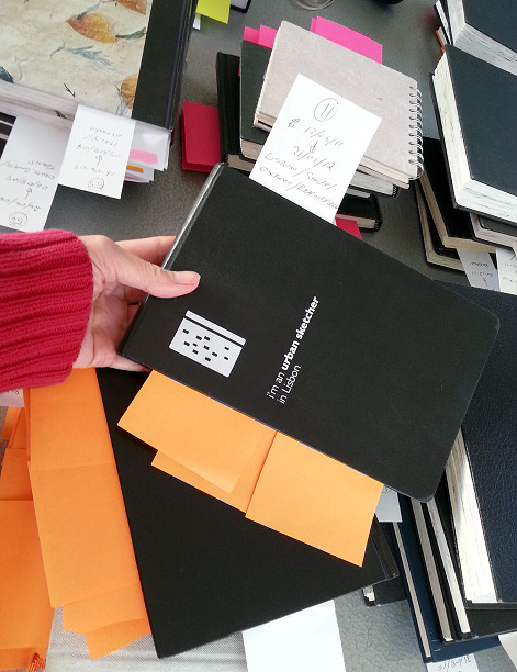
The plan we hatched was to work through the images we bookmarked last time, taking quick snaps on my phone, so I can see them all together. I used post-it notes to tag drawings against the sections of the book I had in mind. Trouble is, the tags needed transferring to the photos I'd taken, or I'd just end up with a bucketful of meaningless snaps, which wouldn't be much better than the piles of sketchbooks! Then there was the complication that most sketches could potentially work in various sections of the book. Oh dear...
There were so many images in play, I had to find a system that would be efficient, without being too time-consuming. John came to the rescue and downloaded Picasa: photo-album software, which lets you tag your images.
I have been working through the sketchbooks, numbering each sketch as I photograph it and logging it in a book, along with the number of the sketchbook (so we can find the sketch again when it comes to scanning), and any tags which might apply. The photos are then uploaded to the computer in batches and quickly renamed with the two reference numbers.
While I am snapping the next batch and scribbling in my book, poor John has the unenviable task of adding all the tags in Picasa. I'm still using the post-it notes, to speed up finding specific sketches if they make the grade and we need to scan them in:
The system is not as time-consuming as it sounds and we did the lot in a few days (though an emergency-dash to Staples had to be made half way through, for more post-its).
The tagging system is brilliant, as I can now pull together all the sketches of noses, or contour-drawing, or speed-sketching at the touch of a button. It's going to make the next stage much, much easier. Phew.
As you can see, I have been sketching stuffed animals:
But more of that later...
It's been a week since my trip to see the publisher of my latest project, the 'Sketching People' book. I have been pretty full-on with it ever since.
The meeting went really well. Everyone in the team was very friendly and easy to get on with. It was good to finally meet the designer, who I worked with on all the presentation spreads. Five of us sat round a table with proper coffee and very nice chocolate biscuits (their regular treat for author visits) and my editor sat me at the head of the table: I felt very important.
Once we got down to business, we really hammered away at the project. They were great at listening to my take on things and good at explaining what I needed to know, so all very positive.
I love that my editor is a straight-talker, like myself, so we got loads sorted in just a couple of hours. There were some tweakings needed to the flat plan and synopsis I had created, but luckily it was basically sound: the changes were mainly a structuring issue that I hadn't realised and a bit of streamlining, all of which was a great improvement.
A new flat plan has been created out of the meeting, although it is apparently still very fluid: the idea is that the structure is there to hang all my work on, but it can adjust to accommodate more or less space needed in the different sections, as I go along.After the meeting, I had a few hours to kill before my train home. It was bitterly cold and no good for sketching outside unfortunately, so I took myself and my sketchbook to the warmth of Natural History Museum, as I enjoyed it so much
the last time. Which is where our stuffed friends above come in.
The rest of last week was mostly spent choosing guest contributors for various sections of the book. We have to do that early on, to give plenty of time for people to sign the paperwork and get their artwork scanned. I need guests because there are some aspects of sketching people which I am pretty rubbish at - crowd scenes for one - so I have collected examples from people like
Caroline Johnson, who are great at it:
It's good to have a variety of approaches in other sections too, so I had my head in Flickr and Pinterest for days, searching people out, and got quite bug-eyed!
I have tried to mix it up a bit: some well-known
Urban Sketchers correspondents, whose work often appears in similar publications, but also some less known sketchers, as the book seems a great way to showcase talent. I sent a list of possibilities to the publisher today, and am waiting to hear what they think. Keep you posted!


