new posts in all blogs
Viewing: Blog Posts Tagged with: hot tips, Most Recent at Top [Help]
Results 1 - 25 of 72
How to use this Page
You are viewing the most recent posts tagged with the words: hot tips in the JacketFlap blog reader. What is a tag? Think of a tag as a keyword or category label. Tags can both help you find posts on JacketFlap.com as well as provide an easy way for you to "remember" and classify posts for later recall. Try adding a tag yourself by clicking "Add a tag" below a post's header. Scroll down through the list of Recent Posts in the left column and click on a post title that sounds interesting. You can view all posts from a specific blog by clicking the Blog name in the right column, or you can click a 'More Posts from this Blog' link in any individual post.
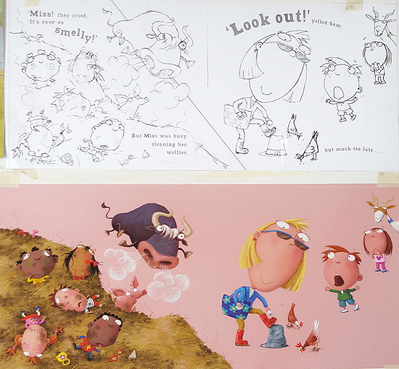
I have been working on a couple of illustrations from the middle of the Class One Farmyard Fun. This is the bit where the bull is free and biffing people into the air, left right and centre. He tosses a whole bunch of children into a smelly muck heap and is then creeping up on the teacher...
As usual, I stuck other previously finished pieces onto the drawing board, to use as colour reference for the characters:
Perversely, I tackled the muck heap illustrations in reverse order. This is the one I did least week, where the children are already in the muck. Teacher is too busy wiping muck from her wellies to notice the bull behind her...
The background on this one has been left blank (the pink is just my pink paper), because I intend it to be cut away to a block colour, which we will drop in digitally. Or rather, 2 colours (which is what the diagonal line on the rough is about).
This digital background technique is firstly to create additional visual variety as the reader works through the book. I hit on the idea of the two-coloured background because, when doing the original rough, I had trouble with the scale of the children against the teacher / bull scenario. The kids should really be much bigger, if they are in front, but this didn't work, because they eclipsed too much of the page and didn't allow teacher and the bull enough impact. But I wanted a spread, for added drama. Hmmmm.... problem! By slicing the background into two colours, I am hoping to create a half-way house between two separate illustrations side-by-side, and a single spread.
I have just this morning finished the artwork for the spread before the one above: one of my favourites:
The children are flying through the air and landing in the muck heap. I created a stowaway piglet in the muck heap earlier on in the story, so it was fun to have him here, worrying about children landing on his head!
Next, I'm going to tackle a spread with the bull up close, a nice simple illustration for once, with the poor farmer flying through the air, about to land in a prickly haystack. Hee hee. Thanks for the great subject matter Julia.
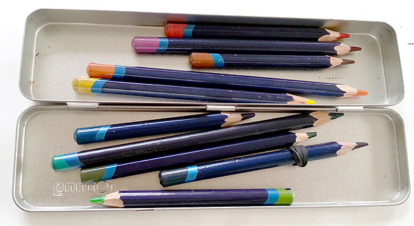
Those kind folks at Derwent have been in touch again and sent me another parcel: a pressie of art materials play with. It came almost on my birthday too! I got all sorts of bits and bobs, some familiar, some new things to try...
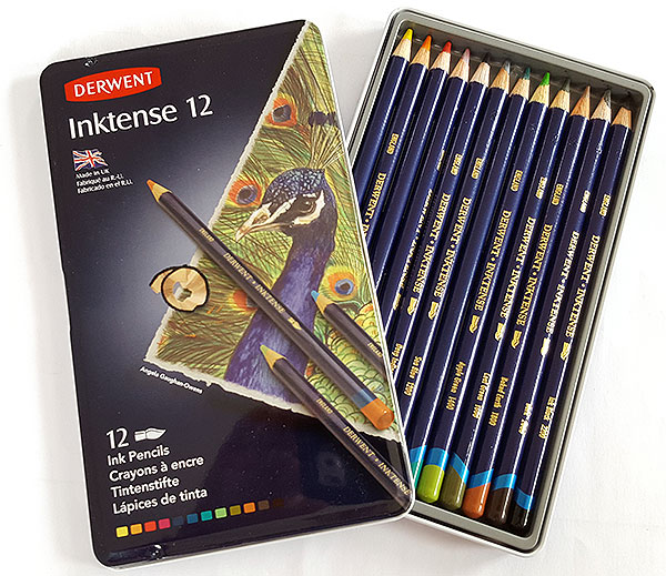
They sent me another set of my all-time favourite tool: the Inktense watercolour pencils.
This 12 set is really all you need. I once went to their shop in the Lake District and bought lots of other colours to add to my kit, but have taken most of them out again, because these colours are so well chosen.
Inktense pencils are absolutely perfect for sketching on the go. I just love the way you can combine dynamic drawing with painterly mark-making and fill the page with vibrant colour, while carrying almost no kit - just a handful of pencils and a waterbrush.
Derwent also sent me some pastels and pastel pencils, knowing how I create my picture book artwork.
The pastel pencils were the perfect thing: really lovely quality of course, richer and softer than a lot of brands, but also very timely, providing me with some new and useful colours which I have already pressed into service, working on Class One Farmyard Fun. You need the pastel pencils for all the fiddly detail which is impossible to achieve otherwise: like all those itsy bitsy outfits the children wear, and tiny animals in the background. The Derwent pastel bars are just slightly harder than I like for my illustrations, but that will make them ideal for outdoor sketching, as soft pastels are a bit of a messy nightmare when you are out and about, so I shall save them to use for landscapes, when the weather is a bit warmer.
For the last 2 years running, John and I have enjoyed a week's caravan holiday in the Lake District, where I have spent my time sitting on top of hills, or down by the water, sketching every day, while John goes off walking. Once my busy period is over, I'm sure we'll be off to do it again, and I shall take my new Derwent pastels with me. Can't wait. Most exciting of all, Derwent sent me something I haven't tried before: a set of water-soluble, tinted, graphite pencils:
I tried them out on a recent sketchcrawl. It was one if my residency days, taking my volunteer group of academic newbie-sketchers out of the safety of the university, to draw in the big wide world for the first time. We didn't go far, just down the road to the Manchester Museum, the same place I took my Urban Sketchers last week.
I thought I would document the occasion by drawing them sketching, rather than focusing on the exhibits, and I used my new pencils to sketch Vanessa and Andy.
The Graphitint are similar to my Inktense pencils, because of being soluble, so I used the same technique - vigorous mark-making followed by quick, understated gestures with a waterbrush - but the Graphitint pencils were different to use in three important ways.
Firstly, the lead is softer than either Inktense or any regular watercolour pencils I have tried before, giving a thicker line which you can see really picked up the grainy surface of the watercolour paper, creating a slightly looser, more textured result:
Secondly, whereas the Inktense are extremely vibrant and explode into colour when you add the water, the Graphitint are far more understated: certainly the set I was given were slightly muted shades, which work well together to create a softer overall effect, whereas the Inktense tend to be more contrasting and zingy.
Lastly, the Graphitint colour doesn't change when wet, it just dissolves. Though less exciting than the Inktense, this makes them more predictable and so slightly easier to manage. It is less easy to 'overdo it' - with the Inktense pencils, if you apply too much pencil work before the water, you can quickly get into a mess. It just depends what you are after.I think these are going to be great for life drawing, although I have not had time to go in ages. Perhaps this will give me the push I need to make some time.
In the meantime, thank you Derwent, for my gorgeous pressies. Much appreciated.
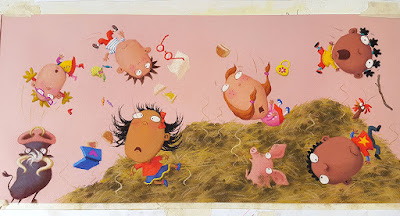
I had a bit of a time, trying to get the first spread of Class One Farmyard Fun finished off. It was SO fiddly. Unfortunately, there are quite a few spreads in the book with this level of complexity (I have only myself to blame, since I designed them!). Fiddly and pastels do not go very well together, so my pastel pencils had to be brought into the action quite a bit. The pencils are great for detail, but the colour is not as rich and dense as the pastel sticks, so I then have to go over the top of the pencil elements with regular pastel, to give it oomph, trying not to blob where I don't need it.
Yep, a nightmare, and very slow, but worth it in the end:
The other tricky thing is keeping track of who's who with the children in the class. There are so many of them, all with different complexions, hair colour and outfits, it will be very easy to get them mixed up along the way. So I added little colour swatches to my 'crib sheet' - the original sketch-sheet where I designed the various children. I can use this as an aide memoir on my desk, as I work my way through all the artwork.
I was working until 7pm on Saturday night, despite having a nasty cold (pause for violins...), because I was desperate to get this first spread finished, before I started Book Week and had to stop work until March 7th, because of being out every day in schools.
I just got done in time and, on Sunday afternoon, I headed down to Bedford, ready for Monday's school event at Cotton End Primary. Since the school is near to where Julia Jarman lives, John and I drove down and stopped overnight with her, which was lovely (thanks Julia!). Every day of this week has been a different place - I've been zipping all over. It's always the busiest week of the year. Back to normal and making a start on my next spread on Monday.
It has taken absolutely ages to get the go-ahead on my roughs for Class One Farmyard Fun. I was beginning to be concerned... Perhaps the publisher hated them. Maybe there would be loads of redraws to do...
I needn't have worried. They finally came back and there was less than a day's worth of changes needed. Phew! I don't know what the delay was, but at least it's sorted now and I am up and running at last.
The first job was really really boring: working out what dimensions to do the artwork (based mostly on how big the final package will be, for posting), enlarging all my roughs to that size, printing them out and then tracing them up onto pastel paper on the lightbox (with all the blinds drawn). Tedious. At least John helped out by cutting all the pastel paper to size, so that was one less boring job.
I've made a start on the pastel bit now. The first marks are a bit scary as I don;t really know what colours I am going to do things - I work it out as I go along, starting with the big 'givens', like blue sky, green grass etc, then making everything else coordinate and contrast. It's going to be a bit of a slow one, as there is such a lot of detail (all the kids in their little outfits...). Because of my Artist-in-Residence work though, I only have half each week, so that will make it twice as long as it would have been.
A long haul. better get to it!
As part of my residency, I ran another of my empowerment workshops recently, working with the academics at the Morgan Centre. My merry band of would-be sketchers were all given a free set of watercolours at the outset and, although we did do some playing around with them during our very first meeting, I have noticed that most people aren't really using them. Not surprising - I know some very seasoned sketchers who are still terrified of watercolour.
So, I thought we would do some work with paint, to get them more familiar with how it feels and to discover some of the simple but effective things you can do.
For people to feel comfortable, it is vital that these workshops are fun and that results are acheivable. I need people to not only learn useful techniques, but to enjoy the session sufficiently that they are inspired to give things a go when they are on their own, with the SCARY blank page.
First of all, we used wet paper and explored simple mark-making methods, introducing watercolour to the page, but then leaving it alone, letting the water take it off to interesting places, resisting the urge to scrub and mix.
Then I asked people to see if they could see an image in the blobs and squiggles. The challenge was to use as few drawn marks as possible to turn the splodges into something. Love these funky birds:
Next, we played a game in pairs, where people took it in turns to add a mark to a shared painting, building up images which were initially abstract, but waiting for the suggestion of something representational to emerge. It's fun because people sometimes have different ideas of where it's going. You can choose to cooperate with your partner, or you can subvert their ideas as you see them emerging and deliberately take it off on a different track.
The idea of the exercise was to get people painting freely, but to keep it light-hearted and devoid of expectation. I wanted them to learn how the paint worked - what consistency to use, which colours reacted together well, the difference between working onto wet and dry paper - all this, without any pressure to create something successful.
Finally, I asked them to use the techniques we had learnt, to do a very quick watercolour sketch of an item of fruit or veg that I'd asked everyone to bring. I showed them how you can restrict where the wet paint is going to go, by creating the shape of your object in water first, then quickly introducing the paint while it's wet. This is my 10-second mango:
I asked people to use only 2 or 3 colours and to let the paint settle on its own, as before. Finally, to finish off with the minimal amount of line-work needed to make the object identifiable. This is my example apple and satsuma:
We suddenly ran out of time and everyone had to rush off, so I only got a photo of one person's painting, this gorgeous garlic. Quite a tricky thing to choose, particularly as an absolute beginner, but she did a fantastic job:
Everyone did really well. Their 'homework' was to go away and use the techniques in their sketchbooks over the next few weeks. My hope is that the workshop demonstrated that you can be quite free and easy with watercolour and still get quite dramatic results, by sticking to a few simple rules:
* Use water first to tell the paint where to go and to give you lovely marks
* Limit yourself to 2 or 3 colours
* Let the paint do its thing - don't fiddle and scrub!
* Less is more: you often don't need outlines
If you are afraid of watercolour, give it a whirl. You need plenty of clean water, a hairdryer to encourage the drying along and a good size brush, so you get enough paint down. Watercolour paper is ideal, but we only had ordinary cartridge paper books to work in and, as you can see, it was fine. So long as it isn't too flimsy. Have fun!
Since
my Craftsy masterclass launched on Oct 19th, I have had an amazing 1161 people sign up! This is great news, not just because it is brilliant to know that it is obviously hitting the spot, but also because Craftsy classes are paid very much like picture books - you get an advance and then royalties.
For those who don't know how an advance works, it is a payment to help cover the time the artist spends in development and production. It's better than a flat fee though, because it is an advance on royalties that the company expects you will be able to earn, which means that, if sales go really well and you earn more than the advance they've paid, you start to get more payments: your actual royalties.
I was paid half my advance when we finished filming in September last year and half when the class went live in October. The Craftsy website has a place with a little graph which tells me how much of my advance has been earned out. I've been taking a peak every few days and watching it creep up and, FANTASTIC news - this morning it looked like this. It was at 99%!
I goes up slightly faster if people click through from my website or blog, so it's hard to work out exactly how many people that missing 1% represents, but I reckon I need about 12 more people to subscribe, for me hit the golden 100%.
The great thing about a Craftsy class is that it is not in 'real time'. You can sign up at any time and watch it at any time: it's there forever, for you to watch over and over if you like, so you can work through things as fast or as slowly as you wish. Plus, if you get busy and suddenly don't have time to get through all the 7 lessons, you can come back and carry on next year, if that fits better. You also get the chance to ask me questions and post your homework. If you've not seen it yet, this little trailer gives you a very clear idea of what you learn:
So, if you want to be able to draw characters with confidence - animals, people, whatever you fancy - and more importantly, learn how to make them feel real, by giving them individual personalities and emotional responses to their situations,
have a go at the class and be one of my 12 people!
It's currently on sale at £19.16 (or whatever the equivalent is in dollars, if you are over that side of the pond). I think for what you get, that it really good value. I've certainly had lots of lovely feedback. Hope you like it!
The roughs for Class One, Farmyard Fun are finished! Well, what I mean to say is, they have all been drawn up and submitted to my publisher. You never know at this stage whether you are actually finished or not - it is not at all unusual for there to be quite a few changes needed. We''ll see. This is the opening spread:
Actually, I had a bit of a false start - I thought I was finished, somewhat prematurely. I was just reading through everything with John, in preparation to emailing the roughs off to Hodder (it can be very useful to have a 2nd pair of eyes - John often spots things I've missed). It was all looking good though. Lots of chaos and plenty of children flying through the air...
Anyway, we read the last spread and the story ended rather suddenly. It was only then that I realised I had missed off the end! There's always a final single page, the one you get after the final spread. It's not always used - it depends on the book and the length of the text. In this series of books, that final page is always a sort of cautionary ending, sometimes with the hint of a sting in the tail.
I worked out what went wrong: when my art director printed me a slightly reduced set of layouts to work from (blank pages with just the text), the single page had got forgotten at her end. I didn't notice because of not working through the illustrations in order.
So, I had to go back to the drawing board (literally) and get scribbling again. This is what I came up with (the little girl will of course be wearing a red dress):
In between my residency sketching days, I have been working on the roughs for Class One Farmyard Fun, my new picture book. It's another one by the lovely Julia Jarman, our 6th collaboration. It is full of all the usual fun and mayhem which Julia writes so well.
The action involves an escaped bull who moves around the farm, chasing various children and tossing then into the air. I tried to make a start, but was having trouble getting my head around the 'geography' of the story. I realised that I needed to create a map of the farm, so I could establish the layout and know which animals were where (ignore the 'flying' truck on the map by the way - that's me drawing a bit of reference off Google Images):
The map was instantly a great help. As I'm working my way through the drawings though, I am occasionally having to go back and make changes to the farm's layout, so that certain things will fall alongside others which are juxtaposed in the text.
For instance, I originally sited the whiffy muck-heap to the left of the bull, under the trees by the lake. The sheep had to be nearby, because Julia's text mentions them both on the same page:
They saw a lot of woolly sheep
And a cock on top of a whiffy muck-heap.
But they didn't see...
But this bit of text comes immediately after a page about the bull, so the two bits of the rhyme are on either side of a single spread. This is the first bit, about the bull:
...the bull in a strop.
They didn't see the big bull frown
Watching Class One walking round
Some of them wearing red
Which makes bulls cross - or so it's said.
I started off drawing this spread as two single pages, but there was such a lot of text to work around on the bull page, I couldn't get it to work.
So I combined the two sets of drawings and turned it into a spread instead. Which meant going back to my map and moving the muck-heap and the field of sheep over to the right of the bull. Unfortunately, this change had a knock-on effect on an earlier page, but at least I had got things to work at last.
This is not the finished rough. It's early days. I get better as I go along, so often come back and re-draw the earlier spreads.
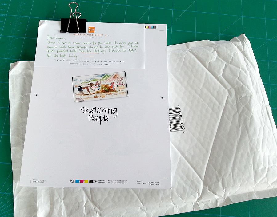
I received a package from my publisher just the other day, with some very exciting contents...
It was the colour proofs of my Sketching People book.
I seem to be juggling lots of different projects at the same time right now, but the urban sketching book is at least one which is very nearly finished.
The colour proofs are when you finally get to see what it's going to look like. Even though I've been very hands-on throughout the progress, I've been dealing with it in batches, so never had the chance to look at it as a complete project. Plus I'd never seen the final design of many of the spreads, so I couldn't wait to get a look.
By this stage, all the design has been finalised, all the text is in place, exactly as it will look, and all the images, whether photos or sketches, are in their final positions on the spreads. It was lovely to see everything looking gorgeous!
But I wasn't just sent them to admire: my job was to go through the whole thing with a fine tooth-comb, checking it over and making any final notes about alterations that needed making, or errors I noticed. That meant reading the entire book, which took a while, as you can imagine.
There were actually lots of little things I picked up, both to do with images and text: I made two pages of notes!
One slight complication was that this was the US version - the text has been Americanised throughout, which does not just involve changes to words, but also some big changes to punctuation. I was surprised to discover for example, that in the US, a colon is followed by a capital letter! There were also many differences over where comas are used.
The text will be re-Anglicised after the proofs have been approved, which means Quarto employing someone to make all the changes: apparently less complex than trying to re-instate my original text. All a bit odd, but everything is, as usual, very US-led. That's where the biggest market for the book will be, despite it originating in the UK.
The biggest single issue I picked up, was the placement of annotation arrows: used to point to where I am making specific comments about particular elements of a sketch. Many of them were not quite pointing to the right place, because my designer didn't always quite understand where I was referring to.
All sorted now though. I am very pleased with how it looks. The quality of the colour is great and the design really sets everything off beautifully (thanks Moira!).
I'm told that it should be ready for publication sometimes around the end of February. You can pre-order already, but don't worry - I will definitely be letting you know when it's ready.
Guess what?! To celebrate the launch of my on-line illustration workshop, the one I filmed recently in Denver with Craftsy, I am running a competition. Hurrah! I'm giving away a free subscription to my 7-lesson master-class on How to Illustrate Children's Book Characters.
It's a prize-draw. All you have to do is click this link and you will be entered. Easy-peasy. When the class launches on October 19th, one person will be picked at random to get the workshop for free.
The 7 lessons take you through everything I could think of that you need to know for creating believable human and animal characters for your illustrations: I crammed in everything I have learnt over the years for you.
We go through lots of tips to show you easy ways to sketch various basic characters as well as how to get across different ages, by playing around with various proportions:
I also demonstrate simple devises for creating different personalities, by varying the positions of facial features, in combination with different head shapes:
I show you how to make characters walk and run, and how to add different facial expressions to communicate more about what's happening:
In one lesson, we look at how you can use clothing and props to tell people more about what your characters are doing and who they are:
We had a lot of fun filming a lesson on how to communicate emotion. At home in my studio, I often act things out in a mirror, to work out the best body-language to use. Clif, my producer, thought it would be good to actually do this on set, so we stole the huge mirror from my dressing room and set it up on an easel in the studio:
I then had to do my acting out in front of the camera (!), playing at being angry, sad, scared etc. before transferring the positions to different character sketches. It took us ages to work out the best way to film it, so we wouldn't see the cameras in the mirror, not to mention the big battery pack I had tucked under my skirt (does my bum look big in this...).
So, this is actually me, being terrified:
At the end of each section, I give you homework tasks, to help you practice what we have been doing and you can then post your work for me to see. You can even ask questions.
I had a lot of fun creating the class and I am hoping it will be a lot of fun to do. By the end, you should be able to create pretty much any character you fancy. But better than that: you will be able to make them feel 'real' (even if they are a crocodile in a dressing gown and slippers), because you will learn how to communicate what they are thinking and feeling too.
So, don't forget to enter the free giveaway draw - you never know. But don't worry, even if you are not the lucky one, I will be giving away discounts in the first couple of weeks, so watch this space!
I am so excited. I can't wait to see how it's turned out!
Last week I officially finished work on my urban sketching book. Last Monday, my editor sent me a print-out (just done on their office printer) of how it looks so far. This was for us to go through together, over the phone, ironing out any remaining issues.
This is the first time I have seen the design of certain elements, like the title page and contents above. I just chose images, then the fairies turned them into something lovely! I am very pleased with how the chapter headers are all looking too. These were the images I chose when I was at the meeting down in London, but the graphics has now been fine-tuned and they are looking really punchy:
There are still the colour proofs to check, which are due in 2 or 3 weeks, and my final job will be to check over the re-anglicised version of the text, in just over a month. My English text has already been Americanised for the Barron's edition. All the main proofing and checking is done on this version, then it is turned back again to UK English. At which stage, I will quickly run my eye over things, to make sure the punctuation fits with the meaning I want to get across (control freak...).
As far as the real work is concerned though, I finished it off on Saturday. Hurrah!
Earlier in the week, I went though my print-out, troubleshooting remaining anomalies and marking it up in red. I was looking at the image placement and graphics, re-reading through my text and looking at 'holes'. The holes were problems with guest images - people whose work I had selected, but who could not be contacted, or couldn't find the sketchbook the work was in.
I was on the phone to my editor for nearly 2 hours last Wednesday afternoon, going through the whole book, pointing up things I felt still needed tweaking and talking through any last-minute text which needed writing to fit the new, replacement guest images we were choosing to fill the holes. Then on Saturday, I spent the day doing all the bits and pieces of final work.
The design team did a great job on the kit-list page, don't you think? Remember when I was talking about it
all being photographed? My print-out is only A3, but the actual book is larger, so I can't wait to see the full-size proofs, where it will be all glossy and gorgeous too!
While I was away having my adventures in Denver, my Sketching People book went off to our US publisher, Barron's, for a pre-publication evaluation. It's standard procedure apparently. They have a list of questions they check against, to decide if they think the book needs any changes before they publish it in the States.
The check-points cover quite fundamental quality issues. They include questions like:
Is the writing style, reading level, interest level, and level of detail appropriate for the intended audience?
What is the general quality of scholarship and accuracy of the text?
Is the coverage of topics thorough and well balanced?
Under each question, the evaluator at Barron's writes a paragraph or two of feedback, before sending the report back to Quarto in the UK. Any problems then come back to me, via my editor, and changes need to be made to fit in with their requirements.
I got the email this morning from my editor at Quarto. She was so delighted, she sent me a copy of the Barron's evaluation report.
Turns out, they loved it. We passed with flying colours - no changes at all. The opinion was that everything was extremely clear, without being overly technical and that I had done 'an excellent job of offering many different approaches and techniques' with 'exactly the details that will help and inspire readers to draw people in urban settings', covering my subject 'well and completely'.
They believe my audience will be find it a 'lively and colourful read'. Best of all was in the summing up at the end, where it says: 'I am ...very familiar with all of the books about onsite drawing that have been published in recent years. "Sketching People" is one of the best books on the subject of urban sketching that I have seen... I am sure (it) will be popular and will sell well.'
That's such a wonderful vote of confidence, especially from somebody as all-powerful and in-the-know as Barron's. Let's hope that you guys, my 'gentle readers' think the same.
The only bit of bad news is that, because Quarto got very behind with things, they have changed the publication date. Instead of being ready in time for Christmas, Sketching People is now not going to appear until around February. Oh well, something to brighten those long, winter evenings...
As regular readers will know, I am very close now to the deadline for my book, the full title of which is now decided: Sketching People, an Urban Sketchers Manual for Drawing Figures and Faces. All the scans from my archive of sketchbooks are done, as well as various additional drawings, created specifically for the book (like for how to draw hands and using colour as a framework instead of pencil).
But one BIG ELEMENT has been waiting until the end... the photographed sequences. These are needed to show how sketches are built up:
But that's really not something that can easily be done at home, so I took the train down to London and spent two days with my publisher and with Phil Wilkins, a freelance photographer.
To better explain how I draw different elements of people and how I tackle specific tricky situations, we wanted to show my sketches in stages. But for my style of working, where a sketch is done very fast, stopping at various stages was a problem. Which is why we got Phil to stand behind me, capturing the work in progress.
There was a bit of a spanner in the works too - a tube strike. This meant we had no models, so had to press-gang various people from the surrounding offices to come and sit for me. We started off by drawing the Senior Editor Kate. She was very unsure about the whole thing, but reassured when she saw it was just her hair I was focussing on:
I did someone's ear, as you can see at the top, then someone else's nose and mouth. We scoured the building for someone glam enough to be wearing high heels, then got her to clamber up on a table so I could draw her legs and feet:
The most scary sketch I had to do was left to day 2: to demonstrate a technique for drawing movement, by superimposing different elements over the top of one another. I thought a violinist would be a good option. Luckily, my editor Lily could play. Unluckily, the only violin we could lay our hands on was a child's one which had been gathering dust in someone's attic, so it's slightly smaller than it should be in the sketches. Hey ho. Probably nobody but another violinist would notice.
Once again, Phil set up over my shoulder so he could take pictures all the way through, from first marks to finished drawing. I did two different versions, first with my Koh-i-Noor rainbow pencil, so Lily ended up with lots of arms:
Then I tried again with my Inktense pencils, using different colours for the different overlaid arms. I think it's this one I like best as it's a more interesting teaching technique:
We finished off with a long pose. I wanted to do something on how to plan out a more complex situation, where you have more than one characters and a bit of background. We mocked up a meeting with Lily and one of the interns. I sketched a little thumbnail first, to plan the composition, which Phil photographed for the book, then I used this plan to create an under-drawing in my sketchbook, in lilac coloured pencil, before beginning in ink with my trusty Sailor pen:
Every minute or so I paused for a photo. It was really quite an odd way to sketch!
Once the line drawing was complete, I used watercolour to pull out the light and shade and give splashes of colour. It's not the way that I would normally work, but it's a good technique to demonstrate for beginners and so something that needed to be covered in the book:
The final sketch is not as exciting as I personally like - it's interesting how the more formalised approach made it harder for me to be expressive - but it will do the job. I gave it as a present to the intern, as a reminder of her time at Quarto, as she is heading home to new Zealand shortly. I also gave individuals the pictures of their ears, noses and legs etc.
We had some other jobs to do while I was in London, bit I'll talk about them next time, or we'll be here forever. See you in a few days...
Last weekend I was away from home for 4 days in the historic village of Evesham, near Worcester, doing another of my dream jobs. It involved enormous amounts of eating (best rhubarb crumble I ever tasted), sketching in the sunshine, listening to stories, chatting into the night over glasses of wine... oh, and also delivering workshops and portfolio advice for members of the Society of Children's Book Writers and Illustrators.
I knew the SCBWI retreat was to be held in a lovely old house with pretty grounds, but I was completely gob-smacked when my taxi stopped outside a long, Tudor house, all timbers and thatch. I was shown up a big, wooden staircase into a lovely old room, whose floorboards sloped down into one corner. I unpacked with a smile.
We kicked off about an hour later, with a brilliant getting-to-know-you exercise run by fellow author/illustrators, Loretta Schauer and Alexis Deacon. We paired up and had to draw or describe events from each other's past, stimulated by silly questions like: When have you injured yourself as a result of your own stupidity?
Then I ran my first session of the weekend: teaching people how to make concertina sketchbooks.
SCBWI had provided a big pile of watercolour paper. We set to, cutting and sticking. We cut up old cardboard boxes for the covers - it worked a treat. Then we all filed into the dining room for the first feast of many.
After dinner, we had a book review cum storytelling session, where we each read a favourite picture book to the rest of the group. There were 30 of us, so it took a while, but was a lovely way to spend the evening.
Next morning was a workshop by Alexis. He taught us techniques for making narratives more interesting, looking at the potential for using dishonest characters with hidden motivations. We all tried to create a story, though mine ran out of steam half way through. After coffee and biccies, we had a bit of free time, so I took my newly-minted sketchbook into the grounds:
Then it was lunch (yum), followed by an interesting talk by Andrea MacDonald, Senior Editor at Random House, about what makes a good picture book:
I did a couple of one-to-one advice sessions next. I found a lovely little summer house tucked away at the foot of the garden, which was perfect for a cost chat. people had booked appointments with me and I did my best to be wise and helpful with first an illustrator, then an author:
My 2nd workshop used the sketchbooks we made earlier. I wanted to explore the idea of finding a narrative in a place, of capturing the essence of a particular period of time using words and pictures, but doing it through close observation, recording what we could see, hear and smell. This is of course something which I am very used to doing in my sketchbooks, and I thought it might make a good source of inspiration.
I sat under a big tree and rang a bell. People gathered from around the grounds. Some had been playing croquet on the lawn!
We had expected mostly illustrators to take up the challenge, but a few authors went for it too. I showed the work I'd done since I arrived, as an example, and talked through easy techniques for getting instant results with watercolour (it was a revelation to most people that you could paint with clear water first, to control the colour), then everyone dispersed for an hour or so of experimentation.
After dinner (yum), we gathered in the conference room and, in small groups, talked though our work-in-progress. Each group then chose the strongest 3 pieces of work for each person - a great idea, as your own favourite bits of work are not necessarily your best and a fresh perspective is very useful. All the work was then displayed for everyone to browse and the next thing I knew, it was midnight!
Sunday began with my main workshop (after breakfast of course - yum). I devised a technique for drawing a journey, one piece at a time, to build up the elements of a story. Only, to put a fly in the ointment and get people out of their comfort-zone, many of the components were chosen randomly, by a neighbour. For me, the challenge was making it work, when about a third of the delegates were not illustrators. Still, it seemed to go extremely well. After coffee (and biccies) people took it in turns to pin up their drawing and tell their story.
Some ideas were hilarious, some were quite dark, some narratives were in a bit of a tangle, which the group helped to sort out: the brainstorming of 30 creative minds, all focussed on progressing one story idea was fantastic to watch.
The 'house cat' decided he wanted to join in. He demanded to be let in from the rain through the French windows, jumped up on the tables, walked across people's work, then took at seat near the front to listen:
After this of course, it was time for lunch (yum). Then we had another talk, this time by Emily Lamm, once my editor at Gullane (who worked with me on
Swap!), now working as Commissioning Editor at Hachette. She gave some excellent advice on what editors are looking for and things to try / avoid in your writing. I tried to capture her and highlights from what she was saying in the concertina sketchbook:
I had two more mentoring sessions during the afternoon, sadly in the house this time, as rain was still bouncing around outside. Then Alexis did a demo session, showing how he draws with ink, using different kinds of brushes (in various stages of decay):
I had my final one-to-one session, then at 7pm the gong sounded and it was time for another glorious dinner. I was impressed with the fact that the veggie choice for every meal was just as adventurous and delicious as its meat counterpart. We were all so impressed as a group that we asked for the chef and kitchen staff to come out and gave them a huge round of applause.
After dinner, we took a group photo in the garden:
Then we were all given a postcard, onto which we had to write three achievable goals for the next 3 months. The illustrators decorated the front of their cards. We stuck stamps on and handed them back to Loretta, whose job it was to post them all back to us in three months time. Good idea, or what?
We stayed up chatting and drinking and taking photos of each other until late, a gradually dwindling group. Finally, at 1am, the last dregs gave up the ghost and headed for bed.
Next morning, I packed my suitcase then luxuriated over my final breakfast (yum):
Then gradually, a few at a time, people had to leave (cue hugging...). It had been such a rich weekend, we all felt rather sad to be on our way. I was so sad that I had to buy myself a present from the gift shop (a VERY funky necklace).
Thank you to Loretta and all the team at SCBWI for inviting me to take part. It was a joy. Thanks as well to Sue Eves and Paul Morton, for the photos.
It was lovely to meet everyone, including the rather amazing Alexis Deacon, who's head is just stuffed with crazy story-stuff. And you know the really good news? I get to do it all again next year, as it's a 2-year invitation!
I have finally tackled the remaining teaching-drawings for the book. The publisher calls them step-by-steps and some of them are exactly that, like the one I did on using colour as a framework. There's also one on 3 stages of drawing eyes.
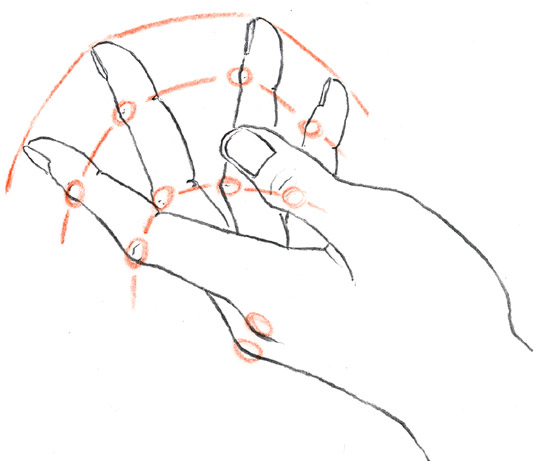
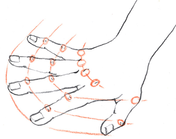
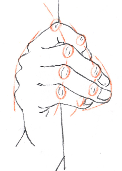
However, quite a few of the so-called step-by-steps are not actually a series of stages, but sets of little graphic features, to help explain how to draw certain aspects. Since hands are always so tricky, I thought I would do some teaching-drawings, looking at how you can use the position of the knuckles to help judge whether you are getting things right or not.
It's a trick I always use. Though the knuckles are staggered, rather than in line, the shape you get when you join them up is echoed in the next set of knuckles, as well as the finger ends. This helps you get finger length right - another thing that is easy to misjudge.
I sketched three line-drawings, (actually, I drew 5: the other 2 were a bit rubbish). I tried to get really different poses. Then I placed a bit of tracing paper over each sketch and circled the knuckles in a coloured pencil. As soon as I joined them up and then drew in the finger-end line, I knew the drawings would work really well.
I scanned both drawings and tracings, then put them together in Photoshop.
Job done.
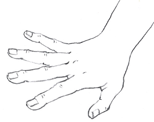
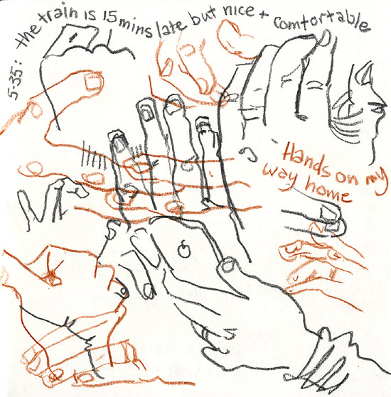
The rest of the spread on How to Sketch Hands uses drawings from my archive of sketchbooks to talk through some other ways of thinking about the various problems, including creating montage sheets, drawing just hands, over and over for practice. This is useful for stopping you getting frustrated when people move. It's also good for making the individual sketches seem less 'precious', so you are less inclined to worry if they go a bit skew-whiff here and there:
It's a great way to pass the time on a train. Try using a couple of different coloured pencils, to stop things getting too confused.
I think (think...) I have now done the last of the scanning for the urban sketching people book (hurrah!). We lost one drawing completely though. This boy was going into a new section I added last month, on things to look out for when drawing people of different ages.
Because he was a last-minute addition, he didn't get sorted out with a reference number when we tagged everything, to remind me which sketchbook he was in. John and I scoured the pile several times (now nearly 100 books). We had a clue - we could tell from when I originally uploaded the sketch to my website sketch-space that it was done in 2012, which narrowed the field at least. We couldn't find it anywhere though. Total mystery.
In the end we gave up and I substituted this one instead, which is a nice sketch, but not as clear for demonstrating the teaching-point: how children's lower lips are often set back, so the upper lip protrudes slightly. Hey-ho.
I don't have many drawings of children, because they are generally such a pain to sketch. Babies are even scarcer in my sketchbooks. Luckily I did find this page, done on a plane:
The montage system is definitely the easiest way to deal with the constant motion of babies and it was great for the book, as all the different angles gave me loads of observations to talk about.
Things might be a bit thin on the ground for younger ones, but I have plenty of examples at the other end of the scale - I just love drawing older faces. So much character. As we age we get more and more individual.
Fortunately, there are some constants to watch for when you're drawing older people, like the tiny, vertical creases we women get above our top lip, the deepening shadow between eye and nose, the loose neck... oh goodness, I've got to stop - it's all too depressing!!
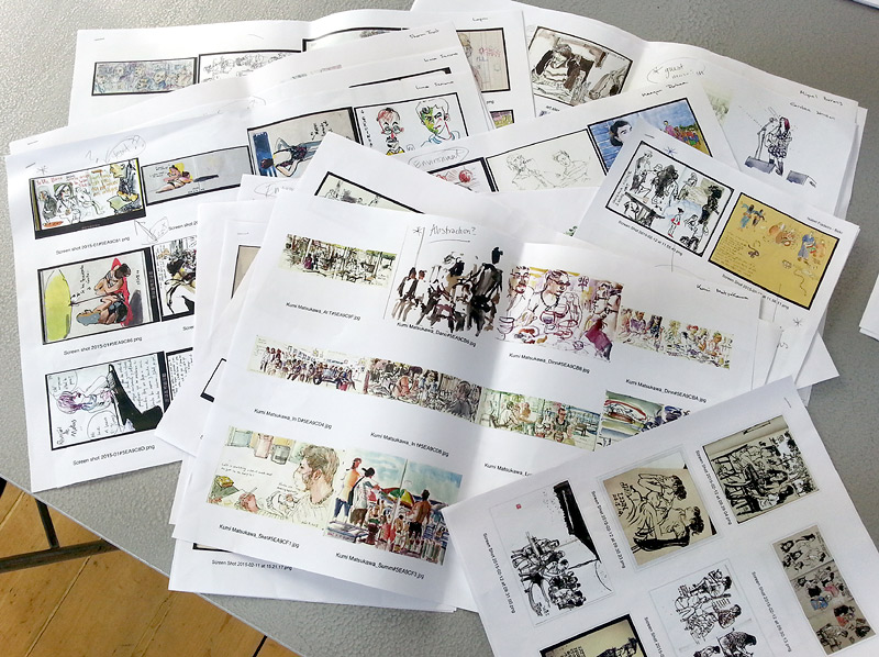
Last week, my publisher sent another big batch of draft spreads through for my Sketching People book. It's so exciting to see it coming together. It has been a very interesting learning process. It's so different to writing a picture book. Okay, there are an awful lot more words, of course, but that's not really what I mean. It's the process which is new.
Organising all my ideas was probably the biggest challenge and that is behind me now. All the text has been created to fit within specific chapters, each of which is subdivided into spreads - remember the Flat Plan? I have never worked in that way before and it has been interesting to watch how the plan has evolved as we've gone along. We are onto our 4th Flat Plan now.
About half of my text was generated by that process of organising my ideas, the rest revolves around specific sketches, selected from my archive of sketchbooks or from guest artists, chosen to help underline particular teaching points in the plan. Those decisions have been mine, but made with the advise and guidance of the editorial team at Quarto. As with any publishing project, it is far more of a team effort than it appears from the outside.
The bit where the rest of the team have really come into their own though, is with the design. I have written my text and chosen my sketches, spread by spread, concentrating on informative content, rather than how it will look. Now all that has to be organised visually, placed on the page in a way which is both clear and (hopefully) gorgeous to look at.
The sketches in these layouts are still using mostly my quickie photos by the way, which is why they are horribly grey. The gleamy, high res scans will be dropped in next, which will look better still:
A batch of initial layouts, for a small section of the book, came through back in March, but my team at Quarto are working on many more books at once than I am used to with picture books, so there has been quite a long gap, where I have been waiting my turn. Now though, things are really motoring.
This new batch is about a third of the book. I went through them last week, adding notations for changes, then we talked it all through on the phone.
You can see from the layout above, that sometimes there are greyed-out areas, where images are to be dropped it later. That's because I have yet to do the filmed sections. Yes... filmed! It's all a tad daunting: I will be filmed in action, then stills will be taken from the film, to use as step-by-step illustrations, in sections like the Colour Before Line step by step I showed you a while ago. Sometimes that's the only way to create something in stages: as with the section above, which is about drawing motion.
Anyway, still some bits to work on as a result of these layouts, so better get on.
I have come up with a new idea that I thought I'd share with you...
At the back of my mind, I am preparing for my up-coming residency with The Morgan Centre in Manchester, thinking about the art materials I will need and how to make things run as smoothly as possible. I have tried out my new concertina sketchbook design and am satisfied that will work well. There is one drawback to concertinas though - in order to make one page flow into another, you often need to open 3 pages at once, which means the paper is wider than the book and you have nothing to rest on. It can all get a bit cack-handed!
While I was thinking about this, I got a tip from another sketcher about water pots, which I thought might improve upon my hairspray-lid system (which does impinge upon my palette's mixing space). My friend suggested using the little, metal clip-on container that oil painters use for their linseed oil and white spirit. Sounded good, so I bought one. Trouble was, when I tried it out, there was no excess on my sketchbook to clip them to.
As it happens, these two problems have a common solution. I cut up one of those plastic folders you buy in stationers and created a sheet of plastic just over an inch taller than my concertina book and about half as wide again. This provides somewhere to clip the water-containers, while also providing an extended back-board to rest on:
The plastic is really light and flexible, so won't be a nuisance to carry around, but with the aid of the sketchbook cover, it is still stiff enough to support the water. I'll be able to tuck the plastic into my bag with my sketchbook and clip it on when I am working:
I've yet to give it a test-run, but it feels really comfortable. As you can see, the plastic doesn't extend quite as wide as 3 sections of paper, but doesn't really need to - that width is enough, because the 140lb watercolour paper is sufficiently stiff to support itself for the little bit of overhang. I didn't want to create something that would be too big and awkward to fit in my bag.
Fans of the little videos John and I occasionally make for my YouTube channel, will be interested to hear of my latest venture. I confess, I am rather excited myself.
A few Urban Sketchers friends of mine, including the truly outstanding Paul Heaston, and Marc Holmes, have recently signed up to run on-line workshops for a company called Craftsy. Paul and Marc's lessons are excellent, as you would imagine (but if you want to sign up for them, do it via the artists' own websites, as that way they get more commission).
Craftsy classes are not just in urban sketching though: there are all sorts of things you can learn, including children's book illustration... See where this is going?
Yes, that's right - they have invited me to do a class on illustrating picture books, concentrating specifically on character design and development. Now, I really enjoyed making our studio-based films, but this is the real thing: the film will be shot over a 3 day period in a proper, real-life, film studio. And not just that... it's in the USA! Okay, so now you know why I am excited.
I have been stealing time where I can over the last week or so, to write down everything I can think of on character creation. It helps that I do a lot of illustration workshops in schools on this theme, as it can be hard sometimes, trying to remember the stuff that you know really well. My next job is to collate these ideas into Craftsy's specific lesson-plan structure.
Once that's done and has got the OK, I will work with a Content Editor to talk further about the specifics of how we turn those learning points into a filmed workshop (which specific characters I will draw as demos, what practical assignments I will set etc). When that's sorted out, I am assigned a Producer to work with, fine-tuning various practical elements of the project and the logistics of what needs to happen when. Apparently, we'll even be discussing my wardrobe (new dress needed..?)
Then comes the exciting bit: Craftsy are going to fly me out to where they are based, in Denver. I'm booked into the film studio for September 9th - 11th. Another adventure! I am doing rather well on that front just lately.
It's early stages and nothing much will happen for a while, as I have my other commitments to work on first, mainly my Urban Sketching People book, but I'll keep you posted (of course). Once the filming is done, there will be about 6 weeks of post-production editing before it's released. If all goes to plan, it sounds like we should have it ready to go live around the middle to end of October. Watch this space!
I have been writing a section from the beginning of my book, discussing different art materials and looking in detail at the kit which I carry and why. Getting your personal kit-bag sorted is important, because you don't want to be fussing about what to take or leave behind, each time you go out. It's difficult, because we all know what it's like to want the very thing you left at home.
Nevertheless, you need to make decisions and pare things down. It's good to travel light, otherwise you aren't able to carry your kit with you 'just in case'. I have 3 versions of my kit. The slim-line version is just my trusty Sailor pen and an A5 - A6 book, which you don't even notice you're carrying. I tend to have these in a pocket most of the time, because you never know.
The next step up is to add my watercolour pencils, a waterbrush, a sweat-wristband (for cleaning the brush) and a knife. That's my medium kit and a good on-the-train kind of size: enough to see me though the odd hour here and there.
My full kit, for sketching day's out, is still pretty compact as I hate being loaded down. All the art equipment packs up into a zipper bag, the size of the average toiletries bag, which slips easily into a large handbag, along with a sketchbook or two.
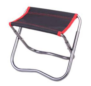
If it's an urban day, I usually pop my mini-stool in my bag too, so I don't have to look for benches or doorsteps. It weighs nothing and fits in a large handbag:
If I'm going rural, this foldaway sitting-mat from a camping shop is way better, because of uneven ground:
I have had to unpack my full kit this week and photograph every individual element for the book. This is because I want to dedicate a spread to peering inside my kit-bag, with pictures of everything and annotations, telling people exactly what each item is and why I have chosen it. I photographed 28 different items like this:
My snaps are not the photos we will end up using, but the designers need to know what everything looks like, so they can design suitable graphics for the page. Once that's done, the publisher will commission a proper photographer to take the pictures they need. In the meantime, I have been writing all the text.
If you are interested in getting some of the specific items like the Sailor or the stool, I have put together some links to where I got them. It's on Facebook here, as part of the Usk Yorkshire website.
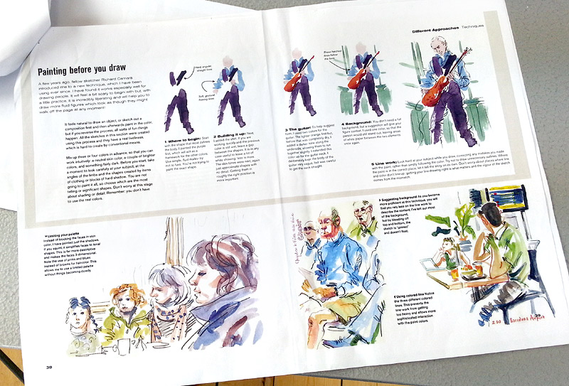
If you have been following the project, you will remember that I have a handful of spreads which are more or less finished - the ones we did as samples, to get the US edition signed up, including this painting before you draw spread:
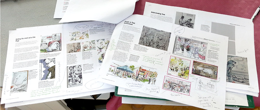
Then, at the start of the year, I sent off a good chunk of the text, along with all the images that will go with it (just photos of my sketchbook pages for now). My publisher has been working on it while I have been doing other things. About two thirds of what I submitted has now been set into very rough spreads and sent back with some suggestions for changes. I had an long phone call with my editor, where we went through everything in fine detail and I scribbled notes all over the spreads:
It's not too bad at all actually. All the text is intact without changes, it's pretty much all suggestions for either squeezing in more images or adding step-by-step breakdowns here and there.
The publisher also sent out a call for other sketchers to submit work for possible inclusion and I have sheets and sheets of gorgeous guest work to choose from. That's going to make things easier. So far, I have been trying to collect potential guest images by trawling Flickr and saving things into Pinterest.
I have mostly addressed the changes now. I just have some captions and annotations to write, to go with the added images, but I'm waiting until my suggestions have been given the green light before I do that.
For now, I have moved on and begun writing a new section of the book. This one looks in detail at how to draw specific parts of the body. We did sketching the eyes as one of the sample spreads. I took a couple of days to get my head back into things, after such a lengthy pause, but I am motoring nicely now and have already written 'feet', 'hair' and 'ears'. Still got mouths, hands and noses to do. Better get on...
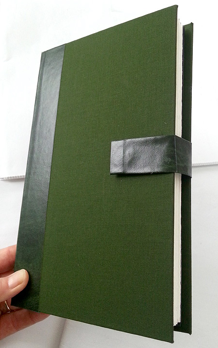
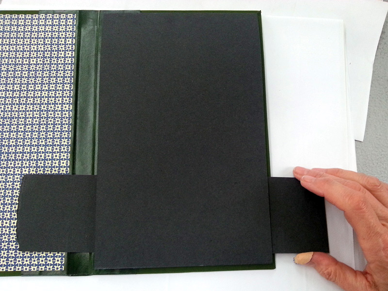
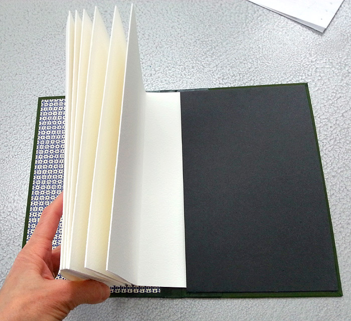
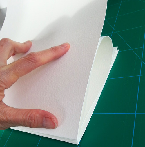
I have now finished my 35 sketchbooks, ready for my residency at Manchester's Morgan Centre. I don't know if anyone out there is going to have a go at making the books for themselves, but in case you are, here's the final stage of the process.
The cover is more or less done, but two things are missing - we need the card insert, to hold the paper concertinas we created in place, and we need a way of fastening the book closed, because the paper will try to escape and inevitably unravel itself in the most inconvenient places you can imagine.
The insert is very straight forward. I bought a pack of A4 black card from WH Smith, 240g, which was perfect. The insert width needs to be approx 10mm narrower than your back cover board. The height, needs an excess of 30 - 40mm to fold over, both top and bottom. The centre between the folds should measure 5mm more than your concertina-paper height (which should also be about 10mm less than the height of the book cover). Score the excess and fold (gently, rather than tightly):
Test that this does in fact sit neatly into your back cover (I made lots of measuring errors during the course of making the books - it's best to double-check everything).
I tried using double-sided tape to stick the insert into the book at first. I figured that it would be less messy than PVA when trying to position the folded card, but it started to peel up after just a couple of hours, so I went back to PVA.
I glued the top flap first, positioned it (folded under) on the inside back cover - 5mm from the top and outside edge - then put it under a couple of books to dry (squeeze out and wipe any excess glue first!)
I did the bottom flap once the top was secure. One trick: I was aware of the potential for excess glue to squeeze out underneath at this stage, unseen, and accidentally glue the insert shut, so I slipped a strip of waste card in between, before pressing the glued flap down.
Again, put books on top to dry, or it springs up.
The end of the concertina-paper can now be slipped under the card and slipped out again when you want to replace your paper. Ingeniously simple solution for refills. I can't take the credit I'm afraid: my clever friend Lucie Golton designed it.
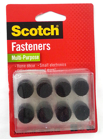
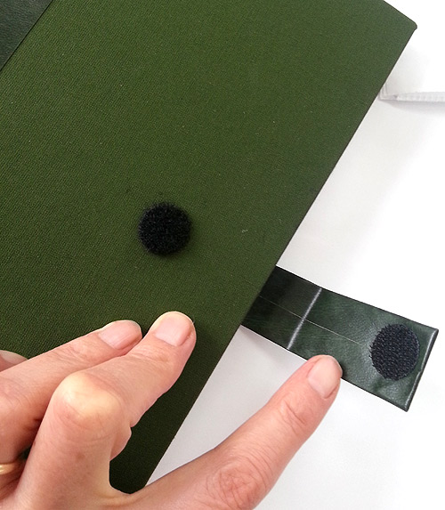
Many people use ribbon to fasten books. I didn't want to drill holes in the cover through, as it acts as a mini drawing board when I am using the book, so I wanted it unsullied. John came up with the Velcro system. I was going to buy Velcro tape, then discovered these nifty little guys:
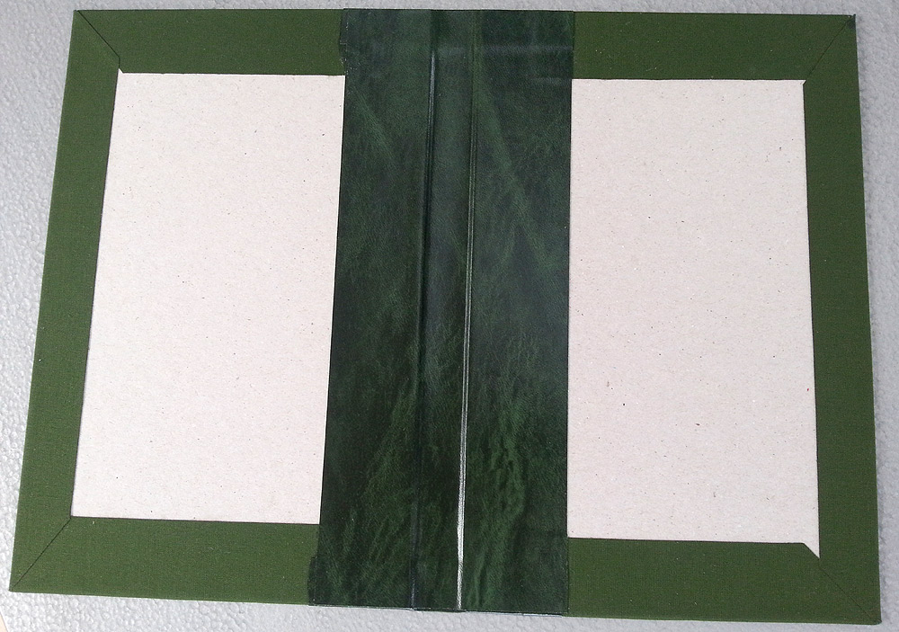
Perfect. You pop one fuzzy spot onto the book, back and front, then attach the loopy halves onto a short strap, which I made from vinyl to match the spine.
I just cut a piece of vinyl twice as wide as needed and 10mm longer each end, cut across the corners, then folded it in on itself, using PVA again.
The beauty of the Velcro is that, when the book is in use, if the unfastened strap gets in the way, you can detach it and stick it back on at 90 degrees. You don't lose it, but it doesn't keep flapping and springing around the edges your paper.
If you found this project useful and want to check out other handy posts, try using the Hot Tips label on the right. I add the label to anything I think might be helpful to other people. It's a bit of a mix, with other ways of home-binding sketchbooks, but also tips for building up an illustration folio, how to do a school visit, create a 'Flat Plan' to plan out a book, or how to use / where to buy particular art materials. All sorts.
The covers are done - hurrah! Making them isn't as tricky as you think, honest. You need:
Book board: warps less, but any thick board could be substituted I guess.
PVA glue and a biggish brush (don't let it dry on the brush!).
Cloth: I've used regular cotton before, but book cloth is stiff and paper-backed, so easier.
Book vinyl: for the spine (though again you could try other materials).
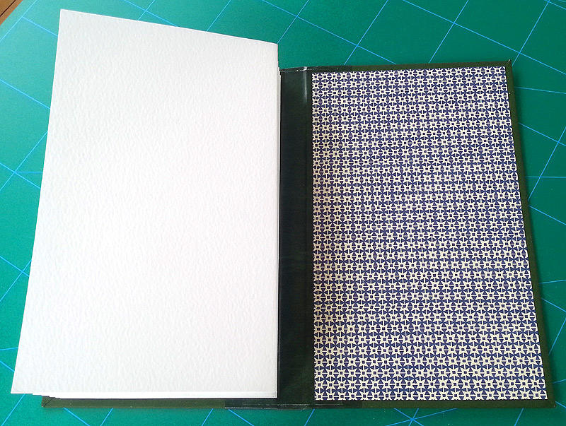
Endpapers: any thickish, patterned paper works.
Medium weight card: a small piece to create a flap, to hold the folded paper in place.
You also need lots of scrap paper, to help create both a clean and a 'gluey' work area, side by side.
I started by cutting 2 pieces of book board: you need to allow 5mm more than your folded paper inner all round. I then cut 2 pieces of book cloth, allowing about 20mm overlap on three sides, but cutting it 20mm short on the spine edge. You stick the book cloth pieces to the boards (it's easier to apply the glue to the board, rather than the book cloth):
You turn it over and cut off the corners, snipping within 2mm of the board corners:
Then you glue all the excess cloth edges and stick them down, making sure to pull the cloth tight over the board edges (sorry, just realised this photo is up the other way - bit confusing, but you get the idea):
The corners are slightly tricky (this is where the book cloth really helps). You use your thumbnail to tuck the cloth into the corner on one side, then fold the other edge over to seal a neat corner:
Next comes the spine. I measured the width of my folded-up paper inner at 15mm. I didn't squeeze the paper too tight, so it wouldn't be under too much pressure and the book would close more easily.
This is where the vinyl comes in: you need a piece to join the two boards together and create a strong spine. Book vinyl is great as it's very strong but also takes pencil on the reverse, so it's easy to measure and cut to size.
I measured 35mm, to stick to each board, plus the 15mm spine, so 85mm wide. It needed to be as long as the board height, plus an extra 20mm top and bottom to fold over. I drew all this onto the vinyl, so it was easier to line things up when sticking on the boards:
I put PVA glue onto the vinyl one half at a time, placing each board so it sat within my pencil lines, until it all looked like this:
Then I glued the excess vinyl top and bottom and folded it over, making sure it was pushed well into the spine.
I then cut another strip of vinyl to go on the spine's inside. That needs to be just 1mm shorter than the book height, both top and bottom, and roughly the same 85mm width. When you glue that on, you need to really push it into the spine edges, so it's snug against the board and stuck tight to the other piece of vinyl:
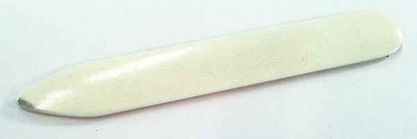
There is a book-binder's tool which is designed for that job, but there are plenty of things which will do the trick, including a thumbnail.
Then you do the endpapers. You would normally stick the paper to both sides but, in this case, the inside back cover is going to be completely obscured by the flap we need to make, to slip the paper insert into. You just need to cover the front. Measure a piece that is 4 - 5mm smaller than the front cover all round and stick it on.
You're nearly there now. I'll tell you how to make the card insert next time, as this is turning into a very long post.
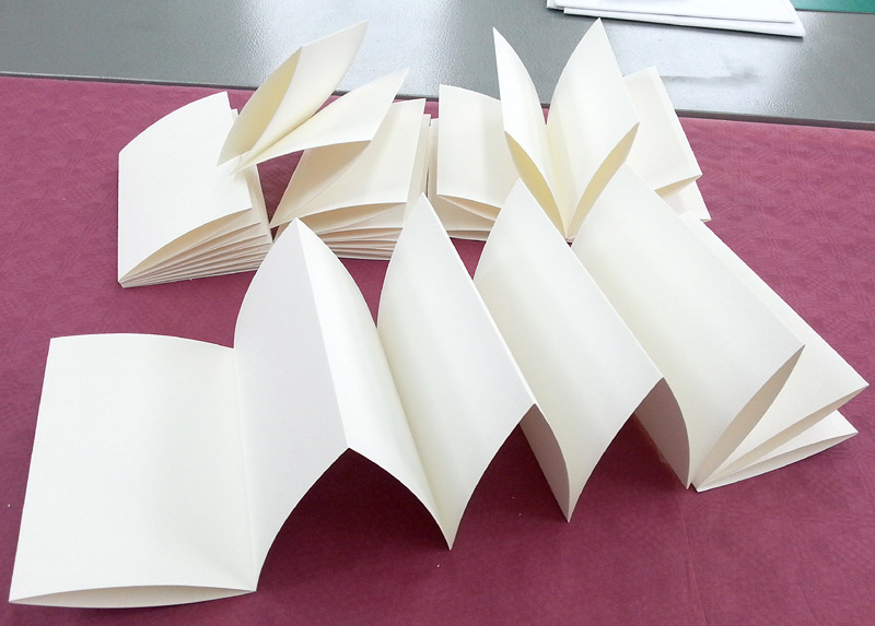
Yesterday afternoon, John and I cut up the very last section of the huge roll of paper for my concertina-format sketchbooks. It's been quite a marathon task, but I now have sketchbook paper coming out of my ears. It has mostly landed on my already full desk, where it is perched on top of all the tagged and numbered sketchbooks, which are still waiting to be scanned for my Urban Sketching book.
So, now I have to gird my lions for all the folding. The ones I folded on Wednesday have been sitting under piles of heavy books ever since. They do seem a little tamer for it:
I have folded 10 so far, so still another 25 to go.
I have made a start on the detachable covers too. There are two to make, as there are two different sizes of paper. This was because the size I wanted to create didn't fit exactly into the width of the roll. Which meant that I got 30 sketchbooks at the 21.5 x 14 size, then another 5 from the 'excess' edge of the roll which were squarer, at 17.5 x 14.
I made a test one first, to fit a Moleskin-size, just to get the technique right. It worked really well. I bought some proper book-cloth specifically for this project, which was a great idea, as it cuts and sticks down very much easier than regular cloth. I also chose a snazzy print for the endpapers. This time, because I had a budget, I bought the proper stuff, rather than using gift-wrap, like I did for the Japanese bound ones:
Because the 300gsm paper folds up into quite a thick book, I had to create a reasonable sized spine for my covers, which I have done with a book vinyl. This is the inside of one of the covers so far:
In case people want to try making some for themselves, I have taking photos at the various stages to show you, but that's for next time.
Although my residency doesn't start until the autumn, I wanted to get the sketchbooks made well in advance, in case of difficulties. So, a couple of weeks ago, a HUGE roll of watercolour paper arrived in the post. It was 10m long and over 1.5m wide: a bit of a nightmare to manoeuvre, but perfect for making concertina books, as you don't need any joins (usually the trickiest bit).
This morning we got stuck in!
We had to pull a 6ft table up alongside my work bench, just to have somewhere big enough to cope with rolling the paper out so we could work with it. Everything had to be scrupulously clean too - another nightmare.
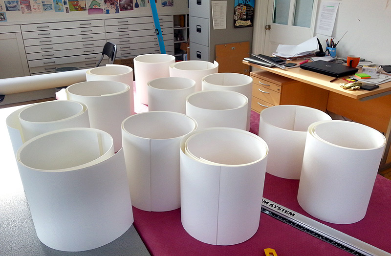
I had worked out that I would get 7 sketchbooks out of the roll's width, each a max of 2m long (so they would not be too unwieldy to exhibit at the university, when I'm done at the end of the residency). Given the roll's 10m length, that meant 5 sets of 7, so 35 books in total.
I decided to cut a couple of the 2m lengths from the roll first, to make things more manageable. I had intended to get the lighter weight paper I usually work on, but at the last minute went for the 140lb instead, so the finished lengths will be more sturdy. Trouble is, that weight means the paper is really springy, so absolutely everything was a two-man job. Thank goodness for John!
I thought long and hard about the order of things and realised that it made sense to do all the scoring (for the folds) before cutting the paper into the separate books. That way I could score across all 7 books at the same time, with only one lot of measuring. The books are going to be 14cm x 21.5cm, but you only need scores for alternate folds (because the folds go in 2 different directions), so we began by measuring out 28cm intervals down each of the 2m lengths.
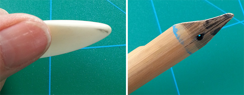
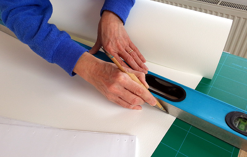
The book-binder's devise I used on my last sketchbook experiment seemed a bit thick to be accurate enough for a long concertina (where any errors quickly multiply), so I sanded the sharpness off a bamboo pen, which was perfect. We didn't have a ruler long enough to straddle the complete 1.5m width, but John dug out a really long spirit level:
That too needed a jolly good wash but, once clean enough, it saved a lot of time at the scoring stage, as we only had to measure up each edge of the paper and not in the middle too.
I had tried to use the spirit-level as a straight-edge for cutting across the width, but that was a BIG MISTAKE. It's depth interfered with the handle of the knife and so I have one rather raggedy cut, before I realised the problem. Ah well - it's a learning process.
Next job was to mark the width with the 12.5cm intervals, ready to cut the paper into strips for the separate books. It would have been really easy to mis-measure, so again I was glad to have my man-servant with me, double-checking as we went along. I was still rather nervous when I actually began cutting:
We had to get 3 separate cutting mats lined up along the bench, because of the ridiculous size of the paper. It worked a treat though. By mid afternoon, we had curls of watercolour paper perched all over the studio, ready for folding:
I worked down the length of each book, folding at the scored lines we had created every 28cm:
I lined up the in-between folds by eye, working without pre-measured scores, so that I could try and make sure the concertina didn't wander too far off square:
The thicker paper took a bit more man-handling and got chunky quite quickly, which was another reason I limited the length to 2m: 14 'pages' of 14cm. 300gsm paper certainly has very strong opinions of its own, so the experience was a bit like wrestling an octopus at times. The folded books are still pretty springy and rather keen to explode - I have put them under heavy books to see if that tames them at all.
So that's the papers for 14 books done so far. I'll tackle another batch tomorrow, while I remember how we did it (and while the studio is clean). Although I must also get on with my book. Eek!
Plus I also have to make a cover for the sketchbooks. Instead of individual covers for each book, which would take ages, I was given a great idea by my sketch-buddy Lucie Golton: a detachable cover which you use again and again. She made me one as a present a while back, so I can copy her system. Thanks so much Lucie!
I'll take some pictures as I make the cover, as well as showing you the finished item, but that's for next time.
View Next 25 Posts


