Aren't you glad?
I'm just going to do a 'ta-dah', here it is thing: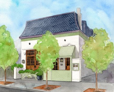
I punched up the values in the roof, the green band and warming hut, and shadows and sidewalk...well, everything but the trees, pretty much.
I added the tile to the roof with paint, but did the details like the address, the lights, a couple other things with colored pencil.
I didn't fuss with the trees because I don't want you to look there. I left them simple, and put all the detail on the building, because I want the viewer to look past the trees and at the restaurant.
I'm happy with it, and hope the client is too!!!!
This was a very simple example of architectural rendering. The people who get paid the really big bucks take architectural floor plans and elevations and using complicated methods, construct a 3D image of the building, THEN do an awesome rendering of it after that!
My little piece didn't have any people in it, nor do most "building portraits", which is what this is. Building portraits are usually nice renderings of someone's home or maybe place of business, or maybe model homes for realtors, things like that.
Rendering by Augustus M. Higginson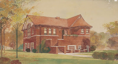
More advanced architectural rendering, which is done to show a building that hasn't been constructed yet, usually shows people (but not always) to show scale and the way a place will be used.
Here are a few links to people who do this for a living. There are about a million gazillion others ~ I just picked a few I know of out of a hat.
Frank Constantino
Bay Illustration
Michael Abbott
For a longer list, go here:
American Society of Architectural Illustrators
Or you can google "Architectural Rendering" or "Architectural Illustration" and get tons more. You could spend days looking at cool illustrations of buildings! (Well, I could.)
Viewing: Blog Posts Tagged with: Table 52, Most Recent at Top [Help]
Results 1 - 4 of 4
Blog: Drawing a Fine Line (Login to Add to MyJacketFlap)
JacketFlap tags: colored pencil, architectural rendering, Table 52, colored pencil, architectural rendering, Table 52, Add a tag
Blog: Drawing a Fine Line (Login to Add to MyJacketFlap)
JacketFlap tags: architectural rendering, Table 52, architectural rendering, Table 52, Add a tag
or, "The work-in-progress blog post with really badly spliced together scans".
I figured you'd all forgive me, right?
Thanks.
OK, so you remember we're doing a little rendering of this restaurant, Table 52. I had the line drawing all worked out and transferred to the paper.
Now its time to color!
I forgot to tell you this is being done at 8.5 x 10.5 inches, but will be reproduced roughly the size you see here (half the size I'm painting it).
So I'm keeping the rendering fairly simple. If this were for a different application, like, a formal painting of the restaurant that was going to be framed and hung on the wall, I would do everything I've done up to this point the same exact way. But I would do it bigger, and I would take much more time with the painting and put in a lot more fussy detail. I would also have better pictures to work with, and would have much more input from the owner, I imagine.
But for what this is being used for, this is how I'm doing it.
I'm using Windsor & Newton, Holbein, and Daniel Smith watercolors.
I started with the sky. Horizon Blue and Blue Grey washed on casually, not trying too hard to "make a sky", but letting the paint just flow together and do its thing.
I also did a pale wash on the sidewalk and ground all around.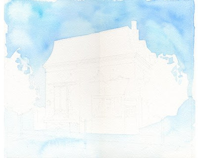
Next the roof. I did the main parts with Payne's Grey and Neutral Tint, then the border bits with Moonglow and Charcoal Grey.
I also added a little color to the tree trunks and the bricks around their bases. I'm trying to start tying the colors together a bit.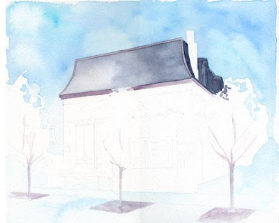
The green band and the "warming hut" were done with Oxide of Chromium and Green Grey.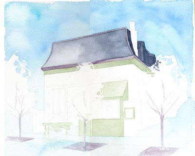
I did quite a bit on this step. I did the doors with Burnt Sienna and Transparent Brown Oxide.
Then I added in the window panes with Payne's Grey (hey...the panes were done with Payne's...cool!) and Charcoal Grey, kind of letting them each be a little different.
I also added layers of greys on the sidewalk and street, and around the sides of the building.
And some shadows on the building itself.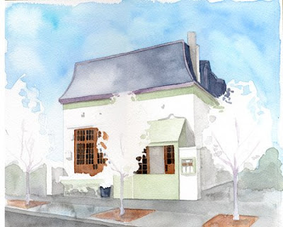
Then the trees. I used Permanent Sap Green and some Yellow Grey. Then I lost track...I just started fiddling some with the whole piece, adding more shadow, more to the tree trunks, etc.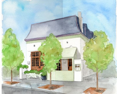
So this is how the rendering is shaping up compared to the original photo.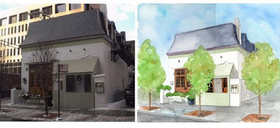
Its much brighter (the photo was taken with no sun, no shadows, bad light, etc.).
I've taken out the snow and Christmas lights and greenery and replaced that with Spring trees and no snow and different greenery in the planters.
This isn't finished, obviously. I need to finish the roof tiles, add the little lights on the building, the address, a few other tidbits. But this let's me see what parts are working and what might need to be adjusted.
I'm going to let it rest overnight and finish it up tomorrow. Nothing like getting away from something for a while to see it with fresh eyes.
Blog: Drawing a Fine Line (Login to Add to MyJacketFlap)
JacketFlap tags: daily painting, architectural rendering, Table 52, light box, lanaquarelle, architectural rendering, Table 52, light box, lanaquarelle, Add a tag
Continuing on with creating an illustration of Table 52 in Chicago...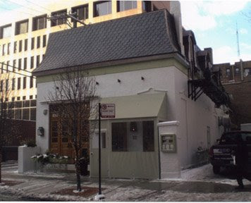 I taped this photo onto my lightbox and did a first trace, establishing the main lines of the building. I straightened up the distortion in the photo (its slight, but its there... the verticals in photos are rarely all truly vertical.)
I took out all the "uglies" that I mentioned in the last post.
I moved the middle tree to the right just a bit so the pretty window would show better. This also had the added benefit of hiding a bit of the "warming hut".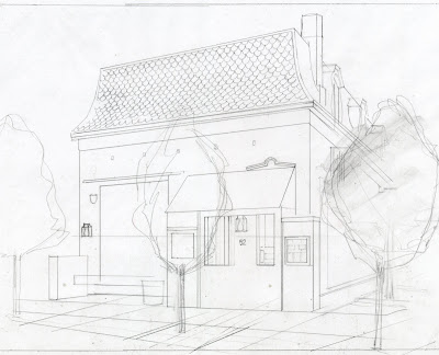 Then I did a really bold thing and added a tree that isn't even there on the right side!
Before I did that I stared at that side of the building and pondered how on earth to show the fire escape and fiddly bits of pipes and all, then also how to show that whole basically dead area.
"Why don't you just crop the whole piece and take that side off altogether?" you ask. Good question. Two things: 1. It needs to be there to balance out the rest of the piece and 2. because I'm doing this for a magazine and there is a size specification, I have to include exactly what I have in the picture to make the size work.
The added tree is in keeping with the two that are already there, and I honestly don't think anyone's going to have an issue with it. This is a case where that "artistic license" we all carry around comes in handy. You just have to know when and how to use it.
So now that I have the composition basically worked out to my satisfaction, I do another trace, tightening things up a bit, cleaning up the linework and adding a few more details.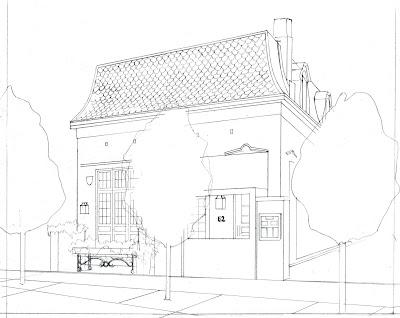
I forgot to say before that I also took out the buildings in the background. Sometimes I leave them in, it depends. If a building is flanked by others, up close, or if the surrounding buildings help establish where this one "lives", or for some other good reason, I will leave them in, and maybe fade them out some.
In this case, the surrounding architecture does nothing to enhance this one, and also, this one is kind of 'stand alone' anyway, so I decided it didn't need any company on the page.
Also, the trees will be very "light" in feeling. I don't want them to overwhelm the picture. I will be taking out the snow in the photo as well, and putting Spring leaves on the trees (and taking out the Christmas lights they currently have wrapped around them). So the overall feel of the piece will be much different than the photo.
Next I put that last sketch on the light box and transfer the drawing to my final paper.
I'm using Lanaquarelle watercolor paper. I darkened the drawing up in Photoshop to show here. In reality its much much lighter, and so is the paper. But it does have a warmish cast to it, which will work nicely with the whole feel of the piece.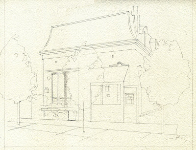 The next thing to do is choose a palette and start painting!
All images and content herein are © Paula Pertile and may not be used or reproduced without permission.
Blog: Drawing a Fine Line (Login to Add to MyJacketFlap)
JacketFlap tags: Chicago, Oprah, architectural rendering, Table 52, Chef Art Smith, Table fifty-two, Oprah, architectural rendering, Table 52, Chef Art Smith, Table fifty-two, Add a tag
And now for something completely different!
Today I want to talk about architectural rendering a little bit. I have a new commission to do a rendering of a restaurant in Chicago, so thought I'd start a work in progress series of posts about it, and also yak about rendering buildings in general some.
This is the photo I will be turning into a nice illustration: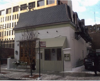
Its Table fifty-two, and is the creation of Chef Art Smith, who just happens to be Oprah's personal chef.
Rendering buildings is a highly specialized field of art. The range of styles, techniques and applications for illustrating architecture is much too much to try to write about in a blog! What I'll do is show you a little of what I do, take you through the process of rendering this piece, then give you some links to places where you can see other illustrators' work. This will take a few posts, at least, I figure!
First up are a few samples of other buildings I've done. I vary my style quite a bit, as you can see.
Ink and watercolor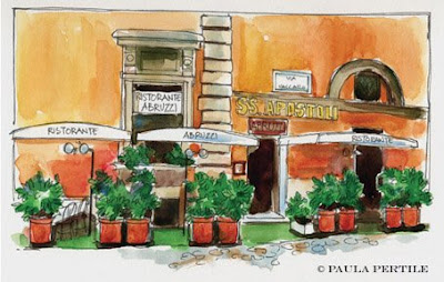
Colored pencil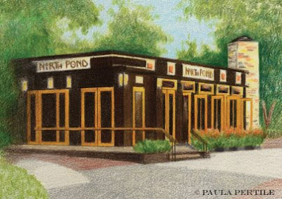 Ink and watercolor
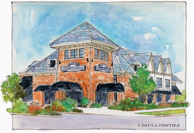
Watercolor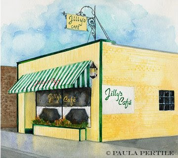
Colored pencil and Photoshop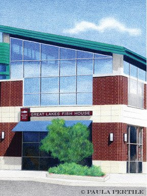
Sometimes the client will ask for something specific. If not, I let the building "tell me" what style and technique to use.
For Table 52, I'm thinking I might use a combination of watercolor and pencil. Its a very elegant space, and a tighter, neater style would work best to bring out the character of the building.
I start with a series of photos my art director sends me. He goes out to the location and takes pictures of the sight. I ask him to take shots of the building from different angles, some close up details, the more the better. The main photo I'll be working from is the correct angle, but I can't see the detail in the windows very well because of the tree, I can't see what's in the planter box in front, etc. etc.
So in addition to this photo I have about a half dozen others that show a lot more information.
We talked about the pictures and discussed what was important to show, and what could be removed, and in general how to make it a good illustration.
Here is my first take on the things that need to be removed from the picture: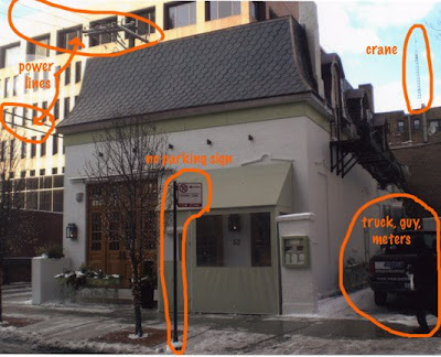
The parking sign out front HAS to go! I always take out signs like that. Ugly!
Also, the power lines on the left, the crane on the right, and of course the truck and some of the meters and whatnot attached to the side of the building.
We talked about the green canopy tent structure in front. That's a temporary structure put up to shelter people who are waiting to get in, from the weather, which is very civilized (the structure, not the weather). It comes down once the weather warms up. But as much as I'd like to remove it, I don't know what the window and door look like underneath, and don't want to just invent something, or "fake it". Looking at the interior shot of the place on the website tells me some of what the window does, but not the door. And since I'm not there to go look in person, and my art director isn't able to go back and take more pictures, we'll have to just settle with what we have to work with. I will include the "warming hut" in the illustration and make it look as nice as possible (luckily its very tastefully done so it won't be hard!)
Now let me go work on this, and I'll post the next steps as soon as I have something to show!
All images and content herein are © Paula Pertile and may not be used or reproduced without permission.


Hi! Paula: Thanks for posting at my blog. I have been watching the Architectural Portrait. It turned out wonderful. Thank-you for sharing.
Sherrie
Very interesting information. Thanks for posting your process.
This turned out nicely. I love how you took all the extraneous things out of the reference and made it your own.
As one who panics at the thought of painting architecture, I found your step-by-step process very interesting to follow.
Thanks for taking the trouble to scan each stage.
I do like your illustrations. I like to visit various sites to see what Architectural Renderings have been created. Never know what you might find.