new posts in all blogs
Viewing Blog: inspiration from vintage kids books and timeless modern graphic design, Most Recent at Top
Results 1 - 25 of 1,737

Grain edit inspires hundreds of designers and illustrators each day with our fresh content and exclusive interviews. Daily posts are hand picked for the best of timeless modern graphic design, typography and illustration from the 1950s – 1970s and contemporary designers that draw from that period. We feature rare design books, vintage kids books, posters and mid century modern ephemera from our bookshelves as well as other designers’ libraries.
Statistics for inspiration from vintage kids books and timeless modern graphic design
Number of Readers that added this blog to their MyJacketFlap: 7

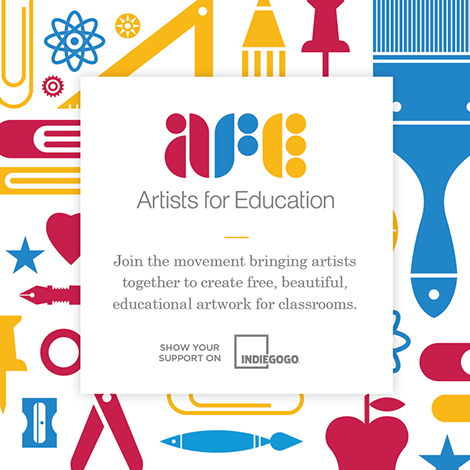
America’s public schools are underfunded and teachers are often lacking essential tools to effectively do their job. To address this, Brad and Krystal Woodard of the design studio, Brave the Woods, created Artists For Education (AFE). The artist-led initiative aims to produce posters that educate and inspire students. To support these efforts, a fundraising campaign has been launched as well as an open call for designers to submit art. Submissions that are accepted will be available for teachers to download free of charge. In addition, giclée prints of the designs can be purchased, with a portion of profits benefiting educational programs. Participating artists include: Invisible Creature, Eight Hour Day, Mary Kate McDevitt, Justin Pervorse, Tuesday Bassen and many more.
To contribute to AFE, please visit their Indiegogo campaign.
Save
Save
Save
Save
 Share on Facebook
Thanks to this week's
Sponsor // Foto Sushi


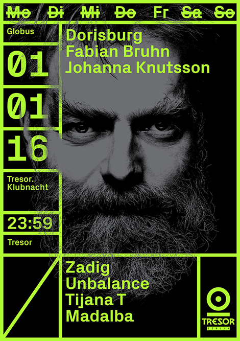
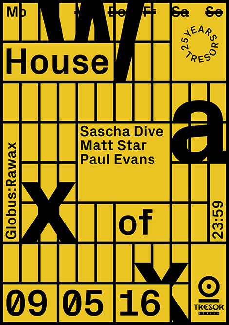
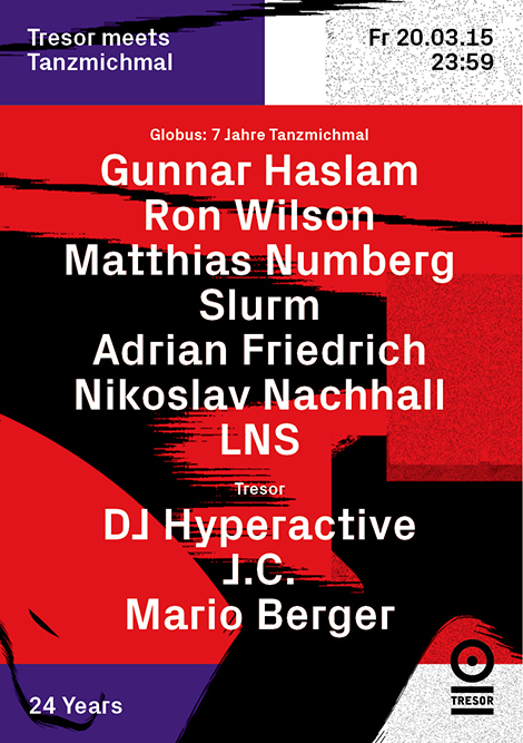
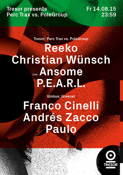
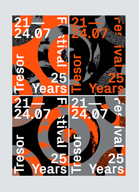
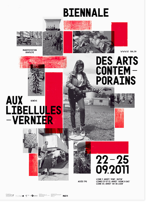
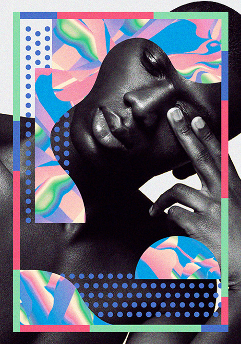
Vanja Golubovic is a graphic designer that splits her time between Geneva and Berlin. Having an affection for music, film, and theater, she often collaborates with cultural institutions. I’m especially fond of her work for Tresor, a Berlin-based techno club and recording label. Fusing dynamic photography, neon colors, and dense textures, she creates posters that express the music’s pulsating rhythms and the venue’s lively ambiance. Uniting these elements is a rigid grid system that provides a visual hierarchy and represents the illustrious cage that the DJs perform in.


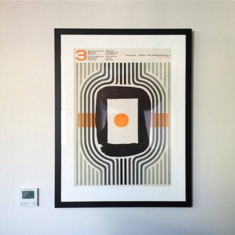
In addition to the club’s posters, here are some of her other projects:


——————–
Also worth viewing:
burkhardthauke
Louis Reith
Mike Cina Interview
Follow us on RSS, Instagram, Pinterest, Wanelo,
——————–
 Share on Facebook
Thanks to this week's
Sponsor // Foto Sushi


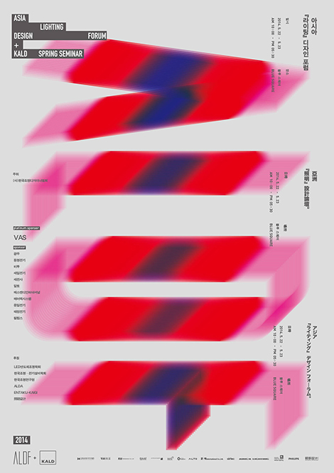
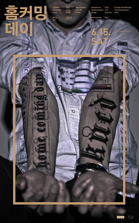
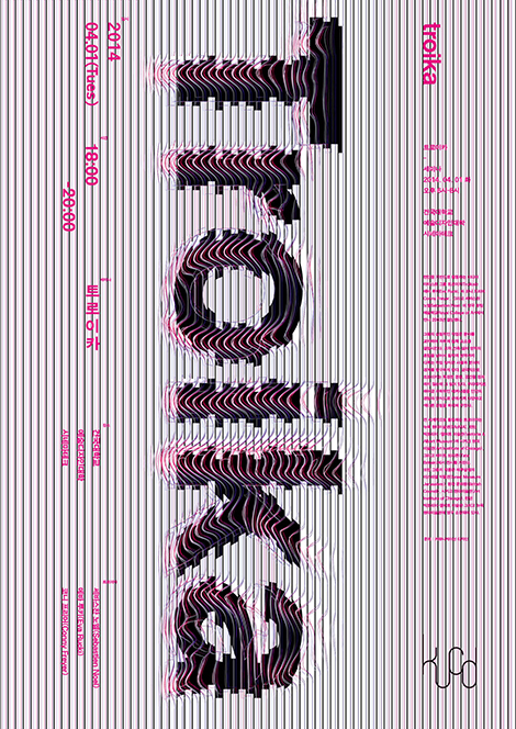
Seoul-based graphic designer, Joonghyun Cho, crafts inventive and highly conceptual posters that capture the essence of the institutions that they promote. This can easily be seen within his vibrant series for the Asia Lighting Design Forum. In each poster, he spells out the event’s acronym with layered gradients that beautifully represent the movement of light and the effects of its properties. Clever and alluring, his work has been recognized by numerous publications including, Communication Arts Korea, Nylon Korea, and Notefolio Magazine.


——————–
Also worth viewing:
Joseph Navarro
Rifle
It’s Time to Move
Follow us on RSS, Instagram, Pinterest, Wanelo,
——————–
 Share on Facebook
Thanks to this week's
Sponsor // Foto Sushi


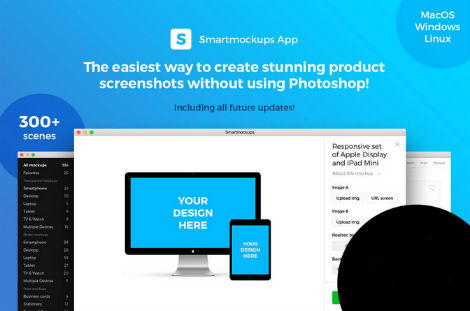
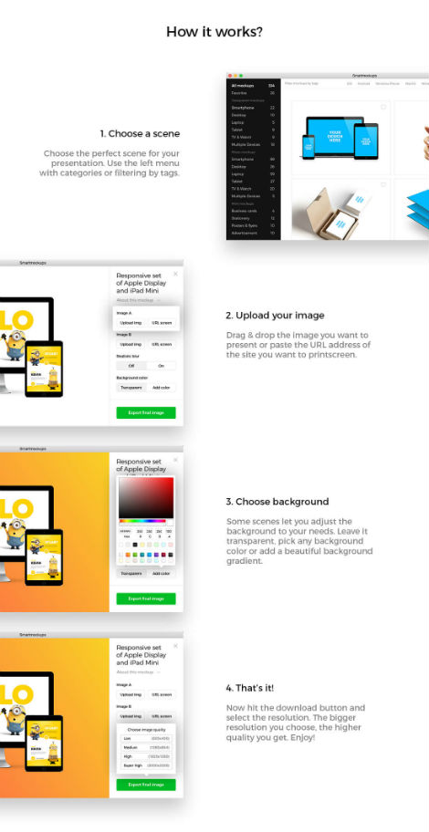
Now you can whip up a product mockup/screenshot in less than 10 seconds, all without even using Photoshop. Yep, it’s a snap with the Smartmockup app. Available for MacOS, Windows and Linux, this simple-to-use app features more than 300 stunning mockup templates. Each template allows you to easily upload and incorporate your product image into the mockup and thus saving you loads of time and money!
For a limited time you can purchase Smartmockup for 50% off at Mighty Deals.
Highlights:
- Easily create product screenshots without using Photoshop.
- 300+ premium, digital, print and screen mockups.
- 30+ responsive screens: Desktop, Laptop, Tablet, Smartphone, Smart TV, Watch.
- Covers variety of print products – Business Cards, Stationery, Posters, Flyers and more.
- Customize backgrounds – change color or add beautiful gradients.
- Blur screens for realistic depth of field effect.

Visit mightydeals.com to see more details on the Smartmockup App.
——————–
A huge thanks to Mighty Deals for sponsoring this week’s RSS Feed!
Interested in sponsoring grain edit?
Visit our sponsorship page for more info.
——————–
Also worth viewing:
Naonori Yago
Hulse & Durrell
Homework
Follow us on RSS, Instagram, Pinterest, Wanelo,
——————–
Save
Save
 Share on Facebook
Thanks to this week's
Sponsor // Foto Sushi


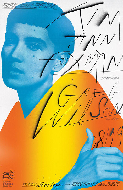
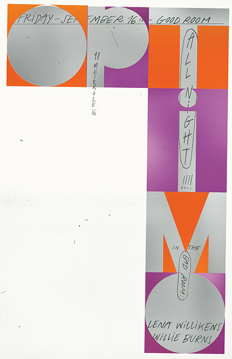
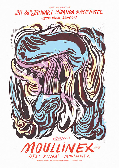
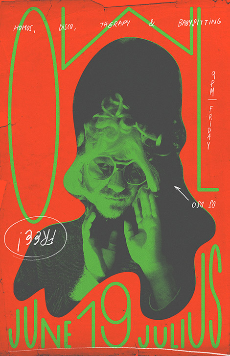
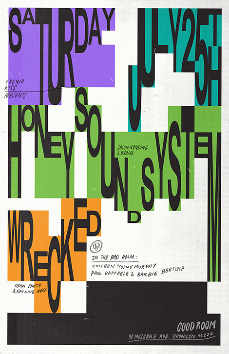
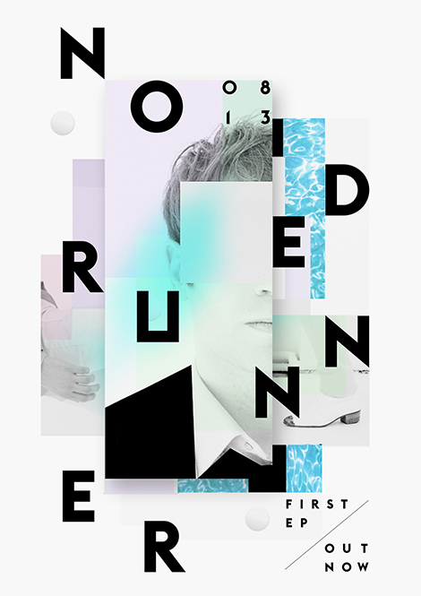
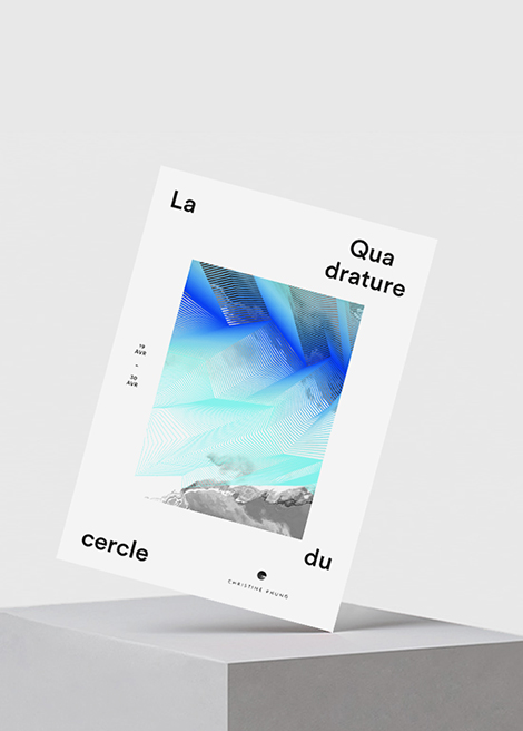
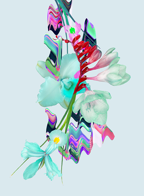
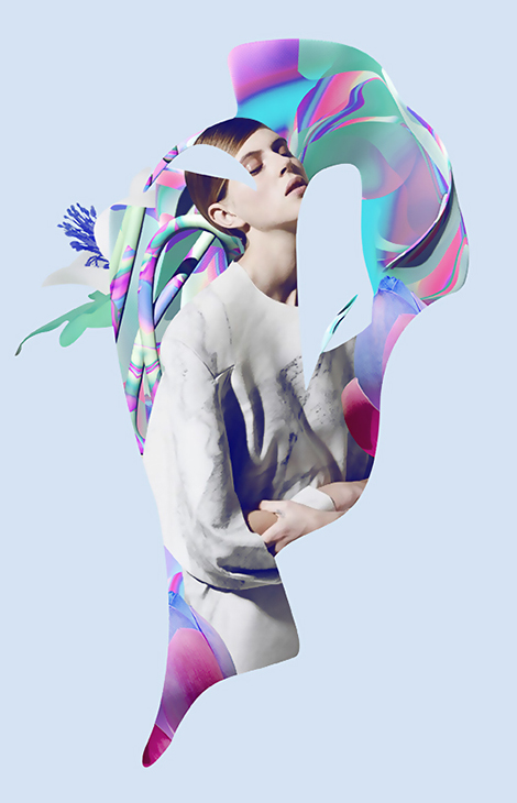
Bráulio Amado is a graphic designer living and working in New York. From comics to music videos, he takes on a number of creative endeavors and always seems to do so with humor and authenticity in mind. I’m particularly impressed with his ongoing poster work for music venues throughout New York. Abstract and experimental, these designs fuse lush gradients with illustrations and photographs in a collage-like fashion. Adding to these compositions, he layers in expressive typography that accentuates the pieces and acts as an analog counterpoint to the purely digital work.


——————–
Also worth viewing:
Mike Lemanski Update
Motoi Shito
Daniel Zender
Follow us on RSS, Instagram, Pinterest, Wanelo,
——————–
 Share on Facebook
Thanks to this week's
Sponsor // Foto Sushi


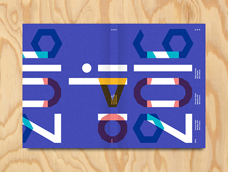
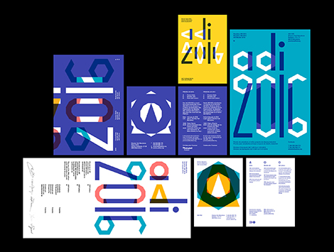
Founded by Lupi Asensio and Martin Lorenz, TwoPoints.Net is a design studio known for their flexible visual identities (FVI). Rather than being static and repetitive, the studio believes that an identity system should be adaptable. This can easily be seen in their work for ADI’s Delta Awards. Using a series of icons, they created a versatile system that could be incorporated into the event’s branding, typeface, and awards.
Two Points’ appreciation for the efficiency of FVIs also fueled the studio to develop a program that helps their clients create designs on their own. While working with Tonangeber, a website for sharing playlists, Two Points created “supertool” — a program that guides DJs through the design process while maintaining the constraints of Tonangeber’s identity system.


——————–
Also worth viewing:
Michael Spitz
Studio Beige
Anymade Studio
Follow us on RSS, Instagram, Pinterest, Wanelo,
——————–
 Share on Facebook
Thanks to this week's
Sponsor // Foto Sushi


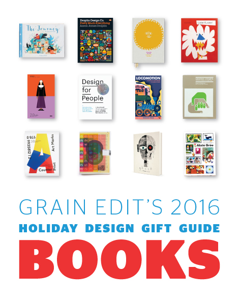
Here it is! Our annual Design Book Gift Guide! In this list, we’ve compiled our favorite titles from the past year. We hope this helps you find the perfect gift for your loved ones this holiday season.


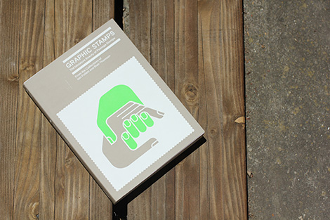
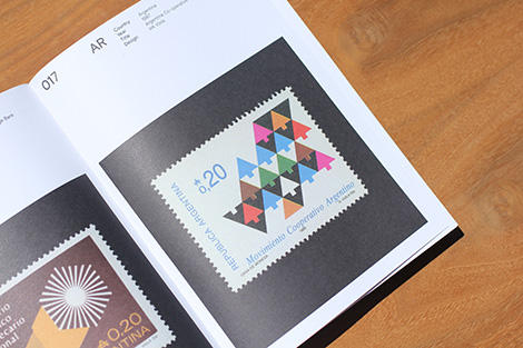
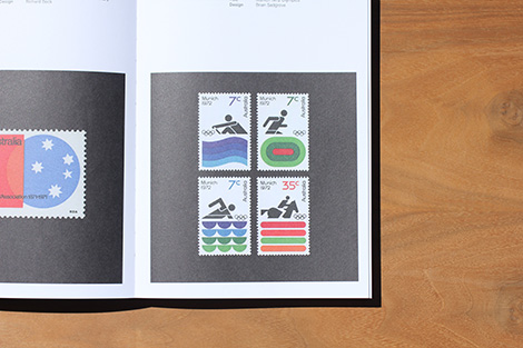
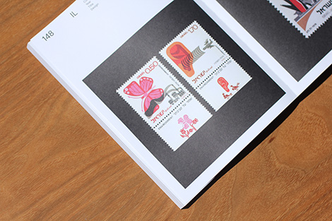
Graphic Stamps: The miniature beauty of postage stamps
Editors: Tony Brook & Adrian Shaughnessy
Stamps selected by Iain Follet & Blair Thomson
Essay: Mark Sinclair
Published by Unit Editions
328 Pages
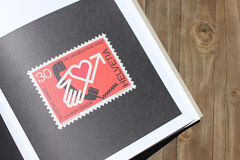
The Archive Series is a bibliographic celebration of graphic design archives and collections. The first title in the new series is devoted to the design of postage stamps. Sourced from the collections of stamp design experts Iain Follett and Blair Thomson, the book celebrates the brilliance of postage stamp design from around the world.
Available at Unit Editions

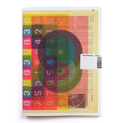
Prints
By Karel Martens
Published by Roma Publications
48 pages
This artist publication contains a sequence of unique letterpress monoprints, made by Karel Martens between 2014 and 2016, reproduced at actual size (except for two larger prints). It is available in two different cover versions which is the result of a printing experiment by printing all the content of the book in 3 layers on one print sheet, which was cut and folded into two different covers.
Available at Roma Publications, Amazon, and your local bookshop.

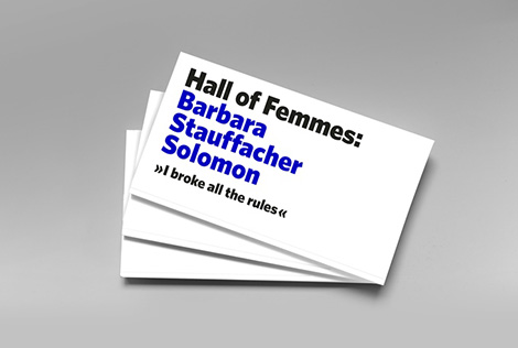
Hall of Femmes: Barbara Stauffacher Solomon
By Hall of Femmes AKA Samira Bouabana and Angela Tillman Sperandio
Published by Hall of Femmes
A Hall of Femmes book about Californian Supergraphics pioneer Barbara Stauffacher Solomon.
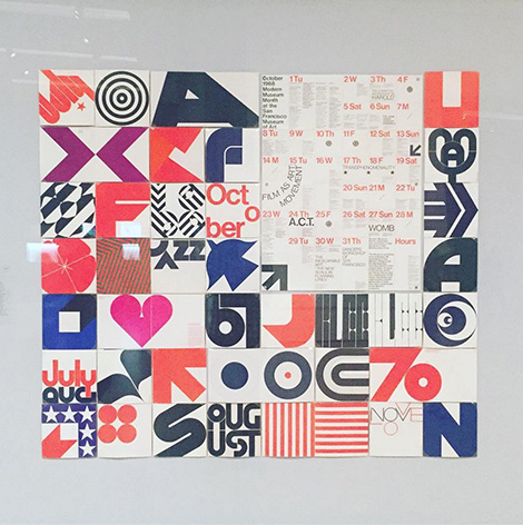
Barbara Stauffacher Solomon was the first to create what came to be known as Supergraphics: monumental graphics designed in harmony with architecture. Her iconic style – mixing Swiss Modernism and West Coast Pop – pioneered the look of California Cool, an important moment in graphic design history.
In addition to an impressive portfolio, she boasts a fascinating life story. Ranging from being a teenage flamenco dancer, to marrying a well-known film director, to suddenly finding herself a young widow with a child to support. At a crossroads, she moves to Switzerland to study under the influential modernist designer Armin Hofmann, before returning to the U.S and creating influential designs that were bigger and bolder than her Swiss counterparts.
Coming Soon.

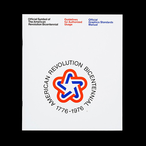
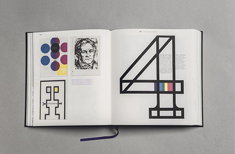
The 1976 American Revolution Bicentennial symbol was the logo for America’s 200th birthday party and a precursor to the NASA logo that Bruce Blackburn would design in 1974.
This edition is a perfect facsimile of the original, wrapped in a black jacket with a foil stamped foreword from Bruce Blackburn and an essay from Christopher Bonanos. The first 1,976 copies are limited edition, featuring a hand-placed original bicentennial post stamp from ’76.
Available at Standards Manual and your local bookshop.

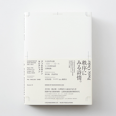
Design By Wangzhihong.com is a collection of the work of one of Taiwan’s top book designers, Wang Zhi-Hong. From typography manuals to Albert Einstein’s Ideas and Opinions, Wang has tackled a range of translated volumes for Asia’s book market. Often employing geometric illustrations and minimal layouts, his work is clean, bold, and intriguing. His approach has earned him international recognition including six of Taiwan’s Golden Butterfly Awards, Kasai Kaoru’s Choice Award, and Excellent Works from the Tokyo Type Directors Club.
Available at Cité Publishing and your local bookshop.

This Brutal World
By Peter Chadwick
Published by Phaidon Press
224 pages
A curated collection of some of the most powerful and awe-inspiring Brutalist architecture ever built. This Brutal World is a global survey of this compelling and much-admired style of architecture. It brings to light virtually unknown Brutalist architectural treasures from across the former eastern bloc and other far flung parts of the world.
Available at Amazon and your local bookshop.

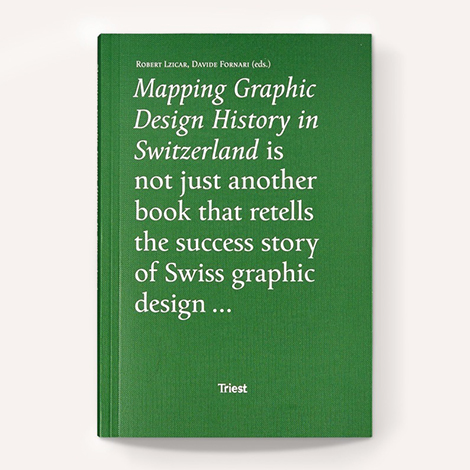
Mapping Graphic Design History in Switzerland
Edited By Rober Lzicar and Davide Fornari
Published by Triest Verlag für Architektur
328 pages
This volume presents eleven original essays on the production, mediation and consumption of graphic design artifacts and processes, as well as their respective discourses, by authors from the German, French and Italian-speaking areas of Switzerland.
Mapping Graphic Design History in Switzerland discusses theoretical and methodological approaches for historical research on graphic design; helps to establish graphic design history as an academic field in Switzerland; and aims to make this discourse accessible to researchers and professional graphic designers in Switzerland and abroad.
The texts are illustrated with around 100 color and largely unpublished images. In addition to the academic texts, the publications contains three visual essays on the history of graphic design in Switzerland, as well as an extensive list of literature and other references.
Includes an epilogue and prologue by the editors and contributions by Constance Delamadeleine, Davide Fornari, Roland Früh, Invar-Torre Hollaus, Barbara Junod, Leslie Kennedy, Robert Lzicar, Corina Neuenschwander, Franziska Nyffenegger, François Rappo, Michael Renner, Bettina Richter, Teal Triggs, Amanda Unger, Peter Vetter. With visual essays designed by Diana Iennaco, Marina Prado and Leonardo Signori
Available at Draw Down, Amazon, and your local bookshop.

Alain Grée: Works by the French Illustrator from the 1960s-70s
By Alain Grée
Published by PIE International
224 pages
This is the very first art collection title introducing his beautiful illustrations selected mainly from his work during the 1960s and 1970s. More than 200 art works are showcased, some of which are only available today in antique books. In addition, this title features Grée’s original paintings, rough sketches and interviews. This is a treasured collection for adults who have grown up with Grée’s books, who will recall their own childhood days, as well as a good reference for those studying illustration.
Available at Counter-Print, Amazon, and your local bookshop.

Explorations in Typography (Second Edition)
By Carolina de Bartolo with Stephen Coles and Erik Spiekermann
Published by 101 Editions
A brand new edition of Explorations in Typography is now available. It has been revised and expanded to include more typesetting examples and more typefaces as well as a visual index of page layouts and grids. Along with the same excerpt from Erik Spiekermann used in the first edition, this edition also features the writing of Stephen Coles who composed all new typeface descriptions and an index of alternates for each that are low-cost or free for educational use.
Available at 101 Editions and your local bookshop.

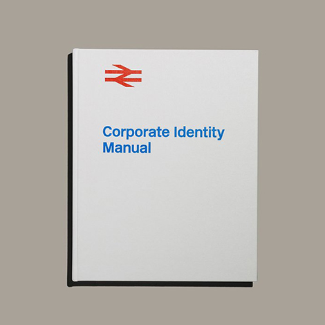
The British Rail Corporate Identity Manual
Created and edited by Wallace Henning
Published by Henning Limited
472 pages
Leaves on the lines, the wrong kind of snow, and soggy stale sandwiches never really helped British Rail become a brand that was truly loved by the nation. Yet, in 2011 the readers of Creative Review voted British Rail’s ‘double arrow’ as their sixth favourite logo.
This book celebrates the British Rail Corporate Identity in its entirety – not only it’s distinctive symbol but it’s full graphic design programme, from detailed specimens of the famous Rail Alphabet typeface to the livery of the Inter-City 125. With full agreement from the Department of Transport – this iconic manual initially created in 1965 have been published as a new, high specification book.
The nature of the ring binder system used to hold the individual Sheets of the original Manual has meant most, or quite possibly all sets of the Manual were never complete. This publication is the only printed full collection of the British Rail Corporate Identity Manual. Outside of museums, archives and private collections, this is only physical form of the Manual.
Foreword by Michael C Place, Creative Director and Founder of Build. Introduction by Tony Howard, former Head of Design at British Rail.
Available at British Rail Manual and your local bookshop.


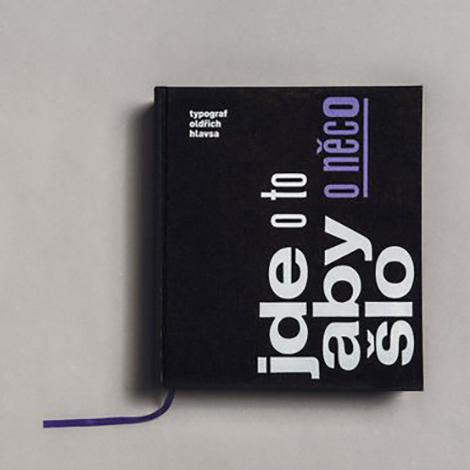
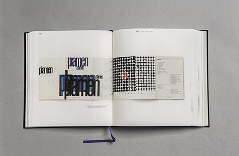
Jde O To, Aby O Něco Šlo
Typograf Oldřich Hlavsa
By Barbora Toman Tylová
Published in 2015 by Akropolis Publishing House in cooperation with Academy of Arts, Architecture and Design in Prague
592 pages
For the first time, a publication summarizes the extensive graphic works of an author, whose work is an important chapter in the history of Czech graphic design of the late 20th century.
In his works, Oldrich Hlavsa (1909 – 1995) focuses especially on the typographic design of books. With the number of designed books, amounting nearly two thousand, he significantly formed the view on creation, function, and purpose of books. He is a follower of Czech avantgarde, works of Karel Teige and Ladislav Sutnar, but through his typographic work the constructional and functional elements get a new meaning.
He left a deep imprint on the history of graphic design with his four publications about fonts, illustration, and books.
His Typograficka pisma latinkova was published in 1957, followed by its English translation A Book of Type and Design published three years later. Three volumes of Typographie were published in 1976, 1981 and 1986. Oldrich Hlavsa was a member of a number of international applied graphic art institutions and committees, he took an active part in work of various international book culture and typography juries; he presented his work both at home and abroad. The quality of his work repeatedly received many local and international awards. For many years, he would take the top places at the competition for the most beautiful Czechoslovak book, and in 1991, he received the prestigious Gutenberg prize of Leipzig, as recognition of his extraordinary lifetime work in book art.
The extensive monograph starts with studies of Barbora Toman Tylova, Jan Rous, and Iva Knoblochova. The following pictorial part describes the essential milestones of Hlavsa’s innovative and unique art work, which is relatively and comprehensively described in the bibliography of Hlavsa’s book and magazine work. The publication is accompanied by a summary of Hlavsa’s theoretical articles, interviews, and reviews of his work, and Hlavsa’s correspondence with reputable Czech and foreign figures in the 20th century design (L. Sutnar, A. Frutiger, H. Zapf).
Available at OldrichHalvasa.ch and your local bookshop.

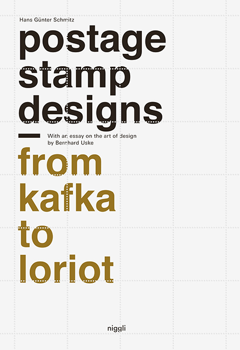
Postage Stamp Designs – From Kafka to Loriot
By Hans Günter Schmitz
Published by Niggli Verlag
160 pages
The world’s first official postage stamp was issued in May 1840: the legendary “One Penny Black” with the profile of the Queen of England. The new payment system in the field of logistics by Sir Rowland Hill quickly gained hold all around the world. For the first time, this publication discusses the significance and functions of postage stamps as prominently visible elements of communication design.
The expressiveness inherent in the small-sized images and the very peculiar and heterogeneous mage vocabulary of this medium of mass culture is analyzed based on more than 40 designs by Hans Günter Schmitz. The book also presents concepts that were not implemented, in addition to sketches, studies, and variations – from Adenauer to the film festival Berlinale, from a mathematicians’ congress to the famous Wuppertal suspension railway.
Available at Niggli Verlag, Amazon, and your local bookshop.

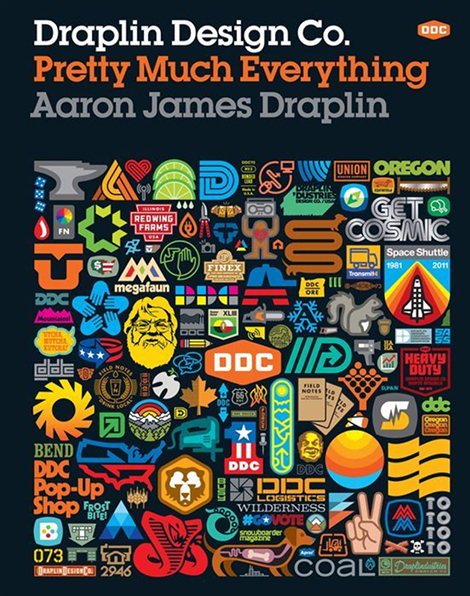
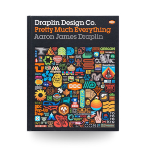
Draplin Design Co.: Pretty Much Everything
By Aaron James Draplin
Published by Harry N. Abrams
256 pages
Esquire. Ford Motors. Burton Snowboards. The Obama Administration. While all of these brands are vastly different, they share at least one thing in common: a teeny, little bit of Aaron James Draplin. Draplin is one of the new school of influential graphic designers who combine the power of design, social media, entrepreneurship, and DIY aesthetic to create a successful business and way of life.
Pretty Much Everything is a mid-career survey of work, case studies, inspiration, road stories, lists, maps, how-tos, and advice. It includes examples of his work—posters, record covers, logos—and presents the process behind his design with projects like Field Notes and the “Things We Love” State Posters. Draplin also offers valuable advice and hilarious commentary that illustrates how much more goes into design than just what appears on the page. With Draplin’s humor and pointed observations on the contemporary design scene, Draplin Design Co. is the complete package for the new generation of designers.
Available at Amazon and your local bookshop.

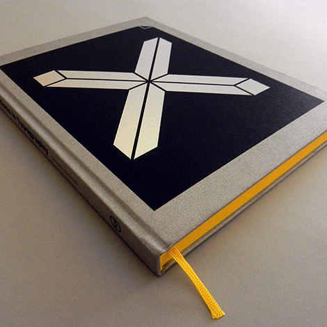
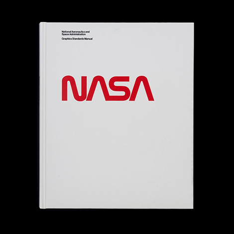
National Aeronautics and Space Administration Graphics Standards Manual
Designed by Richard Danne & Bruce Blackburn
Published by Standards Manual
220 Pages
The NASA Graphics Standards Manual by Richard Danne and Bruce Blackburn is a futuristic vision for an agency at the cutting edge of science and exploration.
The book features a foreword by Richard Danne, an essay by Christopher Bonanos, scans of the original manual (from Danne’s personal copy), reproductions of the original NASA 35mm slide presentation, and scans of the ‘Managers Guide’, a follow up booklet distributed by NASA.
Available at Standards Manual, Counter-Print, and your local bookshop.


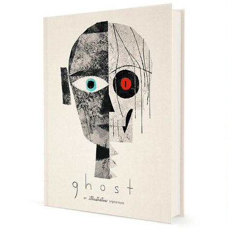
Ghost
Written by Blaise Hemingway and Jesse Reffsin and illustrated by Chris Sasaki and Jeff Turley
Published by Illustratus
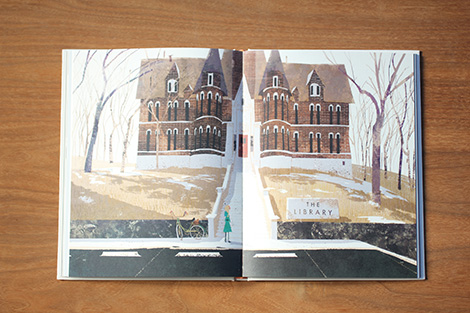
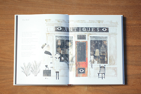
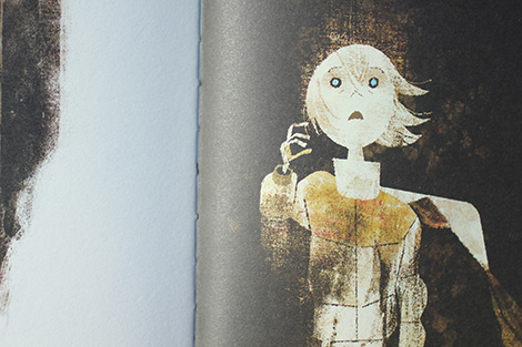
Ghost is a chilling new collection of short stories from a team of writers and illustrators with roots at Pixar, Disney and Paramount. Produced by Illustratus, Ghost marks the studio’s first foray into publishing. If the book is indicative of future releases, then they are off to a very good start. Sizing in at 9.25” x 12”, this mighty tome (or should I say tomb?) contains 13 hair-raising vignettes told through the voice of a reclusive groundskeeper. In each tale, the author meticulously summons the spirit of campfire nights of a youthful past through vivid storytelling that is equally engaging as it is terrifying. Interacting with and shaping the words are a series of dense and haunting visuals. Employing snow-bleached landscapes, speckled textures and muted tones, the images take on an ephemeral and otherworldly quality. The end result is aesthetically stunning and will serve as a worthy benchmark for a new generation of ghost stories.
Available at Illustratus and your local bookshop.


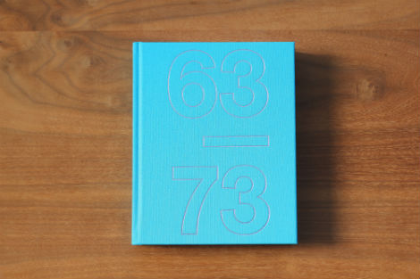
TD 63-73: Total Design and its pioneering role in graphic design (Expanded Edition)
By Ben Bos / Edited by Tony Brook and Adrian Shaughnessy / Design by Spin
Published by Unit Editions
520 Pages
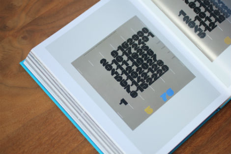
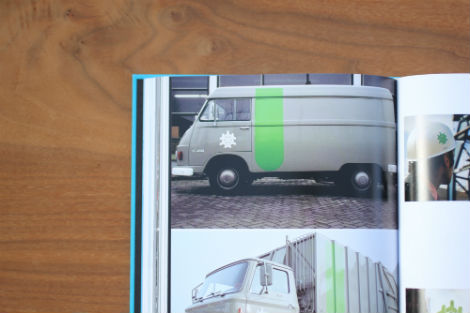
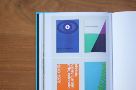
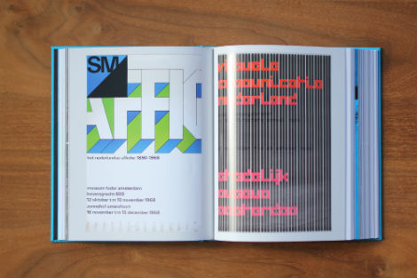
Total Design began in Amsterdam in 1963. Ben Bos joined the founders (Wim Crouwel, Benno Wissing, Friso Kramar and the Schwarz Brothers) from the outset. Together and individually, they set new benchmarks for typography, identity design, cultural design, exhibition design and product design. These benchmarks have rarely, if ever, been surpassed.
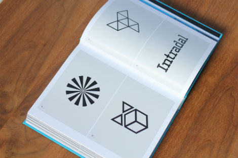
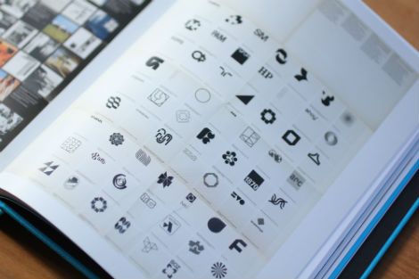
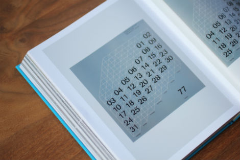
The expanded edition of TD 63-73 is a unique insider’s account of Total Design’s golden period. It contains hundreds of images from the TD archive, and in Ben Bos’s text the reader is given a personal history of a design group that remains as important today as it did when it launched in 1963.
Expanding on this original edition, this new edition features an updated and extended text by Ben Bos that looks beyond 1973, as well as many previously unseen images from his personal archive.
Available at Unit Editions


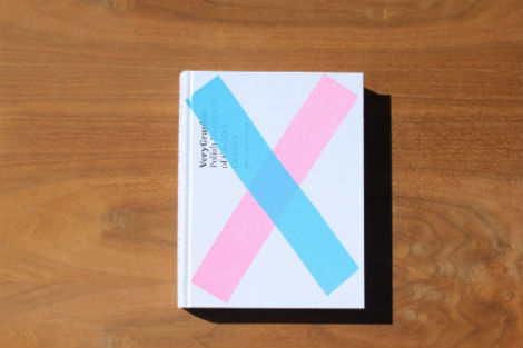
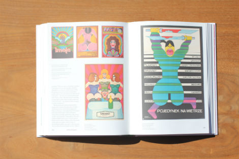
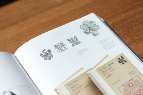
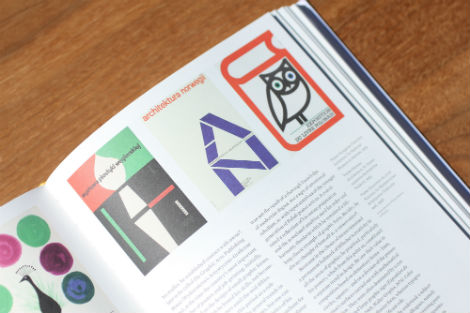
Very Graphic: Polish Designers of the 20th Century
Edited with introduction by Jacek Mrowczyk. Preface by Piotr Rypson, Krzysztof Lenk, Agata Szydowska.
Published by Culture PL
448 Pages
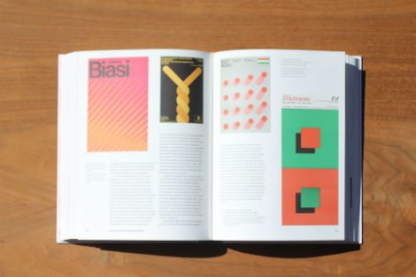
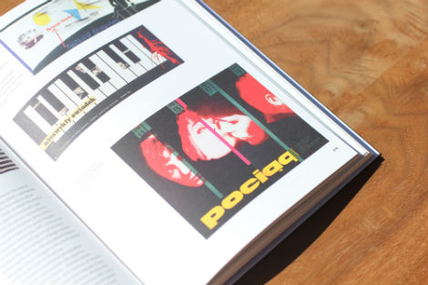
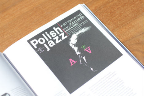
VeryGraphic: Polish Designers of the 20th Century is the first comprehensive history of Polish graphic design. The book showcases its immense and diverse legacy, from the world-renowned Polish Poster school to the lesser-known achievements of artists in the field of applied graphic design, including books and covers, typography and lettering, logos and visual identification as well as packaging. Chronologically detailing the work of over 60 of the most prominent Polish designers, the volume offers a review of Polish graphic design unprecedented in its scope. The cover of each copy is hand-painted, rendering it a truly one-of-a-kind object.
Available at Amazon, artbook.com and your local book shop.


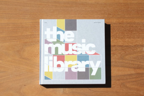
The Music Library: Revised and Expanded Edition
By Jonny Trunk / Published by Fuel
248 Pages
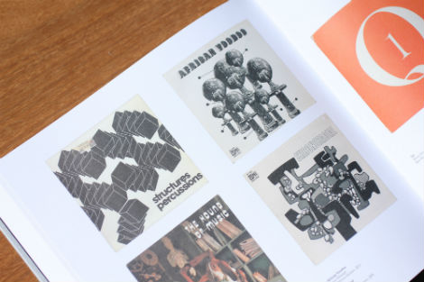
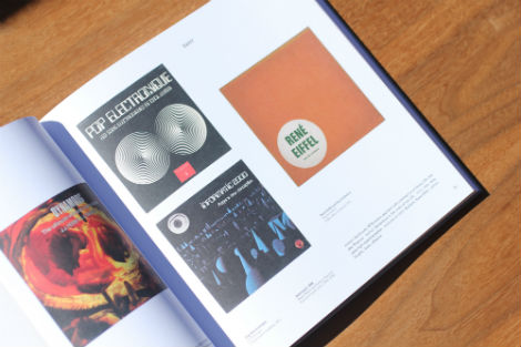
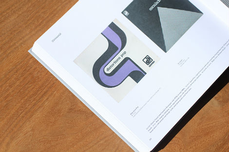
This new and expanded edition of The Music Library contains twice the content of the original book, featuring 625 rare sleeves from 230 music library companies of the 1960s, 1970s and early 1980s. The amazing cover designs of over 100 newly discovered library albums are beautifully reproduced (alongside all the sleeves contained in the first book) and accompanied by exhaustive, updated captions.
Available at Amazon, artbook.com and your local book shop.


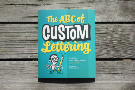
The ABC of Custom Lettering:A Practical Guide to Drawing Letters
By Ivan Castro / Introduction by Ken Barber of House Industries
Published by Korero
140 Pages
This practical and inspirational workbook features easy-to-follow, step-by-step instructions for hand drawing a range of letterforms, from Modern Roman and Gothic through to Latin, Script, and Interlocked. Offering traditional instruction methods with a modern twist, this reference also comes with gallery sections for inspiration and accompanying projects to practice your technique.
Available at Amazon and your local book shop.


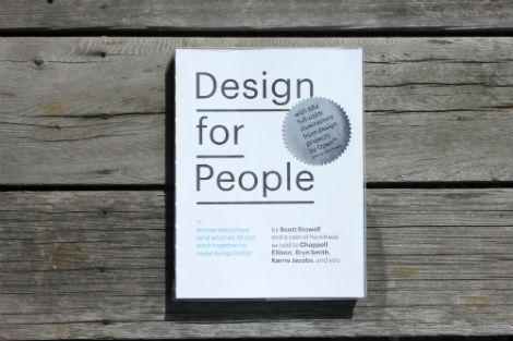
Design for People – Stories About How (and Why) We All Can Work Together to Make Things Better
Edited by Chappell Ellison, Bryn Smith, Scott Stowell. Introduction by Karrie Jacobs. Foreword by Douglass G.A. Scott. Text by Wynton Marsalis.
Published by Metropolis Books
256 Pages
Most design books focus on outcome rather than on process. Scott Stowell’s Design for People is groundbreaking in its approach to design literature. Focusing on 12 design projects by Stowell’s design firm, Open, the volume offers a sort of oral history as told by those involved with each project–designers, clients, interns, collaborators and those who interact with the finished product on a daily basis.
Available at Amazon, artbook.com and your local book shop.


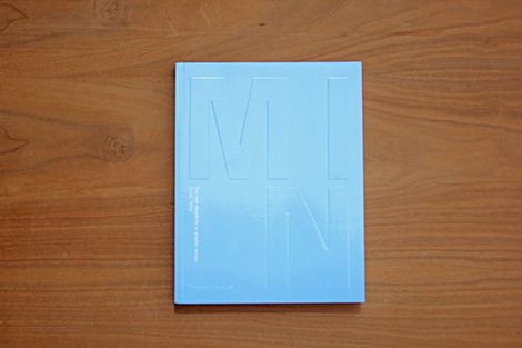
Min: The New Simplicity in Graphic Design
By Stuart Tolley
Published by Thames & Hudson
288 Pages
As creatives take contemporary design in fresh and exciting directions, they are also waving goodbye to the ornate patterns that have saturated our visual culture for the past decade.
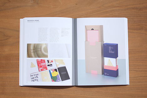
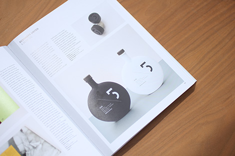
MIN is the first thorough look at this rebirth of simplicity in graphic design. It showcases around 150 outstanding minimalist designers working across a wide range of formats and media – from independent magazines and album covers to corporate identity and branding.
Available at Amazon, Thames & Hudson and your local book shop


Max Bill
Published by Fundacion Juan March
Edited by Manuel Fontán del Junco, María Toledo.
Text by Karin Gimmi, Jakob Bill, Manuel Fontán del Junco, Neus Moyano, Fernando Marzá, María Amalia García, Gillermo Zuaznabar.
352 Pages
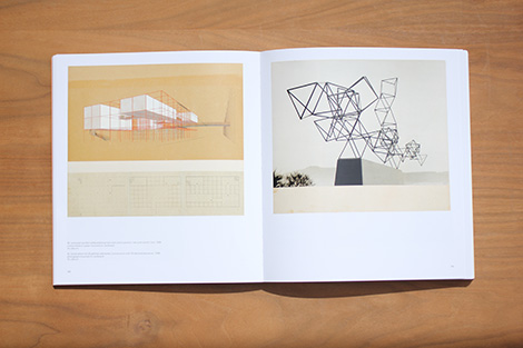
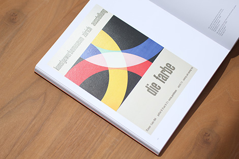
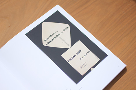
This gorgeously designed, hefty volume—the most thorough Bill overview ever published in English, and the only monograph in print—presents Bill’s oeuvre both chronologically and thematically, across every facet of his multifaceted oeuvre: painting, graphic art, sculpture, architecture, book and magazine design, industrial and furniture design, graphic design and advertising typography—from large-format posters to small inserts in periodicals—as well as his designs for exhibition spaces.
Available at Amazon and artbook.com


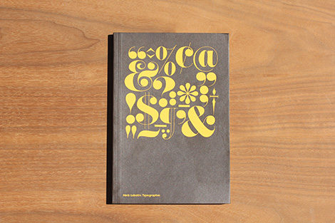
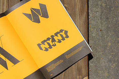
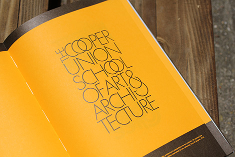
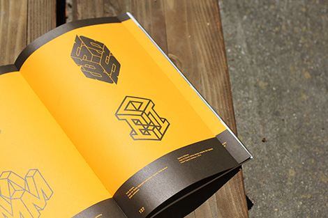
Herb Lubalin: Typographer
Editors: Adrian Shaughnessy & Tony Brook
Published by Unit Editions
208 Pages
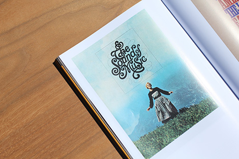
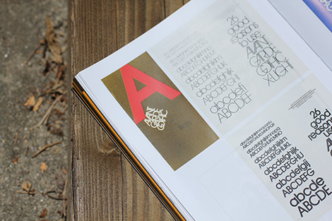
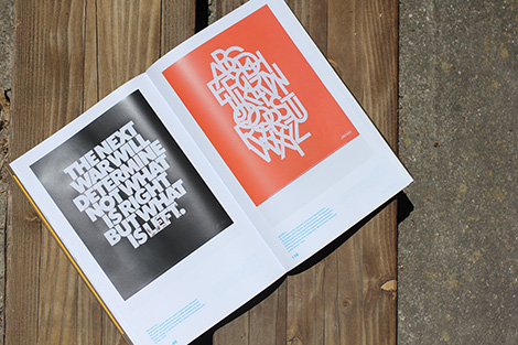
Herb Lubalin claimed not to be a great typographer. ‘In fact,’ he said, ‘I’m terrible, because I don’t follow the rules.’ This new book proves the opposite. On every page it features Lubalin’s typographic genius (logos, layouts, lettering and typefaces), and places him at the forefront of 20th century typographic innovation.
Available at Unit Editions and your local bookshop.


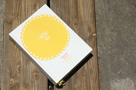
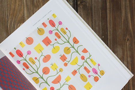
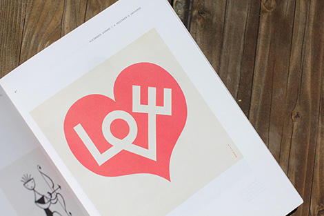
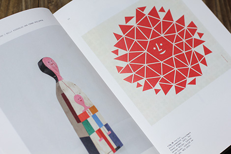
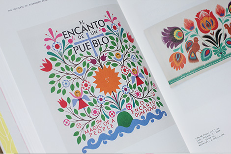
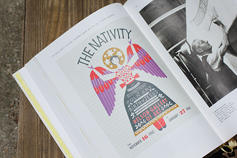
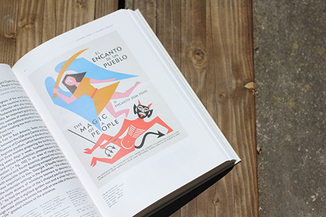
Alexander Girard: A Designer’s Universe
Published by Vitra Design Museum
Edited by Mateo Kries, Jochen Eisenbrand.
Text by Susan Brown, Jochen Eisenbrand, Barbara Hauss, Alexandra Lange, Monica Obniski, Jonathan Olivares.
512 Pages
Alexander Girard was one of the most important modern textile artists and interior designers of the 20th century. He combined Pop and Folk art influences to create a colorfully opulent aesthetic language whose impact continues to be felt today. This richly illustrated catalogue draws on the vast holdings in Girard’s private estate, which were exhaustively investigated for the first time at the Vitra Design Museum. The book presents the oeuvre of the multitalented designer in all its facets, while offering the first scholarly, critical examination of his work.
Available at Amazon, artbook.com and your local book shop.

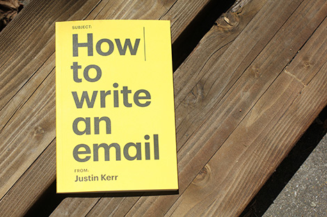
How to Write an Email
By Justin Kerr
Published by Extracurricular Press
109 Pages
The biggest mistake new employees make in the corporate world is thinking that hard work is what leads to success. The reality is that some basic and often overlooked behaviors are the real keys to thriving in the workplace. Part survival guide, part corporate myth-buster, How to write an email shows you how to raise your profile and make the most of your time in any organization.
Available at Amazon, Extracurricular Press and your local book shop.


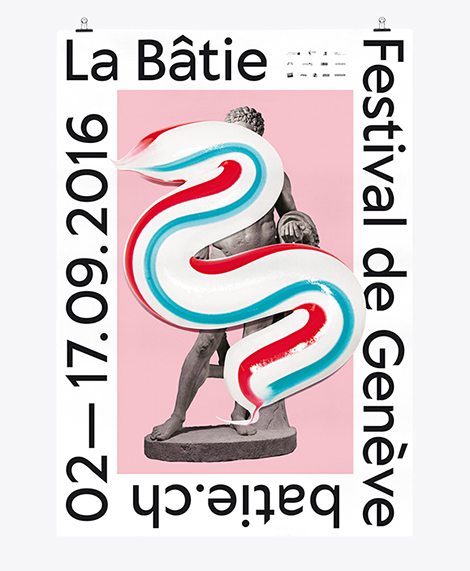
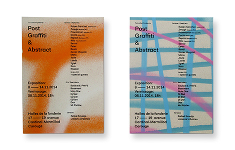
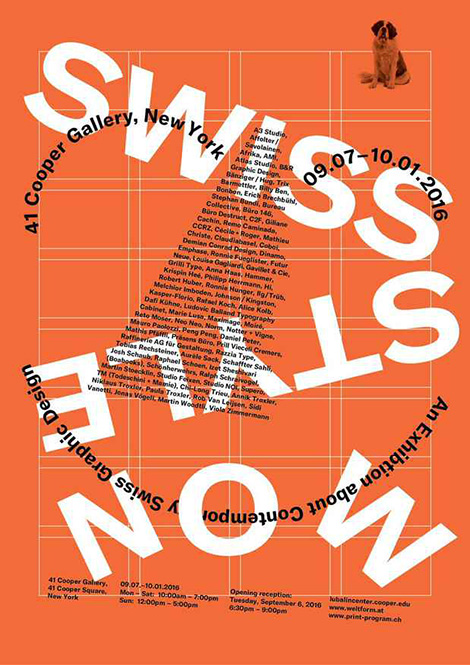
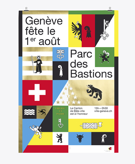
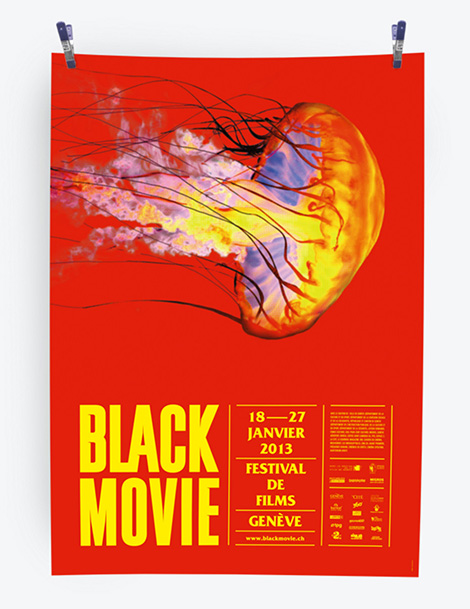
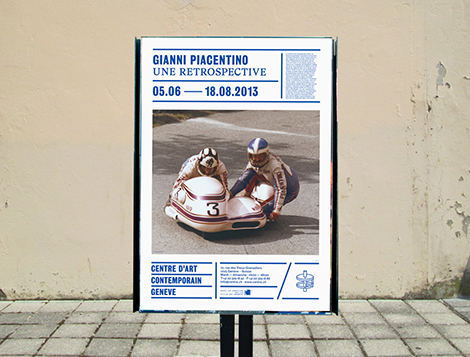
Neo Neo is a Swiss design studio led by Thuy-An Hoang and Xavier Erni. They collaborate with cultural institutions around the world, including Geneva’s Contemporary Art Center and Tokyo’s National Film Center. Not afraid to get a little funky, the studio uses bold and sometimes surprising visuals and mediums within their designs. For Geneva’s La Bâtie Festival, an event in which the city celebrates music and art, the studio employed a long splash of toothpaste as the festival’s key graphic. No matter what they decide to use, their pieces are always chic, fresh, and a testament to the current state of Swiss design.


——————–
Also worth viewing:
Twice
Atelier Tout va bien
Eight Hour Day Interview
Follow us on RSS, Instagram, Pinterest, Wanelo,
——————–
Save
 Share on Facebook
Thanks to this week's
Sponsor // Foto Sushi


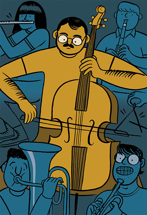
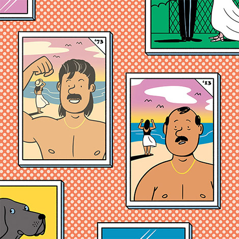
Kyle Metcalf is a Canadian illustrator whose work has graced the pages of The Walrus, Swerve Magazine, and The New York Times. Using thick black outlines and soft colors, he creates charming characters that are often caught in comical situations. Much of this humor comes from a sense of nostalgia that is present throughout his work. Many of the personalities found in his illustrations seem bewildered by their middle age and yearn for their youth. These themes are also present in his still life compositions that portray novelty toys and articles from the past.


——————–
Also worth viewing:
Josh Cochran
Mike Ellis
Danielle Kroll
Follow us on RSS, Instagram, Pinterest, Wanelo,
——————–
 Share on Facebook
Thanks to this week's
Sponsor // Foto Sushi


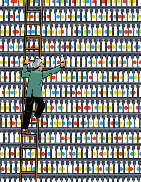
Janne Iivonen is a contemporary devotee of ligne clair, a drawing style made popular by Hergé, the creator of The Adventures of Tintin. Inspired by observing the world around him, Iivonen beautifully captures modern life and the behavioral idiosyncrasies that come with living with today’s technologies. His charming illustrations and relatable characters have helped him accumulate an impressive portfolio of clients including The Guardian, Time Magazine, and GQ.


——————–
Also worth viewing:
Dan Woodger
Marie Assénat
Sarah Mazzetti
Follow us on RSS, Instagram, Pinterest, Wanelo,
——————–
Save
 Share on Facebook
Thanks to this week's
Sponsor // Foto Sushi


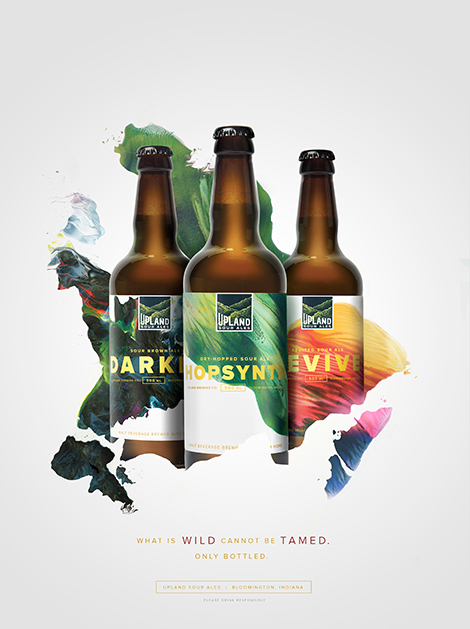
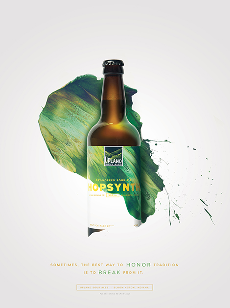
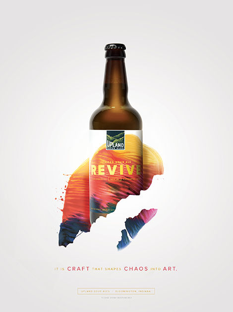
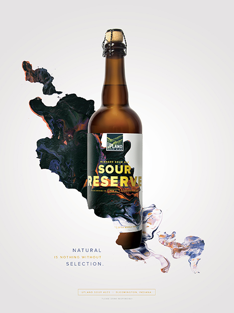
Young & Laramore teamed up with artist Michael Cina to brand Upland Brewing’s wood-aged sour ales. Cina crafted abstract compositions that represent the brewery’s careful blending of different batches to create complex flavors. This collaboration resulted in a vibrant packaging and advertising campaign that signifies the craft and artistry that is put into every bottle.


——————–
Also worth viewing:
Keith Shore
makebardo
Franklyn
Follow us on RSS, Instagram, Pinterest, Wanelo,
——————–
 Share on Facebook
Thanks to this week's
Sponsor // Foto Sushi


We’ve received some amazing items in the past few months including books from Unit Editions, Princeton Architectural Press, Flying Eye, and more. If you’re looking for gift ideas, there’s plenty to choose from in here. See the complete collection after the jump.


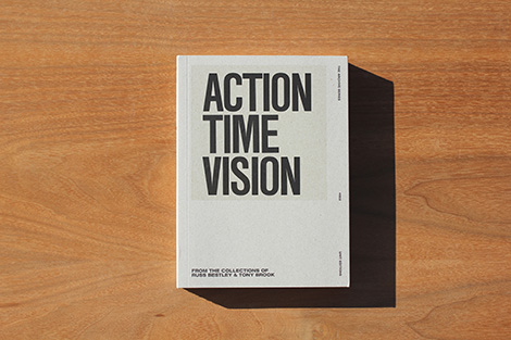
Action Time Vision
Editors: Tony Brook & Adrian Shaughnessy
Consultant Editor: Russ Bestley
Published by Unit Editions
320 pages
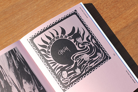
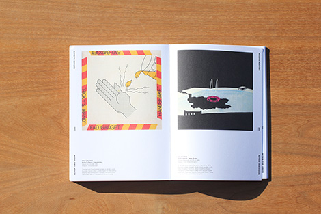
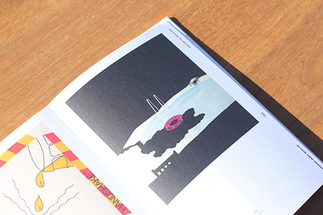
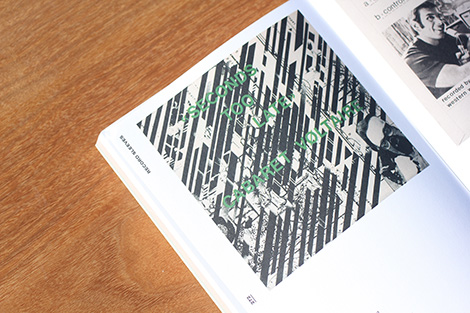
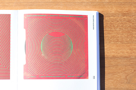
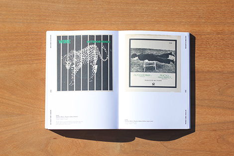
Action Time Vision: Punk & Post-Punk 7″ Record Sleeves [Unit 26] is a celebration of DIY graphics from the punk and post-punk eras. You might call it outsider graphic design.
Few of the sleeves showcased here are beautiful in the normal sense of the word. But they all have an urgency and an exhilarating disregard for design conventions that makes them exceptional. They are all clarion calls for independence and freedom from pop industry norms.
The work in this book is culled from the record collections of designer (and Unit Editions co-founder) Tony Brook, and leading punk scholar Russ Bestley. As one of the world’s leading authorities on punk and post-punk music, Russ has contributed an insightful essay to the book.
Available at Unit Editions and your local bookshop.

Ladies Drawing Night
By Julia Rothman, Leah Goren, and Rachael Cole / Photography Kate Edwards
Published by Chronicle Books
160 pages
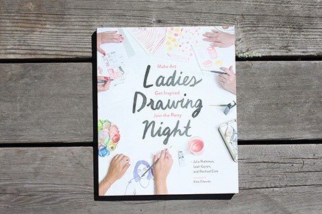
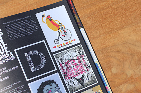
Speaking directly to today’s explosion of creativity, Ladies Drawing Night is for women looking to deepen their creative connections and expressions. Join rock star illustrators Julia Rothman, Leah Goren, and Rachael Cole for ten evenings of fun and art-making. Each night is led by a talented guest artist and themed around a particular topic, from large-scale ink painting to making art with kids. Samantha Hahn, Mary Kate McDevitt, Joana Avillez, and many more share their expertise. Each chapter includes loads of exciting artwork, insights about drawing, and instructions for that night’s project.
Available at Amazon, Chronicle Books, and your local bookshop.


Slab Serif Type: A Century of Bold Letterforms
By Steven Heller and Louise Fili
Published by Thames & Hudson
352 pages
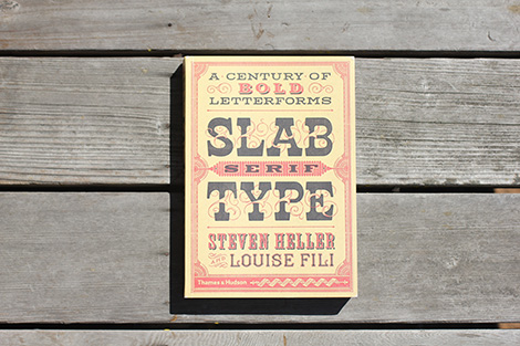
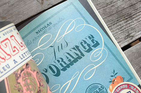
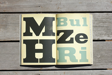
The slab serif typeface—in their classic form, wood types made for large-scale posters, ads, and newspapers—may not be as all-purpose as the gothic or sans serif, but it is equal, if not more powerful, in graphic appeal. Since being introduced in the nineteenth century, slabs have become ubiquitous and are today as popular as ever.
Following the cult typography volumes Scripts, Shadow Type, and Stencil Type, this new volume comprises an artfully curated selection of hundreds of international and classic examples to inspire fresh and unexpected typographic ideas.
Available at Amazon, Thames & Hudson, and your local bookshop.

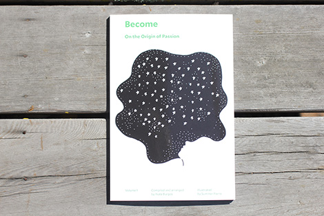
Become: On the Origin of Passion
Compiled and arranged by Nate Burgos / Illustrated by Summer Pierre
Published by Design Feast
115 pages
This collection of stories addresses the phenomenon of finding your passion. That much-mentioned drive that people want, even crave. Whether it’s something you find or something that finds you, passion is an essential and necessary ingredient to a satisfying life. Passion is especially relevant when considering that life-consuming reality called work.
Available at Design Feast and your local bookshop.

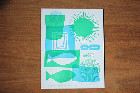
Nature is the Answer
By Nate Williams
For the second edition in the Lustig Elements Collection, illustrator Nate Williams gives you the bold, playful energy of the sun and sea to hang in your home or office, to remind you of the joy of the seashore all year long. Each edition is lovingly letterpress printed in two colors by Fabrik on The Design Collection Papers by Neenah.
Available at The Beauty of Letterpress by Neenah Paper.


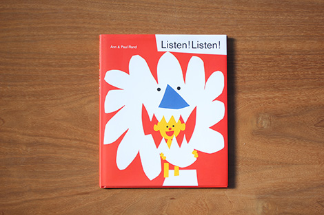
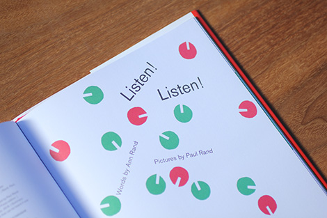
Listen! Listen!
By Ann & Paul Rand
Published by Princeton Architectural Press
32 pages
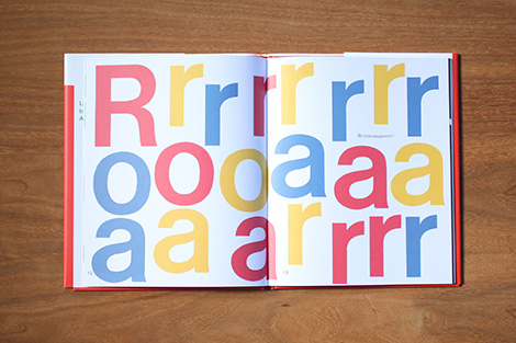
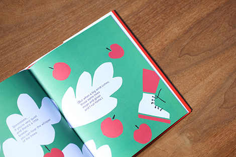
Paul Rand and his wife, Ann, wrote this book for their daughter, Catherine, to explain the interplay of sound and color. Rand’s distinctive paper-cut illustrations of bold shapes and bursts of color beautifully complement Ann’s rhythmic text, encouraging children to listen and repeat noises they hear every day: the “blop” of a raindrop, the “wham!” of a shutting door, the whisper of the wind in the trees, and the “crunch crunch” of buttered toast.
Available at Amazon, Princeton Architectural Press, and your local bookshop.


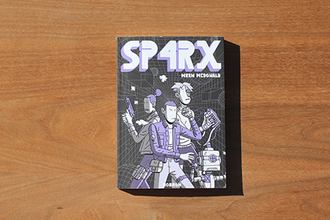
SP4RX
By Wren McDonald
Published by Nobrow Press
120 pages
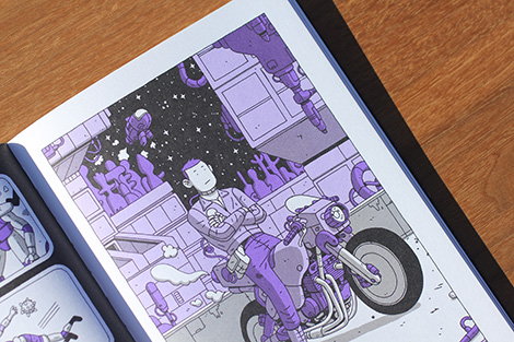
SP4RX is the story of mankind clawing for survival. Set in a future where a class system has emerged, the world is divided into four levels, with the elite ruling from the extravagant top level.
SP4RX, a young hacker who lives off grid, hacks into corporations and sells stolen data to wealthy buyers on the black market – just your average thief. Mega corporation Structus Industries introduces a welfare programme called the “Elpis Program”, which allows the working class to apply for Cybernetic implants to make workers more efficient. On the surface, it seems like a programme to empower the poor and allow them to rise to the ranks of the elite. But SP4RX soon discovers all is not as it seems… SP4RX and Structus are set on a collision course with the fate of humanity at stake in Wren McDonald’s latest sci-fi tale of survival and corruption!
Available at Amazon, Nobrow Press, and your local bookshop.

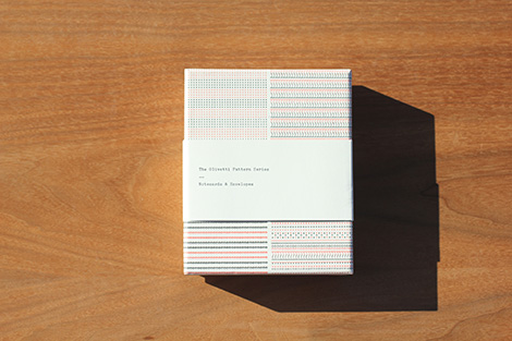
The Olivetti Pattern Series: Notecards and Envelopes
Published by Princeton Architectural Press
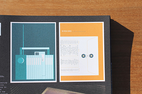
The Olivetti typewriter is an icon, both as a design object and as the favorite writing tool of authors as diverse as John Cheever, Leonard Cohen, and Francis Ford Coppola. This elegant notecard set features four distinctive patterns made on the beloved Olivetti Lettera 32. With classic red-and-black printing on off-white paper, these cards are the perfect all-occasion notecard for the typophile, design maven, aspiring writer, or anyone who reveres the printed page.
Available at Amazon, Princeton Architectural Press, and your local bookshop.

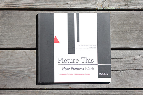
Picture This
By Molly Bang
Published by Chronicle Books
152 pages
Molly Bang’s brilliant, insightful, and accessible treatise is now revised and expanded for its 25th anniversary. Bang’s powerful ideas—about how the visual composition of images works to engage the emotions, and how the elements of an artwork can give it the power to tell a story—remain unparalleled in their simplicity and genius. Why are diagonals dramatic? Why are curves calming? Why does red feel hot and blue feel cold? First published in 1991, Picture This has changed the way artists, illustrators, reviewers, critics, and readers look at and understand art.
Available at Chronicle Books and your local bookshop.


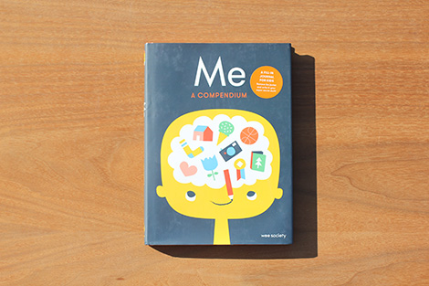
Me: A Compendium
By Wee Society
Published by Clarkson Potter
96 pages
Inventive, hilarious and joyously colorful, this fill-in journal was designed to help kids capture nearly everything that’s uniquely rad about them. With design-savvy, yet completely kid-friendly illustrations, they’re asked to draw or write about a bunch of interesting things — like what their hair looks like, what their band name would be, what they’d bring to outer space, and how they feel about lightning, lizards and pickles.
Available at Amazon, Penguin Random House, and your local bookshop.

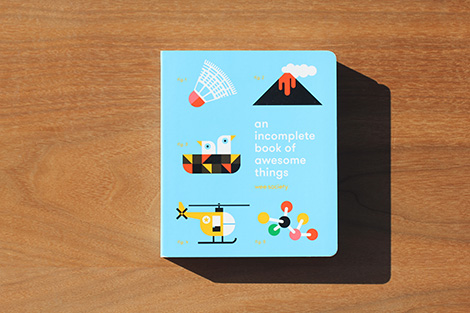
An Incomplete Book of Awesome Things
By Wee Society
Published by Clarkson Potter
38 pages
A celebration some of the world’s most universally awesome (but perhaps overlooked) things: masking tape, tunnels, lava, argyle, elbows, and more. The incomplete compilation — featuring beautifully minimal, vibrant illustrations — was designed to boost kids’ vocabulary, share giggles, and spark conversations.
Available at Amazon, Penguin Random House, and your local bookshop.


Shapes Are Fun
By Katja Spitzer
Published by Flying Eye Books
48 pages
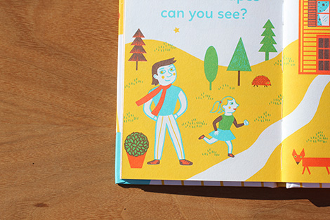
Perfect for Small hands, this mini hard-hardback book is a gentle introduction to shapes. Katja Spitzer’s vibrantly quirky illustrations encourage early learning and make this book a joy to own and read for any young child.
Available at Amazon, Flying Eye Books, and your local bookshop.

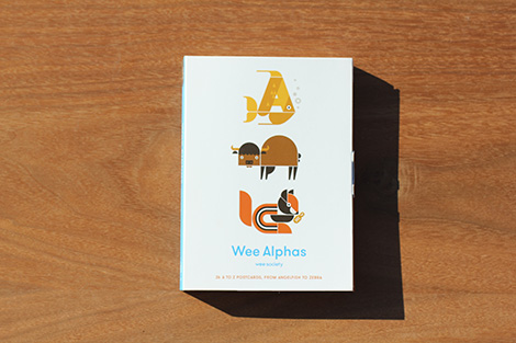
Wee Alphas: 26 A to Z Postcards, from Angelfish to Zebra
By Wee Society
Published by Clarkson Potter
26 cards
This imaginative take on the alphabet features 26 Wee Alphas postcards, each created with a “hidden letter” to find.
Based on the award-winning Wee Alphas kids’ app, the postcards feature quirky illustrations of Biki the Buffalo, Ulysses the Unicorn, Yolanda the Yeti, and their furry, feathered, or finned friends. The cards are bound into a fold-out accordion format that can be displayed in its entirety, or they can be detached to separately display or share.
Available at Amazon, Penguin Random House, and your local bookshop.


All Kinds of Cars
By Carl Johanson
Published by Flying Eye Books
40 pages
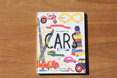
From the wonderfully imaginative mind of Swedish illustrator Carl Johanson, this partly true, partly fictitious book is a fantastic visual collection of cars and other wacky forms of transportation.
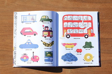
Taking the form of a catalogue, Johanson’s book identifies the ordinary along with the extraordinary – from fire engines and snowploughs to galactic buses and guitar cars. All Kinds of Cars is a playful mix of existing and imaginary, creating a zany book enjoyed by adults and children alike.
Available at Amazon, Flying Eye Books, and your local bookshop.


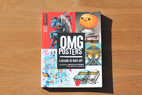
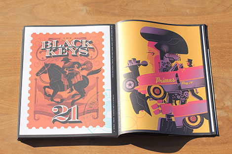
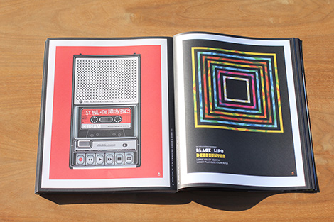
OMG Posters
By Mitch Putnam
Published by Regan Arts
208 pages
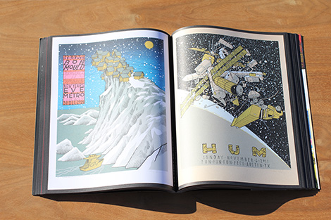
Mining the archives of OMG Posters, founder Mitch Putnam has gathered over 400 of today’s most beautiful concert posters and art prints in one collection.
Available at Amazon, Regan Arts, and your local bookshop.

Professor Astro Cat’s Intergalactic Activity Book
By Zelda Turner / Illustrated by Ben Newman
Published by Flying Eye Books
80 pages
Looking at the stars, do you dream of new worlds beyond our own? Would you like to explore distant planets, fly a rocket or try some chocolate quantum physics? Good news, Professor Astro Cat is here to help!
Packed with amazing experiments, thrilling facts and create-your-own adventures, this Intergalactic Activity Book offers a universe of excitement, and is bursting with ideas for a future at the frontiers of space!
Available at Amazon, Flying Eye Books, and your local bookshop.


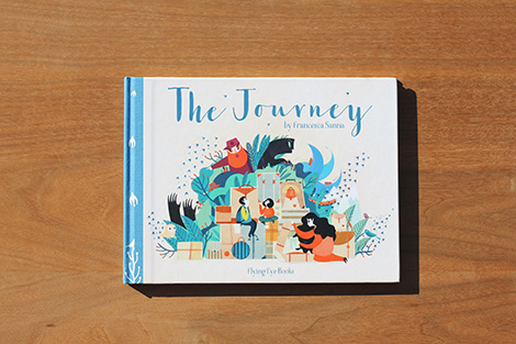
The Journey
By Francesca Sanna
Published by Flying Eye Books
48 pages
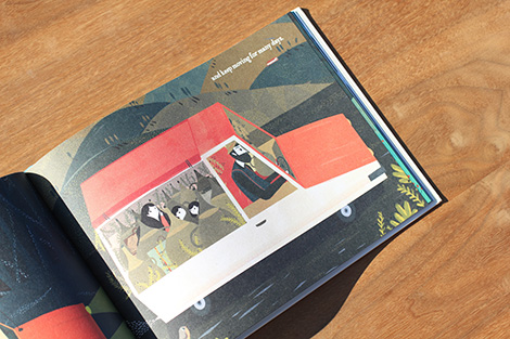
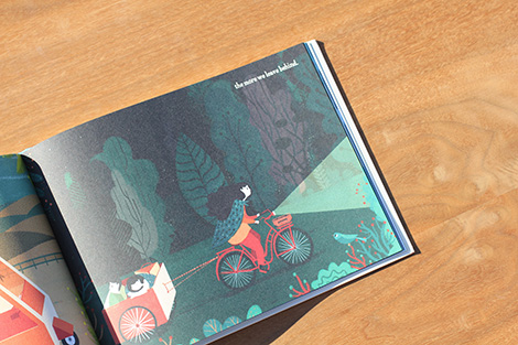
“I look up to the birds that seem to be following us. They are migrating just like us. And their journey, like ours, is very long, but they don’t have to cross any borders.”
What is it like to have to leave everything behind and travel many miles to somewhere unfamiliar and strange? A mother and her two children set out on such a journey; one filled with fear of the unknown, but also great hope.
Based on her interactions with people forced to seek a new home, and told from the perspective of a young child, Francesca Sanna has created a beautiful and sensitive book that is full of significance for our time.
Available at Amazon, Flying Eye Books, and your local bookshop.

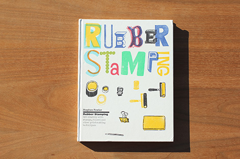
Rubber Stamping
By Stephen Fowler
Published by Laurence King Publishing
160 pages
This beautiful book provides a complete guide to printing with rubber stamps as well as a handful of alternative methods such as using rollers, plaster, or clay. Beginning with a foreword by the artist Rob Ryan and a short history of rubber stamping, it goes on to explain the technical basics: what equipment to use, how to carve your stamps, register multiple colors, and mask prints.
Available at Amazon, Laurence King Publishing, and your local bookshop.

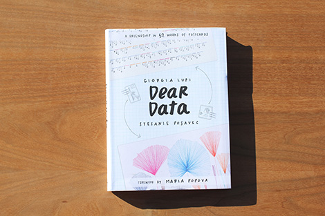
Dear Data
By Giorgia Lupi and Stefanie Posavec
Published by Princeton Architectural Press
288 pages
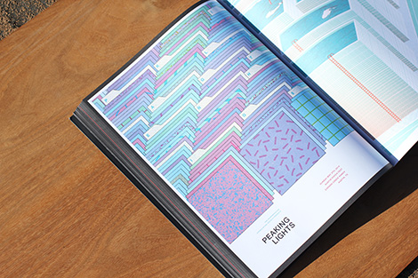
Equal parts mail art, data visualization, and affectionate correspondence, Dear Data celebrates “the infinitesimal, incomplete, imperfect, yet exquisitely human details of life,” in the words of Maria Popova (Brain Pickings), who introduces this charming and graphically powerful book. For one year, Giorgia Lupi, an Italian living in New York, and Stefanie Posavec, an American in London, mapped the particulars of their daily lives as a series of hand-drawn postcards they exchanged via mail weekly—small portraits as full of emotion as they are data, both mundane and magical. Dear Data reproduces in pinpoint detail the full year’s set of cards, front and back, providing a remarkable portrait of two artists connected by their attention to the details of their lives—including complaints, distractions, phone addictions, physical contact, and desires.
Available at Amazon, Princeton Architectural Press, and your local bookshop.


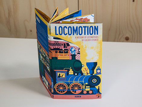
Locomotion
By Golden Cosmos
Published by Nobrow Press
20 pages
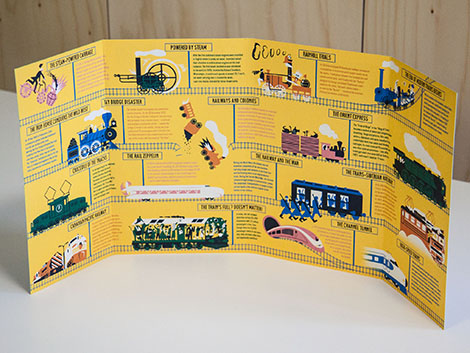
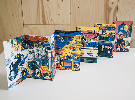
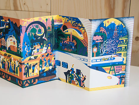
Designed by Golden Cosmos, this beautiful concertina book folds out to a stunning 139 cm panorama detailing the history of trains and locomotives. The wraparound cover also includes facts for each panel of the panorama; beginning with the very first steam engines and traveling through time to the trains we use today.
Available at Amazon, Nobrow Press, and your local bookshop.

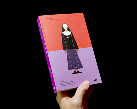
Looking Good
By GraphicDesign&, Veronica Bennett, and illustrator Ryan Todd
Published by GraphicDesign&
95 pages
From Julie Andrews in The Sound of Music to Nobel Peace Prize recipient Mother Teresa (now St Teresa of Calcutta), nuns occupy a special place in popular consciousness as figures of fondness, fun, strictness, purity and grace. Many of us identify nuns by their deceptively simple form of dress – few of us understand, however, that the habit is also a visual code.
A collaboration between GraphicDesign&, Cambridge theology graduate Veronica Bennett and graphic illustrator Ryan Todd, Looking Good: A visual guide to the nun’s habit identifies and illustrates the dress of more than 40 Catholic communities of nuns and sisters. It catalogues and compares this ‘extra ordinary’ religious clothing, explaining its components, significance and distinguishing identifiers. The accompanying text, incorporating visions and miracles, high drama and humble beginnings, persecution and insurrection, reveals how the story of the habit is also that of the struggle between the powerful and the poor; of politics, social care and the role of women; and of the interplay between culture, fashion and faith.
In Looking Good, graphic design and illustration are employed with clarity and charm to decipher this most enduring and evocative form of visual identity – and present it for fresh appreciation at a time when it appears to be in demise.
Available at Amazon, GraphicDesign&, and your local bookshop.
——————–
Also worth viewing…
Recently Received: July
Recently Received Books: April
Recently Received Books: December
Follow us on RSS, Instagram, Pinterest, Wanelo,
——————–
Save
Save
 Share on Facebook
Thanks to this week's
Sponsor // Foto Sushi


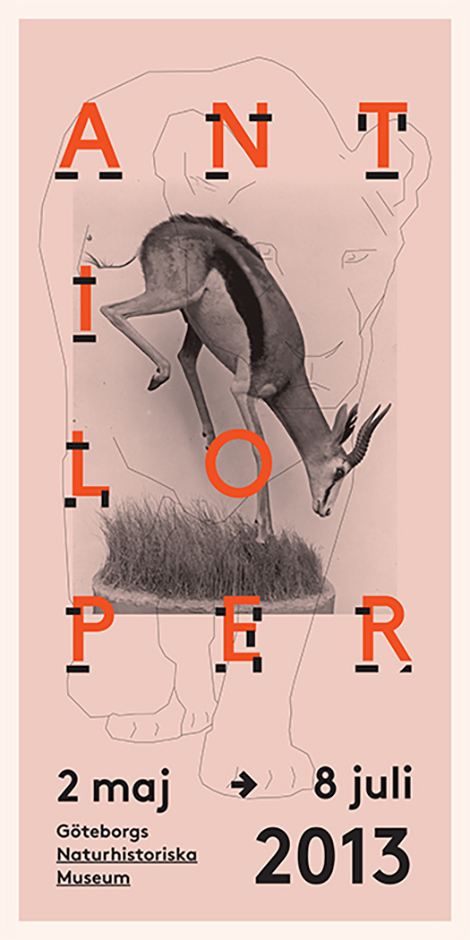
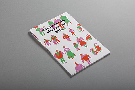
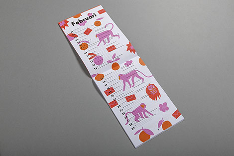
Eric Palmér and Karolina Eriksson run Studio Moss in Gothenburg, Sweden. The designers strive to utilize analysis and research to form concepts that fuel their designs. They often collaborate with artistic exhibitions and festivals throughout Gothenburg and have won multiple awards, including a Kolla! Gold in 2014. Passionate about art education, the designers also teach workshops and tutor at design schools.


——————–
Also worth viewing:
makebardo
Dadu Shin
Mike Cina Interview
Follow us on RSS, Instagram, Pinterest, Wanelo,
——————–
 Share on Facebook
Thanks to this week's
Sponsor // Foto Sushi


Anna Kulachëk crafts vibrant posters for schools, festivals, and entertainment venues throughout Russia and the Czech Republic. Her compositions range from sparse and minimal, to active arrangements brimming with large typography, geometric accents, and bold grids. Her use of saturated colors and emphasized modularity make her pieces ingeniously alluring.


——————–
Also worth viewing:
Michael Spitz
Marta Gawin
Lamm & Kirch
Follow us on RSS, Instagram, Pinterest, Wanelo,
——————–
 Share on Facebook
Thanks to this week's
Sponsor // Foto Sushi


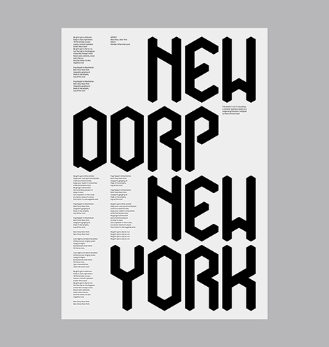
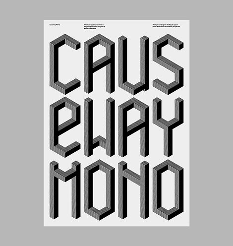
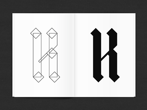
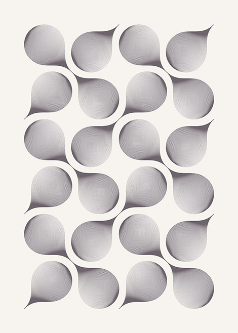
Marius Roosendaal has continued to craft impressive work since we last featured him. He’s invested in a number of self-initiated projects in which he’s designed typefaces inspired by geometry and gothic scripts. I’m especially impressed with his typeface, Causeway, which is highly customizable and can be shaded to appear three-dimensional in isometric perspective. In addition to his typographic work, he’s also released prints of complex explorations with geometric patterns and organic forms. Roosendaal’s work is a great example of how artists can use passion projects to heighten their curiosity, expand their creativity, and refine their skills.


——————–
Also worth viewing:
Jordan Metcalf
Garbett Design
Anne Jordan
Follow us on RSS, Instagram, Pinterest, Wanelo,
——————–
 Share on Facebook
Thanks to this week's
Sponsor // Foto Sushi


Steve Scott is a London-based illustrator who often tells multiple stories within a single illustration. Like an author writing a novel, he crafts details that enrich the themes of his narratives and reveal the purpose and motivation of each of his characters. He thoughtfully executes his dense compositions by utilizing only 3 or 4 colors at a time. The brightest colors highlight essential elements and guide the viewer’s eyes throughout the piece.


——————–
Also worth viewing:
Jun Cen
Til Hafenbrak
Scott Balmer
Follow us on RSS, Instagram, Pinterest, Wanelo,
——————–
 Share on Facebook
Thanks to this week's
Sponsor // Foto Sushi


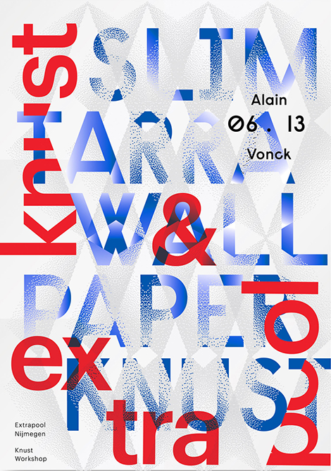
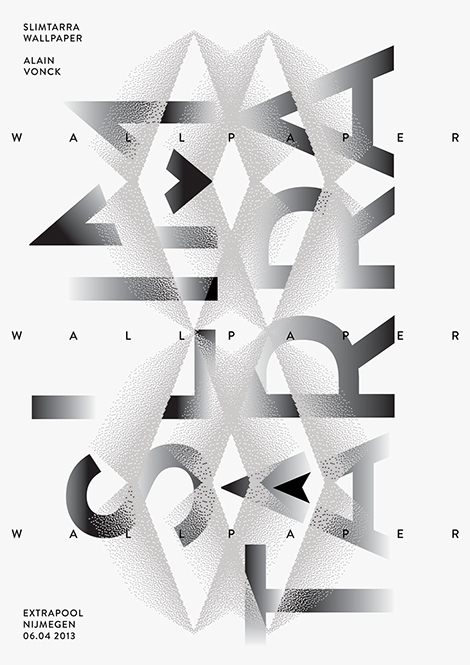
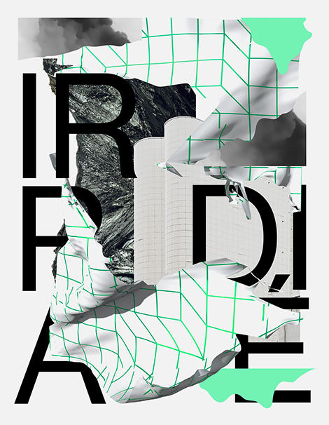
L’atelier Irradié is a French studio founded by brothers Alain and Laurent Vonck. With a passion for photography and experimental type design, the studio creates work that is rich and dynamic. In addition to their commercial work, they’ve launched a series of self-initiated projects that allow them to explore different creative avenues such as collage and 3D modeling. This appetite for creative discovery has fueled inventive work that has been exhibited in galleries around the world and recognized by respected organizations such as the New York Type Directors Club.


Via Typographic Posters
——————–
Also worth viewing:
Violaine & Jérémy
Rationale
CCRZ
Follow us on RSS, Instagram, Pinterest, Wanelo,
——————–
 Share on Facebook
Thanks to this week's
Sponsor // Foto Sushi


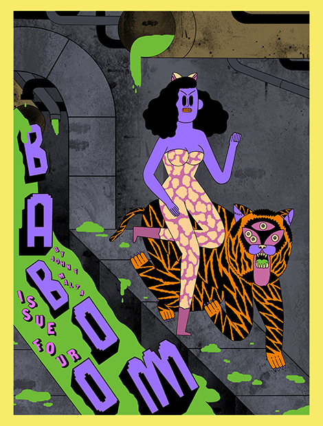
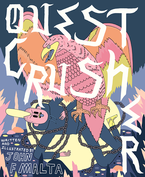
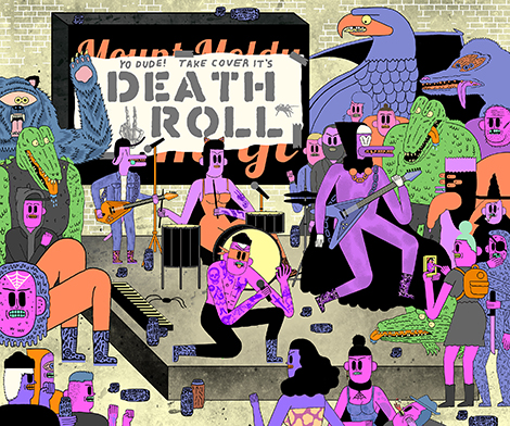
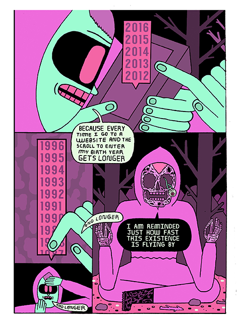
John F. Malta creates imaginative work inspired by his teenage years in the Midwest. His zines and comics, such as Baboom! and The Junkyard, are filled with humorous (and sometimes existential) stories full of rebellious skateboarding punks, guitar playing monsters, and cosmic jungle tigers. His neon color schemes and the mystifying large dark eyes of his characters create lively scenes that vibrate with excitement and mischief. In addition to his personal work, he also collaborates on pieces for The Washington Post, The New Yorker, and Valley Cruises Press. To learn more about his illustrations and creative influences, make sure to follow him on Instagram and to take a look at his annual art anthology, Universal Slime.


——————–
Also worth viewing:
Okay
Til Hafenbrak
Bunker
Follow us on RSS, Instagram, Pinterest, Wanelo,
——————–
 Share on Facebook
Thanks to this week's
Sponsor // Foto Sushi


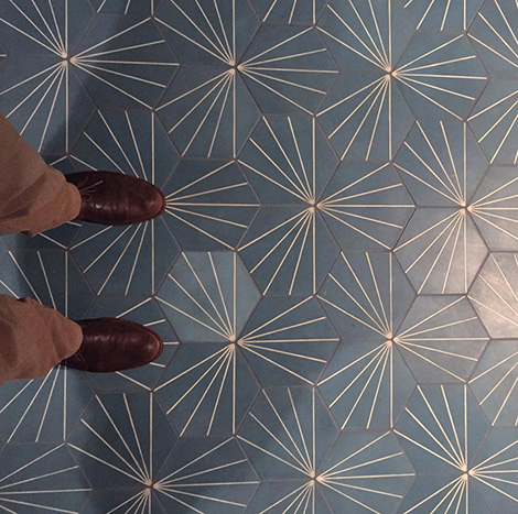
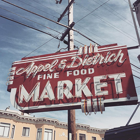
In this edition of Finds from The Field, we feature awesome tile work and signage we’ve found throughout San Francisco including these amazing tiles at Volta.

Liholiho really knows how to welcome its customers.

Check out this dandy sign we discovered out in the avenues.
See all of our Instagram finds here.
——————–
Also worth viewing:
Instagram Finds from the Feild
Rasmus Koch Studio
Design Facts
Follow us on RSS, Instagram, Pinterest, Wanelo,
——————–
Save
 Share on Facebook
Thanks to this week's
Sponsor // Foto Sushi


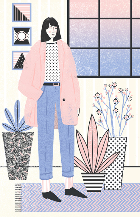
Abbey Lossing is a Brooklyn based illustrator who crafts charming drawings and animated gifs full of lively characters and whimsical narratives. Her pastel color palettes and playful use of halftone patterns give her pieces a warm and lighthearted quality, reminiscent of children’s books and comics. Her work has graced the pages of Variety Magazine and The Magazine of Contemporary Illustration as well as Buzzfeed and Vice News. To see more of her portfolio and to take a peek at her process, make sure to follow her Instagram and blog.


——————–
Also worth viewing:
Josh Cochran
Martina Paukova
Sarah Mazzetti Update
Follow us on RSS, Instagram, Pinterest, Wanelo,
——————–
 Share on Facebook
Thanks to this week's
Sponsor // Foto Sushi


Maxim Leurentop is a Belgian graphic designer who formerly worked under the alias Studio Turbo Turbo and with the Antwerp-based studio Mirror Mirror. A passionate photographer, he often couples his photographs with typographic arrangements that are playful and intriguing, yet still easily read.


——————–
Also worth viewing:
burkhardthauke
Dan Christofferson AKA BeeTeeth
Sindy Ethel
Follow us on RSS, Instagram, Pinterest, Wanelo,
——————–
 Share on Facebook
Thanks to this week's
Sponsor // Foto Sushi


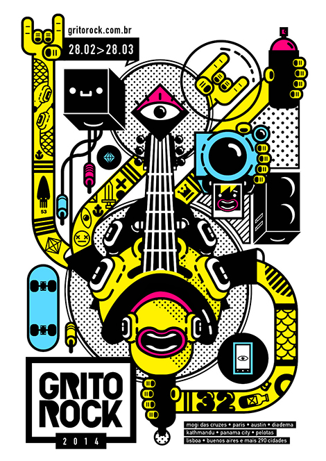
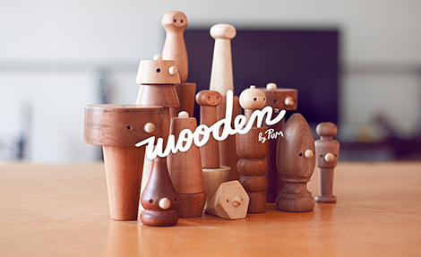
Estudio Pum proudly states, “In order to find new solutions, we must leave our comfort zone.” This passion for exploration and innovation is evident through the variety of illustrative and typographic styles utilized within their body of work. From playful paper cutouts to refined type-driven websites, Pum proves that they aren’t afraid to tackle a diverse range of projects and visual aesthetics. To expand their creativity and learn how to work with different tools, the studio takes on a number of passion projects including a Risograph printed zine and a line of wooden toys and rattles.


——————–
Also worth viewing:
Jun Cen
Tsto
Nate Koehler
Follow us on RSS, Instagram, Pinterest, Wanelo,
——————–
 Share on Facebook
Thanks to this week's
Sponsor // Foto Sushi

View Next 25 Posts


