new posts in all blogs
Viewing: Blog Posts Tagged with: Gouache, Most Recent at Top [Help]
Results 26 - 50 of 277
How to use this Page
You are viewing the most recent posts tagged with the words: Gouache in the JacketFlap blog reader. What is a tag? Think of a tag as a keyword or category label. Tags can both help you find posts on JacketFlap.com as well as provide an easy way for you to "remember" and classify posts for later recall. Try adding a tag yourself by clicking "Add a tag" below a post's header. Scroll down through the list of Recent Posts in the left column and click on a post title that sounds interesting. You can view all posts from a specific blog by clicking the Blog name in the right column, or you can click a 'More Posts from this Blog' link in any individual post.
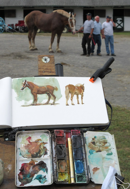
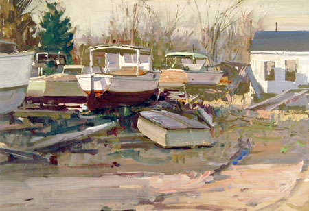
Sketches of the draft horses at the county fair. Gouache, watercolor, and fountain pen, 5 x 8 inches.
These horses didn't pose, even though they always had handlers, because they were getting ready for their events. That's why I kept the sketches small and started several of them in different poses.

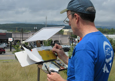
Here's what I pack in my bag for a sketching day at the Dutchess County Fair in Rhinebeck, NY.
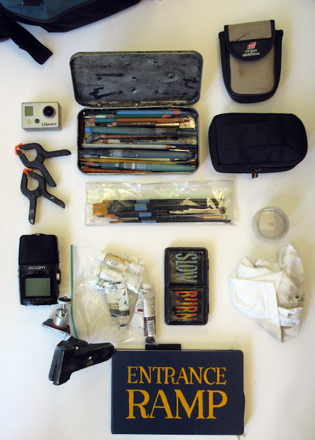
It's everything I need for sketching in watercolors, colored pencils, and gouache. There's a 5 x 8 inch watercolor journal , plus devices for capturing video, stills, and audio. All of this fits onto my belt.
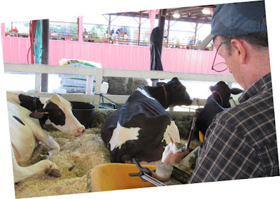
I start off in the cow barn, where the milkers are taking a morning nap before their judging. Without a chair, I paint standing.
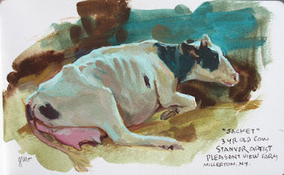 |
| Holstein named "Jacket," gouache by James Gurney |
I use a limited palette of three colors of gouache:
yellow ochre
(Holbein),
perylene maroon
(Winsor Newton), and
viridian
(Winsor Newton)—plus
white
(M. Graham). Viridian serves as my "blue." I can get a nice black with the maroon and the viridian.
1. Underdrawing in water-soluble colored pencil.
2. A wet block-in without white approximates the final colors.
3. Introducing opaque white, and defining the forms of the body.
4. Dark spots and definition of small forms and details.
After the painting session, we watch the draft horse pull. It requires immense power for the team of two Belgian geldings to pull 8500 pounds of concrete.
The
Dutchess County Fair will continue through this Sunday in Rhinebeck. If you live nearby, check it out—it's the second largest fair in New York State, with one of the largest displays of farm animals.

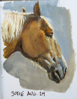 |
| Sofie the draft horse, gouache, by James Gurney |
Yesterday at the barn I painted this portrait sketch of Sofie, one of the four Belgian draft horses. She had just gotten her shower in advance of her appearance today at the Dutchess County Fair. I used a limited palette of black, white, ultra blue, raw sienna, and yellow ochre.
The image is the size of a playing card, about 3 x 3.5 inches.

.jpg?picon=1009)
By: James Gurney,
on 8/24/2015
Blog:
Gurney Journey
(
Login to Add to MyJacketFlap)
JacketFlap tags:
Gouache,
Add a tag
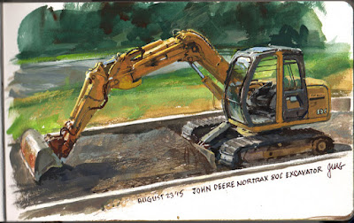 |
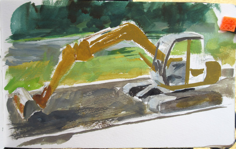
| John Deere Nortrax 80C Excavator, gouache, 5 x 8 inches |
I painted this track excavator yesterday at a construction site. It's a study for a concept painting of a giant robot which will be part of an upcoming video tutorial called "Fantasy in the Wild."
Here's what the painting looked like at an early stage. I measured everything out pretty carefully, but then blocked in the colors loosely.
The new video is going to be a lot of fun. I'll be doing two different imaginative-realism paintings entirely on location. Each one is based on details drawn from the scene around me. In this case I've been going to this construction site on weekends when the machines aren't working, so I can really study all their workings up close.

By: James Gurney,
on 8/19/2015
Blog:
Gurney Journey
(
Login to Add to MyJacketFlap)
JacketFlap tags:
Gouache,
Add a tag
 |
Eugene Galien Laloue (1854 - 1941) La Gare de l'Est.
39 by 69.5cm., 15 1/2 by 27 1/4 in. gouache on paper |
In case you missed the announcement late last month, I've issued the challenge to paint an outdoor market in gouache using three colors and white.
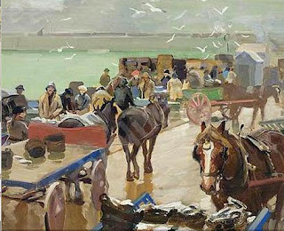 |
| Charles Walter Simpson, 1885-1971 Newlyn fish market, gouache |
Here's a link to
the original blog post, and there are already some exciting entries being uploaded to the
Facebook Event page. The deadline is August 31.
------
Own the 72-minute feature "Gouache in the Wild"
• HD MP4
Download at Gumroad $14.95
• or HD MP4
Download at Sellfy (for Paypal customers) $14.95
• DVD at
Purchase at Kunaki.com (Region 1 encoded NTSC video) $24.50

By: James Gurney,
on 8/13/2015
Blog:
Gurney Journey
(
Login to Add to MyJacketFlap)
JacketFlap tags:
Gouache,
Add a tag
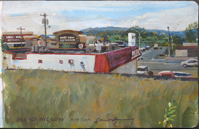 |
| Big Box Landscape by James Gurney, gouache, 5 x 8 inches |
Painting the "franchise landscape," with its fast food restaurants and big box stores, feels to me like an unexplored frontier, full of exciting possibilities.
I brought the video camera along with me so that you could join me in the adventure. (
Link to YouTube)
I don't regard a scene like this as either "ugly" or "beautiful." Sometimes I feel like both of those labels can be barriers to observation, to really
seeing. And seeing is the thing.
But that doesn't mean that all commonplace subjects are equally attractive. I can't put into words why one view fascinates me and another leaves me cold.
---

By: James Gurney,
on 8/8/2015
Blog:
Gurney Journey
(
Login to Add to MyJacketFlap)
JacketFlap tags:
Gouache,
Add a tag
Blog reader Jeff Jordan asked: "I was wondering if you're using gouache strictly as a sketching medium, or if you've done or are doing finished works, illustrations, whatever, in gouache?"
 |
| "Skysweepers," by James Gurney, gouache and acrylic, 1982 |
Jeff, here's an example that I did as a portfolio piece more than 30 years ago. I imagined these "Skysweepers" as flying vehicles that scour the grime off the clear dome that covers a city. The logo on the vehicle shows that the SOLAR corporation owns the municipal contract.
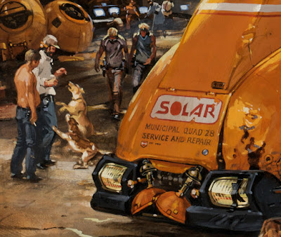
But the fleet is dented and rusty, with black tape holding one one of the headlights. The shop is a mess of leaking oil. Mechanics are drinking on the job, and they've brought their dogs to work.
The idea of creating a future with an embedded history came from
Blade Runner and
Star Wars. I was also inspired by the gouache production designs for those movies by Syd Mead and Ralph McQuarrie.
For this painting I combined some acrylic with the gouache, especially in the smoky areas. I still like using gouache for vehicles, robots, and architecture. I did some sepia paintings, such as "
The Sinking of the Hagfish" and "
Grapple Hold," in gouache for the recent edition of
Dinotopia: First Flight (signed copies on our web store, also available
from Amazon)
. Skysweepers is reproduced in my book
Imaginative Realism: How to Paint What Doesn't Exist which you can also get
from Amazon.
I'll do a post tomorrow with more ideas about designing a future with a rich past.

The guy at the counter wears a T-shirt that says, "I speak my mind because it hurts to bite my tongue all the time." He doesn't say a word.
 |
| Diner Talk, gouache, 5x8 inches by James Gurney. |
Behind me a college girl is talking to her companions. She says, "If I don't have enough Red Bull to get me through the day, I will be pissed." She never stops talking.
The first step in painting the scene is to place the main figure and work out the perspective of the counter, stools, and far wall.
Then I paint the main guy using black gouache fairly transparently. Tip: Before you start painting someone in a restaurant, check their plate. If it's nearly empty they might not be there long.
I begin to introduce some white gouache and build opacity, add detail, and correct errors.
------

By: James Gurney,
on 7/28/2015
Blog:
Gurney Journey
(
Login to Add to MyJacketFlap)
JacketFlap tags:
Gouache,
Add a tag
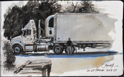 |
| "Co-op Truck," black and white gouache, 5 x 8 inches. |
I have a half hour while they unload the food co-op truck, so I set up my sketchbook on a garbage can. The driver waits in the shade, leaning against the truck.
The preliminary drawing has accurate measurements, but it is very rough and incomplete, just a map of the big shapes.
I lay a light wash over most of the scene (lighter than it appears here), using some warm and cool colors from my watercolor set. This is to lower the tone just a bit from white so that I can come back up to white with the gouache.
I begin to define the dark values. I want to push the values to very light and very dark, not too many middle tones.
The driver comes over to take a picture of the sketch with his cell phone.

By: James Gurney,
on 7/22/2015
Blog:
Gurney Journey
(
Login to Add to MyJacketFlap)
JacketFlap tags:
Gouache,
Add a tag
We had a tremendous response to the
Gas Station Challenge. I put out a call a few weeks ago for you to paint a gas station on location in black and white gouache. One of the reasons I suggested that subject was because I figured no one would have any such painting already completed.
Thanks to everyone who took part. You braved biting flies, extreme heat, rain, and station owners who were suspicious or who thought you were crazy. Some of you painted outdoors for the first time, or painted in gouache for the first time. And there were some old pros stepping up to the plate.
It was really hard to pick the winners, but here 'goes.
Grand Prize
The Grand Prize Winner is Randy Raak's painting of the "Dino Mart" in Golden, Colorado. I would have loved this one even without the dinosaur because it captures such a sense of place, with the new retail construction on the hills above the station. The perspective is really good, and the values are carefully observed. Translating bright colors into gray tones is a challenge.
Randy says "The painting is 9" x 11" on 140# rough watercolor paper, completed 100% on location during five, two hour sessions."
3 Honorable Mention Winners
Olivier Martin is one of three Honorable Mentions for this interesting study of a Parisian gas station.
He had a lot of complicated forms and lettering to sort out, and he did so with real affection for the detail.
He said that it was hard to find a quiet place to paint in Paris, and that his position was a "little bit strange for people who pass on the street, but next to this tree I was in calm."
The second Honorable Mention goes to Eelis Kyttänen for his boat fueling station. He picked an unusual subject and viewpoint. He carefully observed the values of the shadow side of the building, which makes the lighting very convincing.
Here he is showing the painting from the bridge where he painted it.
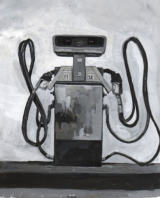
But just to show that not all paintings have to be highly detailed, I'm giving the third Honorable Mention to Dave Lebow for this pump study (below). I like the way he described the curving forms of the modern pump catching the shimmery hot light from the surrounding environment.
This is a good example of the selectivity you can get with gouache. He focused on the pump, and did some of his drawing over the opaque paint. He softened the edges of the distant buildings and trees. It's an artistic effect without calling attention to itself.

Soft edges take conscious effort in gouache, especially if you use full opaques in the hot sun. I also like the way he included a vehicle, knowing how briefly they stay next to pumps.
Pictures of Merit
Braelyn Snow did this study of a single pump. She chose to remove it from the surroundings so that she could spend her time focusing on the variety of surface textures, including the reflection of the hose on the chrome side.
She says, "While I was working at the vacant Apple Pie Inn, a van drove up beside me and the driver asked what I was doing. When I told her, she told me she was the owner and had been worried I was up to something suspicious. Apparently the other two pumps had been stolen. After I assured her I would not steal the pump, only paint it, she gave her blessing and drove away. This is why I like to call ahead when I know who to ask!"
Daniel New also chose to concentrate on a single pump. That way he could describe the decaying plastic covering the advertising sign, the bent metal pieces, and the eroded stickers.
In the part-way finished painting, you can see how he built a lot of those details over flat base tones.
I was surprised how many of you painted from your cars, but judging from the droplets on the window, this was a rainy day.
Jared Cullum captured the full scene with all its detail: the signs, the plantings, and even the cars. The result gives a strong feeling of being there.
He deserves special commendation for doing the painting while babysitting and adapting the stroller into an easel.
Matt Sterbenz painted this night scene. I find this study moody and compelling, with the solid black night sky on the right, and the glow of light under the canopy raising the values of all the darks. It feels like a weird space station, and it would be fun to go back there with full color.
Like a spy, Matt dresses in black and works from his car in a super portable setup. He's kind of a night-painting ninja who might strike anywhere anytime!
Evidently, Larry Kitchen has a lot of experience with gouache. He lays down those lines very professionally and gets the perspective right.
Larry says, "There really is something great about going out on a cool summer morning to catch a scene."
This painting by Nicholas Elias picks up on the weird forms of the superstructure above the pump, with all those fire prevention nozzles.
And it looks like he's got a cool palette rig to hold the sketchbook vertically.
Finally, Jeff Simutis, an experienced architectural painter, painted this old gas station. Nice relaxed handling throughout, with a lot of affection for that false front.
Thanks again to everyone for taking on the challenge. There are a lot more entries, and you can see them all at the
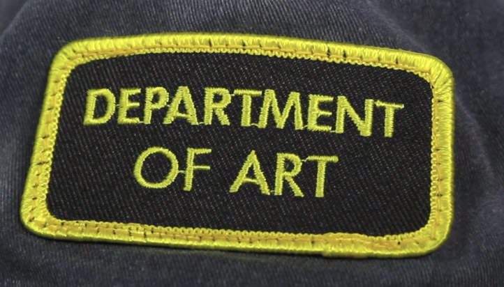
Facebook event page. I'll be contacting Randy, Olivier, Eelis, and Dave about getting their "Department of Art" prize patches.
----

By: James Gurney,
on 7/14/2015
Blog:
Gurney Journey
(
Login to Add to MyJacketFlap)
JacketFlap tags:
Gouache,
Add a tag
The blue and white placemats are printed with ads for local businesses.
 |
| Reflections, gouache (black, white, ultra blue, raw umber), 5x8 inches |
The creamer and the juice glass distort the patterns of the placemats in different ways. One reflects them, and the other refracts them.
To the left of the base of the juice glass, there's an arc of light, a
caustic projection of window light.
Here's what I'm looking as I put in my order for the turkey burger deluxe (+ grilled onions, lettuce, tomato and a side of fries). When Ann brings the plates steaming from the kitchen, I lift up the art studio and set it on the napkin holder.
-----

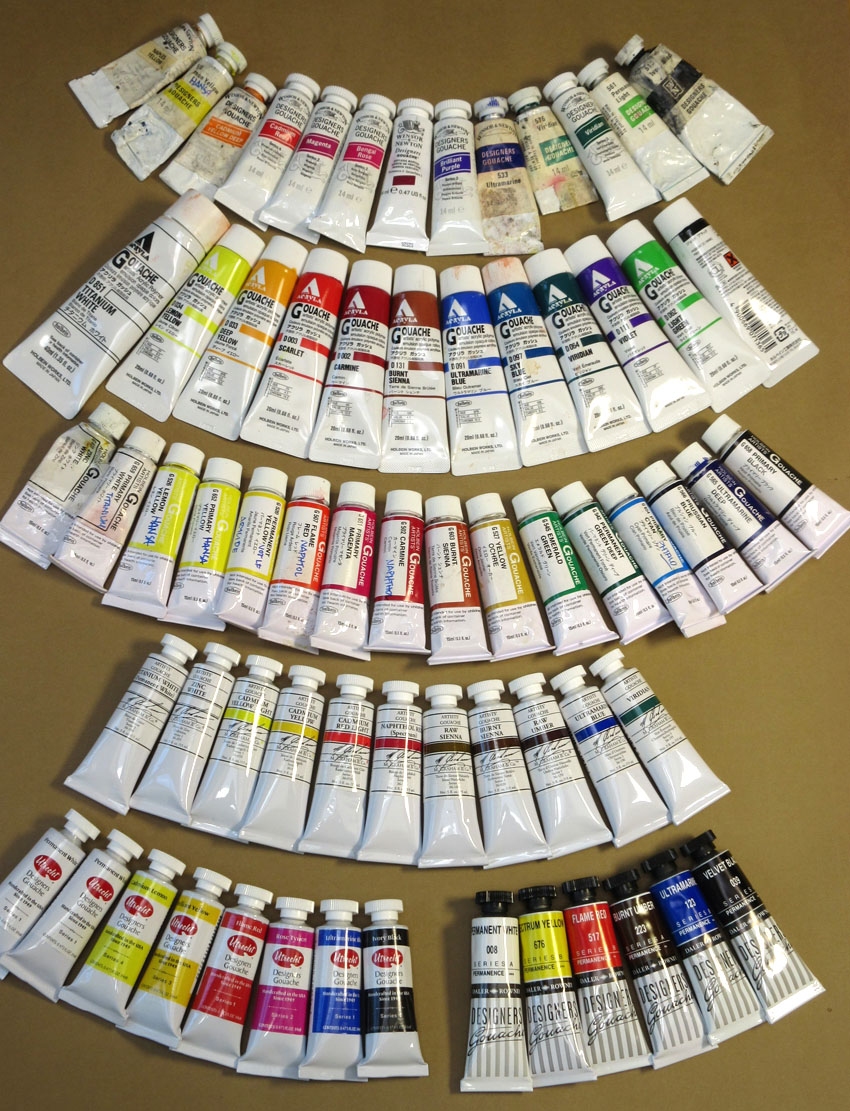
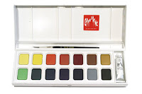
A lot of you have asked which is my favorite brand of gouache, and I have to answer that I can't say yet. I've been trying out a lot of different brands, such as:
M. Graham,
Holbein,
Winsor and Newton,
Utrecht,
Lukas Gouache Schmincke
,
 Pebeo
Pebeo,
Royal Talens, and I've been having fun with all of them.
But my experiments haven't been very systematic, and I often mix several brands on a given painting outing.
One of the brands of gouache I just haven't tried out yet is
Caran d'Ache, though I use their
water-soluble colored pencils
all the time.
Adrian Weber, a fine-art product developer from the Caran D'Ache company in Geneva, wrote me with further answers to the questions I posed to representatives of all the gouache manufacturers. I had inquired what ingredients they used and what qualities they thought were important. (See their answers in my post about
Gouache Ingredients)
Mr. Weber started by offering three important "gouache criteria":
"
A. Opacity : As you say, our definition of « gouache » (from Italian « guazzo ») means a rather opaque, covering « sauce » with a certain covering power on dark undergrounds."
"
B. Water-solubility : According to our definition, gouache needs to be water soluble and stay water soluble. We do not understand how other producers can label colours writing things like : « Acrylic Gouache ». It can’t be both! Either it’s acrylic and permanent after drying (I call it a « liquid plastic » that hardens when water evaporates ; polymerization), or it’s gouache and you can always dissolve layers underneath."
"C. Matt surface : Typical for a good gouache should be it’s matt aspect when dried. It should be close to the pure pigment powder aspect and by this make a distinction to satinated, creamy or oily aspects of other types. This characteristic makes gouache so unique and essential for studying and teaching « colour mixing » based on primaries etc.!"
"To clarify this, I think you need to explain to your readers the terms « Gouache », « Plakatfarbe [in English we'd say "poster paint"] », and « Tempera » that all mean a kind of opaque water colour."
"Even in our own range, we’ve known and still know different types of « gouache ». We only speak for our own gouaches:"
 "1. Gouache in tablets/cakes (dry)
To produce our dry gouache tablets, we extrude them with pressure from a highly pigmented, humide paste (unlike most other producer from dry powder similar to medical pills). In order to provide the right consistency and to make it extrudable, this gouache contains kaolin and calcium carbonite, not just as filler, but as « consistency provider ». We use vegetable binders without plastifiers here."
Retail info on pans sets here
"2.
Gouache extra-fine in small tubes (consistency like tooth paste)Gouache extra-fine is close to a water colour, as the binder is arabic gum and that the quantity of mineral filler is just minimal."
Retail info here
"3. Gouache studio in small tubes (consistency like tooth paste)Gouache studio contains some kaolin and calcium carbonate, some colours containing white also titanium White PW6 which serves as pigment but also as « filler » at the same time."
Retail info on gouache studio sets
 "4. Gouache studio in bottles (liquid)
Liquid Gouache in bottles, mainly used by schools contains bigger quantities of these above mentioned mineral fillers, we use natural binders such as corn or potato starch. As regulations have become so strict on toys, this type of gouache nowadays is close to a food product, as there’s just a minimal quantity of conserving agent against spoilage (20 years ago, formaldehyde was used by most producers !)"
Retail info on Caran d'Ache Fancolor Tempera
"Last remark : Our philosophy is that a good gouache colour, despite its covering qualities, should still be luminous and powerful. This is the reason why we use a strong concentration and a high quality of pigments that we carefully refine in our mills and grinders in our Genevan factory."
"I often compare a colour with coffee or chocolate : Concentrated black coffee made with the best beans has got power and makes an « explosion of taste» in your mouth and throat (similar effect on paper with highly concentrated watercolour without filler !). Now, some people like to add some milk in their coffee or producers add water to decrease the costs of the expensive coffee powder. That’s all ok, but if you add too much milk (filling material !) or too much water in your coffee, it loses its original power and taste, it just gets a characterless muddy sauce!"
"In other words : You can always break down a highly concentrated colour and lighten or darken it, but you can never « pimp up » a colour with too much filler, white or similar ingredients."
"Wishing you all the best for your great project, with kind regards from Geneva, Adrian"
----
Thanks, Adrian!
Previously on GurneyJourney:
Gouache Ingredients: Info from ManufacturersVisit the Caran d'Ache website at
carandache.comOwn the 72-minute feature "Gouache in the Wild"
• HD MP4
Download at Gumroad $14.95
• or HD MP4
Download at Sellfy (for Paypal customers) $14.95
• DVD at
Purchase at Kunaki.com (Region 1 encoded NTSC video) $24.50

By: James Gurney,
on 6/28/2015
Blog:
Gurney Journey
(
Login to Add to MyJacketFlap)
JacketFlap tags:
Gouache,
Add a tag
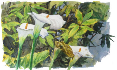 |
| James Gurney, Calla lilies, watercolor and gouache |
Joseph Gyurcsak, an artist and brand manager for Utrecht art supplies, wrote to me in the middle of Gouache Week offering to answer any remaining questions. He told me that he worked on developing Utrecht's line of gouache for more than two and a half years, and that he learned a lot about the medium during that time.
[Gurney] How would you define gouache compared to other water-based media?
[Gyurcsak/Utrecht] "Firstly, I would like to say by definition gouache is OPAQUE watercolor for those who are confused. Gouache colors were not intended to have the same vibrancy as watercolor because the formulation properties are entirely different. They can be permanent and long lasting; just look at the works of John Singer Sargent or Winslow Homer's wonderful interplay of transparent washes (watercolor) with semi-transparent and opaque passages of gouache. There are times when this interplay (transparent, opaque and impasto) is done as masterfully as an oil painting!
"One more truth: opaque colors in any medium and any brand color line will never carry the vibrancy of color intensity compared to any semi-transparent or transparent color when mixed with white! I preach this color mixing law to all students in my demos and lectures."
 [Gurney] When you helped develop the Utrecht line, what qualities did you want to achieve in the paint, and how did you do it?
 [Gyurcsak/Utrecht] "Gouache colors are very delicate formulations. They need to be opaque, even with pigments that don't want to go this way because of their nature. [They should have a] Flat to satin sheen, [and should] lay down flat, continuous washes without striking [Ed. streaking?] when dry, if possible (mainly for designers), flash dry (for rapid layer build up) and have the ability to create thin detail lines if needed. This is complex and demanding, and that is why the formulations are so very delicate in the pigment-loading ratios compared to all other ingredients.
[Gurney] What's different about Utrecht gouache? [Gyurcsak/Utrecht] "Utrecht gouache is different in way of price. We try to be affordable for all level artists to enjoy professional level materials."
[Gurney] Is there any way to retard the drying time in gouache, especially when using it in arid conditions? [Gyurcsak/Utrecht] "This is opposite to its flash dry [Ed. quick-drying] properties but if an artist must, ox gall or glycerin (with eye dropper) used sparingly will buy some more time."
[Gurney] Is there any way to eliminate the value changes as gouache dries?[Gyurcsak/Utrecht] "The shift is going to happen especially more when colors are opaque in gouache and acrylic. Artists develop a sense for working with various mediums and know how to mix in anticipation. Most good instructors advise a test scrap, or as we have seen in artworks from the past at museums, this testing done on borders outside the picture boundaries. I especially love seeing this, as it shows the artist thinking in color notes! Frederick Remington comes to mind."
[Gurney] Are there any grounds or surfaces that should be avoided when using gouache?[Gyurcsak/Utrecht] "Slick ones, gouache wants to peel from these more plastic type surfaces."
[Gurney] Can gouache be used as a substrate for other painting media, such as oil?[Gyurcsak/Utrecht] "Yes, watercolor, chalk pastel, acrylic and oil color. It must be sealed with a
Krylon clear spray for oil, to avoid oil bleeding and staining the colors."
[Gurney] Do you recommend varnishing gouache to get more depth of color and glossiness? What sealers or varnishes would you recommend using or avoiding?[Gyurcsak/Utrecht] "Krystal clear
Krylon is excellent for this, but beware, it is permanent, so rework may be difficult after application. But it will bring increased depth, and many illustrators and designers use this. Believe it or not, a simple non-museum glass in framing gives it depth."
 |
| Painting Calla Lilies in Monterey, Calif. |
[Gurney] again. I thought this would be a good time to answer some of the questions that we weren't able to get to during the live-stream painting last week.
4:29
NatalieBarahona: Do you always do an underpainting for gouache plein air studies?
[Gurney] No, I generally paint directly on the watercolor paper. I use an underpainting either to provide some interesting color possibilities or to seal up the fibers of the paper. Burt Silverman often worked in gouache over gesso, or he primed watercolor paper with a thin layer of white gouache underneath watercolor. It's good to experiment with lots of variations to see what kind of surface you like. In the case of the calla lily sketch at the top of the post, I underpainted the whole image with yellow except for the white areas.
4:38
miaomiao: Hi James! are you usually saving your most saturate colors at end? or it depends?
[Gurney] I do often save the most saturated or highest-chroma accents for the end, especially if they're small accents. But other times I start with high chroma in the underpainting and cut back on the color by covering it with low-chroma layers, such as the passage at right.4:50
ludicrous-sin-filtro-scriptus: how many camera guys do you use to film your dvds?
[Gurney] I don't use any crew. I shoot them all myself. Sometimes if I'm lucky I can convince Jeanette to operate a camera, but she's usually busy sketching. The moving camera shots are done using geared-down Lego motors on homemade dollies.4:45
Kozart: any major tips for mixing colors/ getting the colors that you're looking for?
[Gurney] Yes. When you go to mix a color, mix the HUE first, then the VALUE, then the CHROMA. Exercise: Get a bunch of color swatches from the paint store and try to mix a patch of paint in less than five seconds that you can dab onto the swatch for a perfect match.4:49
nickgoeslife: What are some things you did when you were new at plein air to really push yourself and grow your skills?
[Gurney] Painting outdoors speeds up the decision-making because of the pressure of the circumstances. I did a lot of that, switching media, and working in black and white from time to time.4:49
dirktiede: I find that when drawing or painting outside, I have a tendency to rush. Any tips on how to stay calm and focused and give the drawing/painting the time it needs?
[Gurney] I think that's one of the most important things to keep in mind. It's not just a matter of time; it's a matter of concentration. We all tend to rush too much and to be too distractable. Going back a second (or third) day when the light is the same is a good practice, just to see how far you can push an outdoor painting.4:52
arturo-ramirez: Is this being recorded and available for later watching. I would love to watch it again and see the whole process.
[Gurney] I was hoping to have a highlight video at least, but we've had some audio problems. Best thing to do is to press the "follow" button on my ConcertWindow page to make sure you don't miss the next one.4:53
andreasipl: can you put more pencil on top of gouache? keep building detail?
[Gurney] Yes, because of the matte surface, gouache accepts pencil, pastel, water-soluble colored pencil, or pen. It's a nice way to put in accents and definition at the end.5:03
MikeA: Do you get kicked out of places often?
-----
Sale on videos ends today, the last day of "Gouache Week"Own the 72-minute feature "Gouache in the Wild"
• HD MP4
Download at Gumroad (Get 10% off all Gumroad products until midnight tonight
at this link) $14.95 $13.45
• or HD MP4
Download at Sellfy (for Paypal customers) 10% off until midnight tonight $14.95 $13.45
•
DVD at Kunaki.com (Region 1 encoded NTSC video) 10% off until midnight tonight $24.50. $22.00

After finishing my scrambled eggs this morning at the diner, I painted the still life on the counter in front of me. And then I made a one minute video about it (
Link to video)
The banana pudding cake sits on a paper doily in its covered cake stand. This little painting is mostly transparent watercolor from my pan set. I used a little bit of gouache for the doily and for the highlights in the cylindrical cover.
-----
Sale ends tomorrowOwn the 72-minute feature "Gouache in the Wild"
• HD MP4
Download at Gumroad (Get 10% off all Gumroad products this week only
at this link) $14.95 $13.45
• or HD MP4
Download at Sellfy (for Paypal customers) 10% off this week only $14.95 $13.45
•
DVD at Kunaki.com (Region 1 encoded NTSC video) 10% off this week only $24.50. $22.00

By: James Gurney,
on 6/27/2015
Blog:
Gurney Journey
(
Login to Add to MyJacketFlap)
JacketFlap tags:
Gouache,
Add a tag
Over the years, gouache has attracted some brilliant painters. Here are some virtuosi:
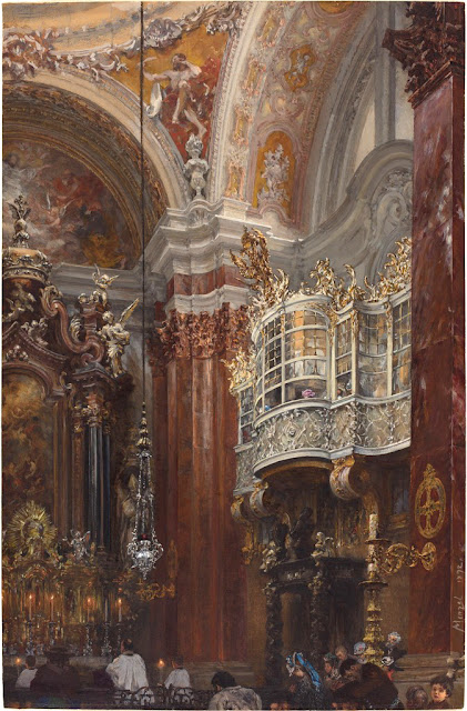 |
Menzel, The Interior of the Jacobskirche at Innsbruck, 1872, 15 3/4 × 10 5/16 in.
|
Adolph Menzel (1815-1905) This long-lived German artist made important contributions in oil, pencil, watercolor, and engraving, but it was said of him that he expressed his greatest truths in gouache.
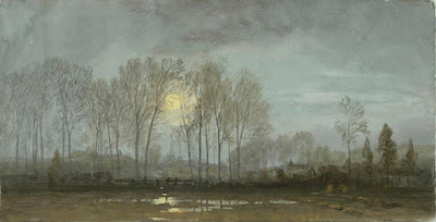 |
| Wm. Trost Richards Moonlit Landscape, 1862, gouache, 6 7/8 x 13 3/8 in. |
William Trost Richards (1833-1905) American landscape painter who often painted small works on tone paper. He was equally competent in oil.
Thomas Moran (1837-1926) Moran painted in oil in his studio work, but brought gouache on location to the American West with some of the first survey teams.
 |
| Leaves watercolor and gouache 8 5/8" x 6 3/4" |
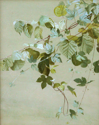
Fidelia Bridges (1834 - 1923) American student of Trost Richards, who painted sensitively observed close-ups of plants.
Albert Beck Wenzell (1864-1917) Belle Epoque illustrator of society life who often worked in black and white.
 Stepan Kolesnikov
 (d. 1955) Russian painter of solid peasants and spindly trees.
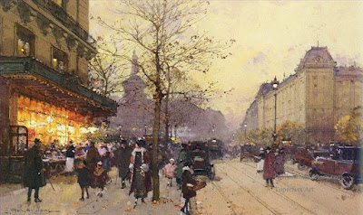 Eugène Galien-Laloue
 (1854-1941) French boulevard painter during la Belle Époque. He painted scenes of bustling streets at twilight. They may have been painted by formula, but it was an impressive formula!

Albert Brenet (1903-2005), a French illustrator specializing in trains and ships.
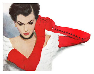 |
| Coby Whitmore, 1950, For the story Heartbreak by A. Barke |
Coby Whitmore (1913-1988) Mid-century style-setting illustrator always, innovative with his compositions.
 Harry Anderson
 (1906-1996) known on this blog for his magazine illustrations of women and children, he painted in tempera—here's one of his plein-air landscapes.
 |
| Freshwater Pond Life, ca. 1970. 12 ½ x 28 ½ inches |
Ned M. Seidler (d.2007) was one of the natural history illustrators for National Geographic and the U.S. Postal Service in the 1970s, often compressing a whole ecosystem into a single picture.
Carl Evers (1907-2000) German-born artist specializing in ships and water.
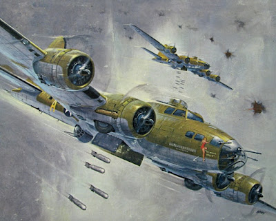 |
| Leynnwood ‘Memphis Belle’, a Boeing B-17F. |
Jack Leynnwood (1921-1999) painted many of the best covers for the Revell plastic models. He painted both in gouache and casein.
Ralph McQuarrie (1929-2012) concept artist for the original Star Wars series.
Syd Mead (born 1933) The combination of Ridley Scott's dystopian vision and Mead's sense of believable detail made the art for Blade Runner some of the finest concept art of all time.
I know I've left out a lot of others, but go ahead and mention them in the comments. Thanks, Charley Parker, Armand Cabrera, and all the others on Facebook who reminded me of some names I had forgotten.

By: James Gurney,
on 6/26/2015
Blog:
Gurney Journey
(
Login to Add to MyJacketFlap)
JacketFlap tags:
Gouache,
Add a tag
When I was in southern California last fall, I painted the "Pepsi Challenger," a Formula 1 race car designed and built by my cousin Dan Gurney and his team back in 1981 (link to YouTube video).
Dan let me set up my sketch easel in his museum, and I interviewed him about the car. The edit mixes my voiceover about the making of the painting with clips of him talking about the design of the car.
Note that the car doesn't have rear view mirrors. They were taken off for some reason, but we joked that when you're way out in first place, you don't need rear view mirrors.
I've been intrigued by this kind of edit, which juxtaposes two different ways of looking at the object being painted. My viewpoint is that of the naïve observer, trying to translate my outward impression into paint, and his is the expert who knows the object inside out.
The expert's perspective is a reminder to me not only of the importance of accuracy, but it also helps to push me beyond the limitations of the moment and the surface, where so many plein-air paintings become stuck.
For this video, we also have the third element of my great-uncle John Gurney's operatic aria playing in the soundtrack, which connects the art of painting with the unusual heritage of my family. I hope it also expresses the kinship between the arts of painting, engineering, and music.
What I tried to accomplish with "Gouache in the Wild" as a whole is to explore the magic of seeing the world firsthand through paint, and to let each painting hinge open like a doorway into new worlds.
Be a part of the adventure! Own the 72-minute feature "Gouache in the Wild," which includes a more comprehensive edit of this segment.
• or HD MP4
Download at Sellfy (for Paypal customers)
10% off this week only $14.95 $13.45•
DVD at Kunaki.com (Region 1 encoded NTSC video)
10% off this week only $24.50. $22.00
By: James Gurney,
on 6/25/2015
Blog:
Gurney Journey
(
Login to Add to MyJacketFlap)
JacketFlap tags:
Toys,
Gouache,
Add a tag
In this mini trailer segment from "Gouache in the Wild," I visit the antique toy collection of Mel Birnkrant to paint his "Brownies" candy containers in acryla gouache (Link to YouTube)
I'm fascinated by the character design from a century ago. They have a sort of eager mania with their big eyes and effervescent smiles. Who can resist those cute Kewpies with their eyes coyly turned aside, and the bouyant little Brownies. No wonder, they were designed by top artists of their day.
The Brownies were created by
Palmer Cox (1840–1924) starting in the 1880s. They were all little men, and they included standard types of that era: Uncle Sam, the Cowboy, the Policeman, the Sailor, the German, and the Chinaman. Brownies were some of the first mass-merchandised characters, and the Kodak "Brownie" camera was named after them.
It's one thing to look at these antique toys, but quite another to paint their portraits. Painting physical character toys is one of the best exercises for artists who want to get better at character design, especially for 3D CG animation.
Read more
The next best thing to sketching a real museum of toys is to check out Mel Birnkrant's phantasmagorical website, starting with
the page on Kewpies and Brownies.
-----
Join the fun! Own the 72 minute feature Gouache in the Wild, which reveals more methods that I used in this painting, including the Renaissance grid system for accuracy.
• HD MP4
Download at Gumroad (Get 10% off all Gumroad products this week only
at this link)
$14.95 $13.45• or HD MP4
Download at Sellfy (for Paypal customers)
10% off this week only $14.95 $13.45•
DVD at Kunaki.com (Region 1 encoded NTSC video)
10% off this week only $24.50. $22.00

By: James Gurney,
on 6/24/2015
Blog:
Gurney Journey
(
Login to Add to MyJacketFlap)
JacketFlap tags:
Gouache,
Add a tag
Here's the gouache landscape I painted "in the wild" today during the hour-long live
webcast on ConcertWindow. Thanks to the 150 of you who joined in from as far as Australia, Russia, Argentina and all over the USA!

By: James Gurney,
on 6/24/2015
Blog:
Gurney Journey
(
Login to Add to MyJacketFlap)
JacketFlap tags:
Gouache,
Add a tag
If you're eager to get going with gouache, why not join this contest?
The challenge is to paint a gas station in black and white gouache on location.
 |
| Gas Pump, gouache, by Thomas Kinkade, 1981 |
For inspiration, here's one of my favorite little paintings. If you've never seen this image before, it might surprise you that it was painted by
Thomas Kinkade, better known for his prints of glowing cottages. When I knew him, it was long before he was "The Painter of Light." In addition to working as background painters, we traveled all over the country doing work for the book we co-wrote called
The Artist's Guide to Sketching
.
He painted the gas pump when that pump design was new, and he wanted to paint it realistically, but subtly push the idea that it looked like a weird robot alien.
Three Rules
1. Just black and white, no other colors, and it must be regular gouache or "acryla" gouache.
2. You can be inside or outside the station. You can show a view of the convenience store or the mechanic's shop or the street scene around the station. If you don't want to do a wide shot, you can focus in on details like signage, soda machine, pumps or cars. It can be a busy station or an abandoned one. But somehow it must be evident that it's set in a gas station.
3. It must be painted on location and it must be a new painting done for this contest. In addition to a scan of the final painting, your entry must include a photo of you with your set-up and the painting in progress.
Prizes
I'll pick one Grand Prize and three Honorable Mentions. All four winners receive
a highly coveted "Department of Art" embroidered patch. In addition, the Grand Prize winner receives a First Day Cover of the Australian dinosaur stamps with a hand-drawn remarque. The top 10 entries will be published on GurneyJourney, and I'll try to figure a way to upload all the entries on another site.
Deadline
It's free to enter. The deadline is Monday, July 20. Winners will be announced July 22.
How to Enter
Email your two files (painting and photo of you doing the painting) to gurneyjourney (at) gmail, subject line "GAS STATION." The files must be
no larger than 700px in any dimension. Or send me a link to a file-hosting site where your image can easily be accessed.
Own the 72 minute feature Gouache in the Wild and be part of the fun• HD MP4
Download at Gumroad (Get 10% off all Gumroad products this week only
at this link)
$14.95 $13.45• or HD MP4
Download at Sellfy (for Paypal customers)
10% off this week only $14.95 $13.45•
DVD at Kunaki.com (Region 1 encoded NTSC video)
10% off this week only $24.50. $22.00

Gouache Week continues with a brief trailer / sampler from the feature Gouache in the Wild. This time Jeanette and I are painting an ordinary gas station while our car is being fixed nearby. (Link to Video)
Color gamut, value gamutIn terms of hue, this is a complementary gamut of blue grays vs. yellow-oranges. I leave out reds, except what I can mix with burnt sienna. And I ignore greens, except very dull greens that I can mix with the few colors on the palette.
I also want to classify the tone values, pushing everything to a group of light tones and dark tones. I try to create the painting using the limited number of color notes represented by the swatches below:
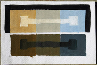 Top row.
 1. Light/Warm; 2. Light/Neutral; 3 Light/Cool.
Bottom row. 4. Dark/Warm; 5. Dark/Neutral; 6. Dark/Cool.
This Spartan color universe yields a strong value statement and it guards against the dullness that comes from painting everything in middle values.
------
Live streaming event TODAY
Own the 72 minute feature Gouache in the Wild and be part of the fun• HD MP4
Download at Gumroad (Get 10% off all Gumroad products this week only
at this link)
$14.95 $13.45• or HD MP4
Download at Sellfy (for Paypal customers)
10% off this week only $14.95 $13.45•
DVD at Kunaki.com (Region 1 encoded NTSC video)
10% off this week only $24.50. $22.00
By: James Gurney,
on 6/23/2015
Blog:
Gurney Journey
(
Login to Add to MyJacketFlap)
JacketFlap tags:
Gouache,
Add a tag
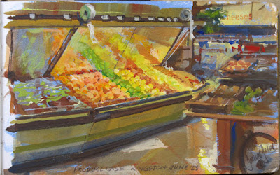 |
| Produce Case, gouache, 5x8 inches, painted at the Hannaford, Kingston, NY |
Earlier today I walked into the supermarket and was mesmerized by the produce case.
The oranges, limes, and lemons were reflected in the big mirrors behind them, and I knew I just had to paint them right then and there.
Luckily I had my gouache supplies with me. I steered an empty shopping cart over next to the apple display. I set up the tripod sketch easel inside the cart. I chose a page with a yellow-blue casein underpainting, and got busy with the colored pencils.
Since the gouache has no smell and is very neat and water-based, I knew I'd be OK working with it there.
My wife took about 55 minutes to do the hunting and gathering. During that time I was nervous that someone from the store would ask me what the heck I was doing, but no one said anything to me.
I think the uniform shirt made me look like I was on some sort of corporate assignment, and my purposeful expression kept me from looking like a complete nut.
Here's the sound environment. (
Link to audio file) The store is near the train tracks and you can hear the train sounding at 00:17.
Thanks, Hannaford supermarkets for your inspiring, artistic displays.
------
Live streaming event tomorrow
Own the video and be part of the fun• HD MP4
Download at Gumroad (GurneyJourney readers get 10% off all Gumroad products this week only
at this link)
$14.95 This week only $13.45

By: James Gurney,
on 6/23/2015
Blog:
Gurney Journey
(
Login to Add to MyJacketFlap)
JacketFlap tags:
Gouache,
Add a tag
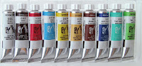
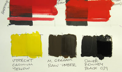
 |
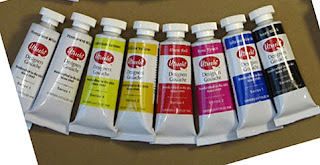
Top: Winsor Newton, Second: Acryla Gouache (Holbein),
Third: Holbein Gouache, Fourth: M. Graham,
Fifth: Utrecht (left), Daler Rowney (right) |
To research the gouache video, I decided to ask manufacturers what ingredients they put in their paints. Here's what I wrote to them:
Dear _______,
I’m currently working on a new instructional DVD called "Gouache in the Wild," and I had a question.
In my research about gouache paints, I'm encountering some confusing information about the formulation of gouache. Many manufacturers claim in their advertising they use no opacifiers, chalks, fillers or other agents or "so-called adulterants" added to the pigment and binder, giving the impression that gouache is made up of solely of pure concentrated pigment and gum arabic. With an opaque pigment such as Venetian red, I can imagine that such a formulation might be possible.
But according to other information I've found, some pigments are so transparent (such as phthalocyanine and other organic pigments) that even if they are used generously in the formulation, the gouache would be unacceptably transparent and dark, and therefore whiteners or opacifiers are used to make them lighter in value and more opaque.
Other authorities claim that the formulations include other necessary ingredients such as honey, plasticizers (glycerin and/or dextrin), and preservatives to protect from spoilage or to improve the flow characteristics.
Could you please comment on what ingredients go into your gouache?
Sincerely, James Gurney
 |
| Top: transparency test, bottom: value shift test |
None of the companies paid me anything or asked for any kind of special favor. But they all gave me thoughtful answers. Here's what I heard back:
Holbein
You are correct, there is so much differing information on Gouache from manufacturer to manufacturer. Here is what my understanding is with respect to competitive Gouache lines and what Holbein has always offered on theirs.
- Almost every gouache line, regardless of origin, contains typically either talc, marble dust, Calcium Carbonate or titanium dioxide. It is very easy to tell when using a gouache that contains these ingredients. The colors tend to be drab and every color will have a chalky/milky overtone.
- Holbein does not add any of these ingredients. Typically they achieve opacity through pigmentation. Holbein gouache is therefore slightly less opaque than other gouache lines, but offers superior color saturation, handling qualities and all colors lack that chalky/milky look. Holbein uses a moisturizer, Polyethlene Glycol and a preservative, benzisothiazoline.
- Holbein acryla gouache uses a pure acryl resin as its base.
I hope this helps and please let me know if you have other questions.
All the best,
Timothy S. Hopper
Executive Vice President
Holbein North America
Winsor Newton
Great question! In fact, gouache can be rendered opaque through two different formulation approaches. The first, and most commonly used, is through the addition of opacifiers like calcium carbonate or titanium dioxide or other things. The result is greater opacity, but the clarity and intensity of the color is compromised, sometimes quite appreciably.
The other approach is to use pigments that tend to be naturally opaque and to load the formulation so heavily with pigment that opacity is the result. Of the two approaches, the second is the one we use. The opacity really and truly comes just from the pigment load.
I would also like to tell you how much I enjoy your book, 'Color & Light'. I teach and recommend it to all of my students. It is the best book on the subject I have seen. It is a great book! I wrote a book for North Light about twelve years ago. 'Colour Secrets for Glowing Oil Paintings' so I can appreciate the amount to time and work it takes.
Best wishes.
Doug Purdon
Technical Advisor
P.S. I just received this reply from our technical manager.
Some opacifier is added, but the formulations rely predominantly on being heavily pigmented.
I suspect that when the pigments are very transparent such as Pthalo Green or Blue this would be necessary to ensure that they had sufficient covering power.
UtrechtHistorically, Utrecht paints have been formulated with heavy emphasis on single-pigment colors to deliver the unique characteristics of the high quality raw ingredients we use, and this is still true of our Designer's Gouache line. Consistent with this goal, we use opacifiers and matting agents only where needed, in the minimum effective proportion. Depending on the individual color, we may use inert pigments like blanc fixe or barium sulfate to achieve an opaque, matte appearance.
A few including Cadmium Lemon Yellow, Cobalt Blue Hue and Naples Yellow have a small amount of titanium white added, either to achieve a hue consistent with a traditional color or to bring a pigment to its best advantage. More information about pigment content is included on the product MSDS:
http://images.utrechtart.com/Content/MSDS/UT-Designers-Gouache-13.pdfOur objective was to offer designer's gouache worthy of the fine artist's palette, something that would never be called "chalky". There may be more variation in opacity/transparency across our assortment than with some brands, but that's a deliberate choice we think makes Utrecht Gouache such an excellent paint. Since skillful and sensitive use of white is so important in gouache painting, we feel that producing tints is best done on the palette by the artist. After all, you can always add white, but you can't subtract it.
The binder for Utrecht Designer's Gouache is pure gum arabic. We do add antimicrobials, wetting agents and plasticizers. Our approach is to develop each color individually rather than a generic palette, so there is no overall single formula for any of our professional paint assortments. I will have to consult our Brand Manager to find out which colors include specific agents. None of the colors in our gouache line include ox gall. I'll review my archives and see what other information I can discover. Thanks for your interest in Utrecht paints!
Matthew Kinsey
Utrecht Art Supplies
M Graham
Thanks for asking. As a small child I wanted to be either a ballerina or an archaeologist so I have been fascinated with Dinotopia for years. Never occurred to me that I would be a paint maker.
When we looked at entering the gouache market, many products were termed "designers" gouache. The idea was to make a design, take a photo and throw the original art work away. Many of the colors were fluorescent or not lightfast because the work was "swimsuit fashion" and permanency did not matter.
We decided to go with a "fine art" version instead. We use the same pigments as our oil, acrylic and watercolors so there are some that are so transparent that opacity requires whiteners. Instead of formulating with opacifiers or whiteners, we leave this decision to the artist. Or the color can be diluted all the way to a wash without chalkiness.
Since our whole operation is 9 folks and a part time stray cat in a 3000 sq. foot cinderblock building surround by hops fields in rural Oregon, we do not go much farther in discussing our formulations.
Diana Graham
Caran d’Ache
Acrylic, watercolor and gouache are waterbased paints. Acrylic is resin based and watercolor and gouache are gum based (resin is not watersoluble, reason why you can’t solve acrylic after it has been dried) and gums are watersoluble.
Watercolor is transparent, reason why there is no filler in the composition. It is just a big amount of pigment ground in an excellent gum like arabic, or better, traganth gum.
Gouache and Acrylic are opaque by definition, reason why they contain calcium carbonate to give them opacity. The binder used for gouache is often potatoe starch (dextrin) but it can be also arabic gum in case of extra fine gouache.
Sometimes, pigments are opaque enough not to be mixed with calcium carbonate (chalk). It is more in the case of mineral pigments like iron oxides or earth (like sienna, umbers etc..).
Hope you will find answers to your questions.
Regards
Eric Vitus
Fine Arts Manager
CARAN D'ACHE SA
Richeson
We have never manufactured gouache, so I am very short on knowledge. In general, most gouache today, particularly at lower quality levels (tempera paint) will contain chalk, because it makes for great opacity and is a cheap filler.
For more expensive lines of gouache, it seems to me that it’s not likely/possible that something is not being added. For example, Ultramarine blue is a transparent blue, but shows up in a gouache line as opaque. This suggests that something has been added. There are opacifying pigments (don’t quote me on the correct terminology), really just additives meant to provide certain properties to paints that can be added. I suspect that while they are not adding Chalk, they are likely adding these opacifying “pigments”. Now for you and me, a pigment should be definable as a color of some sort. The opacifying pigments I know would not make any sort of recognizable paint.
I hope this helps.
Darren Richeson
President
Jack Richeson and Co., Inc
Other brands
Lukas Gouache---
Own the video and be part of the fun• HD MP4
Download at Gumroad (GurneyJourney readers get 10% off all Gumroad products this week only
at this link)
$14.95 This week only $13.45• or HD MP4
Download at Sellfy (for Paypal customers)
•
DVD at Kunaki.com 10% off this week only—
$24.50. This week only $22.00
(Ships anywhere worldwide. Region 1 encoded NTSC video)

(Link to video on YouTube) Here's a brief YouTube version showing the winter landscape at sunset. It's just a fraction of the entire segment from "Gouache in the Wild."
I had to wait for a day that was just above freezing. Before leaving on the painting trip, I prepared a page of the book with a casein underpainting— a warm color area surrounded by cool colors. I had a vague idea of using that abstract color field for some subject that I could light selectively.
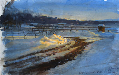
The casein underpainting presents a closed surface to the gouache, so it won't pick up the wet washes, and it makes the watercolor paper a little less absorbent. But the best part is that the color field suggested possibilities for the overlaying washes of semi-opaque color.
---
Own the whole video and take part in the fun
• HD MP4 Download at Gumroad (GurneyJourney readers get 10% off all Gumroad products this week only at this link) $14.95 This week only $13.45
• or HD MP4 Download at Sellfy (for Paypal customers) for 10% off this week only
• DVD at Kunaki.com 10% off this week only—$24.50. This week only $22.00
(Ships anywhere worldwide. Region 1 encoded NTSC video)
(Link to trailer on YouTube)
"Gouache"�hard to spell, but fun to paint with.
Today is the release of the new video tutorial about painting on location in gouache, or opaque watercolor. I'll tackle six different subjects, with each episode focusing on a different approach to the medium. The subjects include a neon sign, a snowy landscape at dusk, a convenience store, a swamp, some antique character toys, and a Formula 1 race car. Some of the studies are precise and controlled, and others are bold and painterly.

Gouache is a time-honored and versatile medium, a favorite with both professionals and beginning painters because of its portability, opacity and suitability for fine detail. But it also presents its own unique challenges, so I share plenty of practical information about formulations, materials, and painting exercises. For example, painting in black and white is a good way to get accustomed to the medium—or to paint in tight quarters, such as a concert hall or a restaurant.
Here's a small sample from a 12-minute segment (
link to the video on YouTube) where I show the most straightforward way to paint in gouache: a careful pencil drawing, with the paint applied to finished effect, area by area.
Stay tuned this week, as I'll share other samples from the video. And mark your calendar: On Wednesday at 4:00 pm Eastern Time, I'll do a free streaming demo of gouache on location via ConcertWindow.
Click the link to see my page there.---
Own the video and be in on the discussionDownload at Gumroad (GurneyJourney readers get 10% off all Gumroad products this week only
at this link)
$14.95 This week only $13.45or
Download at Sellfy (for Paypal customers)
DVD at Kunaki.com 10% off this week only—
$24.50. This week only $22.00
(Ships anywhere worldwide. Region 1 encoded NTSC video)

By: James Gurney,
on 6/18/2015
Blog:
Gurney Journey
(
Login to Add to MyJacketFlap)
JacketFlap tags:
Gouache,
Add a tag
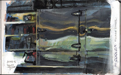 |
| Cooler case, gouache, casein, and colored pencils, 5 x 8 inches |
It's the quiet time at the diner, the middle of the afternoon, just a few regular customers.
There's a cooler case behind the counter. Barb takes a sponge to the stainless steel doors, which reflect two wavy swirls of light. One swirl is the yellow fluorescent above our booth, and the other is the green trees outside.
Barb calls out to Mel, "Don't let me go home without a piece of carrot cake or cheesecake. That's my treat to myself."

View Next 25 Posts