new posts in all blogs
Viewing: Blog Posts Tagged with: Plein Air Painting, Most Recent at Top [Help]
Results 26 - 50 of 96
How to use this Page
You are viewing the most recent posts tagged with the words: Plein Air Painting in the JacketFlap blog reader. What is a tag? Think of a tag as a keyword or category label. Tags can both help you find posts on JacketFlap.com as well as provide an easy way for you to "remember" and classify posts for later recall. Try adding a tag yourself by clicking "Add a tag" below a post's header. Scroll down through the list of Recent Posts in the left column and click on a post title that sounds interesting. You can view all posts from a specific blog by clicking the Blog name in the right column, or you can click a 'More Posts from this Blog' link in any individual post.
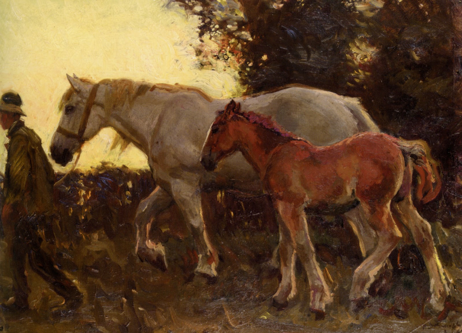
Have you ever forgotten your brushes on a painting excursion? Sir Alfred Munnings did. Here's what happened.

"Once on Exmoor, not long ago," he writes in his memoir, "I arrived by car at Cloud Farm to paint Bagsworthy Water, some twelve miles away, and found I had forgotten my brushes.
I have developed the habit of carrying my brushes separately in a brown-paper roll. A box holds a miserable handful, and I like at least one big brush among the twenty or thirty I choose to take...."
"....With no brushes, I viciously chewed the ends of pieces of wood, tied paint-rags on sticks, sought out minute fir-cones washed down in spate to the stream's bank, some of these matted with fine strands of grass. A teazle was a grand thing on such an occasion. Cursing and raging not to be beaten, I found that with these tools I could do a lot, and the final result was much the same as if I had used brushes."
"I returned next day. Conditions were the same. I sat in the same place near the roaring foam. I made the same design and painted another picture ; this time with brushes. Afterwards, placing the two canvases side by side, and standing back to look, they appeared exactly the same, four yards away."
----

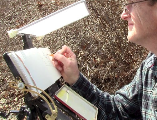
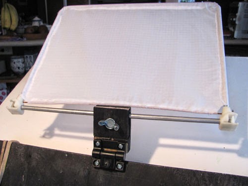
Getting the best light on your artwork while sketching outdoors makes a huge difference for seeing color. Ideally you want soft, diffused white sunlight at a level close to the brightness of the scene itself. The worst thing is cast shadows or dappled light across the painting.
Controlling the light on your work can be difficult on a bright sunny day, which is why I came up with this easel-mounted diffuser. Unlike a white umbrella, this setup won't blow over in heavy wind. The diffuser affects the light only where you need it.
The white diffusing panel is made using a recycled
Pendaflex
frame. These rectangular aluminum supports were used for hanging file folders. Over the frame I stretched
white rip-stop nylon
and sewed a seam around the edge. The angle of the diffuser is completely adjustable and the whole thing is removable, held in by a wood bracket at the top of the easel.
Here's what it looks like on the side away from me. That bracket is a piece of plywood which is split so that it tightens against the aluminum bar. The wood bracket is held on with a
Southco adjustable hinge
, so that the whole bracket can fold down out of the way.
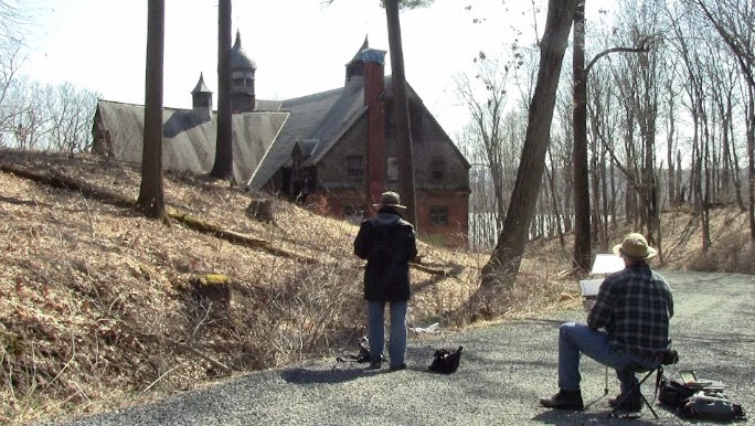
My homemade easel system can work for either sitting or standing height, because it mounts on a camera tripod. Here we were last week painting the old carriage house at the Wilderstein mansion here in the Hudson Valley. I'm painting
contre-jour (facing the light), so the diffuser brings nice white light to my work surface.
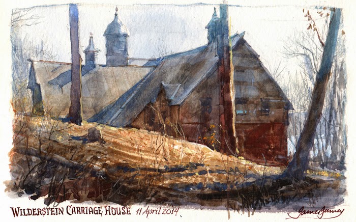
And here's the painting I did. I was conscious of lightening and cooling the top edge of the building silhouette to make the sky feel bright and blue without actually painting the sky blue. It's an effect I've noticed from photography and I wanted to try it out on an observational painting.
I documented the whole thing on video, and I'll be releasing that segment as part of an upcoming DVD/download on plein-air watercolor.

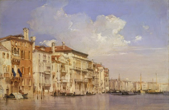
This painting of the Grand Canal in Venice by Richard Parkes Bonington (1801-1828) looks immensely detailed and at first it looks like it would have taken a long time to paint.
But he used a time-saving method that works really well for both plein-air and studio paintings of architecture.
The trick is to paint the large areas of the building fronts in opaque paint with big bristle brushes. Then let that dry completely. This might take 24 hours or several days, depending on whether there's a drying agent in the paint, such as Liquin or a drop of cobalt drier.
On the second day's session, you can go back over those big areas with a smaller brush to subdivide the building fronts. A straightedge can help you find the vanishing points and keep the horizontals in perspective and the verticals true. Note that underneath the vertical strokes of the big windows above, he lightly marked the spacing of the windows in burnt sienna before actually painting them.
Not all of the strokes are dark. You can also pick out some light accents, such as the light stones and the insides of the windows catching light on the brown building at left.
Here's another Venetian painting by Bonington. This one is on millboard, 14 x 18 inches, and was painted on location in 1826. It uses a similar technique—and it's also similar to the technique used by the master of Venetian architecture,
Canaletto. You can
read more about this image and about Bonington at the website of the Kimbell Art Museum, which owns this painting.
If you're painting on location in oil, these two-day paintings take some planning, and you have to be staying somewhere for a while. You can start several paintings one morning, then put them aside and go back to that spot a day or two later to finish them up. But if you're painting in gouache, acrylic, or casein, you can use this method all in one sitting. The mantra is "Large shapes first, small shapes last."
The first painting is from the
Yale Center for British Art in New Haven, Connecticut.
Richard Parkes Bonington on Wikipedia
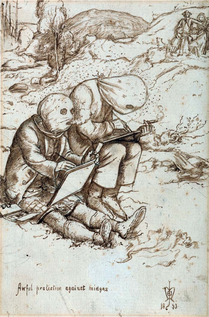
After yesterday's post about the Pre-Raphaelite love triangle, Greg Shea, who works at the Yale Center for British Art, sent this intriguing sketch by John E. Millais.
It shows two sketchers, puffing on smokes, with bags over their heads, with eye and mouth holes cut out to keep out the biting flies. In the distance, a shocked family looks on.
It is titled "Awful protection against midges," and it illustrates a moment from the sketching trip to Scotland Millais took with Ruskin and his wife Effie.
"This drawing comes from a series of about twenty-five amusing records that Millais made as a visual diary of his stay in Scotland with John Ruskin and his wife Effie. It was on this holiday at Brig o’Turk, taken between July and October in 1853, that Millais painted his famous portrait of John Ruskin standing beside Glenfinlas Falls and became deeply infatuated with his wife, Effie. Millais was an avid fan of the humorous magazine Punch and on returning from Scotland he showed the results of the lighter side of his trip (his relations with Ruskin having become naturally somewhat strained) to his friend, the Punch cartoonist John Leech. Although Millais was delighted to see his sketches published he asked for them to be anonymous. The images “would never go with the serious position I occupy in regard to Art”.
"Awful Protection Against Midges was published on the 12th November 1853. It appeared with the title Ingenious protection against midges - a valuable hint to sketchers from nature. Simplified by Leech for the wood block engraving, the Punch illustration lacks the delicate detail of the original drawing. Millais had written to his friend Martha Combe from Brig o’Turk on the 6th September describing this well-known Scottish pest. “There is one drawback to this almost perfect happiness - the midges. They bite so dreadfully that it is beyond human endurance to sit quiet, therefore many a splendid day passes without being able to work”. Martha and Thomas Combe were important Pre-Raphaelite patrons.
"The kilted figure on the left is Millais’ pupil and friend, the artist Michael Halliday in his adopted native attire. On the right may well be Millais himself, however Millais usually portrayed himself with exaggerated gangly legs and arms. An alternative candidate is Millais’ brother William, who can be seen sketching in another of the drawings smoking a similar cheroot. William’s favoured pastime was trout fishing for breakfast."

Here's a painting of a door in Friburg by Pennsylvania artist Charles E. Dana (1843-1924). He studied architecture in Munich, and then went to Paris to learn from Gérôme and Bonnat.
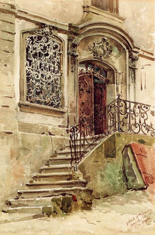
The iron grille in the window, with rectangular mullions behind it, would have taken considerable patience and skill to record in the subtractive medium of transparent watercolor.
A
1915 article described him "as a student always, living much in the past, searching out the works of old craftsmen. It is only natural that his subjects should have been for the most part along the lanes and by-paths where these interests led him. So we find his work quite removed from that of the painter of moods, and his pictures depicting and recording certain real things which were in themselves the expression of the artist-craftsmen of a bygone period."
Left: A street in Cairo by Charles E. Dana

Justin K. Thompson works in animation as a production designer and visual development artist with credits on both Cloudy with a Chance of Meatballs features, The Powerpuff Girls movie and Cartoon Network’s Korgoth of Barbaria pilot, among others.

Justin does plein air painting as a personal activity and feeds that artistic experience and insight back into his professional work. The two below are painted in gouache. He admits to all the plein air purists that on the first painting, he touched it up in his home studio. The second painting is a detail of a slightly larger piece:

See more of Justin’s drawings and paintings on his Tumblr and blog.
I painted this 8x10 oil in 1995 in the west of Ireland, and I send it to you with my warm wishes on this Saint Patrick's day.
If you'd like to hear some Irish music from the comfort of your own computer today, tune into the live-streaming music site
Concert Window.
Co-founder and Irish traditional accordion player Dan Gurney will be performing in Texas this afternoon with his good buddies Sean Earnest (guitar) and Joey Abarta (uilleann pipes).
The show starts at 4:00 Eastern U.S. time. They're touring in support of their new album "The Yanks."
Concert Window websiteHear a free track at the the Yanks Band website
Review of the new Yanks album on Irish Echo
(Video link) Brian Stewart of Minnesota left a career in advertising to focus on plein-air painting and guitar playing. The short video is by Steve Niedorf, part of a series he's doing called "By Hand," about people who do things with their hands.
Via, PleinAir magazine
----
If you live in Georgia, I'll be speaking at SCAD Atlanta today (Thursday, 9-20). The illustrated talk is at 11am, Event Space 4-C
One way to define the contour of a landscape is by means of cast shadows. In late afternoon, the shadows from trees or utility poles wrap over hills, jump up walls, and drop down over curbs.

Creating bands of light and dark adds a great deal of depth to a landscape, and it gives you something to place light or dark figures against.
It's easy to fall into the tendency to paint foliage in a relatively cursory or generalized way, compared to the way we would paint a figure. If we were to give the same loving artistic attention to a tree or a bunch of leaves that we give to a face or a nude figure, then our foliage painting would take a huge leap forward.
One artist who took such care was Peder Mork Mønsted (Danish 1859-1941). In his long career he painted landscapes of all sorts, and managed to blend painterly handling with conscientious rendering.

In this foreground detail of the painting above, he observes the character and the color of each leaf, and records how the colors change as the leaves move in and out of shadow.

But a forest is more than the sum of its leaves, or even of its trees. M
ønsted improvises a different toolset for the far masses of foliage, generalizing and softening where he needs to. 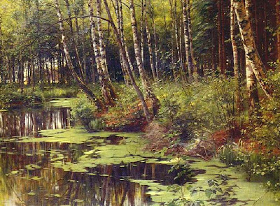
Improvisation and resourcefulness is vital to painting foliage. The tools and methods that we learn from painting casts or figures in the academy don't really serve us outdoors as we face the changefulness and immateriality of nature.
As we've seen in this series, complete imitation of every leaf in a lush landscape is probably not possible or even desirable, nor perhaps is the other extreme of ultra-softness and generalization. One can be faithful to the character of the plant without copying or imitating every detail. Instead, nature must be re-created or "represented" in paint on the canvas.
Asher B. Durand, in his influential 1855 essays "Letters on Landscape Painting" draws this very distinction between imitation and representation. When painting a tree, he says, “direct imitation is impossible." Instead the artist should strive to “represent this foliage in every essential characteristic, without defining the forms of individual leaves. To do this, some analysis of its structure is necessary.”
Th
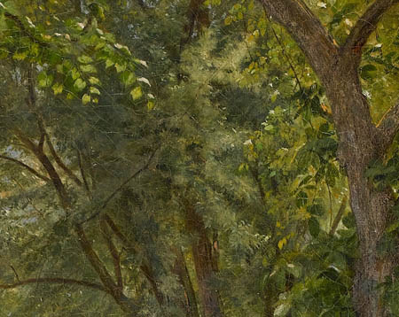
Artists who reference only photographs are missing out on a lot. As useful as photos are, they typically capture only a fraction of what the eye can see.
This is especially true with forest interiors. In a typical photo, the camera interprets the green as a single monochromatic color. The tree trunks sink to black.

In this detail of the photo above, the layers of leaves compress into a jumble of shapes. The blue sky bleaches to white and burns out the openings of the leaves.
Such a scene would look different to an observer. With with our stereoscopic vision, rapid depth focusing, and incredible tolerance of brightness differences, our eyes interpret the scene with far more nuance. Let's see what we can learn by looking at painters who specialized in this very challenging subject.
Here's a painting by William Trost Richards called "Woodland Glade" from 1860. At first glance, the staging of the scene, with the plants festooned around the foreground, may seem a little contrived or conventional. It's an idealized view, but it was painted entirely outdoors from observation. He probably carried his easel around to several locations to create the composite scene.
Although he paints every leaf in the foreground, the distant spaces are filled with variety of colors and edges. Some of the leaves are suggested with a stipple technique, made with a splayed brush. Softness is alternated with crispness throughout. The branches do not go to black, but retain some of their local color.

Here's Ivan Shishkin again, the fellow who painted the weed study in the opening post of the series. This time he's interpreting a coni
Plein-air painting on the sidewalks of midtown Manhattan is a baptism by fire. You're jostled by the crowds, hustled by street people, choked by diesel fumes, and deafened by sirens. Shadows from the high rises sweep rapidly across any scene you choose.
(Link to video) On Thursday, Jeanette and I joined our friend Garin Baker to paint New York City's landmark Grand Central Terminal. Garin's summer intern, Sean Oswald, visiting from Ohio, accompanied us on the expedition.

Here is my oil painting (left) next to Garin's on the right. This is the second painting that Garin completed within the four hours that we allowed ourselves. The video finishes with a sketch that I did of a passenger on the train. More on that tomorrow.
Garin Baker Fine Art
Sean Oswald teacher interview

By: Kathy Temean,
on 6/22/2012
Blog:
Writing and Illustrating
(
Login to Add to MyJacketFlap)
JacketFlap tags:
Illustrator's Saturday,
Anne Belov,
Philadelphia College of Art,
Children's book illustration,
Interview,
inspiration,
Process,
plein air painting,
Printmaking,
authors and illustrators,
Add a tag
 Anne Belov has been painting Fine Art for over 35 years, and doing printmaking for the last 17 years. She studied art at Philadelphia College of Art and later got her MFA in painting from the University of Washington in Seattle.
Over the years, she has realized nothing goes to waste. All her artistic endeavors have taught her that she can carry over things learned from one project to the next. From etching, she learned to love process, strengthen her value range and composition in my paintings, and enhance my ability to meet a deadline and now the impulses toward narrative in her paintings has fueled her desire to make visual stories for children.
Today she is venturing down the road of children’s books illustration and letting her life long passion for Panda Bears show up in her wordless picture book, Pandamorphosis.
She has been a pandamaniac since childhood. Four years ago, a chance encounter with an Atlantic Monthly story on pandas reignited her obsession. Since then, her online cartoon The Panda Chronicles has been gaining fans in leaps and bounds.
A serious painter, as well as a panda punster, Ms Belov resides in the Pacific Northwest where she presides over the Institute for Contemporary Panda Satire. Here is Anne showing and explaining her process:

This is actually 3 steps down the road to this new painting. I’ve done the drawing, under-painted a value study in egg tempera, and then glazed it with a mixture of a warm yellow-green and transparent yellow ochre, mixed with lots of neomeglip. As soon as I decide “I’m always doing it like such and such”, I start doing things differently. I’m working on a smooth clayboard, which is a commercially made product by Ampersand. Sometimes I like to use a very smooth surface, especially when I want to include lots of fussy and subtle detail.

This is halfway between stage 1 and 2, where I am reinforcing the value underpainting with a layer of mostly transparent purple underpainting. This will help reinforce the value structure, particularly in the darker passages. One of the big challenges is to keep the darks more transparent, which keeps them from going “dead”. Here is the full stage 2

Stage 3: OK now we’re on to adding color over most of the painting. OK well all of the painting. Still very rough at this point. I always want to keep edges soft until I’m at a more final stage in the painting. I’m working on the foreground first, as I want it to really pop out from the picture plane, so I want the background to work with the foreground, rather than vice versa. Capisce?

This is Stage 4

Stage 5: What happens here is that I try to experime
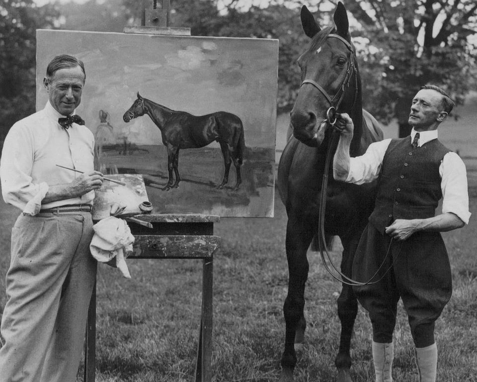
When John Singer Sargent painted his friend, landscape painter Ambrogio Raffele in a cramped hotel room in the Italian Alps, he alternately titled the picture "His Studio" and "No Nonsense."
Along with the painting-within-a-painting, he featured the unmade bed. Never mind if it looks messy and there's wet oil paint everywhere: the morning light looks gorgeous on the linen sheets and on the white shirt thrown over the edge of the bed.
Sargent was in good company painting unmade beds. P
ioneering realists loved to paint unmade beds for the very reason that they were so quotidian and so un-arranged. Eugène Delacroix (1798-1863) painted this bed in watercolor in 1828.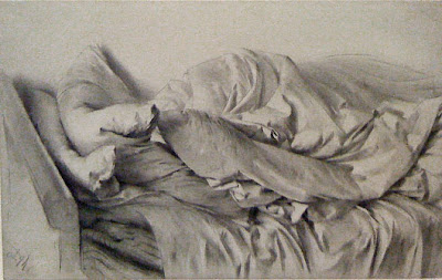
Adolph Menzel drew this bed in 1845, using a stump to soften the folds of the bedclothes. Menzel himself never married, but that didn't stop him from infusing many of his drawings with a sensuous, animated feeling. Without sacrificing naturalism, Menzel's drawing seems almost alive. The pillows appear to be on the verge of waking up themselves, as if they are reaching over and nuzzling the duvet.
Menzel expert Michael Fried accounts for this quality by suggesting that Menzel projected his bodily memories of what it felt like "to rest his own head in the pillows, to to draw the duvet over his reclining body, to fall asleep, to wake, and so on, in combination, of course, with his unique ability to project those feelings back into the drawing taking shape under his hand."
Big collection of Sargent links at Making a Mark Book:
Menzel's Realism: Art and Embodiment in Nineteenth-Century Berlin Appreciation of the Sargent painting by Garin Baker
It was a hazy day in Bridgewater, Massachusetts, an unremarkable street corner. Nothing special happened.
The picture is 5x8 inches, watercolor with white gouache over pencil and brown fountain pen.
The 19th century German instructor Heinrich von Zügel offered his students a memorable tip to help them with color and light as they painted animals outdoors.
Hermann Ebers recalled, "His system was both simple and enlightening. Objects close to the ground were painted in warm tones, somewhere between yellow and brown. Towards the sky the colors are influenced by cold, playing into blue. Vertical surfaces finally show violet influenced tones. "
Ebers continues, "I wrote a humorous song about putting that scheme on an animal, that I had to sing on stage during a live performance:
"The warm part is placed on the belly,
The cold part in the highest light,
The breaking of light is a breeze,
Where? No one knows."
-----
Along the shores of the Hudson River, the railroad line isolates muddy coves. That's where the bog people live.
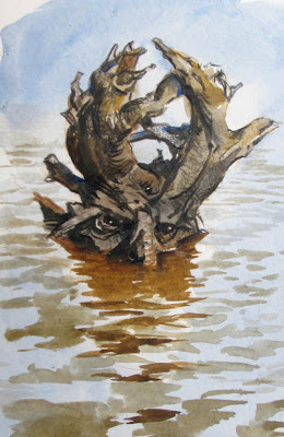
At high tide they look like the roots of trees washed down by floods. But as the tide goes down and the sun goes down you can see their glistening eyes watching you.
Plein-air painters working unaware along the shore sometimes feel a tendril wrap around their ankles. So when I sketched this guy, I kept my escape route always in view.
Here’s a portrait of my son Frank that I painted from life when he was six years old.
At that age, it was basically impossible to get him to hold still for an hour-and-a-half portrait, except for this unusual circumstance.
We were staying on a farm in Ireland, and he discovered a kitten that was being harassed by dogs. The dogs kept playing with the poor thing, picking it up in their mouths, until it got soaking wet and completely exhausted.
Frank rescued the kitten and put it in his lap. It fell instantly asleep under his protection. For as long as it slept, he held as still as a statue.
The painting is 10 x 8 inches in oil.
Happy Saint Patrick's Day, everyone!

Here's a little plein air painting that I did in County Tipperary, Ireland in 2004.
On that trip I didn't rent a car; I just bummed rides. I had all my painting gear in one backpack and all my other gear in a suitcase. I wandered on foot each day alone in search of a motif while my son
Dan was in town studying Irish music and prepping for the
Fleadh Cheoil.
This day I walked up a hill road until I found a break in the hedgerow and a place with a big view. I could look way down into the valley and almost hear the fever of the jigs and reels, while the silent sea of heaven rolled overhead.
The U.S. Forest Service will be hosting an artist residency in Alaska called "
Voices of the Wilderness" for nine days this summer.
(Above: Previous resident Kathy Hodge painting at View Beach in front of the Harriman Glacier -- note mosquito protection.)
According to coordinator Barbara Lydon, it will be an “opportunity for artists to accompany a wilderness ranger in Alaska for up to nine days. Artists may travel by sea kayak, skiff, tour boat, foot, and airplane. They will be immersed in the wilderness in ways that few people experience. They will camp along intimate fiords, walk through towering rain forests, and have the opportunity to see whales, sea otters, bears and other wildlife.
Postmark you application by April 20.
If you're at the CTN Animation Expo in Burbank, please stop by the main stage today for my sketching demo at noon, and come hear my talk "Imaginative Realism" at 6:00.
-----
A week ago I was in a pizza place in Baltimore, and I saw two young women at the table near me looking at pictures on their iPhone.

Perfect, I thought. They’re preoccupied. They won’t notice me sketching them.
I deployed the Moleskine watercolor book and did a very quick pencil lay-in with a #2 pencil. Then I pulled out two Niji brush pens, one with black ink and one with water, letting everything blur together wet-into-wet.
Halfway through, one of them looked up, a little alarmed that I was gazing so intently.
This question has come up before: What do you do now? Pretend you weren’t looking? Fold up your book? Stare at something else? That would only make them feel weirder.
Instead, I plucked up the nerve and I marched right over to their table and said, “I hope you don’t mind. I’m trying to learn to sketch, and I was drawing your picture.” I showed them the half-finished drawing, and even though it looked pretty unpromising, they were immediately interested and glad to cooperate. I told them they didn’t have to hold still or pose or anything--just go back to whatever they were doing.

When I finished, I showed them the results and they got a big kick out of it, and they wanted to put it on their Facebook page. Once I told them what I was doing, the awkwardness disappeared. They were happy to be drawn.
Previously: Portable Portraits
Is it possible to do a painting underwater?
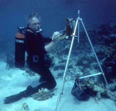
In this photograph, noted fish painter Stanley Meltzoff (1917-2006) appears to be “plein-water” painting on the sea floor. He is using an easel, a palette, a brush, and scuba gear.
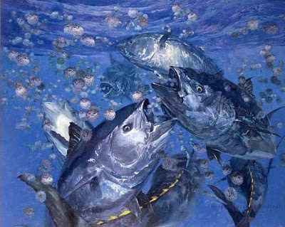
But the artist explained that it was a hoax. “Having often been asked how I paint a fish underwater,” he said, “I decided to photograph the process for an exhibition catalogue, and I included the obvious impossibilities in the photo to make it unbelievable." (Below: a studio painting by Meltzoff)
“The figure standing before the easel has no mask and so is unable to see underwater, but people take it seriously and ask what sort of paints I use and how I get the fish to pose.” (quoted from Meltzoff & Rivkin , 2010)
Earlier artists such as Zarh Pritchard (1866-1956) actually painted underwater. In 1904, Pritchard went to Tahiti, where he swam underwater, holding his breath while making sketches first using using crayons on paper that had been taped to glass and then oiled. He then acquired the only diving suit in Tahiti and produced the first genuine undersea paintings. (Burgess, 1994, pp. 123-124)
“For his underwater work Pritchard used lambskin soaked with oil and brushes thoroughly soaked in oil. Wearing a diver's helmet, serviced by a tank from a boat on the surface, he sank to the seafloor with a coral or stone weight, selected the view that he wanted, had his canvas and materials lowered to him from the boat above, and painted for about half an hour....He preferred the depth of about 30 feet, where he found the light clear and at its best. In calm waters off Tahiti he could actually leave his easel on the seafloor and go back the next day to finish his picture. Most of his underwater work was used as sketches for later completed pictures.” (Shor, 2010)
Zahr wrote about the world where he most loved to paint: "It is a dream world in which everything is enveloped in soft sheen. On reaching bottom, it is as if one were temporarily resting on a dissolving fragment of some far planet. Nowhere does substance appear beyond the middle distance and material forms insensibly vanish into the veils of surrounding color" (Burgess, 1994, p. 158).
Many of his paintings were brought back to San Francisco where they were destroyed in the 1906 earthquake.
I would like


.jpg?picon=1009)


That fine little oil painting looks like it could be the Burren. We hiked there in October, visiting the wedge tombs and the cave hermitage of Saint Colman MacDuach.
Happy Saint Patrick's Day to you, Jim!
I love the light in your Ireland painting.
May your pockets be heavy—
Your heart be light,
And may good luck pursue you
Each morning and night.
Thanx for the heads up on the concert and the new album.
Dan’s music is really great! We have his last cd: “Traditional Irish Music on the Button Accordian,” and really love it.
May your pens always flow, may your brushes always be wet, may your colors stay vibrant and clear, your sculpy flexible, and may your reality always remain imaginative!
Happy St. Patty’s Day! -McRQ
And if you're in Russia (or London) Happy Maslenitsa! *cough cough Boris Kustodiev intro hint hint nudge nudge*
Lovely light in that painting. I was thinking an area south of Sligo:-)
And thanks for the link to Dan's music on his Website, which I'm enjoying as I type.
Happy St Patrick's day, Jim!
Family, fun, and Great Music! Thanks for sharing a bit of your family's St. Patrick's day!
I love how festive the music sounds! I spent the night waiting tables serving green beer; wish the band we had last night was more like your son's.
May the road rise up to meet you!
Steve, yes, that's the Burren. We were staying in Corofin and driving all around to the cliffs and north. I forget the exact spot where I painted this.
Thanks, Roberto Krystal, Keith, Christian, Jean and MP. Sláinte to you all as well.