new posts in all blogs
Viewing: Blog Posts Tagged with: Comics/Cartooning, Most Recent at Top [Help]
Results 1 - 25 of 77
How to use this Page
You are viewing the most recent posts tagged with the words: Comics/Cartooning in the JacketFlap blog reader. What is a tag? Think of a tag as a keyword or category label. Tags can both help you find posts on JacketFlap.com as well as provide an easy way for you to "remember" and classify posts for later recall. Try adding a tag yourself by clicking "Add a tag" below a post's header. Scroll down through the list of Recent Posts in the left column and click on a post title that sounds interesting. You can view all posts from a specific blog by clicking the Blog name in the right column, or you can click a 'More Posts from this Blog' link in any individual post.
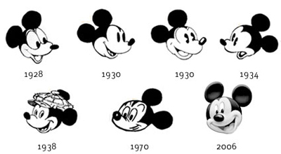
Mickey and Minnie were three-foot-tall mice with circles for ears living in a human world.
As long as the animation style was abstract enough, the absurdity of that idea worked. But as Disney animation became more realistic, it became more and more untenable.
Over the years, Mickey underwent a design evolution, including a major redesign by
Fred Moore for
Sorcerer's Apprentice.
The effort to make him and Minnie more dimensional and emotionally complex came with a price, however, because they became less believable. There was always the problem of those abstract circular ears, which did bizarre things on head turns.
Audiences eventually lost interest in the character, despite efforts to make him the official mascot for the Disney Studios.
Toy designer and
Mickey collector Mel Birnkrant puts it this way:
"Mickey disappeared because of Disney's push towards reality, which wrecked a lot of things in my opinion. As [veteran animator]
Ward Kimball explained to me—and this is the inside story—all of Disney was steering a course towards reality. And it got to a point where the story men, as well, could no longer swallow the existence of a three foot mouse. They could believe in Donald Duck as he was just large enough to exist in the human world (think
Three Caballeros). But Mickey no longer made sense to them."
"The absurdity of the situation is no better illustrated than in the post-Pinocchio cartoon when the kitten Figaro was developed to a new level of realism. There is a scene in which Minnie is giving Figaro a bath that is utterly surreal."

Jessica Abel's new book "
Out on the Wire: The Storytelling Secrets of the New Masters of Radio
" takes a fresh look behind the scenes at what goes into the making of your favorite NPR podcasts.
You might not think of podcasting as a visual medium, but it uses the mind's eye in a way that is suited to a graphic novel, and this non-fiction approach to the subject is surprisingly revealing.
Jessica Abel has a long association with podcasting, having collaborated with "This American Life's" Ira Glass many years ago to create a handbook about the making of the show that they could give to supporters.
That handbook grew in scope to explore the difficult process of creating narrative-driven audio documentaries. In the course of the book you meet the people behind favorite programs such as
99% Invisible,
This American Life,
Radiolab, Invisibilia,and
Snap Judgment.
Woven throughout the presentation, there's useful information about how to record and arrange sound clips, how to use music, and how to edit the spoken word, even down to individual breaths.
One of my favorite parts of the book is about story structure. Abel presents a basic story template that many podcasters use, called the "focus sentence":
"Somebody does something because __________(a motivation for doing that thing) but __________(a challenge to overcome.)"In other words, "A character sets out to accomplish something as a result of some motivating reason, but he has to face various obstacles along the way to that goal."
This focus sentence could be used by artists in any narrative medium to help them define their story.
Taking more than ten hours of sound clips and boiling them down to a ten minute segment that has a logical flow—and then adding voiceover and music—isn't always obvious. It often leads podcasters into what they call the "German forest," a zone of confusion that they have to work their way out of, generally with the combined brainpower of small committee meetings.
The book gives a deeper appreciation of the artistry behind this popular and fast-growing field of radio production.
----
Out on the Wire: The Storytelling Secrets of the New Masters of RadioJessica Abel also wrote a classic textbook on comics called
Drawing Words and Writing Pictures: Making Comics: Manga, Graphic Novels, and Beyond Jessica Abel's podcast "Out on the Wire"
Last weekend the Norman Rockwell Museum introduced a new illustration history website, which provides an rich resource for fans, collectors, and scholars.
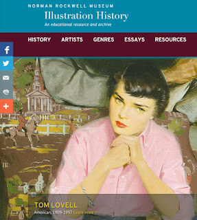
Some of the major names in illustration are featured with bios and sample images. There's also a growing collection of essays which will be written by museum staff and scholars of illustration around the world. The list of resources includes blogs, recommended books, college study programs, and interview videos.
For example, in this 2004, video, (
Link to video) Illustration historian Walt Reed (1917-2015) talks about how he got started as an educator for the Famous Artists School, how he got to know Norman Rockwell, and how that led him to opening the
Illustration House gallery.
The scope of the website encompasses
genres such as editiorial illustration, comics, cartooning, storyboarding, tattooing, and architectural illustration.
The focus is primarily on American illustrators, and there are a lot of important names that are inadvertently left out (please mention 'em in the comments!). And they have overlooked many genres of illustration, such as natural history, medical, paleoart, concept art, pin-up, imaginative realism, reportorial, editorial, and paperback covers. But I trust they'll fix these gaps—they're just starting out, and they're open to feedback.
(
Link to video) The Rockwell Museum has a lot of other videos and audio interviews in their collection that they're happily beginning to release, such as this video where Mr. Rockwell talks about how he found "plain, everyday people" from his small New England surroundings to stand in for people of all religions in his painting "The Golden Rule."

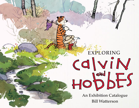
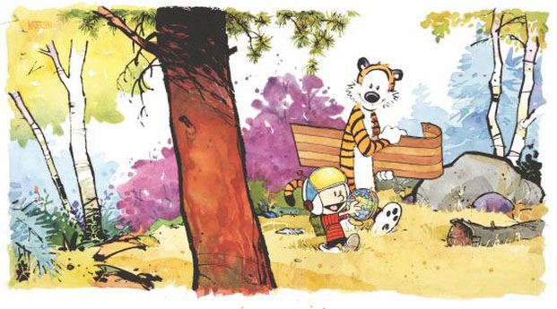
My first thought was: Do I really need another Calvin and Hobbes book?
I'm a fan of Bill Watterson's comic strip about the boy and his tiger friend, and I already have all the other books. So when I heard about the new exhibition catalogue, I wondered, does this book offer anything new?

Watterson created the strip in 1985. Wanting to keep his life private, and to maintain his relentless pace of dailies and Sunday strips,
with a few exceptions, he has always been reticent about interviews.
So the mind behind the comics has always been a bit of a mystery. Who were his influences, and what was he thinking while he was writing and drawing?

Watterson retired the strip in 1995, after only 10 years. His art had kept getting better, and the quality of the strip was at its zenith when he ended it. Since then he hasn't done any new Calvin and Hobbes work.
Other than the
Tenth Anniversary Book
, there isn't much published about his life or choices or approach or philosophy. So without new cartoons, what could the new book possibly offer?
The book is an exhibition catalogue, instigated by Watterson's donation of 3,000 originals to the
Billy Ireland Cartoon Library and Museum at the Ohio State University. The book reproduces a lot of his artwork from the originals so that you can see the rare bits of white-out, pencil lines, and paste-up.
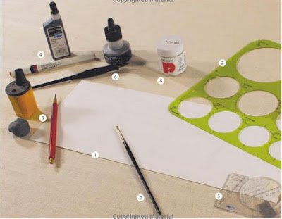
The book also includes a display of his tools, which were pretty simple and straightforward
1. Strathmore bristol board 3-ply
2. Circle template
3. Red mechanical pencil with 2H lead
4. Rapidograph #2
5. Ames lettering guide (which Watterson calls "clear plastic thing with holes")
6. Crow quill pen
7. Small sable brush
8. White-out
But the real core of the book is a 35-page interview with Watterson where he opens up about his beginnings as an artist, his influences, his travails with deadlines, his thinking about character and story, and his musings about comics on the Internet. This will surely stand as the definitive Watterson interview.
As an interviewee, he is everything you would have hoped for: funny, honest, self-deprecating, intelligent, and perceptive.
Here's just one example: Comparing doing coming strips and easel painting (which he has been pursuing in recent years for his own pleasure), he says:
"Since leaving the strip, it's been strange. In painting, there are virtually no constraints at all, and that leaves me completely flummoxed. I could paint something fifteen feet high or six inches high. I could blend and glaze and make it look like a photograph, or I could apply the paint with a trowel. I could work on a picture for a year, or I could finish it in two hours. I could paint what I see, or paint from my imagination, or paint abstractly. I can do anything I want, and the more I learn, the more possibilities I have. That much choice incapacitates me. Every option has some benefit and some drawback, and I change my mind every half hour. In hindsight, then, I have a lot more appreciation for the severe limitations of newspaper comics. It's going to be black and white, it's going to be ink on paper, it's all got to fit in this teeny little space, and it has to be done by yesterday. Okay, thank you, now I can get to work!"
Online article in the Washington Post with more quotes from the interview:
"Bill Watterson talks: This is why you must read the new ‘Exploring Calvin and Hobbes’ book"Book
Book on Amazon:
Exploring Calvin and Hobbes: An Exhibition Catalogue

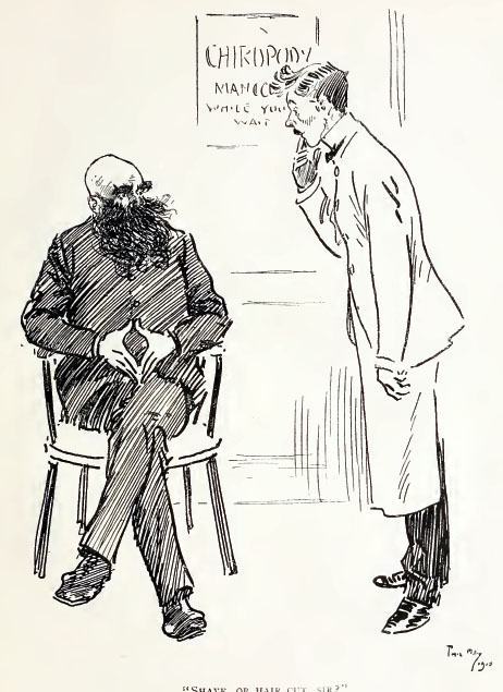
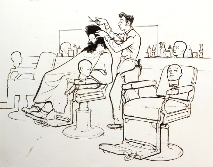
I like trying out new ideas when I'm drawing on location. One approach that I tried many years ago is the on-the-spot character study.
For this one, I was sitting in a barber shop while a customer was getting a haircut.
I told them what I was doing, and they didn't pay much attention to me after that. I used whatever elements of the scene helped to support the story, such as those odd head forms mounted on the barber chairs.
The customer didn't have a mop of hair and beard like that. I kind of made that up, and I exaggerated the barber, too. But I used real details from the scene, like the comb in the barber's back pocket.
I drew the picture with a brush and India ink over a pencil underdrawing, about 11 x 14 inches. I was inspired by the caricature illustration of Al Dorne, Norman Rockwell, and Mort Drucker.
Further reading

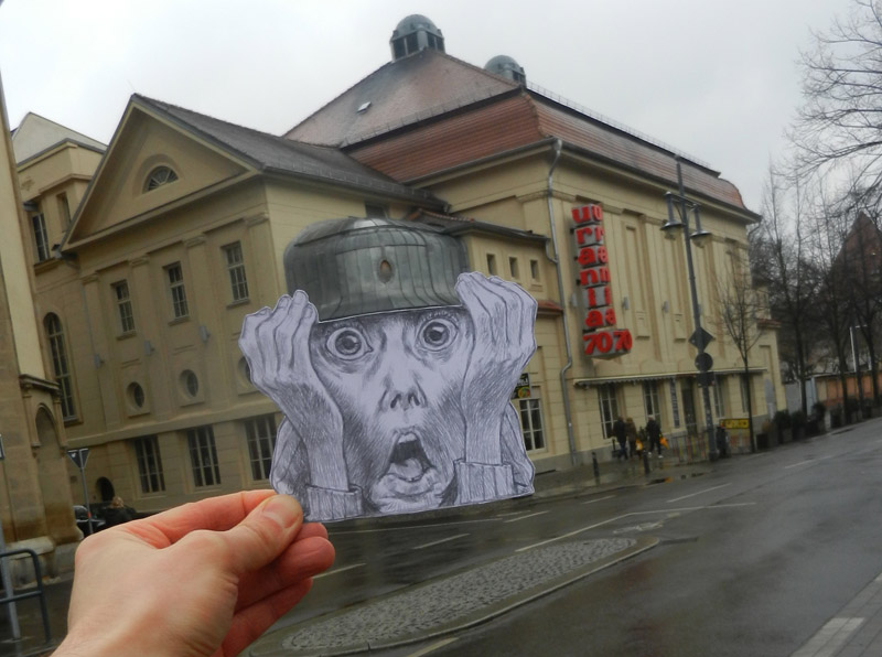
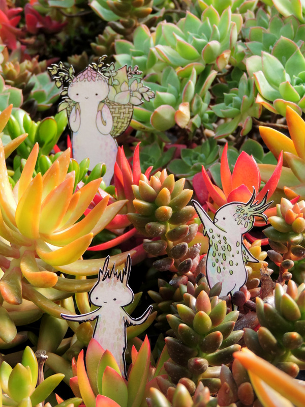
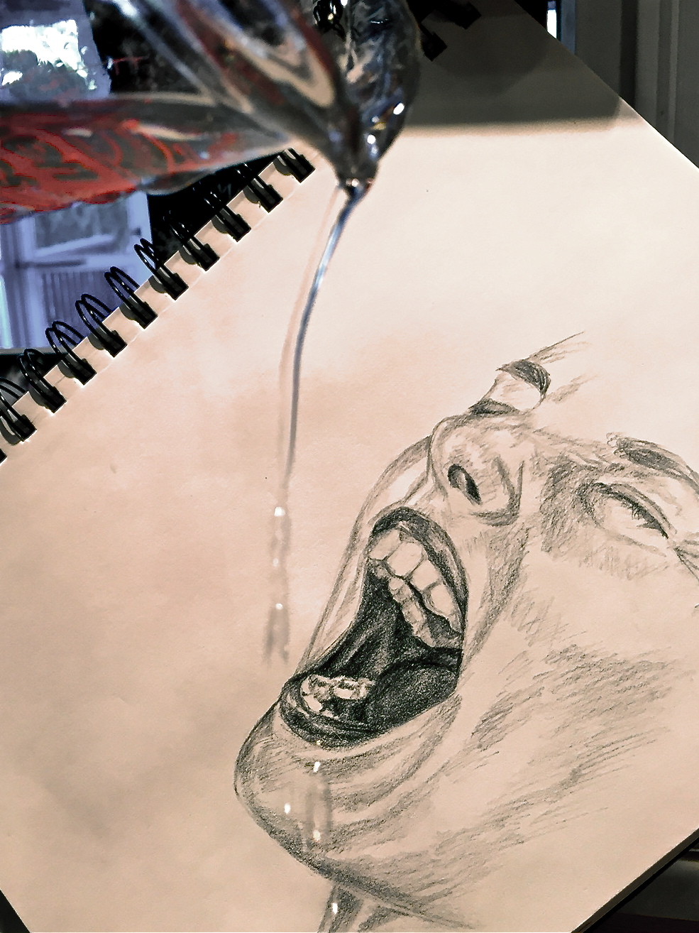
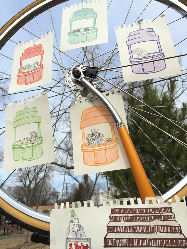
A few weeks ago, I announced the
Interactive Sketchbook Contest here on GurneyJourney, and we received dozens of entries. The challenge was to show a drawing interacting with the real world, either using a drawing on paper or transparent film, but it all had to be done without digital manipulation.
It was really hard to narrow the list down to 10 semifinalists, but here they are.
Tobias Gembalski
Keenan Gaybba
Leigh Ann Gagnon
Samantha Pancer
Alicia Goode
Neeraj Menon
Elena Pavlova
Emmanuel Laverde
Phil Lohmeyer
Melissa Sisk
Please vote for your three favorites in the poll at left (you can vote for more than one). The top three vote-getters will receive official "Department of Art" embroidered patches.
Thanks to all who entered. See the full bunch of entries, including all the Honorable Mentions on my
Facebook page.

An artist at work is always a fun subject for caricature. Here are a couple of my favorites.
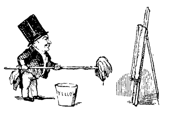
This one shows J.M.W. Turner on Varnishing Day, before the Royal Academy opens its doors to the public. He's a pot-bellied imp with a long-handled mop for a paintbrush. The pail of paint is marked "Yellow."
His friend Edmund Gosse described how he looked: "Instantly, he took up his place at a distance from the canvas, and at a certain notation of the light ran forward over the lawn with the action of a wag-tail, planting at the same time, rapid dabs of paint on the picture, and then retiring again, only, with equal suddenness, to repeat the wag-tail action."
Here's a photo of Sargent. The painting took him many consecutive evenings. He set up the canvas vertically in front of the flower garden, where the children posed with their paper lanterns.
-----
Portraits fellow artists on GurneyJourney

Christie's in Paris will be hosting an auction of comics and illustration on March 14.

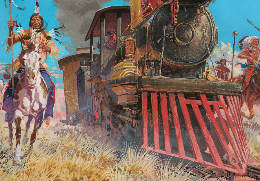
One of the lots is a
Jean Giraud cover for a 1970 Blueberry comic called the "Iron Horse," 36 X 49.2 cm (14.17 x 19.37 in.). Giraud's image of the American West evokes the work of Frederic Remington and Charles Marion Russell.
Giraud (1938-2012) is better known by the pseudonym Moebius, which he used for his science fiction work. He painted with equal virtuosity in almost every medium, including pen-and-ink, watercolor, colored inks, acrylic, and oil.
This one is in gouache. The detail shows the variety of strokes and colors he uses to describe the complex forms of the train. He probably executed a careful underdrawing first, but he didn't hesitate to cover it up with opaque paint.
Gouache allows for a variety of handling, from fine delicate strokes, such as those of the grasses in the foreground, juicy blobs, such as on the horse, or brilliant opaque color, such as in the sky.
The upcoming Christie's auction will include a fine selection of
bandes dessinées and illustration, including Uderzo, Bilal, Manara, Pratt, Schuiten, Juillard, and Guarnido. The selection was made by
Galerie Daniel Maghen of Paris.

 |
| "Shave, or hair cut, sir?" "Corns, you fool! |
Phil May (1863-1904) was an English cartoonist known for his deft and economical pen-and-ink caricatures. He grew up around the theater, so he was familiar with music hall actors and types.
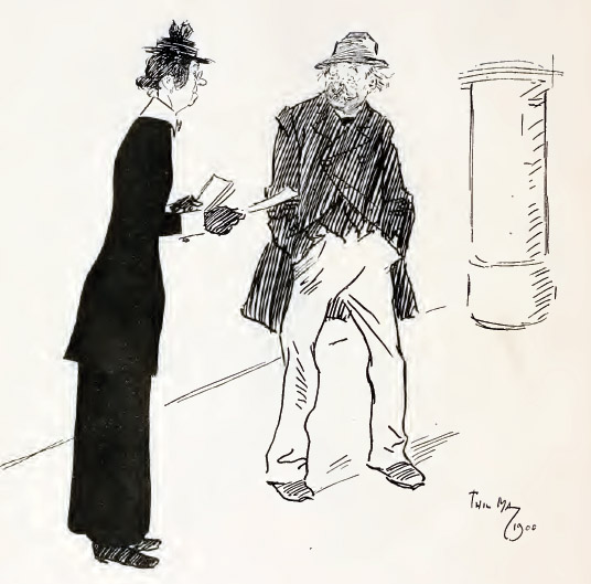 |
Benevolent Lady (distributing tract to inebriate, who has refused to accept one), "Do take one. If you read it, it will do you good." Drunk (pulling himself together), —"Madam, I writes 'em." |
He went to London and was so poor for a while that he slept on park benches, and he got to know all the varieties of gutter snipes. He portrayed them with a kindly wit and a sympathetic eye.
 |
| "Mos' 'stronary thing! a' most shertain th'was shome coffee in it." |
He was so prolific that a publication came out using just his pictures, "Phil May's Illustrated." His cartoons of drunks and street characters made him wealthy and famous.
 |
| Portrait of Phil May by J. J. Shannon |
He liked to wear colorful outfits. According to John Lavery, "The last time we met he came to his studio door wearing the loudest suit I had ever seen. Seeing my look of surprise, he smiled and said, 'Come in and listen to it, dear boy.'"
 |
ARTIST: 'My good man, may I have the honour of sketching your likeness? I am Mr. Phil May."
RUSTIC: 'Oh! are yer? Then, this time you'll be Mr. Phil Mayn't." |

 |
| Left: Female Bust by Picasso, 1937. Right: Popeye by E.C. Segar, 1929-1937 |
While Picasso was experimenting with abstraction in the world of galleries and museums, another abstract art movement was playing out right under people's noses in the realm of comic characters.
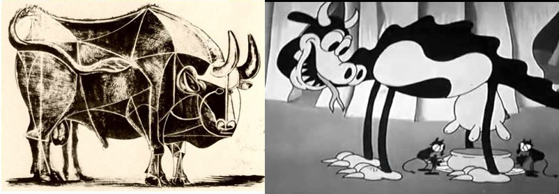 |
| Left: Picasso Bull, 1945. Right: Disney Studios Hell's Bells, 1929 |
In both modes of image-making, artists discovered that a certain power derives from simplification, from stripping away layers of reality and searching for basic psychological symbols. They recognized this power in the older work of the cave painters, the Egyptians, the African mask-makers, and the Japanese printmakers, to name a few.
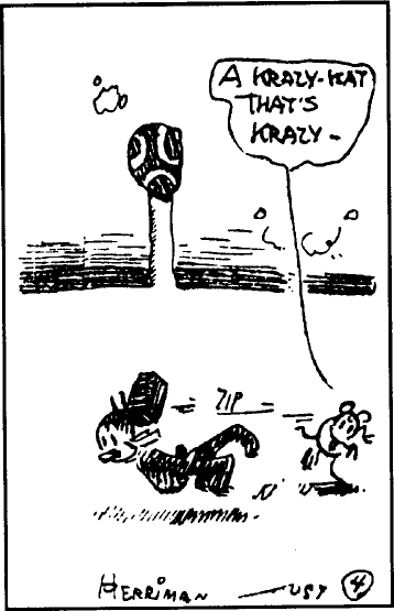 |
| George Herriman, Krazy Kat, 1918 |
The forces driving innovation in the two movements was different. In animation, the whole medium was new; there was no grand tradition of painting to overthrow. No one had seen drawings move before. They were alive! Simplification was a practical and economic necessity because they had to be hand-painted by the thousands on acetate cels. It was a collaborative and often anonymous enterprise, yet no less innovative than the work of the easel-painters.
Cartoon characters in the newspapers had to be reduced to something that could be printed on a mass scale. As the decades passed, comic characters were reproduced more and more quickly at relatively small sizes on cheap paper.
But the most important difference was that images in the world of comic characters had to be expressive. People had to love them. They had to convey character and story and personality. Without that, they were dead on arrival. There was no artificial life support system to keep them going. If no one loved them, they died.

The language of abstraction in the world of comic characters took a while to develop. The Yellow Kid and Little Nemo were among the earliest newspaper characters, and they were still based more or less on the arrangement of a real face. By the time Betty Boop arrives (lower left) in 1930, we're very far from reality.
Mickey's earlier incarnations had dots for pupils floating in a big white shape that could be either the whites of the eyes or a big forehead.
When Fred Moore redesigned Mickey in 1938 for Sorcerer's Apprentice, his pupils became white ovals with smaller pupils inside them. But Mickey always had those two purely abstract circles for ears, which became a problem as Disney Studios strove for more and more realism.
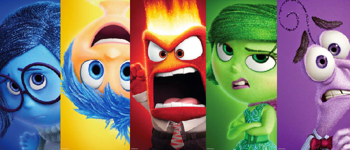 |
| Characters from Pixar's Inside Out. All Disney images ©Disney, Inc. |
The give and take between realism and abstraction continues to this day with character designers in the 3D digital animation world deciding how to boil down the characters to their simple essence. The goal is always to make them more expressive, to make their emotions come across better in a story.
The person who first got me thinking about comics as the "other abstract art movement" was toy collector and inventor Mel Birnkrant, who is fascinated by the design of comic characters, especially between 1920 and 1940. In this heretical view of art history, the art of comic characters is not only a legitimate art form, but perhaps the most protean, innovative and enduring form, which transcends all the "isms," and is the central story of 20th century art history.
Mel says, "Isn't it ironic that modern art had to fight so hard to introduce abstraction to the world? When all the while, abstract art had already been peacefully introduced and willingly accepted by an eager public, many years before, in the form of comic characters."
-----
All copyrights to their respective holders.

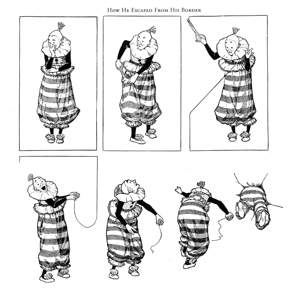 |
| Winsor McCay, "How He Escaped from His Border" |
On this bright new day of 2015, let me offer my hearty wishes to each and every GurneyJourneyer. May we all escape from our borders—from whatever confines or limits us—and leap bravely into new dimensions.

 |
| A.B. Frost "The Power of the Human Eye" from Stuff and Nonsense, 1913 |
The new issue of Illustration Magazine has a feature on A.B. Frost (1851-1928), known for his humorous pen-and-ink illustrations and his realistic wash drawings of the American rural scene.
I love the early days of humorous illustration, when standard cartoon conventions weren't really established, and "straight" illustrators were finding their own ways to make drawings funny.

The article contains 42 illustrations by Frost, some reproduced full page, along with a biography by Gary Land. He tells how Frost got started with his popular "Uncle Remus" illustrations, and how his studies under William Merritt Chase loosened up his painting style, even though he was color blind.
The issue also has features on Virgil Finlay, Tom Miller, and William Meade Price.
You can
order the magazine online or find it at your local newsstand.
Illustration #46Wikipedia on A.B. Frost
Every Thursday night in Los Angeles, a group of artists gets together to draw from the model, but this is no ordinary sketch group.
Organized by
Art Center teacher Bob Kato, attendees of
the Drawing Club work from costumed models who are set up with props and set pieces to suggest a specific character. Themes include such classic types as "The Detective," "French Maid," "The Samurai," or "The Rock Star."
The Thursday night sessions are mostly short poses ranging from 5 minutes to a half hour, and they have long poses on Sundays.
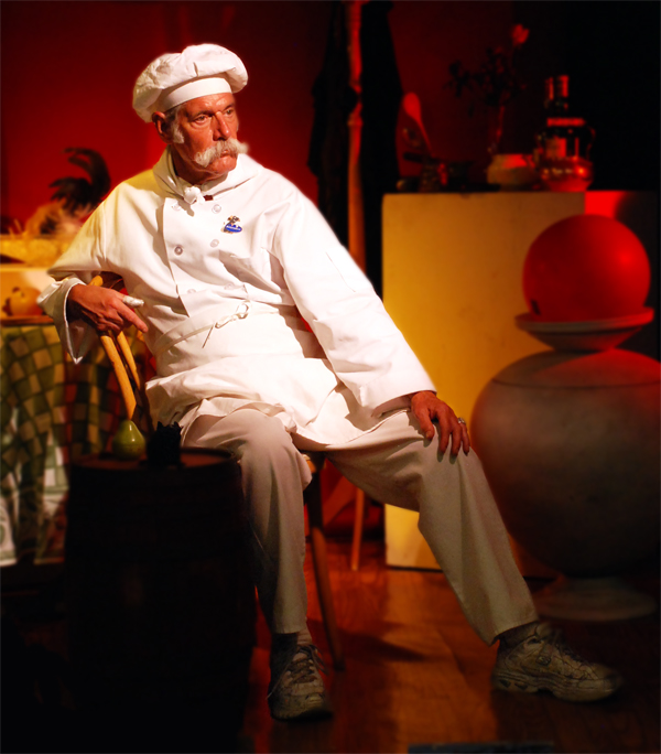
For example, here's Steve Jacobsen modeling as The Chef.
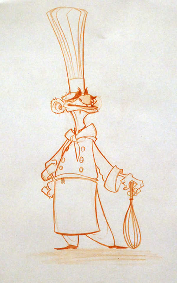
And here's one of the drawings by visual development artist and character designer Brett Bean.
The Drawing Club is not a class; it's more of an open workshop. Anyone who pays the $20.00 entry fee can attend, and the regulars include a lot of master animators and character designers from Walt Disney Feature Animation or DreamWorks Animation who are looking to brush up on their drawing skills. There are also plenty of students, and a spirit of experimentation.
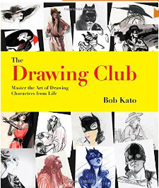
Bob Kato recently released a book of some of the work that has come out of the Drawing Club. The 9x9 inch softcover edition is 144 pages long, and is lavishly illustrated with examples from 66 different artists.
The text by Mr. Kato is full of encouraging tips for going beyond what you're actually observing from the live model. He suggests a variety of media: pencil, markers, brush-and-ink, watercolor, and digital.
Mr. Kato explains how each artist approaches the challenge differently depending on the kind of work they do.
"Story artists like models to do quick, daring poses because they're looking for gestural movement as it relates to storytelling. Their sense of design is heavily invested in the communication of the moment, rather than what media looks best....The character artists, on the other hand, are always looking at the model like a raw ingredient that will be turned into their own version of the character. When the model shows up in costume and starts posing, they look at the shapes made by the costume and character and get to work redesigning...to make the character funnier, scarier, happier, or sadder. They take the pieces apart—a gangster's hat, tie, overcoat, drooping cigarette, and gun—and create their own version."
Book:
The Drawing Club: Master the Art of Drawing Characters from Life
Website:
The Drawing Club

Frederick Henry Townsend (1868-1920) drew this cartoon for the British humor magazine Punch.
OUR EVENING ART CLASSES HAVE COMMENCED
Mr. X. (our dear Professor, who always puts things so tellingly): "In conclusion, I can only repeat what I said last Term—'It's all light and shade, Ladies, whether you're painting a battle-piece, a bunch of grapes, or a child in prayer!'"

Whitney Darrow, Jr. (1909-1999) produced about 1500 cartoons for the New Yorker. A fine draftsman who studied at the Art Students League, Darrow put a lot of careful planning into his cartoons.
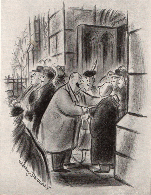 |
| "Reverend, you certainly sold me!" Whitney Darrow, Jr., 1950 |
The original drawing was 9x12 inches, built up with carbon pencil line and charcoal, and solidified with watercolor wash.
Once he got an idea, his first step was to make a number of small sketches to help visualize the situation. Should it be indoors or out? Should the salesman be taller than the reverend?
After he worked out the composition, he submited a rough to The New Yorker. He had two possible captions: "You certainly sold me!" or "Well, you certainly sold me!" The caption actually used (see above) was still another variation.
Once he knew the setting and arrangement of figures, he did a larger sketch to work out the perspective and the cropping.
The final drawing may seem spontaneous, but it was the result of a lot of preliminary work to finalize the gestures and expressions.
Even after the rough was approved, he redrew the composition several times. If you compare this one to the final at the top of the post, he deleted the woman at the right, and he lifted the salesman's hand (and hat) onto the reverend's shoulder.
----
Adapted from the Feb. 1950 issue of
American Artist. Thanks,
James!

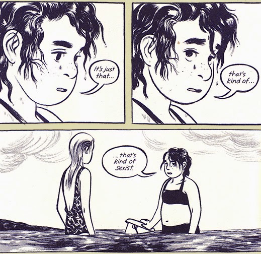
A new graphic novel by the cousin team Jillian Tamaki and Marika Tamaki, This One Summer follows the friendship of two girls, Rosie and Windy during a summer they spend together at a lake house.
Against the backdrop of family dramas and neighborhood crises, they go swimming, watch movies, dance, eat, and talk, trying to make sense the adult world from their perspective of preadolescence.
Both the writing and the drawing are natural and well-observed, and the close pairing of word and pictures leads to moments of real poetry.
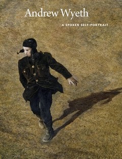
Between 1964 and 2007, Life magazine editor Richard Meryman visited Andrew Wyeth and let him talk —with the tape recorder running. The resulting 400 hours of material were boiled down to a 126 page book called
Andrew Wyeth: A Spoken Self-Portrait
Wyeth's musings, together with a peppering of quotes from family, friends, and critics, gives a powerful insight into Wyeth's unconventional thinking. There are quite a few photos, paintings, and sketches included in the book, and the back of the book has a portfolio of photos of Wyeth's spare studio.
By way of example, here's what Wyeth says about painting in watercolor: "You've got to be a perfect ass to paint the way I do. My best watercolors are when I lose all control—gobs of paint and scratches and spit and maybe mud spattered against the sky. You start to clean it up and there's no life — just smooth things maybe done in the studio with a hairdryer to blow your washes."
"I'd rather miss sometimes and hit strong other times than be an in-between person. If I lose this wildness, I'd be just a perfectionist. I certainly don't want to die without trying every means possible to get what I want. It doesn't matter if you stand on your head and use your feet if you get what you want. I did as many as six watercolors a day and might get one or two that came off."
At Amazon:

People often distinguish hand-drawn animation from CG animation by referring to them as "2D" and "3D." This distinction leads naturally to the thought that hand-drawn animation is primarily concerned with shapes, silhouettes, and other flat graphic qualities.
But really during the Golden Age of Animation in the 1930s and '40s, animators had to be very aware of 3D forms. When Disney animator T. Hee developed the caricatures for the short "Mother Goose in Hollywood," he thought of them in terms of dimensional volumes, based on spheroids, and seen from different angles.
The mouth on the Katherine Hepburn model took a lot of special care because it's not just a flat downward crescent; it also goes
back into the head, and he notes how far back it should go as seen in profile.
Here's the Silly Symphony from 1938, where you can see the caricatures in action. Look for Katherine Hepburn, The Marx Brothers, W. C. Fields, Charles Laughton, Spencer Tracy, Laurel and Hardy, Edward G. Robinson, Clark Gable, Fred Astaire, Greta Garbo, Fats Waller and Cab Calloway. Because of the racial and ethnic stereotypes, the film isn't often seen these days.

When realistic adventure comic strips appeared in the newspapers, it was a big change from the line-dominated cartoon style that had prevailed until then.

One of the pioneers of adventure comics was Milton Caniff (1907-1988). Caniff used dramatic blacks, applied with a brush, providing an opportunity to sink some forms into silhouette, or present mysterious lighting effects. He took some of his inspiration from work he saw in book illustrations.
Milt Caniff's studio mate was Noel Sickles (1910-1982), who had drawn an adventure strip called Scorchy Smith. Sickles was always interested in dramatic, realistic storytelling. He showed Caniff "a set of illustrations by Harold Von Schmidt for Willa Cather's Death Comes for the Archbishop —employing lush black brushwork, defining objects by shadows as much as outlines—Sickles introduced ultra-realism and impressionistic linework to the comics." The quote is from America's Great Comic-Strip Artists
 , by Richard Marschall.

When Von Schmidt (1893-1982) undertook to illustrate the lavish 1929 edition of Cather's book, he took six months off his magazine illustration career and traveled to the American southwest to see the frontier settings of Cather's book. He produced over 60 black and white illustrations, using a brush and ink style where he grouped the cast shadows with the shadow side of the form to create mysterious shapes.

Von Schmidt was very proud of the book, and it influenced not only adventure comics but pulp illustration and European comics.
More examples of Von Schmidt's work at Jim V.'s Illustrators websiteDeath Comes for the Archbishop
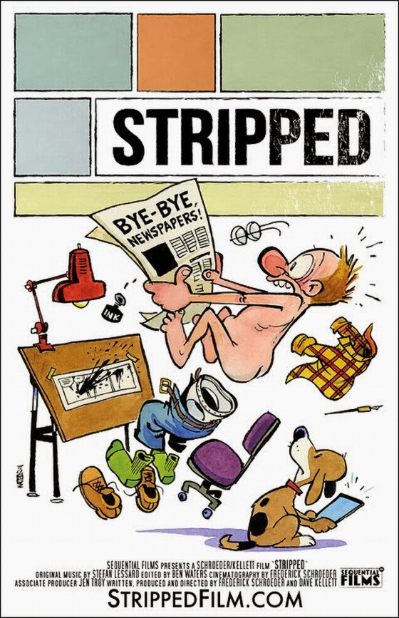
A feature-length documentary has been released about comic strips and how they're coping with the disappearance of newspapers. The video includes a poster by the elusive Bill Watterson (Calvin & Hobbes), along with on-camera interviews with Jim Davis (Garfield), Cathy Guisewite (Cathy), Scott McCloud (Understanding Comics), Mort Walker (Beetle Bailey)
and 70 others.
(
Video link) Here's the trailer. You can
order the documentary now on iTunes.
Stripped Film official websiteStripped Film on Rolling Stone
Thanks, Tom Hart!

The new issue of
Illustration magazine has just arrived. The issue features Pete Hawley, whose perky and stylized females were used in countless swimsuit and underwear ads for the Jantzen company.

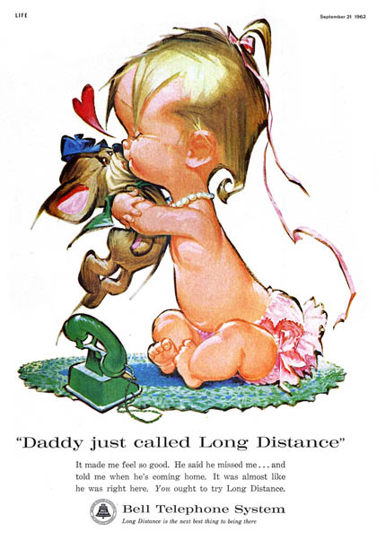
After the ad account went photographic in the early 1960s, Hawley shifted his style to paint cute kids for greeting cards and for Bell Telephone ads.
Illustration issue #39 also has a long article on
Heinrich Kley (1863-1945), best known for his darkly satiric pen and ink drawings of dancing hippos and elephants. The article includes 21 illustrations, many of which were never seen in the familiar
Dover editions
. There's also an interview with German art historian Alexander Kunkel, who has done extensive research on Kley.

Until now, there have been a lot of false stories about Kley being a madman, but in fact he was fairly convention—at least on the outside. His unbridled imagination has inspired many artists over the years, including Walt Disney, who publicly credited the influence on Fantasia.
The interviewer is Joe Procopio, who has just come out with two new books on Kley in his
"Lost Art" series. I haven't seen the books, but
the book trailer promises a lot of intriguing images.
Illustration magazine website
Today's Inspiration on Pete Hawley
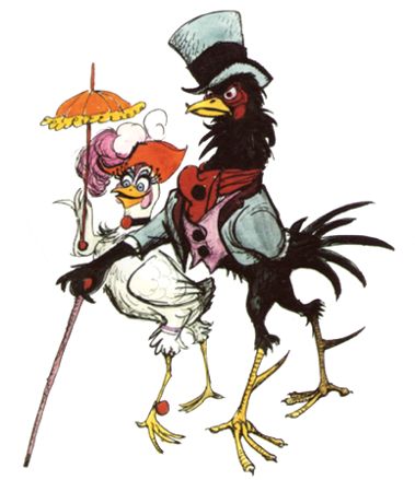
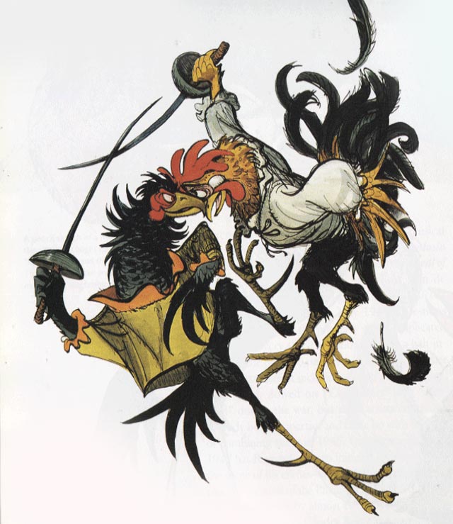
If anyone could draw a sympathetic looking rooster, it was Marc Davis (1913-2000). The senior Disney animator was a master of designing appealing characters, from Brer Rabbit to Tinkerbell.
He teamed up other veterans Ken Anderson, Woolie Reitherman, Milt Kahl to develop a animated feature that told the story of Chanticleer, the rooster who was so proud that he thought his "cock-a-doodle-do" brought on the sunrise. The story wove together the comedy by Edmond Rostand (of Cyrano fame) together with the classic tale of Reynard the Fox.
Unfortunately the material failed to win over Walt Disney, and it might not have worked with American audiences. The studio cancelled the project and put its muscle behind "The Sword and the Stone" instead.
Fortunately, Davis's drawings survive as a fine example of character design.
Books:
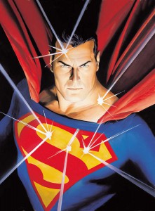
An exhibition of the comic book art of Alex Ross will be opening on Saturday, November 10 at the Norman Rockwell Museum in Stockbridge, Massachusetts.
"Paintings and sketches from his early career from projects like Marvels and Kingdom Come will be included, as well as works from more recent projects, such as Justice, Flash Gordon, and Green Hornet. Showcasing the heavy influence of American illustration and Pop Art on Alex Ross, works by Andy Warhol, Norman Rockwell, Andrew Loomis, and JC Leyendecker will be included. Works by Lynette Ross, the artist’s mother and an artistic inspiration, will be featured, as will Myths prints created by Andy Warhol, featuring many of the subjects of Alex Ross paintings, including Superman, Uncle Sam, and the Wicked Witch of the West from The Wizard of Oz."
The exhibition ends February 24, 2013.
Alex Ross will appear at the Norman Rockwell Museum on Saturday November 10, 2012 from 6:30 pm – 8:30 pm. Commentary at 7 p.m. Autographs (limit of 2 – 3 items per person) with the artist to follow.
Pier Francesco Mola (Italian, 1612-1666) drew this page of pen and ink sketches of clerics and priests. These must have been drawn to amuse his friends.
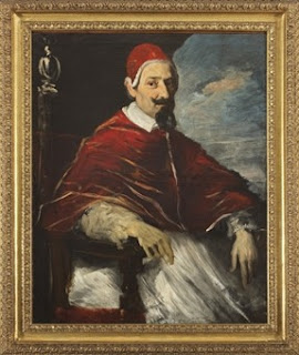
This unguarded satirical humor has a special edge, since Mola owed much of his success to important portrait commissions from members of the Church, including the pope.
(Video link) In this video produced by the National Portrait Gallery, artist John Kascht shares the thinking behind his caricature of Conan O' Brien.
"I don't think about caricature as distortion. It's magnification. There's a big difference. It's precisely because I am going to amplify someone's features that I do care about clarity."
Thanks, Peaceartist.
View Next 25 Posts


.jpg?picon=1009)


.jpg)


I enjoyed looking at Phil's blog and website. I'm mostly a stranger to digital tools, and I'm curious to know a bit about the hard- and software that people like Phil use. I've noticed, in looking at some other digital sites, that the artists don't tend to discuss that. Any suggestions about how I could find out a bit about their tools and techniques?
Tom, I believe he is using Photoshop - - most likely with a Cintiq or some other Wacom tablet. Painter is also a popular program, and for those just getting started Sketchbook Pro is a good choice.
psd.tutsplus.com has quite a number of tutorials and links to digital artist. Feng Zhu also has some beautiful work and videos. With respect to hardware - - Mac or Windows both work fine - - the key is RAM and a good monitor.
Hope that helps a little.
Thanks, Jim, for that very generous and helpful answer. It's not likely I'll be able to explore digital work any time very soon. But someday, I'd love to.