new posts in all blogs
Viewing: Blog Posts Tagged with: Greg Pizzoli, Most Recent at Top [Help]
Results 1 - 12 of 12
How to use this Page
You are viewing the most recent posts tagged with the words: Greg Pizzoli in the JacketFlap blog reader. What is a tag? Think of a tag as a keyword or category label. Tags can both help you find posts on JacketFlap.com as well as provide an easy way for you to "remember" and classify posts for later recall. Try adding a tag yourself by clicking "Add a tag" below a post's header. Scroll down through the list of Recent Posts in the left column and click on a post title that sounds interesting. You can view all posts from a specific blog by clicking the Blog name in the right column, or you can click a 'More Posts from this Blog' link in any individual post.
 Robert Miller was known to everyone except his own family as Count Victor Lustig (or by any of forty-five other aliases). He was a con man, with a career full of ways to separate people from their money, including, believe it or not, selling the Eiffel Tower. He was “one of the most crooked con men ever to have lived.” Not your usual subject for a children’s picture book, but Geisel Award winner Greg Pizzoli pulls it off. Like any good picture book, Tricky Vic: The Impossibly True Story of the Man Who Sold the Eiffel Tower is written with a light touch, and the mixed media illustrations are gorgeously simple-seeming with plenty of visual play that will appeal to children and adults alike, and which complement and extend the text. Vic’s face, for example, is not a face at all, but a fingerprint, and one of his “marks” (victims) was Frenchman Andre Poisson (French for fish), his head replaced with that of a fish, with a speech bubble saying, “He took the bait.”
The beautiful design, the informative sidebars, and these amusing visual elements ought to play well with the Caldecott committee. These little touches are subtle but add up to a winning package. The muted color choices are a bit of a nod to the Elliot Ness era and allow the reader to feel as if he or she is in the middle of an old movie. A gray-green sensibility runs through the book, while the fingerprints and fish heads serve to keep the tone light. However, the committee may also consider one historical issue: Pizzoli says in his author’s note that he altered the actual timeline of Robert Miller’s story, placing Vic’s conning of Al Capone before the sale of the Eiffel Tower, when most accounts suggest he did that afterwards. Pizzoli felt he was giving precedence to character development over exact historical accuracy. Can he do that and have the book still be nonfiction? Will that matter to the Caldecott committee? As a former member of the Sibert committee, I can just picture the discussion through that Sibert lens. I think the Caldecott committee will see this as nonfiction: everything in the text is true — even if the sequence of events has been skewed — and it helps that Pizzoli points out what he did and why. It’s a bit of literary license in the service of good storytelling, which is what any book committee is looking to honor.
The post Tricky Vic appeared first on The Horn Book.
Discover the work of Greg Pizzoli, Cartoon Brew's Artist of the Day!

by Greg Pizzoli (Viking, 2015)
I’ve read lots and lots and lots of books for kids. I’ve read lots of questionable ones and I’ve read lots of spectacular ones. And then I’ve read a handful that are simultaneously spectacular and fresh and inventive and completely honor how smart kids are.
This is one of those.
You might know Greg from that burping crocodile or the hound with a need for speed, but did you know a book about an impossible con is exactly what the world of kids’ books needed? Meet this Greg.
Actually, meet Robert Miller.

(click to enlarge)
A normal kid, one who leaves home to become an artist despite his parents’ best efforts. A normal kid with a penchant for billiards, poker, and gin.
A grifter known as Count Victor Lustig.

(click to enlarge)
This liqour induced pow-wow below the Totally Legit delivery truck might be one of my favorite moments in this thing. It’s accompanied by a sidebar of Totally Legit information about the Prohibition. This blend of grit and truth and history hangs right in the suspense of Vic’s story. It feels like Saul Bass made one of those The More You Know PSAs right there on the page.

(click to enlarge)
One of the greatest tricks in this whole book is how we see the silly, unsuspecting faces of Vic’s marks, but never his. Only a thumprint. Both the clearest and fuzziest identification.
Mixed-media collage always yields great texture, just by its very nature. But Greg adds custom-made rubber stamps, actual photo texture from the floor of the Eiffel Tower, and like we’ve already seen, his very own thumbprint. This approach is as layered and grungy as Vic himself. This book can’t be slick and clean and soft–it needs depth and dirt and intrigue. That’s what it’s got.
That’s no con.
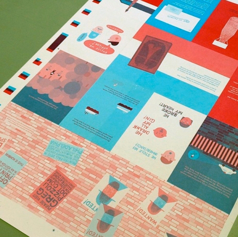
Check out these endpapers. Brick wall, posted bills, danger, and suspense.

(click to enlarge)
Why does that not look like the full width of the book, you ask?
Because then there’s this:
 In the best of places, that sneaky space under the dust jacket, where unsuspecting grownups don’t dare peek. Kids do. They know where the good stuff is. And this is the good stuff: The Ten Commandments for Con Artists by our hero.
I think 8 is my favorite. Or 5. Or 10.
And now, don’t miss Greg and Julie’s chat about this book over at Seven Impossible Things. Lots to digest. Commandment 2 will be an impossibility.

I received a copy of Tricky Vic from Viking, but the comments are all my own. And speaking of Viking, huge kudos to the publicity team that sent the book like so:


By: Joy Chu,
on 11/4/2014
Blog:
got story countdown
(
Login to Add to MyJacketFlap)
JacketFlap tags:
Book trailers,
David Diaz,
Renata Liwska,
Janell Cannon,
Jon Klassen,
Robin Preiss Glasser,
Anna Raff,
Greg Pizzoli,
Salina Yoon,
Andrea Zimmerman,
Carolyn Fisher,
teaching children's book illustration,
David Clemesha,
Lizi Boyd,
Debbie Tilley,
fine art of children's books,
story-telling with pictures,
'Original Art 2013',
buy children's books instead of greeting cards,
Cannon Art Gallery,
Carlsbad CA,
Karen McGuire,
original art vs printed page,
traveling exhibit,
Add a tag

The William Cannon Art Gallery is part of the Carlsbad City Library Complex. Its entrance is on the right side of the courtyard, beyond these archways.

That’s me, giving my UCSD students — past and present — a private tour of the Original Art Show at Cannon Art Gallery. I’m pointing out aspects of Carolyn Fisher’s illustration work from Weeds Find A Way by Cindy Jenson-Elliott. photo by Denise Harbison
Why? Because after November 23, 2014 , the traveling exhibit, “The Original Art 2013“ at the Cannon Art Gallery, in Carlsbad CA will close!

David Diaz checking out the artistry on display at The Original Art
photo by Roxyanne Young
Don’t miss this exhibit! You’ll encounter 40 examples of the best-illustrated books of 2013, from the most talented in the field.
A highlight is the inclusion of published illustrators who happen to live in San Diego and Los Angeles, including Salina Yoon, Debbie Tilley, Andrea Zimmerman & David Clemesha, David Diaz, Janell Cannon, and Robin Preiss Glasser, to name just a few!
There’s a dedicated reading corner where you can sit and peruse the books each piece is culled from. Many of the originals include drawings, paintings, prints, etchings, and collages — a rare opportunity to fully appreciate the diversity of creativity applied to these works. Gallery curator Karen McGuire even adhered post-its to corresponding pages of each book, so that visitors can compare the printed result to its original, up-close!

Book trailers are played on a continual loop above the reading corner of the Gallery. photo by Joy Chu
There’s also a video featuring 19 trailers highlighting selected artists on display, broadcast throughout the duration of the exhibit. Don’t miss it — it’s at the reading corner! Here are just a few of the trailers you’d encounter.
IDEA: It’s not too early to order picture books for holiday gift giving! Give everyone you love a children’s picture book. It’s a bazillion times more enduring than a mere Christmas card! There’s something for everyone.
Like this one (below). Yes, Renata Liwska‘s original work is on display at The Cannon Art Gallery too!
Check out the work of Renata, and her multi-talented illustrator colleagues, at the Cannon Art Gallery, before it becomes yet another happy memory.
1775 Dove Lane
Carlsbad, CA 92011
(760) 602-202
Hours
Tuesday – Thursday: 9 a.m. – 9 p.m.
Friday – Saturday: 9 a.m. – 5 p.m.
Sunday: 1 p.m. – 5 p.m.
CLOSED MONDAYS
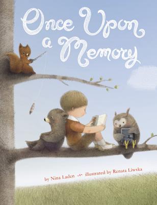
Illustration by Renata Lewiska; text by Nina Laden


"Do you run?" you might ask.
"Only when chased." I would reply.
"Do you blog?" you might ask.
"Only when tagged."
So thank goodness for K.G. Campbell tapping me on the virtual shoulder and saying... "You're it!"
Last week, the funny and fabulously talented K.G. Campbell was "it" in this 4 question game of blog tag. A game in which a bunch of authors and illustrators are running about tagging each other's blogs, answering questions about their working process.
Here is a link to Mr. Campbell's Q and A.
And here is mine...
Ready. Set. Go!
What am I currently working on?
I'm usually juggling 3 projects simultaneously.
This is what is on my desk today...

Work in Progress from SEA REX (Summer 2015, Viking) @mollyidle via Instagram
I'm also scribbling away on sketches for ZOMBELINA DANCES THE NUTCRACKER, by Kristyn Crow (Fall 2015, Bloomsbury).
And... FLORA AND THE PEACOCKS (Spring 2016, Chronicle)
How does my work differ from others of it's genre?
This is an interesting question. I think that if I were a writer of thrilling crime mysteries, or satire, or historical fiction, it might be easier to find a genre basis of comparison, and then to say how my work differs. But picture books aren't really a genre. They're a medium. They are means to tell a story, like a novel, or a comic strip, or a movie. There are as many different ways to utilize the medium of picture books as there are different people making them... that's one of the things I love most about them (picture books and picture book makers).
And while I don't constrain myself to any particular genre when working within the medium of picture books, I do find that the stories I gravitate towards, the stories I want to tell, do tend to have a few elements in common.... improbability, theatricality, sincerity and humor.
Why do I write what I write?
Because I enjoy it! And because I love a challenge.
An idea for a story will strike me, and the prospect of telling it, and telling it well, is at once tantalizing and terrifying.
The terror is what causes me to procrastinate.
I know the depth of the work involved in getting a story just right. It's daunting. No sane person would willingly spend months, or years, fussing over 32 pages and 200 words, or 50 words, or one word... or no words! So, often, I will sit on idea, mulling it over for ages in my mind before I ever put pencil to paper.
But the terror is inevitably overcome by the tantalizing vision I had in that moment when an idea lit. That warm mental lightbulb glow... The vision of how awesome the story could be... So, I start scribbling.
How does my storytelling process work?
Does my storytelling process work? This questions supposes that it does...and I like that idea...so I'm running with it! (This is the only other instance in which you will see me run.)
I sometimes wish fervently that I had a set process which worked for every story...
Every story, every project, seems do demand it's own way of working. And so, I find I'm reinventing the wheel whenever I start something new.
Sometimes the words come first, sometimes an image, sometimes a whole world magically appears out of nowhere and it seems all I have to do is take dictation.
But however it begins, I find myself amassing a bunch of words scribbled in my notebook and a bunch of earnest, if unintelligible, lines drawn in my sketchbook. They look like this...

When I think I have everything figured out, I start working on constructing full sentences and/or full sketches. That is to say, that I think I have everything figured out to make the story work. But that is a very different thing than having everything figured out that will make the story work as a picture book.
Those are two very different things. I mean, can make a really beautiful drawing that works compositionally... But that doesn't matter a lick, if it doesn't work in the context of the book. Pacing, page turns, design, all this gets figured out when I start working to scale on the sequential images. Like this...

That's the uphill work for me. Once the sketches are done, the rest of the process feels like coasting...

FLORA and the PENGUIN (September 2014, Chronicle)
Phew!
I am out of questions, out of answers, and out of breath from all this virtual running.
So...
Tag, Greg Pizzoli - you're it!

By: Carter Higgins,
on 5/13/2014
Blog:
Design of the Picture Book
(
Login to Add to MyJacketFlap)
JacketFlap tags:
design,
illustration,
typography,
book trailers,
color,
balance,
trailers,
composition,
movement,
color theory,
color palette,
CMYK,
shape,
greg pizzoli,
disney-hyperion,
spot color,
Add a tag
 by Greg Pizzoli
published 2014 by Disney-Hyperion
I’m honored and thrilled to have Greg Pizzoli back to the blog this week. About a year ago we talked about Kroc and The Watermelon Seed, and in the many weeks since, that thing (and Greg!) won the Geisel Award! My kindergarteners call him ‘the BURRRRPPP man’ which I’m pretty sure is the highest praise any mere mortal can achieve.
But today! Today is the birthday of Greg’s latest and greatest, Number One Sam. This is my favorite tweet about it: (And side note, you should follow Matt Roeser at Candlewick cause he has impeccable taste and eyeballs.)
And this (!) is the trailer:
 Greg chatted with me about process and art and picture books, and I’ve read these answers about a billion times and am still learning. Enjoy!
Your spot color. Wow! Can you talk about why such a stripped-down design with a limited color palette is such a powerful visual device?
Great question!
To be honest, I’m not sure. But, I think it comes down
to working from an intention, and just having a plan, or restrictions
set in place from the beginning. You can’t just grab another color
from somewhere – when it comes time to make final art, we’ve done
rounds of pantone tests and paper tests, and the limitations and
possibilities are in place, so nothing is casual. Maybe it makes you
consider things in a way that is unique to working in that way?
I know for me, if I’m doing a book that is printed in a limited color
palette, it can feel restrictive in one sense, but there is a real
freedom within the limitations, if you know what I mean. There’s not
endless guessing the way there might be with a CMYK book. Obviously we
do lots of tests and make sure we get the base colors right for the
book, but once that is done, I can start carving out the drawings and
not worry too much about the colors, because we’ve done so much work
on the front end. It’s a challenge I enjoy.
Here’s a photo of a spot color test proof.
Why do you think your stories are best suited to the form of the picture
book. What can you do in this form that you might not be able to in another?
This is a tough one, Carter. Boy, I come to your blog looking to have
a good time, maybe show a video or something, and you slam me with
this “why picture books” stuff. Sheesh. “Gotcha blogging” right here.
But that’s fine, I’ll play along.
I’m kidding, of course. But, it is a tough one. I guess it’s not all
that complicated for me. I’ve always loved picture books and I think
it’s because there are so many possible ways to solve the problem of
telling a story with text and images. It’s a cliche I think, but you
really can do anything in a picture book. But here again, I like the
restrictions. As much as I might complain to my editor that I “just
need one more spread” to tell the story, it’s actually nice to have a
structure where you have to fit a complete world, with a character, a
problem, and (maybe?) a solution to that problem in only 40 (or so)
pages.
There’s something about how deliberate every decision has to be
that is super appealing to me. I’ve been working on writing a longer
thing recently, a series, and it’s not as though I’m not deliberate
when working on it, but I’ll admit that it feels as though not as much
is hinging on each line or picture in the same way. With picture
books, you don’t have room for anything to feel arbitrary. I like
that.
Also, I thought you might want to see these. Sam started out as a
print of a weird dog (top) and then I made a print of another
(cuter) dog, and he kept coming up in my sketchbooks until he became
Number One Sam (bottom).

What do you think are the most important considerations when creating a book trailer?
How do you think through compressing an already spare narrative into a short
animation? Are there aspects to animation you wish you had access to in
picture book art or vice versa? (I guess mostly I’m curious about how book
trailers share storytelling space with picture books and what they can do
differently. Does that make sense?!)
Ya know, it’s a complicated thing this book trailer business. I am
really happy with the two we’ve done so far, but I definitely can’t
take all the credit. Jimmy Simpson, directed and animated both the
trailer for The Watermelon Seed and for Number One Sam, and he is
pretty incredible to work with. Both times we started working, I had
already finished the book, and I had a very basic sense of what I
wanted the trailer to be, but he figures out all of the transitions
and added all of the touches that make them work as well as I think
they do. For example, the “wink” shot from the Number One Sam trailer –
that’s all Jimmy. And of course, he does all of the animation.
I draw the stuff, which is somewhat complicated because you have to
keep everything separated, meaning draw the arm on a different layer
from the body, and the hand on a different layer than the arm, and the
ear on it’s own layer, etc. Basically everything needs to move
independently of everything else, but my characters are pretty simple,
so it’s not too big a deal.
And the music is key. My buddy Christopher Sean Powell composed the
music special for both trailers. What a talent, right? He plays in the
band Man Man, and has his solo music project called Spaceship Aloha,
and was a part of a pretty seminal band from these parts called Need
New Body. I’m thrilled we get to work together on this stuff.
But, to your actual question, I see the trailer and the book as
completely separate things. They have their own pacing, and their own
objectives. With the book, you want everything to feel complete, and
have an emotional pay off of some kind. And you have the narrative arc
to keep things together. With the trailer, it’s more of a tease. You
don’t want to give it all away. And I guess our objective is to just
make them fun and unique.
Book trailers have become more popular, and there is a sort of
template for how they are done that we have tried to stay away from.
We just want them to feel different enough to maybe stand out. It’s a
super small community in some ways, and my book trailers certainly
aren’t racking up millions of views or anything, but we enjoy making
them for their own sake, partly I think because we all just like
working together. If other people dig them, and check out the book on
top of that, that’s icing.
What types of trophies do you have lining your shelves? What kind do you
wish you had? Side note: What would a book called Number One Greg be about?
Beyond my published books, which I kind of think of as trophies in a
way, there are a couple. Last year when I finished the art for Number
One Sam, my editor Rotem sent me a trophy that I keep on my bookcase.
And recently I was looking through some old family photos and found a
first place ribbon that I had won for a school wide art contest in
the 1st grade. My family moved around a ton when I was little, so the
actual winning piece was lost. I remember it though! It was a big
piece of yellow poster board with a marker drawing of outer space.
Maybe it’s time to do a space book?
 And now for some art from Number One Sam. Thank you, Greg! (Click to make any of them larger.)


Tagged:
book trailers,
CMYK,
disney-hyperion,
greg pizzoli,
illustration,
spot color 
 by Greg Pizzoli
Last year I was super busy illustrating a book with a pretty quick turnaround. I think I got the offer in September, and the book was due January 1. So after sketches were approved and everything, I had a little less than three months to do the final artwork for a forty page book (plus covers). It was doable, but just. I wasn’t going have time for anything else. No screenprinting. No writing. Nothing.
Except . . . I had this opportunity. There was an offset printing class with an opening at the university where I teach part-time, and my department head offered me a chance to audit the class and make a book. The whole idea of the class is that you spend half a semester designing a single-sheet book to be printed on an offset press. The second half of the semester you make films, mix inks, and (under the guidance of the Master Printer) assist in printing the book.

I love offset printing and I love making books. I had worked on this press before so the learning curve wasn’t too bad. And the opportunity to make something on my own was just too appealing to pass up. So I signed up for the course and got to work on a project that had been brewing in my sketchbooks for a few years. It was pretty weird, and kind of dark, and I felt certain no publisher would ever be interested in it, so I decided to make a zine. Just an exercise in putting text and images together, simply made for the sake of making it.
Several times I almost dropped the class because of my other commitments. I was too busy to make the art for the zine the way I normally would, and I was nervous about it looking terrible when we went to print. My teacher encouraged me to stick with the class, but to simplify the art so I could produce it faster. She reminded me that I was making this just for me, not for anyone else. The idea that I wasn’t making this zine for publication freed me up considerably, and working on it was really refreshing—it was influenced much more by my design and comics interests, and it just felt different than my other work.
I printed the zine and mailed some out to some people I had worked with or hoped to work with someday. Not pitching the idea—but really just saying—“I love making this stuff! Here’s this weird thing I know you’d never publish that I made!”—excited to share it, but no expectations.

You might guess where this is going—within a month of sending it out, I had a two-book deal with Viking Children’s Books—both dream projects for me. I’ve been researching, writing, and drawing, and a greatly expanded version of that little pamphlet-stitch zine will be an actual picture book in stores next winter! It’s totally different than anything else I have done—and that’s exactly what made it so appealing to my new publisher.
So, looking back on that time last year I guess two things are apparent:
1) Sometimes limitations (meaning your time, or maybe the number of colors/words/pages you can use) will force you to be creative in unexpected ways and 2) Doing the work that you feel driven to do (as opposed to guessing what publishers will want) can produce work you might not expect—and even if you think no one could ever publish it—you might be wrong.
Good luck this month!

Greg Pizzoli is an author, illustrator and screen printer from Philadelphia.
 His first picture book, The Watermelon Seed, was published by Disney*Hyperion Books in 2013 and Publisher’s Weekly called it “an expert debut” in their starred review. Greg has more books in the works with Disney*Hyperion, Viking, Candlewick, and FSG.
Greg’s work has been featured in Communication Arts, 3×3 Illustration Annuals and he’s won two Portfolio Honor Awards from the Society of Children’s Book Writers and Illustrators.
After college, Greg spent two years as a full-time volunteer in AmeriCORPS from 2005-2006. In 2009, he received his MFA from the University of the Arts in Philadelphia, where he now teaches.
He recently gave up drinking (as much) coffee.
His screenprinted works have been exhibited in the United States, Canada, Spain and The Netherlands. His hand-printed artist books are in various collections throughout the country, including The Rare Book Department of the Free Library of Philadelphia.
See more of his work at GregPizzoli.com and GregPizzoli.blogspot.com. Follow him @GregPizzoli on Twitter.

Greg will send a random commenter a pair of hand screenprinted blank cards!
This prize will be given away at the conclusion of PiBoIdMo. You are eligible for this prize if:
- You have registered for PiBoIdMo.
- You have commented ONCE ONLY on today’s post.
- You have completed the PiBoIdMo challenge. (You will have to sign the PiBoIdMo Pledge at the end of the event.)
Good luck, everyone!


By: Carter Higgins,
on 5/13/2013
Blog:
Design of the Picture Book
(
Login to Add to MyJacketFlap)
JacketFlap tags:
color,
book trailer,
concept,
trailers,
texture,
composition,
color palette,
screenprinting,
guest post,
shape,
greg pizzoli,
the watermelon seed,
design,
illustration,
picture book,
Add a tag

by Greg Pizzoli
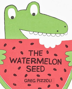
{published 2013, by Disney Hyperion}
I’ve been looking forward to this book for a long time, mostly because that cover is SPECTAZZLING. But also cause I follow Greg Pizzoli on Twitter, where he is clever and quippy and shares things like THE ENDPAPERS. And then this is what the publisher teased us with, so I was pretty much in love with this book right away:
With perfect comic pacing, Greg Pizzoli introduces us to one funny crocodile who has one big fear: swallowing a watermelon seed. What will he do when his greatest fear is realized? Will vines sprout out his ears? Will his skin turn pink? This crocodile has a wild imagination that kids will love.
Yeah. SO INTO THAT. The Watermelon Seed hits stores TOMORROW, May 14th, so you might want to go ahead and get in line. After you meet Greg, of course.
So I’ve also been looking forward to this post for almost as long. I’m thrilled to have Greg Pizzoli in for a visit. Welcome, Greg!


I call him “Kroc”. Sometimes my editor calls him “K-Roc” or “The Krocster”. Boy, does he hate that. My background is in printmaking, and I built a silkscreen shop in my studio, which is how I generate a lot of my work. I think my preference towards limited and deliberate colors comes from the printmaking. It could be laziness, but I’m going to say printmaking.
Even the first sketches of this book were in just a few colors. It just made sense to make the whole book feel like a watermelon. Plus, he’s a crocodile, so the green is already there.
Everyone at Disney*Hyperion was very supportive of my trying out different inks and paper choices to get the feel just right. We did CMYK v. Spot color tests and there was just no comparison. I think it would be tough to get that pink, and that green with CMYK. At least for me. We tried a few different paper stocks, too. I’m super picky.
 Basically you make a drawing in black and use that to make a stencil on a screen. Doesn’t matter how you make that drawing – by hand on tracing paper, with construction paper, in Photoshop – whatever you can use to get a drawing in black. Your screen, which is a frame of aluminum with a fine mesh stretched across it, is covered in photographic emulsion, and you expose the screen to light. Wherever the light hits the emulsion, it hardens and becomes water resistant.
BUT if you put your black drawing between the screen and the light source, the emulsion that is blocked by your drawing (which remember, is black, thus very light blocking-y), that emulsion stays soft. And you can wash it out with water. So everything that wasn’t blocked by your drawing is water resistant, and your drawing washes out of the screen, making a water resistant stencil in the shape of your drawing. You make one of those for each layer, or usually, color. WATERMELON was offset printed obviously, but I did a lot of screenprinting textures, etc to make it feel very printy. The spot colors definitely help there, too.
I’ve been teaching screenprinting for about 4 years at The University of the Arts in Philly. It’s where I met Brian Biggs. He took a continuing ed class I was teaching in 2009. He introduced me to my agent. I dedicated a book to him, but it hasn’t come out yet. I still owe him big time. I still teach! I love it.


Humor usually keeps me interested in whatever I’m doing.


I like to work with texture for sure, too. And shapes. Shapes, yeah, shapes are good. I know this is great interview material here. Breaking news, Greg Pizzoli “like shapes”. Today on Buzzfeed, 23 shapes Greg Pizzoli likes most.
Anyway . . . I was really into shapes and texture with THE WATERMELON SEED, and the next book I’m doing with Hyperion (NUMBER ONE SAM, Summer 2014) comes from a similar place. We’re doing spot colors for that one, too. But four this time, which opens up a lot of possibilities in terms of overlapping layers and colors.


Like most people, I like lots of stuff. I never get tired of looking at Eduardo Munoz Bachs posters. He obviously had a lot of fun making his work. A lot of people you’d suspect probably, Sendak, Ed Emberly, Tove Jansson, Charles Schultz, etc.

 I’m really lucky to have so many talented buddies in the Philly area, too. I host occasional drink ‘n’ draws at my studio and Zach Ohora, Matt Phelan, Bob Shea, Tim Gough, Amy Ignatow, Brian Biggs, Lee Harper, Gene Baretta, Eric Wight, and several others have come by. It’s a good time. Sometimes we do this thing where we each draw for five minutes and then pass the paper to the right and draw on top of that drawing for five minutes, until we get all the way around the circle or run out of beer. You can imagine just how bad these things look. Joe Strummer, Iggy Pop, David Bowie. They’re my heroes.

No way! I love coffee. I think I quit for a while last year and it just floated around my online profile for a bit. I did stop drinking as much. I am down to like 2-3 cups a day which feels great for me. I was drinking like 8-10. Oh yeah. I’m nicer now.
Greg Pizzoli, people. Is he awesome or what?

So yeah. That’s pretty much my favorite thing on the internet right now. Did you catch the part where the period at the end of the sentence becomes a spotlight for good old K-Roc?! I love that detail.
The Watermelon Seed! Greg Pizzoli! Thanks for hanging out here! We love your book. And you are top notch, too.
Tagged:
book trailer,
color palette,
greg pizzoli,
illustration,
picture book,
screenprinting,
shape,
texture,
the watermelon seed 
gregpizzoli:
I might have shared this before, but here it is again. www.gregpizzoli.com

Greg Pizzoli shares shots of his studio space.

.jpeg?picon=2287)
By: SCBWI,
on 8/7/2011
Blog:
The Official SCBWI 10th Annual New York Conference Blog
(
Login to Add to MyJacketFlap)
JacketFlap tags:
Art Showcase,
Greg Pizzoli,
mentorship award program,
Julianna Brion,
Jessica Lanan,
Eliza Wheeler,
Andrea Zuill,
Juana Martinez,
portfolios,
John Deininger,
Christina Forshay,
Add a tag
An esteemed panel of judges (possessing much expertise and very good taste) pored over portfolios yesterday to choose winners for the SCBWI Portfolio Showase! Laurent Linn, Steven Malk, Richard Jesse Watson, Nancy Conescu and Jamie Weiss Chilton chose a grand prize winner and three honor winners as well as several illustrators to participate in SCBWI's illustrator mentorship program.
Note that mentorship recipient Julianna Brion won an SCBWI student scholarship (one of three winners), awarded this year for the first time. And she's the recipient of both a portfolio honor and mentorship. Also note that honor winner Joen Deininger was a mentorship winner last year. (The wonderful SCBWI Illustrator Committee programs yield results!)
Here are the recipients...
 |
| Grand Prize Winner: ELIZA WHEELER |
 |
Portfolio Honor: GREG PIZZOLI |
 |
| Portfolio Honor & Mentorship Recipient: JULIANNA BRION |
 |
| Portfolio Honor: JOHN DEININGER |
3 Comments on Portfolio Showcase Winners, last added: 8/9/2011
 &
|


I like your perspective and feel that it is amazing what we can accomplish! Thanks for your post!
Gah! I love these lessons and they’re SO true! Having time constraints so often pushes me to write without overthinking and good stuff comes out!
Two great pieces of advice. Sometimes I feel that I am most creative and productive when I have a deadline looming. Other times I think that I just need to forget what everyone else says and just write for myself.
Tricky Vic looks awesome! I know my boys will love it
I love that you made the zine just for you and that made all the difference…especially since you had so much going on already. Inspiring! Congratulations that this exploration will be published as well.
Love this, Greg! As Nike puts it, “Just Do It!” If it’s meant to be it will happen, but you have to show up!
Greg: I enjoyed your story. I, too, find the less time I have to do a project, the more I get done.
Greg, how wonderful to have hooked into “dream projects” when you were in the flow of the work that you felt “driven to do.” May it happen over and over again! Thank you for the inspiring story to keep on keeping on!
Greg, my junior reviewer, Ian Kiefer, 3, on my Dallas Moms Blog, LOVED The Watermelon Seed. You can see his review here: https://www.facebook.com/DallasMoms. How cool that that was your first book and now we have more to anticipate. As someone who never has enough time, I find your story about making time for your passion incredibly encouraging. Also, I love hearing about the wonderful reception you received for creating something you love with no expectations. Your post is an important reminder to listen to and trust our own voice and the joy we feel when we let go of what we think others want and write what we love.
Thanks, Greg. I now know what a zine is!