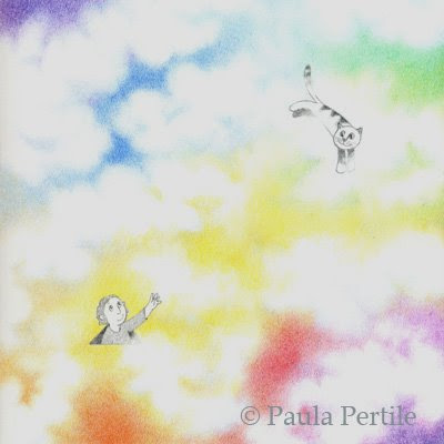
This idea just came to me the other day. I love doing clouds all of a sudden, and thought "what if the sky wasn't just blue?" Maybe this is what it looks like on "the other side". So I put in a kid popping up for a look, reaching out to his kitty who is happily flying through the clouds.
The above image is how it really looks, without any Photoshopping.
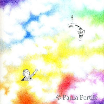
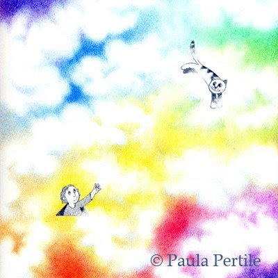
I fiddled with it some in these next three, to see what would happen if I popped the color, or darkened it down.
This one is muted down. I kinda like it.

This is what 'auto color' did to it. Bright!

And this is what "auto levels" did. WOW. I'm not sure I like it so much, but WOW.

I have such a delicate touch, my work sometimes comes out a little light. For the life of me, I can't see it until its been scanned. I always think things look just right, then I see them printed and I want to bump them up some.
Opinions welcome.
3 Comments on Something new, last added: 6/16/2009
Display Comments
Add a Comment


Hi Paula, personally, I like your original version best. I know what you mean though, I have the same dilemma with my cp pictures. I think with your muted version, you lose the bright whites, which are nice, and the other versions are a bit gaudy! Perhaps a compromise would be to strengthen the colours on your original to achieve something in between, ie. brighter but not too gaudy. Just my thoughts - love the picture anyway and the story behind it!
Honestly, I also like the original! I like the fading in-and-out of the colors; though maybe the characters themselves need a little bumping up in intensity just to stand out a bit more. It's always hard to know where the line is with subtle colors and effects.
Hi Paula. My fav is the original and a close second is the other end of the scale - the final version, auto levels. It is fun to see the 'what ifs' when playing with Photoshop but I always prefer my originals. Guess I prefer yours as well. :-)