new posts in all blogs
Viewing: Blog Posts Tagged with: kosslyn, Most Recent at Top [Help]
Results 1 - 13 of 13
How to use this Page
You are viewing the most recent posts tagged with the words: kosslyn in the JacketFlap blog reader. What is a tag? Think of a tag as a keyword or category label. Tags can both help you find posts on JacketFlap.com as well as provide an easy way for you to "remember" and classify posts for later recall. Try adding a tag yourself by clicking "Add a tag" below a post's header. Scroll down through the list of Recent Posts in the left column and click on a post title that sounds interesting. You can view all posts from a specific blog by clicking the Blog name in the right column, or you can click a 'More Posts from this Blog' link in any individual post.
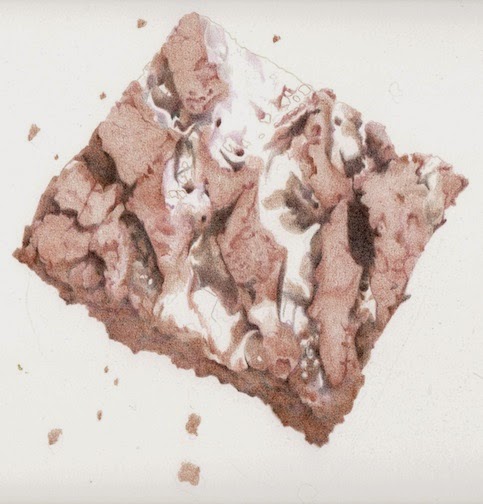
Last week I had to get my car worked on (new brakes!), so I put together a little tin of treats to give the guys (I know, I'm so nice). My motivation wasn't all selfless though. I kept back one of these luscious brownies for myself, to draw.
This isn't any ordinary brownie. Its a super decadent salted caramel brownie. (I overheard one of the car shop guys say he could feel his arteries clogging after he ate one.) They're big, and luscious, and heavy. And irresistible to someone who likes to draw food!
This is how I start. Actually, this is several 'steps' into the process. I just didn't feel like getting up to scan it, but decided I'd better before I got much farther into it. I start by mapping out the nooks and crannies, then start filling in the shadows first, then the more chocolatey parts. I'm simultaneously working out the color (hue), as well as the values (light and dark). One pass of color might focus more on the value, and the next layer might just fill in some flat color.
The parts that are still white are where the caramel is. Its a completely different color, so I'm getting as much of the chocolate established as I can first, then I'll do the caramel.
I can't wait to eat this thing. The smell is driving me crazy! (in a good way)
It has quite a ways to go, but I'll get there.
Oh, its about 8" x 8", so far all Prismacolors, on Fabriano Artistico paper.
This is one little humble pimento olive - the kind you put in your cocktails. I haven't eaten many of these, not being much of a martini drinker, and was surprised to find I actually like them!
But that's not the whole story here. Look closely at the bottom edge of this drawing. See all those little red marks? They're BLOOD. I had a small cut on my hand that I didn't even know about, and accidentally rubbed the edge of the drawing. Eww. And then, hours later, I did it again, with a different scrape on the other hand. I know! I couldn't believe it either.
Luckily, they were all along the bottom edge, so I was able to just trim them off. People on Facebook seemed to think it added value to the art, but I'm not so sure. I think its just icky.
So here's how it looks all cleaned up (blood, and also the background) for prints.
I can't seem to look at any food now without seeing it in this 'top, side, and section view' way. I find myself analyzing things in the grocery store for their drawing potential, trying to visualize them cut open, and lined up like this. I've bought a few things that didn't turn out to be very good subjects, but luckily since its all food it just gets worked into dinner or a snack.
Oh, this was done with Prismacolors on Bristol, and is 4" x 9".

By:
Paula Pertile,
on 7/30/2014
Blog:
Drawing a Fine Line
(
Login to Add to MyJacketFlap)
JacketFlap tags:
cats,
summer,
mouse,
sick,
Polychromos,
Prismacolors,
hot,
Pablos,
Fabriano Artistico paper,
berry tart,
Add a tag
Its all done! Phew. I thought I'd never finish. Being sick is a drag (some kind of 'bug', requiring lots of naps and 'lie downs'). But I managed to pick at this in bits of being up and around and finally gone it done.
The paper is 11 x 17. I used Polychromos, Pablos, and Prismacolor colored pencils, on Fabriano Artistico Hot Press paper.
Not too much else to share. Its so #&* hot here, 100 or over for I've lost count how many days now. The cats have gone wild, insisting I keep the cat door open so they can roam around at night when it cools off. Charlie brought me a mouse, on the bed, at 3:00 am one night, which I did not appreciate.
Sigh. Cats. Summer. Maybe I should eat this tart - its still in the fridge.
Stay cool!
Nothing finished to show today. I took reference for something that ended up being a disaster, so I had to scrap the idea (for now) until I can do a re-shoot and start again. I've also been feeling a little under the weather (partly thanks to a weird piece of fruit, and the rest is thanks to the heat, I'm sure) and haven't been as productive as I'd like. But I do have two very different things 'on the board', and thought I'd share some work in progress shots so you can see what's happening.
First up is a little berry tart. These scanned so different, when in fact the only thing that's been worked on more is the criss-cross dough on the top one. I'm saving the filling to the end, because its going to be so much fun to do - its such a gorgeous color. This is also planned to be one of my Architectural Food pieces, showing the top (this view here), side, and cross section views. If all goes according to plan. If they don't work out I can always cut them off and just have this nice round tart all by itself! So far this is all Prismacolors, on Fabriano Artistico hot press paper.
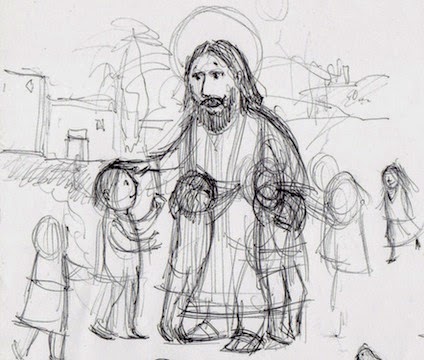
Now, onto Jesus and the children. These are the first first first sketches, sitting with plain printer paper and a black ball point pen, with a cup of coffee, out on the porch.
Working out the girl hugging Jesus.
It seems like there would be a crippled child in the scene. And a bird.
Maybe a girl carrying her little baby brother or sister. Also thinking about hair styles. A braid? Just tied back somehow?
I love fat little baby hands, reaching.
I like the idea of one kid hugging Jesus' hand, and kind of standing on his foot. Jesus doesn't care if you stand on his foot! haha Also drew a little Down Syndrome boy, but then wasn't sure if that was too much. I want to show all kinds of kids, so that kids looking at the illustration will be able to relate.
A girl carrying her lamb. Or maybe he's a boy. Have to make sure the sandals don't look like flip flops!
This one looks like he's anointing someone. Need to work out what that arm's doing. Not sure if I want it to just be 'down', or like he's saying "hey, Jesus!".
Just walking. Getting the feet just right, especially from the back, is tricky.
A little boy and his . . . sister? Not sure how many of these kids will be in this illustration, but the one's that don't make it in will show up in another piece, somewhere, eventually.
Its fun to just imagine a scene like this, and what it was really like.
So that's what I'm up to. Hopefully next time I'll have a little more to share. Hope its cool where you are!
By:
Paula Pertile,
on 7/8/2014
Blog:
Drawing a Fine Line
(
Login to Add to MyJacketFlap)
JacketFlap tags:
cleaning art with Photoshop,
fife and drum,
children's book illustration,
Revolutionary War,
colored pencils,
Prismacolors,
4th of July,
Stars and stripes,
red white and blue,
Add a tag
(click the image to see it larger)
I'm really happy with how these little guys turned out. They were super fun to draw, and I loved using my Prismacolors again for a whole, entire illustration. (Thank you Bostitch Super Pro 6 pencil sharpener for making that possible!)
This guy is very proud to be first in line in the procession, and has been practicing his fife music
a lot, making sure he was ready for today.
This guy lost his nice tricorn hat in a horse-and-wagon mishap just before he had to step into line here, but is trying to put on a brave face, and is very proud that he gets to be the one carrying the flag.
And this guy has been driving his family
nuts, practicing the drums, but they all know its worth it when they see him marching and drumming so well with his friends.
I did this whole thing with colored pencils. And I managed to keep it pretty clean. But even so, it needed a little tweak with Photoshop at the end to look even better. So I thought I'd show you a little 'behind the scenes' look at how things magically get cleaned up before going to print.
This is how it looked straight from the scanner. Its a little 'dirty', and the scanner made a dark edge on the left. Its also a little crooked.
Then here it is cleaned up, and straightened out.
Here's a close up showing one little piece, with the background as it was, then cleaned up.
Can you see how grey the background looks on the left, and all the little 'bits of stuff'? That's the paper texture, and little flecks of pencil that, no matter how careful you are, deposit themselves on the paper and refuse to come off. So, with the help of the eraser tool in Photoshop, I painstakingly go around each figure and erase all of that out, leaving a nice clean background.
I also use the clone tool to carefully pick out any little stray flecks of something that may land on the actual image (here, there was a tiny grain of dark color on his nose).
When I'm working on a piece that I know is going to be printed, and make a little goof or stray mark, I find myself going "That's OK, I'll fix it with Photoshop", and keep going. But when you're doing something where the original art is IT, like a commissioned piece, you have to be really really careful, because there is no room for mistakes, and there is no fixing the final art with Photoshop! The piece has to be perfect (no pressure).
All done! 8 x 10 inches, all Prismacolor colored pencils, on Fabriano Artistico Hot Press paper.
Its officially Summer now, so I guess its fitting that I drew something HOT to kick off the season.
In
the last post I did some work in progress shots of these. I did end up using some Prismacolor Indigo for the darkest darks. These got very burnished and slick by the end, which is OK. Sometimes I leave things kind of 'grainy', and sometimes I burnish. It just depends on what I'm drawing. These needed that waxy finish, so they needed to 'go there'.
I'm not a big chili pepper (or any kind of hot pepper) person, at all, but I do like chili pepper flakes in some dishes, and also dab a bit of the chili sauce on my food in a Chinese restaurant (avoiding the actual seeds though!). One of my favorite dishes is pasta with broccoli rabe, anchovies, olive oil, chili flakes, black pepper and parmesiano reggiano cheese. Chili pepper is good for you, they say - boosts your immune system or something.
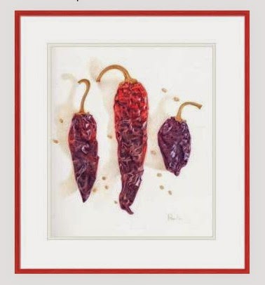
I'll make prints for the shop in the next few days. I think these would be fun, framed up on a kitchen wall, yes?
I bought this package of dried chili pepper pods a while back, thinking they'd be a good drawing. I'm finally getting around to doing them! That's the nice thing about dried stuff - its lasts a good while in the cupboard, patiently waiting, until you get around to using it.
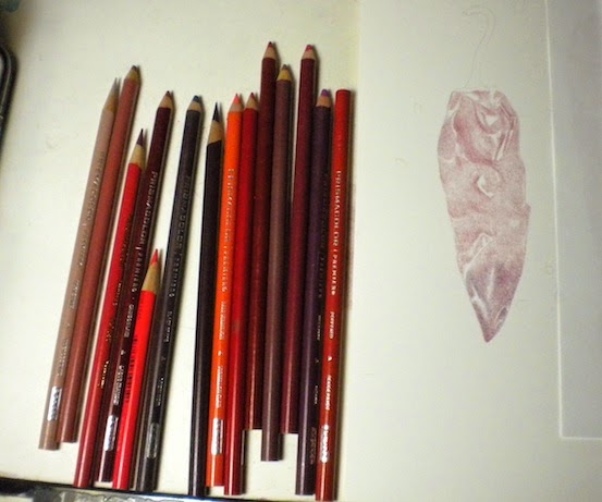
I've gone back to Prismacolors for this. Before I bought my new electric pencil sharpener (
Bostitch SuperPro 6), I had all but given up on these. They were breaking like crazy (in my old duller sharpener), and I thought I might never use them again. But now that I have the new sharpener, which only rarely eats one, they're back on my list of usable pencils. And I'd forgotten how much I love them.
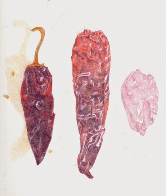
I laid out three of the best chilis in the package, and am trying to work 'left to right' as best I can, to avoid smearing the parts I've already done (I'm right handed - if you're left handed, you would work the opposite direction). I don't always do this, but sometimes it works out to be the best way.
I started with a Raspberry pencil, and kind of mapped out the wrinkle patterns in each chili. Now I'm going back in to each one and rendering it out. The last chili is very very dark, almost black. I've been avoiding using actual black to get the darks dark enough, but I may have to break down and use it. So far I've stuck to Black Grape and Black Cherry to do the darkest darks. I'll wait until I have them all to the same point of finish, then do the final tweaking at the end.
I tend to stick with one brand of pencil when I start working on a piece - I'm not sure why. Maybe I'm just lazy! I could try some Polychromo Indigo I think, or something else to do the darkest darks. I'll figure it out when I get there!
By:
Paula Pertile,
on 5/20/2014
Blog:
Drawing a Fine Line
(
Login to Add to MyJacketFlap)
JacketFlap tags:
Polychromos,
colored pencils,
Prismacolors,
Stonehenge,
Pablos,
Luminance,
Alyona Nickelsen,
chocolate bar,
chocolate candy drawing,
color swatches,
Colored Pencil Painting Bible,
fun size candy bar,
Snickers bar,
Add a tag
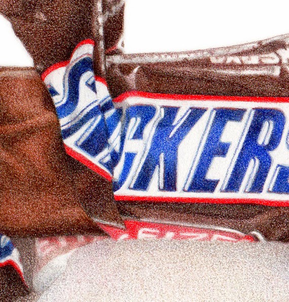
Snickers "fun size" bar
6" x 8", colored pencils on paper
Did I tell you my dream about Einstein? A while back I dreamed I called him up, and after introducing myself and telling him I was an illustrator, somehow (through the magic of dreams) we were sitting across a table from each other at a cafe or something. I started showing him my chocolate drawings, and he says to me (in that affable, smiley way, with the goofy hair) "You should do more!".
And right after that, I had this commission! The client wanted the wrapper torn 'just so', similar to my
Heath Bar drawing I did a while back. So I had the arduous task of tearing open wrappers and taking pics to email over, until I got one that was just right. (Of course 'someone' had to eat all those opened Snickers bars - good thing they were 'fun size'.)
I thought it was finished at this stage, below. I even signed it. The client loved it, but wondered very gently if maybe the wrapper could be darker?
She was right. Sometimes when you look at something for too long, you can have trouble really 'seeing it' properly. I went out shopping or something for a while, then came back and added some color to both the wrapper and the chocolate, and voila - perfect!
I used mostly Polychromos on this, except for the red on the wrapper (LOVE Prismacolor's Permanent Red), but then came back in with some Prismacolor chocolatey browns to add a little 'more' to it over all.
This was done on Stonehenge paper, since all of my other candy drawings have been on that, and I wanted it to look the same (I've been switching over to Fabriano Artistico Hot Press for other work lately.)
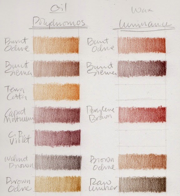
I decided to make a swatch chart of all my chocolate colored colored pencils, so I'll really know what I have to work with. Sometimes chocolate is orangey, sometimes purpley, and the shadows can go almost black. The wrappers aren't always chocolate colored, but when they are, the same thing applies.
Terrible scans of how the whole chart looks ...
And terrible close ups of them (sorry) so you can kind of see what I did.
I did Prismacolors, Pablos, Polychromos, and Luminance.
There are gaps, because at first I was going to try to match colors by name across brands, but that all fell apart pretty fast, and I ended up with a sort of disorganized mess. But it works for me.
(Every time I do swatches I have flashbacks to Illustration 2 class at the
Academy of Art, where we had to make watercolor and gouache swatches of all our new paints - and they had to be
perfect, an exact size, all lined up in straight rows ... actually I think we did them on watercolor paper, then cut them out and pasted them onto a sheet of illustration board with rubber cement - crazy, but they were beautiful, and I used them for years and years. But I digress ...)
This is what they look like when I just do them for me, and just want to get a splotch of color down so I can see what I have. It still surprises me sometimes when I think a color is going to be one thing, based on the casing or lead, then it looks totally different when it goes down on paper. Luminance are the ones that do that the most I think.
I have
Alyona Nickelson's
Colored Pencil Painting Bible, and in it she shows how she swatches her pencils. GURL, she be crazy (I mean that in a good way), but very thorough and totally impressive. She does color 'mixes', as well as un-burnished and burnished. I considered doing something like that with these, since its the mixture of colors that will make just the right chocolate color for each drawing, but then couldn't wrap my brain around how to do it without making it my life's work.
Alyona does have a cool tip about printing your swatches out onto clear paper (like overhead projector transparencies) so you can then lay them over a partially rendered drawing, and see exactly how a new color applied will look. I think that's worth a try.
But I know myself, and figure I'll just do tests as I go along, each time I do a drawing.
For fun, I just googled "drawings of chocolate", and found this
Pinterest page which has a lot of cool art (and a few of my pieces too).
I've made prints of this piece available in my
etsy shop.
Next up is a small architectural food piece . . .
By:
Paula Pertile,
on 2/12/2013
Blog:
Drawing a Fine Line
(
Login to Add to MyJacketFlap)
JacketFlap tags:
Coloursofts,
Stonehenge paper. 8 x 10 colored pencil drawing,
Luminance,
red drawing,
Colored pencil drawing of Maraschino cherries,
Polychromos,
food drawing,
Prismacolors,
Pablos,
Add a tag
Maraschino Cherries
8" x 10" (20.32 x 25.4 cm)
Every brand of pencils under the sun, on Stonehenge paper
I felt like making a new drawing, and looked in the cupboard for a subject. At first I thought I would do anchovies, but for some reason they grossed me out. Then I saw this little jar of maraschino cherries hiding in there which I'd forgotten about, and was so happy.
I always start with a line drawing, then start laying in some shadows or values just to get it going. I've darkened this up quite a bit so it would show up for you here. In real life it was a lot lighter.
This is a very RED drawing. Red is for me the hardest color to do with colored pencils. I really picked my way through this in the first several layers - kind of a 'Sunday painter approach', dawdling along, enjoying the subtle building up of color and value.
By the time I finish I will have used Coloursofts, Prismacolor, Luminance, Pablos and Polychromos.
At this point (above) I've used: Polychromo Burnt Carmine, Coloursoft Rose, Red, Deep Red, Scarlet, and Polychromo Green Gold. All really really light tentative layers.
I'm going back and forth between deepening the color, and re-establishing the forms in the jar.
At one point I got out my Prismacolors, against my better judgement. They've been breaking so much that I put them away and vowed to never use them again, no matter what. But they have the best reds. The best. So I pulled a Permanent Red, and started doing a layer. Then it came time to sharpen, and it broke, instantly. Grrrrrr. Try it again. Broke again. Pulled a whole NEW pencil out of a spare box, more breaking. Break, break, break, break break. I had to finish the one layer though, since I'd started, so I muddled through, but I was not a happy camper.
So now, by about this point, I've used all of the above, plus: Polychromo Purple, Fuschia, Middle Purple, Violet and Pablo Light Purple and Purplish Red. I know, hard to believe.
Then some Polychromo Geranium Lake and Pablo Reddish Orange. I think its here that I let it go for the night, and sat down to watch Downton Abbey.
The next day I was fully out of 'Sunday painter' mode, and very much in a "let's get this DONE" mode, so finally got serious about committing to putting down some real values. That required a bit of burnishing, which I always try to avoid until its the only thing left to get the piece where it needs to go. I skipped a few steps here in the scanning, because I just wanted to tuck in and get it done.
These couple of scans show the addition of: Luminance Permanent Red, Carmine Aubergine, Alizarin Crimson, Scarlet, Pablo Ruby Red, Luminance Green Ochre, Polychromo Olive Green and Green Oxide, Zinc Yellow, and maybe a couple more that I forgot to write down.
I just kept tweaking with a little of this and that until I was happy with it.
I thought you might like to see how un-glamorous my work set up is. I know there are people who have pristine, organized, "let's take a photo for the magazine" kinds of work spaces. How nice for them. Not me.
I stack all my tins of pencils that I'm using up on top of each other, like this, on my slanted drawing table. In the above pic you can see two tins of Polychromos, on top of Luminance, on top of Pablos.
I've separated them out a bit here below so you can see them better. I just pull up a tray when I need to search for a color in a tin below. The Polychromos are all organized neatly by color. The others are not.
And here's a shot of how the 'used' pencils look off to the right side of the board. Not neat. Not organized. They often fall off onto the floor (but I have carpet, so they don't get broken). I honestly don't know how you neat people keep everything all perfect. I admire it, but it doesn't work for me. Of course I'll clean them all up and put them back in their tins now, and the board will get cleared off for the next piece. And it will start all over again.
I'll put prints in the shop at some point. I'm searching for a new paper to do prints on in addition to the semi-gloss I've been using. I would like to offer an option for a more matte paper for some of my pieces. There are just way too many papers to choose from! I want to keep the cost down, so my prints will not be expensive. I do have some fancy paper that turned out to be too thick to feed through my Epson - boo. So I'll keep looking.
The sun is out here, its like Spring. Crazy. Nice, but crazy. People are mowing lawns and watering, washing their cars, wearing t-shirts. Gotta love California.
Phew. What made me decide to do this, I can't remember.
This is about 4,000 layers of Polychromos and Prismacolors.
Its a Chinese floral design. The original reference is darker and more "contrast-y", but I muted it some so it would 'stay back'.
This is what it looked like before I added the dark. Its pretty, but spotty. It needed the dark to tie it all together, to make a unified background that won't fight with the main subject matter.
Now its onto the stars of the show.
Finished!
I skipped to the finish here, leaving out any more steps in the process. Sorry. Sometimes when you get into a piece its a drag to keep interrupting yourself to stop and scan. Like with this one. I just wanted to get it done.
I just kept going with more and more and more layers of greys, mostly, building up the colors and values until it was 'there'.
And because its in Ireland, it needed a nice bit of green grass to sit on.
I kept the pencils slightly dull, and let the grain of the paper work for me in making the stone texture.
This was done with Prismacolors exclusively.
I used just about all the French Greys, Warm Greys and Cool Greys, as well as Putty Beige, Slate Grey, and Ginger Root.
No Black.
The grass was done with Limepeel, Apple Green and Grass Green.
This piece was a fun challenge, since I usually do newer buildings.
(The two previous posts,
here and
here, document my process with this piece, in case you missed them.)
Next up is something with food.
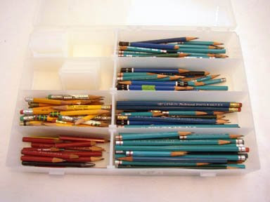
Today I'll let you into my studio to look at how I organize my colored pencils.
I will warn you that this is one area where I'm a little... fussy. If you have an aversion to things that are too organized or orderly or color coordinated, BEWARE!
You may want to turn back now.
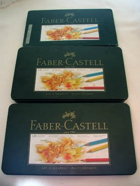
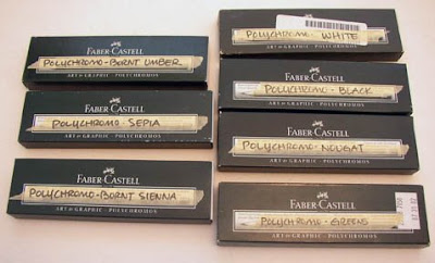
First up we have the Polychromos, which are my favorites and what I use the most, by far. By FAR. (I gave you the link to the manufacturer's site, but they don't have the best price, don't buy them from there! ~ scroll to the bottom of this post for cheaper places.)
I have 3 tins of them ~ 2 are the 120 set, 1 is the 72 set.
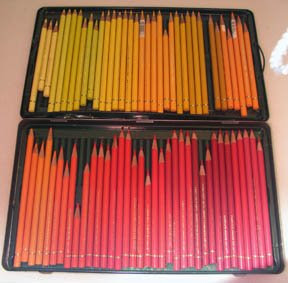
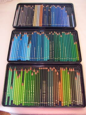
 What I did was take out all the pencils in all 3 sets and reorganize them according to color.
They're not organized by number. Its just visual for my own amusement.
I open them out like this, but with some overlap, on my drawing table when I'm working.
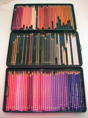
There are gaps in the tins here, especially the browns, since I'm using some of those right now on my chocolate pieces, and have them somewhere else, handy (I'll show you farther down).
In addition to the ones in tins I have boxes full of 'extras', colors I use a lot of or need for specific pieces. I have lots and lots of black, white and ivory, and now a lot of browns, plus other colors that I've needed extras of for some past project. I have all these in a drawer in my art supply cupboard, and have them labelled like this so I know what's in the box.
There are more than this. Its obscene how many I have. If you ever need a color and the art supply stores say they're out of stock, its probably my fault.
I don't have any of the discontinued Soft Black though. I know who has them all but I'm not saying.
~~~~~~~~~
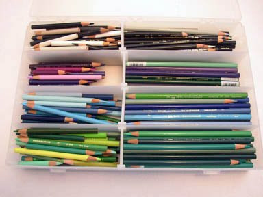
Next up are my Prismacolors.
I found these plastic storage boxes at the art supply store ages ago and they work pretty well. You can adjust the little 'spacers' however you like; so I made a long section for newer pencils and a short section for stubbier bits.
I divided them all up, sort of, by 'reds' or warm colors, and 'blues' or cooler colors. (Although I just noticed a couple of greens have jumped their way over into the warm bin.)
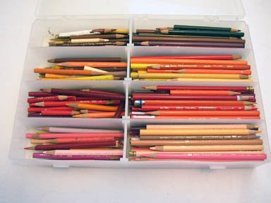
This is by no means a scientific sorting. Its just sort of 'good enough', and when I need a certain color I can find it OK.
I don't use Prismas very much any more. I bought these way back, and some of them are ancient.
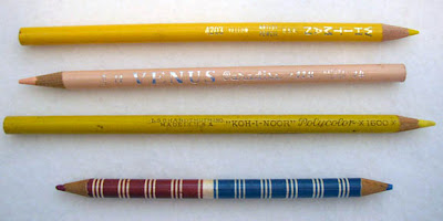
I also have some very interesting odd pencils which I'm sure are collector's items!
There's a Whitman, a Venus, and a "Koh-I-Noor" Polycolor.
And check out that little 2-headed striped number. I think I've had that since about the 4th grade. I used to have a whole set, not sure what happened to the rest of them. I never use that pencil; I just have it as a link to the past. I can't bear to throw it out.
I have one other plastic bin for just regular graphite pencils.
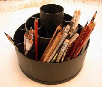
And here's my handy-dandy Tool Turn-about for all the pencils that are either in use on a project, or ones that I haven't "filed" yet. This thing is great, because it keeps the pencils in one spot and keeps them from rolling off the table.
I also have tins of: Coloursoft, Inktense, Graphitints, and watercolor pencils. I just keep them in their original tins, nothing fancy.
I'm really disciplined about keeping these babies organized. I re-file them all after each project. The rest of my studio may be a disaster, but my pencils are always in pretty good shape.
I think if there was a fire (god forbid), after my cats I'd save my pencils.
Here are the 3 main places online I use to order pencils and other supplies:
Dick Blick
Daniel Smith
Jerry's Artarama
Go to each site and sign up to get emailed specials and sales sent to you. You can save a bundle that way!
(As I'm writing this, Polychromo prices vary wildly: Jerry's has them for $1.69, Daniel Smith for $1.39 and Dick Blick for $.95! If you buy them from the manufacturer's site they're $2.69 each!!!! Yikes. But the prices fluctuate, and sometimes the "tin" price will be cheaper at a place that has the open stock for more. So be sure to check around when you're shopping. And there are more places than this, just google "art supplies".)
That's all for today~

By: Rebecca,
on 8/8/2007
Blog:
OUPblog
(
Login to Add to MyJacketFlap)
JacketFlap tags:
Literature,
Economics,
Business,
Education,
oxford,
A-Featured,
Psychology,
harvard,
goldilocks,
powerpoint,
slide,
martians,
sith,
jedi,
psychologies,
keynote,
stephen,
kosslyn,
Add a tag
 Many people, myself included, have used PowerPoint to make important presentations. Did you just throw boxes on the screen or did you think about your audience and your message? I know that I am usually too overwhelmed by color and animation choices to put much thought into how each page should be designed. Stephen M. Kosslyn, chair of the Department of Psychology and John Lindsley Professor at Harvard University, has written a book to elucidate the process. In Clear and to the Point: 8 Psychological Principles for Creating Compelling PowerPoint Presentations, Kosslyn presents eight simple principles, based on modern science about perception, memory, and cognition, that will make any presentation work. In the original article below Kosslyn provides some tips to get you started. (more…)
Share This


There's a printmaker in Colorado who works in similar fashion,layering her inks and building up to the final.
http://brushandbaren.blogspot.com/
I break pencils, too. I've always sharpened with a knife as those little twisty sharpeners make it worse.
Paula, you're step-by-step posts always fascinate me. It is such a help to see how other artists work, no matter what the medium. As usual, I love the drawing. P.S. I'm not a neat worker either.
I love, love seeing the step-by-steps. And I always love seeing how others organize their pencils and workspace. Since I've always used just Prismas, I keep them in jars on my desk, but I just bought a little set of Coloursofts to try. I'm dying to "sample" some new treats. But I'm a little worried that I'm not organized enough to keep multiple brands going...we'll see!
I had been using Canon Matte Photo paper for prints, but it's a very bright white, and it's not as heavy as I'd like. Then I got a new wide format printer for Christmas which led me to a new paper that I really like: Epson Premium Presentation Paper, Matte. (The box is kind of a teal color.) It's a bit heavier (44 lb.) but sails thru my printer just fine, and it's a nice clean white. It comes letter size, 11 x 17, and 13 x 19. And my local Fry's Electronics carries all sizes!
Marschino Cherries makes my mouth water--loved seeing the step-by-step.
Paper I use for small inexpensive prints and note-cards is Staples matte Photo Supreme, which is double sided, and 61 lbs. About $15for a 50 sheet pack.
Your drawing table looks well organized to me-I made a shelf from a 12" board to place at the far edge of my drawing table, with wedge-shaped wood pieces under each end to bring it to level, then bought three plastic turntables which sit on it,each turntable holds about 5 inserts from "tran" pencil cases (Blick)Each insert folds onto itself with velcro,all pencils vertical,I keep Polychromos,A.Durer,and Prismas separately on each turntable which keeps all colors at my fingertips, yet out of the way.then, like you, I keep a tin on the table for pencils I'm using at the time. If I need to take my pencils for a demo,or class,I just open each triangle and stack them flat in my bag and go. The shelf lets me have more open work space on my drawing table because the slant top leaves the space underneath open. Sorry to make this so long, but wanted to share. :-)
your work is beautiful and i really enjoy seeing your artistic process!
This is amazing! I really love the vibrant colours you've achieved, and your lovely soft texture. (also, anchovies would gross me out too, and that smell!).
So glad I found your blog!