JacketFlap connects you to the work of more than 200,000 authors, illustrators, publishers and other creators of books for Children and Young Adults. The site is updated daily with information about every book, author, illustrator, and publisher in the children's / young adult book industry. Members include published authors and illustrators, librarians, agents, editors, publicists, booksellers, publishers and fans. Join now (it's free).
Login or Register for free to create your own customized page of blog posts from your favorite blogs. You can also add blogs by clicking the "Add to MyJacketFlap" links next to the blog name in each post.
Blog Posts by Tag
In the past 7 days
Blog Posts by Date
Click days in this calendar to see posts by day or month
Viewing: Blog Posts Tagged with: Art and Book Design, Most Recent at Top [Help]
Results 1 - 10 of 10
How to use this Page
You are viewing the most recent posts tagged with the words: Art and Book Design in the JacketFlap blog reader. What is a tag? Think of a tag as a keyword or category label. Tags can both help you find posts on JacketFlap.com as well as provide an easy way for you to "remember" and classify posts for later recall. Try adding a tag yourself by clicking "Add a tag" below a post's header. Scroll down through the list of Recent Posts in the left column and click on a post title that sounds interesting. You can view all posts from a specific blog by clicking the Blog name in the right column, or you can click a 'More Posts from this Blog' link in any individual post.
Released last fall from LEE & LOW BOOKS, The Story I’ll Tellis a gentle and moving story of adoption and parental love that is sure to touch the hearts of readers everywhere, no matter how they came to be a family. It has received starred reviews from Booklist and Publishers Weekly, which called it “an unabashed love letter, one that many families will treasure.”
We asked illustrator Jessica Lanan to take us behind the scenes of her art process bringing The Story I’ll Tell to life:
The process for illustrating The Story I’ll Tell started with research and brainstorming. I read books about adoption and collected evocative images from magazines and the internet that I thought might be useful references. There were a lot of questions to investigate as I tried to piece together the identity of the characters and the overall look and feel of the artwork.
As I researched, I also began sketching thumbnails. My art director and editor provided feedback on these, and through several rounds of revisions we worked to get the concept and flow of the art just right. The thumbnail sketches were also essential in order to work out the composition of each page. For each round of revisions I made a printed dummy in order to simulate the flow of the book.
After the thumbnails were ready, I worked on more detailed drawings, using reference images and models as needed. Here you can see a rough clay model that I used as a reference image for one of the drawings:
Once the drawings had been approved, it was time to move on to the final art. I was using watercolor for this book, which is a rather unforgiving medium, so, I made a miniature version of each painting first in order to get all the mistakes out of the way. Then I transferred my drawing to the watercolor paper and started painting!
Each final piece was done with watercolor and colored pencil on 300lb watercolor paper.
Jessica Lanan has been in love with illustrated books since an early age. Besides The Story I’ll Tell, she has also illustrated Good Fortune in a Wrapping Cloth from the Shen’s Books imprint of LEE & LOW BOOKS. She currently lives in Boulder, Colorado, where she enjoys thunderstorms, crunching autumn leaves beneath her feet, and leaving footprints in freshly fallen snow.
You can purchase a copy of The Story I’ll Tell on our website here.
0 Comments on Illustrator Jessica Lanan Takes Us Behind the Art of The Story I’ll Tell as of 1/1/1900
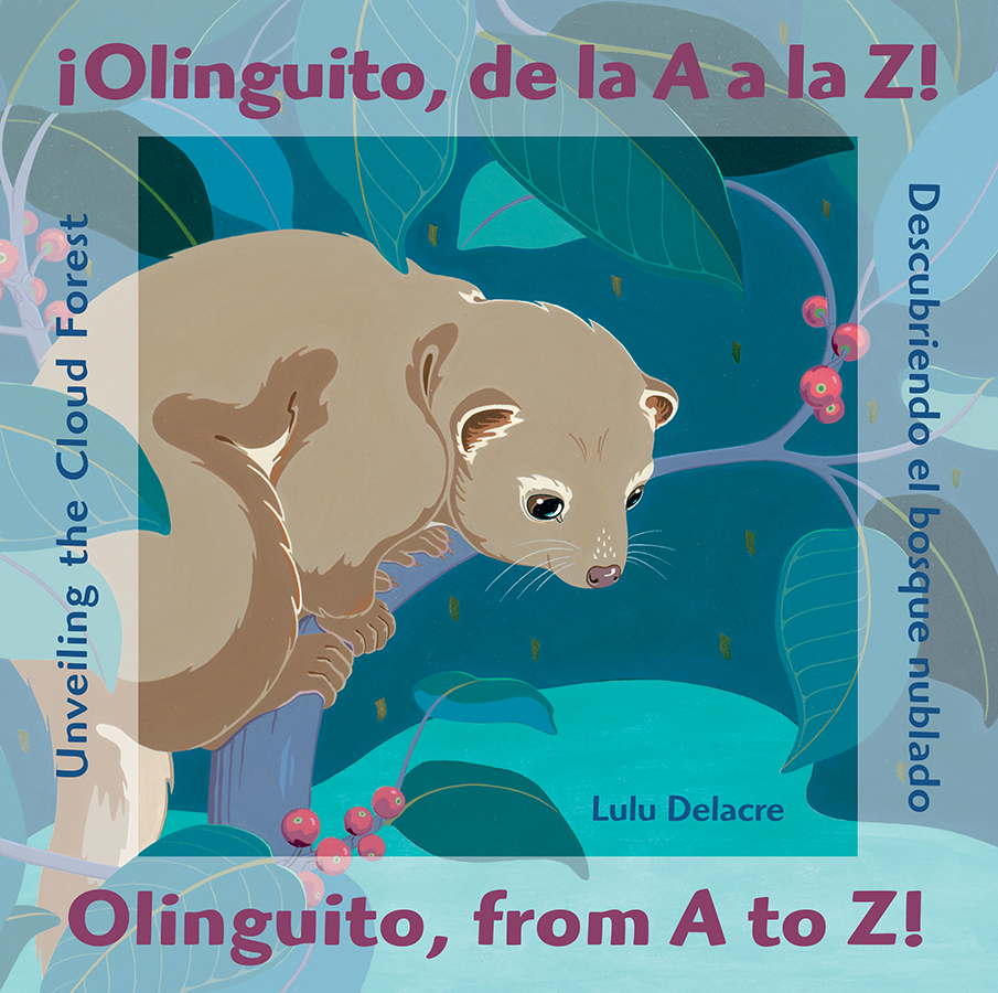
Alto, allá arriba en los Andes brilla un bosque bordado de bromelias… High up in the Andes blooms a brilliant forest embroidered with bromeliads . . .
Set to be released this spring, ¡Olinguito, de la A a la Z! / Olinguito, from A to Z! : Descubriendo el bosque nublado / Unveiling the Cloud Foresttakes readers into the magical world of a cloud forest in the Andes of Ecuador. We discover the bounty of plants, animals, and other organisms that live there as we help a zoologist look for the elusive olinguito, the first new mammal species identified in the Americas since 1978. It has received starred reviews from Publishers Weekly, School Library Journal, and Kirkus Reviews, which called it “a breath of fresh air in the too-often-contrived world of bilingual books.”
We asked Lulu to take us behind the scenes of her exquisite art process to make the cloud forest come alive:
I spent an average of ten days working from eight to ten hours per day creating each spread.
Click for larger image
The first thing I did was to transfer the sketch to the Arches watercolor paper. Then I decided which areas would be collaged printed patterns and which would be painted in flat acrylic colors.
I prepared the patterned backgrounds pressing leaves gathered in the cloud forest dipped in ink and stamped onto rice paper.
Click for larger image
With an X-Acto knife I cut out the shapes of texturized paper and pasted them into the background. I used archival glue and micro tweezers to affix the collage elements in their precise positions.
Click for larger image
Next I prepared all the shades of acrylics that I would need for the spread and stored them in small clear jars. Each section of a color required several thin coats to achieve the rich look I was looking for.
Click for larger image
Once the spread was entirely painted I had fun selecting pressed ferns from the forest to affix to the art. This was a delicate process as some of the pressed leaves and ferns are paper thin.
Click for larger image
The last thing was to create the letters for the spread. I wanted a layered look, recreating the natural layers of flora in the forest, so I drew the letters on vellum paper and cut out them out. I taped the letters onto a vellum square and with careful precision affixed the letter in the spot it was intended to be.
You can purchase a copy of ¡Olinguito, de la A a la Z! / Olinguito, from A to Z! : Descubriendo el bosque nublado / Unveiling the Cloud Forest on our website here.
1 Comments on Author/Illustrator Lulu Delacre Take Us Behind the Art of ¡Olinguito, de la A a la Z! / Olinguito, from A to Z! : Descubriendo el bosque nublado / Unveiling the Cloud Forest, last added: 2/3/2016
Now that we’ve revealed the cover for the amazing Perfect Liars by Kimberly Reid (coming in May!), let’s talk about the cover design process. As with Ink and Ashes last year by Valynne Maetani, Perfect Liars is a YA mystery title. How do you give a book that mysterious air you need? How do you tell readers, “This book is for YOU!”?
The challenge in all YA book design is to create a cover that looks like it belongs in the YA section, but doesn’t look too much like the rest of the YA section. And to do that, you need a good designer. We found that designer in Liz Casal, who’s also designed covers for Little, Brown and Soho Press. Looking at her portfolio, we knew she was just the designer for the job.
We always start with some comp designs, to figure out what direction we’ll want to go in. Liz gave us some really amazing options. Here are a few of my favorites (these aren’t all of them).
What I loved most about Liz’s designs is the care she put into finding photos of models who would look like the main character, Andrea Faraday, who is biracial (black and white). On top of that, her sense of contemporary design is just spot on. It was hard to choose which one we loved most!
We each loved multiple choices, so how could we narrow it down? I showed the potential covers to coworkers here at Lee & Low, to the author, and to her agent, soliciting opinions. We all had reasons for why we liked what we liked. But which direction was the best direction for this book?
There were some easy ones to rule out—the last one (with the girls in the hat) was a great picture, but didn’t convey the feeling we wanted to convey with this book cover. It was too convivial, not mysterious enough. As Kim put it, “I imagine totally loving this for some other book I’d write.” A couple others felt too much like other books, and we weren’t sure we liked the cropping of some others (we didn’t want to lose the character’s full face, even though that cropping created a great sense of mystery).
We all loved the red cover (upper left of the original design), but we felt very strongly that a silhouette wouldn’t be the right choice for a book starring a person of color—we didn’t want to obscure our character’s ethnicity, we wanted to celebrate it! However, that book had a very commercial feel to it. Could we tweak it so that it would clearly show that she’s a character of color?
We looked at a number of options for that cover direction, and in the meanwhile also explored a few other options. We narrowed our options down further, looking at filters and cropping, fonts and angles. And then we decided to go to the experts: teens.
We chose our three favorite covers (we were on about round 3 by now), and during a visit to our office by students from the Grace Church School (who were there to talk to Joseph Bruchac, author of Killer of Enemiesand Trail of the Dead), we asked students to tell us which book they most wanted to read.
Every teen in the room pointed to the cover on the right, the one with the characters wearing sunglasses. We were a little surprised—we thought that opinions might at least be split, or possibly favor the cover we’d been continuing to try to tweak so it wasn’t strictly a silhouette.
Why, we asked, were they most interested in that book?
“Because she looks like she’s hiding something,” said one teen.
For them, those sunglasses meant a sense of mystery.
What do you think? Were our teen experts on to something? We think so!
Released this month, Amazing Places is a collection of original poems hand-picked by acclaimed anthologist Lee Bennett Hopkins that celebrates some of the amazingly diverse places in our nation. It has received starred reviews from Kirkus Reviews and Publishers Weekly, which calls it “a broadly appealing testament to the American landscape and people.”
The gorgeous illustrations in Amazing Places are a uniquecollaboration between artist Chris Soentpiet, who created the rough sketches, and Christy Hale, who brought those sketches to life by adding color and detail. We asked Christy to take us behind the scenes and show us her process for working with Chris Soentpiet’s illustrations to make Amazing Places come to life:
Christy: I have selected the longhouse piece to show the art process used for creating the art for Amazing Places:
1. Chris Soentpiet’s rough sketch
2. The editor and art director requested modifications. Below is Chris’s tight sketch reflecting those changes.
3. The printer scanned Chris’s sketches and then I received the digital files and my work on the art began. I made some additional changes to the original sketch based on editorial suggestions.
4. I changed the pencil line to sepia to give it some richness.
5. To add color to the art I needed some reference for longhouses. I did some image research. Here are two of many pictures I found.
6. I added colors in transparent layers in Photoshop. I wanted to simulate the beautiful watercolor effects Chris is known for. Each layer was a different color. Sometimes there were multiple layers of the same color in varying transparencies for more subtle effects.
Below you see the sepia line with one color added.
7. Here is the sepia line with seven colors added.
8. Here is a screen shot showing the many layers in the Photoshop file.
9. Here is the final image with all the colors. For each piece in the book I worked with a limited palette. In the long house piece there are many, many different neutral colors in varying values. I used color value, intensity, and hue to help direct the eye in each composition.
–
Christy Hale is the author and illustrator of The East-West House: Noguchi’s Childhood in Japan, a Kirkus Reviews Best Books of the Year selection, and Dreaming Up: A Celebration of Building, winner of a Boston Globe-Horn Book Award Honor. As an art educator, Hale has written about artists for Instructor magazine’s Masterpiece of the Month feature and workshops. Hale lives with her family in Palo Alto, California. Visit her online at christyhale.com.
Sunday Shopping, our new spring title released this month, is a whimsical and fun-filled story of a young girl and her grandmother who use their big imaginations to go “shopping” through the Sunday paper. We asked illustrator Shadra Strickland to take us behind the scenes for creating the art work used in Sunday Shopping.
Making the Art for Sunday Shopping
Making the art for Sunday Shopping was almost like making two different books. The two art styles were distinctly different. The illustrations of Evie and grandma in bed were painted in watercolor, much like the paintings I made for Bird. The second set of images were made with a combination of line drawings, acrylic paintings, and assembled digitally.
The most challenging part of making the art for Sunday Shopping, was making sure that all of Evie and grandma’s “bought” items were consistent in all of the small paintings. I had to draw the same small bits of paper in every scene as the wall of items grew and grew.
Once the watercolors were done, I drew all of the Evie, grandma, and cat characters on pieces of Bristol board. They were all painted in the same week to make sure that the clothes and skin tones were consistent. Even then, some colors had to be adjusted after I scanned them into the computer.
Once the characters were all done, I made drawings of the imaginary world with a wax pencil (also known as a China Marker). I drew on sheets of smooth plastic like drawing vellum. Those drawings were then scanned into the computer.
Next, I painted different pieces of newspaper in different colors based on all of the elements I needed in the book. Some colors were adjusted digitally, but not many. Most of the paper was used as it was painted.
After everything was scanned in, I began to “cut” shapes out in photoshop and compose them within the line drawings.
The last step was digital retouching. I had to go back into a few faces and digitally paint over some faces to make sure that skin tone was consistent throughout.
My wonderful editor checked all of the art for consistency, and after a few passes back and forth, we made sure all of the elements were lined up throughout.
Once all of the art was assembled, I worked closely with our designer to discuss page color and type design for the book. My favorite thing about making books with Lee and Low is how truly collaborative the process is!
You can learn more about Shadra Strickland and her creative process on her website.
0 Comments on Illustrator Shadra Strickland Takes Us Behind the Art of Sunday Shopping as of 1/1/1900
Ink and Ashes by Valynne E. Maetani is Tu Books’ first New Visions Award winner. Seventeen-year-old Claire Takata discovers a secret about her deceased father that should have remained a secret.
The New Visions Award, modeled after LEE & LOW’s successful New Voices Award, is for unpublished writers of color who write science-fiction, fantasy, and mystery YA or middle grade novels.
Ink and Ashes is set to be released Spring 2015!
Claire Takata has never known much about her father, who passed away ten years ago. But on the anniversary of his death, she finds a letter from her deceased father to her stepfather. Before now, Claire never had a reason to believe they even knew each other.
Struggling to understand why her parents kept this surprising history hidden, Claire combs through anything that might give her information about her father . . . until she discovers that he was a member of the yakuza, a Japanese organized crime syndicate. The discovery opens a door that should have been left closed.
The race to outrun her father’s legacy reveals secrets of his past that cast ominous shadows, threatening Claire, her friends and family, her newfound love, and ultimately her life. Winner of Tu Books’ New Visions Award, Ink and Ashes is a fascinating debut novel packed with romance, intrigue, and heart-stopping action.
Thanks to the following blogs for participating in the Ink and Ashes cover reveal:
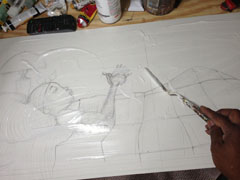
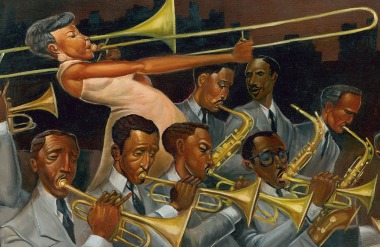
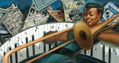
Released in September, Little Melba and her Big Trombone, is the story of Melba Liston, a little-known but trailblazing jazz musician who broke racial and gender barriers to become a famed trombonist and arranger. We asked illustrator Frank Morrison to take us behind the scenes for creating the art work used in Little Melba and her Big Trombone.
Illustration Process
After reading the manuscript for Little Melba and her Big Trombone, I immediately searched for references that could help me bring the story to life. This included clothing from the time period and a trombone, which I have never painted before. I was fortunate enough to find a CD by Melba titled, “Melba Liston and her Bones” as well. After gathering all of my materials my studio begins to sound like a jazz session as I begin reading.
I make thumbnails sketches and jot down notes on the sides of the manuscript while the Be Bopping is blaring from the speakers. My sketches are loose like a trombone’s slide and they take about a minute each.
When the thumbnails are completed I being drawing defined sketches from them and at the same time placing them in page order. Sometimes I may have two or three different ideas for a page as shown in the cover sketches.
Once my sketches are approved, I transfer the final drawings to an illustration board. This, of course, is done after I’ve measuring the dimensions and taped off the edges, which includes a half-inch border.
I spray a fixative on the drawing so it won’t smudge then coat it with a clear gesso. Next I tape the image to a wooden board. The board allows me to work sitting down at my art table or placing the painting on my easel.
Finally I use a lot of jazz music, dancing and oil paints to finish the final art.
Thanks for sharing this behind-the-scenes look! We just read Little Melba for our 30 Days of Diverse Picture Books series. The artwork was one of our favorite things about the book!
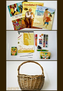
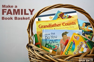
Amanda Boyarshinov is one of the creators of the blog, The Educators’ Spin On It, a site that makes everyday moments into teachable opportunities. She has a Master of Reading Education for grades K-12 and a B.A. in Elementary Education. Additionally, she has her English Speakers of Other Languages (E.S.O.L.) endorsement and has received her National Board Certification in Early Childhood Education. In this post, we’ve been given permission to share her steps on building a family theme Love Book Basket, as well as how to create an “I Love You” book.
HOW TO BUILD A FAMILY THEME LOVE BOOK BASKET
1. Choose a Book
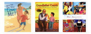
Select themed literature that is appropriate for your child’s age. Younger children may enjoy shorter stories. Older children may like more detailed picture books. Consider both non-fiction and fiction text. Lee and Low Publishing Company sent me the 3 books to read with my children for this article. All thoughts and opinions are 100% my own.
How Far Do You Love Me?
How Far Do You Love Me? is a delightful tale of families all around the world and how much they love their children. Each page introduces a new place on the globe, with a sweet sentence about their love. Geared for 3-6 year olds Click here for the Teachers Guide
Grandfather Counts
Grandfather Counts (Reading Rainbow Books) is a picture book about making connections with your family, no matter what the language may be. Author Andrea Cheng draws upon her own family and friends experiences to weave this tale of love and family. Geared for 6-8 year olds It is a Reading Rainbow selection Click here for the Teachers Guide
Honoring Our Ancestors
Honoring Our Ancestors: Stories and Paintings by Fourteen Artists is a non-fiction picture book highlighting some AMAZING artists: Carl Angel, Enrique Chagoya, George Crespo, Mark Dukes, Maya Gonzalez, Caryl Henry, Nancy Hom, Hung Liu, Judith Lowery, Stephen Von Mason, Mira Reisberg, JoeSam, Patssi Valdez, and Helen Zughaib. Each short story and accompanying artwork gives the reader a snapshot into the importance of family to that artist. Geared for 8-10 year olds.
2. Gather the Supplies for the Selected Activity.
In this activity, children make an “I Love You,” book for a family member. This can be done with art materials around the house. Directions for each page below.
3. Arrange and Display.
Arrange the materials and books in a pleasing manor in a basket, bag or container. Then, leave it on a table or desk area as an invitation to explore. Snuggle in and read. Then make the activity!
You can find directions (and pictures) on how to make an “I Love You” book on The Educators’ Spin On It website.
Make your #LOVEdiverseBooks Basket today!
Stay TUNED!!!!
Next week, The Educators’ Spin On It will be highlighting author Andrea Cheng, author of Grandfather Counts. Here is a sneak peek…
Summer is coming to an end, but that doesn’t mean the fun stops! With cooler weather comes fun indoor activities, like catching a great jazz show. We asked Frank Morrison, illustrator of our new picture book biography, Little Melba and Her Big Trombone, to share some of his favorite jazz numbers with us. Many of the artists below played or arranged with Melba Doretta Liston; others inspired Frank while he created his illustrations. So sit back with your cup of apple cider and let the rhythm carry you away!
John Coltrane: “Out of This World,” plus Coltrane’s albums The Inch Worm, Big Nick, and Giant Steps
Thelonious Monk: “Well, You Needn’t,” “Ruby, My Dear,” “Off Minor,” and “Bemsha Swing”
Dizzy Gillespie: “52nd Street Theme” and “A Night in Tunisia”
Miles Davis: “Freddie Freeloader,” “Round Midnight,” “Airegin,” and “Blue in Green,” plus Davis’s album Kind of Blue
Chet Baker: “My Funny Valentine”
Art Blakey: “Dat Dere,” “Moanin’,” “Blues March,” “The Chess Players,” and “Señor Blues” (performed with Horace Silver)
Abbey Lincoln: “Afro Blue”
Clifford Brown: “Daahoud,” “The Blues Walk,” “Jordu,” and “Parisian Thoroughfare”
Duke Ellington: “In a Sentimental Mood” and “Take the ‘A’ Train”
Stan Getz: “Corcovado” and “I’ve Got You Under My Skin”
Louis Armstrong: “Summer Song,” “West End Blues,” and “I Got Rhythm”
Still can’t get enough jazz music? Here’s Duke Ellington’s “In a Sentimental Mood.”
Have your own favorite jazz tunes? Leave ‘em in the comments!
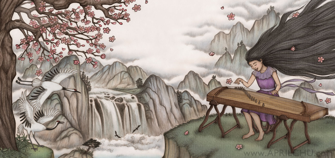
Released in March, Summoning the Phoenix gives readers an inside look into centuries-old Chinese musical instruments and the more recently formed modern Chinese Orchestra. Children of all backgrounds show that traditional Chinese music can be enjoyed by everyone. We asked illustrator April Chu to take us behind the scenes for creating the digital illustrations used in Summoning the Phoenix:
Illustration Process
1. Before I do any sketching at all, I will read a manuscript over and over many times. Sometimes I even close my eyes and just brainstorm ideas. This step is important to me because this is when all the initial images and emotions I get from a story start forming in my head. I also start doing research and compiling photos at this point as I did for Summoning the Phoenix: Poems and Prose about Chinese Musical Instruments. Researching is very important to me before I begin a project especially for a nonfictional picture book. In this case, researching on the Internet was not adequate since I needed to have a good detailed look at each instrument. Fortunately, the California Youth Chinese Symphony was kind enough to allow me to take photos during one of their practice sessions. I was able to get a firsthand look at how the musical instruments were played, what they sounded like, and what they looked like in real life. All those elements eventually shaped the final artwork.
2. After researching, I then start on rough thumbnail sketches. Since I have a hard time drawing at a very small scale, my thumbnails are usually at half size.
3. Next I refine my thumbnail sketches. I know that for this particular spread, I wanted the background to have a grandiose feeling of wind, waterfalls, and mountains that was reminiscent of a traditional Chinese painting. This was the imagery that popped into my head when I did my initial brainstorming.
4. Sometimes I have a couple of options with different compositions.
5. Once the final thumbnail sketch is chosen, I will work on the final, full size sketch.
6. I scan the image into my computer and color in Photoshop. Here is a final illustration of a girl playing the guzheng from Summoning the Phoenix: Poems and Prose about Chinese Musical Instruments.


 a gentle and moving story of adoption and parental love that is sure to touch the hearts of readers everywhere, no matter how they came to be a family. It has received starred reviews from Booklist and Publishers Weekly, which called it “an unabashed love letter, one that many families will treasure.”


 Released this month,
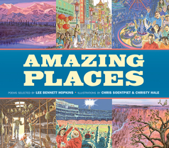


Wow! I loved seeing the steps in Lulu’s illustrations. I’m definitely reading this book!