

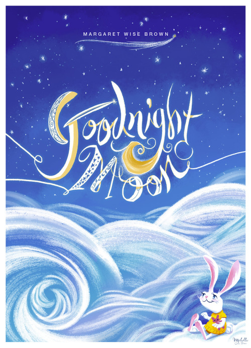
Goodnight Moon Tribute for world book day!
Add a Comment
 By: Tatjana Mai-Wyss,
on 8/20/2014
By: Tatjana Mai-Wyss,
on 8/20/2014
 By: Rachel Frankel,
on 8/10/2014
By: Rachel Frankel,
on 8/10/2014

Ok, I’ll save you the spiel about how deeply I’ve fallen in love with typography and lettering, as that should be fairly obvious by now. Drew Melton‘s work essentially speaks for itself. His deeply expressive fonts and lettering demonstrate the importance of hand-drawing into the design process. Even in the sharpest, finalized versions of his work, you’ll a spontaneity that’s unmistakably fun and energetic.


Drew is an L.A.-based graphic designer and typographer who’s worked with clients like McCann, Nike, Saatchi & Saatchi, and Penguin Books. He’s had quite the interesting journey to success in the lettering realm, some of which is marked by serious self-reflection and the ability to remain humble.

One of the things that hurled him into the design spotlight was his Phraseology project, started with a few other designers and developers in 2011. Very similar to Erik Marinovich’sFriends of Type blog, Phraseology offers the public a chance to submit any word or phrase to be designed by members of the team. Soon enough, Drew was being commissioned for some big-time typography work by notable clients.


Unfortunately, with that exciting attention also came some consequences. As much as I admire Drew’s hand at lettering, I might be even more enamored with his grace and honesty about his past mistakes.
In January 2013, Drew bravely posted a public apology on his blog to several typographic designers, including Jessica Hische, Jon Contino, Dana Tanamachi, and Darren Booth, for drawing inspiration from their styles in ways that were not entirely “okay.” He spoke openly about his guilt and sadness at realizing that his creative process had been built too closely upon the examples of his heroes, and that his heroes were now upset with him.

The topic of creative originality is probably one of the most sensitive. It’s something that is constantly under debate and argued by strong opinions. I’m a strong believer that nothing is purely unique, especially in this day and age. It’s the nature of craft and evolution to build upon an existing idea. But in an age when visual information is so widely accessible, when an illustrator or designer can essentially educate themselves by opening their web browser–it’s up to the creative to draw the line between inspiration and imitation.
It’s a testament to Drew’s work ethic and passion for the art of typography that he was still able to gain success after this admission. Even while he struggled to define his style in the beginnings of his career, it’s clear that he’s succeeded.


Drew is now focusing on font development in addition to personal design and typography. Some of my favorite fonts of his are Lastra, Handsome, and Magnifique.
I highly recommend Drew’s interview with the Australian Graphic Supply Company (a previous Art Crush feature), as well as his feature (along with this wife, stylist and co-creative Kelsey Zahn) on Rverie. Follow along with Drew here:
By: Tatjana Mai-Wyss,
on 4/16/2013
 By: Tatjana Mai-Wyss,
on 3/20/2013
By: Tatjana Mai-Wyss,
on 3/20/2013
One of the newest and most interesting typographic duos that has emerged lately, Pagan and Sharp—run by Carlos Pagan and Lucas Sharp—has released a new typeface called Sharp Sans. Based on the wonderfully simple vision of geometric styling, and a touch of humanism type theory, Sharp Sans does well in so many modern treatment situations that call for a bit of fun.
Along with Sharp Sans, they have produced Malleable Grotesque and the beautiful serif face, Hera Big. Pagan & Sharp are the creatives behind such notable work as the the latest Print 20 under 30 branding, Pinterest Logo, and recent New York Lottery campaign (Carlos’ work at DDB). With such lovely projects, they are well on their way to making a big splash in the typeface design world. Keep up with their latest news by following their twitter and keep an eye out for hopefully many more typefaces to come!


Pagan and Sharp typefaces are available at Myfonts.com
——————–
Also worth viewing:
Jesse Ragan
Typography Sketchbooks by Steven Heller and Lita Talarico
Element One
Not signed up for the Grain Edit RSS Feed yet? Give it a try. Its free and yummy.
——————–
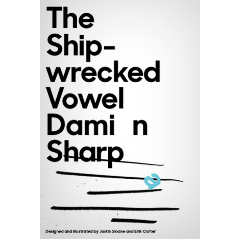
Featured Book: Matte Stephens: Selected Works..jpg?picon=507) By: Gail Maki Wilson,
on 12/12/2012
By: Gail Maki Wilson,
on 12/12/2012
 By: Gail Maki Wilson,
on 10/11/2012
By: Gail Maki Wilson,
on 10/11/2012
 By: John,
on 6/24/2012
By: John,
on 6/24/2012
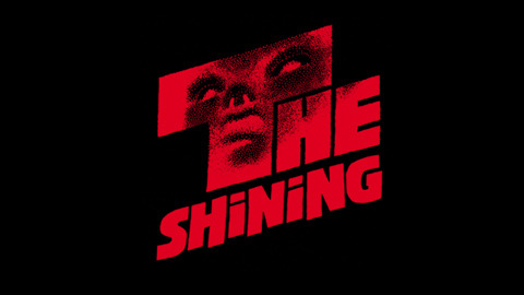
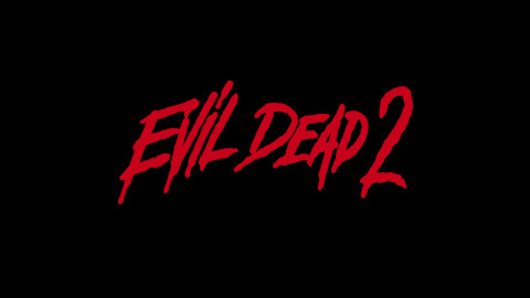
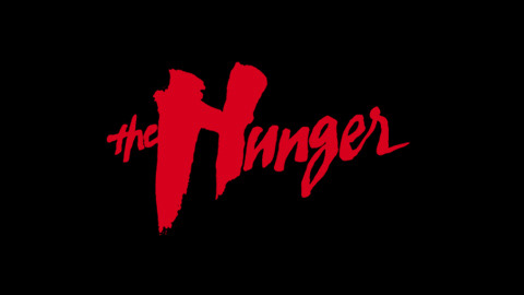
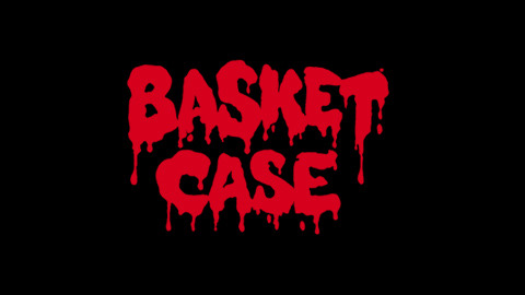
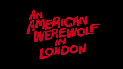
A collection of horror movie titling/logos. Via Christian Annyas of the Movie Title Stills Collection.
By: John,
on 6/18/2012
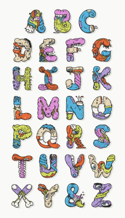
Alphabetcha, a gruesome alphabet by Nathan Walker.
By: John,
on 6/18/2012


The Dead Words offers up creative lettering and typographical renderings of forgotten words.
.jpeg?picon=1639) By: Shadra Strickland,
on 5/5/2012
By: Shadra Strickland,
on 5/5/2012
I am a huge fan of design. Those who know me, know that I majored in communications design before I moved completely to illustration. Fortunately, I have been lucky enough to further my design practice along with my illustration and am now able to find balance between the two disciplines. In NY, I sharpened my design skills while working at Bloomsbury Publishing. I mainly handled paperback conversions, but I also had a chance to work on some title treatments for covers and a few picturebooks. When I work on my own books, I think about the design as much as the visual narrative.
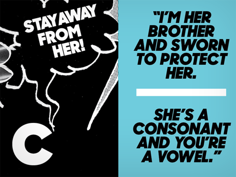
I recently delivered cover art and a few black and white interiors for a really fantastic YA novel. When the editor sent me a cover comp, I had a few issues with the design—mainly the type treatment. In the beginning of the project, I pictured the jacket with a hand written title and expressed it to the editor, but when I delivered the art I didn’t have time to explore it. After seeing the cold computer generated font that was chosen, I knew a hand lettered font would have much more impact and personality, so I went ahead and made one.

the original type treatment
Showing is always better than telling.
I drew over the original type treatment and added my own embellishments and adjustments. I then scanned the drawing into photoshop, created paths and imported them into illustrator where I was able to clean and kern until it looked less like casual writing and more like stylized letterforms. Once I was satisfied with the weight and spacing, I pulled it back into photoshop and embossed it. The editor really liked it and is using it on the cover. ![]()

type by Shadra ![]()
Many thanks to my editor, Christina, who supported my vision for this project. I can’t wait to share the book with you!
 By: Sally Lloyd-Jones,
on 11/14/2011
By: Sally Lloyd-Jones,
on 11/14/2011
 "I'm all in favor of keeping dangerous weapons out of the hands of fools. Let's start with typewriters." ~Frank Lloyd Wright
I love the quote. Plus the idea that something that puts words on a page is dangerous.
Wait. No. Of course this typewriter is dangerous. Imagine what it could do to you if it landed on your head.
I have one of them sitting in the corner of my room. My mum says she loves it and wants it because she learned to type on it. But it's too heavy to pick up let alone transport across the Atlantic. So here it stays sitting there. (But she gets to visit it.)
The other creepy thing about my ancient dangerous typewriter is: it's a typewriter that was around when Hitler was.
This is getting all too creepy. So I'm stopping now. And going back to my extremely dangerous bright green Clairefontaine notebook...
By: John,
on 11/5/2011
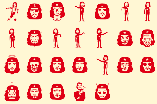
As I’ll be visiting Buenos Aires later this winter, I’ve been reading up on all things Argentinian (including re-watching The Motorcycle Diaries), so I was tickled when I stumbled upon this icon set of the iconic Che Guevara, designed by Jorge Alderete for an Argentinian type foundry named Sudtipos (who also created a lovely Calgary-inspired font named Calgary Script!).
(via SL Che - MyFonts)
By: John,
on 9/28/2011
Playful type from Skip Sterling Illustration
 By: Elena Ornig,
on 3/31/2011
By: Elena Ornig,
on 3/31/2011
Original appeal from the website owner. Dear readers, please try to identify which type you belong to before you place your feedback or the testimonials on my site. Please, write accordingly to your type. Type # 1: If you have nothing nice to say, then please keep your mouth shut. I am not afraid of taking a hit but please spare me your ‘wisdom’, Mr or Mrs “Self-Appointed Critic”. Did you forget that wisdom comes from reservation and humility? Did you forget that “criticism” was originally a neutral verb? I know that you have chosen the easiest path to satisfy your ego and it feels good. Let me tell you what else I know, that path does not take too much intelligence and will never make you happy. I feel sorry for you. You have missed the point. By criticising anybody’s work, you are only looking at the little part of the whole ... Read the rest of this post
Add a Comment
By: John,
on 3/21/2011
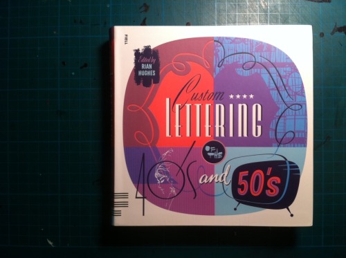
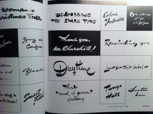

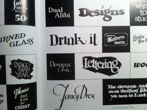
Custom Lettering of the ’40s and ’50s
Last year’s Custom Lettering of the ’60s and ’70s, Rian Hughes’s massive scrapbook of curated lettering samples culled from movie posters, ads, and other ephemera of the time, was one my favourite books of 2010. It quickly gained a permanent spot on the bookshelf closest to my drawing table, it’s such a great reference book.
Its new successor, Custom Lettering of the ’40s and ’50s now joins it on the shelf. Both books are nothing but pure typographic pornography, carefully sorted by style and tone.
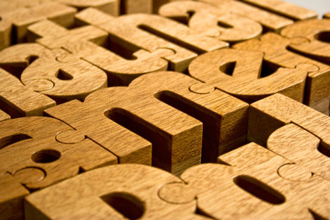
Really like these wooden typographic puzzles (Nuzzles) from designer John Christenson. Hopefully John will have a Nuzzles shop up soon!
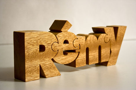
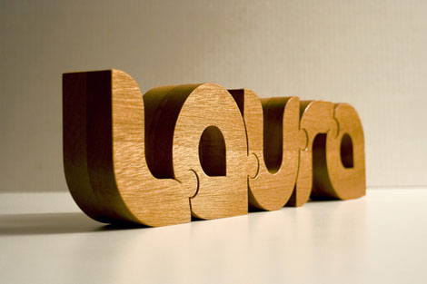
(via Simon’s Work - Thanks Simon)
—–
Also worth checking: Photo-Lettering Alphabet Blocks , Alexander Girard Alphabet Blocks
Enjoy this story? Sign up for our tasty free grain edit RSS feed.
—–
No Tags
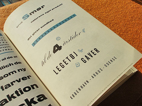
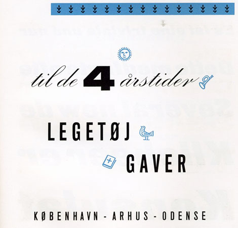
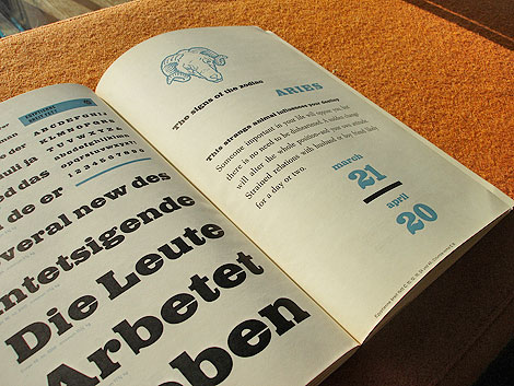
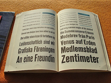
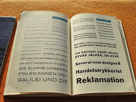
Schriftenkatalog der n.v. Lettergieterij Amsterdam voorheen N. Tetterode
I rarely find cool type catalogs, but this one is a real goldmine. The catalog seen above was produced by the Amsterdam Foundry (formerly N. Tetterode) and appears to date back to the mid-1960s. It’s filled with beautiful specimens including Nobel, Mercator and Aigrette all lovingly laid out in a simple yet elegant manner. If this sparks your interest, I suggest taking a quick glance at the Vette Annonce type specimen sheet we posted back in 2008 as well.
Grotesk in different weights
Karten & Grotesk Breitt Fett
Aigrette
—–
Also worth checking: Simmelkiaer Grotesk Type Specimen
Enjoy this story? Sign up for our tasty free grain edit RSS feed.
—–
No Tags
I tend to find myself irresistibly attracted to charming things -- which has led me into trouble far more often than not -- but these delightful French chickens were crying out for attention and how could I say no? I am far too easily persuaded :) They belonged to the friend of a friend and sat on her table, all round and smooth and quite a pleasure to behold. I've changed the colours but hopefully retained the simplicity of form and it turned out to be a simple yet extremely therapeutic and enjoyable drawing.
I also have a wonderful queue of requests for my type designs which is a great but pleasant surprise. I'm going through them all in between drawings, but here's the last one I managed to do, for my niece:
I'm pleased to say that the sticker for it won me a TBA Award at zazzle on the 28 August :) Thanks Marisa!
French Hen products at Floating Lemons at Zazzle
Marisa cherry pink products at Floating Lemons Type at Zazzle
By: John,
on 2/18/2009

Visit Andy Smith’s Flickr stream for all manner of typographic goodies. Don’t miss his collection of book jacket designs.
(via Delicious Industries)
By: John,
on 1/22/2009

Via The Ministry of Type comes two Flickr sets devoted to showing the different between the original English and the resulting translation into Arabic of several retail identities and examples of consumer packaging.
I was struck by the playful and clever ways in which the originals were faithfully adapted to meet the restrictions of the Arabic letterforms.

Beautiful!
Beautiful colors. And wildflowers!
Awesome work
This is lovely! So happy!