new posts in all blogs
Viewing: Blog Posts Tagged with: cover design, Most Recent at Top [Help]
Results 1 - 25 of 25
How to use this Page
You are viewing the most recent posts tagged with the words: cover design in the JacketFlap blog reader. What is a tag? Think of a tag as a keyword or category label. Tags can both help you find posts on JacketFlap.com as well as provide an easy way for you to "remember" and classify posts for later recall. Try adding a tag yourself by clicking "Add a tag" below a post's header. Scroll down through the list of Recent Posts in the left column and click on a post title that sounds interesting. You can view all posts from a specific blog by clicking the Blog name in the right column, or you can click a 'More Posts from this Blog' link in any individual post.
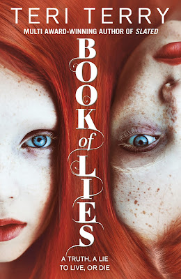 |
My latest: Book of Lies,
published by Orchard Books 24 March! |
by Teri TerryI'm taking a break from blogging about writing this time, and moving on to something that can strike hope, fear, joy and despair into the heart of all authors... sometimes at the same time. Yes, you guessed it: book covers.
Covers are so critical to the success of a book. The most amazing book with the wrong cover will struggle; the most average book with the most amazing cover will do well. Them's the facts. When I first saw the cover for Book of Lies, I was still writing the story. It was love at first sight for me: an amazing cover! Actually possibly the most amazing cover in the history of covers! Though instead of thinking, ok, average insides will do the job, it somehow turned the pressure up a notch to get the story just right.
Considering how important they are, there is very little out there about the shadowy figures behind cover design.
So introducing Thy Bui, YA and middle-grade Art Director for Orion and Orchard:Thy started her design career at Warner Music UK. The three years on sleeve design gave her a unique insight into the visual world of teens and young adults; the move from music to books was an obvious transition. She joined Orchard Books as senior fiction designer at an exciting time – Orchard were building their middle-grade, teen and YA lists, having acquired incredible talent like Ally Carter, Teri Terry and Jonathan Meres .
At the beginning of 2015 Thy began her role as Art Director for middle-grade to YA fiction, working across the Orion and Orchard list. It was an unique opportunity to work on two distinctly different imprints, and to work with amazing debut and prizewinning talent including Annabel Pitcher, Dawn Kurtagich and Leo Hunt.
I decided to do this blog recently when a reader, Carina, asked me about how you become a cover designer. I emailed Thy, and her reply was so generous and detailed that I asked her if I could blog it. Here it is:
Thy on becoming a cover designer:
 I went to university in Australia and did a Design degree focusing on Visual Communication – graphic design, illustration and typography. The following are known for being good for those graphic design (2 dimensional design as opposed to product and industrial design) focused:
- London College of Communication
- Central St Martins
- Kingston University
- University of Brighton
- Cambridge School of Art
 My advice is to completely immerse yourself in book design and design in popular culture – music, fashion, games, film, food, interiors/furniture…everything – as design, and good examples of design and inspiration, crosses all arenas.
And also to bear in mind the importance of type. Keep an eye out for good use of type, and if the degree chosen offers a typography elective, take it.
Design talks and events are also great, I've yet to go to a GLUG event, but they are meant to be inspirational and good for networking. There's also OFFSET in Dublin.
 Below are a handful of book cover related sites to check out. There is so much out there, independent designers, design agencies, illustrators etc…so this is just a starting point:
 And also follow publishers' instagram/pinterest boards. A lot of them are set-up by the designers and they're a little more inspirational than the actual websites which are set-up by the corporate bods as a business tool rather than celebrating the design side of publishing.
And finally, let her/him know to expect to work VERY hard, you need a good portfolio to get into a Design degree. Design is challenging work and not just about making something look pretty. Fantastic design is almost always about a creative concept/approach, followed by great execution.
 ...and a final word from the author who shamelessly put all her Thy-designed-covers down the side of the blog:
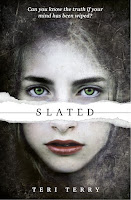
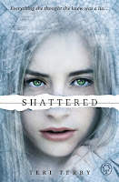
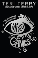
I know how lucky I've been to have Thy as my cover designer for all my covers, from Slated to Book of Lies. I wrote this in the acknowledgements at the back of Book of Lies:  ...thanks to Thy Bui, the very amazing cover designer who has done all my Orchard Books covers. I kept looking at the cover for Book of Lies while I was editing it, and thinking, I have to make this good enough to live up to this cover.
Very true. All I can say is that I hope the insides have lived up to the outsides.
And now for a giveaway with a difference! A copy of Book of Lies, signed by both designer (Thy) and Author, me (Teri):
To enter, please leave a comment to this blog - say hello or ask a question, and then tell us what is your favourite ever book cover and why.
A winner will be chosen at random at noon on 28th March (UK time), using a random number generator.
Open internationally.
Here is Thy holding up two of her creations at my launch event at Waterstones Islington on Saturday.
Thanks, Thy! For being there - both then and now.
 |
| Thanks to Candy Gourlay for the photo |
AND here is most of the Notes from the Slushpile Team at the same party:
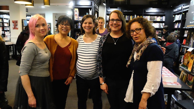 |
From left: Kathryn, Candy, Jo, Teri (me!), and Addy. Missing are Nick and Maureen.
I'd say photo by Candy, as it is in her photos, yet - strangely - she is in the photo... |
Now that we’ve revealed the cover for the amazing Perfect Liars by Kimberly Reid (coming in May!), let’s talk about the cover design process. As with Ink and Ashes last year by Valynne Maetani, Perfect Liars is a YA mystery title. How do you give a book that mysterious air you need? How do you tell readers, “This book is for YOU!”?
The challenge in all YA book design is to create a cover that looks like it belongs in the YA section, but doesn’t look too much like the rest of the YA section. And to do that, you need a good designer. We found that designer in Liz Casal, who’s also designed covers for Little, Brown and Soho Press. Looking at her portfolio, we knew she was just the designer for the job.

We always start with some comp designs, to figure out what direction we’ll want to go in. Liz gave us some really amazing options. Here are a few of my favorites (these aren’t all of them).
 What I loved most about Liz’s designs is the care she put into finding photos of models who would look like the main character, Andrea Faraday, who is biracial (black and white). On top of that, her sense of contemporary design is just spot on. It was hard to choose which one we loved most!
We each loved multiple choices, so how could we narrow it down? I showed the potential covers to coworkers here at Lee & Low, to the author, and to her agent, soliciting opinions. We all had reasons for why we liked what we liked. But which direction was the best direction for this book?
There were some easy ones to rule out—the last one (with the girls in the hat) was a great picture, but didn’t convey the feeling we wanted to convey with this book cover. It was too convivial, not  mysterious enough. As Kim put it, “I imagine totally loving this for some other book I’d write.” A couple others felt too much like other books, and we weren’t sure we liked the cropping of some others (we didn’t want to lose the character’s full face, even though that cropping created a great sense of mystery).
We all loved the red cover (upper left of the original design), but we felt very strongly that a silhouette wouldn’t be the right choice for a book starring a person of color—we didn’t want to obscure our character’s ethnicity, we wanted to celebrate it! However, that book had a very commercial feel to it. Could we tweak it so that it would clearly show that she’s a character of color?
We looked at a number of options for that cover direction, and in the meanwhile also explored a few other options. We narrowed our options down further, looking at filters and cropping, fonts and angles. And then we decided to go to the experts: teens.
 We chose our three favorite covers (we were on about round 3 by now), and during a visit to our office by students from the Grace Church School (who were there to talk to Joseph Bruchac, author of Killer of Enemies and Trail of the Dead), we asked students to tell us which book they most wanted to read.
Every teen in the room pointed to the cover on the right, the one with the characters wearing sunglasses. We were a little surprised—we thought that opinions might at least be split, or possibly favor the cover we’d been continuing to try to tweak so it wasn’t strictly a silhouette.

Why, we asked, were they most interested in that book?
“Because she looks like she’s hiding something,” said one teen.
For them, those sunglasses meant a sense of mystery.
What do you think? Were our teen experts on to something? We think so!
Check out the final cover at Diversity in YA!
.jpeg?picon=2450)
By:
Sherrie Petersen,
on 6/23/2015
Blog:
Write About Now
(
Login to Add to MyJacketFlap)
JacketFlap tags:
interview,
book review,
bloggers,
book giveaway,
author interview,
book covers,
astronomy,
cover design,
outer space,
unique stories,
Book Country,
blogger friends,
Wish You Weren't,
amazing teenagers,
disvovering a planet,
Fabián Cobos,
The Secret Files of Fairday Morrow,
WASP-142b,
Add a tag
Headline news can be depressing. Which is why it makes me happy to find news stories like this one: This Teenager Discovered a New Planet on his Third Day of Work. Seriously. At 15, this kid shows up for day three of his “work experience” project, they’ve assigned him the task of wading through all […]

By: Kim Sponaugle,
on 2/13/2015
Blog:
Illustrator Kim Sponaugle's Picture Kitchen Studio
(
Login to Add to MyJacketFlap)
JacketFlap tags:
cover art,
Kim Sponaugle,
cover design,
book cover,
Picture Kitchen Studio,
chapter book covers,
looking for a book cover artist,
need a great cover,
picture book covers,
tween book covers,
Add a tag
In need of a cover illustration or some design help with a picture book, early reader or tween chapter book? Picture Kitchen Studio can help!

By:
rgarcia406,
on 12/4/2014
Blog:
The Open Book
(
Login to Add to MyJacketFlap)
JacketFlap tags:
Book News,
family,
diversity,
mystery,
New Releases,
thriller,
Cover Design,
Dear Readers,
Tu Books,
cover reveal,
Asian/Asian American,
yakuza,
Diversity in YA,
New Visions Award,
Lee & Low Likes,
Art and Book Design,
Asian American interest,
Japanese American Interest,
Valynne E. Maetani,
Add a tag
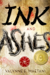
Ink and Ashes by Valynne E. Maetani is Tu Books’ first New Visions Award winner. Seventeen-year-old Claire Takata discovers a secret about her deceased father that should have remained a secret.
The New Visions Award, modeled after LEE & LOW’s successful New Voices Award, is for unpublished writers of color who write science-fiction, fantasy, and mystery YA or middle grade novels.
Ink and Ashes is set to be released Spring 2015!
Claire Takata has never known much about her father, who passed away ten years ago. But on the anniversary of his death, she finds a letter from her deceased father to her stepfather. Before now, Claire never had a reason to believe they even knew each other.
Struggling to understand why her parents kept this surprising history hidden, Claire combs through anything that might give her information about her father . . . until she discovers that he was a member of the yakuza, a Japanese organized crime syndicate. The discovery opens a door that should have been left closed.
The race to outrun her father’s legacy reveals secrets of his past that cast ominous shadows, threatening Claire, her friends and family, her newfound love, and ultimately her life. Winner of Tu Books’ New Visions Award, Ink and Ashes is a fascinating debut novel packed with romance, intrigue, and heart-stopping action.
Thanks to the following blogs for participating in the Ink and Ashes cover reveal:
YA Interrrobang
RT Book Reviews
YA Highway
We can’t wait to hear what you think of the cover! Thanks to Sammy Yuen of Sammy Yuen Interaction Art and Design for the cover design.
Filed under:
Art and Book Design,
Book News,
Cover Design,
Dear Readers,
Diversity in YA,
Lee & Low Likes,
New Releases,
Tu Books Tagged:
Asian American interest,
Asian/Asian American,
cover reveal,
diversity,
family,
Japanese American Interest,
mystery,
New Visions Award,
thriller,
Tu Books,
Valynne E. Maetani,
yakuza 

By:
rgarcia406,
on 11/7/2014
Blog:
The Open Book
(
Login to Add to MyJacketFlap)
JacketFlap tags:
illustration,
Book News,
diversity,
art,
illustrations,
New Releases,
Cover Design,
African/African American Interest,
Dear Readers,
Frank Morrison,
jazz music,
Lee & Low Likes,
Art and Book Design,
Interviews with Authors and Illustrators,
melba liston,
Katheryn Russell-Brown,
Little Melba,
Little Melba and her Big Trombone,
Add a tag
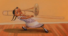
 Released in September, Little Melba and her Big Trombone, is the story of Melba Liston, a little-known but trailblazing jazz musician who broke racial and gender barriers to become a famed trombonist and arranger. We asked illustrator Frank Morrison to take us behind the scenes for creating the art work used in Little Melba and her Big Trombone.
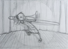
Illustration Process
- After reading the manuscript for Little Melba and her Big Trombone, I immediately searched for references that could help me bring the story to life. This included clothing from the time period and a trombone, which I have never painted before. I was fortunate enough to find a CD by Melba titled, “Melba Liston and her Bones” as well. After gathering all of my materials my studio begins to sound like a jazz session as I begin reading.
- I make thumbnails sketches and jot down notes on the sides of the manuscript while the Be Bopping is blaring from the speakers. My sketches are loose like a trombone’s slide and they take about a minute each.
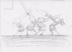
- When the thumbnails are completed I being drawing defined sketches from them and at the same time placing them in page order. Sometimes I may have two or three different ideas for a page as shown in the cover sketches.
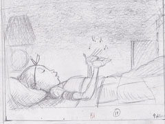
- Once my sketches are approved, I transfer the final drawings to an illustration board. This, of course, is done after I’ve measuring the dimensions and taped off the edges, which includes a half-inch border.
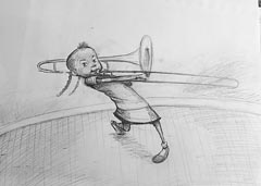
- I spray a fixative on the drawing so it won’t smudge then coat it with a clear gesso. Next I tape the image to a wooden board. The board allows me to work sitting down at my art table or placing the painting on my easel.
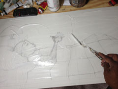
- Finally I use a lot of jazz music, dancing and oil paints to finish the final art.
Filed under:
Art and Book Design,
Book News,
Cover Design,
Dear Readers,
Interviews with Authors and Illustrators,
Lee & Low Likes,
New Releases Tagged:
African/African American Interest,
art,
diversity,
Frank Morrison,
illustration,
illustrations,
jazz music,
Katheryn Russell-Brown,
Little Melba,
Little Melba and her Big Trombone,
melba liston 

By:
keilinh,
on 9/24/2014
Blog:
The Open Book
(
Login to Add to MyJacketFlap)
JacketFlap tags:
medicine woman,
rose eagle,
dystopia,
science fiction,
Book News,
family,
friendship,
native americans,
Joseph Bruchac,
New Releases,
steampunk,
south dakota,
healing,
first love,
novella,
Cover Design,
genetic engineering,
mining,
black hills,
lakota,
Tu Books,
cover reveal,
healer,
Killer of Enemies,
Add a tag
Last fall, Tu Books released Killer of Enemies, a post-apocalyptic steampunk adventure by Joseph Bruchac. Readers were introduced to seventeen-year-old Apache hunter Lozen, a kick-butt warrior who kills monsters to ensure the safety of her family.
Set to be released next month, Joseph Bruchac has written an e-novella that’s a prequel to Killer of Enemies, titled Rose Eagle.
Rose Eagle is set in the Black Hills of South Dakota, where readers are introduced to seventeen-year-old Rose Eagle of the Lakota tribe who is trying to find her place in a post-apocalyptic world.
Before the Silver Cloud, the Lakota were forced to work in the Deeps, mining for ore so that the Ones, the overlords, could continue their wars. But when the Cloud came and enveloped Earth, all electronics were shut off. Some miners were trapped in the deepest Deeps and suffocated, but the Lakota were warned to escape, and the upper Deeps became a place of refuge for them in a post-Cloud world.
In the midst of this chaos, Rose Eagle’s aunt has a dream: Rose will become a medicine woman, a healer. She sends Rose into the Black Hills on a quest to find healing for their people.
Gangly and soft-spoken, Rose is no warrior. She seeks medicine, not danger. Nevertheless, danger finds her, but love and healing soon follow. When Rose Eagle completes her quest, she may return with more than she ever thought she was looking for.
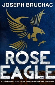 Thanks to the following blogs for participating in the Rose Eagle cover reveal:
Beyond Victoriana
Finding Wonderland
Rich in Color
We can’t wait to hear what you think of the cover!
Filed under:
Book News,
Cover Design,
New Releases,
Tu Books Tagged:
black hills,
cover reveal,
dystopia,
family,
first love,
friendship,
genetic engineering,
healer,
healing,
Joseph Bruchac,
Killer of Enemies,
lakota,
medicine woman,
mining,
native americans,
novella,
rose eagle,
science fiction,
south dakota,
steampunk 

Book covers are something of an obsession for writers, editors, and booksellers. A good cover sells itself, achieving the almost elusive combination of intrigue and aesthetic that makes you itch to pluck the book from the shelf to read its contents. Creating such a cover is, of course, part design skill, part muse-inspired, and part […]

By:
Chad W. Beckerman,
on 5/27/2014
Blog:
Mishaps and Adventures
(
Login to Add to MyJacketFlap)
JacketFlap tags:
Maggie lehrman,
design blog,
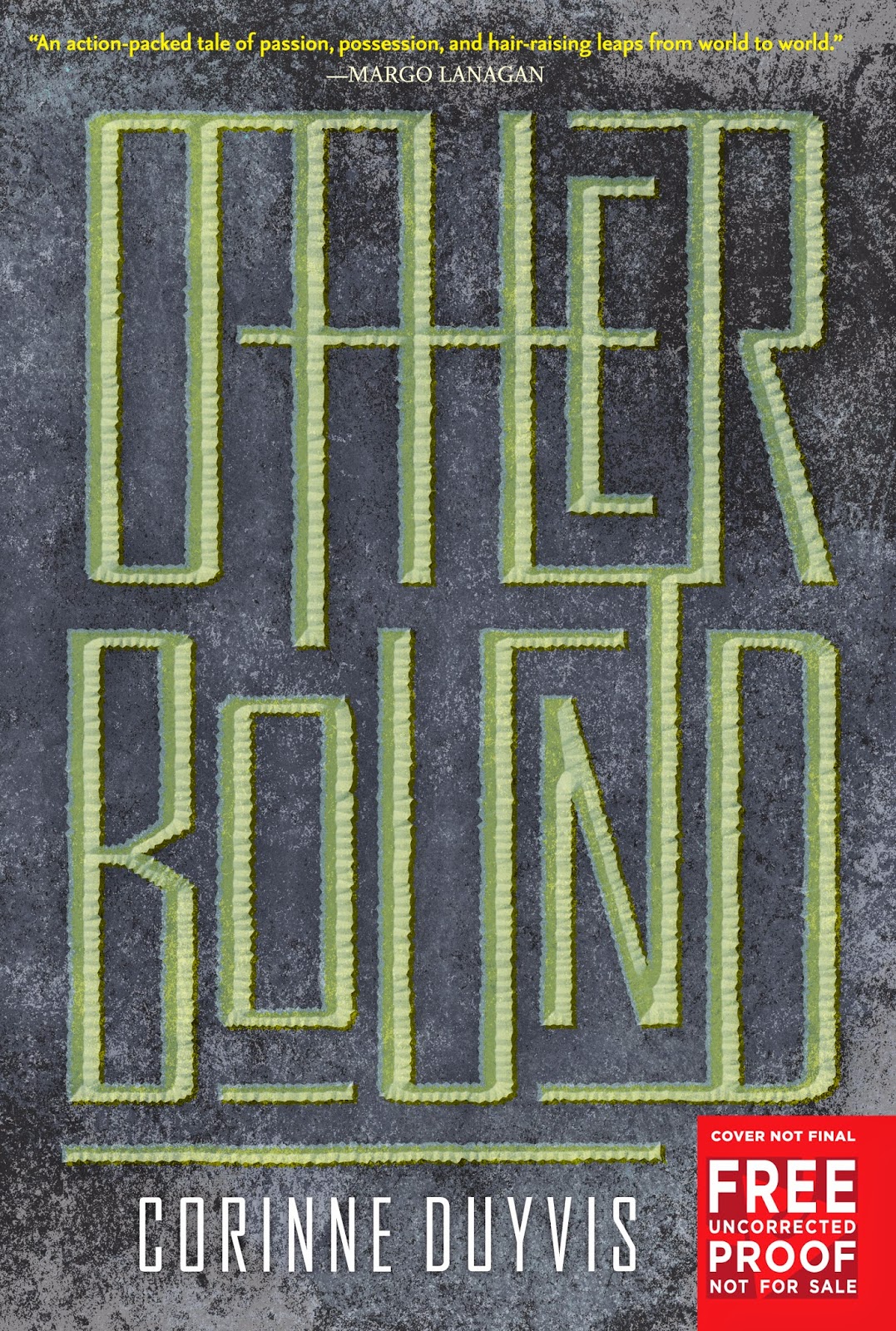
OTHERBOUND,
Corinne Duyvis,
Scbwi,
illustration,
Process,
cover design,
ABRAMS,
art direction,
Add a tag
It's been awhile since my last Cover evolution post after reading this blog you might forgive me. Usually, I give a couple short phrase about how each stage progressed. This post is a little different. Senior Editor
Maggie Lehrman and artist
Vince Natale will guide us through the cover evolution of
OTHERBOUND by Corinne Duyvis So let's get started.
First things first your need to know a little about the story.
Amara is never alone. Not when she’s protecting the cursed princess she unwillingly serves. Not when they’re fleeing across dunes and islands and seas to stay alive. Not when she’s punished, ordered around, or neglected.
She can’t be alone, because a boy from another world experiences all that alongside her, looking through her eyes.
Nolan longs for a life uninterrupted. Every time he blinks, he’s yanked from his Arizona town into Amara’s mind, a world away, which makes even simple things like hobbies and homework impossible. He’s spent years as a powerless observer of Amara’s life. Amara has no idea . . . until he learns to control her, and they communicate for the first time. Amara is terrified. Then, she’s furious.
All Amara and Nolan want is to be free of each other. But Nolan’s breakthrough has dangerous consequences. Now, they’ll have to work together to survive—and discover the truth about their connection.
So now let's hear from Maggie Lerhman, Senior Editor:
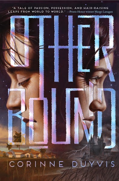
Otherboundis an incredibly original book, unlike anything I’d read before. It has interweaving perspectives, male and female POVs, a “normal” Arizona world and a “fantasy” world of the Dunelands, and characters that cross back and forth between them. The incredibly original can be tough to conceptualize in a book cover, since they tend not to have easy comparisons—and Chad and I found to be true in this case. We wanted to get across the idea of seeing the world through someone else’s eyes, and the general concept that there would be two worlds. But pretty much the rest of the cover was up in the air.
The first few comps that Chad and our designer Sara Corbett came up with tried a photographic/typographic approach. We liked the idea of having one eye open/one eye closed, but these felt a little slick, and they didn’t get across the strangeness and the seriousness of the central concept.
Then Sara and Chad came up with these, which were definitely more mysterious and very striking. Eyes are a natural thing to focus on—Corinne’s original title for the book was Blink. But in the end we felt there was something cold about these.
Our publisher expressed the problem concisely: These feel like science fiction, and we wanted to get across more of a sense of the magic and the fantastical.
By this point, we realized we needed to start from scratch…
but we’d spent a lot of time on what we’d done already, and our Advance Reader Copies were due to the printer. This was a crucial deadline so that booksellers and reviewers could start reading and talking about Corinne’s amazing book in advance of publication. We hate to have to print an ARC with a non-final cover, but sometimes it happens, and in this case, it was unavoidable. But Chad and Sara made an effort to find a typeface that read more “fantasy.”
Some of these felt “fantasy,” but a much more medieval-style fantasy that what Corinne had written. The Dunelands are a gritty, rough-edged world. There’s magic, but it’s an earthy, painful strain of magic, not a gowns-and-potions magic. The gothic feel of that type didn’t fit in with how I had pictured that world. Plus it didn’t hint at Nolan’s real-world environment at all—which is half of the book. We eventually went with this blocky interconnected type, which felt to me as if it had been carved out of stone.
We liked that type for the ARC, but for the final cover, we wanted a more evocative image to go with it. Chad put together this sketch. The idea is from the book: it’s the magical tattoo that servants wear in the Dunelands, with some actual dunegrass below. Something about this didn’t feel right, though. Perhaps it was too mechanical-looking. After all, this is a book that’s very concerned with its protagonists’ bodies—who’s in control, who’s in pain, who gets a say.
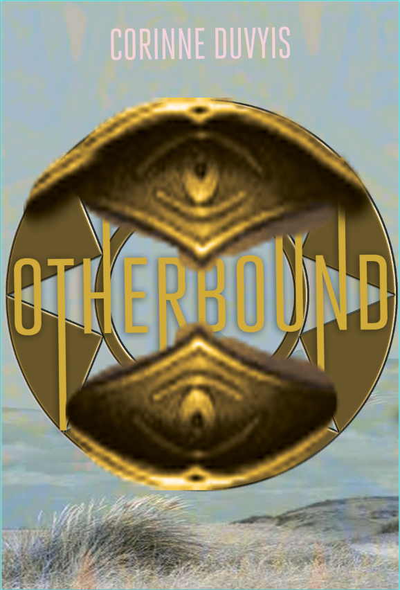
( psst, its Chad, At this point in the process I felt a bit lost and tired but not defeated. I wasn't super happy with this direction but it felt right at the time. Mainly because I think it was different than what we had been doing. Which doesn't mean it was the right direction. )
So finally Chad suggested we approach an illustrator he’d worked with before (on the absolutely gorgeous Megan Whalen Turner Attolia covers), Vince Natale.
(CHAD: I had been waiting to work with Vince again and this was the perfect fit for him. It just took me awhile to figure that out. Thankfully the idea of using Vince was conceived.)
We had total confidence that Vince could bring the fantasy feel to this cover while also introducing compelling characters. He sent several sketches of composition options, all with that old gothic font we’d toyed with for the ARC. Chad took our favorite composition and combined it with the more blocky interconnected type we liked so much in the ARC and Vince went to final.
And now I’ll let Vince take over to discuss some of his process!
These sketches are my effort to work out details of how to handle the imagery at the bottom of the cover art to include in my tight sketch. I needed to show the separate and differing environments each of the protagonists of the book inhabited - one a typical suburban southwestern U.S. neighborhood, and the other a mysterious , magic filled seaside world.
I needed somehow to meld the two together visually, but keep them separate at the same time. I decided that the best way to do this was to draw them on the same plane at similar sizes and commingle some physical elements, and then make the point of them being separate worlds through the use of color.
In the top sketch I felt that there was too much detail in the 'neighborhood' scene, and that the size of the house was too "in your face", and the composition not fluid enough.
In the bottom sketch I felt that I got more of a 'feel' for the environment neighborhood scene -more houses and more obvious mountains in the background and not so much explicit detail.
The castle, though, I found had gotten a bit fidgety and detailed, and the silhouette didn't really scream 'castle' - it looks like ti could be some kind of medieval village.(which might have worked but that wasn't the plan.)
So, I combined the castle from the top sketch with the neighborhood from the bottom and that seemed to hit the mark.
In the completed tight sketch these elements were refined and modified slightly; In the final painting, even a little more -but those were really just details, such as grasses in the foreground to balance out the composition.

This is the underpainting - the first step in the painting process of the final artwork. It's a thin layer of paint applied on top of a very detailed line drawing on canvas or primed board.
This helps to loosely establish the basic color and value patterns as a guide for the top layer of paint.
Here you can see the breakdown of three distinct color sections - warm, orange-brown for the Southwestern feel, cool, silvery-grey for a mysterious mood, and both blending to violet towards the top representing the vast space between the two worlds.
This color scheme developed in my head as I was working through all the preliminary sketches so I had a good idea of where I wanted to go with color.Many times I"ll do color sketches for myself when I'm not sure what the best way to handle something is, if it hasn't just "come to me", or if a client requests one. It's hard doing color sketches for clients though, because most times my color sketches are what I call "failures" -a series of color messes that show me what I DON'T want to do. Also, many times they're simply color swatches that I find look good together, not always little mini versions of the final art. For this piece I gave the art director written notes of my intentions, and for this particular project it worked out well.
And so at least here’s the final over of Otherbound. For the finished book, we printed the type in spot UV so that it pops from the matte background. We’re very happy with the way it turned out and think it conveys everything we need it to—the points of view, fantasy, characters’ bodies, warmth, roughness, etc. It was a long road but good things are worth waiting for.
Reviews:
“Original and compelling; a stunning debut.”
--Kirkus Reviews, starred review
“Numerous plot twists drive the story along, and it’s grounded in worldbuilding that creates a believable, authentic setting. Duyvis makes ingenious use of a fascinating premise.”
--Publishers Weekly, starred review
“Duyvis creates a humdinger of an adventure that contains the agony of loyalty, the allure of magic, and, most gratifyingly, the element of surprise.”
--The Horn Book Magazine

By: Carter Higgins,
on 3/3/2014
Blog:
Design of the Picture Book
(
Login to Add to MyJacketFlap)
JacketFlap tags:
design,
color,
lemony snicket,
concept,
scale,
cover design,
shape,
size,
lisa brown,
trim size,
Add a tag
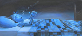
 by Lemony Snicket, illustrated by Lisa Brown
published 2014 by McSweeney’s/McMullens
 Do you know Because of Winn-Dixie? (Have I told you about the time I told Kate DiCamillo I wrote because of Winn-Dixie and obviously meant because of Because of Winn-Dixie but she cackled and my heart soared?)
Anyway. There’s a thing called a Littmus Lozenge. It’s a candy that makes you taste your sorrow and your sad and your sweet, all at once. Maybe it’s the thought of a lozenge sounding like something medicinal, or maybe it’s cause this pharmacy gave me both comfort and the heebie-jeebies, but reading this book felt a little like tasting a Littmus Lozenge. Something unsettling hovers around this place, but it beckons me, too. And I’m not alone in that: those two myth-collectors/busters are at once intrigued and terrified.
It’s weird and charming and confusing and a head-scratcher all at once.
I think that’s exactly what makes it a successful story for kids. Everything doesn’t have to make sense. Offbeat is okay.
Because let’s face it: kid are weird and charming and confusing. They teeter in that fuzzy place between wonder and reality. This is a book that honors this and celebrates that. 
 Is it suspicious, a lady going in and coming out in the same outfit? No. Not necessarily. But see: you are an adult. You are past your prime of delighting in the bizarre and making sense or screwballs out of it. When you read this, rest in it. Let it catapult you from being a grownup. It’s good for you. And then share it with a kid. They’ll get it.
 Physically, I love the compact trim size because it feels like a manual, like a notebook, like some peculiar pamphlet to some oddball prescription in the pharmacy. It’s like a secret. A hush.
 Then! The cover unfolds to show the depths of the Swinster Pharmacy. When you flip it over, there’s a map of the town. Don’t ask me why I didn’t show you that. Just trust me. (If you dare.)

P.S. – Another numbered book I loved recently is How to Bicycle to the Moon to Plant Sunflowers, by Mordecai Gerstein. A total must read if you love quirk and lists like me.
The publisher provided a review copy of 29 Myths on the Swinster Pharmacy, but thoughts and love are my own.
Tagged:
cover design,
lemony snicket,
lisa brown,
scale,
trim size 

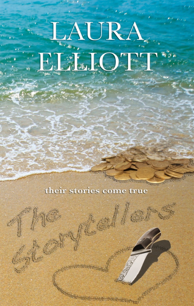
By: Laura A. H. Elliott,
on 8/9/2013
Blog:
Laurasmagicday
(
Login to Add to MyJacketFlap)
JacketFlap tags:
cover reveal,
Quentin Tarantino,
Design,
Uncategorized,
Giveaways,
romance,
Book design,
goodreads,
cover design,
Book cover,
Add a tag
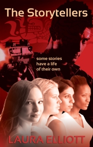
Synopsis:
Four storytellers
One ancient demon
No way out…
Four women who call themselves The Storytellers have gathered one hot August evening to tell tales, as they have for years. But on this night, they unknowingly evoke the powers of an ancient Mayan idol that breathes real life into their stories. The Mayan idol isn’t the only ancient being awakened. A power-hungry demon is determined to see the women fail and become enslaved to him forever.
Now the women’s lives depend on surviving each other’s stories, defeating the demon and solving a centuries-old mystery.
If they survive until The End untold wealth is theirs. But some stories have a life of their own…
ADD ON GOODREADS:
https://www.goodreads.com/book/show/18289410-the-storytellers
OMG! The road to this cover has been hilarious! There was the too-chicklity version the hands-down-the-pants version, the oh-kiss-her-already version and then…..the version that won….the Quentin Tarantino version! Cover design is an adventure for every writer. It’s near and dear to my heart because I loved working in graphics for decades and there’s lots to do here at what I lovingly call the fiction factory. I make the coffee and the popcorn, (you all know that  ) …I’m the janitor….tech support….I’m the buddy in the cubicle next to me who drives me nuts and chews my clock….AND…..I’m the book trailer gal, word maven, wine drinker, coach, and book designer. LOL! Next to writing, book cover design has got to be one of my favorite jobs as an indie––in a terrifying but fun sort of way. I love designing book trailers too but the covers are where I usually get to see my characters for the first time and that’s always magical. I hope you enjoy them. But enough about the book cover journey……
Click here for the giveaway!
Up for grabs? 5 e-arcs of THE STORYTELLERS
Get in on the special contest!
For every 100 adds Laura gets on goodreads for THE STORYTELLERS before the release (September 10th), she will reveal 5 pages of the book early!
If the book hits 600 adds before the release, Laura will release a bonus scene! She will also choose random people who use the tag #THESTORYTELLERS on twitter and facebook, or adds the book to their TBR list, to receive swag!
Goodreads link:
http://www.goodreads.com/book/show/18289410-the-storytellers


By:
Amanda,
on 2/27/2013
Blog:
The Open Book
(
Login to Add to MyJacketFlap)
JacketFlap tags:
illustration,
diversity,
Art,
Science Fiction/Fantasy,
Teens/YA,
Spring 2013,
cover design,
Publishing 101,
Tu Books,
Hammer of Witches,
Add a tag
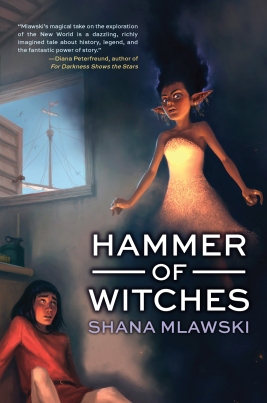
We’re so excited about the upcoming release of our new YA historical fantasy Hammer of Witches! In this post, Tu Books Editorial Director Stacy Whitman discusses how she and the designer came up with the final cover:
Historical fantasy can be tough to market. You have to show that, despite being steeped in research and history, this is an exciting, awesome book. It should look different from all the contemporary books out there, but not old-fashioned. Because of the fantasy element, a photographic cover just couldn’t do this book justice, but for YA, illustration can be tough because you don’t want the illustration to make the book look like it’s for a younger audience. We needed an illustrator whose art had a more mature look, whose sensibility tended more toward something you’d see in the adult market than the middle grade market—and we found that illustrator in
Andrew Mar.
Because the cover is illustrated, there’s a lot more leeway in terms of what we can pick to show. So we get to see an important moment in the story: a character moment where the main character, Baltasar, meets one of his primary companions throughout the book, Jinni (who is a half-genie). We know there’s magic happening–she’s floating, after all!–and we get to see how the author envisioned these characters rather than having to find a model whose looks fit the character or a stock photo that’s not quite right. We can also see that this is a historical setting from the view out the window, the characters’ clothing, and the items on the table. We even get some nice detailing in Jinni’s dress, and I love the expression on her face compared to Baltasar’s!
How did we choose this particular scene? The illustrator and designer both read the book, and we all actually came separately to the conclusion that this key scene had a lot of potential for illustration. Check out a few of the early sketches to peek in on the illustration process. First we had to choose what position the characters would be in, and then we had to figure out where the type could go in juxtaposition with the scene. How would the reader’s eye travel across the artwork and type together? Would this invite them in to the book to read to figure out what will happen?
The modern look of the typography ties it all together–this is a book for today, looking at this controversial time period through a different lens than the old stories. We looked at several font choices—as you can see from the thumbnail sketches, that font is not the one we ended up with on the final cover. Then the designer,
Isaac Stewart, had to place the typography in a way that stood out without overwhelming the great artwork.
The end result: a cover that says “READ ME!” to anyone who sees this book.
There’s been a lot of great buzz about
Hammer of Witches. Here’s what people have been saying:
- “An engaging, magical adventure set against the historical backdrop of Columbus’ westward voyage.” —Kirkus Reviews
- “Mlawski’s magical take on the exploration of the New World is a dazzling, richly imagined tale about history, legend, and the fantastic power of story.” —Diana Peterfreund, author of For Darkness Shows the Stars
- “Hammer of Witches is a historical revelation—an eye-opening magical carpet ride that takes the reader over the ocean and through the woods to an ancient time, full of beauty and grace, and the ever-present conflict between man’s spirituality and his natural brutality.” —Guadalupe Garcia McCall, Pura Belpre Award winner, Morris Award nominee and author of Summer of the Mariposas
- “A truly enjoyable energetic tale and an altogether original take on one of the most important events in human history—the first voyage of Columbus.” —Joseph Bruchac, author of Wolf Mark
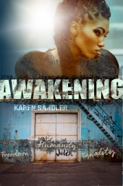
Look for Hammer of Witches in April 2013! In the meantime, take a look at the cover design of our other upcoming YA title Awakening in Cover Design 101: The cover of Awakening.
Filed under:
Art,
Publishing 101,
Tu Books Tagged:
cover design,
diversity,
Hammer of Witches,
illustration,
Science Fiction/Fantasy,
Spring 2013,
Teens/YA,
Tu Books 

By:
Hannah,
on 2/12/2013
Blog:
The Open Book
(
Login to Add to MyJacketFlap)
JacketFlap tags:
diversity,
Art,
cover design,
Science Fiction/Fantasy,
African/African American Interest,
whitewashing,
Publishing 101,
Tu Books,
Teens/YA,
Add a tag
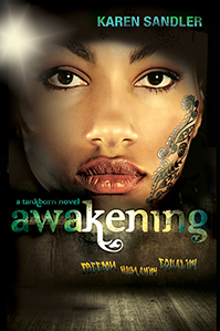
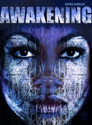
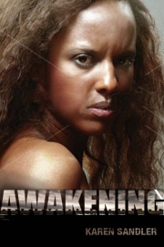
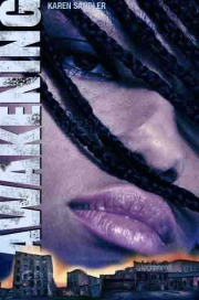
We’re getting close to the release of Awakening, the upcoming sequel to the YA science fiction dystopia Tankborn from our Tu Books imprint! Awakening continues the story of Kayla and Mishalla, two teen GENs (genetically engineered nonhumans) fighting for freedom and equality:
Last week, we were lucky to get some help revealing the cover of Awakening from some great book blogs:
Pretty in Fiction
Speculating on Spec Fic
Live to Read
A Reader of Fictions
This week, Tu Books Publisher Stacy Whitman shares the process of creating the cover:
Those who know Tankborn well will know that there’s something different about the girl on the cover of Awakening compared to the girl on the cover of Tankborn (aside from the fact that they’re two different people and, yes, represent two different characters). I’m not sure I should give it away, actually! But I’ll give you a hint: look at where the GEN tattoo falls in both covers:
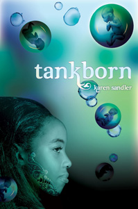
But let’s start from the beginning. First, talking about Awakening will require a few Tankborn spoilers, so those who are spoiler-averse: beware!
As you can see from the early proposed concepts, we had a few possibilities to choose from:
But which one best represented the book? To make a decision, we had to dig into the essence of Awakening.
In Tankborn, Kayla was recruited by a group of trueborns and lowborns quietly working against GEN oppression. In Awakening, Kayla starts to chafe at the slightly more gentle bonds this organization puts upon her—she wants to control her own destiny. But while she works towards freedom (and a chance at love with Devak, a trueborn), a deadly disease is spreading among GENs–which is especially curious considering that GENs are people who are genetically engineered not to get sick. On her travels for the Kinship–while also avoiding bombs set in GEN housing and warehouses by a mysterious group that only identifies themselves with the grafitti “F.H.E.”–Kayla meets a couple other GEN girls who are connected to this disease, one of whom is rumored to be able to heal whomever she touches.
Some early concepts, like the ones above, included one piece of Awakening or another, but a couple looked too modern-day urban or romance genre (didn’t quite set themselves apart as futuristic science fiction); another didn’t get the full message of the book across in a way I felt the other concepts did; another felt like it was actually better held back for the cover of Revolution, the third book in this trilogy (so now you have a hint as to what book 3 may look like!).
In combining the concepts, the designer, Einav Aviram, did a great job of showing what this book is all about in one great cover: the grafitti (Freedom, Humanity, Equality), the mysterious GEN girl who can heal whoever she touches, the dawning of Kayla’s stand for her rights–all coming together.
I should also say, of course, that we were happy for another chance to put a person of color on a cover. Whitewashing of YA covers is still, unfortunately, a common occurrence, and one of the things we try to do at Tu Books is showcase our characters of color on the cover whenever possible, whenever the design allows it.
So there you go, dear readers. What do you think?
Further reading:
Design 101: How a Book Cover Gets Made, Part I
Design 101: How a Book Cover Gets Made, Part II
Filed under:
Art,
Publishing 101,
Tu Books Tagged:
African/African American Interest,
cover design,
diversity,
Science Fiction/Fantasy,
Teens/YA,
Tu Books,
whitewashing 

For a long time we’ve been talking about our upcoming anthology, Diverse Energies, and I am thrilled to be able to share the cover with all of you at last!
Diverse Energies is a YA anthology of dystopian stories with a focus on diversity, and features stories by several award-winning speculative fiction writers including Ursula K. Le Guin, Paolo Bacigalupi, Malinda Lo, Cindy Pon, and Greg van Eekhout. So, without further ado:

Tu Books Editorial Director Stacy Whitman, on the cover:
The hanging letters came first in the concepts. I had already decided that the hanging letters were great, but it took us a while to settle on just the right image. This was a stock photo I happened across while looking for scenes of urban blight. It’s actually a reclaimed industrial space in Italy, which was turned into a park, but two things drew me to it: the way the lines would contrast with the letters in our design, and how much high energy the color of the light possessed. The energy of the colors matched the contrasting hope and darkness of the stories in this book.
The title Diverse Energies comes from a quotation from John F. Kennedy that inspired the anthology: “No one can doubt that the wave of the future is not the conquest of the world by a single dogmatic creed but the liberation of the diverse energies of free nations and free men.”
Look out for Diverse Energies this October! Until then, you can learn more about it here, and stay tuned to the blog for more sneak peeks to come.
Filed under:
Book News,
Musings & Ponderings,
Publishing 101 Tagged:
cover design,
diversity,
Science Fiction/Fantasy,
Teens/YA,
Tu Books 

Me Earl and the Dying Girl is the finniest book I have read this year. And when I say book I don't just mean young adult I mean adult books as well. This is why I knew I need to find someone who had the whit and edginess of the story to design the cover. That lucky man turned out to be
Ben Wiseman. Ben up until recently had only designed book covers for adult books. An impressive list of adult titles I might add. Such as...
Up until senior year, Greg has maintained total social invisibility. He only has one friend, Earl, and together they spend their time—when not playing video games and avoiding Earl’s terrifying brothers— making movies, their own versions of Coppola and Herzog cult classics. Greg would be the first one to tell you his movies are f*@$ing terrible, but he and Earl don’t make them for other people. Until Rachel.Rachel has leukemia, and Greg’s mom gets the genius idea that Greg should befriend her. Against his bet
Like dating, designing the right cover for a book can be a long, arduous process. Sometimes a cover gives off the wrong impression. Sometimes it’s too showy, sometimes it’s too dull. Sometimes a cover says all the right things, but lacks sincerity.
But sometimes, you find The One. And you just know.
That was the case with the cover of Summer of the Mariposas, coming this fall from our Tu Books imprint. Summer of the Mariposas, by Guadalupe Garcia McCall, is a YA retelling of The Odyssey set in Mexico. It follows Odilia and her sisters on their quest to return a dead man to his family (you can read an excerpt of the book here).
Because Guadalupe Garcia McCall is such a gorgeous writer (her first novel, Under the Mesquite, won the Pura Belpré Award and was a Morris Award Finalist) we wanted to find a gorgeous cover that would do justice to her work. Based on suggestions from the editor, Stacy Whitman, and Guadalupe herself, the designer came back with seven or eight different covers to start with. But when we saw this one, we knew it was perfect:

This cover is filled with small details that really capture the feeling of the story – the symbol in the sky, five stars for five sisters, the fantasy elements grounded by a very real-looking road. And yesterday the first ARCs came in, so now we can see what they look like in real life:

What do you think?
(Note: if you’ll be at ALA, we’ll be doing an ARC signing with Guadalupe Garcia McCall herself on Sunday morning at 10AM in booth #2436!)
Filed under:
Publishing 101 Tagged:
cover design,
guadalupe garcia mccall,
Latino/Hispanic/Mexican,
sneak peeks,
Teens/YA,
Tu Books 


I am a huge fan of design. Those who know me, know that I majored in communications design before I moved completely to illustration. Fortunately, I have been lucky enough to further my design practice along with my illustration and am now able to find balance between the two disciplines. In NY, I sharpened my design skills while working at Bloomsbury Publishing. I mainly handled paperback conversions, but I also had a chance to work on some title treatments for covers and a few picturebooks. When I work on my own books, I think about the design as much as the visual narrative.
I recently delivered cover art and a few black and white interiors for a really fantastic YA novel. When the editor sent me a cover comp, I had a few issues with the design—mainly the type treatment. In the beginning of the project, I pictured the jacket with a hand written title and expressed it to the editor, but when I delivered the art I didn’t have time to explore it. After seeing the cold computer generated font that was chosen, I knew a hand lettered font would have much more impact and personality, so I went ahead and made one.

the original type treatment
Showing is always better than telling.
I drew over the original type treatment and added my own embellishments and adjustments. I then scanned the drawing into photoshop, created paths and imported them into illustrator where I was able to clean and kern until it looked less like casual writing and more like stylized letterforms. Once I was satisfied with the weight and spacing, I pulled it back into photoshop and embossed it. The editor really liked it and is using it on the cover. 

type by Shadra 
Many thanks to my editor, Christina, who supported my vision for this project. I can’t wait to share the book with you!
In the first part of our guest blog, Tu Books Editorial Director Stacy Whitman and designer Isaac Stewart discussed how they came up with the cover concept for the novel Vodník. In part II, they share covers they considered and explain how they came up with the final design.
Isaac: By the time we chose a direction for the cover, I had created something like twenty-two thumbnails. I’ll admit, I went a little overboard, but I really wanted to give Vodnik the attention it deserved. And honestly, it was hard work finding the desired balance between ominous and whimsical.
COVER 1: THE HORROR

Isaac: This cover has a lot going for it, despite my getting the color of the vodník’s arm wrong. Initially, I wanted to have a hand thrust up out of the water, a crushed teacup in its grasp. As I searched for images that matched, I found this one and decided it played off the ominous feeling I was hoping for. I tried the whole fire and water dichotomy with the colors of the title and byline, and was hoping that the text itself would carry the Eastern Block feel. The large, in-your-face title was a precursor to what we wound up using on the final cover.
The biggest problem with this cover was it looked like a horror novel, almost completely ignoring the fantasy and whimsy that are also big parts of the story. To tell the truth, it didn’t even look like a YA book.
Stacy: Yeah, this one just wasn’t working for me. It looked too horror-y, and didn’t have the right sensibility that I was going for. Which brought us to…
COVER 2: DEATH ON DUTY
 Isaac: My absolute favorite of the concepts! This was a composite of six different images, and I’m quite proud of how it turned out. Here, we started to get a better balance of the humor, the fantasy, and horror of the book. I really miss this cover, but there were some issues that we just couldn’t get around.
Stacy: My favorite as well! I LOVED it and my first impulse was to go with this one. But the author, Bryce Moore, made some good points that caused us to rethink this one. The most important is that this book is set in Slovakia. The sign is in English. Were we giving off too much of an American Dead Like Me air? Were we focusing too much on Death above the titular vodník character, forgetting the core of the book being about a human teen guy who’s figuring out his life? And again–and this was a point someone brought up in-house as we were discussing our options–given our mission to showcase main characters of color, was there a way we could show his face and have it work just as well or better? I still think this might make for a great promotional piece, but I just wasn’t convinced it was best as the book’s *cover*.
COVER 3: THE ELEMENTS
1 Comments on Design 101: How a Book Cover Gets Made, Part II, last added: 3/14/2012
In this two-part guest blog post, designer Isaac Stewart and Tu Books Executive Editor Stacy Whitman discuss how they came up with the final cover for our new YA fantasy, Vodník:
Isaac: Before brainstorming ideas for a book design, I usually get a few pieces of key information from the editor:
1. What age-range and demographic do we want the book to target?
2. What would the editor like the cover to convey?
3. What has the author said they would like to see on the cover?
Here’s how Stacy answered:
1. The book’s design should appeal to both female and male tweens and teens, but should specifically target the male teen.
2. Stacy wanted a cover that felt ominous, fantastical, with a dash of whimsy.
3. Bryce [Moore, the author] specifically mentioned that he found covers with bold shapes and colors both beautiful and striking. But if we decided to go for a more photographic cover, he wanted to see the vodník statue or Trenčín castle.

Trenčín Castle
He also suggested full-color interior illustrations by Michael Whelan, that the exterior title be in dripping water and his author name be on fire. He also asked for a trip to the moon and a hard drive loaded with Scooby-Doo reruns.
Both Stacy’s and Bryce’s input was invaluable in creating cover concepts. I had long conversations with each of them, trying to find that image that would really fit the book. Though their ideas were sometimes disparate, there was still some overlap that I hoped to be able to harness.
So I set to work reading the manuscript. The goal I kept in mind was this: Find a design that would compel the right audience to pick up the book (and make Stacy and Bryce happy in the process).
Stacy: You’ll note that Bryce had quite a bit of input into the process here. With a smaller company, it’s easier to coordinate with the author for suggestions. While we still have to take marketing information just as much into account when planning covers, we want our authors to be happy with the end result. Their ideas help inspire the designer and I think the covers are better for it. I also show my authors concepts–once we’ve narrowed it down to the best possibilities–so they can point out things I might have missed. (For example, Karen Sandler rightly pointed out that we had accidentally put the tattoo on the wrong side of the main character’s face on Tankborn!)
Isaac: I made notes of particularly visual scenes and looked for reoccurring details and symbols that could be translated into the book design. I’ll admit that several times I lost myself in the reading of the book and had to resurface for air and make notes after the fact! (You’ll see what I mean when you get to read the book later this month. It’s breathtaking. And not just because there’s an evil water demon who wants to drown the main character.)
Today I spent the day inputting all the changes I so painstakingly made by hand awhile back to my mystery novel. I am eager to get these changes made on computer, and finally online so I can relaunch my ebook. I am always an early adopter of new media, and this book came out in 1999 as an ebook published by a press that is no longer in business. My reader at that time cost almost $300, and hardly anyone had one. Hardly anyone bought ebooks either. My novel was the best-selling mystery novel (ebook) for 1999, so that tells you how many were sold that year. Ha. Especially considering that it wasn't even published until October! Still, it did get good reviews, so I have high hopes for it in its new life. As it was written so long ago, it definitely needed to be brought into the new millennium, with cell phones and so on. Otherwise, it holds up. I'm going to need two more full days to finish the uploading.
I also want a new cover. And a marketing campaign. This will not happen overnight as much as I would like for it to. Why can't things happen more quickly? Life is too short, and yet things take too long. It has been ever thus.
Do you write mysteries? Do you have a designer you want to recommend to do my cover? I have someone in mind, but they don't specifically do mysteries. I'm open to suggestions.
Leave a comment.
Earlier this week I said that I was working feverishly on various projects to get them done before submissions started. One of those projects is the cover for the fourth in the Sacred Books Series, The Book of All Things.
I have developed various covers, one of which is my favorite, and one which is the author's. They are not the same.
So, I could now use a little help from all of you. Below you will find the top three cover options (so far). Look at the covers, click them to see them full size, and then ask yourself, "Which book is the one I would want to buy?"
After that, please vote in my cover poll below. The more input I get, the more statistically significant the outcome. So vote! Show your friends and family and have them vote!
Thanks!

Basic Black | 
Rainbow Connection |  Heavy Metal Heavy Metal |
<a href="http://polldaddy.com/s/099C6E1E76DC3AE4">View Survey</a>

Minimalistic graphic design for an imaginary poster, flyer or cover.
You're invited for a visit to Sevensheaven.nl for more imagery.

Posted on 11/30/2009
Blog:
Sugar Frosted Goodness
(
Login to Add to MyJacketFlap)
JacketFlap tags:
murderer,
assassin,
graphic design,
album cover,
hitman,
cover design,
book cover,
poster design,
movie poster,
voxels,
3d pixels,
Add a tag

Minimalistic graphic design for a poster or cover.
More at Sevensheaven.nl


AaBi and Roy
Benny & Jacob in the window BoBo fishing
Jacob fishing & Continental Divide

I understand that is a very weird title, but so much has happened since my last post. To bring you up to date, our little bitty baby is now up to 15 lbs. and so healthy and happy! Thank you God for answering prayers. Our other little granddaughter, Clyr is growing fast and now saying MaMa and Dada. We had a visit over the 4th of July from the boys, AaBi and Roy. We tried so hard to go camping but something came up all week and "we still didn't get to go camping!" That ended up being the motto for our entire week! It was chaotic, the house looked like it threw-up, and the 4th became a day to try to forget! Our son, Jon, was involved in the Kansas floods and had to flee as his house became submerged, he arrived here on the fourth with what he could put in his car and a dog and cat. Thankfully he works at WalMart and was able to transfer to Colorado. So at the present he is living with us until he can get back on his feet. So at one point during this chaotic week we had six adults, two children, and six animals living in our small home. The blessing was having two bathrooms - and the washer ran non-stop! Benny, our littlest grandson ate some meds and spent two days at the emergency room, the transmission went out on the kids car so they ended up staying a couple of days longer, our air-conditioner went out; the list is just to long to continue...plus I want to forget part of it!
But all-in-all, we had a wonderful time together and finally at the end of the week we managed to get to the mountains and go fishing, geocaching, and even had a bear encounter. I will add some pictures on a new blog tomorrow and expand on our bear encounter (and snake).
The time just flew by and I really wasn't ready for them all to leave, I seem to never get enough hugs and love from the kids. I desperately miss living by them and watching the boys grow up. If I had my way (see MomMo's Cobb house story) we would all live together on a working communal farm. Can you tell I grew up in the 60's??? HaHa!
I have been in a lot of pain recently, so part of the time they were here, I was a bit crabby. I'll admit it. (Does that make you laugh, AaBi?) I am having surgery on my cervical spine in Sept. so I am in a soft neck brace to stop further damage and support my neck. The doctor is going to fuse two vertebra together and try to fix another vertebra that is pressing on my spinal column and causing extreme pain in my neck, head, arm and even leg. I have had so many tests and MRI's that I am just ready to get this over with. The good news is...they did find a brain when I had a brain MRI and there wasn't a stroke! This is actually forcing me to use the headset at work when I answer the phone and my Blue tooth device with my cell phone. The scary thing is if I fall, had a wreck, or somehow damaged my neck further (before surgery) I could become paralyzed. I pray my angels are working overtime to help me not be so klutzy! My good friend from work (who's job I took over) had the very same problem and her surgery was on the 6Th of August. She is doing well. I do believe our work (station, ergonomically disastrous desk, lack of headphones and hundreds of calls a day contributed to this problem!) is responsible for where we are today. I am now a headset advocate for everyone at the college. I tell them they do not want to be a little old lady like me someday. Right now they are young and can cradle that phone and type or write when calls come into their department, but it will get you!!!
My 50th birthday is in a couple of weeks and I know I have been blogging about mortality and how fast time goes. Live each day to the fullest and be full of joy. Life is too short not to enjoy yourself. Laugh every day!


 I went to university in Australia and did a Design degree focusing on Visual Communication – graphic design, illustration and typography. The following are known for being good for those graphic design (2 dimensional design as opposed to product and industrial design) focused:
 My advice is to completely immerse yourself in book design and design in popular culture – music, fashion, games, film, food, interiors/furniture…everything – as design, and good examples of design and inspiration, crosses all arenas.
 Below are a handful of book cover related sites to check out. There is so much out there, independent designers, design agencies, illustrators etc…so this is just a starting point:
  And also follow publishers' instagram/pinterest boards. A lot of them are set-up by the designers and they're a little more inspirational than the actual websites which are set-up by the corporate bods as a business tool rather than celebrating the design side of publishing.


.jpeg?picon=1639)


 2 Comments on Design 101: How a book cover gets made, last added: 3/9/2012


[…] COVER DESIGN 101: A SENSE OF MYSTERY. […]