new posts in all blogs
Viewing: Blog Posts Tagged with: portraiture, Most Recent at Top [Help]
Results 1 - 18 of 18
How to use this Page
You are viewing the most recent posts tagged with the words: portraiture in the JacketFlap blog reader. What is a tag? Think of a tag as a keyword or category label. Tags can both help you find posts on JacketFlap.com as well as provide an easy way for you to "remember" and classify posts for later recall. Try adding a tag yourself by clicking "Add a tag" below a post's header. Scroll down through the list of Recent Posts in the left column and click on a post title that sounds interesting. You can view all posts from a specific blog by clicking the Blog name in the right column, or you can click a 'More Posts from this Blog' link in any individual post.
.png.jpg?picon=3640)
By:
Sara Burrier,
on 10/29/2015
Blog:
warrior princess dream
(
Login to Add to MyJacketFlap)
JacketFlap tags:
angel,
colored pencil,
portraiture,
christmas gift,
sara burrier,
sara b illustration,
fairy,
fantasy,
art,
drawing,
portraits,
Add a tag
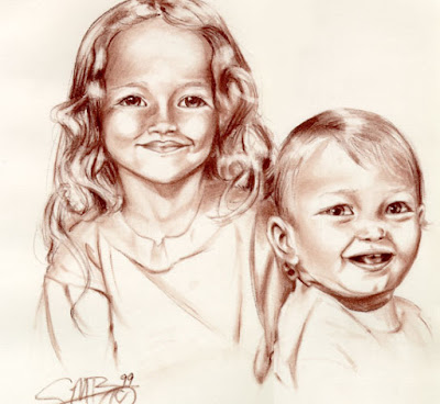
Long ago, in a land far, far away (okay, like a few streets away...literally) I used to sit and draw conté portraits in a mall. My boyfriend at the time worked for a shop, who allowed me to sit right in front offering my services. At the time I did it because I could and it made me a little money during high school. But to be honest, I didn't see it as something to rave about or be excited about.
 |
| c. 1999 |
Fast forward almost 20 years, and I can tell you that my view on portraiture has changed...dramatically.
Hand drawn portraiture brings a perspective, quality, and etherial impression a photograph lacks without professional editing. And this is exactly what I hope to bring to you. The act of drawing a portrait is very personal, challenging, and a HUGE honor and gift given to me as the artist.
I have this daydream to hand draw children, friends, and family into fairies and angels. I am starting this new service using colored pencil while I build my watercolor techniques in this subject matter. The idea behind Impressionable Portraits is they are lifelike, and look very close to the realistic photo, but with a hint of whimsy and sketchiness found only in drawing. They are not intended to be photo realistic, but definitely to look a lot like the person being drawn.
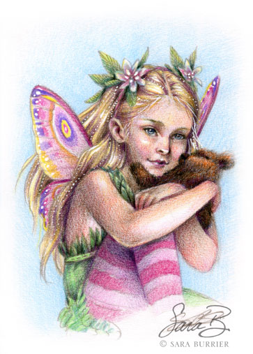 |
| c. 2015 |
I am currently taking commission requests for these portraits, and still have room to get some done before the Christmas holiday. They take about a week to create. Please
visit my request page, fill out the information form, and in the subject line write "Impressionable Portrait".
These are 5x7 inch colored pencil drawings for a flat fee of $200. Sprayed and matted in a white mat, ready to be placed in an 8x10 frame.
All I need is the photo, if it's fairy or angel wings, color palette, and something of interest to the individual. It's my wish to provide an image filled with wonder, joy, and light around a person you love dearly. As a gift, or for yourself.

By: Alice,
on 2/29/2012
Blog:
OUPblog
(
Login to Add to MyJacketFlap)
JacketFlap tags:
Poetry,
Literature,
surrealism,
portraiture,
Humanities,
*Featured,
Art & Architecture,
Arts & Leisure,
Bettina Shaw-Lawrence,
David Gascoyne,
Night Thoughts,
Robert Fraser,
gascoyne,
Add a tag
By Robert Fraser
I am often asked to name my favourite poem by the British writer David Gascoyne (1916-2001), my biography of whom appears with OUP this month. Bearing in mind Gascoyne was in his time an interpreter of Surrealism, an existentialist of a religious variety and a proponent of ecology, you might expect me to go for a poem along these lines. Instead, I usually choose a poem of the early 1940s entitled “Odeur de Pensée.” The title is intriguing for a start, since it translates as either “The Smell of Thought” or”‘The Scent of a Pansy.” A pansy, you will properly reply, is almost odourless; its appearance suggests fragrance without it shedding much. If it possesses a scent at all, it is so elusive as almost to be undetectable. It is thus with thought:
Thought’s odour is so pale that in the air
Nostrils inhale, it disappears like fire
Put out by water. Drifting through the coils
Of the involved and sponge-like brain it frets
The fine-veined walls of secret mental cells,
Brushing their fragile fibre as with light
Nostalgic breezes…
Hard to locate in time or place, fitting uneasily into a biographical sequence, these lines nonetheless convey so much about a writer every stage of whose existence was marked by elusiveness. To me his life seemed a patchwork of lost years, lost works, lost people. There was, for example, the saga of his pre-war diaries, compiled in Paris and London between 1936 and 1940. Gascoyne had lent them to a theatrical colleague, who had forgotten to return them. For decades he assumed them to be lost then, one morning in the early 1970s, they re-appeared on his doorstep wrapped in brown paper, having surfaced among the effects of a recently deceased acquaintance. Unpacked and eventually published, they abounded in descriptions of contemporaries well — or else scarcely — known: W.H. Auden, Igor Stravinsky, André Breton, Henry Miller.
It was the obscurer names that preoccupied me. Bettina Shaw-Lawrence, for example — where was she? As a puppy-like teenager she had been a neighbour of the poet’s in the mid-nineteen thirties. She had a walk-on part in his Paris diaries, since she had gone on to study drawing with Fernand Léger and sculpture with Ossip Zadkine. I had seen a portrait of Bettina as a voluptuous twenty-something year old painted by David Kentish who, along with Lucian Freud and Johnny Craxton, formed the nucleus of the so-called East Anglian School of Painting and Drawing haphazardly run by Cedric Morris in the early war years. If she had known Kentish, there was a fair chance she knew the rest of that ramshackle bunch. Portraiture was very much part of the scene. In 1943 Freud sketched Gascoyne several times, his four wildly differing likenesses bearing witness to the poet’s changeable personality. Had Bettina drawn Gascoyne as well?
I contacted the Bridgeman Art Library who could tell me little, though they thought she might be in Italy. A circuitous trail of contacts led to her daughter, who told me she and her mother lived north of Rome in the picturesque lake-side town of Trevignano Romano. Bettina too had lost Gascoyne’s diaries, her printed copy had been borrowed and not returned. Could I acquire a replacement? I agreed on the condition we met. Thus I lured her to Richmond in Surrey where, one crowded bank holiday, we sat in a crowded pub where I endeavoured to hear her murmured reminiscences above the din of the drinkers. It was futile, so last autumn my wife Catherine and I followed her out to Italy, where she occupies a modest flat hun
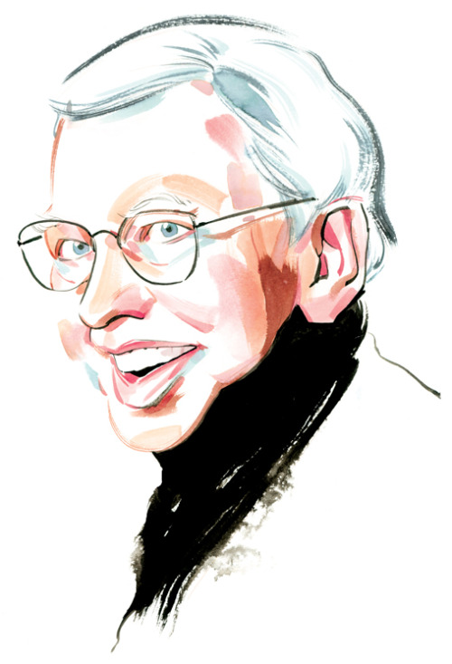
Roger Ebert by Kagan McLeod

Randy Glass has updated his website, which now includes even more of his famous “hedcuts” for the Wall Street Journal. What continues to amaze about Randy’s work is not just the incredible likenesses he’s able to achieve, but that he does it all freehand with pen and ink, and no tracing.
His site’s in Flash, and a little inconvenient to navigate, but worth the trip if you’re a fan of his work.

Rich Pellegrino
Fantastic, colourful portraits painted by illustrator Rich Pellegrino. I particularly liked the series he did for the Wes Anderson tribute show, Bad Dads.


This one is a pencil drawing of my daughter when she was about 18 months old. She is now rolling her eyes and asking if she can go to the mall with her friends :) This was another piece that I've always really liked but I really wasn't planning on it turning into anything and I drew it dangerously close to the edge of the illustration board. The top of her head is almost at the edge of the page. Thank goodness for Photoshop.
 Greetings,
This year I am offering to do paintings for the holiday season. It will be a totally unique gift, created specifically for you or your loved ones. The above image is a flyer that contains more details, click on the image to see a larger version. Also, feel free to download it, or to pass it along to your friends. I am open to any reasonable requests.
Here are larger views of the images shown above:

You can see earlier posts on this image
here which show part of the process used to create this piece.

This is a sample page from my sketchbook.

You can find the story of this portrait
here from an earlier post.
I hope that you find this idea intriguing and feel free to contact me with any related questions.

This is great. What better way for comic artists to celebrate Harvey Pekar’s birthday? Pekar, whose autobio-comics self is famously drawn by different artists throughout his career, is rendered lovingly by over 90 different cartoonists as part of The Pekar Project.
Shown here: two of my faves, Laura Park and Jeffrey Brown.
Posted by John Martz on Drawn! The Illustration and Cartooning Blog |
Permalink |
No comments
Tags: Comics, Harvey Pekar, jeffrey brown, laura park, portraiture


How great are these mini pixel portraits? Very Important Pixels are created by Beligan designer Kristof Saelen who offers up a new set every week. What I find remarkable is that the recognizability of these portraits is due not just to choosing iconic characters; Kristof manages to capture each person’s true likeness in that tiny grid of pixels.
Posted by John Martz on Drawn! The Illustration and Cartooning Blog |
Permalink |
No comments
Tags: Caricature, Kristof Saelen, Pixel Art, portraiture


One of the most prolific and recognizable contemporary illustrators, the award-winning C.F. Payne finally as a website. I found the gallery to be a bit slow-loading at times, but it’s worth it to finally see so much of his work all in one place online.


This most recent piece was actually set in motion about 6 months ago, in an auction to raise money for a local school, I donated a portraiture drawing session. What originally started off being a 1 hour drawing session has morphed into this watercolor painting.
The girl is about 5 years old and her parents were the top bidders who won the portrait. The way that the painting came about is that we arranged for me to come to the school and to do some life drawing on the spot. But little children often suffer from Antsy-pants, soooo, I brought my camera with me. What I ended up with was two nice drawings that gave good gesture and sense of her proportions, and 2 or 3 pictures that were worth anything. Feeling good about that, I came home to the studio and set to work. Obviously photo's give one the ability to really get the details of the face. I really tried hard to leave things as fresh as possible, but my early inclination was to turn her into an 80 year old woman by painting into every nook and cranny of her face! Of course children's faces are soft and round, corners and lines have yet to happen, and so my intention was to create a sense that the colors and values were just ever so lightly floated there.
Technically, I felt that I found a good stride with this painting. I enjoy small crosshatching marks, and with watercolor one is able to build a rich color and texture due to the transparent quality of the paints. My heros for this kind of mark making would have to be George Seurat, his drawings are positively sculptural, and Andrew Wyeth (who could not just LOVE the way that he created his final paintings.) This kind of mark making shows up in some of my pen and ink work as well. For me it's a great way to develop tone. This was really the first time that I employed this method in terms of creating a whole painting with it.
Another note that I was conscious of during the creation of this piece was edges. There is a big effort to display hard edges, and to balance that with soft edges. The soft blending along the cheek and nose area are of particular joy for me. The outer edge is another place where I wanted to show some softness, as well as the rough brush strokes on the paper. For this I looked to John J. Muth for inspiration, I find that his blends and backgrounds are rich with wet into wet blends, and sensitivity to color and edges. I have to admit it was a brave moment putting those moves on there. At that moment, I had the head and shirt done, and most of the hair. So, I had to take a deep breath and launch into that, and well, the results are there on the page.
Finally, speaking of the page, the paper itself is a handmade piece of watercolor paper from
Twin Rocker in Illinois. I was gifted a sample pack of papers from them, which I adore. One thing that I didn't account for was their sizing (the glue in the paper), and the way that it accepted water. In other pieces I've painted on Strathmore board, and Arches Hot Press. This Twin Rocker paper really should have been soaked then stretched rather than painted directly onto, consequently the watercolor didn't soak into the paper very quickly. However the back side to that is that the color also lifts very easily; making corrections was a breeze. The rough nature of the paper and the natural surface were positively a joy to work on.
I hope I have more opportunities to do portraiture, it was really fun. If I am being really honest, I admire this piece for the things that it is to me. So many times, I can create something and find that in the end, I am still not quite satisfied with the results. Here, I am.


Mike Chester recently completed a series of portraits of rock ‘n roll stars on his blog.

These sculpted caricatures of three of the Beatles by David O’Keefe are fantastically grotesque, and yet surprisingly accurate. I imagine if the puppets of Spitting Image created their own version of Spitting Image, it would look like this.


Johan Leion has been drawing a self portrait every day for a year, and judging from the results, it’s prime evidence that these sorts of projects increase one’s creative skills. It’s only after he starts trying to fight the monotony of such a task by experimenting with new media, techniques, and styles that they start to get interesting.

Mel Stringer has been creating this really great series of portraits. She happily takes commissions, too, if you want to get your own created. I liked them so much, I asked her to create one of me. Oh dear, is that what I look like?


Okay, Halloween has come and gone for another year, but that doesn’t mean you won’t enjoy Frederik Peeters (adorably ill-translated) Portraits as Living Deads.


Great project to honor a great comics legend!
We did a somehow similar project, where we invited artists to draw something about “the last match”, see http://www.flickr.com/photos/thelastmatch